
Learn Coding Visually
Learn to code with interactive, live-preview playgrounds — HTML, CSS, JavaScript, React & more.
 HTML Playground42 lessons · Click-based · Live preview
 CSS PlaygroundLearn CSS with a live editor
 JavaScript Playground60 lessons · DOM · Async · Canvas
 React PlaygroundLearn React with a live code editor
 GSAP PlaygroundLearn GSAP animation interactively
 SVG Playground44 lessons · shapes · paths · animation
 SCSS Playground45 lessons · Sass modules · tokens
 Tailwind PlaygroundLearn Tailwind CSS with a live editor
 Bootstrap 5 Playground50 lessons · live preview
Flip Card to Modal — Free GSAP Flip Plugin Snippet
Flip Card to Modal · Modals · Plain HTML, CSS & JS · Live preview
What's included
Features
About this UI Snippet
Flip Card to Modal — Shared-Element Expansion With One DOM Node
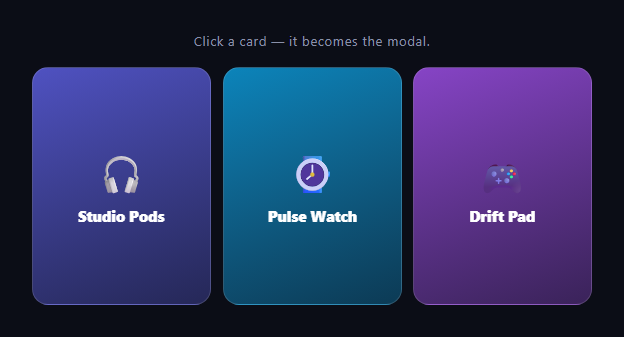
The card-to-modal morph is the shared-element transition every app store and gallery uses: tap a card and it *becomes* the detail view, growing from its grid slot to screen center with perfect continuity. Most implementations fake it with a cloned overlay; this snippet does it honestly — the same DOM node plays both roles — using GSAP's Flip plugin to animate between two CSS layouts.
One element, two layouts, zero coordinates
The card's modal state is just a class: .is-open switches it to position: fixed, centers it with a translate, widens it, and reveals the hidden detail block. The animation is the standard FLIP sandwich — Flip.getState(card) before the class flip, Flip.from(state) after — so GSAP measures where the card was in the grid, where CSS just teleported it, and animates the difference. Neither position is ever computed in JavaScript, which means redesigning the modal (or the grid) requires touching only CSS.
Why the real node beats a clone
Clone-based modals must copy content, sync state between twins, and hide the original — three sources of bugs. Because this is one node, its event listeners, form state, and any live content ride along through the transition. The tradeoff is that the grid keeps a gap where the card left (its slot is preserved since absolute: true handles flight, and the fixed positioning removes it from flow) — visually fine here since the backdrop dims the grid anyway; a placeholder element can hold the slot if your layout collapses.
props: 'borderRadius' keeps corners honest
The grid card and modal share a 16px radius here, but the props option demonstrates the pattern: any style the class flip changes (radius, background, padding-driven visuals) can be recorded and tweened rather than snapping. Without it, Flip animates only position and size.
Content is choreographed, not flipped
The detail paragraph and price are display: none in the grid state — they have no meaningful "before" geometry, so flipping them would stretch text weirdly. Instead they pop in with a separate 0.35s fade-up delayed until the container is ~60% landed. Splitting "container morph" from "content entrance" is the core trick of polished shared-element UIs.
Interaction guards make it production-shaped
An animating flag ignores clicks mid-flight (double-clicking a FLIP is the classic way to strand elements between states), the backdrop click and Escape key both close via the same toggle(), and the open card ignores further clicks so text selection works inside the modal.
The backdrop is CSS, sequenced by class
The blurred backdrop fades via its own CSS transition, toggled in the same frame as the card's class. Layer order (z-index 10 vs 20) puts the traveling card above the backdrop for the entire flight, so the morph never dips behind the dimmer.
Customizing it
Add an image that scales with the card, swap min-height for real content sizing, or FLIP back to a *different* grid position after sorting. Related: reorder animation in flip grid shuffle, the CSS-only expandable card, a classic modal, and product framing like product quick view.
Build with AI
Build, Understand, Optimize, and Extend It With AI
You don't need to reverse-engineer the FLIP sandwich by hand to understand what's happening here. Paste this snippet's HTML, CSS, and JS into an AI coding assistant like Claude and ask it to walk through exactly what Flip.getState captures before the is-open class toggles, and why props: 'borderRadius' is needed on top of the automatic position and size tracking. The same assistant can help optimize it — ask whether the animating flag is sufficient protection against rapid clicks across multiple cards at once, or whether absolute: true is the right choice if the grid layout itself can reflow while a card is mid-flight. It's also useful for extending the interaction: have it add a hero image that scales with the card during the flip, support returning the card to a different grid position after a sort, or stack multiple simultaneously-open cards into a carousel. Treat the code less like a finished artifact and more like a starting point for a conversation.
Prompt to recreate it
Copy this into your AI assistant of choice to build the effect from scratch, or as a jumping-off point for your own variant:
Build a "card that becomes its own modal" shared-element transition in plain HTML, CSS, and JavaScript using GSAP and its Flip plugin (load both from a CDN) — the modal must be the exact same DOM node as the grid card, never a clone.

Requirements:
- A CSS grid of cards, each with a compact "collapsed" look (icon, title) and a hidden detail block (description and price) that is display: none by default.
- A single .is-open class that, when present on a card, switches it via CSS alone to position: fixed, centered on screen with a translate, given a wider fixed width, and reveals its detail block by changing that block's display — no JavaScript should compute or set any pixel coordinates for the open state.
- On click, capture the card's current geometry with Flip.getState before toggling the is-open class, then call Flip.from with that captured state immediately after the class toggle, so GSAP animates the visual difference between the old and new CSS layouts. Pass borderRadius in the getState props list so a border-radius change between the two states is also tweened rather than snapping.
- The revealed detail content (description and price) must not be part of the Flip animation itself — animate it separately with a short fade-and-slide-up tween delayed until the container flip is mostly complete, since display:none elements have no meaningful starting geometry to flip.
- Use a boolean "is a flip currently animating" guard to ignore new clicks until the current Flip.from completes, since clicking again mid-flight would capture a moving element as a bad starting state.
- Add a backdrop element that fades in via its own CSS opacity transition in the same frame the card opens, sits below the traveling card in z-index for the whole flight, and closes the open card when clicked. Also close the open card on pressing the Escape key.
Want to tighten it up first? Run this prompt through the AI Prompt Studio to score it across 8 quality dimensions, catch anti-patterns, and tune the wording for Claude, ChatGPT, or Gemini before you paste it in.
Source Code
<div class="fcm-wrap">
  <p class="fcm-hint">Click a card — it becomes the modal.</p>
  <div class="fcm-grid">
    <div class="fcm-card" style="--cc:#6366f1">
      <span class="fcm-emoji">🎧</span>
      <h3>Studio Pods</h3>
      <div class="fcm-more"><p>Adaptive ANC, 40-hour battery, and a case that doubles as a Bluetooth transmitter for flights.</p><b>$249</b></div>
    </div>
    <div class="fcm-card" style="--cc:#0ea5e9">
      <span class="fcm-emoji">⌚</span>
      <h3>Pulse Watch</h3>
      <div class="fcm-more"><p>Dual-band GPS, 10-day battery, and recovery scores that actually change how you train.</p><b>$329</b></div>
    </div>
    <div class="fcm-card" style="--cc:#a855f7">
      <span class="fcm-emoji">🎮</span>
      <h3>Drift Pad</h3>
      <div class="fcm-more"><p>Hall-effect sticks that never drift, 1000Hz polling, and remappable paddles.</p><b>$89</b></div>
    </div>
  </div>
  <div class="fcm-backdrop" id="fcmBackdrop"></div>
</div>*{box-sizing:border-box;margin:0;padding:0}
body{font-family:system-ui,-apple-system,sans-serif;background:#0b0d16;color:#fff;min-height:100vh;display:flex;align-items:center;justify-content:center;padding:24px}
.fcm-wrap{width:min(560px,94vw)}
.fcm-hint{text-align:center;color:#8a90a8;font-size:13px;letter-spacing:.05em;margin-bottom:18px}
.fcm-grid{display:grid;grid-template-columns:repeat(3,1fr);gap:12px}
.fcm-card{position:relative;display:flex;flex-direction:column;align-items:center;justify-content:center;gap:8px;aspect-ratio:3/4;border-radius:16px;padding:14px;background:linear-gradient(160deg,color-mix(in srgb,var(--cc) 80%,#000),color-mix(in srgb,var(--cc) 30%,#0b0d16));border:1px solid rgba(255,255,255,.15);cursor:pointer;will-change:transform}
.fcm-emoji{font-size:38px}
.fcm-card h3{font-size:15px;font-weight:800;letter-spacing:-.01em;text-align:center}
.fcm-more{display:none;text-align:center;margin-top:10px}
.fcm-more p{font-size:14px;line-height:1.6;color:rgba(255,255,255,.85);max-width:340px}
.fcm-more b{display:inline-block;margin-top:14px;font-size:22px}
.fcm-card.is-open{position:fixed;inset:auto;left:50%;top:50%;transform:translate(-50%,-50%);width:min(420px,90vw);height:auto;aspect-ratio:auto;min-height:340px;z-index:20;cursor:default}
.fcm-card.is-open .fcm-emoji{font-size:64px}
.fcm-card.is-open h3{font-size:24px}
.fcm-card.is-open .fcm-more{display:block}
.fcm-backdrop{position:fixed;inset:0;background:rgba(5,6,12,.7);backdrop-filter:blur(4px);opacity:0;pointer-events:none;transition:opacity .35s;z-index:10}
.fcm-backdrop.is-on{opacity:1;pointer-events:auto}gsap.registerPlugin(Flip);
var backdrop = document.getElementById('fcmBackdrop');
var openCard = null;
var animating = false;
function toggle(card) {
if (animating) return;
animating = true;
// First: capture the card exactly as it sits in (or out of) the grid.
var state = Flip.getState(card, { props: 'borderRadius' });
// Last: flip the class — CSS teleports it to modal (or grid) layout.
var opening = !card.classList.contains('is-open');
card.classList.toggle('is-open');
backdrop.classList.toggle('is-on', opening);
openCard = opening ? card : null;
// Invert + Play: animate from the captured state to the new one.
Flip.from(state, {
duration: 0.55,
ease: 'power3.inOut',
absolute: true,
onComplete: function () { animating = false; }
});
// The extra content pops in after the container lands.
if (opening) {
gsap.from(card.querySelector('.fcm-more'), {
opacity: 0, y: 16, duration: 0.35, delay: 0.3, ease: 'power2.out'
});
}
}
document.querySelectorAll('.fcm-card').forEach(function (card) {
card.addEventListener('click', function () {
if (!card.classList.contains('is-open')) toggle(card);
});
});
backdrop.addEventListener('click', function () {
if (openCard) toggle(openCard);
});
document.addEventListener('keydown', function (e) {
if (e.key === 'Escape' && openCard) toggle(openCard);
});Step by step
How to Use
- 1Add the GSAP CDNsInclude gsap and the Flip plugin from the CDN panel.
- 2Paste HTML, CSS, and JSThree product cards render in a grid.
- 3Click a cardIt morphs from its grid slot into a centered modal.
- 4Watch the contentDetails fade up after the container lands.
- 5Close itBackdrop click or Escape morphs it back to its slot.
- 6Restyle either stateBoth layouts are pure CSS — Flip adapts automatically.
Real-world uses
Common Use Cases
Got questions?
Frequently Asked Questions
The modal is just another CSS state: .is-open makes the same element position: fixed, centered, and wider. Flip.getState captures the grid geometry before the class flip, and Flip.from animates from that capture to wherever CSS teleported the node. One element, two layouts — GSAP animates the difference, so no clone ever exists.
Clones must duplicate content, mirror any state, and hide the original — and they still desync when live content updates mid-transition. With one node, click handlers, media playback, and form values persist through the morph. The only price is managing the vacated grid slot, which the dimmed backdrop makes a non-issue here.
The description and price are display: none in the card state, so they have no meaningful starting geometry — flipping them would smear text across the resize. Instead a separate tween fades them up 0.3s into the morph, after the container is mostly landed. Splitting container motion from content entrance is what makes shared-element UIs read as polished.
An animating boolean set before Flip.from and cleared in its onComplete. Without it, a second click mid-flight would capture a moving element as the "first" state and stack a conflicting animation — the classic way FLIP UIs strand cards between layouts. Clicks on the open modal are also ignored so users can select text.
Yes — geometry differences are Flip's whole job, and style differences can be tweened by listing them in getState's props (this snippet tracks borderRadius as the template). For images, keep one img whose size is driven by each layout; object-fit: cover makes the crop transition naturally during the morph.
Drive is-open from state, but sequence carefully: capture Flip.getState in the click handler before setting state, then call Flip.from in useLayoutEffect (React), nextTick (Vue), or afterNextRender (Angular) once the class has committed. Register Flip at module scope, guard with an animating ref, and revert a gsap.context on unmount. Both layouts express cleanly as conditional Tailwind classes.