Learn Coding Visually
Learn to code with interactive, live-preview playgrounds — HTML, CSS, JavaScript, React & more.
 HTML Playground42 lessons · Click-based · Live preview
 CSS PlaygroundLearn CSS with a live editor
 JavaScript Playground60 lessons · DOM · Async · Canvas
 React PlaygroundLearn React with a live code editor
 GSAP PlaygroundLearn GSAP animation interactively
 SVG Playground44 lessons · shapes · paths · animation
 SCSS Playground45 lessons · Sass modules · tokens
 Tailwind PlaygroundLearn Tailwind CSS with a live editor
 Bootstrap 5 Playground50 lessons · live preview
Team Member Cards — Profile Grid with Social Links HTML CSS
Team Member Cards · Cards · Plain HTML, CSS & JS · Live preview
What's included
Features
transform: translateY(-4px) + box-shadow on :hover — a standard card interaction pattern that communicates clickability without JS.setTimeout delays (100ms, 220ms, 340ms) with CSS transition interpolating opacity and translateY — sequential card reveal without an Intersection Observer.grid-template-columns: repeat(auto-fit, minmax(240px, 1fr)) — any number of cards wraps naturally. One column on mobile, two on tablet, three or more on desktop.<img> tags use loading="lazy" — profile photos outside the initial viewport don't load until scrolled into view.About this UI Snippet
Team Member Cards — Status Indicator, Stats Row Design & Staggered Load Animation
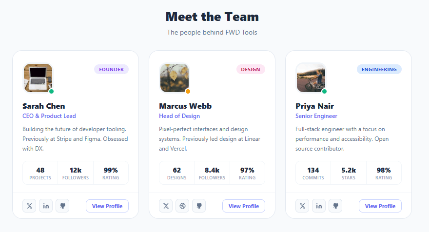
A team section is a trust signal on any company, agency, or product website — it humanises the brand by putting faces and names to the people behind it. This snippet builds a polished three-card team grid: circular-cornered avatar photos with online/away status dots, role badge pills, bio text, a mini statistics row (projects, followers, rating), social link icon buttons, and a "View Profile" CTA — with a staggered fade-in animation on page load.
The design system for team cards involves several decisions that affect perceived quality: how to show presence status, how to communicate role without overwhelming the layout, whether to show metrics, and how to handle social links without cluttering the card.
Status dot positioning
The online/away/offline status dot is positioned absolute at the bottom-right corner of the avatar using bottom: -2px; right: -2px. A border: 2.5px solid #fff creates a white gap ring between the dot and the avatar image — the standard visual trick used by LinkedIn, Slack, and Discord to make the status dot visible against any avatar colour. Three status colours are defined: #10b981 (green for online), #f59e0b (amber for away), #94a3b8 (grey for offline).
Role badge colour coding
Each role badge has a distinct colour variant: indigo for Founder/default, pink for Design, blue for Engineering. This colour coding creates a quick visual taxonomy when multiple cards are shown side by side — a design system pattern used in team directories, project management tools, and HR platforms. The badge font is uppercase with letter-spacing to read like a label chip.
Stats row with divider borders
The three stats (projects, followers, rating) share a single border: 1px solid #f1f5f9 container. Each stat cell has a right border except the last — creating a natural column separator without explicit divider elements. This "shared border" trick is common in analytics cards and pricing tables.
Staggered fade-in animation
On load, JavaScript applies an initial opacity: 0; transform: translateY(20px) to each card, then removes these styles with increasing setTimeout delays (100ms, 220ms, 340ms). The CSS transition handles the interpolation. This lightweight stagger avoids an Intersection Observer while still producing the "cards loading in sequence" effect. Pair with a skeleton loader to show while real profile data is fetching from an API.
Build with AI
Build, Understand, Optimize, and Extend It With AI
You don't have to work out the stagger timing by hand. Paste this snippet's HTML, CSS, and JS into an AI coding assistant like Claude and ask it to explain exactly why each card's setTimeout delay is calculated as a base offset plus the card's index times a fixed step, and why the status dot needs a solid white border ring rather than just a colored circle sitting on top of the avatar. The same assistant can help optimize it — for instance whether hardcoded setTimeout delays should be replaced with an IntersectionObserver so cards only animate in once the section actually scrolls into view, or whether the shared-border stats row technique could break visually if a stat number wraps to two lines. It's also useful for extending the cards: ask it to fetch real presence status from a WebSocket instead of a static class, add a flip-to-reveal-more-bio interaction on click, or generate the role-badge color automatically from a department name instead of hardcoded modifier classes. Treat the code less like a finished artifact and more like a starting point for a conversation.
Prompt to recreate it
Copy this into your AI assistant of choice to build the effect from scratch, or as a jumping-off point for your own variant:
Build a "team member card" grid in plain HTML, CSS, and JavaScript with a staggered load-in animation — no animation library, no framework.

Requirements:
- A responsive CSS grid of cards using auto-fit and minmax so any number of cards wraps naturally at any container width, each card containing: an avatar image with a small presence-status dot positioned at its bottom-right corner (with a solid border the same color as the card background so the dot reads clearly against any photo), a colored role-badge pill, a name, a role line, a short bio, a three-column stats row with shared internal divider borders (not three separate bordered boxes), and a footer with social icon links plus a "View Profile" call-to-action.
- The status dot must support at least three distinct color states (e.g. online, away, offline) applied via a modifier class, and the role badge must support at least three distinct color variants applied the same way.
- The stats row's three cells must share one outer border, with only an internal right-border between adjacent cells (and no right border on the last cell) so it reads as one connected row rather than three separate boxes.
- On page load, every card must start invisible and shifted down slightly (opacity 0 and a translateY offset), then animate to fully visible and untransformed using a CSS transition, with each card's animation delayed by an amount proportional to its position in the grid so the cards visibly reveal in sequence rather than all at once.
- Cards must lift slightly and gain a soft shadow on hover, and social icon buttons must invert from a neutral background to a solid accent-color fill with white icon color on hover.
Want to tighten it up first? Run this prompt through the AI Prompt Studio to score it across 8 quality dimensions, catch anti-patterns, and tune the wording for Claude, ChatGPT, or Gemini before you paste it in.
Step by step
How to Use
- 1Paste HTML, CSS, and JSThree team cards appear in a responsive grid. Each card fades and slides up with a 120ms stagger — the cards load in sequence from left to right.
- 2Inspect the status dotsSarah and Priya have green online dots. Marcus has an amber away dot. The white border ring makes each dot visible against the avatar photo.
- 3Hover over a cardThe card lifts 4px and a soft shadow appears — a standard hover lift that communicates interactivity without being aggressive.
- 4Hover over social iconsEach social icon button fills with the indigo brand colour on hover. The background, icon colour, and border all transition together.
- 5Replace with your teamSwap the
<img src>with real profile photos. Update names, roles, bios, and stat numbers. Change the role badge class to match your team's departments. - 6Add or remove team membersCopy an
<article class="card">block for each new member. The CSS Grid usesauto-fitwithminmax(240px, 1fr)so any number of cards adapts to the container width.
Real-world uses
Common Use Cases
Got questions?
Frequently Asked Questions
Fetch presence data from your status API (Slack Web API, custom endpoint) on page load. Map the status value to the CSS class: el.className = 'status-dot ' + (status === 'active' ? 'online' : status === 'away' ? 'away' : 'offline').
Define a TEAM array of objects with {name, role, bio, avatar, stats, socials}. Map over it to build each card's HTML via template literals and innerHTML. This makes adding/removing team members a data change only.
Create a TeamCard component that accepts a prop object. Map a team array to <TeamCard key={member.id} {...member} />. The stagger animation can use style={{ animationDelay: ${index * 120}ms }} with a CSS @keyframes fadeUp.
Set href="/team/{slug}" on the .view-btn anchor. In your CMS or backend, create a route that renders the full profile page using the same data. In Next.js: /app/team/[slug]/page.js with generateStaticParams for SSG.