Source Code
<div class="cards">
  <div class="card">
    <div class="skel avatar"></div>
    <div class="skel line w60"></div>
    <div class="skel line w40"></div>
    <div class="skel block"></div>
    <div class="skel line w80"></div>
    <div class="skel line w50"></div>
  </div>
  <div class="card">
    <div class="skel avatar"></div>
    <div class="skel line w70"></div>
    <div class="skel line w45"></div>
    <div class="skel block"></div>
    <div class="skel line w90"></div>
    <div class="skel line w35"></div>
  </div>
</div>
* { box-sizing: border-box; margin: 0; padding: 0; }
body { font-family: system-ui, sans-serif; background: #f1f5f9; display: flex; align-items: center; justify-content: center; min-height: 100vh; padding: 20px; }
.cards { display: flex; gap: 16px; flex-wrap: wrap; justify-content: center; }
.card {
background: #fff;
border-radius: 14px;
padding: 20px;
width: 220px;
display: flex;
flex-direction: column;
gap: 10px;
box-shadow: 0 2px 12px rgba(0,0,0,0.06);
}
.skel {
background: linear-gradient(90deg, #e2e8f0 25%, #f1f5f9 50%, #e2e8f0 75%);
background-size: 200% 100%;
animation: shimmer 1.4s infinite;
border-radius: 6px;
}
.avatar { width: 44px; height: 44px; border-radius: 50%; flex-shrink: 0; }
.line { height: 10px; }
.block { height: 80px; border-radius: 8px; }
.w35 { width: 35%; }
.w40 { width: 40%; }
.w45 { width: 45%; }
.w50 { width: 50%; }
.w60 { width: 60%; }
.w70 { width: 70%; }
.w80 { width: 80%; }
.w90 { width: 90%; }
@keyframes shimmer {
0% { background-position: 200% 0; }
100% { background-position: -200% 0; }
}Learn Coding Visually
Learn to code with interactive, live-preview playgrounds — HTML, CSS, JavaScript, React & more.
 HTML Playground42 lessons · Click-based · Live preview
 CSS PlaygroundLearn CSS with a live editor
 JavaScript Playground60 lessons · DOM · Async · Canvas
 React PlaygroundLearn React with a live code editor
 GSAP PlaygroundLearn GSAP animation interactively
 SVG Playground44 lessons · shapes · paths · animation
 SCSS Playground45 lessons · Sass modules · tokens
 Tailwind PlaygroundLearn Tailwind CSS with a live editor
 Bootstrap 5 Playground50 lessons · live preview
Skeleton Loader — Free HTML CSS Shimmer Snippet
Skeleton Loader · Loaders · Plain HTML & CSS · Live preview
What's included
Features
About this UI Snippet
Skeleton Loader — CSS Shimmer with background-size and Composable Shape Utilities
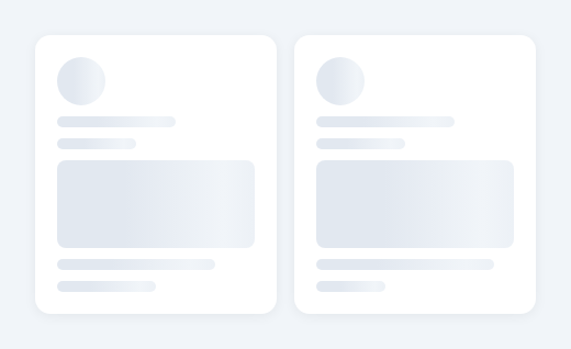
A skeleton loader is a content placeholder that shows the approximate shape and layout of content while it loads. Instead of a generic spinner or loading dots in the centre of the screen, the user sees the card structure, text line positions, and image areas — the layout they are about to receive. Facebook, LinkedIn, and YouTube all use skeleton screens for exactly this reason: users orient themselves to the incoming layout rather than staring at an indeterminate wait.
How the CSS shimmer animation works
Each skeleton element has a background: linear-gradient(90deg, #e2e8f0 25%, #f1f5f9 50%, #e2e8f0 75%). This is a horizontal gradient that starts grey, brightens to near-white in the middle, then returns to grey. The key property is background-size: 200% 100% — the gradient is twice as wide as the element, so only half of it is visible at any time.
The @keyframes shimmer animation shifts background-position from 200% 0 (gradient starting off the right edge) to -200% 0 (gradient finishing off the left edge). As the animation plays, the bright middle section sweeps from right to left, creating the light-catching shimmer effect.
Why this is GPU-accelerated
Animating background-position (unlike animating width or opacity) runs on the browser's compositor thread without triggering layout recalculations or paint operations. This makes it safe to animate dozens of skeleton elements simultaneously with no performance impact.
The shape utility classes
The snippet uses composable utility classes applied alongside .skel: .avatar creates a 44×44px circle (for profile images), .block creates an 80px-tall rectangle (for image thumbnails or chart areas), and .line creates a 10px-tall strip (for text lines). Width utilities .w35 through .w90 set percentage widths so text line lengths vary naturally.
Compose them to mirror any content layout: avatar + two lines (profile header), block + three lines (article card), or three lines of varying widths (text paragraph).
Dark mode adaptation
Change #e2e8f0 (the base grey) to #1e293b and #f1f5f9 (the highlight) to #334155. The shimmer remains visible because the highlight is still lighter than the base, just at a lower overall brightness.
Hiding the skeleton on load
When your API call resolves, hide the skeleton container (skeleton.style.display = 'none') and show the real content container. For React, use a loading state: render the skeleton when isLoading === true and the real content when false.
Build with AI
Build, Understand, Optimize, and Extend It With AI
You don't have to reason through the gradient math on your own. Paste this snippet's HTML and CSS into an AI coding assistant like Claude and ask it to explain exactly why background-size is set to 200% of the element and why the keyframe animates background-position from 200% to -200% rather than 0% to 100%, or why this approach is cheaper than animating opacity on a separate overlay. The same assistant can help optimize it, for example checking whether combining the .skel utility classes into fewer selectors would reduce the CSS the browser has to match on a page with many skeleton cards. It is just as useful for extending the pattern: ask it to add a dark-mode variant using CSS custom properties instead of hardcoded hex values, generate the .avatar/.block/.line composition automatically from a content-shape config object, or wire display toggling to a real isLoading state instead of always rendering. Treat the code less like a finished artifact and more like a starting point for a conversation.
Prompt to recreate it
Copy this into your AI assistant of choice to build the effect from scratch, or as a jumping-off point for your own variant:
Build a reusable "skeleton loader" placeholder system in plain HTML and CSS — no JavaScript required for the shimmer itself, no libraries.

Requirements:
- A base .skel class defining a linear-gradient background with three color stops (grey, near-white highlight, grey), background-size set to 200% of the element's own width, and a looping keyframe animation that slides background-position from 200% 0 to -200% 0 so the bright middle band visibly sweeps across the element.
- Composable shape utility classes layered on top of .skel: a circular .avatar (fixed width/height, 50% border-radius) for profile images, a tall rectangular .block for image or chart placeholders, and a thin .line for text placeholders.
- A set of width utility classes (e.g. w35 through w90, in percent) that can be combined with .line so multiple text-line placeholders in the same card have varied, non-uniform lengths rather than all being identical bars.
- At least two example cards demonstrating different compositions of these primitives (e.g. avatar + two lines + a block + two more lines) to show the shapes are reusable and composable, not hardcoded to one layout.
- Confirm that only background-position is animated (never width, height, or opacity on the shimmer itself) so the effect stays on the GPU compositor thread and remains cheap even with many skeleton elements on one page.
Want to tighten it up first? Run this prompt through the AI Prompt Studio to score it across 8 quality dimensions, catch anti-patterns, and tune the wording for Claude, ChatGPT, or Gemini before you paste it in.
Step by step
How to Use
- 1View the shimmer in the previewThe two skeleton cards render with the shimmer sweeping left to right continuously. Each placeholder matches the shape of a real content card.
- 2Match your content layoutIn the HTML panel, rearrange the .skel elements to match your real content. Use .avatar for circular images, .block for image areas, .line + width classes for text.
- 3Adjust shimmer speedIn the CSS panel, find animation: shimmer 1.4s infinite and change 1.4s. Faster (1s) feels more active; slower (2s) feels more subtle.
- 4Adapt for dark modeChange #e2e8f0 (base) to #1e293b and #f1f5f9 (highlight) to #334155 in the CSS panel for a dark theme skeleton.
- 5Connect to real contentWrap the skeleton in a container. When your API call resolves, hide the skeleton container and show the real content container.
- 6Export in your formatClick "HTML" for a standalone file, "JSX" for a React component, or "Tailwind" for a React + Tailwind version.
Real-world uses
Common Use Cases
Got questions?
Frequently Asked Questions
Each skeleton element has a linear-gradient background that is 200% wide (background-size: 200% 100%). A keyframe shifts background-position from 200% 0 to -200% 0, sliding the lighter highlight from right to left. The bright middle section of the gradient sweeps across the element, creating the shimmer effect.
Animating background-position runs on the browser GPU compositor thread without triggering layout recalculations or paint. This is unlike animating width or height, which cause reflow. Many skeleton elements can animate simultaneously without impacting frame rate.
Combine .skel with .avatar (circle), .block (tall rectangle), or .line (thin strip). Add width classes (.w60, .w80, etc.) to vary text line lengths. Arrange them in the same structure as your real content so the skeleton matches the loaded layout.
Change the gradient colours: #e2e8f0 (base) to a dark surface like #1e293b and #f1f5f9 (highlight) to a slightly lighter value like #334155. The highlight must be visibly different from the base for the shimmer to show.
Keep the skeleton container and the real content container as siblings. When your API call resolves, set skeletonEl.style.display = "none" and contentEl.style.display = "block". In React, use a loading boolean: {isLoading ? <Skeleton /> : <Content data={data} />}.
Yes. Click "JSX" to download a React component. Create a Skeleton component that renders the placeholder shapes. Use it in your data-fetching components: render Skeleton while the fetch is in progress and replace with the real component when data arrives.