Source Code
<div class="page">

  <div class="section">
    <h3 class="label">Bounce</h3>
    <div class="loader bounce">
      <div class="dot"></div>
      <div class="dot"></div>
      <div class="dot"></div>
    </div>
  </div>

  <div class="section">
    <h3 class="label">Pulse</h3>
    <div class="loader pulse">
      <div class="dot"></div>
      <div class="dot"></div>
      <div class="dot"></div>
      <div class="dot"></div>
    </div>
  </div>

  <div class="section">
    <h3 class="label">Wave</h3>
    <div class="loader wave">
      <div class="dot"></div>
      <div class="dot"></div>
      <div class="dot"></div>
      <div class="dot"></div>
      <div class="dot"></div>
    </div>
  </div>

  <div class="section">
    <h3 class="label">Elastic Spinner</h3>
    <div class="spinner">
      <div class="ring"></div>
    </div>
  </div>

  <div class="section">
    <h3 class="label">Button loading state</h3>
    <button class="btn-loading" onclick="triggerLoad(this)">
      <span class="btn-text">Save changes</span>
      <span class="btn-dots" aria-hidden="true">
        <span></span><span></span><span></span>
      </span>
    </button>
  </div>

</div>
* { box-sizing: border-box; margin: 0; padding: 0; }
body { font-family: system-ui, sans-serif; background: #f8fafc; min-height: 100vh; display: flex; align-items: center; justify-content: center; padding: 40px 24px; }
.page { display: flex; flex-direction: column; gap: 40px; align-items: center; width: 100%; }
.section { display: flex; flex-direction: column; align-items: center; gap: 14px; }
.label { font-size: 11px; font-weight: 700; letter-spacing: 1.2px; text-transform: uppercase; color: #94a3b8; }
/* ── Bounce loader ── */
.loader { display: flex; align-items: center; gap: 8px; }
.bounce .dot { width: 12px; height: 12px; border-radius: 50%; background: #6366f1; animation: bounce 1.2s ease-in-out infinite; }
.bounce .dot:nth-child(1) { animation-delay: 0s; }
.bounce .dot:nth-child(2) { animation-delay: 0.2s; }
.bounce .dot:nth-child(3) { animation-delay: 0.4s; }
@keyframes bounce { 0%,100% { transform: translateY(0); opacity: 0.4; } 50% { transform: translateY(-14px); opacity: 1; } }
/* ── Pulse loader ── */
.pulse .dot { width: 10px; height: 10px; border-radius: 50%; background: #6366f1; animation: pulse-dot 1.4s ease-in-out infinite; }
.pulse .dot:nth-child(1) { animation-delay: 0s; }
.pulse .dot:nth-child(2) { animation-delay: 0.2s; }
.pulse .dot:nth-child(3) { animation-delay: 0.4s; }
.pulse .dot:nth-child(4) { animation-delay: 0.6s; }
@keyframes pulse-dot { 0%,100% { transform: scale(0.6); opacity: 0.3; } 50% { transform: scale(1.2); opacity: 1; } }
/* ── Wave loader ── */
.wave .dot { width: 8px; height: 32px; border-radius: 4px; background: #6366f1; animation: wave 1.2s ease-in-out infinite; }
.wave .dot:nth-child(1) { animation-delay: 0s; }
.wave .dot:nth-child(2) { animation-delay: 0.1s; }
.wave .dot:nth-child(3) { animation-delay: 0.2s; }
.wave .dot:nth-child(4) { animation-delay: 0.3s; }
.wave .dot:nth-child(5) { animation-delay: 0.4s; }
@keyframes wave { 0%,100% { transform: scaleY(0.3); opacity: 0.4; } 50% { transform: scaleY(1); opacity: 1; } }
/* ── Elastic spinner ── */
.spinner { width: 40px; height: 40px; }
.ring { width: 100%; height: 100%; border-radius: 50%; border: 3px solid #e2e8f0; border-top-color: #6366f1; animation: spin 0.8s cubic-bezier(0.6,0,0.4,1) infinite; }
@keyframes spin { to { transform: rotate(360deg); } }
/* ── Button loading state ── */
.btn-loading { display: inline-flex; align-items: center; gap: 8px; background: #6366f1; color: #fff; font-size: 14px; font-weight: 600; padding: 11px 22px; border: none; border-radius: 10px; cursor: pointer; transition: background 0.15s; min-width: 160px; justify-content: center; }
.btn-loading:hover { background: #4f46e5; }
.btn-dots { display: none; align-items: center; gap: 4px; }
.btn-dots span { width: 5px; height: 5px; border-radius: 50%; background: rgba(255,255,255,0.8); animation: pulse-dot 1.2s ease-in-out infinite; }
.btn-dots span:nth-child(2) { animation-delay: 0.15s; }
.btn-dots span:nth-child(3) { animation-delay: 0.30s; }
.btn-loading.loading .btn-text { display: none; }
.btn-loading.loading .btn-dots { display: flex; }
.btn-loading.loading { background: #4f46e5; cursor: not-allowed; }function triggerLoad(btn) {
if (btn.classList.contains('loading')) return;
btn.classList.add('loading');
// Simulate async operation — replace with your real fetch/submit
setTimeout(() => {
btn.classList.remove('loading');
btn.querySelector('.btn-text').textContent = '✓ Saved!';
btn.style.background = '#16a34a';
setTimeout(() => {
btn.querySelector('.btn-text').textContent = 'Save changes';
btn.style.background = '';
}, 2000);
}, 2400);
}Learn Coding Visually
Learn to code with interactive, live-preview playgrounds — HTML, CSS, JavaScript, React & more.
 HTML Playground42 lessons · Click-based · Live preview
 CSS PlaygroundLearn CSS with a live editor
 JavaScript Playground60 lessons · DOM · Async · Canvas
 React PlaygroundLearn React with a live code editor
 GSAP PlaygroundLearn GSAP animation interactively
 SVG Playground44 lessons · shapes · paths · animation
 SCSS Playground45 lessons · Sass modules · tokens
 Tailwind PlaygroundLearn Tailwind CSS with a live editor
 Bootstrap 5 Playground50 lessons · live preview
Dots Loader — Free HTML CSS Loading Snippet
Dots Loader · Loaders · Plain HTML, CSS & JS · Live preview
What's included
Features
About this UI Snippet
Dots Loader — Bounce, Pulse, Wave, Spinner & Button Loading State — Pure CSS Animations
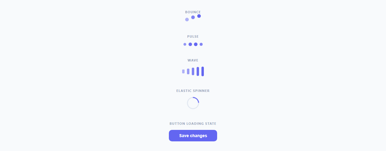
Loading dots are the most versatile and universally recognised loading indicator pattern. Unlike a progress bar (which implies a known completion time) or a skeleton loader (which implies imminent content), loading dots communicate "something is happening" in a neutral, open-ended way. This snippet provides four distinct dot animation variants plus a button loading state — all animating with pure CSS keyframes and no JavaScript for the animations themselves.
Bounce uses translateY(-14px) at the 50% keyframe to lift each dot upward. Staggered animation-delay (0s, 0.2s, 0.4s) on the three dots creates the wave-bounce sequencing. Opacity fades from 0.4 to 1 in sync with the translation, giving the dots a depth illusion as if they are closer when raised.
Pulse scales each dot from scale(0.6) to scale(1.2) with four dots at 0.2s staggered delays. The scale oscillation plus opacity creates a breathing, organic feel. This variant works well for "thinking" or processing states where there is no known end time.
Wave uses bar-shaped dots (8×32px, border-radius: 4px) and scaleY animation — each bar shrinks to 30% height and grows back to full height in sequence, mimicking an audio waveform or equaliser. The five bars with 0.1s staggered delays create a smooth rolling wave.
Elastic Spinner uses border-top-color: #6366f1 on a full-circle border to create the classic arc spinner. The cubic-bezier(0.6, 0, 0.4, 1) timing function accelerates and decelerates the rotation to give an elastic, bouncy feel — much more polished than linear spin.
Button Loading State is the most practically useful variant. Clicking the button adds .loading which hides the text span and shows three inline pulse dots. After an async operation completes (replace the setTimeout with your real fetch call), the .loading class is removed and a success state is shown. The button becomes cursor: not-allowed during loading to prevent double-submission.
All animation variants use transform (translateY, scale, scaleY, rotate) and opacity — properties that run on the GPU compositor and never trigger layout recalculation, keeping all five animations at 60fps even on low-end devices.
Choosing the right variant
Bounce works best for full-page loading overlays and large loading states where the vertical movement reads clearly. Pulse is the standard for "thinking" or processing states — three pulse dots are universally recognised as "in progress". Wave is distinctive for audio-adjacent contexts (music players, voice recorders, chat transcription). The elastic spinner is the most compact and works well in button loading states, small inline indicators, and form field validation spinners.
Build with AI
Build, Understand, Optimize, and Extend It With AI
Rather than reasoning through four keyframe sets on your own, paste this snippet's HTML, CSS, and JS into an AI coding assistant like Claude and ask it to explain exactly why the bounce, pulse, and wave animations stagger with animation-delay on nth-child selectors instead of JavaScript timers, and why every variant only animates transform and opacity rather than width, height, or top/left. The same assistant can help optimize it, for instance checking whether the button loading state's two nested setTimeout calls in triggerLoad() could drift out of sync with a real fetch promise chain. It's also useful for extending the pattern: ask it to add a fifth loader variant with a different stagger shape, wire the button's loading state to an actual async function with proper error handling, or pause an off-screen loader's animation with IntersectionObserver to save GPU cycles. Treat the code less like a finished artifact and more like a starting point for a conversation.
Prompt to recreate it
Copy this into your AI assistant of choice to build the effect from scratch, or as a jumping-off point for your own variant:
Build a set of loading indicators in plain HTML and CSS using only keyframe animations, plus one interactive button loading state in vanilla JavaScript — no animation library.

Requirements:
- A bounce loader: three dot elements that each translateY upward and back with synchronized opacity change, where each dot's animation-delay is staggered (e.g. 0s, 0.2s, 0.4s) purely via nth-child CSS selectors so no JavaScript drives the timing.
- A pulse loader: four dots that scale up and down between two scale factors with staggered delays, using the same nth-child stagger technique.
- A wave loader: five bar-shaped elements (tall and narrow, not circular) that animate scaleY between a shrunken and full height with tighter staggered delays, so they read as a rolling audio-equalizer wave.
- An elastic spinner: a single circular element with a transparent track color and one differently-colored border side, rotating continuously with a cubic-bezier easing curve rather than linear, so the spin has a bouncy, elastic feel.
- Every one of the above four variants must animate only the transform and opacity CSS properties, never width, height, margin, or position offsets, so they run on the GPU compositor without triggering layout.
- A button with a loading state: clicking it swaps its visible label for an inline three-dot pulse animation and disables re-clicks while "loading" (simulated with a timeout, structured so it is obvious where a real fetch or form submission promise would plug in), then on completion shows a temporary success label and color before reverting to its original idle label and color.
Want to tighten it up first? Run this prompt through the AI Prompt Studio to score it across 8 quality dimensions, catch anti-patterns, and tune the wording for Claude, ChatGPT, or Gemini before you paste it in.
Step by step
How to Use
- 1Pick your variantClick the "Save changes" button to see the button loading state. All four animation variants (bounce, pulse, wave, spinner) run automatically on page load.
- 2Copy just the variant you needCopy only the HTML, CSS, and JS for the specific variant you need. Each is self-contained — bounce needs only .bounce .dot CSS rules, pulse needs only .pulse .dot, and so on.
- 3Wire the button loading state to your formIn JS, replace the setTimeout inside triggerLoad() with your real fetch or form submission. Call btn.classList.remove("loading") inside .then() or .finally() so the button always re-enables even on error.
- 4Change the loader colourReplace #6366f1 in the CSS with your brand accent colour. This updates all four variants simultaneously. For the button dots, they use rgba(255,255,255,0.8) — white on the coloured button background.
- 5Change the dot size and gapUpdate the width and height on .dot for each variant. Change gap on .loader to control spacing between dots. For the wave variant, adjust the height on .wave .dot (default 32px) to control bar height.
- 6Export in your formatClick "HTML" for a standalone file, "JSX" for a React component where the button loading state uses useState, or "Tailwind" for a Tailwind CSS version.
Real-world uses
Common Use Cases
Got questions?
Frequently Asked Questions
CSS properties that trigger layout recalculation (width, height, top, left, margin, padding) cause the browser to recalculate the positions of all affected elements on every animation frame — expensive on any device. Properties handled by the GPU compositor (transform: translateY, scale, rotate and opacity) bypass layout and paint entirely. The GPU moves pixels directly. This is why these dot animations run at 60fps even on mobile — they never touch the main thread.
The .loading class sets cursor: not-allowed and the triggerLoad() function returns early if the button already has the .loading class (if (btn.classList.contains("loading")) return). For a more robust solution, also set btn.disabled = true on click and btn.disabled = false in your .finally() handler — the disabled attribute prevents click events at the browser level, not just visually.
Click "JSX" to download. In React: const [loading, setLoading] = useState(false). On click: setLoading(true); try { await yourApiCall(); setSuccess(true); } finally { setLoading(false); }. Conditionally render the text or dots: {loading ? <Dots /> : "Save changes"}. Add disabled={loading} to the button element. Use useRef if you need to reset button text after success.
Use IntersectionObserver: const obs = new IntersectionObserver(([entry]) => { entry.target.style.animationPlayState = entry.isIntersecting ? "running" : "paused"; }); obs.observe(document.querySelector(".wave")). This pauses the animation when the element is scrolled out of view, saving GPU resources on long pages with multiple loaders.