Source Code
<div class="page">

  <div class="section">
    <div class="sec-head"><span class="sec-label">Determinate — 68%</span><span class="sec-pct">68%</span></div>
    <div class="bar-wrap">
      <div class="bar-fill" style="width:68%;background:#6366f1"></div>
    </div>
  </div>

  <div class="section">
    <div class="sec-head"><span class="sec-label">Striped animated</span><span class="sec-pct">45%</span></div>
    <div class="bar-wrap">
      <div class="bar-fill striped" style="width:45%;background:#6366f1"></div>
    </div>
  </div>

  <div class="section">
    <div class="sec-head"><span class="sec-label">Gradient</span><span class="sec-pct">82%</span></div>
    <div class="bar-wrap">
      <div class="bar-fill" style="width:82%;background:linear-gradient(90deg,#6366f1,#ec4899)"></div>
    </div>
  </div>

  <div class="section">
    <div class="sec-head"><span class="sec-label">Indeterminate</span></div>
    <div class="bar-wrap">
      <div class="bar-fill indeterminate" style="background:#6366f1"></div>
    </div>
  </div>

  <div class="section">
    <div class="sec-head"><span class="sec-label">Multi-step upload</span><span class="sec-pct" id="pct-text">0%</span></div>
    <div class="bar-wrap">
      <div class="bar-fill" id="sim-bar" style="width:0%;background:#6366f1;transition:width 0.4s ease"></div>
    </div>
    <div class="step-row">
      <span class="step" id="step-label">Ready to upload</span>
      <button class="step-btn" id="step-btn" onclick="nextStep()">Start upload</button>
    </div>
  </div>

</div>
* { box-sizing: border-box; margin: 0; padding: 0; }
body { font-family: system-ui, sans-serif; background: #f8fafc; min-height: 100vh; display: flex; align-items: center; justify-content: center; padding: 40px 24px; }
.page { display: flex; flex-direction: column; gap: 32px; width: 100%; max-width: 500px; }
.section { display: flex; flex-direction: column; gap: 10px; }
.sec-head { display: flex; justify-content: space-between; align-items: center; }
.sec-label { font-size: 12px; font-weight: 600; color: #475569; }
.sec-pct { font-size: 12px; font-weight: 700; color: #6366f1; }
/* Base track */
.bar-wrap { height: 10px; background: #e2e8f0; border-radius: 999px; overflow: hidden; }
/* Base fill */
.bar-fill { height: 100%; border-radius: 999px; min-width: 0; }
/* Striped */
.striped { background-image: repeating-linear-gradient(
-45deg,
rgba(255,255,255,0.2) 0,
rgba(255,255,255,0.2) 6px,
transparent 6px,
transparent 12px
); background-size: 24px 24px; animation: stripe-move 0.8s linear infinite; }
@keyframes stripe-move { to { background-position: 24px 0; } }
/* Indeterminate */
.indeterminate { width: 40% !important; animation: slide 1.6s ease-in-out infinite; transform-origin: left; }
@keyframes slide {
0% { transform: translateX(-100%); }
50% { transform: translateX(150%); }
100% { transform: translateX(250%); }
}
/* Step section */
.step-row { display: flex; justify-content: space-between; align-items: center; margin-top: 4px; }
.step { font-size: 12px; color: #64748b; }
.step-btn { font-size: 12px; font-weight: 600; color: #fff; background: #6366f1; border: none; border-radius: 7px; padding: 6px 14px; cursor: pointer; transition: background 0.15s; }
.step-btn:hover { background: #4f46e5; }
.step-btn:disabled { background: #a5b4fc; cursor: not-allowed; }const steps = [
{ pct: 0, label: 'Ready to upload', btn: 'Start upload' },
{ pct: 25, label: 'Connecting…', btn: null },
{ pct: 50, label: 'Uploading file…', btn: null },
{ pct: 80, label: 'Processing…', btn: null },
{ pct: 100, label: '✓ Upload complete!', btn: 'Upload again' },
];
let cur = 0;
function nextStep() {
if (cur < steps.length - 1) cur++;
const s = steps[cur];
document.getElementById('sim-bar').style.width = s.pct + '%';
document.getElementById('pct-text').textContent = s.pct + '%';
document.getElementById('step-label').textContent = s.label;
const btn = document.getElementById('step-btn');
if (s.btn) { btn.textContent = s.btn; btn.disabled = false; if (cur === steps.length - 1) cur = 0; }
else { btn.disabled = true; setTimeout(nextStep, 900); }
}Learn Coding Visually
Learn to code with interactive, live-preview playgrounds — HTML, CSS, JavaScript, React & more.
 HTML Playground42 lessons · Click-based · Live preview
 CSS PlaygroundLearn CSS with a live editor
 JavaScript Playground60 lessons · DOM · Async · Canvas
 React PlaygroundLearn React with a live code editor
 GSAP PlaygroundLearn GSAP animation interactively
 SVG Playground44 lessons · shapes · paths · animation
 SCSS Playground45 lessons · Sass modules · tokens
 Tailwind PlaygroundLearn Tailwind CSS with a live editor
 Bootstrap 5 Playground50 lessons · live preview
Progress Bar — Free HTML CSS JS Snippet
Progress Bar · Loaders · Plain HTML, CSS & JS · Live preview
What's included
Features
About this UI Snippet
Progress Bar — Determinate, Striped, Gradient, Indeterminate & Multi-Step Upload
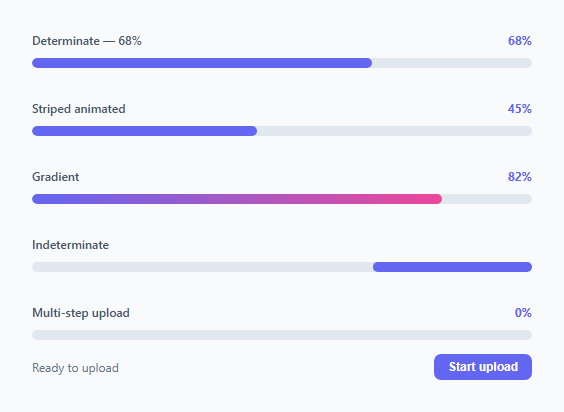
Progress bars communicate how far through a process the user is — whether uploading a file, completing a form, installing software, or finishing a course. The right progress bar variant depends on whether the completion percentage is known (determinate) or unknown (indeterminate). This snippet provides five variants covering every common progress bar use case.
Determinate is the base variant: a fixed-width .bar-fill inside a .bar-wrap track. Setting width: 68% on the fill represents 68% completion. The track uses background: #e2e8f0 (light grey) and border-radius: 999px for a pill shape. The fill inherits the border-radius. Animating width from 0 to a target value via CSS transition creates the fill-in effect.
Striped animated adds a repeating-linear-gradient of diagonal white stripes at -45deg over the fill background. background-size: 24px 24px controls stripe width. A @keyframes animation shifts background-position by 24px per cycle (one stripe width), creating the flowing stripe animation. The stripe movement runs on the compositor via background-position — no layout triggers.
Gradient uses background: linear-gradient(90deg, #6366f1, #ec4899) on the fill element. The gradient stretches across the full fill width regardless of the percentage, creating a colour shift from left to right. Combine with the striped animation for a striped gradient bar.
Indeterminate is for operations where completion percentage is unknown — API calls, file processing, database queries. The fill is fixed at 40% width and uses transform: translateX to slide from -100% (off-screen left) to 250% (off-screen right) in a loop. This communicates "working" without implying a known endpoint.
Multi-step upload simulation shows a realistic file upload flow: the user clicks "Start upload", the bar advances through 0→25→50→80→100% with step labels ("Connecting…", "Uploading file…", "Processing…") automatically advancing on a timer between steps. This teaches the pattern for wiring a real progress bar to upload events — XHR upload.onprogress gives a loaded/total ratio; fetch with ReadableStream gives chunk-by-chunk progress.
All fill animations use width transitions or CSS transforms — both GPU-safe properties that avoid main-thread layout recalculation.
Choosing the right variant for your use case
Use determinate when you have a measurable completion value — file upload bytes, form step count, course completion percentage. Use striped animated when the operation has a known endpoint but the precise percentage is unavailable — background task queues, bulk email sending, batch processing. Use indeterminate for truly unknown duration operations — API calls, database queries, server-side rendering. The gradient variant works identically to determinate but adds visual richness for high-visibility metric displays like profile completion or password strength.
Build with AI
Build, Understand, Optimize, and Extend It With AI
You don't need to work out every keyframe by hand. Paste this snippet's HTML, CSS, and JS into an AI coding assistant like Claude and ask it to explain exactly why the striped animation shifts background-position instead of animating the stripe gradient's angle, or why the indeterminate bar's translateX runs from -100% to 250% rather than a simpler 0% to 100%. The same assistant can help optimize it, for instance checking whether the multi-step simulation's chained setTimeout calls in nextStep should be replaced with a single timeline so the delays stay easy to tune, or whether the striped background-size could be reduced on low-power devices. It's equally useful for extending the bars: ask it to wire the determinate variant to a real XHR upload.onprogress handler, add a pause/cancel control to the multi-step simulation, or add a buffered-progress second bar like a video scrubber shows. Treat the code less like a finished artifact and more like a starting point for a conversation.
Prompt to recreate it
Copy this into your AI assistant of choice to build the effect from scratch, or as a jumping-off point for your own variant:
Build a set of progress bar variants in plain HTML, CSS, and JavaScript with no libraries.

Requirements:
- A determinate bar: a pill-shaped track div containing a fill div whose width is set to a percentage inline style, with a CSS transition on width so JavaScript-driven percentage changes animate smoothly instead of snapping.
- A striped animated bar: the fill uses a repeating-linear-gradient of semi-transparent diagonal stripes at -45 degrees with a fixed background-size, and a keyframe animation that shifts background-position by exactly one stripe-width per cycle so the stripes appear to flow continuously — the animation must only touch background-position, never width or transform, so it stays compositor-friendly.
- A gradient-filled bar: the fill uses a linear-gradient background spanning two colors, stretching across whatever the current fill width is.
- An indeterminate bar for unknown-duration operations: a fill fixed at a partial width (e.g. 40%) that uses a keyframe animation translating it from off-screen left to off-screen right in a continuous loop, with no explicit percentage or ARIA valuenow implied, so it clearly reads as "something is happening" rather than a measurable quantity.
- A multi-step upload simulation: a JavaScript array of steps, each with a target percentage and a status label (e.g. "Connecting...", "Uploading file...", "Processing...", "Upload complete"), a button that starts the sequence, and a function that advances through the array — updating the bar's width, a percentage readout, and the status label — automatically chaining to the next step after a short delay until it reaches the final step, then re-enabling the button to restart.
Want to tighten it up first? Run this prompt through the AI Prompt Studio to score it across 8 quality dimensions, catch anti-patterns, and tune the wording for Claude, ChatGPT, or Gemini before you paste it in.
Step by step
How to Use
- 1Click "Start upload" to see the multi-step simulationThe bar advances from 0% through 25%, 50%, 80%, to 100% with step labels updating automatically. The button re-enables at completion to reset.
- 2Set the percentage on a determinate barUpdate style="width: X%" on the .bar-fill element directly in HTML. For JS-driven updates: document.querySelector(".bar-fill").style.width = percentage + "%" — add transition: width 0.4s ease to CSS for smooth animation.
- 3Switch between variantsCopy only the CSS class you need. Remove the striped class for a plain bar, add it for stripes, add indeterminate for unknown-duration operations. Mix gradient fill background with the striped animation on the same element.
- 4Wire to a real file uploadUse XMLHttpRequest with xhr.upload.addEventListener("progress", e => { const pct = (e.loaded/e.total)*100; bar.style.width = pct+"%"; }). For fetch + ReadableStream, read chunks and accumulate loaded bytes against Content-Length header.
- 5Change height and colourUpdate height on .bar-wrap (default 10px) and the fill background colour. For a thinner progress line, use 3-4px. For a thick progress bar, use 16-20px. Adjust border-radius accordingly.
- 6Export in your formatClick "HTML" for a standalone file, "JSX" for a React component with useState for the progress value, or "Tailwind" for a React + Tailwind CSS version.
Real-world uses
Common Use Cases
Got questions?
Frequently Asked Questions
Use XMLHttpRequest for progress events: const xhr = new XMLHttpRequest(); xhr.upload.addEventListener("progress", e => { if (e.lengthComputable) { const pct = Math.round((e.loaded / e.total) * 100); bar.style.width = pct + "%"; pctText.textContent = pct + "%"; } }); xhr.open("POST", "/upload"); xhr.send(formData). The XHR upload progress event fires repeatedly during transmission, giving real bytes-based progress. The Fetch API does not natively support upload progress — use XHR or a library like axios for uploads.
A determinate bar shows a specific completion percentage — it implies the system knows how much work remains. Use it when you have a measurable quantity: bytes uploaded out of total bytes, steps completed out of total steps, items processed out of total items. An indeterminate bar shows only that "something is happening" — no percentage. Use it for operations where you cannot calculate progress: a network API call with unknown response time, a database query, an image processing task.
Add transition: width 0.4s ease to the .bar-fill CSS rule. Then setting bar.style.width = pct + "%" from JavaScript triggers the CSS transition automatically. The browser interpolates from the current width to the new width over 0.4s. For very rapid updates (real upload progress), reduce the transition duration to 0.1–0.2s so it does not lag behind the actual upload speed.
Click "JSX" to download. Manage const [progress, setProgress] = useState(0) in state. Set the fill width via style={{ width: progress + "%" }}. For a file upload, create an XHR in a useEffect or event handler and call setProgress in the upload.onprogress callback. For a multi-step flow, advance progress state in each step completion handler.