Learn Coding Visually
Learn to code with interactive, live-preview playgrounds — HTML, CSS, JavaScript, React & more.
 HTML Playground42 lessons · Click-based · Live preview
 CSS PlaygroundLearn CSS with a live editor
 JavaScript Playground60 lessons · DOM · Async · Canvas
 React PlaygroundLearn React with a live code editor
 GSAP PlaygroundLearn GSAP animation interactively
 SVG Playground44 lessons · shapes · paths · animation
 SCSS Playground45 lessons · Sass modules · tokens
 Tailwind PlaygroundLearn Tailwind CSS with a live editor
 Bootstrap 5 Playground50 lessons · live preview
Profile Completion Meter — HTML CSS JS Snippet
Profile Completion Meter · Dashboards · Plain HTML, CSS & JS · Live preview
What's included
Features
data-w weight; targetPct scores completed weight over total, so high-impact steps move the ring more.stroke-dasharray = circumference and a shrinking stroke-dashoffset draw the arc, rotated to start at the top.setRing animates the offset each requestAnimationFrame with an ease-out — smooth and export-safe, unlike a CSS stroke transition.done state with a check-circle fill and strike-through label, with hover feedback per row.message returns encouragement by threshold, turning a static label into a motivating nudge.About this UI Snippet
Profile Completion Meter — Weighted Checklist, Animated Progress Ring & Complete State
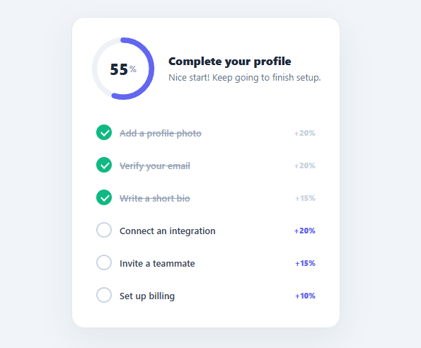
The profile completion meter is one of the most effective onboarding nudges in SaaS: a progress ring paired with a checklist of setup tasks that visibly fills as users complete each step. It leverages the Zeigarnik effect — people are driven to finish what they have started — and measurably increases activation. This snippet implements it in plain HTML, CSS, and vanilla JavaScript: a weighted task checklist, an animated SVG progress ring, an eased percentage count-up, and a celebratory complete state.
Weighted tasks, not just a count
Each task carries a data-w weight (photo 20%, verify email 20%, bio 15%, integration 20%, invite 15%, billing 10%) summing to 100. targetPct recomputes completion as the sum of completed weights over the total — so higher-impact steps move the needle more, exactly as real onboarding scores work. Tasks start with some pre-completed (photo + email = 40%), and clicking any row toggles its done state, checks it off with a strike-through, and recalculates.
Animated SVG progress ring
The ring is two SVG circles (track + progress) using the stroke-dash technique: stroke-dasharray set to the circumference (2πr) and stroke-dashoffset reduced toward zero to draw the arc, rotated -90deg to start at the top. Rather than a CSS transition on stroke-dashoffset (which utility frameworks like Tailwind do not animate, so it would snap), setRing tweens the offset every frame with a requestAnimationFrame loop and a cubic ease-out, animating smoothly from the previously shown value to the new target. The centre percentage counts up in lockstep from the same eased value.
Contextual messaging and complete state
The supporting message changes with progress — "Nice start!", "Almost there", and on 100% "Profile complete 🎉 You are all set!" — turning a static label into encouragement. At 100% the card gains a complete class that recolours the ring green and emphasises the message, marking the goal as achieved. These small reinforcements are what make completion meters convert.
Self-recomputing
Everything derives from the checklist DOM: targetPct reads the tasks each time, so adding, removing, or reweighting tasks needs no other changes, and the ring/percentage/message all follow. On load it computes the initial percentage and message from the pre-completed tasks.
Wire each task's click to actually open that setup step (or mark it done from your backend) and you have a real onboarding widget. Pair this with a stats card for account metrics, an onboarding tour for guided setup, or a streak tracker for ongoing engagement.
Build with AI
Build, Understand, Optimize, and Extend It With AI
You don't need to work out the stroke-dash geometry from scratch. Paste this snippet's HTML, CSS, and JS into an AI coding assistant like Claude and ask it to explain exactly how the circumference constant, the stroke-dasharray, and the shrinking stroke-dashoffset combine with the -90deg rotation to draw an arc that starts at the top, or why setRing tweens the offset in a requestAnimationFrame loop instead of relying on a CSS transition. The same assistant can help optimize it too, for example checking whether targetPct re-querying every task node on each toggle is wasteful once the checklist grows, or whether the ease-out cubic in setRing could be swapped for a spring for a snappier feel. It is equally useful for extending the widget: ask it to persist task state to localStorage or a backend, add a confetti burst at 100 percent, or support nested sub-tasks with their own weights. Treat the code less like a finished artifact and more like a starting point for a conversation.
Prompt to recreate it
Copy this into your AI assistant of choice to build the effect from scratch, or as a jumping-off point for your own variant:
Build a "profile completion meter" in plain HTML, CSS, and JavaScript using only inline SVG and requestAnimationFrame — no charting library, no CSS-only stroke transition.

Requirements:
- A card with an SVG progress ring made of two concentric circles of the same radius: a light track circle and a colored progress circle, both using stroke-dasharray set to the circle's circumference (2 * PI * r) so the entire stroke length is the dash. Rotate the SVG -90 degrees so the arc begins at the top instead of the 3 o'clock position.
- Below or beside the ring, a checklist of tasks, each carrying a numeric weight (e.g. a data attribute) that need not sum to any particular total.
- A function that computes the completion percentage as the sum of the weights of completed tasks divided by the sum of all weights, rounded to a whole number.
- A function that animates the ring: given a new target percentage, it must tween the stroke-dashoffset every animation frame from the currently displayed percentage to the new one over a fixed duration (450ms) using a cubic ease-out curve, updating a centered percentage number in the same loop so the digit and the ring always agree.
- Clicking any task toggles its completed state (with a strikethrough and a filled check indicator), recomputes the percentage, and re-triggers the ring animation from wherever it currently is — including animating backward if a task is unchecked.
- A supporting message that changes at percentage thresholds (e.g. a "nice start" message early on, an "almost there" message in the 60-99 range, and a celebratory message exactly at 100), and a distinct "complete" visual state (e.g. the ring recoloring) that only appears at 100 percent.
Want to tighten it up first? Run this prompt through the AI Prompt Studio to score it across 8 quality dimensions, catch anti-patterns, and tune the wording for Claude, ChatGPT, or Gemini before you paste it in.
Step by step
How to Use
- 1Paste HTML, CSS, and JSA "Complete your profile" card appears with a progress ring at 40% and a six-item checklist (two pre-completed).
- 2Complete a taskClick "Write a short bio" — it checks off with a strike-through and the ring animates up, the percentage counting smoothly.
- 3Watch the message changeAs you pass thresholds the supporting text updates from "Nice start!" to "Almost there".
- 4Undo a taskClick a completed task again to uncheck it — the ring eases back down and the percentage recalculates.
- 5Reach 100%Finish every task — the ring turns green and the message becomes "Profile complete 🎉 You are all set!".
- 6Wire real stepsMake each task's click open that setup flow or sync its done state from your backend; the meter recomputes automatically.
Real-world uses
Common Use Cases
Got questions?
Frequently Asked Questions
On load, set each task's done class from your user record, then call setRing(targetPct()). In toggleTask, after toggling, PATCH the change to your API (optimistically); on failure, revert the class and recompute. Make each row's click open the actual setup step (navigate or open a modal) rather than just toggling, so the checklist drives real completion.
Edit each task's data-w. They do not need to sum to 100 — targetPct divides completed weight by the total of all weights, so any numbers work and the percentage stays correct. Weight steps by impact (e.g. connecting an integration is worth more than adding a bio) to reflect what actually matters for activation.
Utility frameworks like Tailwind do not include stroke-dashoffset in their transition utility, so a CSS-transition approach snaps in the React + Tailwind export. Updating the offset each requestAnimationFrame (with an ease-out) animates smoothly everywhere and lets the centre percentage count up in perfect sync from the same value.
Give the ring role="progressbar" with aria-valuenow/aria-valuemax updated in setRing, and make each task a real interactive element (button or checkbox) so it is keyboard-operable and announces its checked state. Announce the new percentage via an aria-live="polite" region so screen-reader users hear progress as they complete steps.
In React, hold the tasks (with done flags) in useState, derive the percentage with useMemo, and animate the ring with a small tween effect or by setting the offset from an animated value. In Vue, use a ref for tasks and a computed percentage. In Angular, track tasks on the component and bind [style.strokeDashoffset]. The stroke-dash math and checklist CSS port unchanged.