More Dashboards Snippets
Front-End Coding Playgrounds
Learn to code with interactive, live-preview playgrounds — HTML, CSS, JavaScript, React & more.
 HTML Playground42 lessons · Click-based · Live preview
 CSS PlaygroundLearn CSS with a live editor
 JavaScript Playground60 lessons · DOM · Async · Canvas
 React PlaygroundLearn React with a live code editor
 GSAP PlaygroundLearn GSAP animation interactively
 SVG Playground44 lessons · shapes · paths · animation
 SCSS Playground45 lessons · Sass modules · tokens
 Tailwind PlaygroundLearn Tailwind CSS with a live editor
 Bootstrap 5 Playground50 lessons · live preview
Dashboard Layout — Free HTML CSS Admin Snippet
Dashboard Layout · Dashboards · Plain HTML & CSS · Live preview
What's included
Features
About this UI Snippet
Dashboard Layout — Flex App Shell, Fixed Sidebar & Content Grid
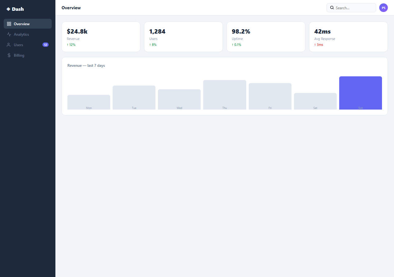
A dashboard layout is the foundational structure of any admin panel, analytics tool, or SaaS application. This snippet provides a complete dashboard frame: a fixed sidebar, a scrollable main content area, a stats cards row, and a data table.
The flex app shell
.app { display: flex; height: 100vh } creates the full-height application frame. The sidebar has a fixed width: 180px and flex-shrink: 0. The main content has flex: 1; overflow-y: auto — it fills all remaining space and scrolls independently of the sidebar.
The stats cards row
Four stats cards use display: grid; grid-template-columns: repeat(4, 1fr) for equal-width distribution. Each card shows an icon, label, value, and change indicator.
The data table
A standard <table> with border-collapse: collapse and alternating row backgrounds communicates tabular data clearly. The status column uses coloured badge chips identical to the Badges & Chips snippet.
The sidebar navigation
The sidebar contains a brand logo, navigation links with icons, and a user profile section at the bottom. Each nav link uses a flex row with icon + label. The active link has background: rgba(accent,0.12) and accent-coloured text. The sidebar uses overflow-y: auto so long nav lists scroll without pushing the user profile off screen.
Responsive behaviour
On mobile, the sidebar should be hidden by default and toggled via a hamburger button. Add @media (max-width: 768px) { .sidebar { position: fixed; left: -180px; transition: left 0.3s; } .sidebar.open { left: 0; } .main { margin-left: 0; } }. A hamburger button in the header calls sidebar.classList.toggle("open").
The stats grid
Four metric cards use display: grid; grid-template-columns: repeat(4, 1fr). Each card has an icon, metric value, label, and change indicator. The change uses green for positive and red for negative. This pattern is from the Stats Card snippet in this library — wire to real data by updating the value and change fields from your API response.
Extending the layout
Drop any snippet from this library into the .main content area. The area scrolls independently, so content of any length works without affecting the sidebar or header. Add a .tabs nav inside the main header for sub-page navigation within the dashboard section.
Build with AI
Build, Understand, Optimize, and Extend It With AI
You don't have to guess how the flex sizing keeps the sidebar pinned while the rest of the page scrolls. Paste this snippet's HTML, CSS, and JS into an AI coding assistant like Claude and ask it to explain exactly why height: 100vh on the app container combined with flex-shrink: 0 on the sidebar and flex: 1 plus overflow-y: auto on the main area produces two independently scrolling regions instead of one long page. The same assistant can help optimize it — ask whether the bar chart's CSS custom property heights would hold up if the values came from live data with wildly different ranges, and whether the sidebar needs a collapsed icon-only mode for narrower desktop windows. It's also useful for extending the shell: ask it to add a mobile hamburger toggle that slides the sidebar in from off-screen, a second collapsed sidebar state, or a sticky sub-header inside the scrollable main area for section tabs. Treat the code less like a finished artifact and more like a starting point for a conversation.
Prompt to recreate it
Copy this into your AI assistant of choice to build the effect from scratch, or as a jumping-off point for your own variant:
Build a dashboard application shell in plain HTML and CSS (no JavaScript required for the base layout) using only Flexbox and CSS Grid — no layout library.

Requirements:
- A full-height root container using display: flex and height: 100vh containing a fixed-width sidebar and a flexible main content area.
- The sidebar must have a fixed pixel width and flex-shrink: 0 so it never compresses when the main content is wide, and its own vertical scrolling if the navigation list grows longer than the viewport.
- The main content area must use flex: 1 to fill all remaining horizontal space and overflow-y: auto so it scrolls independently of the sidebar, which must stay pinned in place while the user scrolls the main content.
- Inside the main area, a fixed-height top bar (not part of the scrolling content) containing a page title, a search input, and a user avatar circle.
- Below the top bar, a metrics row using CSS Grid with repeat(4, 1fr) columns showing four equal-width stat cards, each with a value, a label, and a trend indicator.
- A simple bar chart built from plain div elements (no canvas, no charting library) where each bar's height is driven by a CSS custom property set inline per bar, and the tallest or most recent bar is visually highlighted with a different color.
- A responsive breakpoint that hides the sidebar off-screen by default on narrow viewports and slides it in via a class toggle and a hamburger button, using only a CSS transition on a positional property.
Step by step
How to Use
- 1Load the snippetClick "Dashboard Layout" in the sidebar. The preview shows the full app shell: dark sidebar, stats row, and data table.
- 2Update sidebar nav linksIn the HTML panel, change the sidebar link labels and SVG icons.
- 3Update stats card valuesChange the metric values, labels, and change percentages in the four stats cards.
- 4Update table dataReplace the table rows with your own data. Update column headers and row content.
- 5Change sidebar widthUpdate width: 180px on .sidebar in the CSS panel to adjust the sidebar size.
- 6Export in your formatClick "HTML" for a standalone file, "JSX" for a React component, or "Tailwind" for a React + Tailwind version.
Real-world uses
Common Use Cases
Got questions?
Frequently Asked Questions
The .app container is display: flex; height: 100vh. The .sidebar has flex-shrink: 0 (prevents compression) and its own height: 100vh with overflow-y: auto. The .main has flex: 1; overflow-y: auto. Both fill full height; the main area scrolls independently while the sidebar stays pinned.
Toggle a .collapsed class on the sidebar. CSS .sidebar.collapsed { width: 48px } collapses it to icon-only. Add overflow: hidden and hide the text labels with .collapsed .nav-label { display: none }. The main content expands into the freed space automatically via flex.
Add @media (max-width: 768px) { .sidebar { position: fixed; left: -180px; transition: left 0.3s; z-index: 100; } .sidebar.open { left: 0 } .app { padding-left: 0 } }. Add a hamburger button that toggles .open. An overlay behind the sidebar closes it on tap.
Yes. Create a Layout component that wraps all pages. The Sidebar component manages its own collapsed state. In Next.js, use the App Router layout.js to wrap all routes: export default function RootLayout({ children }) { return <div className="app"><Sidebar /><main>{children}</main></div> }
Add a .topbar element inside .main before .content. Give it position: sticky; top: 0; z-index: 10; background: #fff. Because .main uses overflow-y: auto, sticky positioning is scoped to the main scroll container — it pins to the top of the main area, not the viewport.
After your API fetch resolves, update each stat: const stats = await fetch("/api/stats").then(r => r.json()); document.getElementById("stat-revenue").textContent = "$" + stats.revenue.toLocaleString(). In React, store API data in useState and pass values as props to StatsCard components.