Source Code
<div class="demo">
  <div class="row">
    <span class="badge indigo">New</span>
    <span class="badge green">Live</span>
    <span class="badge yellow">Beta</span>
    <span class="badge red">Deprecated</span>
    <span class="badge gray">Draft</span>
  </div>
  <div class="row">
    <button class="chip">
      <svg width="12" height="12" viewBox="0 0 24 24" fill="none" stroke="currentColor" stroke-width="2.5"><path d="M20.59 13.41l-7.17 7.17a2 2 0 0 1-2.83 0L2 12V2h10l8.59 8.59a2 2 0 0 1 0 2.82z"/><line x1="7" y1="7" x2="7.01" y2="7"/></svg>
      Design <span class="remove" onclick="this.parentElement.remove()">×</span>
    </button>
    <button class="chip">
      <svg width="12" height="12" viewBox="0 0 24 24" fill="none" stroke="currentColor" stroke-width="2.5"><path d="M20.59 13.41l-7.17 7.17a2 2 0 0 1-2.83 0L2 12V2h10l8.59 8.59a2 2 0 0 1 0 2.82z"/><line x1="7" y1="7" x2="7.01" y2="7"/></svg>
      Frontend <span class="remove" onclick="this.parentElement.remove()">×</span>
    </button>
    <button class="chip">
      <svg width="12" height="12" viewBox="0 0 24 24" fill="none" stroke="currentColor" stroke-width="2.5"><path d="M20.59 13.41l-7.17 7.17a2 2 0 0 1-2.83 0L2 12V2h10l8.59 8.59a2 2 0 0 1 0 2.82z"/><line x1="7" y1="7" x2="7.01" y2="7"/></svg>
      React <span class="remove" onclick="this.parentElement.remove()">×</span>
    </button>
  </div>
  <div class="row">
    <span class="status"><span class="dot pulse green"></span> Online</span>
    <span class="status"><span class="dot yellow"></span> Away</span>
    <span class="status"><span class="dot red"></span> Busy</span>
    <span class="status"><span class="dot gray"></span> Offline</span>
  </div>
</div>
* { box-sizing: border-box; margin: 0; padding: 0; }
body { font-family: system-ui, sans-serif; background: #f8fafc; display: flex; align-items: center; justify-content: center; min-height: 100vh; padding: 20px; }
.demo { display: flex; flex-direction: column; gap: 20px; }
.row { display: flex; flex-wrap: wrap; gap: 8px; align-items: center; }
.badge { font-size: 11px; font-weight: 700; padding: 3px 9px; border-radius: 20px; text-transform: uppercase; letter-spacing: 0.4px; }
.badge.indigo { background: rgba(99,102,241,0.1); color: #4f46e5; }
.badge.green { background: rgba(22,163,74,0.1); color: #16a34a; }
.badge.yellow { background: rgba(245,158,11,0.1); color: #d97706; }
.badge.red { background: rgba(220,38,38,0.1); color: #dc2626; }
.badge.gray { background: rgba(100,116,139,0.1); color: #475569; }
.chip { display: inline-flex; align-items: center; gap: 5px; padding: 5px 10px; font-size: 12px; font-weight: 500; border-radius: 20px; background: #f1f5f9; border: 1px solid #e2e8f0; color: #475569; cursor: pointer; font-family: inherit; transition: background 0.12s; }
.chip:hover { background: #e2e8f0; }
.remove { margin-left: 2px; font-size: 14px; line-height: 1; color: #94a3b8; }
.remove:hover { color: #dc2626; }
.status { display: inline-flex; align-items: center; gap: 6px; font-size: 13px; font-weight: 500; color: #475569; }
.dot { width: 8px; height: 8px; border-radius: 50%; flex-shrink: 0; }
.dot.green { background: #22c55e; }
.dot.yellow { background: #f59e0b; }
.dot.red { background: #ef4444; }
.dot.gray { background: #94a3b8; }
.dot.pulse { box-shadow: 0 0 0 0 rgba(34,197,94,0.5); animation: pulse 1.5s infinite; }
@keyframes pulse { 0% { box-shadow: 0 0 0 0 rgba(34,197,94,0.5); } 70% { box-shadow: 0 0 0 8px rgba(34,197,94,0); } 100% { box-shadow: 0 0 0 0 rgba(34,197,94,0); } }Learn Coding Visually
Learn to code with interactive, live-preview playgrounds — HTML, CSS, JavaScript, React & more.
 HTML Playground42 lessons · Click-based · Live preview
 CSS PlaygroundLearn CSS with a live editor
 JavaScript Playground60 lessons · DOM · Async · Canvas
 React PlaygroundLearn React with a live code editor
 GSAP PlaygroundLearn GSAP animation interactively
 SVG Playground44 lessons · shapes · paths · animation
 SCSS Playground45 lessons · Sass modules · tokens
 Tailwind PlaygroundLearn Tailwind CSS with a live editor
 Bootstrap 5 Playground50 lessons · live preview
Badges & Chips — Free HTML CSS Snippet
Badges & Chips · Buttons · Plain HTML & CSS · Live preview
What's included
Features
About this UI Snippet
Badges & Chips — Semantic Colour Badges, Removable Tags & Animated Pulse Dot
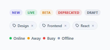
Badges, chips, and status indicators are small label elements used throughout every web interface — category tags on blog posts, status pills on order tracking pages, removable filter chips on search results, and live status dots on dashboards. This snippet provides all three patterns in a single component with composable CSS classes.
Semantic colour badges
The .badge class creates a pill label with text-transform: uppercase and letter-spacing: 0.4px — standard badge typography. Each colour variant uses a matching rgba tinted background: .badge.indigo uses background: rgba(99,102,241,0.1) with color: #4f46e5. The rgba approach gives the badge a transparent tint that works on both white and grey backgrounds without looking opaque. Five variants: indigo, green, yellow, red, and gray cover the full semantic range (neutral, success, warning, danger, muted).
Removable chips
.chip elements are display: inline-flex with a remove button (.remove) inside. The remove × character has color: #94a3b8 that transitions to color: #dc2626 on hover — a clear signal that clicking it will remove the chip. Wire the onclick to chip.remove() or a state update in your framework.
Status indicators with pulse dot
The .status pattern pairs a coloured 8px .dot circle with a label. The .dot.pulse variant adds a CSS keyframe animation — box-shadow: 0 0 0 0 rgba(34,197,94,0.5) expanding to 0 0 0 8px rgba(34,197,94,0) and back — creating a ripple pulse effect that communicates live/active status. This is the same pattern used by status pages, chat applications, and real-time dashboards.
Where each pattern fits
Badges work on static labels — categories, tags, plan names, version numbers. Chips work on user-applied filters or selections that can be removed. Status dots work on user presence, service health, connection state, and any real-time indicator.
The ::before dot indicator
Status badges use a ::before pseudo-element with content: '' and border-radius: 50% for a small coloured dot before the text label. The dot inherits its colour from the badge's text colour using background: currentColor — change the text colour and the dot updates automatically. The dot has margin-right: 5px and is vertically centred using position: relative; top: -0.5px.
Removable filter chips
The filter chip pattern uses a .chip container with the label text and a × remove button inside. The remove button has font-size: 14px and a hover background that turns slightly red, giving a clear remove affordance without a destructive-looking icon. Clicking × calls chip.remove() and optionally fires a custom event: chip.dispatchEvent(new CustomEvent('chip-remove', { detail: chip.dataset.value, bubbles: true })).
Animated chip entry
New chips can animate in via @keyframes: opacity 0 → 1 and scale(0.8) → 1 over 0.15s. Apply the keyframe to .chip. When chips are removed, animate out similarly by adding .removing class, then removing the DOM element on animationend. This makes the chip row feel dynamic and responsive to additions and deletions.
Build with AI
Build, Understand, Optimize, and Extend It With AI
You don't have to eyeball every rgba tint and keyframe by hand to understand this one. Paste the HTML and CSS into an AI coding assistant like Claude and ask it to explain exactly why the badge backgrounds use a 10% opacity rgba fill tied to the same hue as the text color instead of a flat pastel background, or how the box-shadow keyframe in the pulse animation produces a ripple rather than a simple fade. The same assistant can help optimize it — asking whether the pulse animation should pause when the tab is backgrounded to save cycles, or how to add the missing removable-chip JavaScript cleanly without inline onclick handlers. It's also a quick way to extend the set: ask it to add an animated entrance for new chips, a dismissible toast-style badge, or a compact avatar-plus-status combo. Treat the code less like a finished artifact and more like a starting point for a conversation.
Prompt to recreate it
Copy this into your AI assistant of choice to build the effect from scratch, or as a jumping-off point for your own variant:
Build a set of "badges, chips, and status dots" in plain HTML and CSS (no JavaScript required for the badges and dots; the chips need a small removal script) matching this exact structure.

Requirements:
- Five badge color variants (indigo, green, yellow, red, gray), each a small uppercase pill with letter-spacing, using a background that is a 10% opacity rgba tint of the variant's own color rather than a flat pastel, paired with a solid, fully-saturated text color of the same hue.
- Removable filter chips: an inline-flex pill containing an icon, a text label, and a small "x" remove control; clicking the remove control must remove only that chip element from the DOM (e.g. via closest chip lookup), leaving sibling chips untouched, and the remove control's color must shift to a red hover state as a clear destructive-action affordance.
- Status indicators: a small round colored dot next to a text label, in four color states (green, yellow, red, gray) representing online, away, busy, and offline.
- The green "online" dot must run a continuous CSS keyframe animation that expands and fades a box-shadow ring outward from the dot (starting as a tight solid ring and ending fully transparent and larger), looping indefinitely, while the dot itself stays a solid filled circle throughout.
- All three patterns (badges, chips, status dots) must be visually distinguishable at a glance and usable independently of each other in a layout.
Want to tighten it up first? Run this prompt through the AI Prompt Studio to score it across 8 quality dimensions, catch anti-patterns, and tune the wording for Claude, ChatGPT, or Gemini before you paste it in.
Step by step
How to Use
- 1Load the snippetClick "Badges & Chips" in the sidebar. The preview shows semantic badges, removable chips with hover X, and status dots including the animated pulse.
- 2Pick the patterns you needCopy only the HTML and CSS for the pattern you need — .badge for labels, .chip for removable tags, .status/.dot for presence indicators.
- 3Change badge coloursIn the CSS panel, update the rgba values on each .badge.colour class to match your brand or semantic system.
- 4Wire chip removalIn the HTML panel, add onclick="this.closest('.chip').remove()" to each .remove button to make chips removable.
- 5Change the pulse dot colourUpdate the rgba(34,197,94,...) values in the @keyframes pulse and .dot.pulse CSS to your status colour.
- 6Export in your formatClick "HTML" for a standalone file, "JSX" for a React component, or "Tailwind" for a React + Tailwind version.
Real-world uses
Common Use Cases
Got questions?
Frequently Asked Questions
A badge is a static informational label — a category, status, or tier marker that the user cannot interact with. A chip is an interactive element, typically a filter or tag that the user can remove. Badges are display-only; chips have a remove action.
rgba(99,102,241,0.1) creates a 10% opacity tint of the badge colour. This looks clean on both white and light-grey backgrounds without appearing as an opaque coloured block. Opaque badge backgrounds (like background: #e0e7ff) look different on grey vs white cards; rgba tints adapt to both.
Add onclick="this.closest('.chip').remove()" to the .remove button element. This removes the closest parent .chip from the DOM. In React, manage chips as an array in state and filter out the removed chip on click.
@keyframes pulse expands box-shadow from 0 0 0 0 rgba(34,197,94,0.5) to 0 0 0 8px rgba(34,197,94,0) and back. The shadow starts as a tight coloured ring and expands outward while fading to transparent, creating the ripple effect. Only the green .dot.pulse variant uses this animation.
Yes. Copy an existing .badge.colour CSS block and rename the class. Pick a matching foreground and background rgba colour. The base .badge styles handle all the typography and shape — the variant only needs to set background and color.
Yes. Click "JSX" to download a React component or "Tailwind" for a Tailwind version. In Tailwind, the indigo badge maps to: text-indigo-600 bg-indigo-50 uppercase text-xs font-bold tracking-wide px-2.5 py-0.5 rounded-full.