More Cards Snippets
Front-End Coding Playgrounds
Learn to code with interactive, live-preview playgrounds — HTML, CSS, JavaScript, React & more.
 HTML Playground42 lessons · Click-based · Live preview
 CSS PlaygroundLearn CSS with a live editor
 JavaScript Playground60 lessons · DOM · Async · Canvas
 React PlaygroundLearn React with a live code editor
 GSAP PlaygroundLearn GSAP animation interactively
 SVG Playground44 lessons · shapes · paths · animation
 SCSS Playground45 lessons · Sass modules · tokens
 Tailwind PlaygroundLearn Tailwind CSS with a live editor
 Bootstrap 5 Playground50 lessons · live preview
Order Tracking Timeline — HTML CSS JS Snippet
Order Tracking Timeline · Cards · Plain HTML, CSS & JS · Live preview
What's included
Features
current index plus render controls the entire timeline — rail height, dot states, checkmarks, text emphasis, and the status pill all derive from it..ot-rail-fill grows its height to current / (steps − 1) with a cubic-bezier transition, so progress visibly climbs instead of snapping.box-shadow keyframe — no JS timer, so it costs nothing and never drifts.svg from scale(.4) and zero opacity to full, making each completed stage feel rewarding.advanceStatus writes a real timestamp into each newly reached step, replacing its "Pending" placeholder.About this UI Snippet
Order Tracking Timeline — Animated Progress Rail, Pulsing Current Stage & Completed Checkmarks
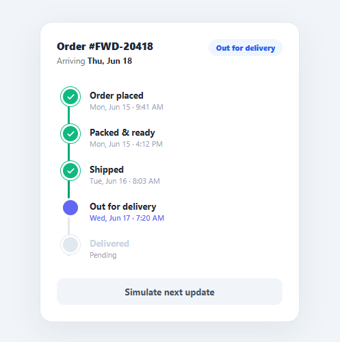
"Where is my order?" is the single most common post-purchase question, and a clear tracking timeline answers it before the customer has to email support. A good fulfilment timeline shows every stage from placed to delivered, marks what is done, highlights what is happening now, and animates as the order advances — turning anxious waiting into reassuring progress. This snippet implements that pattern in plain HTML, CSS, and vanilla JavaScript: a vertical timeline with an animated progress rail, checkmark-completed steps, a pulsing current stage, a status pill, and a live ETA.
The component is driven by a single current index and a render function — change the index, call render, and the entire visual state (rail height, dot colours, checkmarks, text emphasis, status pill) follows. That makes wiring it to real tracking events trivial.
Animated progress rail
Behind the dots runs a grey .ot-rail. Inside it, .ot-rail-fill is a green gradient whose height is set as a percentage of current / (steps − 1). A cubic-bezier transition animates the fill upward whenever the order advances, so progress visibly grows rather than jumping. The rail is positioned to line up exactly with the centre of each dot, and a higher z-index on the dots keeps them above the rail.
Three dot states: done, active, pending
Each step is classed by render: indices below current get .done (green dot with a checkmark that scales in), the index equal to current gets .active (an indigo dot with a pulsing ring), and the rest stay pending (grey). The checkmark svg animates from scale(.4) and opacity:0 to full size, so completing a step feels like a small reward. The active dot's pulse is a pure-CSS box-shadow keyframe that expands and fades on a loop — drawing the eye to the current stage without any JavaScript animation loop.
Status pill and ETA
A pill in the header mirrors the current stage label ("In transit", "Out for delivery"). On delivery, render recolours the pill green and updates the ETA text to "today" — small touches that make the final state feel distinct and complete.
Live advancement
The "Simulate next update" button calls advanceStatus, which increments current, fills in a real timestamp for the newly reached step, and re-renders. When the order reaches the final stage, the button disables and switches to "Order delivered ✓". In production you would call render from a websocket message, a polling fetch, or a server-sent event carrying the carrier's latest scan — the rendering code does not change.
Pair this timeline with an order summary of the items being shipped, a stepper for checkout progress, or a vertical timeline for general event histories.
Build with AI
Build, Understand, Optimize, and Extend It With AI
You do not need to mentally simulate every stage transition to understand this component. Paste its HTML, CSS, and JS into an AI coding assistant like Claude and ask it to explain precisely how the single current index drives the rail-fill height percentage, the done and active class assignment, and the status pill text all from one render call, or why the active dot's pulse is a pure CSS box-shadow keyframe rather than a JavaScript-driven animation. The same assistant can help you optimize it, for instance considering whether re-querying all step elements on every render matters once a timeline has dozens of stages versus caching the node list once. It is also useful for extending the effect: ask it to add an error or exception state for a failed delivery stop, wire advanceStatus up to a real websocket message instead of a button click, or make the rail and steps lay out horizontally for a wide desktop card. Treat the code less like a finished artifact and more like a starting point for a conversation.
Prompt to recreate it
Copy this into your AI assistant of choice to build the effect from scratch, or as a jumping-off point for your own variant:
Build an "order tracking timeline" in plain HTML, CSS, and JavaScript with no framework — a single numeric index and one render function must drive the entire visual state.

Requirements:
- A vertical list of stage steps (e.g. order placed, packed, shipped, out for delivery, delivered), each with a dot and a title/timestamp, plus a background rail behind the dots and a colored fill element on top of the rail.
- Track the currently reached stage as a single zero-based index variable. A render function must, on every call: mark every step before the current index as done (giving it a completed style and revealing a checkmark icon inside its dot), mark the step at the current index as active (a distinct color and a looping pulse), and leave the rest in a neutral pending style.
- The rail-fill element's height must be set as a CSS percentage computed from current divided by (total steps minus 1), and that height change must animate smoothly via a CSS transition (not a JS-driven frame loop), so advancing a stage visibly grows the fill.
- The completed checkmark icon inside each done dot must animate in from a smaller scale and zero opacity to full scale and opacity — do not just toggle display or opacity alone.
- The current stage's dot must have a continuously looping pulse implemented purely as a CSS box-shadow keyframe animation (expanding and fading ring), not a setInterval or requestAnimationFrame loop.
- A button must call a function that increments the current index by one, writes in a real timestamp string for the newly reached step (replacing a "Pending" placeholder), and calls render again; once the last stage is reached, the button must disable itself and change its label to indicate completion.
- A status pill near the top must always mirror the current stage's label text and switch to a distinct completed color once the last stage is reached.
Step by step
How to Use
- 1Paste HTML, CSS, and JSAn order-tracking card appears with five stages; the first three are complete with green checkmarks and "Shipped" pulses as the current stage.
- 2Read the current stateThe green rail fills up to the active stage, the header pill shows "In transit", and the ETA reads "Thu, Jun 18".
- 3Advance the orderClick "Simulate next update" — the rail animates up, "Shipped" turns into a checkmark, and "Out for delivery" starts pulsing with a real timestamp.
- 4Watch the pulse moveEach advance moves the indigo pulsing ring to the new current stage and updates the status pill to match.
- 5Reach deliveredAdvance to the final stage — the rail fills to 100%, every dot is a checkmark, the pill turns green, and the ETA changes to "today".
- 6See the completed buttonOnce delivered, the button disables and reads "Order delivered ✓", signalling there are no further updates.
Real-world uses
Common Use Cases
Got questions?
Frequently Asked Questions
Map your carrier's status codes to step indices, set current to the latest reached step, and call render(). For live updates, subscribe to a websocket or poll a tracking endpoint; each message just updates current and the timestamps, then re-renders — no other code changes.
Switch the .ot-timeline layout to a row, lay the rail horizontally, and animate .ot-rail-fill width instead of height. The render logic stays identical — only the axis the percentage applies to changes. Horizontal works well on wide desktop layouts; vertical is better on mobile.
Add an .error state class with a red dot and an alert icon, and a status like "Delivery attempt failed". In render, branch when the current step carries an error flag so the rail stops at that point and the pill turns red, prompting the customer to take action.
Wrap the timeline in an aria-live="polite" region so advances are announced, mark completed steps with visually-hidden "completed" text and the current step with "in progress", and ensure the status pill text conveys state without relying on colour alone. The checkmarks should have an aria-hidden since the text already states completion.
In React, hold current in useState and derive each step's class from its index versus current; set the rail height from a computed percentage in the style prop. In Vue, use a ref for current and :class/:style bindings in a v-for. In Angular, track current on the component and bind [class.done]/[class.active]. The rail and pulse CSS port unchanged.