Multi-Step Progress Wizard — HTML CSS JS Snippet

Multi-Step Progress Wizard · Navigation · Plain HTML, CSS & JS · Live preview

Share & Support

What's included

Features

Animated connector line fill between steps
Icon-to-checkmark swap on completed steps using CSS only
Panel slide-in animation on step change
Plan selector using: has() CSS with JS fallback
Back/Next button state derived from single integer
Next button label changes to "Finish" on last step
Success panel with spring-easing pop animation
Zero dependencies — pure HTML, CSS, JavaScript

About this UI Snippet

Multi-Step Progress Wizard — Animated Step Indicator, Connector Fill & Plan Selector
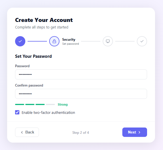
Screenshot of the Multi-Step Progress Wizard snippet rendered live

A multi-step wizard breaks a long form into smaller, focused stages that feel manageable. Each step shows one logical group of fields — personal info, security, plan selection, confirmation — and a persistent progress indicator at the top communicates how far along the user is. Research consistently shows that multi-step forms have higher completion rates than long single-page forms because the cognitive load per screen is lower and progress feels visible and achievable.

Step indicator architecture

The step indicator is a horizontal flex row: four .step elements separated by .step-line spacers. Each step contains a circle icon and a label; only the active step shows its label text (via display:none on .step-info and display:block on .step.active .step-info). This keeps the indicator compact on small screens while showing helpful context on the active step.

Connector line fill animation

Each .step-line has a child .step-line-fill div. When a step is completed, JavaScript sets fill.style.width = '100%'. Because the CSS defines transition: width 0.4s ease on the fill, the line smoothly grows from left to right — visually "unlocking" the path to the next step. This technique requires no canvas or SVG — just a block div inside an overflow:hidden container.

Done state: swap icon via CSS

Completed steps show a checkmark instead of their original icon. This is achieved with two sibling SVGs: .step-icon (the step's purpose icon) and .check-icon (a checkmark). By default .check-icon is display:none. When the parent gets the .done class, CSS rules flip them: .step.done .step-icon { display:none } and .step.done .check-icon { display:block }. No DOM manipulation required — the icons are always in the HTML, CSS controls which is visible.

Panel transitions

Each form section is a .panel div; only the one with .active has display:block. A CSS @keyframes fadeIn animation on .panel.active slides the panel in from 12px to the right with an opacity fade over 250ms, giving a sense of forward motion when advancing steps. Going backwards could use a mirrored animation (translateX from -12px) which you can add by swapping the class on the panel before setting active.

Plan selector with :has() CSS

The plan selection uses <label> wrappers containing a hidden radio input. .plan-card:has(input:checked) applies the selected border and background when the radio inside is checked — pure CSS selection state with no JavaScript listener. A JavaScript click handler also syncs a .selected class for browsers that don't support :has() yet, providing a robust progressive enhancement approach.

JavaScript state machine

The current integer tracks the active step (1–4). updateWizard() is a pure render function: it iterates 1–TOTAL, assigns active/done/neutral classes to each step, activates the matching panel, and sets line fill widths. Both nextStep() and prevStep() simply increment/decrement current then call updateWizard(). This single-state-variable + pure-render pattern maps directly to React's useState hook.

Success state animation

The final panel shows a green ring with a checkmark that scales in from 0 using @keyframes pop with a spring cubic-bezier (0.175, 0.885, 0.32, 1.275). This overshoot easing is the same used in iOS confirmation animations — it makes the success feel earned and satisfying.

Button state management

The Back button has the HTML disabled attribute toggled by btnBack.disabled = current === 1. The Next button's label changes to "Finish" with a checkmark icon when on the penultimate step, and the button is disabled on the last step. All visual states flow from the single current integer — no scattered class toggles.

React integration

Use useState(1) for the current step. Wrap each panel in a component: <ProfileStep />, <SecurityStep />, <PlanStep />, <SuccessStep />. Render only the active component. The step indicator maps over a STEPS config array to render circles and labels. Pass onNext and onBack callbacks down to each step component, or manage navigation in the parent wizard component.

Accessibility

The step indicator should use role="list" on the steps container and role="listitem" on each step. The active step should have aria-current="step". The panels should use aria-live="polite" so screen readers announce the new panel content when it appears. Disabled buttons already communicate their state via the HTML disabled attribute.

See also the stepper snippet for a simpler number-based indicator, the multi-step form snippet for a form-focused variant, and the circular steps snippet for a radial progress design.

Step by step

How to Use

  1. 1
    Copy the full HTML structureThe wizard needs all four .panel divs and the .steps indicator in the same container. Do not separate them — the JS targets all elements by ID.
  2. 2
    Adjust step countTo add or remove steps: add/remove .step and .step-line elements in .steps, add/remove .panel divs, and update the TOTAL constant in the JS.
  3. 3
    Add the CSS and JSPaste both blocks. The JS updateWizard() function is the single source of truth — it derives all visual state from the current integer variable.
  4. 4
    Customise panel contentReplace the content inside each .panel with your own form fields. The wizard navigation works independently of what is inside each panel.
  5. 5
    Add validation before advancingIn nextStep(), add a validation check before incrementing current. Return early if validation fails, and show an error message inside the current panel.

Real-world uses

Common Use Cases

Signup Onboarding
Multi-step account creation with profile, security, and plan selection
Product Setup
SaaS product configuration wizard split into logical stages
Checkout Flow
E-commerce checkout split into cart, shipping, payment, confirm
Form Surveys
Long intake forms split into sections to improve completion rates

Got questions?

Frequently Asked Questions

Use useState(1) for current step. Map a STEPS config array to render the indicator. Render only the active panel component. Pass onNext/onBack as props or use a context.

In nextStep(), run your validation logic first. If it fails, show an error inside the current panel and return early without incrementing current.

Add an onclick to each .step that calls goToStep(n). Only allow jumping to completed steps (where i < current) to prevent skipping required fields.

Track a direction variable (next/prev). In fadeIn keyframe, use translateX(12px) for forward. Add a fadeInBack animation with translateX(-12px) and apply it when direction is prev.

Open the Export menu (or the Test Exports preview) in the snippet toolbar. It generates a plain React component, a React + Tailwind version where the step-indicator and panel styles become utility classes, a Vue 3 single-file component with the step navigation in script setup, and an Angular standalone component. Each converter preserves the markup, the connector-fill animation, and the panel transitions, so the wizard behaves identically across React, Vue, and Angular. Hold the current step and form values in component state and pass the plan options in as a prop or input instead of hardcoding the panels.

Multi-Step Progress Wizard — Export as HTML, React, Vue, Angular & Tailwind

HTML
<!DOCTYPE html>
<html lang="en">
<head>
  <meta charset="UTF-8" />
  <meta name="viewport" content="width=device-width, initial-scale=1.0" />
  <title>Multi-Step Progress Wizard</title>
  <style>
    * { box-sizing: border-box; margin: 0; padding: 0; }
    body { font-family: system-ui, sans-serif; background: linear-gradient(135deg, #f0f4ff 0%, #faf0ff 100%); display: flex; align-items: center; justify-content: center; min-height: 100vh; padding: 20px; }
    .wizard-wrap { width: 100%; max-width: 520px; }
    .wizard { background: #fff; border-radius: 20px; box-shadow: 0 8px 40px rgba(0,0,0,0.1); overflow: hidden; }
    .wizard-header { padding: 28px 28px 0; }
    .wizard-title { font-size: 20px; font-weight: 800; color: #111827; margin-bottom: 4px; }
    .wizard-sub { font-size: 13px; color: #6b7280; }
    
    /* Step indicator */
    .steps { display: flex; align-items: center; padding: 24px 28px; gap: 0; }
    .step { display: flex; align-items: center; gap: 10px; flex-shrink: 0; }
    .step-circle { width: 36px; height: 36px; border-radius: 50%; border: 2px solid #e5e7eb; background: #fff; display: flex; align-items: center; justify-content: center; color: #9ca3af; transition: all 0.3s; flex-shrink: 0; }
    .step.active .step-circle { border-color: #6366f1; color: #6366f1; background: #eef2ff; }
    .step.done .step-circle { border-color: #6366f1; background: #6366f1; color: #fff; }
    .check-icon { display: none; }
    .step.done .step-icon { display: none; }
    .step.done .check-icon { display: block; }
    .step-info { display: none; }
    .step.active .step-info { display: block; }
    .step-label { font-size: 12px; font-weight: 700; color: #111827; }
    .step-desc { font-size: 10px; color: #6b7280; }
    .step-line { flex: 1; height: 2px; background: #e5e7eb; margin: 0 8px; position: relative; overflow: hidden; }
    .step-line-fill { height: 100%; width: 0; background: #6366f1; transition: width 0.4s ease; }
    
    /* Panels */
    .panels { padding: 0 28px; min-height: 220px; }
    .panel { display: none; animation: fadeIn 0.25s ease; }
    .panel.active { display: block; }
    @keyframes fadeIn { from { opacity: 0; transform: translateX(12px); } to { opacity: 1; transform: none; } }
    .panel-title { font-size: 15px; font-weight: 700; color: #111827; margin-bottom: 16px; }
    .field-row { display: grid; grid-template-columns: 1fr 1fr; gap: 12px; margin-bottom: 12px; }
    .field { display: flex; flex-direction: column; gap: 5px; margin-bottom: 12px; }
    .field label { font-size: 12px; font-weight: 600; color: #374151; }
    .field input { padding: 9px 12px; border: 1.5px solid #e5e7eb; border-radius: 8px; font-size: 13px; color: #111827; outline: none; transition: border-color 0.2s; }
    .field input:focus { border-color: #6366f1; }
    .strength-row { display: flex; align-items: center; gap: 10px; margin-bottom: 12px; }
    .strength-bars { display: flex; gap: 4px; }
    .sbar { width: 32px; height: 4px; border-radius: 2px; background: #e5e7eb; }
    .sbar.filled { background: #10b981; }
    .strength-label { font-size: 11px; font-weight: 700; color: #10b981; }
    .checkbox-row { display: flex; align-items: center; gap: 8px; font-size: 13px; color: #374151; cursor: pointer; }
    .checkbox-row input { width: 15px; height: 15px; accent-color: #6366f1; }
    .plan-cards { display: flex; flex-direction: column; gap: 10px; }
    .plan-card { display: flex; align-items: center; gap: 12px; padding: 12px 14px; border: 1.5px solid #e5e7eb; border-radius: 12px; cursor: pointer; transition: all 0.15s; }
    .plan-card:has(input:checked) { border-color: #6366f1; background: #f5f3ff; }
    .plan-card input { accent-color: #6366f1; }
    .plan-body { flex: 1; }
    .plan-name { font-size: 13px; font-weight: 700; color: #111827; display: flex; align-items: center; gap: 6px; }
    .plan-price { font-size: 12px; font-weight: 600; color: #6366f1; }
    .plan-feat { font-size: 11px; color: #6b7280; }
    .pop-badge { font-size: 9px; font-weight: 700; background: #6366f1; color: #fff; padding: 1px 6px; border-radius: 10px; }
    
    /* Success */
    .success-state { text-align: center; padding: 20px 0; }
    .success-ring { width: 68px; height: 68px; border-radius: 50%; background: #dcfce7; color: #16a34a; display: flex; align-items: center; justify-content: center; margin: 0 auto 16px; animation: pop 0.5s cubic-bezier(0.175,0.885,0.32,1.275); }
    @keyframes pop { from { transform: scale(0); } to { transform: scale(1); } }
    .success-title { font-size: 18px; font-weight: 800; color: #111827; margin-bottom: 8px; }
    .success-sub { font-size: 13px; color: #6b7280; line-height: 1.6; margin-bottom: 16px; }
    .summary-pills { display: flex; flex-wrap: wrap; gap: 7px; justify-content: center; }
    .pill { font-size: 12px; font-weight: 600; padding: 4px 12px; background: #f3f4f6; color: #374151; border-radius: 20px; }
    .pill-pro { background: #eef2ff; color: #6366f1; }
    
    /* Footer */
    .wizard-footer { display: flex; align-items: center; justify-content: space-between; padding: 20px 28px; border-top: 1px solid #f3f4f6; margin-top: 20px; }
    .btn-back { display: flex; align-items: center; gap: 5px; padding: 8px 16px; border: 1.5px solid #e5e7eb; border-radius: 8px; background: #fff; color: #6b7280; font-size: 13px; font-weight: 600; cursor: pointer; transition: all 0.15s; }
    .btn-back:hover:not(:disabled) { border-color: #6366f1; color: #6366f1; }
    .btn-back:disabled { opacity: 0.35; cursor: default; }
    .step-count { font-size: 12px; color: #9ca3af; font-weight: 500; }
    .btn-next { display: flex; align-items: center; gap: 5px; padding: 9px 20px; border: none; border-radius: 8px; background: #6366f1; color: #fff; font-size: 13px; font-weight: 700; cursor: pointer; transition: background 0.15s; }
    .btn-next:hover { background: #4f46e5; }
  </style>
</head>
<body>
  <div class="wizard-wrap">
    <div class="wizard">
      <div class="wizard-header">
        <h2 class="wizard-title">Create Your Account</h2>
        <p class="wizard-sub">Complete all steps to get started</p>
      </div>
  
      <!-- Step indicator -->
      <div class="steps" id="stepsEl">
        <div class="step active" data-step="1">
          <div class="step-circle">
            <svg class="step-icon" width="14" height="14" viewBox="0 0 24 24" fill="none" stroke="currentColor" stroke-width="2.5" stroke-linecap="round"><path d="M20 21v-2a4 4 0 0 0-4-4H8a4 4 0 0 0-4 4v2"/><circle cx="12" cy="7" r="4"/></svg>
            <svg class="check-icon" width="14" height="14" viewBox="0 0 24 24" fill="none" stroke="currentColor" stroke-width="2.5" stroke-linecap="round"><polyline points="20 6 9 17 4 12"/></svg>
          </div>
          <div class="step-info">
            <div class="step-label">Profile</div>
            <div class="step-desc">Personal info</div>
          </div>
        </div>
        <div class="step-line"><div class="step-line-fill" id="line1"></div></div>
        <div class="step" data-step="2">
          <div class="step-circle">
            <svg class="step-icon" width="14" height="14" viewBox="0 0 24 24" fill="none" stroke="currentColor" stroke-width="2.5" stroke-linecap="round"><rect x="3" y="11" width="18" height="11" rx="2"/><path d="M7 11V7a5 5 0 0 1 10 0v4"/></svg>
            <svg class="check-icon" width="14" height="14" viewBox="0 0 24 24" fill="none" stroke="currentColor" stroke-width="2.5" stroke-linecap="round"><polyline points="20 6 9 17 4 12"/></svg>
          </div>
          <div class="step-info">
            <div class="step-label">Security</div>
            <div class="step-desc">Set password</div>
          </div>
        </div>
        <div class="step-line"><div class="step-line-fill" id="line2"></div></div>
        <div class="step" data-step="3">
          <div class="step-circle">
            <svg class="step-icon" width="14" height="14" viewBox="0 0 24 24" fill="none" stroke="currentColor" stroke-width="2.5" stroke-linecap="round"><rect x="2" y="3" width="20" height="14" rx="2"/><path d="M8 21h8M12 17v4"/></svg>
            <svg class="check-icon" width="14" height="14" viewBox="0 0 24 24" fill="none" stroke="currentColor" stroke-width="2.5" stroke-linecap="round"><polyline points="20 6 9 17 4 12"/></svg>
          </div>
          <div class="step-info">
            <div class="step-label">Plan</div>
            <div class="step-desc">Choose tier</div>
          </div>
        </div>
        <div class="step-line"><div class="step-line-fill" id="line3"></div></div>
        <div class="step" data-step="4">
          <div class="step-circle">
            <svg class="step-icon" width="14" height="14" viewBox="0 0 24 24" fill="none" stroke="currentColor" stroke-width="2.5" stroke-linecap="round"><polyline points="20 6 9 17 4 12"/></svg>
            <svg class="check-icon" width="14" height="14" viewBox="0 0 24 24" fill="none" stroke="currentColor" stroke-width="2.5" stroke-linecap="round"><polyline points="20 6 9 17 4 12"/></svg>
          </div>
          <div class="step-info">
            <div class="step-label">Done</div>
            <div class="step-desc">All set!</div>
          </div>
        </div>
      </div>
  
      <!-- Panels -->
      <div class="panels">
        <div class="panel active" id="panel1">
          <h3 class="panel-title">Personal Information</h3>
          <div class="field-row">
            <div class="field"><label>First name</label><input type="text" placeholder="Alex" value="Alex"></div>
            <div class="field"><label>Last name</label><input type="text" placeholder="Morgan" value="Morgan"></div>
          </div>
          <div class="field"><label>Email address</label><input type="email" placeholder="[email protected]" value="[email protected]"></div>
          <div class="field"><label>Job title</label><input type="text" placeholder="Software Engineer" value="Software Engineer"></div>
        </div>
  
        <div class="panel" id="panel2">
          <h3 class="panel-title">Set Your Password</h3>
          <div class="field"><label>Password</label><input type="password" placeholder="Min. 8 characters" value="••••••••••"></div>
          <div class="field"><label>Confirm password</label><input type="password" placeholder="Repeat password" value="••••••••••"></div>
          <div class="strength-row">
            <div class="strength-bars">
              <div class="sbar filled"></div><div class="sbar filled"></div><div class="sbar filled"></div><div class="sbar"></div>
            </div>
            <span class="strength-label">Strong</span>
          </div>
          <label class="checkbox-row"><input type="checkbox" checked> Enable two-factor authentication</label>
        </div>
  
        <div class="panel" id="panel3">
          <h3 class="panel-title">Choose Your Plan</h3>
          <div class="plan-cards">
            <label class="plan-card"><input type="radio" name="plan" value="free" checked><div class="plan-body"><div class="plan-name">Free</div><div class="plan-price">$0/mo</div><div class="plan-feat">3 projects · 1GB storage</div></div></label>
            <label class="plan-card selected"><input type="radio" name="plan" value="pro"><div class="plan-body"><div class="plan-name">Pro <span class="pop-badge">Popular</span></div><div class="plan-price">$12/mo</div><div class="plan-feat">Unlimited projects · 50GB</div></div></label>
            <label class="plan-card"><input type="radio" name="plan" value="team"><div class="plan-body"><div class="plan-name">Team</div><div class="plan-price">$39/mo</div><div class="plan-feat">5 seats · 200GB storage</div></div></label>
          </div>
        </div>
  
        <div class="panel" id="panel4">
          <div class="success-state">
            <div class="success-ring">
              <svg width="32" height="32" viewBox="0 0 24 24" fill="none" stroke="currentColor" stroke-width="2.5" stroke-linecap="round"><polyline points="20 6 9 17 4 12"/></svg>
            </div>
            <h3 class="success-title">Account Created!</h3>
            <p class="success-sub">Welcome aboard, Alex. Your account is ready. Check your inbox for a confirmation email.</p>
            <div class="summary-pills">
              <span class="pill">Alex Morgan</span>
              <span class="pill">[email protected]</span>
              <span class="pill pill-pro">Pro Plan</span>
            </div>
          </div>
        </div>
      </div>
  
      <!-- Footer nav -->
      <div class="wizard-footer">
        <button class="btn-back" id="btnBack" onclick="prevStep()" disabled>
          <svg width="14" height="14" viewBox="0 0 24 24" fill="none" stroke="currentColor" stroke-width="2.5" stroke-linecap="round"><polyline points="15 18 9 12 15 6"/></svg>
          Back
        </button>
        <span class="step-count" id="stepCount">Step 1 of 4</span>
        <button class="btn-next" id="btnNext" onclick="nextStep()">
          Next
          <svg width="14" height="14" viewBox="0 0 24 24" fill="none" stroke="currentColor" stroke-width="2.5" stroke-linecap="round"><polyline points="9 18 15 12 9 6"/></svg>
        </button>
      </div>
    </div>
  </div>
  <script>
    let current = 1;
    const TOTAL = 4;
    
    function updateWizard() {
      for (let i = 1; i <= TOTAL; i++) {
        const step = document.querySelector('[data-step="' + i + '"]');
        const panel = document.getElementById('panel' + i);
        step.classList.remove('active','done');
        panel.classList.remove('active');
        if (i < current) step.classList.add('done');
        else if (i === current) { step.classList.add('active'); panel.classList.add('active'); }
        if (i <= TOTAL - 1) {
          const fill = document.getElementById('line' + i);
          if (fill) fill.style.width = i < current ? '100%' : '0%';
        }
      }
      document.getElementById('btnBack').disabled = current === 1;
      document.getElementById('btnNext').disabled = current === TOTAL;
      const nextBtn = document.getElementById('btnNext');
      nextBtn.innerHTML = current === TOTAL - 1
        ? 'Finish <svg width="14" height="14" viewBox="0 0 24 24" fill="none" stroke="currentColor" stroke-width="2.5" stroke-linecap="round"><polyline points="20 6 9 17 4 12"/></svg>'
        : 'Next <svg width="14" height="14" viewBox="0 0 24 24" fill="none" stroke="currentColor" stroke-width="2.5" stroke-linecap="round"><polyline points="9 18 15 12 9 6"/></svg>';
      document.getElementById('stepCount').textContent = 'Step ' + current + ' of ' + TOTAL;
    }
    
    function nextStep() { if (current < TOTAL) { current++; updateWizard(); } }
    function prevStep() { if (current > 1) { current--; updateWizard(); } }
    
    // Plan card radio sync
    document.querySelectorAll('.plan-card').forEach(card => {
      card.addEventListener('click', function() {
        document.querySelectorAll('.plan-card').forEach(c => c.classList.remove('selected'));
        this.classList.add('selected');
        this.querySelector('input').checked = true;
      });
    });
    
    updateWizard();
  </script>
</body>
</html>
Tailwind
<!DOCTYPE html>
<html lang="en">
<head>
  <meta charset="UTF-8" />
  <meta name="viewport" content="width=device-width, initial-scale=1.0" />
  <title>Multi-Step Progress Wizard</title>
  <!-- Tailwind CSS v3+ — arbitrary value classes (e.g. bg-[#0f172a]) are valid -->
  <script src="https://cdn.tailwindcss.com"></script>
  <style>
    @keyframes fadeIn { from { opacity: 0; transform: translateX(12px); } to { opacity: 1; transform: none; } }

    @keyframes pop { from { transform: scale(0); } to { transform: scale(1); } }

    * {
      box-sizing: border-box; margin: 0; padding: 0;
    }

    body {
      font-family: system-ui, sans-serif; background: linear-gradient(135deg, #f0f4ff 0%, #faf0ff 100%); display: flex; align-items: center; justify-content: center; min-height: 100vh; padding: 20px;
    }

    .step.active .step-circle {
      border-color: #6366f1; color: #6366f1; background: #eef2ff;
    }

    .step.done .step-circle {
      border-color: #6366f1; background: #6366f1; color: #fff;
    }

    .step.done .step-icon {
      display: none;
    }

    .step.done .check-icon {
      display: block;
    }

    .step.active .step-info {
      display: block;
    }

    .panel {
      display: none; animation: fadeIn 0.25s ease;
    }

    .panel.active {
      display: block;
    }

    .field label {
      font-size: 12px; font-weight: 600; color: #374151;
    }

    .field input {
      padding: 9px 12px; border: 1.5px solid #e5e7eb; border-radius: 8px; font-size: 13px; color: #111827; outline: none; transition: border-color 0.2s;
    }

    .field input:focus {
      border-color: #6366f1;
    }

    .sbar.filled {
      background: #10b981;
    }

    .checkbox-row input {
      width: 15px; height: 15px; accent-color: #6366f1;
    }

    .plan-card:has(input:checked) {
      border-color: #6366f1; background: #f5f3ff;
    }

    .plan-card input {
      accent-color: #6366f1;
    }

    .btn-back:hover:not(:disabled) {
      border-color: #6366f1; color: #6366f1;
    }

    .btn-back:disabled {
      opacity: 0.35; cursor: default;
    }
  </style>
</head>
<body>
  <div class="w-full max-w-[520px]">
    <div class="bg-[#fff] rounded-[20px] shadow-[0_8px_40px_rgba(0,0,0,0.1)] overflow-hidden">
      <div class="pt-7 px-7 pb-0">
        <h2 class="text-xl font-extrabold text-[#111827] mb-1">Create Your Account</h2>
        <p class="text-[13px] text-[#6b7280]">Complete all steps to get started</p>
      </div>
  
      <!-- Step indicator -->
      <div class="flex items-center py-6 px-7 gap-0" id="stepsEl">
        <div class="step flex items-center gap-2.5 shrink-0 active" data-step="1">
          <div class="step-circle w-9 h-9 rounded-full border-2 border-[#e5e7eb] bg-[#fff] flex items-center justify-center text-[#9ca3af] [transition:all_0.3s] shrink-0">
            <svg class="step-icon" width="14" height="14" viewBox="0 0 24 24" fill="none" stroke="currentColor" stroke-width="2.5" stroke-linecap="round"><path d="M20 21v-2a4 4 0 0 0-4-4H8a4 4 0 0 0-4 4v2"/><circle cx="12" cy="7" r="4"/></svg>
            <svg class="check-icon hidden" width="14" height="14" viewBox="0 0 24 24" fill="none" stroke="currentColor" stroke-width="2.5" stroke-linecap="round"><polyline points="20 6 9 17 4 12"/></svg>
          </div>
          <div class="step-info hidden">
            <div class="text-xs font-bold text-[#111827]">Profile</div>
            <div class="text-xs text-[#6b7280]">Personal info</div>
          </div>
        </div>
        <div class="flex-1 h-0.5 bg-[#e5e7eb] my-0 mx-2 relative overflow-hidden"><div class="h-full w-0 bg-[#6366f1] [transition:width_0.4s_ease]" id="line1"></div></div>
        <div class="step flex items-center gap-2.5 shrink-0" data-step="2">
          <div class="step-circle w-9 h-9 rounded-full border-2 border-[#e5e7eb] bg-[#fff] flex items-center justify-center text-[#9ca3af] [transition:all_0.3s] shrink-0">
            <svg class="step-icon" width="14" height="14" viewBox="0 0 24 24" fill="none" stroke="currentColor" stroke-width="2.5" stroke-linecap="round"><rect x="3" y="11" width="18" height="11" rx="2"/><path d="M7 11V7a5 5 0 0 1 10 0v4"/></svg>
            <svg class="check-icon hidden" width="14" height="14" viewBox="0 0 24 24" fill="none" stroke="currentColor" stroke-width="2.5" stroke-linecap="round"><polyline points="20 6 9 17 4 12"/></svg>
          </div>
          <div class="step-info hidden">
            <div class="text-xs font-bold text-[#111827]">Security</div>
            <div class="text-xs text-[#6b7280]">Set password</div>
          </div>
        </div>
        <div class="flex-1 h-0.5 bg-[#e5e7eb] my-0 mx-2 relative overflow-hidden"><div class="h-full w-0 bg-[#6366f1] [transition:width_0.4s_ease]" id="line2"></div></div>
        <div class="step flex items-center gap-2.5 shrink-0" data-step="3">
          <div class="step-circle w-9 h-9 rounded-full border-2 border-[#e5e7eb] bg-[#fff] flex items-center justify-center text-[#9ca3af] [transition:all_0.3s] shrink-0">
            <svg class="step-icon" width="14" height="14" viewBox="0 0 24 24" fill="none" stroke="currentColor" stroke-width="2.5" stroke-linecap="round"><rect x="2" y="3" width="20" height="14" rx="2"/><path d="M8 21h8M12 17v4"/></svg>
            <svg class="check-icon hidden" width="14" height="14" viewBox="0 0 24 24" fill="none" stroke="currentColor" stroke-width="2.5" stroke-linecap="round"><polyline points="20 6 9 17 4 12"/></svg>
          </div>
          <div class="step-info hidden">
            <div class="text-xs font-bold text-[#111827]">Plan</div>
            <div class="text-xs text-[#6b7280]">Choose tier</div>
          </div>
        </div>
        <div class="flex-1 h-0.5 bg-[#e5e7eb] my-0 mx-2 relative overflow-hidden"><div class="h-full w-0 bg-[#6366f1] [transition:width_0.4s_ease]" id="line3"></div></div>
        <div class="step flex items-center gap-2.5 shrink-0" data-step="4">
          <div class="step-circle w-9 h-9 rounded-full border-2 border-[#e5e7eb] bg-[#fff] flex items-center justify-center text-[#9ca3af] [transition:all_0.3s] shrink-0">
            <svg class="step-icon" width="14" height="14" viewBox="0 0 24 24" fill="none" stroke="currentColor" stroke-width="2.5" stroke-linecap="round"><polyline points="20 6 9 17 4 12"/></svg>
            <svg class="check-icon hidden" width="14" height="14" viewBox="0 0 24 24" fill="none" stroke="currentColor" stroke-width="2.5" stroke-linecap="round"><polyline points="20 6 9 17 4 12"/></svg>
          </div>
          <div class="step-info hidden">
            <div class="text-xs font-bold text-[#111827]">Done</div>
            <div class="text-xs text-[#6b7280]">All set!</div>
          </div>
        </div>
      </div>
  
      <!-- Panels -->
      <div class="py-0 px-7 min-h-[220px]">
        <div class="panel active" id="panel1">
          <h3 class="text-[15px] font-bold text-[#111827] mb-4">Personal Information</h3>
          <div class="grid grid-cols-2 gap-3 mb-3">
            <div class="field flex flex-col gap-[5px] mb-3"><label>First name</label><input type="text" placeholder="Alex" value="Alex"></div>
            <div class="field flex flex-col gap-[5px] mb-3"><label>Last name</label><input type="text" placeholder="Morgan" value="Morgan"></div>
          </div>
          <div class="field flex flex-col gap-[5px] mb-3"><label>Email address</label><input type="email" placeholder="[email protected]" value="[email protected]"></div>
          <div class="field flex flex-col gap-[5px] mb-3"><label>Job title</label><input type="text" placeholder="Software Engineer" value="Software Engineer"></div>
        </div>
  
        <div class="panel" id="panel2">
          <h3 class="text-[15px] font-bold text-[#111827] mb-4">Set Your Password</h3>
          <div class="field flex flex-col gap-[5px] mb-3"><label>Password</label><input type="password" placeholder="Min. 8 characters" value="••••••••••"></div>
          <div class="field flex flex-col gap-[5px] mb-3"><label>Confirm password</label><input type="password" placeholder="Repeat password" value="••••••••••"></div>
          <div class="flex items-center gap-2.5 mb-3">
            <div class="flex gap-1">
              <div class="sbar w-8 h-1 rounded-sm bg-[#e5e7eb] filled"></div><div class="sbar w-8 h-1 rounded-sm bg-[#e5e7eb] filled"></div><div class="sbar w-8 h-1 rounded-sm bg-[#e5e7eb] filled"></div><div class="sbar w-8 h-1 rounded-sm bg-[#e5e7eb]"></div>
            </div>
            <span class="text-[11px] font-bold text-[#10b981]">Strong</span>
          </div>
          <label class="checkbox-row flex items-center gap-2 text-[13px] text-[#374151] cursor-pointer"><input type="checkbox" checked> Enable two-factor authentication</label>
        </div>
  
        <div class="panel" id="panel3">
          <h3 class="text-[15px] font-bold text-[#111827] mb-4">Choose Your Plan</h3>
          <div class="flex flex-col gap-2.5">
            <label class="plan-card flex items-center gap-3 py-3 px-3.5 border rounded-xl cursor-pointer [transition:all_0.15s]"><input type="radio" name="plan" value="free" checked><div class="flex-1"><div class="text-[13px] font-bold text-[#111827] flex items-center gap-1.5">Free</div><div class="text-xs font-semibold text-[#6366f1]">$0/mo</div><div class="text-[11px] text-[#6b7280]">3 projects · 1GB storage</div></div></label>
            <label class="plan-card flex items-center gap-3 py-3 px-3.5 border rounded-xl cursor-pointer [transition:all_0.15s] selected"><input type="radio" name="plan" value="pro"><div class="flex-1"><div class="text-[13px] font-bold text-[#111827] flex items-center gap-1.5">Pro <span class="text-[9px] font-bold bg-[#6366f1] text-[#fff] py-px px-1.5 rounded-[10px]">Popular</span></div><div class="text-xs font-semibold text-[#6366f1]">$12/mo</div><div class="text-[11px] text-[#6b7280]">Unlimited projects · 50GB</div></div></label>
            <label class="plan-card flex items-center gap-3 py-3 px-3.5 border rounded-xl cursor-pointer [transition:all_0.15s]"><input type="radio" name="plan" value="team"><div class="flex-1"><div class="text-[13px] font-bold text-[#111827] flex items-center gap-1.5">Team</div><div class="text-xs font-semibold text-[#6366f1]">$39/mo</div><div class="text-[11px] text-[#6b7280]">5 seats · 200GB storage</div></div></label>
          </div>
        </div>
  
        <div class="panel" id="panel4">
          <div class="text-center py-5 px-0">
            <div class="w-[68px] h-[68px] rounded-full bg-[#dcfce7] text-[#16a34a] flex items-center justify-center mt-0 mx-auto mb-4 [animation:pop_0.5s_cubic-bezier(0.175,0.885,0.32,1.275)]">
              <svg width="32" height="32" viewBox="0 0 24 24" fill="none" stroke="currentColor" stroke-width="2.5" stroke-linecap="round"><polyline points="20 6 9 17 4 12"/></svg>
            </div>
            <h3 class="text-lg font-extrabold text-[#111827] mb-2">Account Created!</h3>
            <p class="text-[13px] text-[#6b7280] leading-[1.6] mb-4">Welcome aboard, Alex. Your account is ready. Check your inbox for a confirmation email.</p>
            <div class="flex flex-wrap gap-[7px] justify-center">
              <span class="text-xs font-semibold py-1 px-3 bg-[#f3f4f6] text-[#374151] rounded-[20px]">Alex Morgan</span>
              <span class="text-xs font-semibold py-1 px-3 bg-[#f3f4f6] text-[#374151] rounded-[20px]">[email protected]</span>
              <span class="text-xs font-semibold py-1 px-3 bg-[#f3f4f6] text-[#374151] rounded-[20px] bg-[#eef2ff] text-[#6366f1]">Pro Plan</span>
            </div>
          </div>
        </div>
      </div>
  
      <!-- Footer nav -->
      <div class="flex items-center justify-between py-5 px-7 border-t border-t-[#f3f4f6] mt-5">
        <button class="btn-back flex items-center gap-[5px] py-2 px-4 border rounded-lg bg-[#fff] text-[#6b7280] text-[13px] font-semibold cursor-pointer [transition:all_0.15s]" id="btnBack" onclick="prevStep()" disabled>
          <svg width="14" height="14" viewBox="0 0 24 24" fill="none" stroke="currentColor" stroke-width="2.5" stroke-linecap="round"><polyline points="15 18 9 12 15 6"/></svg>
          Back
        </button>
        <span class="text-xs text-[#9ca3af] font-medium" id="stepCount">Step 1 of 4</span>
        <button class="flex items-center gap-[5px] py-[9px] px-5 border-0 rounded-lg bg-[#6366f1] text-[#fff] text-[13px] font-bold cursor-pointer [transition:background_0.15s] hover:bg-[#4f46e5]" id="btnNext" onclick="nextStep()">
          Next
          <svg width="14" height="14" viewBox="0 0 24 24" fill="none" stroke="currentColor" stroke-width="2.5" stroke-linecap="round"><polyline points="9 18 15 12 9 6"/></svg>
        </button>
      </div>
    </div>
  </div>
  <script>
    let current = 1;
    const TOTAL = 4;
    
    function updateWizard() {
      for (let i = 1; i <= TOTAL; i++) {
        const step = document.querySelector('[data-step="' + i + '"]');
        const panel = document.getElementById('panel' + i);
        step.classList.remove('active','done');
        panel.classList.remove('active');
        if (i < current) step.classList.add('done');
        else if (i === current) { step.classList.add('active'); panel.classList.add('active'); }
        if (i <= TOTAL - 1) {
          const fill = document.getElementById('line' + i);
          if (fill) fill.style.width = i < current ? '100%' : '0%';
        }
      }
      document.getElementById('btnBack').disabled = current === 1;
      document.getElementById('btnNext').disabled = current === TOTAL;
      const nextBtn = document.getElementById('btnNext');
      nextBtn.innerHTML = current === TOTAL - 1
        ? 'Finish <svg width="14" height="14" viewBox="0 0 24 24" fill="none" stroke="currentColor" stroke-width="2.5" stroke-linecap="round"><polyline points="20 6 9 17 4 12"/></svg>'
        : 'Next <svg width="14" height="14" viewBox="0 0 24 24" fill="none" stroke="currentColor" stroke-width="2.5" stroke-linecap="round"><polyline points="9 18 15 12 9 6"/></svg>';
      document.getElementById('stepCount').textContent = 'Step ' + current + ' of ' + TOTAL;
    }
    
    function nextStep() { if (current < TOTAL) { current++; updateWizard(); } }
    function prevStep() { if (current > 1) { current--; updateWizard(); } }
    
    // Plan card radio sync
    document.querySelectorAll('.plan-card').forEach(card => {
      card.addEventListener('click', function() {
        document.querySelectorAll('.plan-card').forEach(c => c.classList.remove('selected'));
        this.classList.add('selected');
        this.querySelector('input').checked = true;
      });
    });
    
    updateWizard();
  </script>
</body>
</html>
React
import React, { useEffect } from 'react';

// CSS — optionally move to MultiStepProgressWizard.module.css
const css = `
* { box-sizing: border-box; margin: 0; padding: 0; }
body { font-family: system-ui, sans-serif; background: linear-gradient(135deg, #f0f4ff 0%, #faf0ff 100%); display: flex; align-items: center; justify-content: center; min-height: 100vh; padding: 20px; }
.wizard-wrap { width: 100%; max-width: 520px; }
.wizard { background: #fff; border-radius: 20px; box-shadow: 0 8px 40px rgba(0,0,0,0.1); overflow: hidden; }
.wizard-header { padding: 28px 28px 0; }
.wizard-title { font-size: 20px; font-weight: 800; color: #111827; margin-bottom: 4px; }
.wizard-sub { font-size: 13px; color: #6b7280; }

/* Step indicator */
.steps { display: flex; align-items: center; padding: 24px 28px; gap: 0; }
.step { display: flex; align-items: center; gap: 10px; flex-shrink: 0; }
.step-circle { width: 36px; height: 36px; border-radius: 50%; border: 2px solid #e5e7eb; background: #fff; display: flex; align-items: center; justify-content: center; color: #9ca3af; transition: all 0.3s; flex-shrink: 0; }
.step.active .step-circle { border-color: #6366f1; color: #6366f1; background: #eef2ff; }
.step.done .step-circle { border-color: #6366f1; background: #6366f1; color: #fff; }
.check-icon { display: none; }
.step.done .step-icon { display: none; }
.step.done .check-icon { display: block; }
.step-info { display: none; }
.step.active .step-info { display: block; }
.step-label { font-size: 12px; font-weight: 700; color: #111827; }
.step-desc { font-size: 10px; color: #6b7280; }
.step-line { flex: 1; height: 2px; background: #e5e7eb; margin: 0 8px; position: relative; overflow: hidden; }
.step-line-fill { height: 100%; width: 0; background: #6366f1; transition: width 0.4s ease; }

/* Panels */
.panels { padding: 0 28px; min-height: 220px; }
.panel { display: none; animation: fadeIn 0.25s ease; }
.panel.active { display: block; }
@keyframes fadeIn { from { opacity: 0; transform: translateX(12px); } to { opacity: 1; transform: none; } }
.panel-title { font-size: 15px; font-weight: 700; color: #111827; margin-bottom: 16px; }
.field-row { display: grid; grid-template-columns: 1fr 1fr; gap: 12px; margin-bottom: 12px; }
.field { display: flex; flex-direction: column; gap: 5px; margin-bottom: 12px; }
.field label { font-size: 12px; font-weight: 600; color: #374151; }
.field input { padding: 9px 12px; border: 1.5px solid #e5e7eb; border-radius: 8px; font-size: 13px; color: #111827; outline: none; transition: border-color 0.2s; }
.field input:focus { border-color: #6366f1; }
.strength-row { display: flex; align-items: center; gap: 10px; margin-bottom: 12px; }
.strength-bars { display: flex; gap: 4px; }
.sbar { width: 32px; height: 4px; border-radius: 2px; background: #e5e7eb; }
.sbar.filled { background: #10b981; }
.strength-label { font-size: 11px; font-weight: 700; color: #10b981; }
.checkbox-row { display: flex; align-items: center; gap: 8px; font-size: 13px; color: #374151; cursor: pointer; }
.checkbox-row input { width: 15px; height: 15px; accent-color: #6366f1; }
.plan-cards { display: flex; flex-direction: column; gap: 10px; }
.plan-card { display: flex; align-items: center; gap: 12px; padding: 12px 14px; border: 1.5px solid #e5e7eb; border-radius: 12px; cursor: pointer; transition: all 0.15s; }
.plan-card:has(input:checked) { border-color: #6366f1; background: #f5f3ff; }
.plan-card input { accent-color: #6366f1; }
.plan-body { flex: 1; }
.plan-name { font-size: 13px; font-weight: 700; color: #111827; display: flex; align-items: center; gap: 6px; }
.plan-price { font-size: 12px; font-weight: 600; color: #6366f1; }
.plan-feat { font-size: 11px; color: #6b7280; }
.pop-badge { font-size: 9px; font-weight: 700; background: #6366f1; color: #fff; padding: 1px 6px; border-radius: 10px; }

/* Success */
.success-state { text-align: center; padding: 20px 0; }
.success-ring { width: 68px; height: 68px; border-radius: 50%; background: #dcfce7; color: #16a34a; display: flex; align-items: center; justify-content: center; margin: 0 auto 16px; animation: pop 0.5s cubic-bezier(0.175,0.885,0.32,1.275); }
@keyframes pop { from { transform: scale(0); } to { transform: scale(1); } }
.success-title { font-size: 18px; font-weight: 800; color: #111827; margin-bottom: 8px; }
.success-sub { font-size: 13px; color: #6b7280; line-height: 1.6; margin-bottom: 16px; }
.summary-pills { display: flex; flex-wrap: wrap; gap: 7px; justify-content: center; }
.pill { font-size: 12px; font-weight: 600; padding: 4px 12px; background: #f3f4f6; color: #374151; border-radius: 20px; }
.pill-pro { background: #eef2ff; color: #6366f1; }

/* Footer */
.wizard-footer { display: flex; align-items: center; justify-content: space-between; padding: 20px 28px; border-top: 1px solid #f3f4f6; margin-top: 20px; }
.btn-back { display: flex; align-items: center; gap: 5px; padding: 8px 16px; border: 1.5px solid #e5e7eb; border-radius: 8px; background: #fff; color: #6b7280; font-size: 13px; font-weight: 600; cursor: pointer; transition: all 0.15s; }
.btn-back:hover:not(:disabled) { border-color: #6366f1; color: #6366f1; }
.btn-back:disabled { opacity: 0.35; cursor: default; }
.step-count { font-size: 12px; color: #9ca3af; font-weight: 500; }
.btn-next { display: flex; align-items: center; gap: 5px; padding: 9px 20px; border: none; border-radius: 8px; background: #6366f1; color: #fff; font-size: 13px; font-weight: 700; cursor: pointer; transition: background 0.15s; }
.btn-next:hover { background: #4f46e5; }
`;

export default function MultiStepProgressWizard() {
  // Auto-generated escape hatch: the original snippet's vanilla JS runs once
  // after mount and queries the rendered DOM. For idiomatic React, lift this
  // into state + handlers.
  useEffect(() => {
    const _listeners = [];
    const _originalAddEventListener = EventTarget.prototype.addEventListener;
    EventTarget.prototype.addEventListener = function(type, listener, options) {
      _listeners.push({ target: this, type, listener, options });
      return _originalAddEventListener.call(this, type, listener, options);
    };
    let current = 1;
    const TOTAL = 4;
    
    function updateWizard() {
      for (let i = 1; i <= TOTAL; i++) {
        const step = document.querySelector('[data-step="' + i + '"]');
        const panel = document.getElementById('panel' + i);
        step.classList.remove('active','done');
        panel.classList.remove('active');
        if (i < current) step.classList.add('done');
        else if (i === current) { step.classList.add('active'); panel.classList.add('active'); }
        if (i <= TOTAL - 1) {
          const fill = document.getElementById('line' + i);
          if (fill) fill.style.width = i < current ? '100%' : '0%';
        }
      }
      document.getElementById('btnBack').disabled = current === 1;
      document.getElementById('btnNext').disabled = current === TOTAL;
      const nextBtn = document.getElementById('btnNext');
      nextBtn.innerHTML = current === TOTAL - 1
        ? 'Finish <svg width="14" height="14" viewBox="0 0 24 24" fill="none" stroke="currentColor" stroke-width="2.5" stroke-linecap="round"><polyline points="20 6 9 17 4 12"/></svg>'
        : 'Next <svg width="14" height="14" viewBox="0 0 24 24" fill="none" stroke="currentColor" stroke-width="2.5" stroke-linecap="round"><polyline points="9 18 15 12 9 6"/></svg>';
      document.getElementById('stepCount').textContent = 'Step ' + current + ' of ' + TOTAL;
    }
    
    function nextStep() { if (current < TOTAL) { current++; updateWizard(); } }
    function prevStep() { if (current > 1) { current--; updateWizard(); } }
    
    // Plan card radio sync
    document.querySelectorAll('.plan-card').forEach(card => {
      card.addEventListener('click', function() {
        document.querySelectorAll('.plan-card').forEach(c => c.classList.remove('selected'));
        this.classList.add('selected');
        this.querySelector('input').checked = true;
      });
    });
    
    updateWizard();
    // Cleanup: restore addEventListener and remove all listeners
    return () => {
      EventTarget.prototype.addEventListener = _originalAddEventListener;
      for (const { target, type, listener, options } of _listeners) {
        target.removeEventListener(type, listener, options);
      }
    };

    // Expose handlers used by inline JSX events to the global scope
    if (typeof prevStep === 'function') window.prevStep = prevStep;
    if (typeof nextStep === 'function') window.nextStep = nextStep;
  }, []);

  return (
    <>
      <style>{css}</style>
      <div className="wizard-wrap">
        <div className="wizard">
          <div className="wizard-header">
            <h2 className="wizard-title">Create Your Account</h2>
            <p className="wizard-sub">Complete all steps to get started</p>
          </div>
      
          
          <div className="steps" id="stepsEl">
            <div className="step active" data-step="1">
              <div className="step-circle">
                <svg className="step-icon" width="14" height="14" viewBox="0 0 24 24" fill="none" stroke="currentColor" strokeWidth="2.5" strokeLinecap="round"><path d="M20 21v-2a4 4 0 0 0-4-4H8a4 4 0 0 0-4 4v2"/><circle cx="12" cy="7" r="4"/></svg>
                <svg className="check-icon" width="14" height="14" viewBox="0 0 24 24" fill="none" stroke="currentColor" strokeWidth="2.5" strokeLinecap="round"><polyline points="20 6 9 17 4 12"/></svg>
              </div>
              <div className="step-info">
                <div className="step-label">Profile</div>
                <div className="step-desc">Personal info</div>
              </div>
            </div>
            <div className="step-line"><div className="step-line-fill" id="line1"></div></div>
            <div className="step" data-step="2">
              <div className="step-circle">
                <svg className="step-icon" width="14" height="14" viewBox="0 0 24 24" fill="none" stroke="currentColor" strokeWidth="2.5" strokeLinecap="round"><rect x="3" y="11" width="18" height="11" rx="2"/><path d="M7 11V7a5 5 0 0 1 10 0v4"/></svg>
                <svg className="check-icon" width="14" height="14" viewBox="0 0 24 24" fill="none" stroke="currentColor" strokeWidth="2.5" strokeLinecap="round"><polyline points="20 6 9 17 4 12"/></svg>
              </div>
              <div className="step-info">
                <div className="step-label">Security</div>
                <div className="step-desc">Set password</div>
              </div>
            </div>
            <div className="step-line"><div className="step-line-fill" id="line2"></div></div>
            <div className="step" data-step="3">
              <div className="step-circle">
                <svg className="step-icon" width="14" height="14" viewBox="0 0 24 24" fill="none" stroke="currentColor" strokeWidth="2.5" strokeLinecap="round"><rect x="2" y="3" width="20" height="14" rx="2"/><path d="M8 21h8M12 17v4"/></svg>
                <svg className="check-icon" width="14" height="14" viewBox="0 0 24 24" fill="none" stroke="currentColor" strokeWidth="2.5" strokeLinecap="round"><polyline points="20 6 9 17 4 12"/></svg>
              </div>
              <div className="step-info">
                <div className="step-label">Plan</div>
                <div className="step-desc">Choose tier</div>
              </div>
            </div>
            <div className="step-line"><div className="step-line-fill" id="line3"></div></div>
            <div className="step" data-step="4">
              <div className="step-circle">
                <svg className="step-icon" width="14" height="14" viewBox="0 0 24 24" fill="none" stroke="currentColor" strokeWidth="2.5" strokeLinecap="round"><polyline points="20 6 9 17 4 12"/></svg>
                <svg className="check-icon" width="14" height="14" viewBox="0 0 24 24" fill="none" stroke="currentColor" strokeWidth="2.5" strokeLinecap="round"><polyline points="20 6 9 17 4 12"/></svg>
              </div>
              <div className="step-info">
                <div className="step-label">Done</div>
                <div className="step-desc">All set!</div>
              </div>
            </div>
          </div>
      
          
          <div className="panels">
            <div className="panel active" id="panel1">
              <h3 className="panel-title">Personal Information</h3>
              <div className="field-row">
                <div className="field"><label>First name</label><input type="text" placeholder="Alex" value="Alex" /></div>
                <div className="field"><label>Last name</label><input type="text" placeholder="Morgan" value="Morgan" /></div>
              </div>
              <div className="field"><label>Email address</label><input type="email" placeholder="[email protected]" value="[email protected]" /></div>
              <div className="field"><label>Job title</label><input type="text" placeholder="Software Engineer" value="Software Engineer" /></div>
            </div>
      
            <div className="panel" id="panel2">
              <h3 className="panel-title">Set Your Password</h3>
              <div className="field"><label>Password</label><input type="password" placeholder="Min. 8 characters" value="••••••••••" /></div>
              <div className="field"><label>Confirm password</label><input type="password" placeholder="Repeat password" value="••••••••••" /></div>
              <div className="strength-row">
                <div className="strength-bars">
                  <div className="sbar filled"></div><div className="sbar filled"></div><div className="sbar filled"></div><div className="sbar"></div>
                </div>
                <span className="strength-label">Strong</span>
              </div>
              <label className="checkbox-row"><input type="checkbox" defaultChecked /> Enable two-factor authentication</label>
            </div>
      
            <div className="panel" id="panel3">
              <h3 className="panel-title">Choose Your Plan</h3>
              <div className="plan-cards">
                <label className="plan-card"><input type="radio" name="plan" value="free" defaultChecked /><div className="plan-body"><div className="plan-name">Free</div><div className="plan-price">$0/mo</div><div className="plan-feat">3 projects · 1GB storage</div></div></label>
                <label className="plan-card selected"><input type="radio" name="plan" value="pro" /><div className="plan-body"><div className="plan-name">Pro <span className="pop-badge">Popular</span></div><div className="plan-price">$12/mo</div><div className="plan-feat">Unlimited projects · 50GB</div></div></label>
                <label className="plan-card"><input type="radio" name="plan" value="team" /><div className="plan-body"><div className="plan-name">Team</div><div className="plan-price">$39/mo</div><div className="plan-feat">5 seats · 200GB storage</div></div></label>
              </div>
            </div>
      
            <div className="panel" id="panel4">
              <div className="success-state">
                <div className="success-ring">
                  <svg width="32" height="32" viewBox="0 0 24 24" fill="none" stroke="currentColor" strokeWidth="2.5" strokeLinecap="round"><polyline points="20 6 9 17 4 12"/></svg>
                </div>
                <h3 className="success-title">Account Created!</h3>
                <p className="success-sub">Welcome aboard, Alex. Your account is ready. Check your inbox for a confirmation email.</p>
                <div className="summary-pills">
                  <span className="pill">Alex Morgan</span>
                  <span className="pill">[email protected]</span>
                  <span className="pill pill-pro">Pro Plan</span>
                </div>
              </div>
            </div>
          </div>
      
          
          <div className="wizard-footer">
            <button className="btn-back" id="btnBack" onClick={(event) => { prevStep() }} defaultDisabled>
              <svg width="14" height="14" viewBox="0 0 24 24" fill="none" stroke="currentColor" strokeWidth="2.5" strokeLinecap="round"><polyline points="15 18 9 12 15 6"/></svg>
              Back
            </button>
            <span className="step-count" id="stepCount">Step 1 of 4</span>
            <button className="btn-next" id="btnNext" onClick={(event) => { nextStep() }}>
              Next
              <svg width="14" height="14" viewBox="0 0 24 24" fill="none" stroke="currentColor" strokeWidth="2.5" strokeLinecap="round"><polyline points="9 18 15 12 9 6"/></svg>
            </button>
          </div>
        </div>
      </div>
    </>
  );
}
React + Tailwind
import React, { useEffect } from 'react';
// Requires Tailwind CSS v3+ — https://tailwindcss.com/docs/installation
// Arbitrary value classes (e.g. bg-[#0f172a]) are valid Tailwind v3+

export default function MultiStepProgressWizard() {
  // Auto-generated escape hatch: the original snippet's vanilla JS runs once
  // after mount and queries the rendered DOM. For idiomatic React, lift this
  // into state + handlers.
  useEffect(() => {
    const _listeners = [];
    const _originalAddEventListener = EventTarget.prototype.addEventListener;
    EventTarget.prototype.addEventListener = function(type, listener, options) {
      _listeners.push({ target: this, type, listener, options });
      return _originalAddEventListener.call(this, type, listener, options);
    };
    let current = 1;
    const TOTAL = 4;
    
    function updateWizard() {
      for (let i = 1; i <= TOTAL; i++) {
        const step = document.querySelector('[data-step="' + i + '"]');
        const panel = document.getElementById('panel' + i);
        step.classList.remove('active','done');
        panel.classList.remove('active');
        if (i < current) step.classList.add('done');
        else if (i === current) { step.classList.add('active'); panel.classList.add('active'); }
        if (i <= TOTAL - 1) {
          const fill = document.getElementById('line' + i);
          if (fill) fill.style.width = i < current ? '100%' : '0%';
        }
      }
      document.getElementById('btnBack').disabled = current === 1;
      document.getElementById('btnNext').disabled = current === TOTAL;
      const nextBtn = document.getElementById('btnNext');
      nextBtn.innerHTML = current === TOTAL - 1
        ? 'Finish <svg width="14" height="14" viewBox="0 0 24 24" fill="none" stroke="currentColor" stroke-width="2.5" stroke-linecap="round"><polyline points="20 6 9 17 4 12"/></svg>'
        : 'Next <svg width="14" height="14" viewBox="0 0 24 24" fill="none" stroke="currentColor" stroke-width="2.5" stroke-linecap="round"><polyline points="9 18 15 12 9 6"/></svg>';
      document.getElementById('stepCount').textContent = 'Step ' + current + ' of ' + TOTAL;
    }
    
    function nextStep() { if (current < TOTAL) { current++; updateWizard(); } }
    function prevStep() { if (current > 1) { current--; updateWizard(); } }
    
    // Plan card radio sync
    document.querySelectorAll('.plan-card').forEach(card => {
      card.addEventListener('click', function() {
        document.querySelectorAll('.plan-card').forEach(c => c.classList.remove('selected'));
        this.classList.add('selected');
        this.querySelector('input').checked = true;
      });
    });
    
    updateWizard();
    // Cleanup: restore addEventListener and remove all listeners
    return () => {
      EventTarget.prototype.addEventListener = _originalAddEventListener;
      for (const { target, type, listener, options } of _listeners) {
        target.removeEventListener(type, listener, options);
      }
    };

    // Expose handlers used by inline JSX events to the global scope
    if (typeof prevStep === 'function') window.prevStep = prevStep;
    if (typeof nextStep === 'function') window.nextStep = nextStep;
  }, []);

  return (
    <>
      <style>{`
@keyframes fadeIn { from { opacity: 0; transform: translateX(12px); } to { opacity: 1; transform: none; } }

@keyframes pop { from { transform: scale(0); } to { transform: scale(1); } }

* {
  box-sizing: border-box; margin: 0; padding: 0;
}

body {
  font-family: system-ui, sans-serif; background: linear-gradient(135deg, #f0f4ff 0%, #faf0ff 100%); display: flex; align-items: center; justify-content: center; min-height: 100vh; padding: 20px;
}

.step.active .step-circle {
  border-color: #6366f1; color: #6366f1; background: #eef2ff;
}

.step.done .step-circle {
  border-color: #6366f1; background: #6366f1; color: #fff;
}

.step.done .step-icon {
  display: none;
}

.step.done .check-icon {
  display: block;
}

.step.active .step-info {
  display: block;
}

.panel {
  display: none; animation: fadeIn 0.25s ease;
}

.panel.active {
  display: block;
}

.field label {
  font-size: 12px; font-weight: 600; color: #374151;
}

.field input {
  padding: 9px 12px; border: 1.5px solid #e5e7eb; border-radius: 8px; font-size: 13px; color: #111827; outline: none; transition: border-color 0.2s;
}

.field input:focus {
  border-color: #6366f1;
}

.sbar.filled {
  background: #10b981;
}

.checkbox-row input {
  width: 15px; height: 15px; accent-color: #6366f1;
}

.plan-card:has(input:checked) {
  border-color: #6366f1; background: #f5f3ff;
}

.plan-card input {
  accent-color: #6366f1;
}

.btn-back:hover:not(:disabled) {
  border-color: #6366f1; color: #6366f1;
}

.btn-back:disabled {
  opacity: 0.35; cursor: default;
}
      `}</style>
      <div className="w-full max-w-[520px]">
        <div className="bg-[#fff] rounded-[20px] shadow-[0_8px_40px_rgba(0,0,0,0.1)] overflow-hidden">
          <div className="pt-7 px-7 pb-0">
            <h2 className="text-xl font-extrabold text-[#111827] mb-1">Create Your Account</h2>
            <p className="text-[13px] text-[#6b7280]">Complete all steps to get started</p>
          </div>
      
          
          <div className="flex items-center py-6 px-7 gap-0" id="stepsEl">
            <div className="step flex items-center gap-2.5 shrink-0 active" data-step="1">
              <div className="step-circle w-9 h-9 rounded-full border-2 border-[#e5e7eb] bg-[#fff] flex items-center justify-center text-[#9ca3af] [transition:all_0.3s] shrink-0">
                <svg className="step-icon" width="14" height="14" viewBox="0 0 24 24" fill="none" stroke="currentColor" strokeWidth="2.5" strokeLinecap="round"><path d="M20 21v-2a4 4 0 0 0-4-4H8a4 4 0 0 0-4 4v2"/><circle cx="12" cy="7" r="4"/></svg>
                <svg className="check-icon hidden" width="14" height="14" viewBox="0 0 24 24" fill="none" stroke="currentColor" strokeWidth="2.5" strokeLinecap="round"><polyline points="20 6 9 17 4 12"/></svg>
              </div>
              <div className="step-info hidden">
                <div className="text-xs font-bold text-[#111827]">Profile</div>
                <div className="text-xs text-[#6b7280]">Personal info</div>
              </div>
            </div>
            <div className="flex-1 h-0.5 bg-[#e5e7eb] my-0 mx-2 relative overflow-hidden"><div className="h-full w-0 bg-[#6366f1] [transition:width_0.4s_ease]" id="line1"></div></div>
            <div className="step flex items-center gap-2.5 shrink-0" data-step="2">
              <div className="step-circle w-9 h-9 rounded-full border-2 border-[#e5e7eb] bg-[#fff] flex items-center justify-center text-[#9ca3af] [transition:all_0.3s] shrink-0">
                <svg className="step-icon" width="14" height="14" viewBox="0 0 24 24" fill="none" stroke="currentColor" strokeWidth="2.5" strokeLinecap="round"><rect x="3" y="11" width="18" height="11" rx="2"/><path d="M7 11V7a5 5 0 0 1 10 0v4"/></svg>
                <svg className="check-icon hidden" width="14" height="14" viewBox="0 0 24 24" fill="none" stroke="currentColor" strokeWidth="2.5" strokeLinecap="round"><polyline points="20 6 9 17 4 12"/></svg>
              </div>
              <div className="step-info hidden">
                <div className="text-xs font-bold text-[#111827]">Security</div>
                <div className="text-xs text-[#6b7280]">Set password</div>
              </div>
            </div>
            <div className="flex-1 h-0.5 bg-[#e5e7eb] my-0 mx-2 relative overflow-hidden"><div className="h-full w-0 bg-[#6366f1] [transition:width_0.4s_ease]" id="line2"></div></div>
            <div className="step flex items-center gap-2.5 shrink-0" data-step="3">
              <div className="step-circle w-9 h-9 rounded-full border-2 border-[#e5e7eb] bg-[#fff] flex items-center justify-center text-[#9ca3af] [transition:all_0.3s] shrink-0">
                <svg className="step-icon" width="14" height="14" viewBox="0 0 24 24" fill="none" stroke="currentColor" strokeWidth="2.5" strokeLinecap="round"><rect x="2" y="3" width="20" height="14" rx="2"/><path d="M8 21h8M12 17v4"/></svg>
                <svg className="check-icon hidden" width="14" height="14" viewBox="0 0 24 24" fill="none" stroke="currentColor" strokeWidth="2.5" strokeLinecap="round"><polyline points="20 6 9 17 4 12"/></svg>
              </div>
              <div className="step-info hidden">
                <div className="text-xs font-bold text-[#111827]">Plan</div>
                <div className="text-xs text-[#6b7280]">Choose tier</div>
              </div>
            </div>
            <div className="flex-1 h-0.5 bg-[#e5e7eb] my-0 mx-2 relative overflow-hidden"><div className="h-full w-0 bg-[#6366f1] [transition:width_0.4s_ease]" id="line3"></div></div>
            <div className="step flex items-center gap-2.5 shrink-0" data-step="4">
              <div className="step-circle w-9 h-9 rounded-full border-2 border-[#e5e7eb] bg-[#fff] flex items-center justify-center text-[#9ca3af] [transition:all_0.3s] shrink-0">
                <svg className="step-icon" width="14" height="14" viewBox="0 0 24 24" fill="none" stroke="currentColor" strokeWidth="2.5" strokeLinecap="round"><polyline points="20 6 9 17 4 12"/></svg>
                <svg className="check-icon hidden" width="14" height="14" viewBox="0 0 24 24" fill="none" stroke="currentColor" strokeWidth="2.5" strokeLinecap="round"><polyline points="20 6 9 17 4 12"/></svg>
              </div>
              <div className="step-info hidden">
                <div className="text-xs font-bold text-[#111827]">Done</div>
                <div className="text-xs text-[#6b7280]">All set!</div>
              </div>
            </div>
          </div>
      
          
          <div className="py-0 px-7 min-h-[220px]">
            <div className="panel active" id="panel1">
              <h3 className="text-[15px] font-bold text-[#111827] mb-4">Personal Information</h3>
              <div className="grid grid-cols-2 gap-3 mb-3">
                <div className="field flex flex-col gap-[5px] mb-3"><label>First name</label><input type="text" placeholder="Alex" value="Alex" /></div>
                <div className="field flex flex-col gap-[5px] mb-3"><label>Last name</label><input type="text" placeholder="Morgan" value="Morgan" /></div>
              </div>
              <div className="field flex flex-col gap-[5px] mb-3"><label>Email address</label><input type="email" placeholder="[email protected]" value="[email protected]" /></div>
              <div className="field flex flex-col gap-[5px] mb-3"><label>Job title</label><input type="text" placeholder="Software Engineer" value="Software Engineer" /></div>
            </div>
      
            <div className="panel" id="panel2">
              <h3 className="text-[15px] font-bold text-[#111827] mb-4">Set Your Password</h3>
              <div className="field flex flex-col gap-[5px] mb-3"><label>Password</label><input type="password" placeholder="Min. 8 characters" value="••••••••••" /></div>
              <div className="field flex flex-col gap-[5px] mb-3"><label>Confirm password</label><input type="password" placeholder="Repeat password" value="••••••••••" /></div>
              <div className="flex items-center gap-2.5 mb-3">
                <div className="flex gap-1">
                  <div className="sbar w-8 h-1 rounded-sm bg-[#e5e7eb] filled"></div><div className="sbar w-8 h-1 rounded-sm bg-[#e5e7eb] filled"></div><div className="sbar w-8 h-1 rounded-sm bg-[#e5e7eb] filled"></div><div className="sbar w-8 h-1 rounded-sm bg-[#e5e7eb]"></div>
                </div>
                <span className="text-[11px] font-bold text-[#10b981]">Strong</span>
              </div>
              <label className="checkbox-row flex items-center gap-2 text-[13px] text-[#374151] cursor-pointer"><input type="checkbox" defaultChecked /> Enable two-factor authentication</label>
            </div>
      
            <div className="panel" id="panel3">
              <h3 className="text-[15px] font-bold text-[#111827] mb-4">Choose Your Plan</h3>
              <div className="flex flex-col gap-2.5">
                <label className="plan-card flex items-center gap-3 py-3 px-3.5 border rounded-xl cursor-pointer [transition:all_0.15s]"><input type="radio" name="plan" value="free" defaultChecked /><div className="flex-1"><div className="text-[13px] font-bold text-[#111827] flex items-center gap-1.5">Free</div><div className="text-xs font-semibold text-[#6366f1]">$0/mo</div><div className="text-[11px] text-[#6b7280]">3 projects · 1GB storage</div></div></label>
                <label className="plan-card flex items-center gap-3 py-3 px-3.5 border rounded-xl cursor-pointer [transition:all_0.15s] selected"><input type="radio" name="plan" value="pro" /><div className="flex-1"><div className="text-[13px] font-bold text-[#111827] flex items-center gap-1.5">Pro <span className="text-[9px] font-bold bg-[#6366f1] text-[#fff] py-px px-1.5 rounded-[10px]">Popular</span></div><div className="text-xs font-semibold text-[#6366f1]">$12/mo</div><div className="text-[11px] text-[#6b7280]">Unlimited projects · 50GB</div></div></label>
                <label className="plan-card flex items-center gap-3 py-3 px-3.5 border rounded-xl cursor-pointer [transition:all_0.15s]"><input type="radio" name="plan" value="team" /><div className="flex-1"><div className="text-[13px] font-bold text-[#111827] flex items-center gap-1.5">Team</div><div className="text-xs font-semibold text-[#6366f1]">$39/mo</div><div className="text-[11px] text-[#6b7280]">5 seats · 200GB storage</div></div></label>
              </div>
            </div>
      
            <div className="panel" id="panel4">
              <div className="text-center py-5 px-0">
                <div className="w-[68px] h-[68px] rounded-full bg-[#dcfce7] text-[#16a34a] flex items-center justify-center mt-0 mx-auto mb-4 [animation:pop_0.5s_cubic-bezier(0.175,0.885,0.32,1.275)]">
                  <svg width="32" height="32" viewBox="0 0 24 24" fill="none" stroke="currentColor" strokeWidth="2.5" strokeLinecap="round"><polyline points="20 6 9 17 4 12"/></svg>
                </div>
                <h3 className="text-lg font-extrabold text-[#111827] mb-2">Account Created!</h3>
                <p className="text-[13px] text-[#6b7280] leading-[1.6] mb-4">Welcome aboard, Alex. Your account is ready. Check your inbox for a confirmation email.</p>
                <div className="flex flex-wrap gap-[7px] justify-center">
                  <span className="text-xs font-semibold py-1 px-3 bg-[#f3f4f6] text-[#374151] rounded-[20px]">Alex Morgan</span>
                  <span className="text-xs font-semibold py-1 px-3 bg-[#f3f4f6] text-[#374151] rounded-[20px]">[email protected]</span>
                  <span className="text-xs font-semibold py-1 px-3 bg-[#f3f4f6] text-[#374151] rounded-[20px] bg-[#eef2ff] text-[#6366f1]">Pro Plan</span>
                </div>
              </div>
            </div>
          </div>
      
          
          <div className="flex items-center justify-between py-5 px-7 border-t border-t-[#f3f4f6] mt-5">
            <button className="btn-back flex items-center gap-[5px] py-2 px-4 border rounded-lg bg-[#fff] text-[#6b7280] text-[13px] font-semibold cursor-pointer [transition:all_0.15s]" id="btnBack" onClick={(event) => { prevStep() }} defaultDisabled>
              <svg width="14" height="14" viewBox="0 0 24 24" fill="none" stroke="currentColor" strokeWidth="2.5" strokeLinecap="round"><polyline points="15 18 9 12 15 6"/></svg>
              Back
            </button>
            <span className="text-xs text-[#9ca3af] font-medium" id="stepCount">Step 1 of 4</span>
            <button className="flex items-center gap-[5px] py-[9px] px-5 border-0 rounded-lg bg-[#6366f1] text-[#fff] text-[13px] font-bold cursor-pointer [transition:background_0.15s] hover:bg-[#4f46e5]" id="btnNext" onClick={(event) => { nextStep() }}>
              Next
              <svg width="14" height="14" viewBox="0 0 24 24" fill="none" stroke="currentColor" strokeWidth="2.5" strokeLinecap="round"><polyline points="9 18 15 12 9 6"/></svg>
            </button>
          </div>
        </div>
      </div>
    </>
  );
}
Vue
<template>
  <div class="wizard-wrap">
    <div class="wizard">
      <div class="wizard-header">
        <h2 class="wizard-title">Create Your Account</h2>
        <p class="wizard-sub">Complete all steps to get started</p>
      </div>
  
      <!-- Step indicator -->
      <div class="steps" id="stepsEl">
        <div class="step active" data-step="1">
          <div class="step-circle">
            <svg class="step-icon" width="14" height="14" viewBox="0 0 24 24" fill="none" stroke="currentColor" stroke-width="2.5" stroke-linecap="round"><path d="M20 21v-2a4 4 0 0 0-4-4H8a4 4 0 0 0-4 4v2"/><circle cx="12" cy="7" r="4"/></svg>
            <svg class="check-icon" width="14" height="14" viewBox="0 0 24 24" fill="none" stroke="currentColor" stroke-width="2.5" stroke-linecap="round"><polyline points="20 6 9 17 4 12"/></svg>
          </div>
          <div class="step-info">
            <div class="step-label">Profile</div>
            <div class="step-desc">Personal info</div>
          </div>
        </div>
        <div class="step-line"><div class="step-line-fill" id="line1"></div></div>
        <div class="step" data-step="2">
          <div class="step-circle">
            <svg class="step-icon" width="14" height="14" viewBox="0 0 24 24" fill="none" stroke="currentColor" stroke-width="2.5" stroke-linecap="round"><rect x="3" y="11" width="18" height="11" rx="2"/><path d="M7 11V7a5 5 0 0 1 10 0v4"/></svg>
            <svg class="check-icon" width="14" height="14" viewBox="0 0 24 24" fill="none" stroke="currentColor" stroke-width="2.5" stroke-linecap="round"><polyline points="20 6 9 17 4 12"/></svg>
          </div>
          <div class="step-info">
            <div class="step-label">Security</div>
            <div class="step-desc">Set password</div>
          </div>
        </div>
        <div class="step-line"><div class="step-line-fill" id="line2"></div></div>
        <div class="step" data-step="3">
          <div class="step-circle">
            <svg class="step-icon" width="14" height="14" viewBox="0 0 24 24" fill="none" stroke="currentColor" stroke-width="2.5" stroke-linecap="round"><rect x="2" y="3" width="20" height="14" rx="2"/><path d="M8 21h8M12 17v4"/></svg>
            <svg class="check-icon" width="14" height="14" viewBox="0 0 24 24" fill="none" stroke="currentColor" stroke-width="2.5" stroke-linecap="round"><polyline points="20 6 9 17 4 12"/></svg>
          </div>
          <div class="step-info">
            <div class="step-label">Plan</div>
            <div class="step-desc">Choose tier</div>
          </div>
        </div>
        <div class="step-line"><div class="step-line-fill" id="line3"></div></div>
        <div class="step" data-step="4">
          <div class="step-circle">
            <svg class="step-icon" width="14" height="14" viewBox="0 0 24 24" fill="none" stroke="currentColor" stroke-width="2.5" stroke-linecap="round"><polyline points="20 6 9 17 4 12"/></svg>
            <svg class="check-icon" width="14" height="14" viewBox="0 0 24 24" fill="none" stroke="currentColor" stroke-width="2.5" stroke-linecap="round"><polyline points="20 6 9 17 4 12"/></svg>
          </div>
          <div class="step-info">
            <div class="step-label">Done</div>
            <div class="step-desc">All set!</div>
          </div>
        </div>
      </div>
  
      <!-- Panels -->
      <div class="panels">
        <div class="panel active" id="panel1">
          <h3 class="panel-title">Personal Information</h3>
          <div class="field-row">
            <div class="field"><label>First name</label><input type="text" placeholder="Alex" value="Alex"></div>
            <div class="field"><label>Last name</label><input type="text" placeholder="Morgan" value="Morgan"></div>
          </div>
          <div class="field"><label>Email address</label><input type="email" placeholder="[email protected]" value="[email protected]"></div>
          <div class="field"><label>Job title</label><input type="text" placeholder="Software Engineer" value="Software Engineer"></div>
        </div>
  
        <div class="panel" id="panel2">
          <h3 class="panel-title">Set Your Password</h3>
          <div class="field"><label>Password</label><input type="password" placeholder="Min. 8 characters" value="••••••••••"></div>
          <div class="field"><label>Confirm password</label><input type="password" placeholder="Repeat password" value="••••••••••"></div>
          <div class="strength-row">
            <div class="strength-bars">
              <div class="sbar filled"></div><div class="sbar filled"></div><div class="sbar filled"></div><div class="sbar"></div>
            </div>
            <span class="strength-label">Strong</span>
          </div>
          <label class="checkbox-row"><input type="checkbox" checked> Enable two-factor authentication</label>
        </div>
  
        <div class="panel" id="panel3">
          <h3 class="panel-title">Choose Your Plan</h3>
          <div class="plan-cards">
            <label class="plan-card"><input type="radio" name="plan" value="free" checked><div class="plan-body"><div class="plan-name">Free</div><div class="plan-price">$0/mo</div><div class="plan-feat">3 projects · 1GB storage</div></div></label>
            <label class="plan-card selected"><input type="radio" name="plan" value="pro"><div class="plan-body"><div class="plan-name">Pro <span class="pop-badge">Popular</span></div><div class="plan-price">$12/mo</div><div class="plan-feat">Unlimited projects · 50GB</div></div></label>
            <label class="plan-card"><input type="radio" name="plan" value="team"><div class="plan-body"><div class="plan-name">Team</div><div class="plan-price">$39/mo</div><div class="plan-feat">5 seats · 200GB storage</div></div></label>
          </div>
        </div>
  
        <div class="panel" id="panel4">
          <div class="success-state">
            <div class="success-ring">
              <svg width="32" height="32" viewBox="0 0 24 24" fill="none" stroke="currentColor" stroke-width="2.5" stroke-linecap="round"><polyline points="20 6 9 17 4 12"/></svg>
            </div>
            <h3 class="success-title">Account Created!</h3>
            <p class="success-sub">Welcome aboard, Alex. Your account is ready. Check your inbox for a confirmation email.</p>
            <div class="summary-pills">
              <span class="pill">Alex Morgan</span>
              <span class="pill">[email protected]</span>
              <span class="pill pill-pro">Pro Plan</span>
            </div>
          </div>
        </div>
      </div>
  
      <!-- Footer nav -->
      <div class="wizard-footer">
        <button class="btn-back" id="btnBack" @click="prevStep()" disabled>
          <svg width="14" height="14" viewBox="0 0 24 24" fill="none" stroke="currentColor" stroke-width="2.5" stroke-linecap="round"><polyline points="15 18 9 12 15 6"/></svg>
          Back
        </button>
        <span class="step-count" id="stepCount">Step 1 of 4</span>
        <button class="btn-next" id="btnNext" @click="nextStep()">
          Next
          <svg width="14" height="14" viewBox="0 0 24 24" fill="none" stroke="currentColor" stroke-width="2.5" stroke-linecap="round"><polyline points="9 18 15 12 9 6"/></svg>
        </button>
      </div>
    </div>
  </div>
</template>

<script setup>
import { onMounted } from 'vue';

let current = 1;
const TOTAL = 4;
function updateWizard() {
  for (let i = 1; i <= TOTAL; i++) {
    const step = document.querySelector('[data-step="' + i + '"]');
    const panel = document.getElementById('panel' + i);
    step.classList.remove('active','done');
    panel.classList.remove('active');
    if (i < current) step.classList.add('done');
    else if (i === current) { step.classList.add('active'); panel.classList.add('active'); }
    if (i <= TOTAL - 1) {
      const fill = document.getElementById('line' + i);
      if (fill) fill.style.width = i < current ? '100%' : '0%';
    }
  }
  document.getElementById('btnBack').disabled = current === 1;
  document.getElementById('btnNext').disabled = current === TOTAL;
  const nextBtn = document.getElementById('btnNext');
  nextBtn.innerHTML = current === TOTAL - 1
    ? 'Finish <svg width="14" height="14" viewBox="0 0 24 24" fill="none" stroke="currentColor" stroke-width="2.5" stroke-linecap="round"><polyline points="20 6 9 17 4 12"/></svg>'
    : 'Next <svg width="14" height="14" viewBox="0 0 24 24" fill="none" stroke="currentColor" stroke-width="2.5" stroke-linecap="round"><polyline points="9 18 15 12 9 6"/></svg>';
  document.getElementById('stepCount').textContent = 'Step ' + current + ' of ' + TOTAL;
}
function nextStep() { if (current < TOTAL) { current++; updateWizard(); } }
function prevStep() { if (current > 1) { current--; updateWizard(); } }

onMounted(() => {
  // Plan card radio sync
  document.querySelectorAll('.plan-card').forEach(card => {
    card.addEventListener('click', function() {
      document.querySelectorAll('.plan-card').forEach(c => c.classList.remove('selected'));
      this.classList.add('selected');
      this.querySelector('input').checked = true;
    });
  });
  updateWizard();
});
</script>

<style scoped>
* { box-sizing: border-box; margin: 0; padding: 0; }
body { font-family: system-ui, sans-serif; background: linear-gradient(135deg, #f0f4ff 0%, #faf0ff 100%); display: flex; align-items: center; justify-content: center; min-height: 100vh; padding: 20px; }
.wizard-wrap { width: 100%; max-width: 520px; }
.wizard { background: #fff; border-radius: 20px; box-shadow: 0 8px 40px rgba(0,0,0,0.1); overflow: hidden; }
.wizard-header { padding: 28px 28px 0; }
.wizard-title { font-size: 20px; font-weight: 800; color: #111827; margin-bottom: 4px; }
.wizard-sub { font-size: 13px; color: #6b7280; }

/* Step indicator */
.steps { display: flex; align-items: center; padding: 24px 28px; gap: 0; }
.step { display: flex; align-items: center; gap: 10px; flex-shrink: 0; }
.step-circle { width: 36px; height: 36px; border-radius: 50%; border: 2px solid #e5e7eb; background: #fff; display: flex; align-items: center; justify-content: center; color: #9ca3af; transition: all 0.3s; flex-shrink: 0; }
.step.active .step-circle { border-color: #6366f1; color: #6366f1; background: #eef2ff; }
.step.done .step-circle { border-color: #6366f1; background: #6366f1; color: #fff; }
.check-icon { display: none; }
.step.done .step-icon { display: none; }
.step.done .check-icon { display: block; }
.step-info { display: none; }
.step.active .step-info { display: block; }
.step-label { font-size: 12px; font-weight: 700; color: #111827; }
.step-desc { font-size: 10px; color: #6b7280; }
.step-line { flex: 1; height: 2px; background: #e5e7eb; margin: 0 8px; position: relative; overflow: hidden; }
.step-line-fill { height: 100%; width: 0; background: #6366f1; transition: width 0.4s ease; }

/* Panels */
.panels { padding: 0 28px; min-height: 220px; }
.panel { display: none; animation: fadeIn 0.25s ease; }
.panel.active { display: block; }
@keyframes fadeIn { from { opacity: 0; transform: translateX(12px); } to { opacity: 1; transform: none; } }
.panel-title { font-size: 15px; font-weight: 700; color: #111827; margin-bottom: 16px; }
.field-row { display: grid; grid-template-columns: 1fr 1fr; gap: 12px; margin-bottom: 12px; }
.field { display: flex; flex-direction: column; gap: 5px; margin-bottom: 12px; }
.field label { font-size: 12px; font-weight: 600; color: #374151; }
.field input { padding: 9px 12px; border: 1.5px solid #e5e7eb; border-radius: 8px; font-size: 13px; color: #111827; outline: none; transition: border-color 0.2s; }
.field input:focus { border-color: #6366f1; }
.strength-row { display: flex; align-items: center; gap: 10px; margin-bottom: 12px; }
.strength-bars { display: flex; gap: 4px; }
.sbar { width: 32px; height: 4px; border-radius: 2px; background: #e5e7eb; }
.sbar.filled { background: #10b981; }
.strength-label { font-size: 11px; font-weight: 700; color: #10b981; }
.checkbox-row { display: flex; align-items: center; gap: 8px; font-size: 13px; color: #374151; cursor: pointer; }
.checkbox-row input { width: 15px; height: 15px; accent-color: #6366f1; }
.plan-cards { display: flex; flex-direction: column; gap: 10px; }
.plan-card { display: flex; align-items: center; gap: 12px; padding: 12px 14px; border: 1.5px solid #e5e7eb; border-radius: 12px; cursor: pointer; transition: all 0.15s; }
.plan-card:has(input:checked) { border-color: #6366f1; background: #f5f3ff; }
.plan-card input { accent-color: #6366f1; }
.plan-body { flex: 1; }
.plan-name { font-size: 13px; font-weight: 700; color: #111827; display: flex; align-items: center; gap: 6px; }
.plan-price { font-size: 12px; font-weight: 600; color: #6366f1; }
.plan-feat { font-size: 11px; color: #6b7280; }
.pop-badge { font-size: 9px; font-weight: 700; background: #6366f1; color: #fff; padding: 1px 6px; border-radius: 10px; }

/* Success */
.success-state { text-align: center; padding: 20px 0; }
.success-ring { width: 68px; height: 68px; border-radius: 50%; background: #dcfce7; color: #16a34a; display: flex; align-items: center; justify-content: center; margin: 0 auto 16px; animation: pop 0.5s cubic-bezier(0.175,0.885,0.32,1.275); }
@keyframes pop { from { transform: scale(0); } to { transform: scale(1); } }
.success-title { font-size: 18px; font-weight: 800; color: #111827; margin-bottom: 8px; }
.success-sub { font-size: 13px; color: #6b7280; line-height: 1.6; margin-bottom: 16px; }
.summary-pills { display: flex; flex-wrap: wrap; gap: 7px; justify-content: center; }
.pill { font-size: 12px; font-weight: 600; padding: 4px 12px; background: #f3f4f6; color: #374151; border-radius: 20px; }
.pill-pro { background: #eef2ff; color: #6366f1; }

/* Footer */
.wizard-footer { display: flex; align-items: center; justify-content: space-between; padding: 20px 28px; border-top: 1px solid #f3f4f6; margin-top: 20px; }
.btn-back { display: flex; align-items: center; gap: 5px; padding: 8px 16px; border: 1.5px solid #e5e7eb; border-radius: 8px; background: #fff; color: #6b7280; font-size: 13px; font-weight: 600; cursor: pointer; transition: all 0.15s; }
.btn-back:hover:not(:disabled) { border-color: #6366f1; color: #6366f1; }
.btn-back:disabled { opacity: 0.35; cursor: default; }
.step-count { font-size: 12px; color: #9ca3af; font-weight: 500; }
.btn-next { display: flex; align-items: center; gap: 5px; padding: 9px 20px; border: none; border-radius: 8px; background: #6366f1; color: #fff; font-size: 13px; font-weight: 700; cursor: pointer; transition: background 0.15s; }
.btn-next:hover { background: #4f46e5; }
</style>
Angular
// @ts-nocheck
// Note: vanilla JS DOM manipulation is preserved as-is inside ngAfterViewInit().
// For idiomatic Angular, replace document.getElementById() with @ViewChild() refs
// and move state into component properties with two-way binding.
import { Component, AfterViewInit, ViewEncapsulation } from '@angular/core';
import { CommonModule } from '@angular/common';

@Component({
  selector: 'app-multi-step-progress-wizard',
  standalone: true,
  imports: [CommonModule],
  encapsulation: ViewEncapsulation.None,
  template: `
    <div class="wizard-wrap">
      <div class="wizard">
        <div class="wizard-header">
          <h2 class="wizard-title">Create Your Account</h2>
          <p class="wizard-sub">Complete all steps to get started</p>
        </div>
    
        <!-- Step indicator -->
        <div class="steps" id="stepsEl">
          <div class="step active" data-step="1">
            <div class="step-circle">
              <svg class="step-icon" width="14" height="14" viewBox="0 0 24 24" fill="none" stroke="currentColor" stroke-width="2.5" stroke-linecap="round"><path d="M20 21v-2a4 4 0 0 0-4-4H8a4 4 0 0 0-4 4v2"/><circle cx="12" cy="7" r="4"/></svg>
              <svg class="check-icon" width="14" height="14" viewBox="0 0 24 24" fill="none" stroke="currentColor" stroke-width="2.5" stroke-linecap="round"><polyline points="20 6 9 17 4 12"/></svg>
            </div>
            <div class="step-info">
              <div class="step-label">Profile</div>
              <div class="step-desc">Personal info</div>
            </div>
          </div>
          <div class="step-line"><div class="step-line-fill" id="line1"></div></div>
          <div class="step" data-step="2">
            <div class="step-circle">
              <svg class="step-icon" width="14" height="14" viewBox="0 0 24 24" fill="none" stroke="currentColor" stroke-width="2.5" stroke-linecap="round"><rect x="3" y="11" width="18" height="11" rx="2"/><path d="M7 11V7a5 5 0 0 1 10 0v4"/></svg>
              <svg class="check-icon" width="14" height="14" viewBox="0 0 24 24" fill="none" stroke="currentColor" stroke-width="2.5" stroke-linecap="round"><polyline points="20 6 9 17 4 12"/></svg>
            </div>
            <div class="step-info">
              <div class="step-label">Security</div>
              <div class="step-desc">Set password</div>
            </div>
          </div>
          <div class="step-line"><div class="step-line-fill" id="line2"></div></div>
          <div class="step" data-step="3">
            <div class="step-circle">
              <svg class="step-icon" width="14" height="14" viewBox="0 0 24 24" fill="none" stroke="currentColor" stroke-width="2.5" stroke-linecap="round"><rect x="2" y="3" width="20" height="14" rx="2"/><path d="M8 21h8M12 17v4"/></svg>
              <svg class="check-icon" width="14" height="14" viewBox="0 0 24 24" fill="none" stroke="currentColor" stroke-width="2.5" stroke-linecap="round"><polyline points="20 6 9 17 4 12"/></svg>
            </div>
            <div class="step-info">
              <div class="step-label">Plan</div>
              <div class="step-desc">Choose tier</div>
            </div>
          </div>
          <div class="step-line"><div class="step-line-fill" id="line3"></div></div>
          <div class="step" data-step="4">
            <div class="step-circle">
              <svg class="step-icon" width="14" height="14" viewBox="0 0 24 24" fill="none" stroke="currentColor" stroke-width="2.5" stroke-linecap="round"><polyline points="20 6 9 17 4 12"/></svg>
              <svg class="check-icon" width="14" height="14" viewBox="0 0 24 24" fill="none" stroke="currentColor" stroke-width="2.5" stroke-linecap="round"><polyline points="20 6 9 17 4 12"/></svg>
            </div>
            <div class="step-info">
              <div class="step-label">Done</div>
              <div class="step-desc">All set!</div>
            </div>
          </div>
        </div>
    
        <!-- Panels -->
        <div class="panels">
          <div class="panel active" id="panel1">
            <h3 class="panel-title">Personal Information</h3>
            <div class="field-row">
              <div class="field"><label>First name</label><input type="text" placeholder="Alex" value="Alex"></div>
              <div class="field"><label>Last name</label><input type="text" placeholder="Morgan" value="Morgan"></div>
            </div>
            <div class="field"><label>Email address</label><input type="email" placeholder="[email protected]" value="[email protected]"></div>
            <div class="field"><label>Job title</label><input type="text" placeholder="Software Engineer" value="Software Engineer"></div>
          </div>
    
          <div class="panel" id="panel2">
            <h3 class="panel-title">Set Your Password</h3>
            <div class="field"><label>Password</label><input type="password" placeholder="Min. 8 characters" value="••••••••••"></div>
            <div class="field"><label>Confirm password</label><input type="password" placeholder="Repeat password" value="••••••••••"></div>
            <div class="strength-row">
              <div class="strength-bars">
                <div class="sbar filled"></div><div class="sbar filled"></div><div class="sbar filled"></div><div class="sbar"></div>
              </div>
              <span class="strength-label">Strong</span>
            </div>
            <label class="checkbox-row"><input type="checkbox" checked> Enable two-factor authentication</label>
          </div>
    
          <div class="panel" id="panel3">
            <h3 class="panel-title">Choose Your Plan</h3>
            <div class="plan-cards">
              <label class="plan-card"><input type="radio" name="plan" value="free" checked><div class="plan-body"><div class="plan-name">Free</div><div class="plan-price">$0/mo</div><div class="plan-feat">3 projects · 1GB storage</div></div></label>
              <label class="plan-card selected"><input type="radio" name="plan" value="pro"><div class="plan-body"><div class="plan-name">Pro <span class="pop-badge">Popular</span></div><div class="plan-price">$12/mo</div><div class="plan-feat">Unlimited projects · 50GB</div></div></label>
              <label class="plan-card"><input type="radio" name="plan" value="team"><div class="plan-body"><div class="plan-name">Team</div><div class="plan-price">$39/mo</div><div class="plan-feat">5 seats · 200GB storage</div></div></label>
            </div>
          </div>
    
          <div class="panel" id="panel4">
            <div class="success-state">
              <div class="success-ring">
                <svg width="32" height="32" viewBox="0 0 24 24" fill="none" stroke="currentColor" stroke-width="2.5" stroke-linecap="round"><polyline points="20 6 9 17 4 12"/></svg>
              </div>
              <h3 class="success-title">Account Created!</h3>
              <p class="success-sub">Welcome aboard, Alex. Your account is ready. Check your inbox for a confirmation email.</p>
              <div class="summary-pills">
                <span class="pill">Alex Morgan</span>
                <span class="pill">[email protected]</span>
                <span class="pill pill-pro">Pro Plan</span>
              </div>
            </div>
          </div>
        </div>
    
        <!-- Footer nav -->
        <div class="wizard-footer">
          <button class="btn-back" id="btnBack" (click)="prevStep()" disabled>
            <svg width="14" height="14" viewBox="0 0 24 24" fill="none" stroke="currentColor" stroke-width="2.5" stroke-linecap="round"><polyline points="15 18 9 12 15 6"/></svg>
            Back
          </button>
          <span class="step-count" id="stepCount">Step 1 of 4</span>
          <button class="btn-next" id="btnNext" (click)="nextStep()">
            Next
            <svg width="14" height="14" viewBox="0 0 24 24" fill="none" stroke="currentColor" stroke-width="2.5" stroke-linecap="round"><polyline points="9 18 15 12 9 6"/></svg>
          </button>
        </div>
      </div>
    </div>
  `,
  styles: [`
    * { box-sizing: border-box; margin: 0; padding: 0; }
    body { font-family: system-ui, sans-serif; background: linear-gradient(135deg, #f0f4ff 0%, #faf0ff 100%); display: flex; align-items: center; justify-content: center; min-height: 100vh; padding: 20px; }
    .wizard-wrap { width: 100%; max-width: 520px; }
    .wizard { background: #fff; border-radius: 20px; box-shadow: 0 8px 40px rgba(0,0,0,0.1); overflow: hidden; }
    .wizard-header { padding: 28px 28px 0; }
    .wizard-title { font-size: 20px; font-weight: 800; color: #111827; margin-bottom: 4px; }
    .wizard-sub { font-size: 13px; color: #6b7280; }
    
    /* Step indicator */
    .steps { display: flex; align-items: center; padding: 24px 28px; gap: 0; }
    .step { display: flex; align-items: center; gap: 10px; flex-shrink: 0; }
    .step-circle { width: 36px; height: 36px; border-radius: 50%; border: 2px solid #e5e7eb; background: #fff; display: flex; align-items: center; justify-content: center; color: #9ca3af; transition: all 0.3s; flex-shrink: 0; }
    .step.active .step-circle { border-color: #6366f1; color: #6366f1; background: #eef2ff; }
    .step.done .step-circle { border-color: #6366f1; background: #6366f1; color: #fff; }
    .check-icon { display: none; }
    .step.done .step-icon { display: none; }
    .step.done .check-icon { display: block; }
    .step-info { display: none; }
    .step.active .step-info { display: block; }
    .step-label { font-size: 12px; font-weight: 700; color: #111827; }
    .step-desc { font-size: 10px; color: #6b7280; }
    .step-line { flex: 1; height: 2px; background: #e5e7eb; margin: 0 8px; position: relative; overflow: hidden; }
    .step-line-fill { height: 100%; width: 0; background: #6366f1; transition: width 0.4s ease; }
    
    /* Panels */
    .panels { padding: 0 28px; min-height: 220px; }
    .panel { display: none; animation: fadeIn 0.25s ease; }
    .panel.active { display: block; }
    @keyframes fadeIn { from { opacity: 0; transform: translateX(12px); } to { opacity: 1; transform: none; } }
    .panel-title { font-size: 15px; font-weight: 700; color: #111827; margin-bottom: 16px; }
    .field-row { display: grid; grid-template-columns: 1fr 1fr; gap: 12px; margin-bottom: 12px; }
    .field { display: flex; flex-direction: column; gap: 5px; margin-bottom: 12px; }
    .field label { font-size: 12px; font-weight: 600; color: #374151; }
    .field input { padding: 9px 12px; border: 1.5px solid #e5e7eb; border-radius: 8px; font-size: 13px; color: #111827; outline: none; transition: border-color 0.2s; }
    .field input:focus { border-color: #6366f1; }
    .strength-row { display: flex; align-items: center; gap: 10px; margin-bottom: 12px; }
    .strength-bars { display: flex; gap: 4px; }
    .sbar { width: 32px; height: 4px; border-radius: 2px; background: #e5e7eb; }
    .sbar.filled { background: #10b981; }
    .strength-label { font-size: 11px; font-weight: 700; color: #10b981; }
    .checkbox-row { display: flex; align-items: center; gap: 8px; font-size: 13px; color: #374151; cursor: pointer; }
    .checkbox-row input { width: 15px; height: 15px; accent-color: #6366f1; }
    .plan-cards { display: flex; flex-direction: column; gap: 10px; }
    .plan-card { display: flex; align-items: center; gap: 12px; padding: 12px 14px; border: 1.5px solid #e5e7eb; border-radius: 12px; cursor: pointer; transition: all 0.15s; }
    .plan-card:has(input:checked) { border-color: #6366f1; background: #f5f3ff; }
    .plan-card input { accent-color: #6366f1; }
    .plan-body { flex: 1; }
    .plan-name { font-size: 13px; font-weight: 700; color: #111827; display: flex; align-items: center; gap: 6px; }
    .plan-price { font-size: 12px; font-weight: 600; color: #6366f1; }
    .plan-feat { font-size: 11px; color: #6b7280; }
    .pop-badge { font-size: 9px; font-weight: 700; background: #6366f1; color: #fff; padding: 1px 6px; border-radius: 10px; }
    
    /* Success */
    .success-state { text-align: center; padding: 20px 0; }
    .success-ring { width: 68px; height: 68px; border-radius: 50%; background: #dcfce7; color: #16a34a; display: flex; align-items: center; justify-content: center; margin: 0 auto 16px; animation: pop 0.5s cubic-bezier(0.175,0.885,0.32,1.275); }
    @keyframes pop { from { transform: scale(0); } to { transform: scale(1); } }
    .success-title { font-size: 18px; font-weight: 800; color: #111827; margin-bottom: 8px; }
    .success-sub { font-size: 13px; color: #6b7280; line-height: 1.6; margin-bottom: 16px; }
    .summary-pills { display: flex; flex-wrap: wrap; gap: 7px; justify-content: center; }
    .pill { font-size: 12px; font-weight: 600; padding: 4px 12px; background: #f3f4f6; color: #374151; border-radius: 20px; }
    .pill-pro { background: #eef2ff; color: #6366f1; }
    
    /* Footer */
    .wizard-footer { display: flex; align-items: center; justify-content: space-between; padding: 20px 28px; border-top: 1px solid #f3f4f6; margin-top: 20px; }
    .btn-back { display: flex; align-items: center; gap: 5px; padding: 8px 16px; border: 1.5px solid #e5e7eb; border-radius: 8px; background: #fff; color: #6b7280; font-size: 13px; font-weight: 600; cursor: pointer; transition: all 0.15s; }
    .btn-back:hover:not(:disabled) { border-color: #6366f1; color: #6366f1; }
    .btn-back:disabled { opacity: 0.35; cursor: default; }
    .step-count { font-size: 12px; color: #9ca3af; font-weight: 500; }
    .btn-next { display: flex; align-items: center; gap: 5px; padding: 9px 20px; border: none; border-radius: 8px; background: #6366f1; color: #fff; font-size: 13px; font-weight: 700; cursor: pointer; transition: background 0.15s; }
    .btn-next:hover { background: #4f46e5; }
  `]
})
export class MultiStepProgressWizardComponent implements AfterViewInit {
  ngAfterViewInit(): void {
    let current = 1;
    const TOTAL = 4;
    
    function updateWizard() {
      for (let i = 1; i <= TOTAL; i++) {
        const step = document.querySelector('[data-step="' + i + '"]');
        const panel = document.getElementById('panel' + i);
        step.classList.remove('active','done');
        panel.classList.remove('active');
        if (i < current) step.classList.add('done');
        else if (i === current) { step.classList.add('active'); panel.classList.add('active'); }
        if (i <= TOTAL - 1) {
          const fill = document.getElementById('line' + i);
          if (fill) fill.style.width = i < current ? '100%' : '0%';
        }
      }
      document.getElementById('btnBack').disabled = current === 1;
      document.getElementById('btnNext').disabled = current === TOTAL;
      const nextBtn = document.getElementById('btnNext');
      nextBtn.innerHTML = current === TOTAL - 1
        ? 'Finish <svg width="14" height="14" viewBox="0 0 24 24" fill="none" stroke="currentColor" stroke-width="2.5" stroke-linecap="round"><polyline points="20 6 9 17 4 12"/></svg>'
        : 'Next <svg width="14" height="14" viewBox="0 0 24 24" fill="none" stroke="currentColor" stroke-width="2.5" stroke-linecap="round"><polyline points="9 18 15 12 9 6"/></svg>';
      document.getElementById('stepCount').textContent = 'Step ' + current + ' of ' + TOTAL;
    }
    
    function nextStep() { if (current < TOTAL) { current++; updateWizard(); } }
    function prevStep() { if (current > 1) { current--; updateWizard(); } }
    
    // Plan card radio sync
    document.querySelectorAll('.plan-card').forEach(card => {
      card.addEventListener('click', function() {
        document.querySelectorAll('.plan-card').forEach(c => c.classList.remove('selected'));
        this.classList.add('selected');
        this.querySelector('input').checked = true;
      });
    });
    
    updateWizard();

    // Bind inline-handler functions to the component so the template can call them
    Object.assign(this, { updateWizard, nextStep, prevStep });
  }
}