


Learn Coding Visually
Learn to code with interactive, live-preview playgrounds — HTML, CSS, JavaScript, React & more.
 HTML Playground42 lessons · Click-based · Live preview
 CSS PlaygroundLearn CSS with a live editor
 JavaScript Playground60 lessons · DOM · Async · Canvas
 React PlaygroundLearn React with a live code editor
 GSAP PlaygroundLearn GSAP animation interactively
 SVG Playground44 lessons · shapes · paths · animation
 SCSS Playground45 lessons · Sass modules · tokens
 Tailwind PlaygroundLearn Tailwind CSS with a live editor
 Bootstrap 5 Playground50 lessons · live preview
Multi-Step Form — Free HTML CSS JS Wizard Snippet
Multi-step Form · Forms · Plain HTML, CSS & JS · Live preview
What's included
Features
About this UI Snippet
Multi-Step Form — cur Variable, Dot Active/Done States & Step Panel Switching
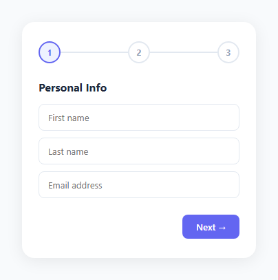
A multi-step form breaks a long form into manageable sections — account details, personal info, and confirmation — displayed one at a time, as in a checkout form or progress wizard. The stepper indicator at the top shows progress through the sections, reducing the cognitive load of a large single-page form.
The cur variable and update()
let cur = 1 tracks the current step (1-indexed). update() runs after every Next or Back click. For each step index i, it: shows/hides the step panel via .active class, updates the dot via .active (current) and .done (completed), and sets the dot's textContent to '✓' for done steps or the step number for active/pending. Back/Next buttons have boundary guards — Back is disabled at step 1, Next changes to Submit at step 3.
The dot stepper
Each dot is a 32px circle. .step-dot.active applies accent colour border and text. .step-dot.done applies filled accent background with white tick. The connecting lines between dots fill with accent colour for completed steps.
Step panel switching
Each .step-content panel has display: none by default. Adding .active switches to display: flex. Only one panel is active at a time — update() iterates all panels and sets the class based on the index comparison.
Validation before advancing
In a production form, validate the current step's fields before calling next(). If validation fails, show error messages and return without incrementing cur.
Step state management
The stepper has three states per step: pending (grey circle with number), active (accent ring with pulsing outer glow), and done (filled circle with checkmark). These are managed by index comparison: steps before currentStep are done, currentStep is active, steps after are pending. Each step dot uses CSS conditional classes rather than inline styles — this keeps the visual logic in CSS where it belongs.
Validation before advance
goNext() checks required fields in the current step before advancing: const required = currentPanel.querySelectorAll('[required]'); const valid = [...required].every(f => f.value.trim()). If any required field is empty, the step does not advance and the empty fields get a red border via .invalid class. This prevents users from reaching the final step with incomplete data.
Progress line fill
The connecting line between step dots fills progressively: width: (currentStep / totalSteps) * 100 + '%'. The line uses a gradient from accent to accent — a visual indicator of overall progress separate from the individual step dots.
Data collection across steps
Each input retains its value as steps change because the panels are shown/hidden via display toggle, not created/destroyed. Collect all form values at the final step using new FormData(formElement) or querySelectorAll('[name]') to gather all named inputs regardless of which panel they are in.
Build with AI
Build, Understand, Optimize, and Extend It With AI
Instead of tracing every classList.toggle call by hand, paste this snippet's HTML, CSS, and JS into an AI coding assistant like Claude and ask it to explain exactly how the single cur variable drives three independent visual systems at once — the step-dot fill and checkmark, the connecting line fill, and which .step panel is display: flex — inside one update() function. The same assistant can help optimize it, for instance asking whether looping from 1 to total on every single Next/Back click is wasteful compared to only touching the two steps whose state actually changed, or whether the hardcoded three-step total should instead be derived from counting .step elements in the DOM. It's also handy for extending the wizard: ask it to add real per-step required-field validation before cur++, persist entered values if the user navigates away and back, or swap the dot stepper for a labeled step-name version. Treat the code less like a finished artifact and more like a starting point for a conversation.
Prompt to recreate it
Copy this into your AI assistant of choice to build the effect from scratch, or as a jumping-off point for your own variant:
Build a "multi-step form wizard" in plain HTML, CSS, and JavaScript driven by a single current-step integer — no form library, no framework.

Requirements:
- A row of numbered circular step indicators connected by horizontal line segments, where each circle and its adjacent line segment must independently show one of three states (pending/grey, active/highlighted, or done/filled with a checkmark instead of its number), computed purely by comparing that step's position to the current step variable.
- Several form step panels, each hidden by default (display: none) and shown only when its index equals the current step, with a slide-and-fade-in animation each time a panel becomes active.
- A single function that, given the current step number, updates every dot's state, every connecting line's fill, and which panel is visible — so there is exactly one place where step-transition logic lives, not scattered across multiple handlers.
- A Back button that is hidden entirely on the first step and a Next button whose label changes to "Submit" on the second-to-last step and something like "Done" on the very last step.
- Before advancing past any step, check that step's required input fields have non-empty values; if any are empty, block the advance and visually flag the empty fields rather than silently failing.
- All step panels must remain in the DOM the whole time (not recreated), so any values a user typed on an earlier step are still present if they navigate back to it.
- The final step must be a distinct confirmation view (not just another form panel) with a success icon and message.
Want to tighten it up first? Run this prompt through the AI Prompt Studio to score it across 8 quality dimensions, catch anti-patterns, and tune the wording for Claude, ChatGPT, or Gemini before you paste it in.
Source Code
<div class="wizard">
  <div class="progress">
    <div class="step-dot active" id="d1">1</div>
    <div class="line" id="l1"></div>
    <div class="step-dot" id="d2">2</div>
    <div class="line" id="l2"></div>
    <div class="step-dot" id="d3">3</div>
  </div>

  <div class="step active" id="s1">
    <h3>Personal Info</h3>
    <div class="fields">
      <input type="text" placeholder="First name" />
      <input type="text" placeholder="Last name" />
      <input type="email" placeholder="Email address" />
    </div>
  </div>

  <div class="step" id="s2">
    <h3>Account Setup</h3>
    <div class="fields">
      <input type="text" placeholder="Username" />
      <input type="password" placeholder="Password" />
      <input type="password" placeholder="Confirm password" />
    </div>
  </div>

  <div class="step" id="s3">
    <h3>All Done! 🎉</h3>
    <p class="confirm-msg">Your account has been created successfully. Check your email for the verification link.</p>
    <div class="confirm-icon">✓</div>
  </div>

  <div class="actions">
    <button class="btn ghost" id="back-btn" onclick="prevStep()" style="display:none">Back</button>
    <button class="btn solid" id="next-btn" onclick="nextStep()">Next →</button>
  </div>
</div>
* { box-sizing: border-box; margin: 0; padding: 0; }
body { font-family: system-ui, sans-serif; background: #f8fafc; display: flex; align-items: center; justify-content: center; min-height: 100vh; padding: 20px; }
.wizard { background: #fff; border-radius: 18px; padding: 28px 24px; width: 340px; box-shadow: 0 4px 24px rgba(0,0,0,0.08); display: flex; flex-direction: column; gap: 24px; }
.progress { display: flex; align-items: center; }
.step-dot { width: 32px; height: 32px; border-radius: 50%; border: 2px solid #e2e8f0; background: #fff; display: flex; align-items: center; justify-content: center; font-size: 12px; font-weight: 700; color: #94a3b8; flex-shrink: 0; transition: all 0.25s; }
.step-dot.active { border-color: #6366f1; color: #6366f1; background: #eef2ff; }
.step-dot.done { border-color: #6366f1; background: #6366f1; color: #fff; }
.line { flex: 1; height: 2px; background: #e2e8f0; transition: background 0.25s; }
.line.done { background: #6366f1; }
.step { display: none; flex-direction: column; gap: 14px; }
.step.active { display: flex; animation: slideIn 0.2s ease; }
@keyframes slideIn { from { opacity:0; transform:translateX(12px); } to { opacity:1; transform:none; } }
h3 { font-size: 16px; font-weight: 700; color: #1e293b; }
.fields { display: flex; flex-direction: column; gap: 10px; }
.fields input { padding: 10px 13px; font-size: 13px; font-family: inherit; border: 1.5px solid #e2e8f0; border-radius: 8px; outline: none; color: #1e293b; transition: border-color 0.15s; }
.fields input:focus { border-color: #6366f1; }
.confirm-msg { font-size: 13px; color: #64748b; line-height: 1.65; }
.confirm-icon { font-size: 40px; text-align: center; color: #16a34a; }
.actions { display: flex; gap: 10px; justify-content: flex-end; }
.btn { padding: 9px 20px; font-size: 13px; font-weight: 600; border-radius: 8px; cursor: pointer; font-family: inherit; transition: all 0.15s; }
.btn.solid { background: #6366f1; color: #fff; border: none; }
.btn.solid:hover { background: #4f46e5; }
.btn.ghost { background: none; color: #475569; border: 1.5px solid #e2e8f0; }
.btn.ghost:hover { border-color: #6366f1; color: #6366f1; }let cur = 1;
const total = 3;
function update() {
for (let i = 1; i <= total; i++) {
document.getElementById('s'+i).classList.toggle('active', i === cur);
const dot = document.getElementById('d'+i);
dot.classList.toggle('active', i === cur);
dot.classList.toggle('done', i < cur);
dot.textContent = i < cur ? '✓' : i;
if (i < total) document.getElementById('l'+i).classList.toggle('done', i < cur);
}
document.getElementById('back-btn').style.display = cur > 1 ? 'block' : 'none';
const nextBtn = document.getElementById('next-btn');
nextBtn.textContent = cur === total - 1 ? 'Submit ✓' : cur === total ? 'Done' : 'Next →';
if (cur === total) nextBtn.style.background = '#16a34a';
}
function nextStep() { if (cur < total) { cur++; update(); } }
function prevStep() { if (cur > 1) { cur--; update(); } }Step by step
How to Use
- 1Click Next and BackClick Next to advance through steps. The dot stepper updates with active and done states. Click Back to return.
- 2Update step contentIn the HTML panel, change the heading, field labels, and input types in each .step-content div.
- 3Add a fourth stepAdd a .step-dot and connecting .line element in the stepper row, and a .step-content div. Update const total = 4 in the JS.
- 4Add step validationIn the JS next() function, check required fields before incrementing cur. If a field is empty, show an error and return.
- 5Change accent colourUpdate the accent colour (#6366f1) on .step-dot.active, .step-dot.done, and .connecting line in the CSS panel.
- 6Export in your formatClick "HTML" for a standalone file, "JSX" for a React component, or "Tailwind" for a React + Tailwind version.
Real-world uses
Common Use Cases
Got questions?
Frequently Asked Questions
next() increments cur if cur < total; prev() decrements if cur > 1. After either, update() runs — it loops i from 1 to total and applies .active/.done to each dot and .active to the matching step panel.
Each .line element between dots has a conditional class. Lines before the current step (i < cur) get .done applied via classList.toggle("done", i < cur). CSS .line.done applies the accent background colour.
Add a .step-dot, a connecting .line, and another .step-dot to the progress row in the HTML. Add a fourth .step-content div. Update const total = 4 in the JS. The update() loop handles any number of steps.
In next(), before cur++, read the current step's required fields: const inputs = document.querySelectorAll("#s" + cur + " input[required]"). Check each input.value. If any are empty, show an error message and return early without incrementing cur.
The Next button changes label to Submit at the last step. Wire the button's onclick to a submit function when cur === total, or replace the button with a real <button type="submit"> inside a <form> element.
Yes. Click "JSX" for a React component. In React, manage currentStep in useState. Derive dot states and panel visibility from currentStep in the render. Validate the current step panel's inputs in the next handler before incrementing.