

Learn Coding Visually
Learn to code with interactive, live-preview playgrounds — HTML, CSS, JavaScript, React & more.
 HTML Playground42 lessons · Click-based · Live preview
 CSS PlaygroundLearn CSS with a live editor
 JavaScript Playground60 lessons · DOM · Async · Canvas
 React PlaygroundLearn React with a live code editor
 GSAP PlaygroundLearn GSAP animation interactively
 SVG Playground44 lessons · shapes · paths · animation
 SCSS Playground45 lessons · Sass modules · tokens
 Tailwind PlaygroundLearn Tailwind CSS with a live editor
 Bootstrap 5 Playground50 lessons · live preview
Glide.js Testimonial Slider — Auto-Playing Quote Carousel Snippet
Glide.js Testimonial Slider · Misc · Plain HTML, CSS & JS · Live preview
What's included
Features
About this UI Snippet
Glide.js Testimonial Slider — How the Track, Slides, and Bullets Connect
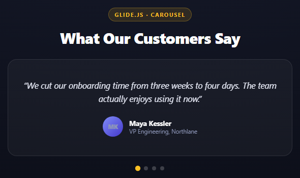
Glide.js deliberately does not generate any markup for you — unlike a lot of carousel libraries that hand you a single <div> and build everything internally, Glide expects a specific HTML skeleton and *progressively enhances* it. That's a real tradeoff: more markup to write, but the DOM is fully yours to style and inspect, and the slider degrades to a plain scrollable list if the script fails to load.
The required skeleton
html
<div class="glide">
  <div class="glide__track" data-glide-el="track">
    <ul class="glide__slides"> ... <li class="glide__slide">...</li> ... </ul>
  </div>
</div>
The outer .glide element is what you pass to new Glide(selector) — it's the mount point. data-glide-el="track" is not decorative; Glide's JS specifically queries for that attribute to find the element it will apply a CSS transform: translate3d() to as it moves between slides. Get the attribute wrong (or leave it off) and Glide silently fails to find its track and the slider does nothing. glide__slides and glide__slide are the classes Glide's own core CSS (the second CDN file, glide.core.min.css) uses to lay slides out in a flex row with 100% width each, which is what makes them sit side by side ready to be translated.
Mounting
js
var glide = new Glide('.gts-glide', { type: 'carousel', autoplay: 4000, perView: 1 });
glide.mount();
Construction alone does nothing — new Glide() just builds the configuration object. .mount() is the call that actually attaches Glide's internal components (Run, Swipe, Autoplay, etc.) and starts the slider. This two-step API is intentional: it lets you register custom components or event listeners between construction and mount if you need to hook into Glide's internals before it starts running.
type: 'carousel' vs type: 'slider'
Glide ships two fundamentally different navigation modes. type: 'slider' is bounded — it stops at the first and last slide and disables further navigation past the edges. type: 'carousel' is what this snippet uses: it loops infinitely, so navigating past the last testimonial wraps back to the first one seamlessly, which is exactly what continuous autoplay needs — an autoplaying slider-type carousel would just stop dead at the last slide.
Bullets are just anchors with a data attribute
data-glide-dir="=0", =1, etc. on each bullet button tell Glide's Controls component exactly which slide index to jump to when clicked (the = prefix means "go to this exact index," distinct from > / < which mean relative next/previous). Glide automatically applies glide__bullet--active to whichever bullet corresponds to the current slide, which is what the CSS hooks into to grow and recolor the active dot — no manual JS tracking of "which slide is active" is needed on your end.
hoverpause
hoverpause: true pauses the autoplay timer while the pointer is over the slider and resumes it on mouseleave — small detail, but it's the difference between a testimonial carousel a user can actually read versus one that keeps advancing mid-sentence.
Reusing it
Swap perView: 1 for perView: 3 with a peek option to preview adjacent testimonials, as in the product gallery slider snippet, or drop autoplay entirely and rely on arrow controls (data-glide-el="controls") for a user-driven testimonial wall.
Build with AI
Build, Understand, Optimize, and Extend It With AI
Glide's two-file, skeleton-driven approach is worth understanding before extending it, so ask an AI assistant like Claude to explain exactly what data-glide-el="track" and the glide__slides/glide__slide classes are for, and what breaks (silently) if you get one wrong. Then ask why type: 'carousel' is required here specifically because of autoplay, tracing through what type: 'slider' would do once it reached the last testimonial. Good extensions: add arrow controls alongside the existing dots, make each testimonial link out to a full case study, add a progress-bar-style autoplay indicator instead of static dots, or swap perView: 1 for perView: 2 on wide screens using Glide's breakpoints option. Pair it with the product gallery slider to see the same library configured for a very different perView/peek setup.
Prompt to recreate it
Copy this into your AI assistant of choice to build the effect from scratch, or as a jumping-off point for your own variant:
Build an auto-playing testimonial carousel using Glide.js (v3.6, from a CDN, both the JS and its core CSS file) in plain HTML, CSS, and JavaScript.

Requirements:
- Use Glide's required skeleton exactly: an outer div with class "glide", containing a div with class "glide__track" and data-glide-el="track", containing a ul with class "glide__slides" and 4 li elements with class "glide__slide" — do not deviate from these classes/attributes since Glide's JS specifically queries for them.
- Each slide should render a centered testimonial card: an italicized quote, a circular gradient avatar with initials (no external images), an author name, and their role/company.
- Below the track, add a bullet navigation block: a div with data-glide-el="controls[nav]" containing one button per slide, each with class "glide__bullet" and data-glide-dir="=N" (N being that slide's zero-based index).
- Initialize Glide with: new Glide('.your-glide-selector', { type: 'carousel', autoplay: 4000, perView: 1, hoverpause: true }) then call .mount(). Explain in the write-up why type must be 'carousel' (infinite loop) rather than the default 'slider' (which stops at the last slide) for autoplay to work continuously without dead-ending.
- Style the bullets so the active one (Glide automatically applies glide__bullet--active) is visually larger and differently colored than the inactive ones — do this with plain CSS, no JS tracking of which slide is active.
- Style it as a dark, centered, single-card-at-a-time slider with generous padding, matching a typical marketing testimonial section. Keep all JavaScript in var/function style, no ES modules.
Want to tighten it up first? Run this prompt through the AI Prompt Studio to score it across 8 quality dimensions, catch anti-patterns, and tune the wording for Claude, ChatGPT, or Gemini before you paste it in.
Source Code
<div class="gts-stage">
  <div class="gts-head">
    <span class="gts-tag">Glide.js · carousel</span>
    <h2>What Our Customers Say</h2>
  </div>
  <div class="glide gts-glide">
    <div class="glide__track" data-glide-el="track">
      <ul class="glide__slides">
        <li class="glide__slide">
          <div class="gts-card">
            <p class="gts-quote">“We cut our onboarding time from three weeks to four days. The team actually enjoys using it now.”</p>
            <div class="gts-author">
              <span class="gts-avatar" style="background:linear-gradient(135deg,#818cf8,#4338ca)">MK</span>
              <div><strong>Maya Kessler</strong><span>VP Engineering, Northlane</span></div>
            </div>
          </div>
        </li>
        <li class="glide__slide">
          <div class="gts-card">
            <p class="gts-quote">“Support response time went from 6 hours to under 20 minutes after we switched. Our NPS jumped 22 points.”</p>
            <div class="gts-author">
              <span class="gts-avatar" style="background:linear-gradient(135deg,#f472b6,#a855f7)">RT</span>
              <div><strong>Rui Tanaka</strong><span>Head of Support, Fjord</span></div>
            </div>
          </div>
        </li>
        <li class="glide__slide">
          <div class="gts-card">
            <p class="gts-quote">“Implementation took an afternoon, not a quarter. That alone paid for the first year of the contract.”</p>
            <div class="gts-author">
              <span class="gts-avatar" style="background:linear-gradient(135deg,#34d399,#059669)">AO</span>
              <div><strong>Amara Odu</strong><span>CTO, Ledger Labs</span></div>
            </div>
          </div>
        </li>
        <li class="glide__slide">
          <div class="gts-card">
            <p class="gts-quote">“The reporting dashboard alone justified the switch. Finance stopped asking us for manual exports.”</p>
            <div class="gts-author">
              <span class="gts-avatar" style="background:linear-gradient(135deg,#fb923c,#ea580c)">DL</span>
              <div><strong>Diego Larra</strong><span>Finance Ops, Trellis</span></div>
            </div>
          </div>
        </li>
      </ul>
    </div>
    <div class="glide__bullets gts-bullets" data-glide-el="controls[nav]">
      <button class="glide__bullet" data-glide-dir="=0"></button>
      <button class="glide__bullet" data-glide-dir="=1"></button>
      <button class="glide__bullet" data-glide-dir="=2"></button>
      <button class="glide__bullet" data-glide-dir="=3"></button>
    </div>
  </div>
</div>*{box-sizing:border-box;margin:0;padding:0}
body{font-family:system-ui,-apple-system,sans-serif;background:radial-gradient(120% 100% at 50% 0%,#171b2c,#090b13);color:#fff;min-height:100vh;display:flex;align-items:center;justify-content:center;padding:24px}
.gts-stage{width:min(560px,94vw);display:flex;flex-direction:column;align-items:center;gap:22px}
.gts-head{text-align:center}
.gts-tag{display:inline-block;font-size:11px;font-weight:700;letter-spacing:.14em;text-transform:uppercase;color:#fbbf24;background:rgba(251,191,36,.12);border:1px solid rgba(251,191,36,.3);padding:5px 12px;border-radius:99px;margin-bottom:12px}
.gts-head h2{font-size:clamp(22px,5vw,30px);font-weight:800;letter-spacing:-.02em}
.gts-glide{width:100%}
.gts-card{background:rgba(255,255,255,.04);border:1px solid rgba(255,255,255,.1);border-radius:18px;padding:34px 30px;display:flex;flex-direction:column;gap:22px;min-height:190px;justify-content:center;text-align:center}
.gts-quote{font-size:16.5px;line-height:1.6;color:#e6e9f5;font-style:italic}
.gts-author{display:flex;align-items:center;justify-content:center;gap:12px}
.gts-avatar{width:40px;height:40px;border-radius:50%;display:flex;align-items:center;justify-content:center;font:800 13px system-ui;color:#fff;flex:0 0 40px}
.gts-author div{display:flex;flex-direction:column;text-align:left}
.gts-author strong{font-size:13.5px}
.gts-author span{font-size:11.5px;color:#8e97b8}
.gts-bullets{display:flex;justify-content:center;gap:8px;margin-top:20px}
.gts-bullets .glide__bullet{width:8px;height:8px;border-radius:50%;border:none;background:rgba(255,255,255,.2);cursor:pointer;padding:0;transition:background .2s,transform .2s}
.gts-bullets .glide__bullet--active{background:#fbbf24;transform:scale(1.3)}var glide = new Glide('.gts-glide', {
type: 'carousel',
autoplay: 4000,
perView: 1,
animationDuration: 500,
hoverpause: true,
});
glide.mount();Step by step
How to Use
- 1Add both Glide.js CDN filesInclude glide.min.js and glide.core.min.css from the CDN panel — the CSS provides the track/slide layout.
- 2Paste HTML, CSS, and JSFour testimonial cards render one at a time with dot navigation below.
- 3Watch it autoplayautoplay: 4000 advances every 4 seconds; hoverpause: true stops it while you're reading.
- 4Click a dot to jumpdata-glide-dir="=N" on each bullet jumps straight to that testimonial.
- 5Notice the seamless looptype: 'carousel' wraps from the last testimonial back to the first with no dead stop.
- 6Add more testimonialsAdd another <li class="glide__slide"> and a matching bullet button — Glide adapts automatically.
Real-world uses
Common Use Cases
Got questions?
Frequently Asked Questions
Glide is a progressive-enhancement library: it queries specific data attributes (data-glide-el="track") and classes (glide__slides, glide__slide) to find the elements it needs to animate, rather than generating markup itself. This means the slider degrades to a readable, if static, list if the script fails to load, and you retain full control over the DOM structure.
new Glide(selector, options) only builds the configuration object — it does not touch the DOM. .mount() is the call that actually initializes Glide's internal components (Run, Swipe, Autoplay, Controls, etc.) and starts the slider running. Splitting construction from mounting gives you a place to register custom Glide components before anything becomes active.
type: 'slider' is bounded and stops navigating at the first and last slide. type: 'carousel' loops infinitely instead, wrapping from the last slide back to the first. Autoplay combined with type: 'slider' would just stop dead once it reached the final testimonial, so 'carousel' is required for continuous autoplay.
Each bullet has a data-glide-dir="=N" attribute where N is the target slide index. Glide's Controls component listens for clicks on elements with that attribute to trigger navigation, and separately applies a glide__bullet--active class to whichever bullet matches the currently showing slide index — you never manually track or toggle that class yourself.
With hoverpause: true (the default), Glide's Autoplay component listens for mouseenter/mouseleave on the slider and pauses/resumes the autoplay timer accordingly. Set it to false if you want the carousel to keep advancing even while the user's pointer is over it, though that usually hurts readability for text-heavy content like testimonials.
Add a second controls block with data-glide-el="controls" containing two buttons with data-glide-dir="<" and data-glide-dir=">" for previous/next. It can coexist with the bullets block used here — Glide supports multiple controls elements pointed at the same instance simultaneously.