Learn Coding Visually
Learn to code with interactive, live-preview playgrounds — HTML, CSS, JavaScript, React & more.
 HTML Playground42 lessons · Click-based · Live preview
 CSS PlaygroundLearn CSS with a live editor
 JavaScript Playground60 lessons · DOM · Async · Canvas
 React PlaygroundLearn React with a live code editor
 GSAP PlaygroundLearn GSAP animation interactively
 SVG Playground44 lessons · shapes · paths · animation
 SCSS Playground45 lessons · Sass modules · tokens
 Tailwind PlaygroundLearn Tailwind CSS with a live editor
 Bootstrap 5 Playground50 lessons · live preview
Glide.js Product Gallery Slider — Peek Effect Snippet
Glide.js Product Gallery Slider · Cards · Plain HTML, CSS & JS · Live preview
What's included
Features
About this UI Snippet
Glide.js Product Gallery Slider — perView, peek, and gap Explained
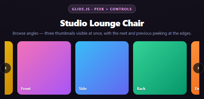
A single-item slider (like the testimonial slider) only has one number to think about. A multi-item gallery slider has three interacting numbers, and getting the visual "peek" effect right depends on understanding how they combine.
perView: how many whole slides are visible
perView: 3 tells Glide to size each slide's track width at roughly one-third of the track container, so three product angles are visible side by side at once instead of one at a time. This is a layout calculation Glide performs on mount and on every resize — it doesn't hardcode a pixel width, so the slider stays responsive without a media query.
peek: revealing part of the neighbors
peek: { before: 40, after: 40 }
peek is what actually produces the "next and previous images visible at the edges" look. It shrinks the *visible slide area* by a fixed pixel amount on each side and offsets the track so that much of the neighboring slide (before the first fully-visible one, and after the last) bleeds into view at the container's edges. Without peek, perView: 3 would show exactly three slides with hard edges flush against the container — functional, but it reads as "3 fixed slots" rather than "a scrollable filmstrip," and gives the user no visual cue that more images exist off to either side.
The before/after split lets you peek asymmetrically if needed (for example, more peek on the side the user is more likely to scroll toward), though this snippet uses equal values for a balanced, centered feel.
gap: spacing between slides, not container padding
gap: 14 inserts 14px of space *between* adjacent slides specifically — it's a property Glide manages internally as part of its width calculations, not a CSS margin you'd add yourself. Setting gap via plain CSS margin on .glide__slide would throw off Glide's own math for how wide each slide's *content* area should be relative to perView, since Glide already accounts for the configured gap when it computes per-slide width. That's why gap is a Glide option, not a stylesheet rule.
Arrow controls vs. bullets
This snippet swaps the testimonial slider's dot bullets for arrow buttons, using data-glide-el="controls" on the wrapping container and data-glide-dir="<"/">" (relative previous/next, unlike the "=N" absolute jump used for bullets) on the two buttons. Both controls types listen through the same Controls component internally — the difference is purely which data-glide-dir syntax you use and how many buttons you render.
Reusing it
Drop peek to { before: 0, after: 0 } for a gallery with hard edges instead of a filmstrip feel, or increase perView to 4-5 for a denser thumbnail strip. Pair the peek technique with the logo carousel snippet, which uses a similar perView setup but adds continuous autoplay instead of manual arrow navigation.
Build with AI
Build, Understand, Optimize, and Extend It With AI
Ask an AI assistant like Claude to explain, with numbers, how perView, peek, and gap combine to produce a slide's final pixel width — that arithmetic is the part most people get wrong when customizing a Glide gallery. Then ask what specifically would break visually if gap were added as CSS margin instead of the Glide option (slides would overflow the track or leave inconsistent spacing because Glide's own width math wouldn't account for it). Good extensions: add Glide's breakpoints option to drop to perView: 1 with no peek on mobile, add a thumbnail strip below the main slider that jumps to a slide on click (using "=N" direction), or sync a "currently viewing: 2 of 6" counter using Glide's run.after event. Pair with the logo carousel snippet to compare a manually-navigated peek gallery against a continuously autoplaying one.
Prompt to recreate it
Copy this into your AI assistant of choice to build the effect from scratch, or as a jumping-off point for your own variant:
Build a multi-visible product image gallery slider using Glide.js (v3.6, from a CDN, both the JS and its core CSS file) in plain HTML, CSS, and JavaScript.

Requirements:
- Use Glide's required skeleton: outer div.glide, div.glide__track with data-glide-el="track", ul.glide__slides containing 6 li.glide__slide elements, each showing a labeled square CSS-gradient placeholder representing a product angle (front, side, back, detail, in-room, fabric) — no external images.
- Add left/right arrow controls: a wrapping element with data-glide-el="controls" containing two buttons, one with data-glide-dir="<" and one with data-glide-dir=">", styled as circular floating buttons positioned over the vertical center of the track's edges.
- Initialize Glide with: perView: 3 (three thumbnails visible at once), peek: { before: 40, after: 40 } (so part of the previous and next thumbnails bleed into view at both edges, giving a filmstrip feel instead of hard-edged fixed slots), gap: 14, and type: 'carousel' for infinite looping. Call .mount() after constructing.
- In the write-up, explain clearly how perView, peek, and gap interact to determine each slide's actual rendered width, and why gap must be passed as a Glide option rather than added as CSS margin on the slide elements (Glide's internal width calculation already accounts for the configured gap value).
- Style it as a dark product-gallery panel with rounded square thumbnails and a soft shadow, centered on the page. Keep all JavaScript in var/function style, no ES modules.
Want to tighten it up first? Run this prompt through the AI Prompt Studio to score it across 8 quality dimensions, catch anti-patterns, and tune the wording for Claude, ChatGPT, or Gemini before you paste it in.
Source Code
<div class="ggs-stage">
  <div class="ggs-head">
    <span class="ggs-tag">Glide.js · peek + controls</span>
    <h2>Studio Lounge Chair</h2>
    <p>Browse angles — three thumbnails visible at once, with the next and previous peeking at the edges.</p>
  </div>
  <div class="glide ggs-glide">
    <div class="glide__track" data-glide-el="track">
      <ul class="glide__slides">
        <li class="glide__slide"><div class="ggs-img" style="background:linear-gradient(135deg,#f472b6,#a855f7)">Front</div></li>
        <li class="glide__slide"><div class="ggs-img" style="background:linear-gradient(135deg,#38bdf8,#6366f1)">Side</div></li>
        <li class="glide__slide"><div class="ggs-img" style="background:linear-gradient(135deg,#34d399,#059669)">Back</div></li>
        <li class="glide__slide"><div class="ggs-img" style="background:linear-gradient(135deg,#fb923c,#ea580c)">Detail</div></li>
        <li class="glide__slide"><div class="ggs-img" style="background:linear-gradient(135deg,#818cf8,#4338ca)">In Room</div></li>
        <li class="glide__slide"><div class="ggs-img" style="background:linear-gradient(135deg,#facc15,#ca8a04)">Fabric</div></li>
      </ul>
    </div>
    <div class="glide__arrows ggs-arrows" data-glide-el="controls">
      <button class="glide__arrow glide__arrow--left ggs-arrow" data-glide-dir="<">‹</button>
      <button class="glide__arrow glide__arrow--right ggs-arrow" data-glide-dir=">">›</button>
    </div>
  </div>
</div>*{box-sizing:border-box;margin:0;padding:0}
body{font-family:system-ui,-apple-system,sans-serif;background:radial-gradient(120% 100% at 50% 0%,#181420,#0a0812);color:#fff;min-height:100vh;display:flex;align-items:center;justify-content:center;padding:24px}
.ggs-stage{width:min(620px,94vw);display:flex;flex-direction:column;align-items:center;gap:18px}
.ggs-head{text-align:center}
.ggs-tag{display:inline-block;font-size:11px;font-weight:700;letter-spacing:.14em;text-transform:uppercase;color:#f0abfc;background:rgba(240,171,252,.12);border:1px solid rgba(240,171,252,.3);padding:5px 12px;border-radius:99px;margin-bottom:12px}
.ggs-head h2{font-size:clamp(22px,5vw,28px);font-weight:800;letter-spacing:-.02em}
.ggs-head p{font-size:13px;color:#8e97b8;margin-top:6px}
.ggs-glide{width:100%;position:relative}
.glide__track{overflow:hidden}
.ggs-img{aspect-ratio:1;border-radius:14px;display:flex;align-items:flex-end;padding:12px;font:700 12px system-ui;color:rgba(255,255,255,.9);text-shadow:0 1px 3px rgba(0,0,0,.4);box-shadow:0 10px 26px -16px rgba(0,0,0,.8)}
.ggs-arrows{position:absolute;top:50%;left:0;right:0;transform:translateY(-50%);display:flex;justify-content:space-between;padding:0 -6px;pointer-events:none}
.ggs-arrow{pointer-events:auto;width:34px;height:34px;border-radius:50%;border:1px solid rgba(255,255,255,.18);background:rgba(10,10,16,.72);color:#fff;font-size:17px;cursor:pointer;display:flex;align-items:center;justify-content:center;transition:background .18s,transform .18s}
.ggs-arrow:hover{background:rgba(240,171,252,.28);transform:scale(1.08)}
.glide__arrow--left{margin-left:-14px}
.glide__arrow--right{margin-right:-14px}var glide = new Glide('.ggs-glide', {
type: 'carousel',
perView: 3,
peek: { before: 40, after: 40 },
gap: 14,
animationDuration: 400,
});
glide.mount();Step by step
How to Use
- 1Add both Glide.js CDN filesInclude glide.min.js and glide.core.min.css from the CDN panel.
- 2Paste HTML, CSS, and JSSix product-angle thumbnails render, three visible at once with peeking edges.
- 3Notice the peek effectpeek: { before: 40, after: 40 } bleeds part of the adjacent slide into view at both edges.
- 4Click the arrow buttonsdata-glide-dir="<" and ">" step one slide at a time using relative navigation.
- 5Resize the windowperView recalculates slide width as a fraction of the container, staying responsive without a media query.
- 6Adjust gap and peekChange the numeric values to make the filmstrip feel tighter or looser.
Real-world uses
Common Use Cases
Got questions?
Frequently Asked Questions
peek doesn't change how many whole slides are counted by perView — it shrinks the fully-visible track area by a fixed pixel amount on each side and shifts the track so part of the neighboring slide bleeds into that space. The result is a filmstrip feel where you can see a sliver of what's next, rather than perView slides with clean, closed edges.
Glide computes each slide's width internally based on perView, peek, and gap together, so the gap has to be a value Glide's own layout math is aware of. Adding spacing via a plain CSS margin on .glide__slide would double-count with, or throw off, Glide's internal width calculation, causing slides to overflow or leave inconsistent visible widths.
"<" and ">" are relative directions — go back or forward one slide from wherever the slider currently is — used for arrow controls. "=N" is an absolute jump to a specific zero-based slide index, used for bullet/dot navigation where each button maps to one exact slide.
Yes — peek: { before: 20, after: 60 } would reveal less of the previous slide and more of the next one, useful if you want to visually bias attention toward "there's more ahead." This snippet uses equal values for a symmetric, centered look.
Glide recalculates each slide's pixel width on mount and on window resize, always as a proportion of the current track container width (accounting for peek and gap). Because the calculation re-runs automatically, the same perView: 3 configuration adapts to any container size without you writing breakpoint-specific CSS.
Use Glide's breakpoints option: new Glide(sel, { perView: 3, breakpoints: { 640: { perView: 1, peek: { before: 0, after: 0 } } } }). Glide watches window width and swaps in the override config for whichever breakpoint currently applies, without you writing your own resize listener.