Learn Coding Visually
Learn to code with interactive, live-preview playgrounds — HTML, CSS, JavaScript, React & more.
 HTML Playground42 lessons · Click-based · Live preview
 CSS PlaygroundLearn CSS with a live editor
 JavaScript Playground60 lessons · DOM · Async · Canvas
 React PlaygroundLearn React with a live code editor
 GSAP PlaygroundLearn GSAP animation interactively
 SVG Playground44 lessons · shapes · paths · animation
 SCSS Playground45 lessons · Sass modules · tokens
 Tailwind PlaygroundLearn Tailwind CSS with a live editor
 Bootstrap 5 Playground50 lessons · live preview
ScrollOut Timeline Cascade — CSS-Driven Reveal Snippet
ScrollOut Timeline Cascade · Misc · Plain HTML, CSS & JS · Live preview
What's included
Features
About this UI Snippet
ScrollOut Timeline Cascade — Where ScrollOut Ends and CSS Begins
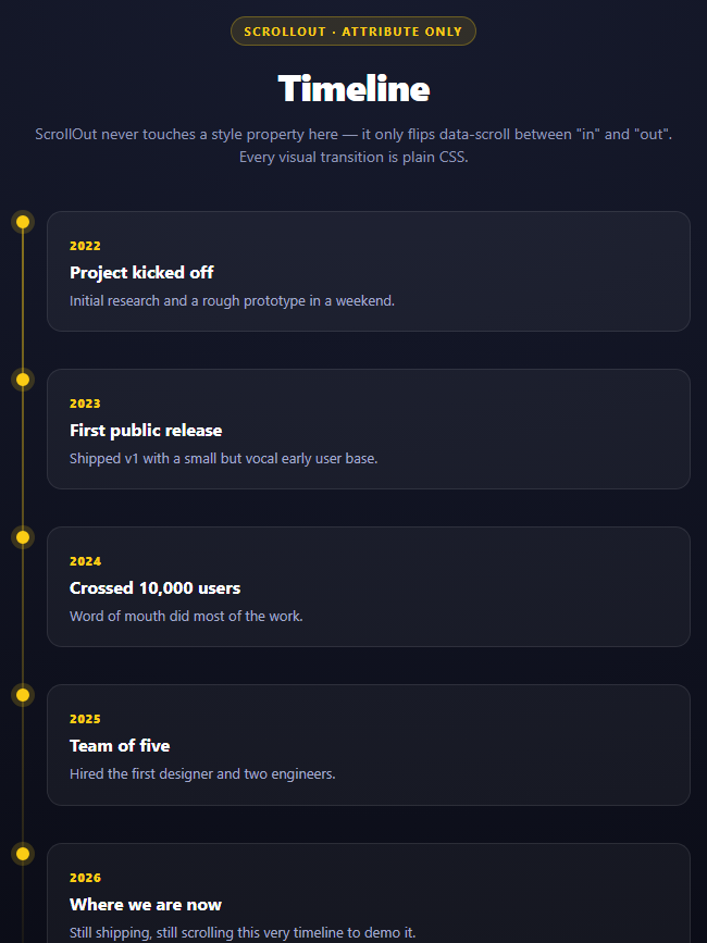
Compare this snippet's JavaScript to anime.js's ripple grid and the difference in *philosophy* is the whole story. The ripple grid's JS owns everything — it computes delay, defines keyframes, sets duration and easing, and directly mutates transform, backgroundColor, and borderRadius on every frame. This timeline's JS is five lines and touches zero style properties. That's not a simpler version of the same idea; it's a categorically different tool.
What ScrollOut actually does: attribute toggling, nothing else
js
ScrollOut({
  targets: '.stc-entry',
  threshold: 0.35,
  once: false
});
That call does exactly one job: watch every .stc-entry, and the moment one crosses 35% visibility, write data-scroll="in" onto it (and data-scroll="out" when it leaves, since once: false keeps tracking after the first reveal instead of detaching). It does not know what data-scroll="in" is supposed to *look like*. It has no opinion on whether that should be a fade, a slide, a color change, or nothing at all. From ScrollOut's point of view, an entry becoming visible and an entry's checkout button being enabled are the same kind of event — it fires the attribute change and steps back.
Where the actual animation lives
Every pixel of motion in this timeline is this CSS rule pair:
css
.stc-entry{opacity:0;transform:translateX(-18px);transition:opacity .5s ease,transform .5s ease}
.stc-entry[data-scroll="in"]{opacity:1;transform:translateX(0)}
The base state is invisible and shifted left; the [data-scroll="in"] attribute selector overrides both properties back to their resting values, and because transition is declared on the base rule, the browser animates between whichever two states are currently active — no @keyframes, no JS-driven requestAnimationFrame loop, nothing but the CSS transition engine doing what it always does when a matched property changes value.
Why this division of labor is worth knowing
This is the *inverse* of the "hidden until revealed" WOW.js pattern too — WOW.js toggles a class and lets animate.css's keyframes take over, while ScrollOut toggles an attribute and leaves plain CSS transitions (not even a separate animation library) to take over. Once you see ScrollOut only ever writing data-scroll/--custom-properties and never a style, it becomes obvious that ScrollOut is a visibility *sensor*, not an animation *engine* — and that's a deliberate scope decision, not a missing feature. It means you can restyle every entrance in this timeline by editing CSS alone, with the JS untouched, which is not true of the anime.js-driven snippets in this library.
once: false and re-triggering
Setting once: false (ScrollOut's default is actually to keep tracking, but it's made explicit here) means scrolling an entry back out of view flips it to data-scroll="out", and the CSS transitions it back to the hidden state — so scrolling up and back down replays the entrance. Set once: true if you want each entry to lock into its revealed state permanently after the first reveal.
Build with AI
Build, Understand, Optimize, and Extend It With AI
This snippet is best used to have an AI articulate a boundary rather than explain a trick. Paste it into an assistant like Claude and ask it to state precisely what ScrollOut is responsible for versus what plain CSS is responsible for in this timeline, and to contrast that division against a library like anime.js (which owns both halves) or WOW.js (which toggles a class but still lets animate.css's own keyframes do the work). Then ask what would happen, concretely, if you deleted the [data-scroll="in"] CSS rule but kept the ScrollOut call — the attribute would still be written correctly, but nothing would visibly change, which is a good way to prove the split is real. To extend it: ask for a horizontal-alternating timeline (entries left/right of a center line), a version using ScrollOut's cssProps to drive a --visible-y-based scrub effect instead of a binary in/out state, or a version that also updates a connecting-line "fill" height as entries reveal.
Prompt to recreate it
Copy this into your AI assistant of choice to build the effect from scratch, or as a jumping-off point for your own variant:
Build a vertical timeline using ScrollOut (v2, from a CDN) in plain HTML, CSS, and JavaScript.

Requirements:
- A vertical line with at least 5 timeline entries (date, heading, short description) each positioned with a small dot on the line and a card to its right.
- Each entry element must carry the data-scroll attribute (ScrollOut's default targets selector is [data-scroll], so no targets option is needed).
- Initialize with ScrollOut({ targets: '.entry-class', threshold: 0.35, once: false }) — a 5-line JS call, nothing more. Do NOT set any inline styles, animate any property, or use any animation library from JavaScript.
- Write 100% of the actual animation in plain CSS: a base state with opacity: 0 and a horizontal transform offset, a transition property declared on that base rule, and a [data-scroll="in"] attribute-selector rule that overrides opacity and transform back to their resting values — this attribute-selector rule is what the browser's CSS transition engine actually animates between.
- Also recolor each entry's timeline dot via the same [data-scroll="in"] selector, so the dot and the card animate off the same attribute state.
- Add a code comment above the ScrollOut() call explicitly stating the division of labor: ScrollOut decides WHEN (visibility, via the data-scroll attribute) and CSS decides HOW (the actual transform/opacity/timing), unlike a library such as anime.js that owns both halves in one JS call.
- Style as a dark themed page with a gradient-faded vertical line and glowing dots on revealed entries, with enough content that entries start below the fold.
Want to tighten it up first? Run this prompt through the AI Prompt Studio to score it across 8 quality dimensions, catch anti-patterns, and tune the wording for Claude, ChatGPT, or Gemini before you paste it in.
Source Code
<div class="stc-stage">
  <div class="stc-head">
    <span class="stc-tag">ScrollOut · attribute only</span>
    <h2>Timeline</h2>
    <p>ScrollOut never touches a style property here — it only flips data-scroll between "in" and "out". Every visual transition is plain CSS.</p>
  </div>
  <div class="stc-line">
    <div class="stc-entry" data-scroll>
      <div class="stc-dot"></div>
      <div class="stc-card"><span class="stc-date">2022</span><h3>Project kicked off</h3><p>Initial research and a rough prototype in a weekend.</p></div>
    </div>
    <div class="stc-entry" data-scroll>
      <div class="stc-dot"></div>
      <div class="stc-card"><span class="stc-date">2023</span><h3>First public release</h3><p>Shipped v1 with a small but vocal early user base.</p></div>
    </div>
    <div class="stc-entry" data-scroll>
      <div class="stc-dot"></div>
      <div class="stc-card"><span class="stc-date">2024</span><h3>Crossed 10,000 users</h3><p>Word of mouth did most of the work.</p></div>
    </div>
    <div class="stc-entry" data-scroll>
      <div class="stc-dot"></div>
      <div class="stc-card"><span class="stc-date">2025</span><h3>Team of five</h3><p>Hired the first designer and two engineers.</p></div>
    </div>
    <div class="stc-entry" data-scroll>
      <div class="stc-dot"></div>
      <div class="stc-card"><span class="stc-date">2026</span><h3>Where we are now</h3><p>Still shipping, still scrolling this very timeline to demo it.</p></div>
    </div>
  </div>
</div>*{box-sizing:border-box;margin:0;padding:0}
body{font-family:system-ui,-apple-system,sans-serif;background:radial-gradient(120% 100% at 50% 0%,#171b2e,#090a13);color:#fff;min-height:100vh;padding:48px 24px 200px}
.stc-stage{max-width:620px;margin:0 auto;display:flex;flex-direction:column;gap:40px}
.stc-head{text-align:center}
.stc-tag{display:inline-block;font-size:11px;font-weight:700;letter-spacing:.14em;text-transform:uppercase;color:#facc15;background:rgba(250,204,21,.12);border:1px solid rgba(250,204,21,.3);padding:5px 12px;border-radius:99px;margin-bottom:14px}
.stc-head h2{font-size:clamp(24px,4.4vw,34px);font-weight:800;letter-spacing:-.02em}
.stc-head p{font-size:14px;color:#9198b8;margin-top:10px;line-height:1.5}
.stc-line{position:relative;padding-left:28px}
.stc-line::before{content:'';position:absolute;left:5px;top:6px;bottom:6px;width:2px;background:linear-gradient(180deg,rgba(250,204,21,.5),rgba(250,204,21,.05))}
.stc-entry{position:relative;margin-bottom:34px}
.stc-entry:last-child{margin-bottom:0}
.stc-dot{position:absolute;left:-28px;top:4px;width:12px;height:12px;border-radius:50%;background:#0b0d18;border:2px solid rgba(250,204,21,.4);transition:background .3s,border-color .3s,box-shadow .3s}
/* This is the entire animation. ScrollOut only sets data-scroll="in" or "out" on
.stc-entry -- every transform, opacity, and transition-timing value below is
ordinary CSS with zero JavaScript involvement. */
.stc-entry{opacity:0;transform:translateX(-18px);transition:opacity .5s ease,transform .5s ease}
.stc-entry[data-scroll="in"]{opacity:1;transform:translateX(0)}
.stc-entry[data-scroll="in"] .stc-dot{background:#facc15;border-color:#facc15;box-shadow:0 0 0 5px rgba(250,204,21,.18)}
.stc-card{background:rgba(255,255,255,.045);border:1px solid rgba(255,255,255,.09);border-radius:14px;padding:18px 20px}
.stc-date{display:inline-block;font-size:11px;font-weight:800;color:#facc15;letter-spacing:.06em;margin-bottom:6px}
.stc-card h3{font-size:16px;font-weight:700;margin-bottom:6px}
.stc-card p{font-size:13px;color:#a3aacb;line-height:1.55}// The full division of labor: ScrollOut decides WHEN an entry is visible and writes
// that decision as an attribute (data-scroll="in" / "out"). It never sets a single
// style property. 100% of the actual animation -- the translateX, the opacity fade,
// the easing curve, the 0.5s duration -- lives in the CSS above via the
// [data-scroll="in"] selector. This is different from a library like anime.js, which
// owns both the "when" and the "how" of an animation in one call.
ScrollOut({
targets: '.stc-entry',
threshold: 0.35,
once: false
});Step by step
How to Use
- 1Add the ScrollOut CDN scriptA single script tag — no CSS dependency shipped by the library itself.
- 2Mark timeline entries with data-scrollScrollOut's default targets selector is [data-scroll], so no extra selector config is required.
- 3Write the CSS transition yourselfBase state hidden/offset, and a [data-scroll="in"] rule overriding it — ScrollOut supplies neither.
- 4Call ScrollOut with a thresholdthreshold: 0.35 controls how much of an entry must show before it flips to "in".
- 5Set once: false to allow replayEntries revert to data-scroll="out" when scrolled back out of view, replaying on re-entry.
- 6Style the connecting line and dots separatelyThese are static CSS, unrelated to ScrollOut, forming the timeline's visual spine.
Real-world uses
Common Use Cases
Got questions?
Frequently Asked Questions
No. ScrollOut only writes a data-scroll="in" or data-scroll="out" attribute onto each .stc-entry based on visibility. Every visual change — the fade, the slide, the timing — comes from the CSS transition and the [data-scroll="in"] attribute selector, not from ScrollOut.
anime.js's stagger call owns both when an animation happens and exactly how it looks — it directly sets scale, color, and radius keyframes in JS. ScrollOut only decides when (via the data-scroll attribute); the how is entirely separate CSS that ScrollOut never reads or writes.
It keeps ScrollOut watching an entry after its first reveal, so scrolling it back out of the viewport flips data-scroll back to "out" and the CSS transition reverses. Setting once: true would lock each entry into its revealed state permanently after the first time it's shown.
A lower threshold would flip data-scroll to "in" the moment a sliver of an entry's top edge enters the viewport, before it is realistically readable. 0.35 requires more of the card to actually be visible first.
Yes — that is the point of this division of labor. Edit only the CSS transition and the [data-scroll="in"] rule (e.g. switch translateX for translateY, or add a scale), and the ScrollOut configuration itself never needs to change.
No. ScrollOut ships no CSS at all — it is purely a JS visibility tracker. All styling, including the hidden/attribute-selector transition pattern used here, is authored by hand.