
Learn Coding Visually
Learn to code with interactive, live-preview playgrounds — HTML, CSS, JavaScript, React & more.
 HTML Playground42 lessons · Click-based · Live preview
 CSS PlaygroundLearn CSS with a live editor
 JavaScript Playground60 lessons · DOM · Async · Canvas
 React PlaygroundLearn React with a live code editor
 GSAP PlaygroundLearn GSAP animation interactively
 SVG Playground44 lessons · shapes · paths · animation
 SCSS Playground45 lessons · Sass modules · tokens
 Tailwind PlaygroundLearn Tailwind CSS with a live editor
 Bootstrap 5 Playground50 lessons · live preview
Chartist.js Animated Donut Chart — Staggered Slice Sweep Snippet
Chartist.js Animated Donut Chart · Charts · Plain HTML, CSS & JS · Live preview
What's included
Features
About this UI Snippet
Chartist.js Animated Donut Chart — Animating Slices Instead of a Line
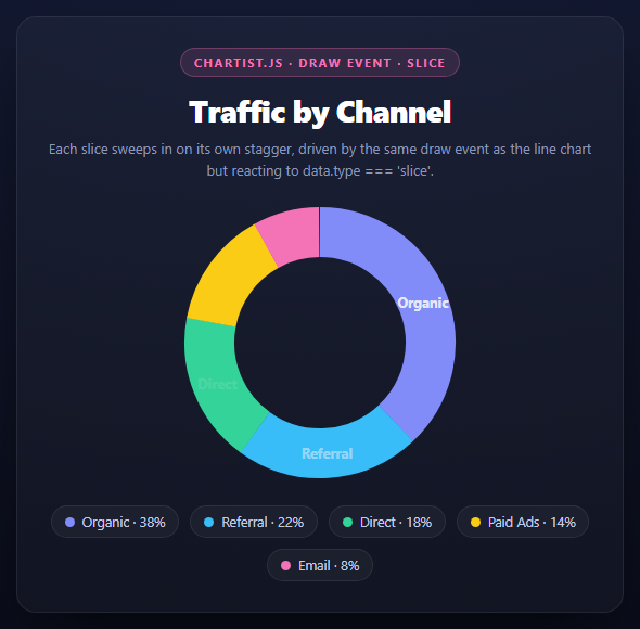
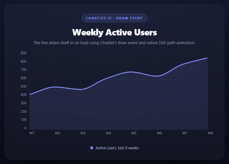
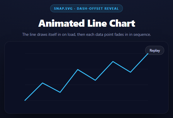
The animated line chart in this library reacts to data.type === 'line' inside Chartist's draw event. A donut chart is built from the same event, but the element type that arrives is completely different — 'slice' — and understanding why the animation technique still works, with different numbers, is the actual lesson here.
Slices are arcs, not one continuous path
Chartist renders each wedge of a donut or pie chart as its own separate SVG <path> describing an arc — one element per data value, not one shared path split into segments. That's why chart.on('draw', ...) fires once per slice with data.type === 'slice' and a data.index telling you which wedge you're looking at. Each of these arc paths has its own getTotalLength(), proportional to how large that slice's share of the total is — a 38% "Organic" wedge has a longer arc length than an 8% "Email" wedge, and the animation code below reads that per-slice, not once for the whole chart.
The same dash trick, applied per-arc
js
var length = data.element._node.getTotalLength();
data.element.attr({ 'stroke-dasharray': length + 'px ' + length + 'px' });
data.element.animate({ 'stroke-dashoffset': { from: -length, to: 0, ... } });
This is the identical dash-length technique from the line chart snippet, adapted to a closed arc: dasharray is set to the slice's own arc length (twice, dash-then-gap, expressed with explicit px units because Chartist's donut slices are stroked paths rather than filled shapes), and stroke-dashoffset animates from negative the length to 0. The negative starting offset is the detail that differs from the line chart — it makes the dash appear to sweep in starting from the slice's own start angle rather than appearing to retract from its far end, which reads correctly for a clockwise donut sweep instead of looking like it's unwinding backward.
Staggering wedge-by-wedge with begin
begin: data.index * 160 delays each slice's animation start by 160ms times its index, so the donut fills in visibly one wedge at a time — Organic sweeps in first, then Referral starts as Organic finishes, and so on. This is the exact same begin-based stagger pattern used for the point reveal in the line chart snippet, just applied to full wedges instead of small dots.
Labels wait for their slice
The data.type === 'label' branch fades in each percentage label only after its own slice has had time to sweep most of the way in (begin: 700 + data.index * 160), so a label never appears floating over an empty, not-yet-drawn wedge.
Per-series coloring without a CSS class per slice
Chartist generates series classes as .ct-series-a, .ct-series-b, etc. — letter suffixes in data order, not by label. Since there's no built-in per-slice color option in the options object for a plain array of numbers, this snippet builds one small <style> block at runtime mapping each generated series letter to a color from the COLORS array, keeping the color list defined once in JS rather than duplicated as hardcoded CSS.
Build with AI
Build, Understand, Optimize, and Extend It With AI
This snippet pairs well with an AI conversation about a subtle sign-flip: paste it into an assistant like Claude alongside the animated line chart snippet from this same library, and ask it to explain precisely why the donut sweep animates stroke-dashoffset from -length to 0 while the line chart animates from +length to 0, and what would visually change if you swapped the two. Also worth asking: why data.index matters twice here — once for the stagger delay and once implicitly through Chartist's auto-generated ct-series-{letter} classes, and whether those two uses of index could ever get out of sync (they can't, since both come from the same series array order, but it's worth having the AI confirm why). To extend it: ask for a version that also displays a live-updating center total using chart.update(), a version where clicking a slice highlights it by dimming the others, or a version that converts this into a true pie chart (donut: false) with an outward "explode" offset per slice on hover.
Prompt to recreate it
Copy this into your AI assistant of choice to build the effect from scratch, or as a jumping-off point for your own variant:
Build an animated donut chart using Chartist.js (v1.3.0, from a CDN, both the JS and its index.css) in plain HTML, CSS, and JavaScript, where each slice sweeps into place with a staggered delay.

Requirements:
- A 5-category donut chart created with new Chartist.PieChart('#selector', { labels, series: [numeric values] }, { donut: true, donutWidth: 46, showLabel: true, total: sum of the series }), styled to sit in a dark card panel with a legend list below it showing each category's color swatch, name, and percentage.
- Attach a chart.on('draw', function(data) { ... }) listener that checks data.type. For data.type === 'slice': read the wedge's real arc length with data.element._node.getTotalLength(), set stroke-dasharray to that length twice (as "Npx Npx"), and animate stroke-dashoffset from NEGATIVE that length to 0 over ~700ms with an eased curve — explain in a comment why the negative starting value (rather than positive, as a straight line chart would use) makes the arc sweep in the correct clockwise direction for a closed arc shape. Stagger each slice's animation with begin: data.index * 160 so wedges sweep in sequentially, not simultaneously.
- For data.type === 'label': fade each percentage label's opacity from 0 to 1, with a begin delay timed to start after its own slice has mostly finished sweeping (roughly 700 + data.index * 160).
- Since Chartist generates anonymous ct-series-a/b/c/... classes for a plain numeric series array, generate a <style> block at runtime in JS that maps each generated series letter to a color from a COLORS array, and build the legend list from the same LABELS/VALUES/COLORS arrays so nothing is duplicated between JS and hardcoded CSS.
Want to tighten it up first? Run this prompt through the AI Prompt Studio to score it across 8 quality dimensions, catch anti-patterns, and tune the wording for Claude, ChatGPT, or Gemini before you paste it in.
Source Code
<div class="cad-stage">
  <div class="cad-head">
    <span class="cad-tag">Chartist.js · draw event · slice</span>
    <h2>Traffic by Channel</h2>
    <p>Each slice sweeps in on its own stagger, driven by the same draw event as the line chart but reacting to data.type === 'slice'.</p>
  </div>
  <div class="cad-chart" id="cadChart"></div>
  <ul class="cad-legend" id="cadLegend"></ul>
</div>*{box-sizing:border-box;margin:0;padding:0}
body{font-family:system-ui,-apple-system,sans-serif;background:radial-gradient(120% 100% at 50% 0%,#161d38,#080a14);color:#fff;min-height:100vh;display:flex;align-items:center;justify-content:center;padding:24px}
.cad-stage{width:min(560px,94vw);display:flex;flex-direction:column;gap:20px;background:rgba(255,255,255,.03);border:1px solid rgba(255,255,255,.08);border-radius:18px;padding:28px;box-shadow:0 24px 60px -24px rgba(0,0,0,.8)}
.cad-head{text-align:center}
.cad-tag{display:inline-block;font-size:11px;font-weight:700;letter-spacing:.14em;text-transform:uppercase;color:#f472b6;background:rgba(244,114,182,.12);border:1px solid rgba(244,114,182,.3);padding:5px 12px;border-radius:99px;margin-bottom:12px}
.cad-head h2{font-size:clamp(22px,4.4vw,28px);font-weight:800;letter-spacing:-.02em}
.cad-head p{font-size:13px;color:#8e97b8;margin-top:7px;line-height:1.5}
.cad-chart{height:260px}
.cad-chart .ct-label{fill:#eef0fb;font-size:.8rem;font-weight:700}
.cad-legend{list-style:none;display:flex;flex-wrap:wrap;gap:10px;justify-content:center}
.cad-legend li{display:flex;align-items:center;gap:7px;font-size:12.5px;color:#c3cbe8;background:rgba(255,255,255,.04);border:1px solid rgba(255,255,255,.08);padding:6px 12px;border-radius:99px}
.cad-legend .cad-swatch{width:9px;height:9px;border-radius:50%;display:inline-block}var LABELS = ['Organic', 'Referral', 'Direct', 'Paid Ads', 'Email'];
var VALUES = [38, 22, 18, 14, 8];
var COLORS = ['#818cf8', '#38bdf8', '#34d399', '#facc15', '#f472b6'];
var data = { labels: LABELS, series: VALUES };
var options = {
donut: true,
donutWidth: 46,
showLabel: true,
labelInterpolationFnc: function (label) { return label; },
startAngle: 0,
total: VALUES.reduce(function (a, b) { return a + b; }, 0)
};
var chart = new Chartist.PieChart('#cadChart', data, options);
// Same draw event Chartist fires for every element type, but for a donut/pie chart
// each wedge comes through as data.type === 'slice', carrying data.index so we can
// stagger each one's entrance relative to the others.
chart.on('draw', function (data) {
if (data.type === 'slice') {
// pathLength is the arc length of this specific wedge -- donut slices are drawn
// as SVG arcs, and each one has its own stroke length depending on how large its
// percentage of the total is. Reusing the same dasharray/dashoffset sweep trick
// as the line chart draws each wedge as an arc sweeping clockwise into place.
var length = data.element._node.getTotalLength();
data.element.attr({ 'stroke-dasharray': length + 'px ' + length + 'px' });
data.element.animate({
'stroke-dashoffset': {
id: 'sweep' + data.index,
dur: 700,
from: -length,
to: 0,
easing: Chartist.Svg.Easing.easeOutQuint,
// Stagger: each slice waits for roughly the previous ones to finish sweeping
// before it starts, so the donut fills in wedge by wedge rather than all
// wedges sweeping simultaneously.
begin: data.index * 160
}
});
}
if (data.type === 'label') {
data.element.attr({ opacity: 0 });
data.element.animate({
opacity: { dur: 400, from: 0, to: 1, begin: 700 + data.index * 160, easing: 'ease' }
});
}
});
var colorStyle = document.createElement('style');
colorStyle.textContent = LABELS.map(function (_, i) {
return '.cad-chart .ct-series-' + String.fromCharCode(97 + i) + ' .ct-slice-donut{stroke:' + COLORS[i] + '}';
}).join('\n');
document.head.appendChild(colorStyle);
var legend = document.getElementById('cadLegend');
LABELS.forEach(function (label, i) {
var li = document.createElement('li');
li.innerHTML = '<span class="cad-swatch" style="background:' + COLORS[i] + '"></span>' + label + ' · ' + VALUES[i] + '%';
legend.appendChild(li);
});Step by step
How to Use
- 1Add both Chartist CDN filesThe JS bundle and index.css — required for both charts in this library.
- 2Create the chart with donut: truenew Chartist.PieChart(selector, data, { donut: true, donutWidth: 46, ... }).
- 3Listen for data.type === "slice"Each wedge fires its own draw event with a per-slice arc length and index.
- 4Sweep each slice from -length to 0The negative starting offset makes the arc sweep clockwise from its start angle.
- 5Stagger with begin: index * 160Wedges sweep in one after another rather than all at once.
- 6Color slices via a generated stylesheetMap each .ct-series-{letter} class to a color since donut data is a plain value array.
Real-world uses
Common Use Cases
Got questions?
Frequently Asked Questions
A line is one continuous SVG path for the whole series; a donut slice is a separate arc-shaped path per data value. That's why the draw event fires with data.type === "slice" once per wedge, each carrying its own arc length and data.index, rather than once for the whole series.
A negative starting offset makes the visible dash sweep in starting from the arc's own beginning point, matching the donut's natural clockwise draw direction. Starting from +length (as the line chart does) would make this particular arc shape appear to unwind from the wrong end.
begin: data.index * 160 delays each wedge's animation start proportionally to its position in the series, so wedges sweep in one after another. Without it, all wedges would animate simultaneously and the sequential reveal effect would be lost.
Chartist auto-generates series classes like ct-series-a, ct-series-b in data order, with no built-in way to assign colors by label for a plain numeric series array. Generating the CSS at runtime from one COLORS array keeps the color list defined in a single place instead of duplicated between JS and a hand-written stylesheet.
Each label's begin delay is timed to start after its own slice has mostly finished sweeping in, so a percentage label never appears floating over a wedge that hasn't been drawn yet.
Yes — set donut: false (or omit it) and the draw event still fires with data.type === "slice" for each wedge; the arc-length sweep animation works identically since it operates on the slice's actual rendered path regardless of whether the center is hollow.