

Learn Coding Visually
Learn to code with interactive, live-preview playgrounds — HTML, CSS, JavaScript, React & more.
 HTML Playground42 lessons · Click-based · Live preview
 CSS PlaygroundLearn CSS with a live editor
 JavaScript Playground60 lessons · DOM · Async · Canvas
 React PlaygroundLearn React with a live code editor
 GSAP PlaygroundLearn GSAP animation interactively
 SVG Playground44 lessons · shapes · paths · animation
 SCSS Playground45 lessons · Sass modules · tokens
 Tailwind PlaygroundLearn Tailwind CSS with a live editor
 Bootstrap 5 Playground50 lessons · live preview
Chartist.js Animated Line Chart — Self-Drawing SVG Snippet
Chartist.js Animated Line Chart · Charts · Plain HTML, CSS & JS · Live preview
What's included
Features
About this UI Snippet
Chartist.js Animated Line Chart — The Real draw Event Pattern
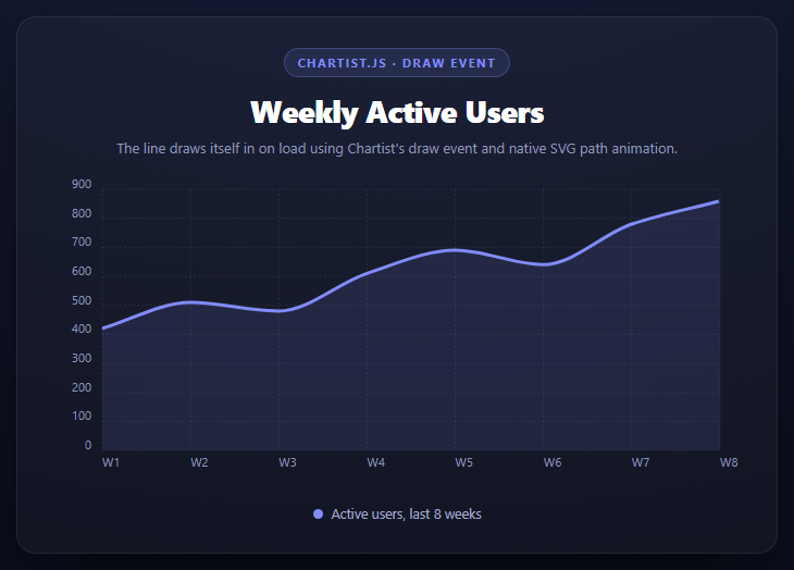
Most "animated chart" snippets fake it with a CSS opacity fade on the whole SVG. This one draws the actual line path in, the way a pen would, using the animation mechanism Chartist.js ships and documents for exactly this purpose: the draw event plus each SVG element's own .animate() method.
The draw event fires once per element, typed
js
chart.on('draw', function (data) {
  if (data.type === 'line') { ... }
  if (data.type === 'point') { ... }
});
Chartist doesn't render a chart in one pass and hand you a finished SVG — it emits a draw event for every single element as it constructs the chart: one for each grid line, each axis label, each data point, and one for the series line path itself. data.type tells you which kind of element just got created, and data.element is Chartist's own SVG wrapper object around the real DOM node (available as data.element._node). This event-per-element design is what makes fine-grained, per-element animation possible without touching Chartist's internals — you're reacting to construction as it happens, not post-processing a finished chart.
Why stroke-dashoffset, not a CSS fade
A CSS opacity transition on the <path> would make the whole line fade into existence at once — every point simultaneously. To make it look like the line is being *drawn*, left to right, you need the classic SVG dash trick:
js
data.element.attr({ 'stroke-dasharray': length, 'stroke-dashoffset': length });
data.element.animate({ 'stroke-dashoffset': { dur: 1400, from: length, to: 0, easing: ... } });
getTotalLength() gives the path's exact length in user units. Setting stroke-dasharray to that same length creates one dash exactly as long as the whole path, with one equally long gap. At stroke-dashoffset: length, the dash is shifted completely out of view, so nothing renders. Animating the offset down to 0 slides the visible dash progressively onto the path — the line appears to extend from its start point to its end point over the animation's duration. This is a pure-SVG technique with a long history that predates Chartist, and Chartist's contribution is just giving you a clean hook (the draw event) and a clean method (.animate()) to apply it without wiring raw DOM event listeners.
.animate() is SMIL-style, not CSS transitions
Chartist's .animate() is its own small animation engine, modeled on SMIL (<animate> SVG elements) rather than CSS transitions. Each property gets an object with begin (delay), dur, from, to, and easing — note this is a *different* API shape from a CSS transition, and it's necessary here because CSS cannot animate stroke-dasharray/stroke-dashoffset reliably across all the states this snippet needs (namely, setting the starting dash state via .attr() and then immediately animating from it in the same tick without a layout-thrashing reflow in between).
Staggering the points after the line
The point animation's begin: 1200 + data.index * 60 deliberately starts after the line's own 1400ms draw is mostly finished, and staggers each point's fade-in by its index — so dots appear to "land" on the line just behind the drawing tip, reinforcing the sense that the line is being traced in real time rather than the points and line animating as two unrelated things.
Build with AI
Build, Understand, Optimize, and Extend It With AI
This snippet is a good candidate for asking an AI to justify a specific technical choice rather than just explain code: paste it into an assistant like Claude and ask precisely why stroke-dashoffset was chosen over a CSS opacity or clip-path transition for the "line drawing itself in" effect, and have it walk through what getTotalLength() returns and why the dasharray must match it exactly. Then ask what happens if the draw event handler doesn't check data.type before calling .animate() — since draw fires for grid lines and labels too, and those don't have a stroke-dashoffset-friendly shape, calling this code on them would either throw or silently do nothing. To extend it: ask for a version where the line redraws every time new data is pushed in via chart.update(), a version that also animates the Y-axis grid lines in with a staggered fade, or a version using Chartist's PieChart or BarChart instead, applying the same draw-event pattern to a different data.type.
Prompt to recreate it
Copy this into your AI assistant of choice to build the effect from scratch, or as a jumping-off point for your own variant:
Build a line chart using Chartist.js (v1.3.0, from a CDN, both the JS and its index.css) in plain HTML, CSS, and JavaScript, where the line animates in as if being drawn on load.

Requirements:
- An 8-point line chart (e.g. weekly data) created with new Chartist.LineChart('#selector', data, options), with showArea: true for a soft fill under the line, styled to fit a dark card panel.
- Attach a chart.on('draw', function(data) { ... }) listener. This must check data.type === 'line' before acting, since draw also fires for grid lines, labels, and points with different data.type values.
- For the line type: get the path's real length with data.element._node.getTotalLength(), set both stroke-dasharray and stroke-dashoffset to that length via data.element.attr(), then call data.element.animate() to tween stroke-dashoffset from that length down to 0 over roughly 1400ms with an eased curve (e.g. Chartist.Svg.Easing.easeOutQuint) — this is the standard SVG "draw the path in" technique and must NOT be replaced with a CSS opacity fade or transition.
- For the point type inside the same draw handler: animate each point's opacity from 0 to 1 with a begin delay staggered by data.index, timed to start near the end of the line's own draw animation so points appear to land just behind the drawing tip.
- Add a comment explaining that Chartist's draw event fires once per individual SVG element as the chart constructs itself, and that .animate() is Chartist's own SMIL-style animation method (distinct from CSS transitions), which is why this approach is used instead of CSS.
Want to tighten it up first? Run this prompt through the AI Prompt Studio to score it across 8 quality dimensions, catch anti-patterns, and tune the wording for Claude, ChatGPT, or Gemini before you paste it in.
Source Code
<div class="cal-stage">
  <div class="cal-head">
    <span class="cal-tag">Chartist.js · draw event</span>
    <h2>Weekly Active Users</h2>
    <p>The line draws itself in on load using Chartist's draw event and native SVG path animation.</p>
  </div>
  <div class="cal-chart" id="calChart"></div>
  <div class="cal-legend">
    <span class="cal-dot"></span> Active users, last 8 weeks
  </div>
</div>*{box-sizing:border-box;margin:0;padding:0}
body{font-family:system-ui,-apple-system,sans-serif;background:radial-gradient(120% 100% at 50% 0%,#161d38,#080a14);color:#fff;min-height:100vh;display:flex;align-items:center;justify-content:center;padding:24px}
.cal-stage{width:min(700px,94vw);display:flex;flex-direction:column;gap:20px;background:rgba(255,255,255,.03);border:1px solid rgba(255,255,255,.08);border-radius:18px;padding:28px;box-shadow:0 24px 60px -24px rgba(0,0,0,.8)}
.cal-head{text-align:center}
.cal-tag{display:inline-block;font-size:11px;font-weight:700;letter-spacing:.14em;text-transform:uppercase;color:#818cf8;background:rgba(129,140,248,.12);border:1px solid rgba(129,140,248,.3);padding:5px 12px;border-radius:99px;margin-bottom:12px}
.cal-head h2{font-size:clamp(22px,4.4vw,28px);font-weight:800;letter-spacing:-.02em}
.cal-head p{font-size:13px;color:#8e97b8;margin-top:7px}
.cal-chart{height:280px}
.cal-chart .ct-label{color:#8e97b8;fill:#8e97b8;font-size:.7rem}
.cal-chart .ct-grid{stroke:rgba(255,255,255,.08)}
.cal-chart .ct-series-a .ct-line{stroke:#818cf8;stroke-width:3px}
.cal-chart .ct-series-a .ct-point{stroke:#818cf8;stroke-width:8px}
.cal-chart .ct-series-a .ct-area{fill:#818cf8;fill-opacity:.12}
.cal-legend{display:flex;align-items:center;gap:8px;justify-content:center;font-size:12.5px;color:#a3aacb}
.cal-dot{width:9px;height:9px;border-radius:50%;background:#818cf8;display:inline-block}var data = {
labels: ['W1', 'W2', 'W3', 'W4', 'W5', 'W6', 'W7', 'W8'],
series: [
{ name: 'active-users', data: [420, 510, 480, 610, 690, 640, 780, 860] }
]
};
var options = {
fullWidth: true,
showArea: true,
low: 0,
axisY: { onlyInteger: true },
chartPadding: { right: 24, top: 10, bottom: 0 }
};
var chart = new Chartist.LineChart('#calChart', data, options);
// Chartist fires a "draw" event for every individual element it renders -- grid
// lines, labels, points, and the line path itself all pass through here with a
// data.type telling you which. This is Chartist's real, documented mechanism for
// animating SVG: instead of a CSS transition (which can't animate stroke-dashoffset
// the way this needs), you call the SMIL-style .animate() method Chartist attaches
// to every element it draws, describing a "from" and "to" value over a duration.
chart.on('draw', function (data) {
if (data.type === 'line') {
// pathLength gives the exact length of the drawn path in user units. Animating
// stroke-dashoffset from that length down to 0, with a dasharray equal to the
// same length, is the standard SVG "draw a line in" trick: the dash pattern is
// exactly as long as the path, so at offset = length nothing shows, and at
// offset = 0 the whole stroke is visible.
var length = data.element._node.getTotalLength();
data.element.attr({ 'stroke-dasharray': length, 'stroke-dashoffset': length });
data.element.animate({
'stroke-dashoffset': {
id: 'draw',
dur: 1400,
from: length,
to: 0,
easing: Chartist.Svg.Easing.easeOutQuint
}
});
}
if (data.type === 'point') {
data.element.animate({
opacity: {
begin: 1200 + data.index * 60,
dur: 300,
from: 0,
to: 1,
easing: 'ease'
}
});
}
});Step by step
How to Use
- 1Add both Chartist CDN filesThe JS bundle and its index.css — Chartist needs its own stylesheet for chart structure.
- 2Create the chart with new Chartist.LineChart()Pass a container selector, a data object with labels/series, and an options object.
- 3Attach a draw event listenerchart.on("draw", fn) fires once per element as the chart constructs itself.
- 4Animate the line via stroke-dashoffsetSet dasharray/dashoffset to the path's total length, then animate offset to 0.
- 5Stagger points after the lineDelay each point's fade-in by its index so they appear to land as the line finishes drawing.
- 6Reuse the pattern for updatesCalling chart.update() with new data re-fires draw, replaying the same animation.
Real-world uses
Common Use Cases
Got questions?
Frequently Asked Questions
draw fires once per individual SVG element as Chartist constructs the chart — separately for each grid line, label, point, and the line path — rather than once for the whole finished chart. data.type tells you which kind of element you're looking at in each call.
An opacity fade makes the entire line appear at once, uniformly. Setting stroke-dasharray to the path's length and animating stroke-dashoffset from that length to 0 reveals the path progressively along its length, which is what makes it look drawn rather than faded.
It returns the exact length of the rendered SVG path in user units. The dash trick only works if stroke-dasharray matches the real path length exactly — an approximated or hardcoded value would either cut the line short or leave a visible gap partway through.
Chartist's .animate() is a SMIL-style animation method built into the SVG wrapper objects it hands you in the draw event. It lets you set the starting dash state and immediately animate from it in the same synchronous block, which is more reliable here than coordinating a CSS transition with a JS-set starting style.
The point animation's begin delay (1200ms plus a per-index stagger) is timed to start near the end of the line's own 1400ms draw animation, so each point appears to land just behind the drawing tip rather than popping in independently of the line's progress.
Yes — calling chart.update(newData) makes Chartist re-run its draw pass, which re-fires the draw event for the new elements, so the same dash-offset animation plays again on the updated line.