Learn Coding Visually
Learn to code with interactive, live-preview playgrounds — HTML, CSS, JavaScript, React & more.
 HTML Playground42 lessons · Click-based · Live preview
 CSS PlaygroundLearn CSS with a live editor
 JavaScript Playground60 lessons · DOM · Async · Canvas
 React PlaygroundLearn React with a live code editor
 GSAP PlaygroundLearn GSAP animation interactively
 SVG Playground44 lessons · shapes · paths · animation
 SCSS Playground45 lessons · Sass modules · tokens
 Tailwind PlaygroundLearn Tailwind CSS with a live editor
 Bootstrap 5 Playground50 lessons · live preview
AutoAnimate Filter Grid — Animated Category Filter Snippet
AutoAnimate Filter Grid · Cards · Plain HTML & CSS · Live preview
What's included
Features
About this UI Snippet
AutoAnimate Filter Grid — Animating Insert/Remove, Not Just Reorder
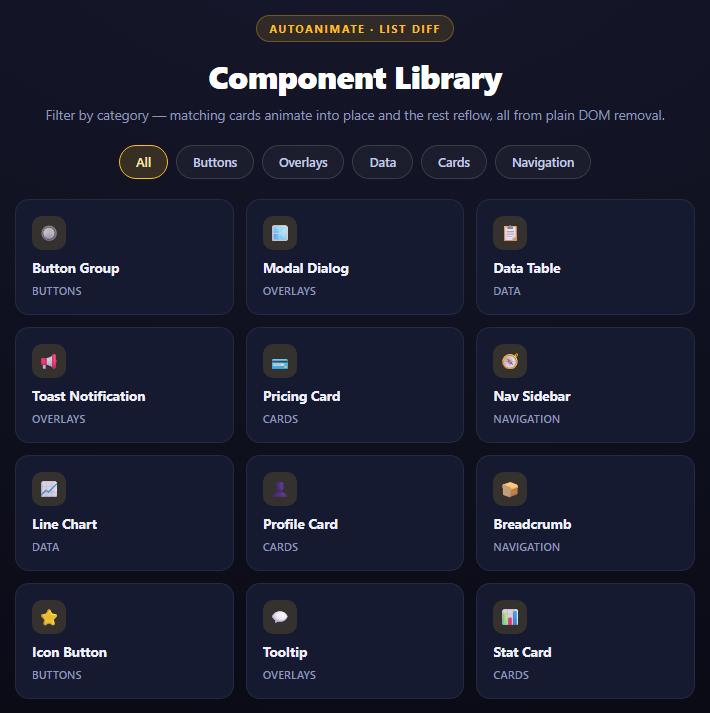
Filtering a grid is deceptively hard to animate well by hand. The naive approach — swap display: none on non-matching cards — never actually reflows the grid, so the remaining cards jump to their new positions instead of sliding. Doing it properly with CSS alone means measuring every card's before/after position, computing deltas, and running keyed transitions on insert *and* remove, which is a lot of code for something that should be simple. @formkit/auto-animate collapses all of that into one call.
Removal and insertion are different from reordering
The AutoAnimate Kanban Column snippet demonstrates autoAnimate handling reorder — the same set of elements changing position. This snippet exercises the other half of its diffing logic: elements actually entering and leaving the DOM.
renderGrid() does the simplest possible thing:
gridEl.innerHTML = ''; visible.forEach(function (item) { gridEl.appendChild(cardNode(item)); });
It wipes the grid and rebuilds only the cards that match the active filter. autoAnimate's MutationObserver sees this as a mutation on gridEl's childList and, for every animate-eligible change, decides per-element whether it is:
- Staying — present in both the before and after set, just possibly at a different grid position. It gets a FLIP-style transform animation from old position to new.
- Leaving — present before, absent after. It gets an exit animation (scale + fade by default) and is only actually removed from the DOM once that animation finishes — autoAnimate briefly keeps it mounted to animate it out, even though your code already called innerHTML = ''.
- Entering — absent before, present after. It gets an enter animation (scale + fade in) instead of appearing instantly.
That "leaving" behavior is the subtle part: your JavaScript already destroyed the node conceptually (it's gone from your data and gone from the fresh DOM you built), but autoAnimate holds a clone of it in place just long enough to play the exit transition, then removes the clone. You never see this happening; you just get an animation that looks like the card faded out where it was.
Why the grid reflow looks continuous
Because non-matching cards leave and remaining cards get FLIP transforms simultaneously, the whole grid appears to *reflow* — cards slide left/up to close gaps left by removed siblings, in the same animation frame as the removed cards fading out. This is exactly what CSS Grid's own layout would do instantly and jarringly; autoAnimate's transform-based interpolation is what makes it feel physical instead.
Passing options
autoAnimate(gridEl, { duration: 220, easing: 'ease-in-out' }) — the second argument is a plain options object accepted directly by the library, no custom code needed. duration is in milliseconds and easing accepts any standard CSS easing keyword or cubic-bezier string.
Reusing it
Any grid with a category, tag, or search filter benefits from wrapping the container in autoAnimate() — search-as-you-type result grids, tag-filtered portfolios, table row filters. Pair it with a Stagger Grid Ripple if you want a manual, more customizable version of the same enter animation, or the AutoAnimate Kanban Column for the reorder half of this same primitive.
Build with AI
Build, Understand, Optimize, and Extend It With AI
This snippet is a good way to explore the "leaving node" behavior of FLIP libraries, which is less intuitive than the reorder case. Paste it into an AI assistant like Claude and ask it to explain precisely how autoAnimate can play an exit animation on a card after your own code has already removed it from the DOM via innerHTML = '' -- the answer involves it cloning removed nodes from the MutationObserver's record and animating the clone. Then ask what would happen to the exit animation if renderGrid() ran twice in quick succession (rapid double-click on a chip) and how autoAnimate resolves overlapping in-flight animations on the same element. To extend it: ask it to add a live search input that filters alongside the category chips, add a count badge per chip showing how many items match, or make the exit/enter animation a custom plugin function that flies cards out toward the direction of the cursor instead of the default fade.
Prompt to recreate it
Copy this into your AI assistant of choice to build the effect from scratch, or as a jumping-off point for your own variant:
Build a filterable component grid using @formkit/auto-animate (v0.8). This package ships no UMD/global CDN build — only an ES module — so import it with `import autoAnimate from 'https://cdn.jsdelivr.net/npm/@formkit/auto-animate@0.8.1/index.mjs'` inside a <script type="module"> tag rather than loading a separate CDN <script src> and using a global, in plain HTML, CSS, and JavaScript.

Requirements:
- Maintain a flat array of item objects (id, title, category, icon/emoji) covering at least 5 categories, plus a fixed list of category names for the filter chips including an "All" option.
- Render category chips as pill buttons above a CSS Grid of cards; clicking a chip sets the active filter and toggles an "is-on" class on the clicked chip only.
- On every filter change, clear the grid container's innerHTML entirely and re-append only the cards matching the active filter -- do not use display:none toggling. autoAnimate must be the only thing producing the enter/exit/reflow animation; do not write any manual transition CSS.
- Call autoAnimate(gridElement, { duration: 220, easing: 'ease-in-out' }) exactly once on the grid container, passing that options object to demonstrate configurable timing.
- Handle the empty-result case: if a category has zero matching items, render a single centered "no items" message spanning the full grid width instead of a blank area.
- Style it as a dark card grid (3 columns desktop, 2 columns mobile via one media query) with each card showing an icon badge, a title, and a small category label.
- Add a code comment above the autoAnimate() call explaining that removed nodes are cloned and animated out even though innerHTML already deleted them from the live DOM.
Want to tighten it up first? Run this prompt through the AI Prompt Studio to score it across 8 quality dimensions, catch anti-patterns, and tune the wording for Claude, ChatGPT, or Gemini before you paste it in.
Source Code
<div class="afg-stage">
  <div class="afg-head">
    <span class="afg-tag">AutoAnimate · list diff</span>
    <h2>Component Library</h2>
    <p>Filter by category — matching cards animate into place and the rest reflow, all from plain DOM removal.</p>
  </div>
  <div class="afg-chips" id="afgChips"></div>
  <div class="afg-grid" id="afgGrid"></div>
</div>
<script type="module">
import autoAnimate from 'https://cdn.jsdelivr.net/npm/@formkit/auto-animate@0.8.1/index.mjs';

var COMPONENTS = [
  { id: 1, title: 'Button Group', cat: 'buttons', icon: '🔘' },
  { id: 2, title: 'Modal Dialog', cat: 'overlays', icon: '🪟' },
  { id: 3, title: 'Data Table', cat: 'data', icon: '📋' },
  { id: 4, title: 'Toast Notification', cat: 'overlays', icon: '📢' },
  { id: 5, title: 'Pricing Card', cat: 'cards', icon: '💳' },
  { id: 6, title: 'Nav Sidebar', cat: 'navigation', icon: '🧭' },
  { id: 7, title: 'Line Chart', cat: 'data', icon: '📈' },
  { id: 8, title: 'Profile Card', cat: 'cards', icon: '👤' },
  { id: 9, title: 'Breadcrumb', cat: 'navigation', icon: '🍞' },
  { id: 10, title: 'Icon Button', cat: 'buttons', icon: '⭐' },
  { id: 11, title: 'Tooltip', cat: 'overlays', icon: '💬' },
  { id: 12, title: 'Stat Card', cat: 'cards', icon: '📊' },
];

var CATS = ['all', 'buttons', 'overlays', 'data', 'cards', 'navigation'];
var chipsEl = document.getElementById('afgChips');
var gridEl = document.getElementById('afgGrid');
var active = 'all';

// A single autoAnimate() call on the grid parent is the entire animation
// layer. Every filter click below just removes/appends plain DOM nodes;
// autoAnimate's MutationObserver picks up the diff and animates it.
autoAnimate(gridEl, { duration: 220, easing: 'ease-in-out' });

CATS.forEach(function (cat) {
  var chip = document.createElement('button');
  chip.className = 'afg-chip' + (cat === active ? ' is-on' : '');
  chip.textContent = cat === 'all' ? 'All' : cat.charAt(0).toUpperCase() + cat.slice(1);
  chip.dataset.cat = cat;
  chipsEl.appendChild(chip);
});

function cardNode(item) {
  var el = document.createElement('div');
  el.className = 'afg-card';
  el.dataset.id = item.id;
  el.innerHTML =
    '<span class="afg-icon">' + item.icon + '</span>' +
    '<span class="afg-card-title">' + item.title + '</span>' +
    '<span class="afg-card-tag">' + item.cat + '</span>';
  return el;
}

function renderGrid() {
  gridEl.innerHTML = '';
  var visible = COMPONENTS.filter(function (c) { return active === 'all' || c.cat === active; });
  if (visible.length === 0) {
    var empty = document.createElement('div');
    empty.className = 'afg-empty';
    empty.textContent = 'No components in this category.';
    gridEl.appendChild(empty);
    return;
  }
  visible.forEach(function (item) { gridEl.appendChild(cardNode(item)); });
}

chipsEl.addEventListener('click', function (e) {
  var chip = e.target.closest('.afg-chip');
  if (!chip) return;
  active = chip.dataset.cat;
  chipsEl.querySelectorAll('.afg-chip').forEach(function (c) { c.classList.toggle('is-on', c === chip); });
  // Every card in the grid is torn down and only the matching subset is
  // rebuilt. autoAnimate treats this as a batch of removals (and, on the
  // next filter, insertions) and animates each one individually -- cards
  // that stay visible slide to their new grid slot, cards that disappear
  // shrink and fade rather than vanishing instantly.
  renderGrid();
});

renderGrid();
</script>*{box-sizing:border-box;margin:0;padding:0}
body{font-family:system-ui,-apple-system,sans-serif;background:radial-gradient(120% 100% at 50% 0%,#16182c,#0a0a14);color:#fff;min-height:100vh;display:flex;align-items:center;justify-content:center;padding:24px}
.afg-stage{width:min(680px,94vw);display:flex;flex-direction:column;align-items:center;gap:20px}
.afg-head{text-align:center}
.afg-tag{display:inline-block;font-size:11px;font-weight:700;letter-spacing:.14em;text-transform:uppercase;color:#fbbf24;background:rgba(251,191,36,.12);border:1px solid rgba(251,191,36,.3);padding:5px 12px;border-radius:99px;margin-bottom:12px}
.afg-head h2{font-size:clamp(24px,5vw,32px);font-weight:800;letter-spacing:-.02em}
.afg-head p{font-size:13.5px;color:#8e97b8;margin-top:7px;line-height:1.5}
.afg-chips{display:flex;flex-wrap:wrap;gap:8px;justify-content:center}
.afg-chip{padding:8px 16px;border-radius:99px;border:1px solid rgba(255,255,255,.14);background:rgba(255,255,255,.04);color:#c3cbe8;font:600 12.5px system-ui;cursor:pointer;transition:background .18s,border-color .18s,color .18s}
.afg-chip:hover{background:rgba(255,255,255,.09);color:#fff}
.afg-chip.is-on{border-color:#fbbf24;background:rgba(251,191,36,.16);color:#ffe6a8}
.afg-grid{display:grid;grid-template-columns:repeat(3,1fr);gap:12px;width:100%}
@media (max-width: 560px){.afg-grid{grid-template-columns:repeat(2,1fr)}}
.afg-card{background:#161a30;border:1px solid rgba(255,255,255,.07);border-radius:14px;padding:16px;display:flex;flex-direction:column;gap:8px;min-height:104px}
.afg-icon{width:34px;height:34px;border-radius:10px;background:rgba(251,191,36,.14);display:flex;align-items:center;justify-content:center;font-size:16px}
.afg-card-title{font-size:13.5px;font-weight:700;color:#eef0fb}
.afg-card-tag{font-size:10.5px;font-weight:600;color:#8e97b8;text-transform:uppercase;letter-spacing:.04em}
.afg-empty{grid-column:1/-1;text-align:center;color:#5c6486;font-size:13px;padding:30px 0}Step by step
How to Use
- 1No CDN script tag needed@formkit/auto-animate ships no UMD/global build — the demo imports it directly as an ES module inside a <script type="module"> tag instead.
- 2Paste HTML, CSS, and JSA twelve-card component grid renders with category filter chips above it.
- 3Call autoAnimate on the gridautoAnimate(gridEl, { duration, easing }) attaches the observer with custom timing.
- 4Click a filter chipNon-matching cards fade out and remaining cards slide to fill the gaps automatically.
- 5Click All to resetWatch previously hidden cards animate back in as fresh inserts, not instant pops.
- 6Swap in your own datasetReplace COMPONENTS and CATS with real items — the render/filter logic needs no changes.
Real-world uses
Common Use Cases
Got questions?
Frequently Asked Questions
It does not rely on your JS still holding a reference to them. Its MutationObserver callback fires with the removed nodes included in the mutation record, so it clones them, re-inserts the clone temporarily, plays the exit animation on the clone, and only then discards it. Your code never needs to keep the old nodes around.
Yes, via a custom plugin function passed as the second argument instead of an options object -- autoAnimate accepts a function that receives (el, action, oldCoords, newCoords) and returns a KeyframeEffect, giving full control over enter, remove, and remain animations.
The library defaults to a slightly slower, spring-flavored curve tuned for general use. Passing an explicit duration/easing object tunes the feel for this specific grid -- a quick, symmetric ease reads better for a dense filter grid than a longer bounce would.
The animation itself is transform/opacity only, so it is compositor-driven and cheap regardless of grid size. The cost that does scale with size is the DOM rebuild in renderGrid() -- for very large catalogs, filter data first and diff-patch the DOM instead of using innerHTML = "", though autoAnimate's behavior is unaffected either way.
autoAnimate queues correctly: a new mutation while an animation is in flight captures the current (mid-animation) position as its new "before" state, so the transform to the next state starts from wherever the element actually is, not from a stale value -- there is no visible snapping.
Filter your source array in state/computed as usual and render the filtered list; call autoAnimate(ref.current) once after mount (React useEffect, Vue onMounted) on the grid container ref. The library also ships useAutoAnimate for React and a v-auto-animate directive for Vue that wrap this same call.
@formkit/auto-animate publishes no UMD/IIFE build on npm — only an ES module (index.mjs), which ends in a real export statement that throws a syntax error if loaded as a classic script. Importing it requires the importing <script> tag itself to be type="module", which is why this demo's whole script lives inline in the HTML instead of a separate CDN <script src> plus a global function.