
Learn Coding Visually
Learn to code with interactive, live-preview playgrounds — HTML, CSS, JavaScript, React & more.
 HTML Playground42 lessons · Click-based · Live preview
 CSS PlaygroundLearn CSS with a live editor
 JavaScript Playground60 lessons · DOM · Async · Canvas
 React PlaygroundLearn React with a live code editor
 GSAP PlaygroundLearn GSAP animation interactively
 SVG Playground44 lessons · shapes · paths · animation
 SCSS Playground45 lessons · Sass modules · tokens
 Tailwind PlaygroundLearn Tailwind CSS with a live editor
 Bootstrap 5 Playground50 lessons · live preview
Vertical Thumbnail-Nav Carousel — HTML CSS JS Snippet
Vertical Thumbnail-Nav Carousel · Cards · Plain HTML, CSS & JS · Live preview
What's included
Features
About this UI Snippet
Vertical Thumbnail-Nav Carousel — A Side Rail Instead of a Strip Underneath
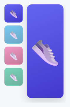
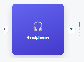
The Synced Main + Thumbnail Carousel elsewhere in this library places a horizontal thumbnail *strip* beneath a sliding main image. This one takes the same core idea — one shared index driving both a main view and a set of thumbnails — and lays it out the other common way real product pages do it: a vertical thumbnail *rail* running down the left side, with the main image sliding vertically in sync beside it.
Same single-source-of-truth pattern, different geometry
Just like its horizontal sibling, this carousel builds every thumbnail from the main slide track's own data at load time (no duplicated markup), and every interaction — a thumbnail click, an arrow key — funnels through one goTo/render() pair that updates both the main track's translateY and every thumbnail's active state together. The *only* structural difference is that the main track flows vertically (translateY, flex-direction: column) while the thumbnail rail is its own independently-scrollable vertical column beside it, rather than a horizontal strip below.
The active thumbnail still auto-scrolls into view — vertically
Just as the horizontal version calls scrollIntoView({ inline: 'nearest' }) to keep the active thumbnail visible in a horizontally-scrolling strip, this one calls scrollIntoView({ block: 'nearest' }) — the vertical equivalent — so a long list of thumbnails that overflows its own column height still keeps the currently-active one in view as the main image advances.
Build with AI
Build, Understand, Optimize, and Extend It With AI
Paste this snippet's HTML, CSS, and JS into an AI coding assistant like Claude and ask it to compare this snippet against the horizontal Synced Main + Thumbnail Carousel elsewhere in this library and identify exactly which parts of the code are geometry-specific (axis, flex-direction, scrollIntoView options) versus which parts of the single-shared-index synchronization pattern stayed completely unchanged between the two orientations. It's also worth asking the assistant to add touch swipe support to the main image adapted to the vertical axis, or to make the layout responsively switch to the horizontal thumbnail-strip version on narrow viewports.
Prompt to recreate it
Copy this into your AI assistant of choice to build the effect from scratch, or as a jumping-off point for your own variant:
Build a product-gallery-style carousel in plain HTML, CSS, and vanilla JavaScript with a large main image synced to a VERTICAL rail of thumbnails positioned beside it (not a horizontal strip beneath it) — no library.

Requirements:
- A main image area to one side showing one slide at a time via a vertically sliding track (translateY transform with a CSS transition, flex-direction column layout), and a separate vertically-scrollable column of thumbnail buttons positioned beside it (not below it).
- Thumbnails must be generated dynamically in JavaScript from the same slide data the main track uses, not duplicated by hand in the HTML — each thumbnail's click handler must jump the main image directly to that slide.
- A single shared "current index" variable that is the only source of truth for which slide is active in both the main image and the thumbnail rail; every interaction must update this one variable and re-render both views from it, so they can never disagree with each other.
- When the current slide changes, the matching thumbnail must scroll itself into view within its own vertically-scrollable column if not already fully visible, using the vertical-appropriate scrollIntoView option, not the horizontal one.
- Up/Down arrow key support (not Left/Right, to match the vertical orientation) that steps the current index within bounds.
- The active thumbnail must be visually distinguished (e.g. a colored border) from the inactive ones, updated every time the current index changes.
Want to tighten it up first? Run this prompt through the AI Prompt Studio to score it across 8 quality dimensions, catch anti-patterns, and tune the wording for Claude, ChatGPT, or Gemini before you paste it in.
Source Code
<div class="vtn-wrap">
  <div class="vtn-thumbs" id="vtnThumbs"></div>
  <div class="vtn-main">
    <div class="vtn-track" id="vtnTrack">
      <div class="vtn-slide" style="background:linear-gradient(160deg,#6366f1,#4338ca)"><span>👟</span></div>
      <div class="vtn-slide" style="background:linear-gradient(160deg,#0ea5e9,#0369a1)"><span>👟</span></div>
      <div class="vtn-slide" style="background:linear-gradient(160deg,#ec4899,#9d174d)"><span>👟</span></div>
      <div class="vtn-slide" style="background:linear-gradient(160deg,#10b981,#047857)"><span>👟</span></div>
    </div>
  </div>
</div>*{box-sizing:border-box;margin:0;padding:0}
body{font-family:system-ui,-apple-system,sans-serif;background:#f6f7f9;min-height:100vh;display:flex;align-items:center;justify-content:center;padding:24px}
.vtn-wrap{display:flex;gap:12px;height:320px}
.vtn-thumbs{display:flex;flex-direction:column;gap:10px;overflow-y:auto;padding-right:2px}
.vtn-thumb{flex:0 0 62px;width:62px;border-radius:10px;border:2.5px solid transparent;cursor:pointer;display:flex;align-items:center;justify-content:center;font-size:26px;opacity:.55;transition:border-color .15s,opacity .15s}
.vtn-thumb.active{border-color:#6366f1;opacity:1}
.vtn-main{position:relative;flex:1;border-radius:16px;overflow:hidden;box-shadow:0 12px 30px rgba(15,23,42,.16)}
.vtn-track{display:flex;flex-direction:column;height:100%;transition:transform .4s cubic-bezier(.4,0,.2,1)}
.vtn-slide{flex:0 0 100%;display:flex;align-items:center;justify-content:center;font-size:90px}var track = document.getElementById('vtnTrack');
var slides = document.querySelectorAll('.vtn-slide');
var thumbsWrap = document.getElementById('vtnThumbs');
var current = 0;
slides.forEach(function (s, i) {
var t = document.createElement('button');
t.className = 'vtn-thumb';
t.style.background = s.style.background;
t.innerHTML = '<span>👟</span>';
t.setAttribute('aria-label', 'View image ' + (i + 1));
t.addEventListener('click', function () { goTo(i); });
thumbsWrap.appendChild(t);
});
var thumbs = document.querySelectorAll('.vtn-thumb');
function render() {
track.style.transform = 'translateY(' + (-current * 100) + '%)';
thumbs.forEach(function (t, i) {
t.classList.toggle('active', i === current);
if (i === current) t.scrollIntoView({ block: 'nearest', behavior: 'smooth' });
});
}
function goTo(i) { current = i; render(); }
function next() { goTo((current + 1) % slides.length); }
function prev() { goTo((current - 1 + slides.length) % slides.length); }
document.addEventListener('keydown', function (e) {
if (e.key === 'ArrowDown') next();
else if (e.key === 'ArrowUp') prev();
});
render();Step by step
How to Use
- 1Paste HTML, CSS, and JSA large image appears beside a vertical rail of four thumbnails, the first one highlighted.
- 2Click a thumbnailThe main image slides vertically to match, and that thumbnail gets the active border.
- 3Use Up/Down arrow keysStep through the gallery vertically without touching a thumbnail directly.
- 4Add a fifth thumbnailAdd one more .vtn-slide to the main track — a matching thumbnail is generated automatically.
- 5Scroll a long thumbnail railIf there are more thumbnails than fit, the active one auto-scrolls into view as it changes.
Real-world uses
Common Use Cases
Got questions?
Frequently Asked Questions
That one lays the thumbnail strip out horizontally beneath a horizontally-sliding main image (translateX). This one lays the thumbnail rail out vertically beside a vertically-sliding main image (translateY) — the underlying single-shared-index synchronization pattern is otherwise identical.
.vtn-thumbs already has overflow-y: auto — give it (or its parent .vtn-wrap) an explicit max-height in pixels matching your desired rail height, and it will scroll internally once thumbnails exceed that height.
Yes — reorder the two child elements in .vtn-wrap's HTML (thumbnails after the main image instead of before), no other changes needed since it's a plain flex row.
Attach a touchstart/touchend listener to .vtn-main comparing vertical (clientY) delta, mirroring the pattern used in the Vertical Content Carousel snippet elsewhere in this library.
Thumbnails are real, labeled buttons, and Up/Down arrow keys provide full keyboard navigation of the main image, matching the vertical visual layout.