
Learn Coding Visually
Learn to code with interactive, live-preview playgrounds — HTML, CSS, JavaScript, React & more.
 HTML Playground42 lessons · Click-based · Live preview
 CSS PlaygroundLearn CSS with a live editor
 JavaScript Playground60 lessons · DOM · Async · Canvas
 React PlaygroundLearn React with a live code editor
 GSAP PlaygroundLearn GSAP animation interactively
 SVG Playground44 lessons · shapes · paths · animation
 SCSS Playground45 lessons · Sass modules · tokens
 Tailwind PlaygroundLearn Tailwind CSS with a live editor
 Bootstrap 5 Playground50 lessons · live preview
Rolodex Flip Carousel — HTML CSS JS Snippet
Rolodex Flip Carousel · Cards · Plain HTML, CSS & JS · Live preview
What's included
Features
About this UI Snippet
Rolodex Flip Carousel — Two Chained Animations, Not One Transition
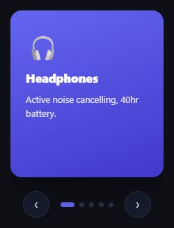
A slide carousel moves sideways; this one flips forward around its own top edge, like a page on a physical rolodex or day-planner falling away to reveal the next one. That motion can't be a single CSS transition between two states — it needs *two separate animations chained together*, because the outgoing card and the incoming card are travelling through completely different halves of the rotation.
Flip-out, swap content, flip-in — using animationend as the handoff
Clicking next adds .rfc-flip-out, a keyframe animation that rotates the card from flat to rotateX(-100deg) while fading it out — as if it's tipping forward and away. Only once that animation actually *finishes* (caught via an animationend listener, not a fixed setTimeout) does the code swap in the next card's content and add .rfc-flip-in, a second keyframe animation starting from rotateX(100deg) (as if the new card is falling into place from behind) down to flat. Two listeners, two animations, one continuous-feeling motion.
Why perspective lives on the parent, not the card
Just like the cube carousel, perspective: 900px sits on .rfc-stage (the card's parent) while transform-style: preserve-3d and transform-origin: center top live on the card itself — that origin is what makes the rotation pivot around the card's *top edge* specifically, producing the falling-page look rather than a rotation around the card's own center.
Build with AI
Build, Understand, Optimize, and Extend It With AI
Paste this snippet's HTML, CSS, and JS into an AI coding assistant like Claude and ask it to explain why the flip-out and flip-in phases are chained via two separate animationend listeners rather than being written as a single keyframe animation, and what would go wrong (particularly around content-swapping) if they were combined into one. It's also worth asking the assistant to add a subtle drop-shadow that intensifies mid-flip to sell the sense of the card lifting off the stack, or to make the flip direction alternate (forward for next, backward for previous) to reinforce the navigation direction.
Prompt to recreate it
Copy this into your AI assistant of choice to build the effect from scratch, or as a jumping-off point for your own variant:
Build a rolodex-style card flip carousel in plain HTML, CSS, and vanilla JavaScript, where advancing shows a two-phase 3D flip (the current card falling away, then the next card falling into place) rather than a slide or crossfade — no library.

Requirements:
- A single card element inside a perspective-enabled parent container, with transform-style: preserve-3d and a transform-origin set to the top edge of the card so rotation pivots around that edge rather than the card's center.
- Two separate CSS keyframe animations: a "flip out" animation rotating the card around the X axis to roughly -100 degrees while fading its opacity to zero, and a "flip in" animation starting from roughly +100 degrees rotation and zero opacity, ending at zero rotation and full opacity.
- Advancing to a new card must trigger the flip-out animation on the current card, wait for that specific animation to genuinely finish (detected via the animationend event, not a fixed timeout guessed to match the animation's duration), only then swap the card's content and background to the new item's data, and immediately trigger the flip-in animation, again detecting its real completion via animationend before allowing another flip to begin.
- A guard preventing a new flip from starting while one is already mid-animation, so rapid clicking cannot overlap or corrupt the two-phase sequence.
- Previous/next buttons and a row of dynamically generated indicator dots (matching however many items exist in the data array) that can jump directly to any card, still playing the full two-phase flip regardless of how far away the target card is.
- Left/Right arrow key support performing the same next/previous action as the buttons.
Want to tighten it up first? Run this prompt through the AI Prompt Studio to score it across 8 quality dimensions, catch anti-patterns, and tune the wording for Claude, ChatGPT, or Gemini before you paste it in.
Source Code
<div class="rfc-stage">
  <div class="rfc-card" id="rfcCard" style="background:linear-gradient(160deg,#6366f1,#4338ca)">
    <span class="rfc-icon">🎧</span><h3>Headphones</h3><p>Active noise cancelling, 40hr battery.</p>
  </div>
  <div class="rfc-controls">
    <button class="rfc-btn" id="rfcPrev" aria-label="Previous card">‹</button>
    <div class="rfc-dots" id="rfcDots"></div>
    <button class="rfc-btn" id="rfcNext" aria-label="Next card">›</button>
  </div>
</div>*{box-sizing:border-box;margin:0;padding:0}
body{font-family:system-ui,-apple-system,sans-serif;background:#0f1117;min-height:100vh;display:flex;align-items:center;justify-content:center;padding:24px}
.rfc-stage{display:flex;flex-direction:column;align-items:center;gap:20px;perspective:900px}
.rfc-card{width:220px;height:240px;border-radius:16px;padding:28px 22px;display:flex;flex-direction:column;gap:10px;box-shadow:0 18px 40px rgba(0,0,0,.4);transform-style:preserve-3d;transform-origin:center top;backface-visibility:hidden}
.rfc-card.rfc-flip-out{animation:rfcFlipOut .45s cubic-bezier(.6,0,.4,1) forwards}
.rfc-card.rfc-flip-in{animation:rfcFlipIn .45s cubic-bezier(.2,0,.4,1) forwards}
@keyframes rfcFlipOut{to{transform:rotateX(-100deg);opacity:0}}
@keyframes rfcFlipIn{from{transform:rotateX(100deg);opacity:0}to{transform:rotateX(0deg);opacity:1}}
.rfc-icon{font-size:36px}
.rfc-card h3{color:#fff;font-size:17px;font-weight:800}
.rfc-card p{color:rgba(255,255,255,.85);font-size:13px;line-height:1.5}
.rfc-controls{display:flex;align-items:center;gap:16px}
.rfc-btn{width:38px;height:38px;border-radius:50%;background:#161c2c;border:1px solid #2a3348;color:#cbd5e1;font-size:19px;cursor:pointer;display:flex;align-items:center;justify-content:center;transition:background .15s,color .15s}
.rfc-btn:hover{background:#232c42;color:#fff}
.rfc-dots{display:flex;gap:7px}
.rfc-dot{width:7px;height:7px;border-radius:50%;background:#2a3348;border:none;cursor:pointer;transition:background .2s,width .2s}
.rfc-dot.active{background:#6366f1;width:20px;border-radius:4px}var CARDS = [
{ icon: '🎧', title: 'Headphones', text: 'Active noise cancelling, 40hr battery.', bg: '#6366f1,#4338ca' },
{ icon: '📷', title: 'Camera', text: 'Full-frame sensor, 45MP stacked CMOS.', bg: '#ec4899,#9d174d' },
{ icon: '⌚', title: 'Watch', text: 'Always-on display, week-long battery.', bg: '#0ea5e9,#0369a1' },
{ icon: '🎮', title: 'Console', text: '4K/120fps, instant resume everywhere.', bg: '#10b981,#047857' },
{ icon: '🔊', title: 'Speaker', text: 'Room-filling sound, weatherproof build.', bg: '#f59e0b,#b45309' },
];
var card = document.getElementById('rfcCard');
var dotsWrap = document.getElementById('rfcDots');
var current = 0;
var animating = false;
CARDS.forEach(function (c, i) {
var d = document.createElement('button');
d.className = 'rfc-dot';
d.setAttribute('aria-label', 'Go to card ' + (i + 1));
d.addEventListener('click', function () { goTo(i); });
dotsWrap.appendChild(d);
});
var dots = document.querySelectorAll('.rfc-dot');
function paint(i) {
var c = CARDS[i];
card.style.background = 'linear-gradient(160deg,' + c.bg + ')';
card.innerHTML = '<span class="rfc-icon">' + c.icon + '</span><h3>' + c.title + '</h3><p>' + c.text + '</p>';
dots.forEach(function (d, di) { d.classList.toggle('active', di === i); });
}
function flipTo(i) {
if (animating || i === current) return;
animating = true;
card.classList.add('rfc-flip-out');
card.addEventListener('animationend', function handler() {
card.removeEventListener('animationend', handler);
current = i;
paint(current);
card.classList.remove('rfc-flip-out');
card.classList.add('rfc-flip-in');
card.addEventListener('animationend', function handler2() {
card.removeEventListener('animationend', handler2);
card.classList.remove('rfc-flip-in');
animating = false;
});
});
}
function next() { flipTo((current + 1) % CARDS.length); }
function prev() { flipTo((current - 1 + CARDS.length) % CARDS.length); }
function goTo(i) { flipTo(i); }
document.getElementById('rfcNext').addEventListener('click', next);
document.getElementById('rfcPrev').addEventListener('click', prev);
document.addEventListener('keydown', function (e) {
if (e.key === 'ArrowRight') next();
else if (e.key === 'ArrowLeft') prev();
});
paint(0);Step by step
How to Use
- 1Paste HTML, CSS, and JSA single card appears showing the first item.
- 2Click the next arrowThe card flips forward and away, then the next card falls into place from behind.
- 3Click a dotJump directly to that card — the same two-phase flip plays regardless of distance.
- 4Use arrow keysLeft/Right trigger the same flip without touching the mouse.
- 5Add a sixth cardAdd one object to the CARDS array — dots and flip logic scale automatically.
Real-world uses
Common Use Cases
Got questions?
Frequently Asked Questions
A setTimeout duplicates the animation-duration value in two places (the CSS and the JS), which drifts the moment either one is edited alone. animationend fires exactly when the browser finishes the animation, so the two phases always stay perfectly chained regardless of how long the animation actually takes.
Swap the rotateX direction in both keyframes — flip-out to rotateX(100deg) and flip-in starting from rotateX(-100deg) — to reverse which way the page appears to fall.
Yes — replace rotateX with rotateY throughout, and change transform-origin from center top to either left center or right center depending on which edge you want the page to pivot around.
Change the .45s duration on both .rfc-flip-out and .rfc-flip-in — keep them equal so the two phases feel balanced, or make flip-in slightly faster than flip-out for a snappier arrival.
The arrows and dots are real, labeled buttons, and the whole carousel is operable via Left/Right arrow keys — consider adding an aria-live region announcing the new card's title once the flip completes.