You Might Also Like
Learn Coding Visually
Learn to code with interactive, live-preview playgrounds — HTML, CSS, JavaScript, React & more.
 HTML Playground42 lessons · Click-based · Live preview
 CSS PlaygroundLearn CSS with a live editor
 JavaScript Playground60 lessons · DOM · Async · Canvas
 React PlaygroundLearn React with a live code editor
 GSAP PlaygroundLearn GSAP animation interactively
 SVG Playground44 lessons · shapes · paths · animation
 SCSS Playground45 lessons · Sass modules · tokens
 Tailwind PlaygroundLearn Tailwind CSS with a live editor
 Bootstrap 5 Playground50 lessons · live preview
Video Background Hero — Free HTML CSS JS Snippet
Video Background Hero · Heroes · Plain HTML, CSS & JS · Live preview
What's included
Features
About this UI Snippet
Video Background Hero — CSS Blob Animation, Play Button & Fullscreen Video Modal
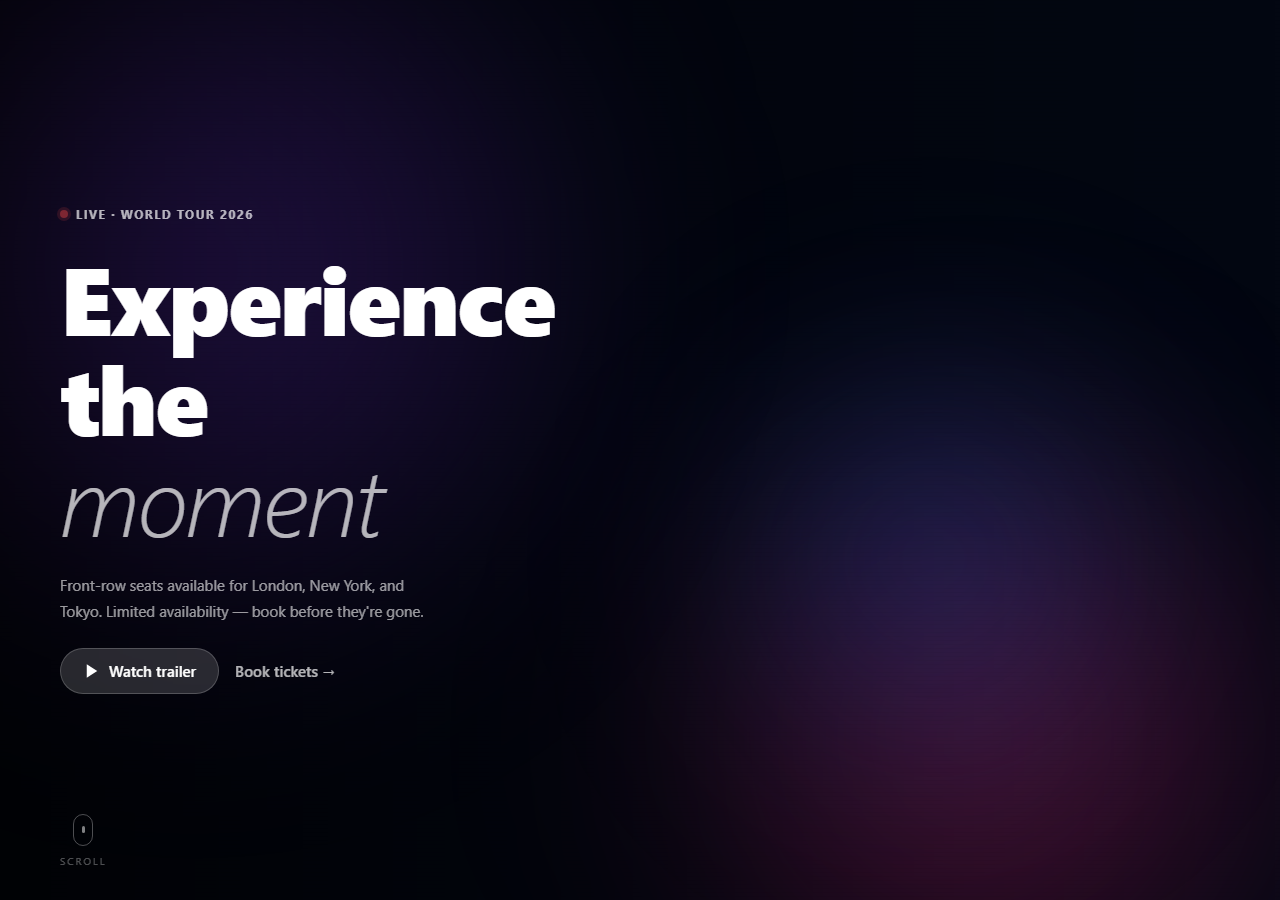
A video background hero creates an immersive, cinematic above-the-fold experience — widely used for event landing pages, entertainment products, film and music websites, and premium brand campaigns. This snippet provides a complete video background hero without requiring an actual video file: three animated CSS radial-gradient blobs simulate the colour and movement of a video background, a scanline texture adds grain, a left-fade overlay makes text legible, and a pill-shaped play button opens a fullscreen video modal — all in plain HTML, CSS, and vanilla JavaScript.
The CSS blob animation as a video substitute
Three absolutely positioned divs with radial-gradient backgrounds and filter: blur(100px) create large, soft colour blobs. A CSS @keyframes drift animation moves each blob via translate(x,y) on different durations (18–25s) and delays (-4s, -8s). Because they move at different speeds and in different directions, the blobs never synchronise — creating the organic, shifting colour movement associated with video backgrounds. The key advantage over a real video: zero file size, no loading delay, no browser autoplay restrictions.
The scanline texture
A repeating-linear-gradient creates horizontal lines at 4px intervals: transparent 3px, then a 1px semi-transparent black stripe. At 3% opacity, this adds grain and depth without being visually distracting — the same technique used on premium dark UIs.
The left-fade overlay
A linear-gradient overlay fades from rgba(0,0,0,0.7) on the left (where the text sits) to transparent on the right. This makes text legible against any background colour without darkening the right side of the hero where visual interest should remain.
The video modal
Clicking the play button adds .open to the fullscreen modal overlay. The modal uses backdrop-filter: blur(12px) on a near-black background. The inner container uses aspect-ratio: 16/9 for a consistent video frame. In production, replace the .video-placeholder div with a real video element or YouTube/Vimeo iframe. Click-outside (e.target === e.currentTarget on the overlay) and ESC key close the modal — the same dismiss pattern as the base modal snippet.
The live event eyebrow
A pulsing red dot + "Live · World Tour 2026" label communicates urgency and recency. The dot uses box-shadow for the glow ring and an opacity keyframe for the pulse animation.
Accessibility and performance
For users who prefer reduced motion, add @media (prefers-reduced-motion: reduce) { .blob { animation: none; } .dot-pulse { animation: none; } } to freeze the blob drift and live badge pulse. The blob animations use CSS transform which runs on the GPU compositor — safe for 60fps even on mobile. Test with Chrome DevTools Performance to verify no layout recalculation is triggered.
Build with AI
Build, Understand, Optimize, and Extend It With AI
Instead of tracing the animation timing by hand, paste this snippet's HTML, CSS, and JS into an AI coding assistant like Claude and ask it to explain exactly why the three blobs use different animation-duration and animation-delay values (and one reversed animation-direction), and why that specific combination is what keeps them from ever visually synchronizing into a repeating, obviously-looped pattern. It's also worth an accessibility question — ask what prefers-reduced-motion media query changes should be added so the drifting blobs and pulsing live dot freeze for users who've requested less motion. For extending it, have it swap the CSS blobs for a real muted looping background video while keeping the overlay and scanline layers unchanged, add a second CTA that deep-links into a specific chapter of the trailer, or make the scroll indicator disappear once the user actually scrolls. Treat the code less like a finished artifact and more like a starting point for a conversation.
Prompt to recreate it
Copy this into your AI assistant of choice to build the effect from scratch, or as a jumping-off point for your own variant:
Build a cinematic video-background-style hero section in plain HTML, CSS, and vanilla JavaScript, using pure CSS animated shapes as a zero-file-size substitute for an actual background video.

Requirements:
- A full-viewport-height hero with three large, blurred, radial-gradient "blob" divs absolutely positioned and layered behind the content, each using a different size, position, gradient color, and CSS keyframe animation duration/delay so their drifting movement never falls into a visibly synchronized loop; at least one blob must animate in the reverse direction from the others.
- A subtle scanline texture layer using a repeating-linear-gradient at a low opacity laid over the blobs, purely decorative and non-interactive (must not block clicks).
- A horizontal fade overlay (dark on one side fading to transparent) so headline text remains legible regardless of what's animating behind it.
- Foreground content consisting of a small pulsing "live" indicator dot next to an eyebrow label, a large multi-line headline, a supporting paragraph, and two calls to action: a pill-shaped "glass" button (semi-transparent background plus backdrop-filter blur) that opens a video modal, and a plain text link.
- A fullscreen modal, hidden by default, that fades and scales in when opened: a centered 16:9 frame with a close button, dismissible by clicking its button, clicking the dark backdrop outside the frame, or pressing Escape.
- A scroll-hint indicator near the bottom of the hero (an animated mouse-wheel icon plus a "Scroll" label) that continuously animates to invite the visitor to scroll further.
Want to tighten it up first? Run this prompt through the AI Prompt Studio to score it across 8 quality dimensions, catch anti-patterns, and tune the wording for Claude, ChatGPT, or Gemini before you paste it in.
Step by step
How to Use
- 1Click "Watch trailer" to open the video modalThe play button opens a fullscreen modal with backdrop blur. Click the × button, press ESC, or click the dark backdrop to close. The modal has a 16:9 aspect ratio for video content.
- 2Add a real video inside the modalReplace the .video-placeholder div with a video element: <video src="trailer.mp4" controls autoplay style="width:100%;height:100%;object-fit:cover"></video>. Or use a YouTube iframe: <iframe src="https://www.youtube.com/embed/VIDEO_ID?autoplay=1" frameborder="0" allow="autoplay" style="width:100%;height:100%;"></iframe>
- 3Update the eyebrow, headline, and CTAsEdit the .eyebrow span text for your event or product. Change the two-line h1 headline and the .italic word. Update the .sub paragraph. Wire .btn-tickets href to your booking or product page.
- 4Change the blob coloursIn the CSS, update the rgba() colours in .b1, .b2, and .b3 background gradients. Use three complementary colours from your brand palette. Higher opacity values (0.6–0.8) create more vivid blobs; lower (0.2–0.3) create subtler ambience.
- 5Use a real video as the backgroundFor a real video background: add <video autoplay muted loop playsinline> inside .bg-anim. Set position:absolute; inset:0; object-fit:cover; width:100%; height:100%. Keep the .overlay and .scanline on top for text legibility and grain texture.
- 6Export in your formatClick "HTML" for a standalone file, "JSX" for a React component using useState for the modal open state, or "Tailwind" for a Tailwind CSS version.
Real-world uses
Common Use Cases
Got questions?
Frequently Asked Questions
Inside .bg-anim, replace the three .blob divs with a video element: <video autoplay muted loop playsinline style="position:absolute;inset:0;width:100%;height:100%;object-fit:cover;" src="your-video.mp4"></video>. The muted and autoplay attributes together allow autoplay in all browsers — autoplay without muted is blocked by all major browsers. The loop attribute loops infinitely. Keep .scanline and .overlay as-is for texture and text legibility. Remove .blob CSS classes.
Replace the .video-placeholder div with an iframe: <iframe width="100%" height="100%" src="https://www.youtube.com/embed/VIDEO_ID?autoplay=1" frameborder="0" allow="autoplay; fullscreen" allowfullscreen style="position:absolute;inset:0;"></iframe>. The autoplay=1 parameter starts the video when the modal opens. Add ?enablejsapi=1 if you want to control the player via the YouTube IFrame API. To stop the video when the modal closes, call the iframe's contentWindow.postMessage to pause: iframe.contentWindow.postMessage("stopVideo","*").
Add a poster attribute to the video element: poster="thumbnail.jpg". The poster image shows while the video loads — it should be a single frame from the video. For a loading spinner, add a .loading-overlay div over the video and listen for the video canplaythrough event: video.addEventListener("canplaythrough", () => loadingOverlay.style.display = "none"). The CSS blob background in this snippet never needs a loading state since it is pure CSS.
Click "JSX" to download. Manage modal open state with useState(false). Toggle with setModalOpen(true) on play button click. Close with setModalOpen(false) in the close handler. For the ESC key, use a useEffect: useEffect(() => { if (!modalOpen) return; const handler = e => { if (e.key === "Escape") setModalOpen(false); }; document.addEventListener("keydown", handler); return () => document.removeEventListener("keydown", handler); }, [modalOpen]). The CSS blob animation is pure CSS — no JavaScript needed for it.