
Learn Coding Visually
Learn to code with interactive, live-preview playgrounds — HTML, CSS, JavaScript, React & more.
 HTML Playground42 lessons · Click-based · Live preview
 CSS PlaygroundLearn CSS with a live editor
 JavaScript Playground60 lessons · DOM · Async · Canvas
 React PlaygroundLearn React with a live code editor
 GSAP PlaygroundLearn GSAP animation interactively
 SVG Playground44 lessons · shapes · paths · animation
 SCSS Playground45 lessons · Sass modules · tokens
 Tailwind PlaygroundLearn Tailwind CSS with a live editor
 Bootstrap 5 Playground50 lessons · live preview
Startup Hero — Free HTML CSS Landing Snippet
Startup Hero · Heroes · Plain HTML & CSS · Live preview
What's included
Features
About this UI Snippet
Startup Hero Section — Dark Gradient Background, Gradient Headline, Social Proof & Trusted-By Strip
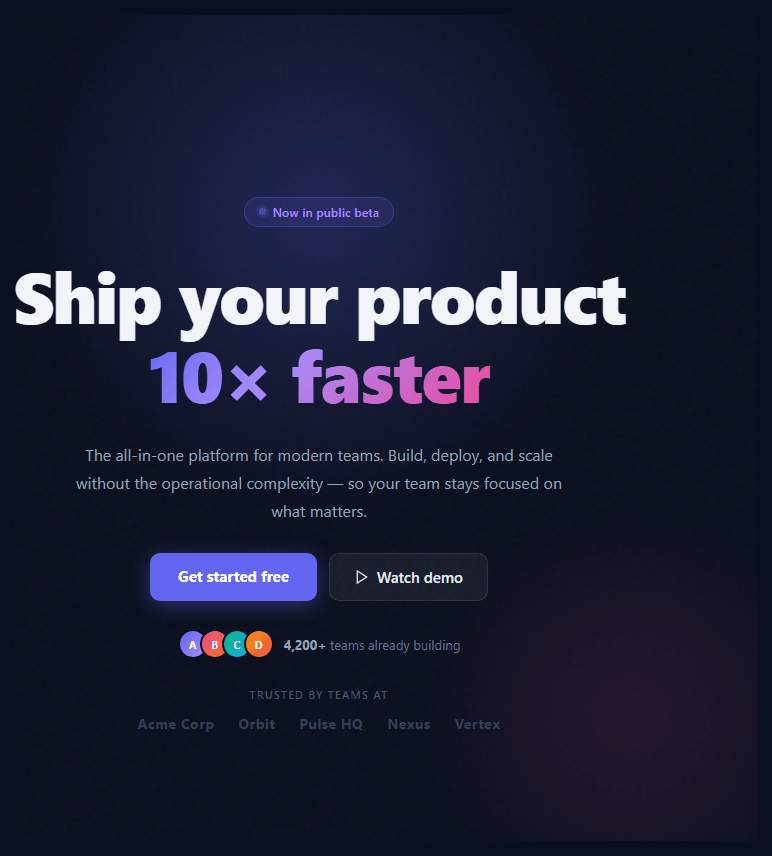
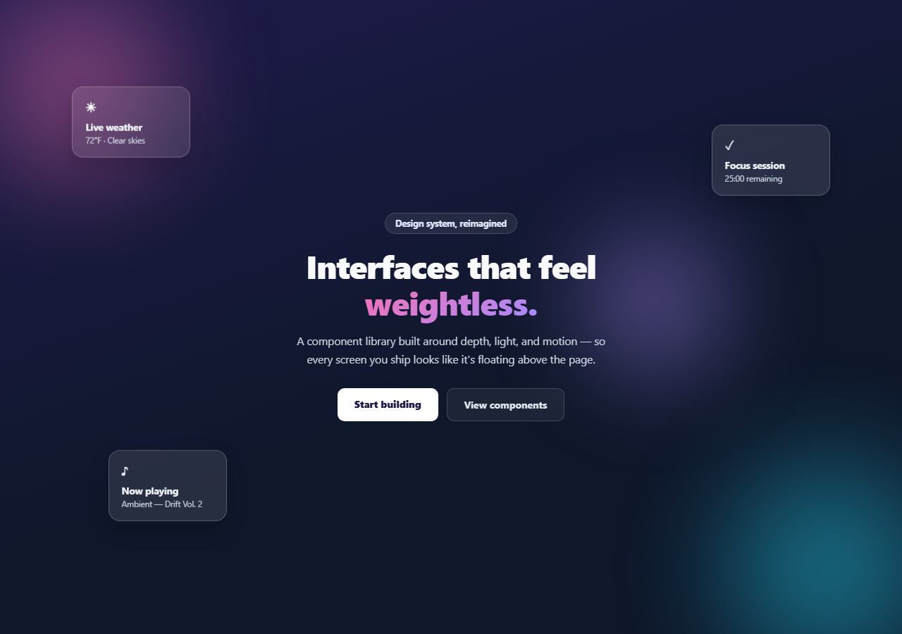
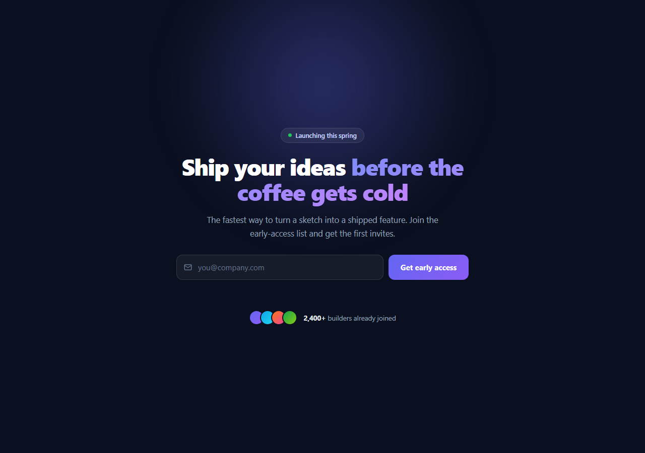
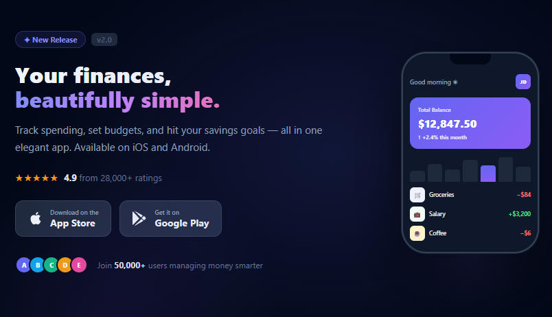
If you are building a SaaS landing page, startup site, or product launch page and need a complete hero section that converts, this snippet gives you everything: a dark gradient background with ambient glow orbs, an animated beta badge, a large gradient headline, a subtitle, dual CTA buttons, an avatar + user count social proof row, and a trusted-by logo strip — all in plain HTML and CSS with no JavaScript required.
The dark background and ambient glow
The hero uses background: #0a0f1e — a near-black dark navy that makes bright elements pop. Two ::before and ::after pseudo-elements create radial-gradient glow orbs in indigo and pink. The glow is purely decorative and uses pointer-events: none so it never blocks clicks. A subtle noise texture overlay (inline SVG feTurbulence filter) adds micro-texture depth at 3% opacity.
The animated badge
The "Now in public beta" badge uses a pulsing dot: a 7px circle with box-shadow: 0 0 0 3px rgba(99,102,241,0.3) that animates opacity between 1 and 0.5 — communicating live status without being distracting.
The gradient headline
The gradient text uses background: linear-gradient(135deg, #6366f1, #a78bfa, #ec4899) with background-clip: text and -webkit-text-fill-color: transparent. The font-size uses clamp(36px, 7vw, 72px) — fluid from 36px on mobile to 72px on wide screens with no media query.
Social proof row
The overlapping avatar stack uses negative margin-left: -8px on all but the first avatar. Each avatar has a 2px border matching the background colour so the overlap appears clean. The user count ("4,200+ teams") appears next to the avatars as an inline social proof signal.
Trusted-by logo strip
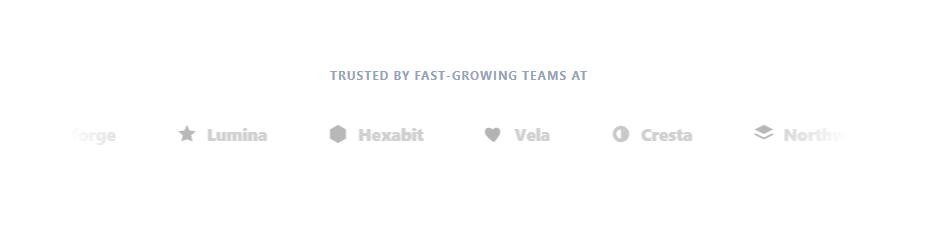
The logo strip uses placeholder company names in a muted colour. Replace these with real company wordmarks as SVG or img elements. The strip communicates enterprise adoption at a glance without requiring full logo assets during development.
Customising this snippet
Change the badge text to match your launch stage. Update the gradient colour stops in .grad to match your brand. Replace the placeholder logos with real company names or SVG wordmarks. Update the user count. Wire the CTA buttons to your sign-up or demo booking flow.
Export and framework compatibility
Click "JSX" to export a React component. Since this snippet uses no JavaScript, it can be a pure Server Component in Next.js App Router — no "use client" directive required. For scroll entry animations, wrap in a Framer Motion motion.section or use the Reveal on Scroll snippet.
Build with AI
Build, Understand, Optimize, and Extend It With AI
You don't need to work out how this entirely CSS-driven hero layers its depth cues by hand. Paste this snippet's HTML, CSS, and JS into an AI coding assistant like Claude and ask it to explain exactly why the ambient glow orbs use pointer-events none and are built from pseudo-elements rather than extra divs, or how the inline SVG feTurbulence filter produces a noise texture without loading an image file. The same assistant can help optimize it, for example checking whether the inline SVG data URI noise background has any measurable paint cost worth profiling on lower-end devices. It's also useful for extending the feature: ask it to add a subtle parallax tilt on the glow orbs as the cursor moves, wire the Watch Demo button to a real video modal (the FAQ sketches the approach), or convert the fixed placeholder company names into real SVG logo marks with matching opacity treatment. Treat the code less like a finished artifact and more like a starting point for a conversation.
Prompt to recreate it
Copy this into your AI assistant of choice to build the effect from scratch, or as a jumping-off point for your own variant:
Build a dark SaaS startup hero section using only HTML and CSS, no JavaScript at all.

Requirements:
- A full-height hero with a near-black background, containing two large radial-gradient glow shapes built from pseudo-elements (not extra div elements), positioned so they sit behind all content, are decorative only (pointer-events none so they never intercept clicks), and use different colors and positions to avoid looking perfectly symmetrical.
- A subtle full-bleed noise texture overlay using an inline SVG data URI with a feTurbulence filter (not an external image file), set to a very low opacity so it adds grain without being visually distracting.
- A pill-shaped "status" badge containing a small circular dot that pulses via a CSS keyframe animating opacity, positioned above the main headline.
- A large headline where one phrase is rendered with a gradient fill using the background-clip: text technique (with the necessary vendor-prefixed fallback), sized with a clamp() function so it scales fluidly between a mobile and desktop size with zero media queries.
- Two call-to-action buttons side by side (wrapping to stack on narrow viewports via flex-wrap) — one a solid filled primary button with a hover lift and glow shadow, the other a translucent ghost-style button containing an inline SVG play icon.
- A social proof row showing a stack of small circular avatars overlapping via negative margins (each with a border matching the page background so the overlap reads cleanly) next to a bolded user count.
- A "trusted by" section below the fold-safe content showing a small uppercase label followed by a row of muted placeholder company name text spans that wrap on narrow screens.
Want to tighten it up first? Run this prompt through the AI Prompt Studio to score it across 8 quality dimensions, catch anti-patterns, and tune the wording for Claude, ChatGPT, or Gemini before you paste it in.
Source Code
<section class="hero">
  <div class="noise"></div>

  <div class="badge-row">
    <span class="badge">
      <span class="badge-dot"></span>
      Now in public beta
    </span>
  </div>

  <h1 class="headline">
    Ship your product<br>
    <span class="grad">10× faster</span>
  </h1>

  <p class="sub">The all-in-one platform for modern teams. Build, deploy, and scale without the operational complexity — so your team stays focused on what matters.</p>

  <div class="cta-row">
    <a href="#" class="btn-primary">Get started free</a>
    <a href="#" class="btn-ghost">
      <svg width="16" height="16" viewBox="0 0 24 24" fill="none" stroke="currentColor" stroke-width="2" stroke-linecap="round"><polygon points="5 3 19 12 5 21 5 3"/></svg>
      Watch demo
    </a>
  </div>

  <div class="social-proof">
    <div class="avatars">
      <div class="av" style="background:linear-gradient(135deg,#6366f1,#a78bfa)">A</div>
      <div class="av" style="background:linear-gradient(135deg,#ec4899,#f97316)">B</div>
      <div class="av" style="background:linear-gradient(135deg,#10b981,#0ea5e9)">C</div>
      <div class="av" style="background:linear-gradient(135deg,#f59e0b,#ef4444)">D</div>
    </div>
    <span class="proof-text"><strong>4,200+</strong> teams already building</span>
  </div>

  <div class="trusted">
    <span class="trusted-label">Trusted by teams at</span>
    <div class="logos">
      <span class="logo">Acme Corp</span>
      <span class="logo">Orbit</span>
      <span class="logo">Pulse HQ</span>
      <span class="logo">Nexus</span>
      <span class="logo">Vertex</span>
    </div>
  </div>
</section>
* { box-sizing: border-box; margin: 0; padding: 0; }
body { font-family: system-ui, sans-serif; background: #0a0f1e; min-height: 100vh; overflow-x: hidden; }
.hero { position: relative; min-height: 100vh; display: flex; flex-direction: column; align-items: center; justify-content: center; text-align: center; padding: 60px 24px; gap: 28px; overflow: hidden; }
/* Ambient glow */
.hero::before { content: ''; position: absolute; width: 600px; height: 600px; background: radial-gradient(circle, rgba(99,102,241,0.25) 0%, transparent 70%); top: -100px; left: 50%; transform: translateX(-50%); pointer-events: none; }
.hero::after { content: ''; position: absolute; width: 400px; height: 400px; background: radial-gradient(circle, rgba(236,72,153,0.12) 0%, transparent 70%); bottom: 0; right: 10%; pointer-events: none; }
/* Noise texture */
.noise { position: absolute; inset: 0; opacity: 0.03; background-image: url("data:image/svg+xml,%3Csvg viewBox='0 0 200 200' xmlns='http://www.w3.org/2000/svg'%3E%3Cfilter id='n'%3E%3CfeTurbulence type='fractalNoise' baseFrequency='0.9' numOctaves='4'/%3E%3C/filter%3E%3Crect width='100%25' height='100%25' filter='url(%23n)'/%3E%3C/svg%3E"); pointer-events: none; }
.badge-row { position: relative; z-index: 1; }
.badge { display: inline-flex; align-items: center; gap: 7px; background: rgba(99,102,241,0.12); border: 1px solid rgba(99,102,241,0.3); color: #a78bfa; font-size: 12px; font-weight: 600; padding: 6px 14px; border-radius: 20px; letter-spacing: 0.2px; }
.badge-dot { width: 7px; height: 7px; border-radius: 50%; background: #6366f1; box-shadow: 0 0 0 3px rgba(99,102,241,0.3); animation: pulse 2s ease infinite; }
@keyframes pulse { 0%,100%{opacity:1} 50%{opacity:0.5} }
.headline { position: relative; z-index: 1; font-size: clamp(36px, 7vw, 72px); font-weight: 900; line-height: 1.1; letter-spacing: -1.5px; color: #f1f5f9; max-width: 760px; }
.grad { background: linear-gradient(135deg, #6366f1 0%, #a78bfa 40%, #ec4899 100%); -webkit-background-clip: text; -webkit-text-fill-color: transparent; background-clip: text; }
.sub { position: relative; z-index: 1; font-size: 16px; color: #94a3b8; max-width: 520px; line-height: 1.75; }
.cta-row { position: relative; z-index: 1; display: flex; gap: 12px; flex-wrap: wrap; justify-content: center; }
.btn-primary { background: #6366f1; color: #fff; font-size: 15px; font-weight: 700; padding: 13px 28px; border-radius: 10px; text-decoration: none; transition: background 0.15s, transform 0.15s, box-shadow 0.15s; box-shadow: 0 4px 20px rgba(99,102,241,0.4); }
.btn-primary:hover { background: #4f46e5; transform: translateY(-1px); box-shadow: 0 8px 28px rgba(99,102,241,0.5); }
.btn-ghost { display: flex; align-items: center; gap: 7px; background: rgba(255,255,255,0.06); color: #e2e8f0; font-size: 15px; font-weight: 600; padding: 13px 24px; border-radius: 10px; text-decoration: none; border: 1px solid rgba(255,255,255,0.1); transition: background 0.15s, border-color 0.15s; }
.btn-ghost:hover { background: rgba(255,255,255,0.1); border-color: rgba(255,255,255,0.2); }
.social-proof { position: relative; z-index: 1; display: flex; align-items: center; gap: 10px; }
.avatars { display: flex; }
.av { width: 30px; height: 30px; border-radius: 50%; display: flex; align-items: center; justify-content: center; font-size: 11px; font-weight: 700; color: #fff; margin-left: -8px; border: 2px solid #0a0f1e; }
.av:first-child { margin-left: 0; }
.proof-text { font-size: 13px; color: #64748b; }
.proof-text strong { color: #94a3b8; }
.trusted { position: relative; z-index: 1; display: flex; flex-direction: column; align-items: center; gap: 12px; }
.trusted-label { font-size: 11px; text-transform: uppercase; letter-spacing: 1.2px; color: #475569; font-weight: 600; }
.logos { display: flex; gap: 24px; flex-wrap: wrap; justify-content: center; }
.logo { font-size: 14px; font-weight: 700; color: #334155; letter-spacing: 0.5px; }Step by step
How to Use
- 1Update the headline and badge textIn the HTML panel, edit the h1 text and the badge label ("Now in public beta"). The gradient span wraps whichever part of the headline you want highlighted in the gradient colour.
- 2Change the gradient accent colourIn the CSS panel, find the .grad background gradient and the ambient glow ::before rgba values. Replace #6366f1 and #ec4899 with your brand colours throughout.
- 3Update the social proof numbersChange "4,200+ teams already building" to your real user or customer count. Update avatar initials and gradients to match your team or customer avatars.
- 4Replace the trusted-by logosReplace the .logo text spans with real company names or SVG wordmarks. Size them consistently at 14–16px and use a muted colour (rgba(255,255,255,0.3)) for brand-appropriate opacity.
- 5Wire the CTA buttonsSet href="#" on .btn-primary to your sign-up URL and .btn-ghost to your demo or video URL. Both handle hover states and the primary button has a drop shadow glow.
- 6Export in your formatClick "HTML" for a standalone file ready to paste into any page, "JSX" for a React component, or "Tailwind" for a React + Tailwind CSS version with utility classes.
Real-world uses
Common Use Cases
Got questions?
Frequently Asked Questions
The .grad span has background: linear-gradient(135deg, #6366f1, #a78bfa, #ec4899). Then -webkit-background-clip: text clips the background to the text shape, and -webkit-text-fill-color: transparent makes the text fill itself transparent so the background gradient shows through. The standard background-clip: text property is also set for non-WebKit browsers. Both properties are required — the effect does not work if either is missing.
For an inline video modal: add a data-video="YOUR_YOUTUBE_ID" attribute to .btn-ghost. In JavaScript, listen for the click event and create a modal overlay with an iframe: const iframe = document.createElement("iframe"); iframe.src = "https://www.youtube.com/embed/" + btn.dataset.video + "?autoplay=1"; . See the Modal snippet in this library for the full dismiss pattern with ESC and click-outside close.
The hero already uses clamp() for fluid font sizing and flex-wrap: wrap on the CTA row so buttons stack vertically on narrow screens. For the logo strip on very narrow screens, add @media (max-width: 480px) { .logos { gap: 12px; } .logo { font-size: 12px; } }. The padding: 60px 24px on .hero provides sufficient breathing room on mobile without a media query.
Yes. Click "JSX" to download a React component. Since this snippet has no JavaScript, the JSX export is purely structural — no useState or useEffect needed. In Next.js App Router, use it as a server component (no "use client" directive required). For animations on scroll entry, wrap the hero in a motion.section from Framer Motion or use the Reveal on Scroll snippet from the Animations category.