Learn Coding Visually
Learn to code with interactive, live-preview playgrounds — HTML, CSS, JavaScript, React & more.
 HTML Playground42 lessons · Click-based · Live preview
 CSS PlaygroundLearn CSS with a live editor
 JavaScript Playground60 lessons · DOM · Async · Canvas
 React PlaygroundLearn React with a live code editor
 GSAP PlaygroundLearn GSAP animation interactively
 SVG Playground44 lessons · shapes · paths · animation
 SCSS Playground45 lessons · Sass modules · tokens
 Tailwind PlaygroundLearn Tailwind CSS with a live editor
 Bootstrap 5 Playground50 lessons · live preview
Hero with Floating Glassmorphic Cards — Free HTML CSS Snippet
Hero with Floating Glassmorphic Cards · Heroes · Plain HTML & CSS · Live preview
What's included
Features
About this UI Snippet
Hero with Floating Glassmorphic Cards — Frosted Panels Drifting Over an Animated Blob Backdrop
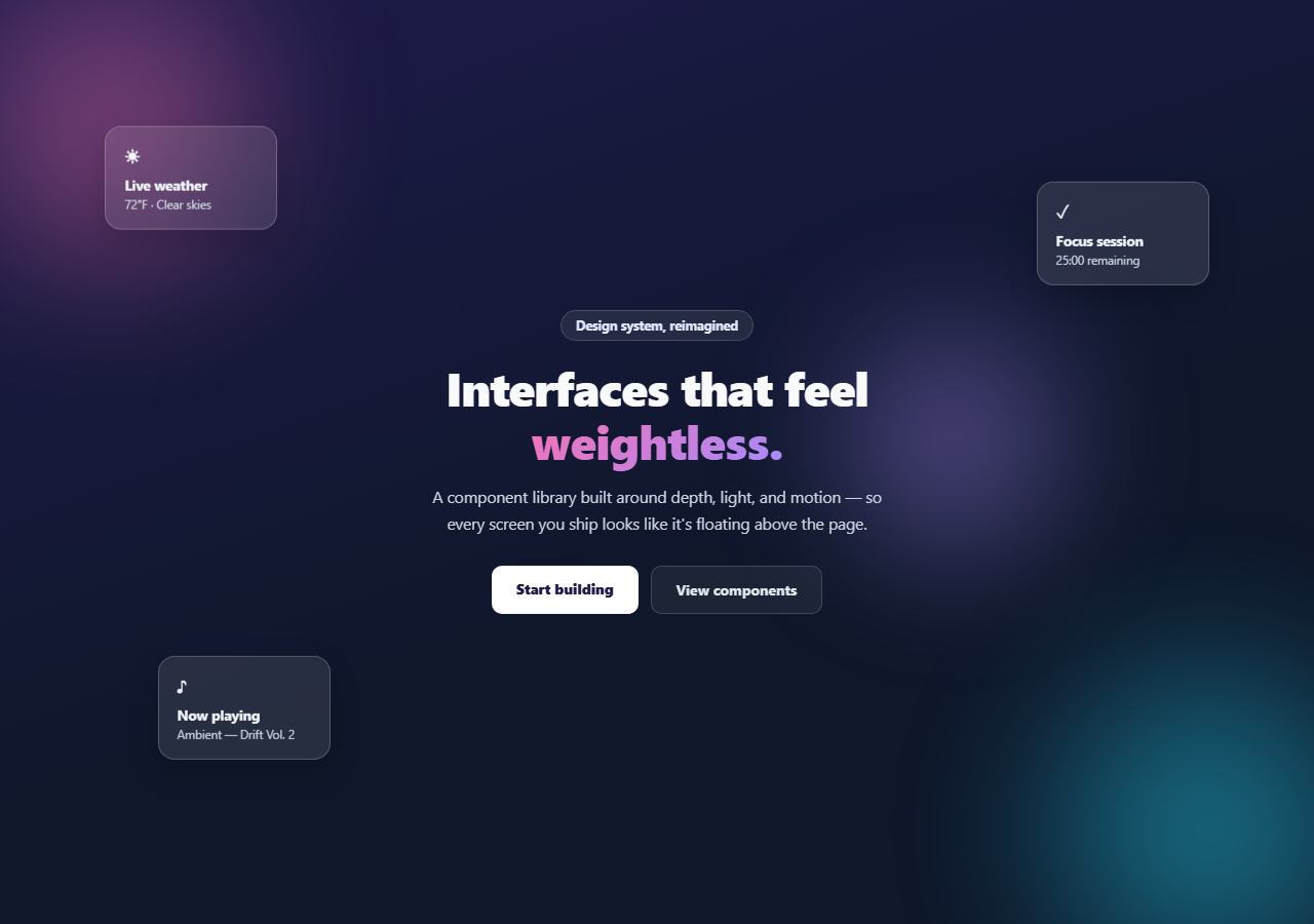
Glassmorphism reads as flat and lifeless the moment every frosted panel sits perfectly still. This hero fixes that with three floating glass cards drifting gently at different speeds and offsets over a slowly moving gradient-blob backdrop — pure HTML and CSS, no JavaScript, no canvas.
The blob backdrop
Three large, heavily blurred radial-gradient circles (.gcf-blob1/2/3) sit behind the content, each with its own drift keyframe animation moving it a short distance and gently scaling it up and down over 14–20 seconds. Because the durations differ and one runs in reverse, the blobs never fall into a synchronized rhythm — the backdrop keeps subtly reshaping itself instead of visibly looping. filter: blur(60px) turns hard-edged circles into soft, colorful light without a single image asset.
Frosted glass, done properly
Each .gcf-card uses background: rgba(255,255,255,0.1) plus backdrop-filter: blur(16px) (with the -webkit- prefix for Safari) and a faint border — the combination that makes glassmorphism actually read as glass rather than a semi-transparent box. Content sitting behind the card visibly blurs through it, so the moving blobs are essential set dressing, not decoration: without something behind the cards to distort, the blur effect is invisible.
Independent float timing is the whole trick
The three cards each get a distinct translateY oscillation keyframe (gcfFloat1/2/3) at different durations (6s, 7.5s, 5.2s) and different amplitudes and directions. This is the detail that separates a convincing "floating in space" effect from an obviously synced, robotic one — in real fluid dynamics nothing this size moves in perfect unison, and neither should these cards. Keep each card's duration and offset distinct any time you add more.
Cards with a purpose, not just shapes
Rather than empty frosted rectangles, each card shows a small piece of plausible live data — a weather reading, a now-playing track, a focus-timer countdown — reinforcing the "ambient interface" positioning of the hero's copy. Swap these for whatever mini-widgets are relevant to your product.
Customizing it
Change the blob and gradient-text colors to your palette — the gradient text on the emphasized headline word reuses the background-clip: text technique from other heroes in this library. Add or remove floating cards, keeping each one's float keyframe duration and direction distinct. On narrow screens the cards hide by default since there usually isn't room for them without crowding the headline — reposition rather than hide if your layout has space.
Build with AI
Build, Understand, Optimize, and Extend It With AI
You don't have to eyeball the float timing until it looks natural. Paste this snippet's HTML and CSS into an AI coding assistant like Claude and ask it to explain why the frosted glass cards need the animated blob backdrop behind them for backdrop-filter to have any visible effect, and why giving each card's float keyframe a distinct duration and amplitude avoids the synchronized, mechanical look that identical timings would produce. The same assistant can help you tune it further — ask whether the blur radius and opacity values should change for a lighter or heavier glass effect, or whether performance suffers with backdrop-filter on lower-end devices and what a graceful fallback should look like. It's also useful for extending the scene: ask it to add mouse-parallax so the cards shift slightly toward the cursor in addition to their float animation, or to make the blob colors respond to a light/dark theme toggle. Treat the code less like a finished artifact and more like a starting point for a conversation.
Prompt to recreate it
Copy this into your AI assistant of choice to build the effect from scratch, or as a jumping-off point for your own variant:
Build a hero section in plain HTML and CSS only (no JavaScript, no canvas) featuring floating glassmorphic cards over an animated gradient blob backdrop.

Requirements:
- A dark hero background with three large, heavily blurred radial-gradient circles ("blobs") in different colors positioned behind the content, each with its own CSS keyframe animation that gently translates and scales it over a long duration (roughly 14-20 seconds), with at least one blob's animation running in reverse direction so the blobs never move in visible sync with each other.
- Centered hero copy (badge, headline with one word rendered as gradient text via background-clip: text, subheading, two CTA buttons) sitting above the blobs in stacking order.
- Three small "glass" cards positioned absolutely at different points around the hero, each styled with a semi-transparent white background, backdrop-filter: blur (with the -webkit- prefixed version too), a faint light border, and a soft box-shadow, so that the blurred blobs behind them are visibly distorted through the glass.
- Each of the three cards must have its own distinct CSS keyframe float animation — a gentle vertical oscillation via translateY — with a different duration, amplitude, and vertical direction per card, so the three cards drift independently and never appear to move in unison.
- Give each card a small icon, a bold title, and a short detail line representing a plausible piece of live data (for example a weather reading, a currently-playing track, or a countdown timer) rather than leaving the cards empty.
- Make it responsive: hide the floating cards on narrow screens below roughly 900px so the headline stays readable, and scale down the headline font size at that breakpoint too.
Want to tighten it up first? Run this prompt through the AI Prompt Studio to score it across 8 quality dimensions, catch anti-patterns, and tune the wording for Claude, ChatGPT, or Gemini before you paste it in.
Step by step
How to Use
- 1Paste the HTML and CSSA dark hero renders with drifting gradient blobs and three floating glass cards.
- 2Watch the blobs and cards moveEach blob and each card runs its own independent animation timing, so nothing moves in sync.
- 3Resize below 900pxThe floating cards hide to keep the headline readable on small screens.
- 4Edit the card contentChange the icon, title, and detail text in each .gcf-card to match your product.
- 5Retheme the colorsSwap the blob gradients and the headline's gradient-text colors for your brand.
- 6Add more cardsGive each new card its own float keyframe with a distinct duration and direction.
Real-world uses
Common Use Cases
Got questions?
Frequently Asked Questions
backdrop-filter: blur only has a visible effect on whatever is actually behind the element. Without the animated gradient blobs, the frosted cards would look like plain semi-transparent boxes with no distortion to reveal. The blobs are essential set dressing for the glass effect to read as glass.
If every card floated on the same timing, they'd rise and fall in perfect unison, which reads as an obviously mechanical loop. Distinct durations (6s, 7.5s, 5.2s), amplitudes, and directions mean the cards drift independently, the way objects of different size and weight would in real fluid motion, and the scene never looks like a repeating cycle at a glance.
It's supported in all current major browsers, but Safari historically needed the -webkit-backdrop-filter prefix, which this snippet includes. If you need to support very old browsers without backdrop-filter support, the cards fall back to a plain translucent background — still readable, just without the blur-through effect.
Duplicate a .gcf-card element with a new position (top/left/right/bottom) and add a new @keyframes rule with a distinct name, duration, and translateY range, then reference it in that card's animation property. Keep the timing different from the existing three cards to preserve the unsynced feel.
Since there's no JavaScript, this is a direct markup and CSS conversion — click JSX, Vue, or Angular in the export panel. The keyframe animations and backdrop-filter properties carry over unchanged as they're pure CSS.