Source Code
<section class="hero">
<div class="mesh"></div>
<div class="mesh-2"></div>
<div class="mesh-3"></div>
<div class="content">
<div class="eyebrow">Design System & Components</div>
<h1 class="headline">Beautiful interfaces<br>built for <span class="swap" id="swap">everyone</span></h1>
<p class="sub">Copy-paste components that look great out of the box. No configuration, no opinion lock-in — just clean, production-ready code that works everywhere.</p>
<div class="btns">
<a href="#" class="btn-solid">Browse components</a>
<a href="#" class="btn-outline">Read the docs</a>
</div>
<div class="stats">
<div class="stat"><span class="stat-n">97+</span><span class="stat-l">Components</span></div>
<div class="divider"></div>
<div class="stat"><span class="stat-n">11</span><span class="stat-l">Categories</span></div>
<div class="divider"></div>
<div class="stat"><span class="stat-n">Free</span><span class="stat-l">Forever</span></div>
</div>
</div>
<div class="scroll-hint">
<div class="scroll-line"></div>
<span>Scroll</span>
</div>
</section>* { box-sizing: border-box; margin: 0; padding: 0; }
body { font-family: system-ui, sans-serif; min-height: 100vh; overflow: hidden; }
.hero { position: relative; min-height: 100vh; display: flex; flex-direction: column; align-items: center; justify-content: center; background: #030712; overflow: hidden; }
/* CSS mesh gradient blobs */
.mesh, .mesh-2, .mesh-3 { position: absolute; border-radius: 50%; filter: blur(80px); pointer-events: none; animation: drift 18s ease-in-out infinite; }
.mesh { width: 600px; height: 600px; background: radial-gradient(circle, rgba(99,102,241,0.5), transparent 70%); top: -150px; left: -100px; }
.mesh-2 { width: 500px; height: 500px; background: radial-gradient(circle, rgba(236,72,153,0.4), transparent 70%); bottom: -100px; right: -80px; animation-delay: -6s; animation-direction: reverse; }
.mesh-3 { width: 350px; height: 350px; background: radial-gradient(circle, rgba(14,165,233,0.35), transparent 70%); top: 40%; left: 40%; animation-delay: -12s; }
@keyframes drift {
0%,100% { transform: translate(0, 0) scale(1); }
33% { transform: translate(40px, -50px) scale(1.05); }
66% { transform: translate(-30px, 30px) scale(0.95); }
}
.content { position: relative; z-index: 1; display: flex; flex-direction: column; align-items: center; text-align: center; gap: 24px; padding: 0 24px; max-width: 760px; }
.eyebrow { font-size: 11px; font-weight: 700; letter-spacing: 2px; text-transform: uppercase; color: rgba(165,180,252,0.8); background: rgba(99,102,241,0.1); border: 1px solid rgba(99,102,241,0.25); padding: 6px 16px; border-radius: 20px; }
.headline { font-size: clamp(38px, 7vw, 74px); font-weight: 900; color: #fff; line-height: 1.1; letter-spacing: -1.5px; }
.swap { background: linear-gradient(90deg, #a78bfa, #ec4899, #f97316); -webkit-background-clip: text; -webkit-text-fill-color: transparent; background-clip: text; display: inline-block; background-size: 200%; animation: shimmer 4s linear infinite; }
@keyframes shimmer { 0% { background-position: 0% } 100% { background-position: 200% } }
.sub { font-size: 15px; color: rgba(148,163,184,0.9); line-height: 1.8; max-width: 480px; }
.btns { display: flex; gap: 12px; flex-wrap: wrap; justify-content: center; }
.btn-solid { background: #6366f1; color: #fff; font-size: 14px; font-weight: 700; padding: 12px 26px; border-radius: 10px; text-decoration: none; transition: background 0.15s; }
.btn-solid:hover { background: #4f46e5; }
.btn-outline { background: transparent; color: #e2e8f0; font-size: 14px; font-weight: 600; padding: 12px 26px; border-radius: 10px; border: 1px solid rgba(255,255,255,0.15); text-decoration: none; transition: border-color 0.15s, background 0.15s; }
.btn-outline:hover { border-color: rgba(255,255,255,0.3); background: rgba(255,255,255,0.05); }
.stats { display: flex; align-items: center; gap: 24px; margin-top: 8px; }
.stat { display: flex; flex-direction: column; align-items: center; gap: 2px; }
.stat-n { font-size: 22px; font-weight: 800; color: #fff; }
.stat-l { font-size: 11px; color: rgba(100,116,139,0.9); text-transform: uppercase; letter-spacing: 0.8px; }
.divider { width: 1px; height: 28px; background: rgba(255,255,255,0.1); }
/* Scroll hint */
.scroll-hint { position: absolute; bottom: 32px; left: 50%; transform: translateX(-50%); display: flex; flex-direction: column; align-items: center; gap: 8px; z-index: 1; }
.scroll-line { width: 1px; height: 40px; background: linear-gradient(to bottom, transparent, rgba(99,102,241,0.6)); animation: scrollAnim 2s ease-in-out infinite; }
.scroll-hint span { font-size: 10px; letter-spacing: 2px; text-transform: uppercase; color: rgba(100,116,139,0.6); }
@keyframes scrollAnim { 0%,100% { opacity: 0.3; transform: scaleY(0.8); } 50% { opacity: 1; transform: scaleY(1); } }// Cycling word swap animation
const words = ['everyone', 'developers', 'designers', 'startups', 'teams'];
let idx = 0;
const el = document.getElementById('swap');
setInterval(() => {
el.style.opacity = '0';
el.style.transform = 'translateY(8px)';
el.style.transition = 'opacity 0.3s, transform 0.3s';
setTimeout(() => {
idx = (idx + 1) % words.length;
el.textContent = words[idx];
el.style.opacity = '1';
el.style.transform = 'translateY(0)';
}, 320);
}, 2800);Learn Coding Visually
Learn to code with interactive, live-preview playgrounds — HTML, CSS, JavaScript, React & more.
 HTML Playground42 lessons · Click-based · Live preview
 CSS PlaygroundLearn CSS with a live editor
 JavaScript Playground60 lessons · DOM · Async · Canvas
 React PlaygroundLearn React with a live code editor
 GSAP PlaygroundLearn GSAP animation interactively
 SVG Playground44 lessons · shapes · paths · animation
 SCSS Playground45 lessons · Sass modules · tokens
 Tailwind PlaygroundLearn Tailwind CSS with a live editor
 Bootstrap 5 Playground50 lessons · live preview
Gradient Mesh Hero — Free HTML CSS JS Snippet
Gradient Mesh Hero · Heroes · Plain HTML, CSS & JS · Live preview
What's included
Features
About this UI Snippet
Gradient Mesh Hero — Animated CSS Mesh Background, Shimmer Text & Cycling Word Swap
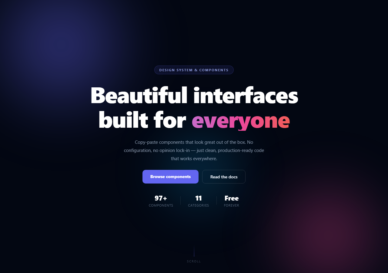
The mesh gradient hero is the most popular aesthetic on modern product landing pages — a dark background with large blurred radial-gradient colour blobs that drift slowly, creating an ambient painted background effect. This snippet gives you a complete implementation with three animated mesh blobs, a shimmer gradient headline, a cycling word swap animation, a stats row, and a scroll-down indicator — all in plain HTML, CSS, and minimal JavaScript.
How the CSS mesh gradient works
Three absolutely positioned div elements (.mesh, .mesh-2, .mesh-3) each have a radial-gradient background in different colours (indigo, pink, cyan) and filter: blur(80px) to create the soft, painterly blob effect. They use position: absolute and overflow: hidden on the parent to stay contained. A CSS @keyframes animation (drift) moves each blob by translate(x,y) and scale() on a different delay and direction — so they move independently and never look static. The blur is handled on the GPU compositor.
The shimmer gradient headline
The .swap span has background: linear-gradient(90deg, purple, pink, orange) with background-size: 200%. A @keyframes animation shifts background-position from 0% to 200%, causing the gradient to sweep continuously across the text — a smooth shimmer effect that runs indefinitely.
The word swap animation
A setInterval cycles through ["everyone", "developers", "designers", "startups", "teams"] every 2.8 seconds. On each tick, the element fades out via opacity: 0 and translateY(8px), then the text changes and fades back in. This pattern cycles through audience segments to communicate broad relevance without a long copy list.
The scroll-down indicator
A vertical gradient line animates via scaleY and opacity to suggest downward scroll. The line uses background: linear-gradient(to bottom, transparent, indigo) for a natural fade-in from nothing. Letter-spaced uppercase "Scroll" label below reinforces the affordance.
The stats row
Three stats (97+ components, 11 categories, Free) separated by thin 1px dividers communicate scale and value proposition at a glance. Update with your own product metrics.
Performance and accessibility
All three mesh blob animations use CSS transform — GPU compositor only, no layout recalculation triggered. The shimmer gradient text animation uses background-position — also compositor-safe. For users who prefer reduced motion, add @media (prefers-reduced-motion: reduce) { .mesh, .mesh-2, .mesh-3 { animation: none; } .swap { animation: none; } } to freeze the blobs and shimmer without removing the visual design. The word swap setInterval should also be gated: check window.matchMedia("(prefers-reduced-motion: reduce)").matches before calling setInterval.
Build with AI
Build, Understand, Optimize, and Extend It With AI
Instead of manually tracing how three blurred blobs never look synchronized, hand this snippet's HTML, CSS, and JS to an AI coding assistant like Claude and ask it to explain why staggering each mesh div's drift animation-delay and flipping animation-direction to reverse on one of them is what keeps the background from ever repeating a visible pattern. The same assistant can help optimize it — ask whether three large blurred, animated divs are cheap enough on low-end mobile GPUs, or whether the word-swap setInterval should be paused when the tab is backgrounded using the Page Visibility API. It's also a fast way to extend the hero: ask it to make the mesh blobs follow the cursor slightly for a parallax feel, add a fourth blob with its own color and timing, or gate the whole animation set behind a prefers-reduced-motion media query with a graceful static fallback. Treat the code less like a finished artifact and more like a starting point for a conversation.
Prompt to recreate it
Copy this into your AI assistant of choice to build the effect from scratch, or as a jumping-off point for your own variant:
Build an animated gradient mesh hero section in plain HTML, CSS, and minimal JavaScript, no canvas, no libraries.

Requirements:
- Three or more absolutely positioned, large circular divs, each with a different radial-gradient background fading to transparent, each with filter: blur(80px), contained inside a hero section with overflow: hidden so nothing bleeds past the viewport.
- One shared drift keyframe animation that moves each blob with transform: translate(x, y) scale(s) through at least three keyframe stops, applied to every blob but with a different animation-delay (using negative values so they start mid-cycle) and at least one blob using animation-direction: reverse, so the blobs never move in visible unison.
- A headline where part of the text uses a linear-gradient background with background-size around 200%, background-clip: text and transparent text fill, animated by shifting background-position across a keyframe loop to create a continuous color shimmer.
- A JavaScript-driven word-swap: an array of words cycled by setInterval, where each tick fades the current word out (opacity 0, translateY offset) via a CSS transition, swaps the textContent after the transition duration with setTimeout, then fades the new word back in.
- A scroll-down indicator built from a short vertical gradient line that pulses opacity and scaleY on an infinite keyframe animation.
- A stats row with thin 1px divider elements between each stat, and primary and outline call-to-action buttons below the headline.
Want to tighten it up first? Run this prompt through the AI Prompt Studio to score it across 8 quality dimensions, catch anti-patterns, and tune the wording for Claude, ChatGPT, or Gemini before you paste it in.
Step by step
How to Use
- 1Click play and watch the mesh animationThree gradient blobs drift independently using the drift @keyframes with different animation-delay and direction values. The shimmer text and word swap also run automatically on load.
- 2Change the mesh blob coloursIn the CSS panel, update the rgba colours in .mesh, .mesh-2, and .mesh-3 background radial-gradient values. Use rgba() with low opacity (0.3–0.5) so blobs blend smoothly without overpowering the text.
- 3Update the cycling wordsIn the JS panel, edit the words array: ["everyone", "developers", ...]. Add or remove audience segments. Change the 2800ms interval to control swap speed.
- 4Update the headline and statsEdit the static part of the headline in the HTML h1. Update the .stat-n values to your real component count, category count, or other product metrics.
- 5Adjust the mesh speed and sizeIn the CSS, change animation-duration on .mesh (default 18s) to speed up or slow down the drift. Reduce width/height on each .mesh element for smaller, tighter blobs. Increase filter: blur() for softer, more diffuse blobs.
- 6Export in your formatClick "HTML" for a standalone file, "JSX" for a React component with useEffect for the word swap interval and cleanup, or "Tailwind" for a React + Tailwind CSS version.
Real-world uses
Common Use Cases
Got questions?
Frequently Asked Questions
Three div elements are positioned absolutely inside the hero. Each has a radial-gradient background in a different colour with filter: blur(80px) applied — the blur creates the soft, diffuse blob shape. A CSS @keyframes animation moves each blob via transform: translate() and scale() on different durations (18s), delays (-6s, -12s), and directions (normal, reverse). Because they move at different rates and in different directions, they never synchronise and always look organic. Crucially, transforms run on the GPU compositor and do not trigger layout recalculation.
Copy one of the .mesh div elements in the HTML and add a .mesh-4 class. In the CSS, add .mesh-4 { width: 400px; height: 400px; background: radial-gradient(circle, rgba(234,179,8,0.3), transparent 70%); top: 20%; right: 20%; animation-delay: -9s; } — adjust the position, size, and colour to fill any empty area. Multiple overlapping blobs with mix-blend-mode: screen (if you add it) would blend colours additively.
setInterval fires every 2800ms. On each tick, it applies opacity: 0 and transform: translateY(8px) via inline style with transition to fade the element out and slide it down. After 320ms (the transition duration), a setTimeout fires, changes el.textContent to the next word in the array, then immediately sets opacity: 1 and transform: translateY(0) to fade back in. The result is a clean fade-swap with a slight upward slide that signals the text has changed.
Yes. Click "JSX" to download. In React, manage the word swap in a useEffect with a setInterval. Return a cleanup function that calls clearInterval() to prevent memory leaks when the component unmounts: useEffect(() => { const id = setInterval(() => { ... }, 2800); return () => clearInterval(id); }, []). In Next.js App Router, add "use client" since the component uses useEffect. The CSS mesh animations are purely CSS and work unchanged in any framework.