Source Code
<section class="hero">
<div class="top-bar">
<span class="location">✦ London & Remote</span>
<span class="year">Est. 2019</span>
</div>
<div class="main">
<div class="left">
<div class="number-accent">03</div>
<div class="services-list">
<div class="svc">Brand Identity</div>
<div class="svc active">Web Design</div>
<div class="svc">Development</div>
<div class="svc">Motion</div>
</div>
</div>
<div class="center">
<h1 class="headline">
We craft<br>
<em class="italic-word">remarkable</em><br>
digital work
</h1>
<div class="rule"></div>
<p class="tagline">Award-winning creative studio pushing the boundaries of digital experience — from visual identity to interactive web.</p>
<a href="#" class="cta">Start a project ↗</a>
</div>
<div class="right">
<div class="stat-block">
<span class="big-n">120<sup>+</sup></span>
<span class="big-l">Projects</span>
</div>
<div class="stat-block">
<span class="big-n">98<sup>%</sup></span>
<span class="big-l">Client satisfaction</span>
</div>
<div class="stat-block">
<span class="big-n">14</span>
<span class="big-l">Awards won</span>
</div>
<div class="marquee-wrap">
<div class="marquee-track" id="mq">
<span>Brand ✦</span><span>Design ✦</span><span>Code ✦</span><span>Motion ✦</span>
<span>Brand ✦</span><span>Design ✦</span><span>Code ✦</span><span>Motion ✦</span>
</div>
</div>
</div>
</div>
<div class="bottom-bar">
<div class="clients">
<span class="client-label">Clients include</span>
<span class="client">Acme</span>
<span class="client-dot">·</span>
<span class="client">Orbit</span>
<span class="client-dot">·</span>
<span class="client">Pulse</span>
<span class="client-dot">·</span>
<span class="client">Nexus</span>
</div>
<a href="#" class="view-work">View work →</a>
</div>
</section>* { box-sizing: border-box; margin: 0; padding: 0; }
body { font-family: 'Georgia', serif; background: #fafaf8; min-height: 100vh; }
.hero { display: flex; flex-direction: column; min-height: 100vh; padding: 0 40px; border-left: 1px solid #e5e5e0; border-right: 1px solid #e5e5e0; max-width: 1200px; margin: 0 auto; }
.top-bar { display: flex; justify-content: space-between; align-items: center; padding: 20px 0; border-bottom: 1px solid #e5e5e0; font-family: system-ui, sans-serif; font-size: 11px; letter-spacing: 1.5px; text-transform: uppercase; color: #9ca3af; }
.main { display: flex; gap: 0; flex: 1; align-items: stretch; }
/* Left column — numbered service list */
.left { width: 180px; border-right: 1px solid #e5e5e0; padding: 40px 24px 40px 0; display: flex; flex-direction: column; gap: 24px; flex-shrink: 0; }
.number-accent { font-size: 80px; font-weight: 900; color: #e5e5e0; line-height: 1; font-family: system-ui, sans-serif; }
.services-list { display: flex; flex-direction: column; gap: 6px; }
.svc { font-family: system-ui, sans-serif; font-size: 11px; letter-spacing: 0.8px; text-transform: uppercase; color: #9ca3af; padding: 6px 0; border-bottom: 1px solid transparent; transition: color 0.2s; cursor: default; }
.svc.active { color: #111; border-bottom-color: #111; }
.svc:hover { color: #555; }
/* Center — main headline */
.center { flex: 1; padding: 40px 48px; display: flex; flex-direction: column; justify-content: center; gap: 24px; border-right: 1px solid #e5e5e0; }
.headline { font-size: clamp(44px, 7vw, 88px); font-weight: 900; color: #111; line-height: 1.05; letter-spacing: -2px; }
.italic-word { font-style: italic; font-weight: 400; color: #6b7280; }
.rule { width: 48px; height: 2px; background: #111; }
.tagline { font-size: 14px; color: #6b7280; line-height: 1.8; max-width: 340px; font-family: system-ui, sans-serif; }
.cta { display: inline-block; font-family: system-ui, sans-serif; font-size: 13px; font-weight: 700; color: #111; border: 1.5px solid #111; padding: 12px 24px; border-radius: 4px; text-decoration: none; letter-spacing: 0.5px; transition: background 0.15s, color 0.15s; }
.cta:hover { background: #111; color: #fafaf8; }
/* Right column — stats + marquee */
.right { width: 180px; border-left: 1px solid transparent; padding: 40px 0 40px 24px; display: flex; flex-direction: column; justify-content: center; gap: 28px; flex-shrink: 0; }
.stat-block { display: flex; flex-direction: column; gap: 2px; }
.big-n { font-size: 32px; font-weight: 900; color: #111; line-height: 1; font-family: system-ui, sans-serif; }
.big-n sup { font-size: 14px; vertical-align: super; }
.big-l { font-family: system-ui, sans-serif; font-size: 10px; letter-spacing: 0.8px; text-transform: uppercase; color: #9ca3af; }
/* Marquee */
.marquee-wrap { overflow: hidden; border-top: 1px solid #e5e5e0; padding-top: 16px; }
.marquee-track { display: flex; gap: 12px; white-space: nowrap; font-family: system-ui, sans-serif; font-size: 10px; letter-spacing: 1px; text-transform: uppercase; color: #9ca3af; animation: scroll-l 12s linear infinite; }
.marquee-track span { flex-shrink: 0; }
@keyframes scroll-l { from { transform: translateX(0) } to { transform: translateX(-50%) } }
/* Bottom bar */
.bottom-bar { display: flex; justify-content: space-between; align-items: center; padding: 20px 0; border-top: 1px solid #e5e5e0; font-family: system-ui, sans-serif; }
.clients { display: flex; align-items: center; gap: 10px; }
.client-label { font-size: 10px; letter-spacing: 1px; text-transform: uppercase; color: #9ca3af; margin-right: 4px; }
.client { font-size: 13px; font-weight: 600; color: #374151; }
.client-dot { color: #d1d5db; }
.view-work { font-size: 13px; font-weight: 600; color: #111; text-decoration: none; letter-spacing: 0.3px; transition: opacity 0.15s; }
.view-work:hover { opacity: 0.6; }// Service list active cycling
const svcs = document.querySelectorAll('.svc');
let cur = 1;
setInterval(() => {
svcs[cur].classList.remove('active');
cur = (cur + 1) % svcs.length;
svcs[cur].classList.add('active');
}, 2500);Learn Coding Visually
Learn to code with interactive, live-preview playgrounds — HTML, CSS, JavaScript, React & more.
 HTML Playground42 lessons · Click-based · Live preview
 CSS PlaygroundLearn CSS with a live editor
 JavaScript Playground60 lessons · DOM · Async · Canvas
 React PlaygroundLearn React with a live code editor
 GSAP PlaygroundLearn GSAP animation interactively
 SVG Playground44 lessons · shapes · paths · animation
 SCSS Playground45 lessons · Sass modules · tokens
 Tailwind PlaygroundLearn Tailwind CSS with a live editor
 Bootstrap 5 Playground50 lessons · live preview
Agency Hero — Free HTML CSS JS Editorial Snippet
Agency Hero · Heroes · Plain HTML, CSS & JS · Live preview
What's included
Features
About this UI Snippet
Agency Hero — Three-Column Editorial Layout, Oversized Serif Headline & Service Cycling
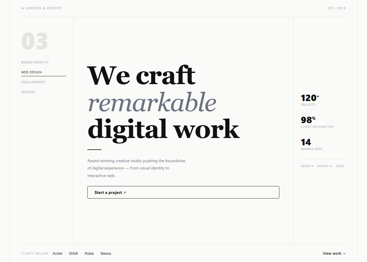
If you are building a creative agency, design studio, or freelance portfolio site that needs to command attention through typography rather than flashy backgrounds, this snippet gives you a complete three-column editorial hero: a left service list with active state cycling, a large center serif headline with italic accent word, a right stats column with a CSS marquee ticker, and a client logo strip footer — all with a restrained, editorial aesthetic.
The three-column editorial layout
The .main container uses flex with fixed-width left (180px) and right (180px) columns and a flexible center column that grows to fill the remaining space. All three columns are separated by 1px solid borders in a muted colour (#e5e5e0). The hero itself is constrained to max-width: 1200px with side borders — creating a newspaper column feel that looks intentionally designed.
The oversized headline
The h1 uses font-family: Georgia (serif) with font-size: clamp(44px, 7vw, 88px) and letter-spacing: -2px. The italic-word em element uses font-style: italic and font-weight: 400 with a muted grey colour — a stark contrast to the bold 900-weight surrounding text. This mixed-weight typography technique creates visual interest without colour.
The service list with active cycling
The left column shows four service disciplines with one marked .active at any time. A setInterval cycles the active class every 2.5 seconds — drawing the eye to the left column and implying dynamic presentation of your full service offering. The active item gets a full-width black underline border; all others are muted grey.
The CSS marquee ticker
The .marquee-track duplicates the content ("Brand ✦ Design ✦ Code ✦ Motion ✦") twice and uses animation: scroll-l that translates the track by -50% — since 50% represents exactly one copy of the content, the scroll loops seamlessly without JavaScript.
The restrained colour palette
The entire hero uses only black (#111), warm white (#fafaf8), and various greys. This monochrome editorial palette communicates design confidence — letting the typography do the work rather than relying on gradient accents. Add a single brand colour to the CTA hover or the active service item for personality.
Font choice and typographic pairing
The headline uses font-family: Georgia, serif — a system serif available on all devices without a web font load. For a premium typographic result, replace Georgia with a loaded serif such as Playfair Display, Cormorant Garamond, or Fraunces from Google Fonts. Load only the 900 weight and the 400 italic style for the minimum file size. The body copy and UI elements use system-ui to maintain readability without a second font load.
Build with AI
Build, Understand, Optimize, and Extend It With AI
You don't have to work out the marquee math or the cycling interval yourself — paste this snippet's HTML, CSS, and JS into an AI coding assistant like Claude and ask it to explain exactly why the marquee track's content is duplicated twice and the keyframe translates by exactly -50 percent for a seamless loop, and why the service list cycling starts at index 1 to match the initial active HTML state. The same assistant is useful for optimizing it — asking whether the setInterval-driven active class cycling should pause on hover or on prefers-reduced-motion, or whether the three fixed-width flex columns should switch to CSS Grid for more predictable breakpoint behavior. It's just as good for extending the hero: ask it to make the service list clickable so users can jump to a specific service section, animate the stat numbers counting up on load, or swap the setInterval cycling for an IntersectionObserver-triggered entrance the first time the hero scrolls into view. Treat the code less like a finished artifact and more like a starting point for a conversation.
Prompt to recreate it
Copy this into your AI assistant of choice to build the effect from scratch, or as a jumping-off point for your own variant:
Build a three-column editorial "agency hero" section in plain HTML, CSS, and JavaScript — no libraries, no CSS Grid required (use flexbox with fixed-width side columns and a fluid center).

Requirements:
- A top bar with a location label and an "Est. [year]" label, separated by space-between alignment, styled in small uppercase letter-spaced text.
- A three-column main area: a fixed-width left column listing several service names stacked vertically with only one marked as visually "active" (bold with an underline) at a time; a flexible center column with a large multi-line serif headline where one word is styled in italic with a lighter weight and color for typographic contrast, a short horizontal rule, a tagline paragraph, and a bordered call-to-action link; a fixed-width right column with three stat blocks (a large number plus a small label each) and a horizontally auto-scrolling ticker at the bottom.
- Every column must be separated from its neighbor by a thin 1px solid border, and the whole hero constrained to a max-width with matching left/right border rails, producing a newspaper-column look.
- Implement the service list "active" cycling with a setInterval (no CSS-only animation): every couple of seconds, remove the active class from the currently active service, advance to the next one with wraparound (modulo the list length), and add the active class to it, relying on a CSS transition on color and border-bottom for the visual fade between states.
- Implement the ticker as a pure CSS marquee: duplicate its list of words exactly twice inside one flex container with no line wrapping, then animate that container's transform with a linear, infinitely-repeating keyframe that translates it by exactly -50% of its own width, so the loop is seamless because the second copy starts exactly where the first ended.
- Keep the color palette monochrome (black, off-white, and grays only) with no gradients, so the layout's structure and typography carry all the visual weight.
Want to tighten it up first? Run this prompt through the AI Prompt Studio to score it across 8 quality dimensions, catch anti-patterns, and tune the wording for Claude, ChatGPT, or Gemini before you paste it in.
Step by step
How to Use
- 1Update the agency name and locationEdit the .location span in the top bar to your city or work arrangement ("London & Remote", "New York", "Worldwide"). Edit the "Est. 2019" year to your agency founding year.
- 2Update the headline and taglineEdit the three-line h1 headline. The em tag wraps the italic accent word — change "remarkable" to your key brand differentiator. Update the .tagline paragraph with your agency positioning statement.
- 3Update the service listIn the HTML, edit the four .svc div texts to match your actual service disciplines. The JS cycles the active class — no code change needed when you update the service names.
- 4Update stats and client namesChange the three .stat-block numbers (120+, 98%, 14) to your real project count, satisfaction rate, and awards. Update the four .client names in the bottom bar to real client company names.
- 5Change the marquee ticker contentEdit the .marquee-track span elements. Keep both copies identical (the track has each word twice for seamless looping). Change speed by editing animation-duration from 12s to faster or slower.
- 6Export in your formatClick "HTML" for a standalone file, "JSX" for a React component with useEffect for the cycling interval, or "Tailwind" for a React + Tailwind CSS version.
Real-world uses
Common Use Cases
Got questions?
Frequently Asked Questions
The .marquee-track contains the content ("Brand ✦ Design ✦ Code ✦ Motion ✦") written twice — two identical copies side by side. The @keyframes animation translates the track from 0 to -50% of its total width. Since 50% of the full track width equals exactly one copy of the content, when the animation restarts from 0, it looks identical to where it ended — creating a seamless loop. The animation uses linear timing for consistent speed.
A querySelectorAll(".svc") selects all service items. A setInterval fires every 2500ms. On each tick, it removes .active from the current item, increments the index (wrapping back to 0 after the last item), and adds .active to the new current item. The CSS transition on .svc color and border-bottom smoothly fades between states. The cycling starts from index 1 (Web Design) matching the initial HTML state.
The current palette is intentionally monochrome. To add one brand colour: change the .svc.active border-bottom-color and color to your brand hex. Change the .cta hover background to your brand colour. Optionally, tint the italic-word colour from #6b7280 to a very light version of your brand colour. Using one accent colour on only two or three elements maintains the editorial restraint while adding brand identity.
Add @media (max-width: 768px) { .main { flex-direction: column; } .left, .right { width: 100%; border-right: none; padding: 24px 0; border-bottom: 1px solid #e5e5e0; } .center { padding: 32px 0; border-right: none; } .hero { padding: 0 20px; } .number-accent { font-size: 48px; } } — this stacks the three columns vertically on mobile while maintaining the editorial border structure.