Source Code
<div class="scene">
  <h2>Trusted by teams at</h2>
  <div class="marquee-wrap">
    <div class="track">
      <span>Vercel</span><span>Stripe</span><span>Linear</span><span>Figma</span>
      <span>Notion</span><span>Loom</span><span>Clerk</span><span>Supabase</span>
      <span>Vercel</span><span>Stripe</span><span>Linear</span><span>Figma</span>
      <span>Notion</span><span>Loom</span><span>Clerk</span><span>Supabase</span>
    </div>
  </div>
  <div class="marquee-wrap reverse">
    <div class="track">
      <span>🚀 Ship faster</span><span>⚡ Zero config</span><span>🎨 Design tokens</span>
      <span>🔒 Type safe</span><span>🌍 Edge CDN</span><span>📦 Tree shakeable</span>
      <span>🚀 Ship faster</span><span>⚡ Zero config</span><span>🎨 Design tokens</span>
      <span>🔒 Type safe</span><span>🌍 Edge CDN</span><span>📦 Tree shakeable</span>
    </div>
  </div>
</div>
* { box-sizing: border-box; margin: 0; padding: 0; }
body { font-family: system-ui, sans-serif; background: #0f172a; }
.scene { min-height: 100vh; display: flex; flex-direction: column; align-items: center; justify-content: center; gap: 24px; overflow: hidden; }
h2 { font-size: 18px; font-weight: 700; color: #475569; }
.marquee-wrap { width: 100%; overflow: hidden; -webkit-mask: linear-gradient(90deg, transparent, black 10%, black 90%, transparent); mask: linear-gradient(90deg, transparent, black 10%, black 90%, transparent); }
.track { display: flex; width: max-content; animation: scroll 18s linear infinite; }
.reverse .track { animation-direction: reverse; }
.track span { padding: 8px 28px; font-size: 14px; font-weight: 600; color: #334155; white-space: nowrap; border-right: 1px solid #1e293b; }
.reverse .track span { color: #475569; margin: 0 6px; border: none; border-radius: 20px; border: 1px solid rgba(99,102,241,0.12); background: rgba(99,102,241,0.06); }
@keyframes scroll { from { transform: translateX(0); } to { transform: translateX(-50%); } }Learn Coding Visually
Learn to code with interactive, live-preview playgrounds — HTML, CSS, JavaScript, React & more.
 HTML Playground42 lessons · Click-based · Live preview
 CSS PlaygroundLearn CSS with a live editor
 JavaScript Playground60 lessons · DOM · Async · Canvas
 React PlaygroundLearn React with a live code editor
 GSAP PlaygroundLearn GSAP animation interactively
 SVG Playground44 lessons · shapes · paths · animation
 SCSS Playground45 lessons · Sass modules · tokens
 Tailwind PlaygroundLearn Tailwind CSS with a live editor
 Bootstrap 5 Playground50 lessons · live preview
Marquee Ticker — Free HTML CSS Infinite Scroll Snippet
Marquee / Ticker · Animations · Plain HTML & CSS · Live preview
What's included
Features
About this UI Snippet
Marquee Ticker — CSS Infinite Scroll, Mask Edge Fade & Reverse Variant
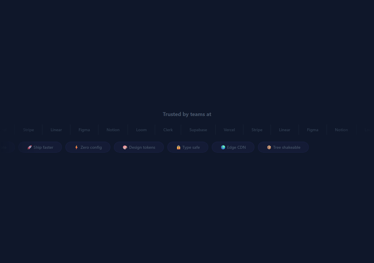
A marquee is a horizontally scrolling strip of text or logos that loops continuously. It is used on landing pages to show client logos, tech stack icons, feature names, or announcement text in a space-efficient format. The CSS approach is far lighter than JavaScript-based solutions and requires no library.
How the infinite scroll works
The content sits inside a .track div that has display: flex; width: max-content. The max-content width means the track is exactly as wide as all its children combined — no wrapping. A @keyframes scroll animation runs transform: translateX(0) to translateX(-50%) continuously. The content is duplicated in the HTML so that when the animation reaches -50% it has moved exactly one copy of the content — the duplicated copy fills in seamlessly, creating an infinite loop with no jump.
The CSS mask edge fade
.marquee-wrap { -webkit-mask: linear-gradient(90deg, transparent, black 10%, black 90%, transparent); mask: linear-gradient(90deg, transparent, black 10%, black 90%, transparent) } applies a mask that fades the track to transparency at both edges. The mask is black in the middle (fully visible) and transparent at 0% and 100% (fully invisible). This creates the appearance that the content appears and disappears at the edges rather than hard-clipping.
The reverse variant
Adding .reverse to the marquee wrapper applies animation-direction: reverse. This reverses the same keyframe — the track scrolls right instead of left. Using two rows with opposite directions creates the staggered counter-scroll effect seen on marketing pages.
Pause on hover
Add .track:hover { animation-play-state: paused; } to pause the animation when the user mouses over — useful when the items are clickable.
Changing the speed
Update 18s in animation: scroll 18s linear infinite to control speed. Lower values are faster; higher values are slower. Both rows can have different durations for visual variety.
The duplicate content loop trick
The marquee contains the content twice: <div class="track"><span>items...</span><span>items...</span></div>. The CSS animation translates the track from 0 to -50% of its width. Since 50% equals exactly one copy of the content, when the animation resets from -50% to 0, the two copies line up perfectly — creating a seamless infinite loop with no visible jump. The key requirement: both copies must be identical.
The CSS mask-image edge fade
To fade the marquee content at both edges (the "infinite scroll" look), apply mask-image: linear-gradient(to right, transparent, black 10%, black 90%, transparent) to the marquee container. This makes the content fade in from the left edge and fade out to the right edge. The mask uses percentage values so it adapts to any container width.
Pause on hover
Add animation-play-state: paused to .track on .marquee:hover to pause the scroll when the user hovers. This is important for marquees containing interactive content (links, buttons) — it prevents items from moving away before the user can click them.
Build with AI
Build, Understand, Optimize, and Extend It With AI
You do not need to puzzle out why exactly two copies of the content are required. Paste this snippet's HTML, CSS, and JS into an AI coding assistant like Claude and ask it to explain precisely why width: max-content on .track combined with an exact duplicate of every span is what makes translateX(-50%) loop without a visible jump, and why the .reverse variant only needs animation-direction: reverse rather than a second separate keyframe. The same assistant can help optimize it, for instance asking whether the hardcoded 16 duplicated span tags could instead be generated from a single JavaScript array to eliminate the risk of the two halves silently drifting out of sync when someone edits only one copy. It is also useful for extending the marquee: ask it to add a third counter-scrolling row at a different speed, make individual items pause the whole row on hover without stopping the other rows, or convert the fixed-text spans into linked, clickable items while keeping the loop seamless. Treat the code less like a finished artifact and more like a starting point for a conversation.
Prompt to recreate it
Copy this into your AI assistant of choice to build the effect from scratch, or as a jumping-off point for your own variant:
Build an infinite scrolling "marquee ticker" with two rows in plain HTML and CSS only, no JavaScript required.

Requirements:
- Each row's track must contain the exact same list of items rendered twice back to back (not once), and the track's width must be set to max-content so it never wraps and is exactly as wide as all its children combined.
- Animate each track with a single CSS keyframe that transitions from translateX(0) to translateX(-50%) on an infinite linear loop, relying entirely on the fact that the second half of the track is an identical copy of the first half for the reset to be visually seamless.
- Wrap each track in a container with overflow: hidden and a CSS mask-image (with the -webkit- prefixed equivalent for compatibility) that fades the content to transparent at the left and right edges using percentage stops, rather than a hard clip.
- Provide a second row variant that scrolls in the opposite direction using only animation-direction: reverse on the same shared keyframe — do not write a second, separately-defined keyframe for the reverse direction.
- Style the two rows differently (e.g. plain text items with dividers in one row, pill-shaped badges in the other) to demonstrate the technique works regardless of the item's visual treatment.
- Ensure individual item text never wraps mid-item using white-space: nowrap, so the marquee's items always render as a single unbroken line even at narrow viewport widths.
Want to tighten it up first? Run this prompt through the AI Prompt Studio to score it across 8 quality dimensions, catch anti-patterns, and tune the wording for Claude, ChatGPT, or Gemini before you paste it in.
Step by step
How to Use
- 1Load the snippetClick "Marquee / Ticker" in the sidebar. The preview shows two rows — one scrolling left, one right — with the edge fade mask active.
- 2Update the content itemsIn the HTML panel, replace the span text in both the original and duplicate .track with your logos, tech names, or announcement text. Keep both copies identical.
- 3Change the scroll speedUpdate 18s in animation: scroll 18s linear infinite in the CSS panel. Duplicate each row at a different speed for visual variety.
- 4Add pause on hoverIn the CSS panel, add .track:hover { animation-play-state: paused; } so the marquee stops when users hover over a clickable item.
- 5Change the edge fade widthUpdate the 10% and 90% values in the mask gradient to control how much of the track fades at each edge.
- 6Export in your formatClick "HTML" for a standalone file, "JSX" for a React component, or "Tailwind" for a React + Tailwind version.
Real-world uses
Common Use Cases
Got questions?
Frequently Asked Questions
The content is duplicated in HTML — the .track contains two identical sets of items. The translateX(-50%) animation moves exactly one copy-width to the left. When it arrives, it is visually identical to the start position, creating a seamless loop.
mask: linear-gradient(90deg, transparent, black 10%, black 90%, transparent) applies a transparency mask. Areas where the mask is black are fully visible; areas where it is transparent are invisible. The 10% and 90% stops create a fade zone at each edge while the middle is fully visible.
Add class="marquee-wrap reverse" to the wrapper element. The .reverse .track rule applies animation-direction: reverse, which runs the same scroll keyframe in reverse — scrolling right instead of left.
Add .track:hover { animation-play-state: paused; } to the CSS. This is useful when marquee items are clickable links — hovering stops the scroll so the user can click.
Update the duration in animation: scroll 18s linear infinite. Lower numbers scroll faster; higher numbers slower. The two rows in this snippet can have different durations for visual variation.
Yes. Replace the span text with img elements inside the track spans. Set a fixed width and height on each img and use object-fit: contain for logos. Duplicate the img elements for the seamless loop.