Source Code
<section class="cta">
  <div class="glow"></div>
  <div class="cta-inner">
    <span class="eyebrow">Limited-time offer</span>
    <h2 class="cta-title">Ready to ship faster?<br>Start building today.</h2>
    <p class="cta-lead">Join 12,000+ teams already using our platform. No credit card required — set up in under two minutes.</p>

    <form class="signup">
      <input type="email" placeholder="you@company.com" required>
      <button type="submit">Get started free</button>
    </form>

    <ul class="trust">
      <li>✓ 14-day free trial</li>
      <li>✓ Cancel anytime</li>
      <li>✓ 24/7 support</li>
    </ul>
  </div>
</section>
* { box-sizing: border-box; margin: 0; padding: 0; }
body {
font-family: system-ui, sans-serif;
background: #0b1020;
min-height: 100vh;
display: flex; align-items: center; justify-content: center;
padding: 24px;
}
.cta {
position: relative;
width: 100%; max-width: 760px;
overflow: hidden;
border-radius: 24px;
padding: 56px 40px;
text-align: center;
background: linear-gradient(135deg, #4f46e5, #7c3aed 55%, #db2777);
box-shadow: 0 30px 60px rgba(79,70,229,0.35);
}
/* Soft animated glow blob */
.glow {
position: absolute;
top: -40%; left: 50%;
width: 480px; height: 480px;
transform: translateX(-50%);
background: radial-gradient(circle, rgba(255,255,255,0.25), transparent 60%);
animation: float 6s ease-in-out infinite;
pointer-events: none;
}
@keyframes float {
0%, 100% { transform: translate(-50%, 0); }
50% { transform: translate(-50%, 24px); }
}
.cta-inner { position: relative; z-index: 1; }
.eyebrow {
display: inline-block;
font-size: 12px; font-weight: 800; letter-spacing: 0.08em; text-transform: uppercase;
color: #fff;
background: rgba(255,255,255,0.16);
padding: 6px 14px; border-radius: 999px;
margin-bottom: 18px;
}
.cta-title { font-size: 34px; line-height: 1.15; font-weight: 800; color: #fff; margin-bottom: 14px; }
.cta-lead { font-size: 16px; color: rgba(255,255,255,0.85); line-height: 1.6; max-width: 480px; margin: 0 auto 28px; }
.signup {
display: flex; gap: 10px;
max-width: 440px; margin: 0 auto 22px;
}
.signup input {
flex: 1;
padding: 14px 16px;
border: none; border-radius: 12px;
font-size: 14px; font-family: inherit;
outline: none;
}
.signup input:focus { box-shadow: 0 0 0 3px rgba(255,255,255,0.4); }
.signup button {
padding: 14px 24px;
border: none; border-radius: 12px;
background: #0b1020; color: #fff;
font-size: 14px; font-weight: 700; font-family: inherit;
cursor: pointer; white-space: nowrap;
transition: transform 0.15s, background 0.15s;
}
.signup button:hover { transform: translateY(-2px); background: #161c33; }
.trust {
list-style: none;
display: flex; flex-wrap: wrap; gap: 18px; justify-content: center;
font-size: 13px; color: rgba(255,255,255,0.8);
}
@media (max-width: 560px) {
.cta { padding: 40px 22px; }
.cta-title { font-size: 26px; }
.signup { flex-direction: column; }
}function submitCta(e) {
e.preventDefault();
const email = e.target.querySelector('input').value;
const btn = e.target.querySelector('button');
btn.textContent = 'Welcome aboard! 🎉';
console.log('CTA signup:', email);
}
document.querySelector('.signup').addEventListener('submit', submitCta);Learn Coding Visually
Learn to code with interactive, live-preview playgrounds — HTML, CSS, JavaScript, React & more.
 HTML Playground42 lessons · Click-based · Live preview
 CSS PlaygroundLearn CSS with a live editor
 JavaScript Playground60 lessons · DOM · Async · Canvas
 React PlaygroundLearn React with a live code editor
 GSAP PlaygroundLearn GSAP animation interactively
 SVG Playground44 lessons · shapes · paths · animation
 SCSS Playground45 lessons · Sass modules · tokens
 Tailwind PlaygroundLearn Tailwind CSS with a live editor
 Bootstrap 5 Playground50 lessons · live preview
CTA Banner Section — Gradient Call-to-Action Snippet
CTA Banner Section · Heroes · Plain HTML, CSS & JS · Live preview
What's included
Features
About this UI Snippet
CTA Banner Section — Gradient Background, Inline Email Capture & Trust Badges
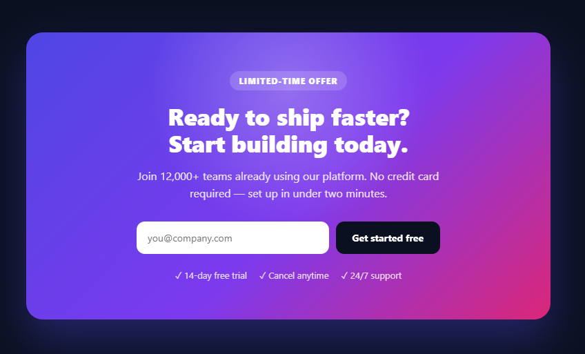
A call-to-action (CTA) banner is one of the most-searched section snippets because almost every landing page needs a final, high-converting prompt that turns a reader into a signup. This snippet is a complete, responsive CTA section built with the conversion best-practices that actually move the needle: a gradient background that draws the eye, an eyebrow tag that adds urgency, a benefit-driven headline, an inline email capture form, trust badges to reduce friction, and a subtle animated glow for polish. It is production-ready and works on any background.
The anatomy of a high-converting CTA
The section follows the proven CTA layout, top to bottom: an eyebrow pill ("Limited-time offer") that creates urgency and frames the offer; a two-line headline ("Ready to ship faster? Start building today.") that leads with a benefit, not a feature; a short supporting paragraph with social proof ("Join 12,000+ teams") and a friction-remover ("No credit card required"); the action itself — an inline email field and a contrasting button; and a row of trust badges ("14-day free trial", "Cancel anytime", "24/7 support") directly under the button where hesitation peaks. Every element earns its place by either building desire or removing a reason not to click.
The gradient background and contrasting button
The banner uses a diagonal linear-gradient(135deg, #4f46e5, #7c3aed 55%, #db2777) — indigo through purple to pink — which stands out vividly against a page and signals "this is important." The crucial conversion detail is the button color: instead of a white or matching-gradient button (which would blend in), the CTA button is near-black (#0b1020), the page's own dark background. High contrast between the button and its surroundings measurably improves click-through, because the action becomes the single most prominent thing in the section. The button also lifts on hover (translateY(-2px)) for tactile feedback.
The animated glow
A .glow element sits behind the content: a large radial-gradient(circle, rgba(255,255,255,0.25), transparent) blob positioned at the top, gently drifting up and down with a 6-second @keyframes float loop. It has pointer-events: none so it never interferes with clicks, and the content sits above it via position: relative; z-index: 1. This soft moving light adds depth and a premium, alive feel without distracting from the message — the kind of detail that separates a flat banner from a polished one. Because it only animates transform, it is GPU-cheap and smooth.
The inline email-capture form
Reducing the action to a single email field plus a button is a deliberate conversion choice: every extra field lowers completion. The form is a flex row — the <input type="email" required> flexes to fill the space and the button stays fixed-width with white-space: nowrap. The native type="email" and required give free client-side validation and the correct mobile keyboard. On submit, the small submitCta handler prevents the default page reload and swaps the button to a success message ("Welcome aboard! 🎉"); in production you would POST the email to your backend or email provider instead. The input shows a clear focus ring for keyboard users.
Responsive behavior
CTA banners must work on phones, where most traffic converts. A @media (max-width: 560px) query reduces the padding and headline size and, importantly, switches the signup form to flex-direction: column so the email field and button stack full-width instead of squeezing side by side. The trust badges wrap naturally with flex-wrap. The whole section is fluid with max-width and centered, so it looks intentional from a 360px phone to a wide desktop.
Why this converts better than a plain "Sign up" button
A bare button at the end of a page leaves conversion on the table. This banner stacks multiple persuasion techniques in one focused block: urgency (the eyebrow), benefit framing (the headline), social proof and friction removal (the paragraph), a low-effort single-field action, and trust badges placed exactly where doubt occurs. Visually, the gradient isolates the CTA from the rest of the page so the eye lands on it, and the dark high-contrast button makes the next step obvious. These are the same ingredients used in the highest-converting SaaS and marketing pages.
Customizing the CTA
Swap the gradient colors for your brand, and keep the button a high-contrast color that does not appear elsewhere in the gradient. Rewrite the eyebrow, headline, and paragraph for your offer — lead the headline with the outcome the user wants. Change the trust badges to your actual guarantees. To make it a button-only CTA (no email capture), replace the form with a single anchor styled like the button. To embed it mid-page rather than full-screen, drop the body flex centering and place the <section> in your layout. Because it is one self-contained section with a small handler, it pastes into any page.
Build with AI
Build, Understand, Optimize, and Extend It With AI
You don't have to guess why each element in this banner is placed where it is. Paste the HTML, CSS, and JS into an AI coding assistant like Claude and ask it to explain why the CTA button is deliberately colored near-black instead of matching the gradient, and how the glow blob's float keyframes stay GPU-cheap by only animating transform. The same assistant is useful for optimizing it — ask whether the radial-gradient glow could be replaced with a pre-rendered image for lower-end devices, or whether the gradient itself should be simplified for print or reduced-motion contexts. It's also a fast way to extend the banner: ask it to add a countdown timer next to the eyebrow tag for real urgency, wire submitCta up to an actual email provider API, or build a second variant with a single button instead of the email form for a simpler call to action. Treat the code less like a finished artifact and more like a starting point for a conversation.
Prompt to recreate it
Copy this into your AI assistant of choice to build the effect from scratch, or as a jumping-off point for your own variant:
Build a high-converting gradient CTA banner section in plain HTML, CSS, and JavaScript — no frameworks, no build step.

Requirements:
- A centered section with a diagonal linear-gradient background (at least three color stops), rounded corners, and a drop shadow that matches the gradient's hue.
- An "eyebrow" pill label above the headline for urgency framing, a two-line benefit-led headline, and a supporting paragraph containing both a social-proof number and a friction-removing statement (e.g. no credit card required).
- An inline single-row email capture form: a flex-grow email input with type="email" and required, plus a fixed-width submit button with white-space: nowrap so it never wraps awkwardly next to the input.
- The submit button's background color must be a high-contrast color that does not appear anywhere in the section's gradient (for example, reusing the page's own dark background color) so it is the single most visually prominent element in the section — not a white or gradient-matching button that blends in.
- A decorative glow element positioned behind the content using a radial-gradient blob, pointer-events: none so it never blocks clicks, a subtly looping float animation using only the transform property (translate), and z-index layering so the real content sits above it.
- A row of trust badges (e.g. free trial length, cancellation policy, support) directly beneath the button, since that is where user hesitation peaks.
- A responsive breakpoint that stacks the email input and button vertically on narrow viewports and reduces the section's padding and headline font size.
- A submit handler that prevents the default form submission and replaces the button's text with a confirmation message.
Want to tighten it up first? Run this prompt through the AI Prompt Studio to score it across 8 quality dimensions, catch anti-patterns, and tune the wording for Claude, ChatGPT, or Gemini before you paste it in.
Step by step
How to Use
- 1Drop in the sectionPaste the <section class="cta"> where you want the call-to-action. It is self-contained and centers itself; remove the body flex to embed it inline.
- 2Write benefit-led copyChange the eyebrow, headline, and paragraph. Lead the headline with the outcome (the benefit), and keep social proof and a friction-remover in the paragraph.
- 3Keep a high-contrast buttonRe-theme the gradient, but make the button a color that does NOT appear in the gradient so the action stands out and converts better.
- 4Wire up the formIn submitCta, POST the email to your backend or email provider instead of just showing the success message.
- 5Set your trust badgesReplace the trust list items with your real guarantees (trial length, refund policy, support).
- 6Export in your formatClick "HTML" for a standalone file, "JSX" for a React component, or "Tailwind" for a React + Tailwind version.
Real-world uses
Common Use Cases
Got questions?
Frequently Asked Questions
A high-converting CTA stacks several techniques in one focused block: an eyebrow for urgency, a benefit-led headline, a paragraph with social proof and a friction-remover (no credit card), a low-effort single-field action, and trust badges right under the button. The gradient isolates the CTA visually and the high-contrast button makes the next step obvious.
A button that blends into its background gets overlooked. Making the button a high-contrast color that does not appear in the gradient (here near-black) makes the action the single most prominent element, which measurably improves click-through.
The submitCta handler prevents the default reload and shows a success state. In production, replace that with a fetch/POST of the email value to your backend or email provider (Mailchimp, ConvertKit, etc.), then show the confirmation.
Yes. A max-width keeps it tidy on desktop, and a media query at 560px reduces padding and headline size and stacks the email field and button vertically so the form is full-width and easy to tap on phones.
Replace the <form> with a single <a> styled like the button (same padding, radius, dark background). The rest of the layout — eyebrow, headline, paragraph, trust badges — stays the same.
Yes. Click "JSX" for a React component or "Tailwind" for a React + Tailwind version. In React, manage the email in useState and submit it in an onSubmit handler; the gradient, glow, and layout are pure CSS and work unchanged.