Source Code
<div class="container py-5" style="max-width:560px">
  <div id="bstestiCarousel" class="carousel slide" data-bs-ride="false">
    <div class="carousel-inner">
      <div class="carousel-item active">
        <div class="card bstesti-card"><div class="card-body text-center">
          <div class="bstesti-stars">★★★★★</div>
          <p class="bstesti-quote">"Cut our onboarding time from two weeks to two days. The whole team adopted it in a single sprint."</p>
          <strong>Dana Reyes</strong><div class="text-muted small">Head of Ops, Fenwick</div>
        </div></div>
      </div>
      <div class="carousel-item">
        <div class="card bstesti-card"><div class="card-body text-center">
          <div class="bstesti-stars">★★★★★</div>
          <p class="bstesti-quote">"Support responded in minutes, not days. That alone justified switching."</p>
          <strong>Priya Nair</strong><div class="text-muted small">CTO, Loomis</div>
        </div></div>
      </div>
      <div class="carousel-item">
        <div class="card bstesti-card"><div class="card-body text-center">
          <div class="bstesti-stars">★★★★☆</div>
          <p class="bstesti-quote">"The API is exactly what you'd hope for — predictable, well documented, no surprises."</p>
          <strong>Marcus Chen</strong><div class="text-muted small">Lead Engineer, Voxel</div>
        </div></div>
      </div>
    </div>
    <button class="carousel-control-prev" type="button" data-bs-target="#bstestiCarousel" data-bs-slide="prev">
      <span class="carousel-control-prev-icon"></span>
    </button>
    <button class="carousel-control-next" type="button" data-bs-target="#bstestiCarousel" data-bs-slide="next">
      <span class="carousel-control-next-icon"></span>
    </button>
    <div class="carousel-indicators bstesti-dots position-relative mt-3">
      <button type="button" data-bs-target="#bstestiCarousel" data-bs-slide-to="0" class="active"></button>
      <button type="button" data-bs-target="#bstestiCarousel" data-bs-slide-to="1"></button>
      <button type="button" data-bs-target="#bstestiCarousel" data-bs-slide-to="2"></button>
    </div>
  </div>
</div>
.bstesti-card { border: 1px solid #eceef1; border-radius: 14px; min-height: 220px; }
.bstesti-stars { color: #f59e0b; font-size: 15px; margin-bottom: 10px; }
.bstesti-quote { font-size: 16px; color: #1f2937; margin-bottom: 16px; }
.carousel-control-prev, .carousel-control-next { width: 5%; filter: invert(1); opacity: .5; }
.bstesti-dots button { background-color: #d1d5db; width: 7px; height: 7px; border-radius: 50%; }
.bstesti-dots button.active { background-color: #6366f1; }// Bootstrap's own Carousel component handles all sliding and indicator
// sync via data-bs-* attributes — data-bs-ride="false" keeps it from
// auto-advancing, since testimonials should stay until manually browsed.
const carousel = bootstrap.Carousel.getOrCreateInstance(document.getElementById('bstestiCarousel'), { ride: false });Learn Coding Visually
Learn to code with interactive, live-preview playgrounds — HTML, CSS, JavaScript, React & more.
 HTML Playground42 lessons · Click-based · Live preview
 CSS PlaygroundLearn CSS with a live editor
 JavaScript Playground60 lessons · DOM · Async · Canvas
 React PlaygroundLearn React with a live code editor
 GSAP PlaygroundLearn GSAP animation interactively
 SVG Playground44 lessons · shapes · paths · animation
 SCSS Playground45 lessons · Sass modules · tokens
 Tailwind PlaygroundLearn Tailwind CSS with a live editor
 Bootstrap 5 Playground50 lessons · live preview
Bootstrap Testimonial Card Carousel — Free Snippet
Bootstrap Testimonial Card Carousel · Cards · Plain HTML, CSS & JS · Live preview
What's included
Features
About this UI Snippet
Bootstrap Testimonial Card Carousel — HTML, CSS & JavaScript
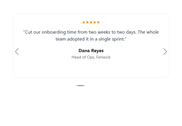
Bootstrap's Carousel component is usually shown carrying full-bleed images — this snippet uses the same real component to carry testimonial cards instead: a star rating, a quote, and an attribution, one per slide. The prev/next arrows, the clickable indicator dots, and the slide transition are all Bootstrap's own .carousel/.carousel-inner/.carousel-indicators markup, wired entirely through data-bs-target/data-bs-slide attributes.
One deliberate setting: data-bs-ride="false". Testimonials are read, not glanced at — auto-advancing them (Bootstrap's default carousel behavior) risks sliding a quote away before a visitor finishes reading it. Here the carousel only ever moves when a visitor clicks an arrow or a dot.
Build with AI
Build, Understand, Optimize, and Extend It With AI
Hand this snippet's HTML, CSS, and JS to an AI coding assistant like Claude and ask it to add swipe/touch gesture support for mobile visitors, or to make each slide show two testimonial cards side-by-side on desktop and one on mobile. It's also a good exercise to ask the assistant to pull testimonial data from a JSON array and render the slides dynamically instead of hardcoded HTML.
Prompt to recreate it
Copy this into your AI assistant of choice to build the effect from scratch, or as a jumping-off point for your own variant:
Build a Bootstrap 5.3 carousel used for testimonial cards, using the real Bootstrap CDN framework (bootstrap.min.css and bootstrap.bundle.min.js), not custom CSS made to resemble Bootstrap.

Requirements:
- Use Bootstrap's real Carousel component (carousel/carousel-inner/carousel-item) with at least three slides, each containing a full card with a star rating, a quote, and an attribution (name and role) — not images.
- Disable auto-advance (data-bs-ride="false") so the carousel only moves on explicit visitor interaction via the prev/next arrows or the indicator dots, all using Bootstrap's real carousel-control and carousel-indicators markup.
- Initialize the carousel instance in JavaScript with bootstrap.Carousel.getOrCreateInstance and the ride:false option, rather than relying only on the data attribute.
- The whole thing must remain readable and correctly sized on both mobile and desktop widths.
Want to tighten it up first? Run this prompt through the AI Prompt Studio to score it across 8 quality dimensions, catch anti-patterns, and tune the wording for Claude, ChatGPT, or Gemini before you paste it in.
Step by step
How to Use
- 1Load the snippetClick the snippet in the sidebar Library tab. The preview loads the first testimonial card.
- 2Click the next arrowBootstrap's real Carousel slides smoothly to the second testimonial.
- 3Click an indicator dotJump directly to any of the three testimonials by clicking its dot.
- 4Add a fourth testimonialCopy a .carousel-item block and add a matching fourth indicator button with data-bs-slide-to="3".
Real-world uses
Common Use Cases
Got questions?
Frequently Asked Questions
Yes — the sliding, the prev/next controls, and the indicator dots are all genuine Bootstrap 5.3 Carousel behavior, driven by data-bs-target/data-bs-slide attributes, loaded from the real CDN.
data-bs-ride="false" disables Bootstrap's default auto-advance. Testimonials need to be read, not glanced at, so this carousel only moves when a visitor clicks an arrow or a dot.
Copy a .carousel-item block with your new content, and add a matching indicator button with data-bs-slide-to="3" (continuing the zero-based index) to the indicator row.
Yes — remove data-bs-ride="false" (or set it to "carousel") and optionally pass an interval option to the JS initialization, e.g. { interval: 6000 }.
Yes — they're Bootstrap's standard carousel controls, which include the correct ARIA labeling and keyboard focusability out of the box.