Source Code
<div class="container py-5">
<div class="btn-group mb-4" role="group" id="bsmgFilter">
<button type="button" class="btn btn-outline-dark active" data-cat="all">All</button>
<button type="button" class="btn btn-outline-dark" data-cat="nature">Nature</button>
<button type="button" class="btn btn-outline-dark" data-cat="city">City</button>
<button type="button" class="btn btn-outline-dark" data-cat="people">People</button>
</div>
<div class="bsmg-masonry" id="bsmgGrid">
<img src="https://picsum.photos/id/1015/500/650" data-cat="nature" class="bsmg-img" alt="Mountain river">
<img src="https://picsum.photos/id/1011/500/400" data-cat="people" class="bsmg-img" alt="Portrait">
<img src="https://picsum.photos/id/1016/500/750" data-cat="city" class="bsmg-img" alt="City skyline">
<img src="https://picsum.photos/id/1025/500/500" data-cat="people" class="bsmg-img" alt="Dog portrait">
<img src="https://picsum.photos/id/1043/500/620" data-cat="nature" class="bsmg-img" alt="Field">
<img src="https://picsum.photos/id/1031/500/450" data-cat="city" class="bsmg-img" alt="Street">
<img src="https://picsum.photos/id/1035/500/700" data-cat="nature" class="bsmg-img" alt="Forest">
<img src="https://picsum.photos/id/1027/500/500" data-cat="people" class="bsmg-img" alt="Crowd">
<img src="https://picsum.photos/id/1044/500/580" data-cat="city" class="bsmg-img" alt="Bridge">
</div>
</div>
<div class="modal fade" id="bsmgModal" tabindex="-1">
<div class="modal-dialog modal-dialog-centered modal-lg">
<div class="modal-content bg-dark">
<div class="modal-body p-0 text-center position-relative">
<img id="bsmgModalImg" src="" class="img-fluid w-100" alt="Enlarged view">
<button class="btn btn-light bsmg-nav bsmg-prev" id="bsmgPrev">«</button>
<button class="btn btn-light bsmg-nav bsmg-next" id="bsmgNext">»</button>
<button type="button" class="btn-close btn-close-white position-absolute top-0 end-0 m-2" data-bs-dismiss="modal"></button>
</div>
</div>
</div>
</div>.bsmg-masonry { column-count: 3; column-gap: 0.75rem; }
.bsmg-img { width: 100%; display: block; margin-bottom: 0.75rem; border-radius: 8px; cursor: pointer; break-inside: avoid; }
.bsmg-img.bsmg-hidden { display: none; }
@media (max-width: 768px) { .bsmg-masonry { column-count: 2; } }
@media (max-width: 480px) { .bsmg-masonry { column-count: 1; } }
.bsmg-nav {
position: absolute;
top: 50%;
transform: translateY(-50%);
opacity: 0.85;
}
.bsmg-prev { left: 12px; }
.bsmg-next { right: 12px; }const filterButtons = Array.from(document.querySelectorAll('#bsmgFilter button'));
const allImages = Array.from(document.querySelectorAll('.bsmg-img'));
let currentSet = allImages;
let currentIndex = 0;
const modalEl = document.getElementById('bsmgModal');
const modal = new bootstrap.Modal(modalEl);
const modalImg = document.getElementById('bsmgModalImg');
function visibleImages() {
return allImages.filter(img => !img.classList.contains('bsmg-hidden'));
}
function applyFilter(cat) {
allImages.forEach(img => {
const matches = cat === 'all' || img.dataset.cat === cat;
img.classList.toggle('bsmg-hidden', !matches);
});
}
filterButtons.forEach(btn => {
btn.addEventListener('click', () => {
filterButtons.forEach(b => b.classList.remove('active'));
btn.classList.add('active');
applyFilter(btn.dataset.cat);
});
});
function openModal(img) {
// The Prev/Next set is always recomputed from whatever is currently
// visible, so cycling only ever moves within the active filtered set.
currentSet = visibleImages();
currentIndex = currentSet.indexOf(img);
modalImg.src = img.src;
modal.show();
}
function showAt(index) {
const len = currentSet.length;
currentIndex = (index + len) % len;
modalImg.src = currentSet[currentIndex].src;
}
allImages.forEach(img => {
img.addEventListener('click', () => openModal(img));
});
document.getElementById('bsmgPrev').addEventListener('click', () => showAt(currentIndex - 1));
document.getElementById('bsmgNext').addEventListener('click', () => showAt(currentIndex + 1));
modalEl.addEventListener('keydown', e => {
if (e.key === 'ArrowLeft') showAt(currentIndex - 1);
if (e.key === 'ArrowRight') showAt(currentIndex + 1);
});Learn Coding Visually
Learn to code with interactive, live-preview playgrounds — HTML, CSS, JavaScript, React & more.
 HTML Playground42 lessons · Click-based · Live preview
 CSS PlaygroundLearn CSS with a live editor
 JavaScript Playground60 lessons · DOM · Async · Canvas
 React PlaygroundLearn React with a live code editor
 GSAP PlaygroundLearn GSAP animation interactively
 SVG Playground44 lessons · shapes · paths · animation
 SCSS Playground45 lessons · Sass modules · tokens
 Tailwind PlaygroundLearn Tailwind CSS with a live editor
 Bootstrap 5 Playground50 lessons · live preview
Bootstrap Masonry Image Gallery — Free HTML CSS JS Snippet
Bootstrap Masonry Image Gallery · Layouts · Plain HTML, CSS & JS · Live preview
What's included
Features
About this UI Snippet
Bootstrap Masonry Image Gallery — HTML, CSS & JavaScript
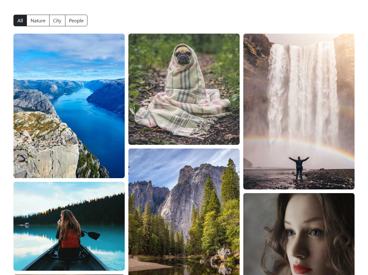
A masonry layout needs images of different heights to flow into balanced columns without leftover gaps, and the simplest way to get that without a JavaScript layout library is CSS multi-column layout: .bsmg-masonry sets column-count: 3 and column-gap: 0.75rem, and each .bsmg-img gets break-inside: avoid so the browser's own column-balancing algorithm never slices an image in half across a column break. Because column layout — unlike CSS Grid — flows items down each column before wrapping to the next, images of varying aspect ratios naturally interlock instead of leaving the ragged same-height rows a plain row/col grid would produce.
Category filtering works the same way as a typical Bootstrap btn-group filter: each image carries its category in a data-cat attribute, and clicking a filter button calls applyFilter(cat), which toggles a bsmg-hidden class (display: none) on every image that doesn't match, while also moving Bootstrap's active class onto only the clicked button. Because column layout reflows automatically as elements are hidden, filtering the gallery re-balances the remaining images into fresh columns with no manual re-layout code needed.
The lightbox is a real Bootstrap modal component, instantiated once with new bootstrap.Modal(modalEl) and reused for every image rather than creating a new modal instance per click. The detail that makes the Prev/Next cycling correct is in openModal(img): it calls visibleImages() — which filters allImages down to whatever currently lacks bsmg-hidden — and stores that as currentSet at the moment the modal opens, then finds the clicked image's position in it with indexOf. This is the specific edge case the requirements call out: if the currently applied filter is "Nature", Prev/Next inside the modal must only step through the nature photos, not the full nine-image gallery, and recomputing currentSet fresh on every open (rather than caching it once globally) means switching filters and reopening the modal always cycles the correct, currently-filtered subset.
showAt(index) wraps the index with (index + len) % len, so clicking Prev on the first image or Next on the last one loops around to the opposite end instead of getting stuck, and the same navigation is also wired to the Left/Right arrow keys while the modal is open.
The modal's dark bg-dark content area and btn-close-white close button are deliberate choices rather than defaults: a lightbox showing a photograph reads much better against a near-black background than Bootstrap's default white modal, since a white surround competes visually with the photo's own edges and colors, and the inverted close-button variant keeps that control legible against the dark background instead of disappearing into it.
Build with AI
Build, Understand, Optimize, and Extend It With AI
Ask an AI assistant like Claude to add a fade/zoom transition when the modal image changes between Prev/Next clicks, or to lazy-load the gallery images with the loading="lazy" attribute and a blur-up placeholder for slower connections.
Prompt to recreate it
Copy this into your AI assistant of choice to build the effect from scratch, or as a jumping-off point for your own variant:
Build a Bootstrap 5.3 masonry image gallery with a lightbox using the real Bootstrap CDN (bootstrap.min.css and bootstrap.bundle.min.js), not custom CSS made to resemble Bootstrap.

Requirements:
- A CSS column-count based masonry grid of at least nine images with varying heights, flowing into columns without gaps, using break-inside: avoid so images are never sliced across a column break.
- A category filter using a Bootstrap btn-group above the gallery that shows/hides images by a data-category attribute, letting the masonry columns re-balance automatically as items are hidden or shown.
- Clicking any visible image opens it enlarged in a real Bootstrap modal component (instantiated via the bootstrap.Modal JS API), with Prev/Next buttons inside the modal.
- The Prev/Next buttons must cycle only through the currently filtered set of images (recomputed at the moment the modal opens), with the index wrapping around at both ends.
- Support Left/Right arrow key navigation while the modal is open, in addition to the Prev/Next buttons.
Want to tighten it up first? Run this prompt through the AI Prompt Studio to score it across 8 quality dimensions, catch anti-patterns, and tune the wording for Claude, ChatGPT, or Gemini before you paste it in.
Step by step
How to Use
- 1Load the snippetNine images of varying heights appear arranged into three flowing masonry columns with no gaps.
- 2Click "Nature"The grid re-balances to show only the nature photos, flowing into columns without leftover empty space.
- 3Click any visible imageA real Bootstrap modal opens showing that image enlarged, with Prev/Next arrow buttons.
- 4Click Next repeatedlyThe modal cycles only through the nature photos currently shown, wrapping back to the first after the last.
- 5Close the modal and click "All"The full nine-image gallery reappears, re-flowed into masonry columns.
- 6Reopen an image and use arrow keysLeft and Right arrow keys navigate the modal the same way the Prev/Next buttons do.
Real-world uses
Common Use Cases
Got questions?
Frequently Asked Questions
Yes. Keep the image list and active category in component state, derive the visible array with a filter before rendering, and store the modal open state and current index in the same state object; the CSS column-count masonry and modal markup need no changes, only the class-toggling logic moves into conditional class bindings.
CSS multi-column layout (column-count) automatically distributes block-level children down each column in source order, and because images have naturally varying heights, this produces the balanced, gap-free masonry look without any manual position calculation.
openModal() recomputes visibleImages() — the current non-hidden image set — at the exact moment the modal opens and stores it as currentSet, so all subsequent Prev/Next clicks index into that filtered array rather than the full unfiltered gallery.
The break-inside: avoid CSS rule on each .bsmg-img tells the browser's column-balancing algorithm to move a whole image to the next column rather than splitting it across a column boundary.
Yes — replace the btn-group and modal with Tailwind's own button group styling and a hand-built dialog (or Bootstrap's bundled JS just for the modal component), while keeping the column-count masonry CSS and the filtering/navigation JavaScript exactly as is, since neither depends on Bootstrap-specific behavior beyond the Modal API.
Yes — add another img.bsmg-img element with a new data-cat value and a matching filter button with the same data-cat value; both the masonry layout and the filtering logic read that attribute directly, requiring no other code changes.