Source Code
<div class="container py-5 d-flex justify-content-center">
  <div class="card bsprofile-card">
    <div class="bsprofile-cover"></div>
    <div class="card-body text-center">
      <div class="bsprofile-avatar mx-auto">DR</div>
      <h5 class="card-title mb-0">Dana Reyes</h5>
      <p class="text-muted small mb-3">Head of Product · Fenwick</p>
      <div class="d-flex justify-content-center gap-4 mb-3">
        <div><strong id="bsprofileFollowers">2,481</strong><div class="text-muted small">Followers</div></div>
        <div><strong>312</strong><div class="text-muted small">Following</div></div>
        <div><strong>48</strong><div class="text-muted small">Posts</div></div>
      </div>
      <button class="btn w-100 fw-bold bsprofile-follow" id="bsprofileBtn" data-following="false">Follow</button>
    </div>
  </div>
</div>
.bsprofile-card { width: 300px; border: 1px solid #eceef1; border-radius: 16px; overflow: hidden; }
.bsprofile-cover { height: 80px; background: linear-gradient(135deg, #6366f1, #ec4899); }
.bsprofile-avatar {
width: 76px; height: 76px; margin-top: -46px;
border-radius: 50%; border: 4px solid #fff;
background: #111827; color: #fff;
display: flex; align-items: center; justify-content: center;
font-weight: 700; font-size: 20px;
}
.bsprofile-follow { transition: background .15s, color .15s, border-color .15s; }
.bsprofile-follow[data-following="false"] { background: #111827; border-color: #111827; color: #fff; }
.bsprofile-follow[data-following="true"] { background: #fff; border: 1.5px solid #d1d5db; color: #111827; }
.bsprofile-follow[data-following="true"]:hover { background: #fef2f2; border-color: #fca5a5; color: #dc2626; }
.bsprofile-follow[data-following="true"]:hover::after { content: " (Unfollow)"; }
.bsprofile-follow[data-following="true"] .bsprofile-label-default { display: inline; }
.bsprofile-follow[data-following="true"]:hover .bsprofile-label-default { display: none; }const btn = document.getElementById('bsprofileBtn');
const followersEl = document.getElementById('bsprofileFollowers');
const BASE = 2481;
btn.addEventListener('click', () => {
const following = btn.dataset.following === 'true';
const next = !following;
btn.dataset.following = String(next);
btn.textContent = next ? 'Following' : 'Follow';
followersEl.textContent = (next ? BASE + 1 : BASE).toLocaleString();
});Learn Coding Visually
Learn to code with interactive, live-preview playgrounds — HTML, CSS, JavaScript, React & more.
 HTML Playground42 lessons · Click-based · Live preview
 CSS PlaygroundLearn CSS with a live editor
 JavaScript Playground60 lessons · DOM · Async · Canvas
 React PlaygroundLearn React with a live code editor
 GSAP PlaygroundLearn GSAP animation interactively
 SVG Playground44 lessons · shapes · paths · animation
 SCSS Playground45 lessons · Sass modules · tokens
 Tailwind PlaygroundLearn Tailwind CSS with a live editor
 Bootstrap 5 Playground50 lessons · live preview
Bootstrap Profile Card with Follow Toggle — Free Snippet
Bootstrap Profile Card with Follow Toggle · Cards · Plain HTML, CSS & JS · Live preview
What's included
Features
About this UI Snippet
Bootstrap Profile Card with Follow Toggle — HTML, CSS & JavaScript
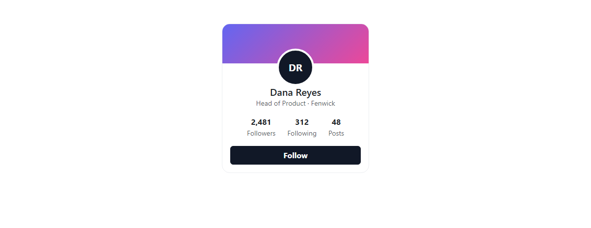
A profile card's Follow button is usually the only interactive element on the card, and this snippet makes sure it's genuinely functional: clicking it toggles a data-following attribute between "false" and "true", swaps the button's own text between "Follow" and "Following", and adjusts the visible follower count by exactly one — an increment when you follow, back down when you unfollow — built on real Bootstrap 5.3's .card component.
The hover state on an already-followed button is a deliberate, common social-app pattern: hovering "Following" reveals "(Unfollow)" and a red-tinted style, previewing what the click will do before it happens, so unfollowing never feels accidental.
Build with AI
Build, Understand, Optimize, and Extend It With AI
Hand this snippet's HTML, CSS, and JS to an AI coding assistant like Claude and ask it to wire the follow toggle to a real API call with an optimistic UI update and a rollback on failure, or to add aria-pressed="true"/"false" to the button so its toggle state is explicitly announced to assistive technology, not just inferred from its text. It's also a good exercise to ask the assistant to add a small particle or heart animation on follow.
Prompt to recreate it
Copy this into your AI assistant of choice to build the effect from scratch, or as a jumping-off point for your own variant:
Build a Bootstrap 5.3 profile card with a working follow toggle, using the real Bootstrap CDN framework (bootstrap.min.css and bootstrap.bundle.min.js), not custom CSS made to resemble Bootstrap.

Requirements:
- A real Bootstrap card with a gradient cover banner, an overlapping circular avatar, a name and title, follower/following/post stat counts, and a Follow button.
- Clicking the Follow button must toggle a data attribute tracking its follow state, swap its visible text between "Follow" and "Following", and update the displayed follower count by exactly one in the corresponding direction — do not just toggle a CSS class with no state tracking.
- When the button is in its "Following" state, hovering it must visually preview an unfollow action (e.g. showing "(Unfollow)" text and a red-tinted style) without requiring a click.
- The whole card must work with only inline CSS for the avatar (no external image required) so it renders correctly with no assets.
Want to tighten it up first? Run this prompt through the AI Prompt Studio to score it across 8 quality dimensions, catch anti-patterns, and tune the wording for Claude, ChatGPT, or Gemini before you paste it in.
Step by step
How to Use
- 1Load the snippetClick the snippet in the sidebar Library tab. The preview loads a profile card with "Follow" and 2,481 followers.
- 2Click FollowThe button becomes "Following" (light style) and the follower count increments to 2,482.
- 3Hover the Following buttonIt shows "(Unfollow)" in a red-tinted style, previewing what clicking again will do.
- 4Click again to unfollowThe button reverts to "Follow" and the count drops back to 2,481.
Real-world uses
Common Use Cases
Got questions?
Frequently Asked Questions
It updates the displayed number in this front-end demo, incrementing or decrementing by one to reflect your own follow action. Wire the click handler to a real API call for actual persistence.
A data-following attribute on the button itself holds "true" or "false", read and flipped on each click — CSS attribute selectors ([data-following="true"]) drive the different visual styles for each state.
It's a deliberate UX pattern: previewing the consequence of a click before it happens (via CSS ::after content and a color change) makes an unfollow action feel intentional rather than an accidental double-click.
Yes — replace .bsprofile-avatar's content and background with an <img> tag; keep the same circular sizing and negative top margin so it still overlaps the cover banner correctly.
The button's visible text already changes between "Follow" and "Following" (not just its color), so its state is conveyed to screen readers through the same text content a sighted user reads.