Source Code
<div class="container py-5">
<div class="bshtabs-wrap">
<button class="bshtabs-arrow bshtabs-left" id="bshtabsLeft" aria-label="Scroll tabs left">‹</button>
<ul class="nav nav-tabs bshtabs-nav flex-nowrap" id="bshtabsNav" role="tablist">
<li class="nav-item"><button class="nav-link active" data-bs-toggle="tab" data-bs-target="#bsh-overview">Overview</button></li>
<li class="nav-item"><button class="nav-link" data-bs-toggle="tab" data-bs-target="#bsh-specs">Specifications</button></li>
<li class="nav-item"><button class="nav-link" data-bs-toggle="tab" data-bs-target="#bsh-reviews">Reviews</button></li>
<li class="nav-item"><button class="nav-link" data-bs-toggle="tab" data-bs-target="#bsh-shipping">Shipping & Returns</button></li>
<li class="nav-item"><button class="nav-link" data-bs-toggle="tab" data-bs-target="#bsh-warranty">Warranty</button></li>
<li class="nav-item"><button class="nav-link" data-bs-toggle="tab" data-bs-target="#bsh-faq">FAQ</button></li>
<li class="nav-item"><button class="nav-link" data-bs-toggle="tab" data-bs-target="#bsh-support">Support</button></li>
</ul>
<button class="bshtabs-arrow bshtabs-right" id="bshtabsRight" aria-label="Scroll tabs right">›</button>
</div>
<div class="tab-content bshtabs-content p-3">
<div class="tab-pane fade show active" id="bsh-overview">A compact, precision-milled aluminum stand for any 13–34" monitor.</div>
<div class="tab-pane fade" id="bsh-specs">Weight capacity: 20kg. Height: 12cm. Material: 6061 aluminum.</div>
<div class="tab-pane fade" id="bsh-reviews">4.8 out of 5 stars, based on 214 reviews.</div>
<div class="tab-pane fade" id="bsh-shipping">Free shipping over $50. Returns accepted within 30 days.</div>
<div class="tab-pane fade" id="bsh-warranty">2-year limited warranty against manufacturing defects.</div>
<div class="tab-pane fade" id="bsh-faq">Compatible with all standard VESA mounts.</div>
<div class="tab-pane fade" id="bsh-support">Contact support@example.com for help with your order.</div>
</div>
</div>.bshtabs-wrap { display: flex; align-items: center; gap: 4px; }
.bshtabs-nav {
overflow-x: auto;
scrollbar-width: none;
flex: 1;
}
.bshtabs-nav::-webkit-scrollbar { display: none; }
.bshtabs-nav .nav-link { white-space: nowrap; }
.bshtabs-arrow {
flex-shrink: 0; width: 28px; height: 32px;
border: 1px solid #e5e7eb; border-radius: 6px;
background: #fff; cursor: pointer; font-size: 16px; color: #6b7280;
}
.bshtabs-arrow:hover { border-color: #6366f1; color: #6366f1; }
.bshtabs-content { border: 1px solid #dee2e6; border-top: none; font-size: 14px; color: #374151; }const nav = document.getElementById('bshtabsNav');
const left = document.getElementById('bshtabsLeft');
const right = document.getElementById('bshtabsRight');
// Bootstrap's Tab component handles switching panes; these two buttons just
// scroll the tab strip itself, for when there are too many tabs to fit.
left.addEventListener('click', () => nav.scrollBy({ left: -160, behavior: 'smooth' }));
right.addEventListener('click', () => nav.scrollBy({ left: 160, behavior: 'smooth' }));
// Clicking a tab scrolls it into view, in case it's currently off-screen —
// keyboard/tab navigation shouldn't require also manually scrolling the strip.
nav.addEventListener('shown.bs.tab', e => {
e.target.scrollIntoView({ behavior: 'smooth', inline: 'center', block: 'nearest' });
});Learn Coding Visually
Learn to code with interactive, live-preview playgrounds — HTML, CSS, JavaScript, React & more.
 HTML Playground42 lessons · Click-based · Live preview
 CSS PlaygroundLearn CSS with a live editor
 JavaScript Playground60 lessons · DOM · Async · Canvas
 React PlaygroundLearn React with a live code editor
 GSAP PlaygroundLearn GSAP animation interactively
 SVG Playground44 lessons · shapes · paths · animation
 SCSS Playground45 lessons · Sass modules · tokens
 Tailwind PlaygroundLearn Tailwind CSS with a live editor
 Bootstrap 5 Playground50 lessons · live preview
Bootstrap Horizontal Scrollable Tabs — Free Snippet
Bootstrap Horizontal Scrollable Tabs · Navigation · Plain HTML, CSS & JS · Live preview
What's included
Features
About this UI Snippet
Bootstrap Horizontal Scrollable Tabs — HTML, CSS & JavaScript
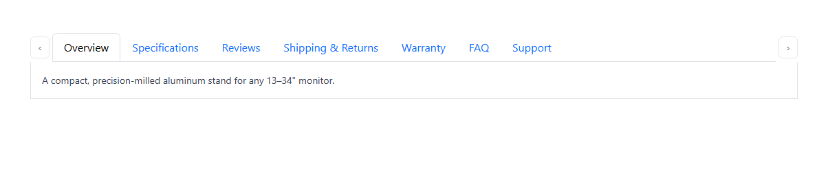
Seven tab labels — Overview, Specifications, Reviews, Shipping & Returns, Warranty, FAQ, Support — routinely overflow a narrow container. This snippet keeps real Bootstrap 5.3's Tab component doing exactly what it already does well (switching panes via data-bs-toggle="tab") and adds only what it doesn't provide: a horizontally scrollable strip (overflow-x: auto plus flex-nowrap) with two small arrow buttons that call nav.scrollBy() to nudge the strip left or right.
A second, easy-to-miss detail: clicking a tab that's already visible works fine, but a tab reached via keyboard navigation while scrolled out of view wouldn't be. Listening for Bootstrap's own shown.bs.tab event and calling scrollIntoView({ inline: 'center' }) on whichever tab was just activated means the active tab is always visible in the strip, however it was reached.
Build with AI
Build, Understand, Optimize, and Extend It With AI
Hand this snippet's HTML, CSS, and JS to an AI coding assistant like Claude and ask it to hide the left/right arrow buttons automatically when there's nothing left to scroll in that direction, or to add touch-swipe momentum scrolling refinements for mobile. It's also a good exercise to ask the assistant to make the tab strip's scroll position persist across a page reload.
Prompt to recreate it
Copy this into your AI assistant of choice to build the effect from scratch, or as a jumping-off point for your own variant:
Build a Bootstrap 5.3 horizontally scrollable tab strip, using the real Bootstrap CDN framework (bootstrap.min.css and bootstrap.bundle.min.js), not custom CSS made to resemble Bootstrap.

Requirements:
- Use Bootstrap's real Tab component (nav-tabs, data-bs-toggle="tab") with at least seven tabs, enough to overflow a typical container width — do not write custom JavaScript for switching between tab panes.
- Make the tab list itself horizontally scrollable (overflow-x auto, no wrapping) with the native scrollbar hidden, and add two arrow buttons that scroll the tab strip left and right using scrollBy() with smooth scrolling.
- Listen for Bootstrap's own shown.bs.tab event and, whenever a tab becomes active, scroll that specific tab into view within the strip (horizontally centered if possible) — this must work correctly regardless of how the tab was activated, not just by clicking an arrow first.
Want to tighten it up first? Run this prompt through the AI Prompt Studio to score it across 8 quality dimensions, catch anti-patterns, and tune the wording for Claude, ChatGPT, or Gemini before you paste it in.
Step by step
How to Use
- 1Load the snippetClick the snippet in the sidebar Library tab. The preview loads seven tabs, more than fit in the visible width.
- 2Click the right arrowThe tab strip smoothly scrolls right, revealing the tabs that were cut off.
- 3Click a tab near the edgeIt becomes active and scrolls itself into full view if it was partially hidden.
- 4Add an eighth tabCopy a nav-item/tab-pane pair — it just extends the scrollable strip, no layout changes needed.
Real-world uses
Common Use Cases
Got questions?
Frequently Asked Questions
Real Bootstrap 5.3 — every pane switch is handled by Bootstrap's own Tab component via data-bs-toggle="tab". The only custom code is the horizontal-scroll arrows and the scroll-into-view behavior.
Each calls nav.scrollBy({ left: ±160, behavior: "smooth" }) on the tab strip's container, nudging it by a fixed amount with native smooth scrolling — no custom animation code.
A listener on Bootstrap's own shown.bs.tab event calls scrollIntoView on whichever tab was just activated, so a tab reached via keyboard navigation (or one near the edge) is always brought fully into view.
No — the strip scrolls to accommodate however many nav-items exist; there's no hardcoded tab count anywhere in the logic.
No — scrollbar-width: none and a WebKit scrollbar override hide the native scrollbar, so only the two arrow buttons (and swipe/trackpad scrolling) are visible ways to scroll it.