Source Code
<section class="rts-hero">
  <div class="rts-copy">
    <span class="rts-eyebrow">Trusted by product teams everywhere</span>
    <h1 class="rts-h1">The design tool teams<br>actually stick with</h1>
    <p class="rts-sub">Real-time collaboration, versioning that never loses work, and a component system that scales with your team.</p>
    <a href="#" class="rts-cta">Get started free</a>
  </div>

  <div class="rts-spotlight" id="rtsSpotlight">
    <div class="rts-slide active" data-index="0">
      <p class="rts-quote">"We replaced three separate tools with this. Our design-to-dev handoff time dropped by half in the first month."</p>
      <div class="rts-person"><span class="rts-avatar" style="background:linear-gradient(135deg,#f472b6,#ec4899)">MK</span><div><strong>Maya Kessler</strong><span>Head of Design, Fluent</span></div></div>
    </div>
    <div class="rts-slide" data-index="1">
      <p class="rts-quote">"The versioning alone justified the switch. I have never once lost work or fought a merge conflict since we moved."</p>
      <div class="rts-person"><span class="rts-avatar" style="background:linear-gradient(135deg,#60a5fa,#6366f1)">DP</span><div><strong>Daniel Petrov</strong><span>Product Designer, Northwind</span></div></div>
    </div>
    <div class="rts-slide" data-index="2">
      <p class="rts-quote">"Our component library finally stays in sync across every file. Onboarding a new designer now takes a day, not a week."</p>
      <div class="rts-person"><span class="rts-avatar" style="background:linear-gradient(135deg,#34d399,#10b981)">AR</span><div><strong>Aisha Rahman</strong><span>Design Lead, Coral</span></div></div>
    </div>

    <div class="rts-dots" id="rtsDots">
      <button type="button" class="rts-dot active" data-goto="0" aria-label="Testimonial 1"></button>
      <button type="button" class="rts-dot" data-goto="1" aria-label="Testimonial 2"></button>
      <button type="button" class="rts-dot" data-goto="2" aria-label="Testimonial 3"></button>
    </div>
  </div>
</section>*{box-sizing:border-box;margin:0;padding:0}
body{font-family:system-ui,-apple-system,sans-serif;background:#faf9fb;color:#1e1b2e}
.rts-hero{min-height:100vh;display:grid;grid-template-columns:1.05fr 1fr;gap:56px;align-items:center;padding:48px 60px;max-width:1180px;margin:0 auto}
@media (max-width:880px){.rts-hero{grid-template-columns:1fr;padding:32px 22px;text-align:center}}
.rts-eyebrow{display:inline-block;font-size:12px;font-weight:700;letter-spacing:.06em;text-transform:uppercase;color:#8b5cf6;margin-bottom:12px}
.rts-h1{font-size:clamp(30px,4.4vw,46px);font-weight:800;line-height:1.14;letter-spacing:-.02em;margin-bottom:14px}
.rts-sub{font-size:15.5px;color:#5b5470;line-height:1.7;max-width:440px;margin-bottom:24px}
@media (max-width:880px){.rts-sub{margin-left:auto;margin-right:auto}}
.rts-cta{display:inline-block;background:#7c3aed;color:#fff;font-weight:700;font-size:15px;padding:13px 28px;border-radius:10px;text-decoration:none;box-shadow:0 10px 26px rgba(124,58,237,.28);transition:transform .15s}
.rts-cta:hover{transform:translateY(-2px)}
.rts-spotlight{position:relative;background:#fff;border-radius:20px;padding:34px 30px 26px;min-height:210px;box-shadow:0 24px 60px rgba(30,27,46,.1);border:1px solid #efeaf7}
.rts-slide{position:absolute;inset:34px 30px 26px;opacity:0;transform:translateY(8px);transition:opacity .4s ease,transform .4s ease;pointer-events:none;display:flex;flex-direction:column;justify-content:space-between}
.rts-slide.active{opacity:1;transform:translateY(0);pointer-events:auto;position:relative;inset:auto}
.rts-quote{font-size:16.5px;line-height:1.6;font-weight:600;color:#1e1b2e;margin-bottom:22px}
.rts-person{display:flex;align-items:center;gap:12px}
@media (max-width:880px){.rts-person{justify-content:center}}
.rts-avatar{width:38px;height:38px;border-radius:50%;color:#fff;font-size:13px;font-weight:800;display:flex;align-items:center;justify-content:center;flex-shrink:0}
.rts-person strong{display:block;font-size:13.5px;font-weight:800}
.rts-person span{font-size:12px;color:#8b8299}
.rts-dots{display:flex;gap:7px;justify-content:center;margin-top:24px}
.rts-dot{width:7px;height:7px;border-radius:50%;background:#e6e0f0;border:none;cursor:pointer;padding:0;transition:width .25s,background .25s}
.rts-dot.active{width:22px;border-radius:4px;background:#7c3aed}// Real setTimeout-driven carousel: auto-advances every 4.5s, pauses on hover/focus,
// and supports manual navigation via the dots — both paths share one goToSlide function.
var spotlight = document.getElementById('rtsSpotlight');
var slides = spotlight.querySelectorAll('.rts-slide');
var dots = document.getElementById('rtsDots').querySelectorAll('.rts-dot');
var current = 0;
var timer = null;
var INTERVAL = 4500;
function goToSlide(index) {
slides[current].classList.remove('active');
dots[current].classList.remove('active');
current = (index + slides.length) % slides.length;
slides[current].classList.add('active');
dots[current].classList.add('active');
}
function next() {
goToSlide(current + 1);
}
function startTimer() {
stopTimer();
timer = window.setInterval(next, INTERVAL);
}
function stopTimer() {
if (timer) {
window.clearInterval(timer);
timer = null;
}
}
dots.forEach(function (dot) {
dot.addEventListener('click', function () {
goToSlide(parseInt(dot.dataset.goto, 10));
startTimer(); // manual navigation resets the auto-advance clock
});
});
spotlight.addEventListener('mouseenter', stopTimer);
spotlight.addEventListener('mouseleave', startTimer);
spotlight.addEventListener('focusin', stopTimer);
spotlight.addEventListener('focusout', startTimer);
startTimer();Learn Coding Visually
Learn to code with interactive, live-preview playgrounds — HTML, CSS, JavaScript, React & more.
 HTML Playground42 lessons · Click-based · Live preview
 CSS PlaygroundLearn CSS with a live editor
 JavaScript Playground60 lessons · DOM · Async · Canvas
 React PlaygroundLearn React with a live code editor
 GSAP PlaygroundLearn GSAP animation interactively
 SVG Playground44 lessons · shapes · paths · animation
 SCSS Playground45 lessons · Sass modules · tokens
 Tailwind PlaygroundLearn Tailwind CSS with a live editor
 Bootstrap 5 Playground50 lessons · live preview
Hero with Rotating Testimonial Spotlight — Free Snippet
Hero with Rotating Testimonial Spotlight · Heroes · Plain HTML, CSS & JS · Live preview
What's included
Features
About this UI Snippet
Hero with Rotating Testimonial Spotlight — Auto-Rotating Quote Carousel That Pauses on Hover
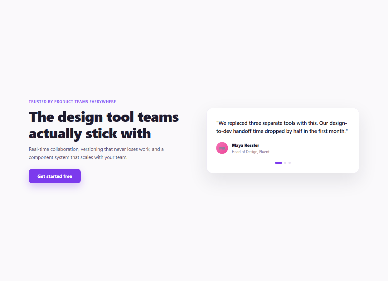
Social proof works best when it sits right beside the claim it's backing up — not three scrolls down the page in a dedicated testimonials section a visitor may never reach. This hero puts a real, rotating customer quote directly next to the headline, cycling through several testimonials automatically while still giving the visitor manual control over which one they're reading.
One `goToSlide()` function, two entry points
Both the automatic timer and the clickable dots call the exact same goToSlide(index) function rather than duplicating the slide-swap logic in two places. It removes .active from the current slide and dot, computes the new index with (index + slides.length) % slides.length (which correctly wraps a negative or out-of-range index back into bounds), and adds .active to the new slide and dot. Because there is only one function that actually changes which slide is showing, a bug fix or visual tweak to the transition only needs to happen in one place.
The cross-fade, not a slide-in
The default (inactive) .rts-slide state is opacity: 0, transform: translateY(8px), and position: absolute so inactive slides stack on top of each other without affecting layout height. The .active class resets opacity and transform and switches back to normal document flow (position: relative) so the spotlight card's height matches whichever quote is currently showing, rather than being pinned to the tallest quote in the set. This means shorter and longer quotes each get a naturally-sized card instead of extra empty space.
Pause on hover and keyboard focus
mouseenter/mouseleave call stopTimer()/startTimer() so a visitor reading a testimonial doesn't have it yanked away mid-read by the auto-advance. Just as important, focusin/focusout do the same thing for keyboard users — a testimonial carousel that only pauses on mouse hover but keeps auto-advancing while a keyboard user is tabbed into one of the dot buttons is a common accessibility gap that this snippet avoids by handling both input modes identically.
Manual navigation resets the clock
Clicking a dot calls goToSlide() directly and then calls startTimer() again, which internally calls stopTimer() first to clear any existing interval before setting a fresh one. This means a visitor who manually picks the third testimonial gets a full 4.5 seconds to read it before auto-advance resumes, rather than the auto-advance firing a moment later because the old timer was still running on its original schedule.
Growing pill dots for the active state
Rather than three plain equal-size dots, the .active dot animates its own width from 7px to 22px with border-radius: 4px, turning it into a short pill while the inactive dots stay circular. This is a small but effective way to make the current position unambiguous at a glance, and the transition on width and background makes the change itself readable rather than an instant jump.
Adding a fourth testimonial
Copy an existing .rts-slide block with a new data-index, quote, and .rts-person block, and add a matching .rts-dot button with the next data-goto value. The JavaScript re-queries .rts-slide and .rts-dot via querySelectorAll on load, and slides.length inside goToSlide()'s modulo wrap means the carousel automatically accounts for however many slides exist — no other JavaScript changes are required.
Slowing down or speeding up the rotation
Change the INTERVAL constant (currently 4500 milliseconds) to any value. A slower rotation reads better for longer quotes; a faster one suits shorter, punchier testimonials.
Build with AI
Build, Understand, Optimize, and Extend It With AI
Rather than debugging carousel timing issues by trial and error, paste this snippet's HTML, CSS, and JS into an AI coding assistant like Claude and ask it to explain why goToSlide() is the single shared entry point for both the automatic timer and the manual dot clicks, and what would go wrong — duplicated logic, or the two paths falling out of sync — if the dot click handler manipulated the active classes directly instead of calling the same function. The same assistant is useful for extending the pattern: ask it to add swipe-gesture support for mobile, add previous/next arrow buttons using the existing modulo-wrapped goToSlide(current - 1) / goToSlide(current + 1) calls, or convert the vanilla setInterval-based carousel into a React version using useEffect cleanup to correctly clear the interval on unmount. It can also help you audit the accessibility of the pause-on-focus behavior against your specific testimonial content and dot button labeling. Treat the code less like a finished artifact and more like a starting point for a conversation.
Prompt to recreate it
Copy this into your AI assistant of choice to build the effect from scratch, or as a jumping-off point for your own variant:
Build a hero section in plain HTML, CSS, and vanilla JavaScript with a headline and CTA on one side and an auto-rotating testimonial spotlight card on the other — three testimonials cross-fading automatically, with clickable dot navigation, no carousel library.

Requirements:
- Three testimonial slides (quote text, avatar initials, name, and role), stacked on top of each other using absolute positioning so inactive slides don't affect the card's layout, with the active slide switching to normal document flow so the card's height matches whichever quote is currently showing.
- The active slide should cross-fade in (opacity and a small vertical transform, both CSS-transitioned) rather than appearing or disappearing instantly.
- A single shared function that changes which slide is active — used both by an automatic setInterval-driven advance every 4-5 seconds and by clicking one of three dot buttons below the card, so there is exactly one place in the code that manipulates which slide has the active class. Use modulo arithmetic on the slide index so the function safely wraps around at either end of the list.
- Auto-advance must pause while the mouse is hovering the card AND while any dot button has keyboard focus (not mouse-hover only), and resume when the mouse leaves or focus moves elsewhere.
- Clicking a dot to manually jump to a testimonial should reset the auto-advance timer so the visitor gets a full interval to read the selected testimonial before it changes again.
- The active dot should visually grow into a short pill shape distinct from the other circular dots, with a smooth transition.
Want to tighten it up first? Run this prompt through the AI Prompt Studio to score it across 8 quality dimensions, catch anti-patterns, and tune the wording for Claude, ChatGPT, or Gemini before you paste it in.
Step by step
How to Use
- 1Watch it auto-rotateThe spotlight card cross-fades to the next testimonial every 4.5 seconds automatically.
- 2Hover or focus the cardAuto-advance pauses while the mouse is over the card or a dot has keyboard focus, and resumes when it leaves.
- 3Click a dot to jumpManually selecting a testimonial resets the auto-advance timer so you get a full interval to read it.
- 4Edit the testimonialsChange the quote text, name, role, and avatar initials/color inside each .rts-slide block.
- 5Add or remove testimonialsCopy or delete a .rts-slide plus its matching .rts-dot — the carousel adapts to however many slides exist.
- 6Export in your formatClick "HTML" for a standalone file, "JSX" for a React component, or "Tailwind" for a React + Tailwind version.
Real-world uses
Common Use Cases
Got questions?
Frequently Asked Questions
The dot click handler calls goToSlide() to jump directly to that testimonial, then calls startTimer() again. startTimer() internally calls stopTimer() first to clear the existing interval before creating a new one, so the visitor gets a full 4.5-second interval starting from their manual click rather than the auto-advance firing on the old schedule a moment later.
All slides are stacked with position: absolute inside a relatively-positioned card, and the .active slide switches to position: relative so the card's height matches its content. This lets the opacity and transform CSS transitions animate smoothly between two overlapping slides during the cross-fade; using display: none on the outgoing slide would remove it from the flow instantly with no way to fade it out.
Both. In addition to mouseenter/mouseleave, the code listens for focusin/focusout on the spotlight container, which fires when a dot button inside it gains or loses keyboard focus. This means a keyboard user tabbing into the dots gets the same pause behavior as a mouse user hovering the card.
Copy an existing .rts-slide <div> (updating its data-index, quote text, and .rts-person details) and add a matching .rts-dot button with the next data-goto value. Because slides and dots are queried fresh via querySelectorAll and the wrap math uses slides.length, no other JavaScript needs to change.
The expression (index + slides.length) % slides.length wraps any index — including one that would be negative or past the end of the array — back into the valid [0, slides.length) range. This is what would let you add "previous" and "next" arrow buttons calling goToSlide(current - 1) or goToSlide(current + 1) safely at either end of the list without extra bounds-checking code.
Change the INTERVAL constant near the top of the JS panel, given in milliseconds (the default is 4500, i.e. 4.5 seconds). A larger value gives visitors more time per testimonial; a smaller one cycles through them faster.