Source Code
<div class="pt-demo" id="ptDemo">
  <header class="pt-topbar">
    <div class="pt-logo">Northstar</div>
    <nav class="pt-nav">
      <button class="pt-nav-item" id="ptTarget0">Dashboard</button>
      <button class="pt-nav-item" id="ptTarget1">Projects</button>
      <button class="pt-nav-item" id="ptTarget2">Reports</button>
    </nav>
    <button class="pt-avatar" id="ptTarget3">JS</button>
  </header>

  <main class="pt-main">
    <div class="pt-card" id="ptTarget4">
      <h3>Create your first project</h3>
      <p>Projects group your tasks, files, and teammates in one place.</p>
      <button class="pt-card-btn">New project</button>
    </div>
    <div class="pt-panel">
      <p>Everything else on the page fades out while the tour is active, keeping attention on one element at a time.</p>
      <button class="pt-restart-btn" id="ptRestartBtn">Restart tour</button>
    </div>
  </main>

  <div class="pt-overlay" id="ptOverlay" hidden></div>
  <div class="pt-tooltip" id="ptTooltip" hidden>
    <div class="pt-tooltip-step" id="ptStepLabel">Step 1 of 4</div>
    <h4 class="pt-tooltip-title" id="ptTooltipTitle"></h4>
    <p class="pt-tooltip-text" id="ptTooltipText"></p>
    <div class="pt-tooltip-footer">
      <a href="#" class="pt-skip" id="ptSkip">Skip tour</a>
      <div class="pt-tooltip-btns">
        <button class="pt-btn pt-btn-ghost" id="ptBack">Back</button>
        <button class="pt-btn pt-btn-primary" id="ptNext">Next</button>
      </div>
    </div>
  </div>
</div>
* { box-sizing: border-box; }
body { font-family: system-ui, -apple-system, sans-serif; background: #f1f5f9; margin: 0; min-height: 100vh; }
.pt-demo { position: relative; min-height: 100vh; }
.pt-topbar { display: flex; align-items: center; gap: 24px; padding: 14px 24px; background: #fff; border-bottom: 1px solid #e2e8f0; }
.pt-logo { font-weight: 800; color: #4f46e5; font-size: 16px; }
.pt-nav { display: flex; gap: 6px; flex: 1; }
.pt-nav-item { border: none; background: none; font: inherit; font-weight: 600; font-size: 13px; color: #475569; padding: 8px 14px; border-radius: 8px; cursor: pointer; }
.pt-nav-item:hover { background: #f1f5f9; }
.pt-avatar { width: 34px; height: 34px; border-radius: 50%; background: #4f46e5; color: #fff; border: none; font-weight: 700; font-size: 12px; cursor: pointer; }
.pt-main { max-width: 760px; margin: 40px auto; padding: 0 24px; display: grid; gap: 20px; grid-template-columns: 1fr 1fr; }
.pt-card { background: #fff; border: 1px solid #e2e8f0; border-radius: 14px; padding: 22px; }
.pt-card h3 { margin: 0 0 8px; font-size: 16px; color: #1e293b; }
.pt-card p { margin: 0 0 16px; font-size: 13px; color: #64748b; line-height: 1.6; }
.pt-card-btn { background: #4f46e5; color: #fff; border: none; padding: 9px 16px; border-radius: 8px; font-weight: 700; font-size: 13px; cursor: pointer; }
.pt-panel { background: #fff; border: 1px solid #e2e8f0; border-radius: 14px; padding: 22px; display: flex; flex-direction: column; gap: 14px; justify-content: space-between; }
.pt-panel p { margin: 0; font-size: 13px; color: #64748b; line-height: 1.6; }
.pt-restart-btn { align-self: flex-start; background: #eef2ff; color: #4f46e5; border: none; padding: 8px 14px; border-radius: 8px; font-weight: 700; font-size: 12.5px; cursor: pointer; }
.pt-overlay {
position: fixed; inset: 0; z-index: 40;
background: rgba(15, 23, 42, 0.6);
box-shadow: 0 0 0 9999px rgba(15, 23, 42, 0.6);
border-radius: 12px;
transition: top 0.3s ease, left 0.3s ease, width 0.3s ease, height 0.3s ease;
pointer-events: none;
}
.pt-tooltip {
position: fixed; z-index: 50; width: 280px;
background: #fff; border-radius: 14px; padding: 18px;
box-shadow: 0 20px 40px rgba(15, 23, 42, 0.25);
transition: top 0.3s ease, left 0.3s ease;
}
.pt-tooltip-step { font-size: 11px; font-weight: 800; color: #4f46e5; text-transform: uppercase; letter-spacing: 0.04em; margin-bottom: 6px; }
.pt-tooltip-title { margin: 0 0 6px; font-size: 15px; color: #1e293b; }
.pt-tooltip-text { margin: 0 0 16px; font-size: 12.5px; color: #64748b; line-height: 1.6; }
.pt-tooltip-footer { display: flex; align-items: center; justify-content: space-between; gap: 10px; }
.pt-skip { font-size: 12px; color: #94a3b8; font-weight: 600; text-decoration: none; }
.pt-skip:hover { text-decoration: underline; }
.pt-tooltip-btns { display: flex; gap: 8px; }
.pt-btn { border: none; border-radius: 8px; padding: 7px 14px; font-size: 12.5px; font-weight: 700; cursor: pointer; font-family: inherit; }
.pt-btn-primary { background: #4f46e5; color: #fff; }
.pt-btn-ghost { background: #f1f5f9; color: #475569; }
.pt-btn:disabled { opacity: 0.45; cursor: not-allowed; }
@media (max-width: 640px) {
.pt-main { grid-template-columns: 1fr; }
.pt-tooltip { width: calc(100vw - 32px); }
}var TOUR_STEPS = [
{ targetId: 'ptTarget0', title: 'Your dashboard', text: 'This is home base — a live overview of everything happening across your workspace.' },
{ targetId: 'ptTarget1', title: 'Projects live here', text: 'Every project you create shows up in this menu for quick access.' },
{ targetId: 'ptTarget3', title: 'Your account', text: 'Manage your profile, notifications, and billing from this menu.' },
{ targetId: 'ptTarget4', title: 'Create a project', text: 'Click here any time to start a brand new project from scratch.' },
];
var overlay = document.getElementById('ptOverlay');
var tooltip = document.getElementById('ptTooltip');
var stepLabel = document.getElementById('ptStepLabel');
var tooltipTitle = document.getElementById('ptTooltipTitle');
var tooltipText = document.getElementById('ptTooltipText');
var backBtn = document.getElementById('ptBack');
var nextBtn = document.getElementById('ptNext');
var skipLink = document.getElementById('ptSkip');
var restartBtn = document.getElementById('ptRestartBtn');
var currentStep = 0;
var padding = 10;
function positionTour() {
var step = TOUR_STEPS[currentStep];
var target = document.getElementById(step.targetId);
var rect = target.getBoundingClientRect();
overlay.style.top = (rect.top - padding) + 'px';
overlay.style.left = (rect.left - padding) + 'px';
overlay.style.width = (rect.width + padding * 2) + 'px';
overlay.style.height = (rect.height + padding * 2) + 'px';
stepLabel.textContent = 'Step ' + (currentStep + 1) + ' of ' + TOUR_STEPS.length;
tooltipTitle.textContent = step.title;
tooltipText.textContent = step.text;
backBtn.disabled = currentStep === 0;
nextBtn.textContent = currentStep === TOUR_STEPS.length - 1 ? 'Finish' : 'Next';
var tooltipTop = rect.bottom + 16;
var tooltipLeft = rect.left;
var maxLeft = window.innerWidth - 296;
if (tooltipLeft > maxLeft) tooltipLeft = maxLeft;
if (tooltipLeft < 12) tooltipLeft = 12;
if (tooltipTop + 160 > window.innerHeight) tooltipTop = rect.top - 176;
tooltip.style.top = tooltipTop + 'px';
tooltip.style.left = tooltipLeft + 'px';
}
function showTour() {
currentStep = 0;
overlay.hidden = false;
tooltip.hidden = false;
positionTour();
}
function hideTour() {
overlay.hidden = true;
tooltip.hidden = true;
}
nextBtn.addEventListener('click', function () {
if (currentStep === TOUR_STEPS.length - 1) {
hideTour();
return;
}
currentStep += 1;
positionTour();
});
backBtn.addEventListener('click', function () {
if (currentStep === 0) return;
currentStep -= 1;
positionTour();
});
skipLink.addEventListener('click', function (e) {
e.preventDefault();
hideTour();
});
restartBtn.addEventListener('click', showTour);
window.addEventListener('resize', function () {
if (!overlay.hidden) positionTour();
});
showTour();Learn Coding Visually
Learn to code with interactive, live-preview playgrounds — HTML, CSS, JavaScript, React & more.
 HTML Playground42 lessons · Click-based · Live preview
 CSS PlaygroundLearn CSS with a live editor
 JavaScript Playground60 lessons · DOM · Async · Canvas
 React PlaygroundLearn React with a live code editor
 GSAP PlaygroundLearn GSAP animation interactively
 SVG Playground44 lessons · shapes · paths · animation
 SCSS Playground45 lessons · Sass modules · tokens
 Tailwind PlaygroundLearn Tailwind CSS with a live editor
 Bootstrap 5 Playground50 lessons · live preview
Product Tour Spotlight Overlay — Free HTML CSS JS Snippet
Product Tour Spotlight Overlay · Modals · Plain HTML, CSS & JS · Live preview
What's included
Features
About this UI Snippet
Product Tour Spotlight Overlay — Guided Onboarding with a Spotlighted Cutout
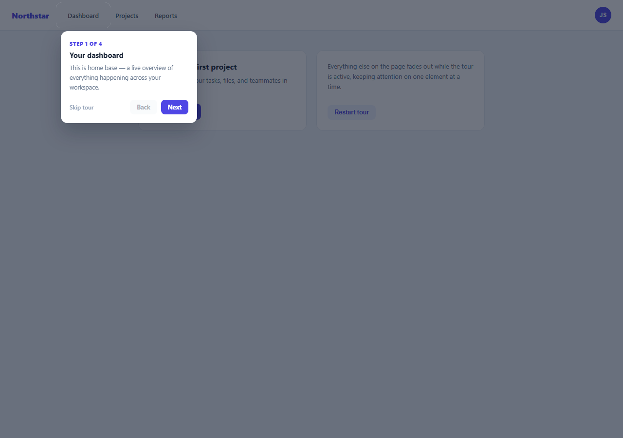
This snippet builds the "spotlight tour" pattern used by countless onboarding flows: a dark, semi-transparent layer covers the whole page except for a rectangular cutout around the element currently being explained, paired with a floating tooltip card that carries the step's copy and navigation controls.
The spotlight cutout
The cutout is produced with a single element, .pt-overlay, whose box-shadow is set to 0 0 0 9999px rgba(15,23,42,0.6). Because the element itself has a transparent background, only its shadow — spread out to cover the entire viewport — is visible, so the element's own bounding box reads as a clear "hole" in the dark layer. Positioning the overlay directly on top of the target element (via getBoundingClientRect()) is what makes the hole line up with whatever is being highlighted.
Driving position from real layout data
TOUR_STEPS is a plain array mapping each step to a target element's id. positionTour() reads that target's live getBoundingClientRect() on every step change and writes the resulting top/left/width/height directly onto the overlay and tooltip, with a small CSS transition so the spotlight visibly glides between elements rather than jumping.
Tooltip placement and viewport clamping
The tooltip defaults to appearing just below the target, but its left offset and vertical placement are clamped against window.innerWidth/innerHeight so it never renders off-screen for targets near an edge — flipping above the target when there isn't room below.
Step navigation and exit paths
Next/Back simply increment or decrement currentStep and re-run positionTour(); the Back button disables itself on step one, and Next relabels itself "Finish" on the last step. A Skip link and the Finish action both hide the overlay and tooltip immediately, and a Restart button lets the demo be replayed without a page reload.
Step by step
How to Use
- 1Load the snippetClick "Product Tour Spotlight Overlay" in the sidebar to load its HTML, CSS, and JS into the editor panels. The preview updates instantly.
- 2Edit the codeModify any panel — HTML, CSS, or JS. The preview refreshes as you type. Use Reset in each panel header to restore the original.
- 3Preview on devicesClick the Mobile (375px), Tablet (768px), or Desktop buttons in the preview header to check responsiveness.
- 4Export in your formatClick "HTML" to download a standalone file, "JSX" for a React component, "Tailwind" for a React + Tailwind CSS component, "Tailwind HTML" for a standalone HTML file with Tailwind CDN, "Vue" for a Vue 3 SFC with <template>/<script setup>/<style scoped>, or "Angular" for a standalone Angular .component.ts file. "Copy all" copies the full code to clipboard.
- 5Save your versionClick "Save as", type a name, and press Enter. Your snippet saves to IndexedDB and appears in the Saved tab.
Real-world uses
Common Use Cases
Got questions?
Frequently Asked Questions
The overlay element is transparent itself but has an oversized box-shadow (0 0 0 9999px) that fills the rest of the viewport. Positioning that transparent element over the target creates the visual effect of a hole in the dark layer.
Each step in TOUR_STEPS references a target element by id. positionTour() calls getBoundingClientRect() on that live DOM element every time the step changes, so positioning always reflects the actual current layout.
positionTour() clamps the computed left offset against window.innerWidth and flips the tooltip above the target if there is not enough room below it, keeping it fully visible at any target position.
Yes — add entries to the TOUR_STEPS array with a targetId matching any element in the page, plus a title and text; the existing navigation logic works with any number of steps.