Source Code
<div class="tp-wrap">
  <div class="tp-panel" id="tpPanel" data-theme="light">
    <div class="tp-panel-header">
      <span class="tp-panel-title">Preview Panel</span>
      <label class="tp-switch">
        <input type="checkbox" id="tpToggle" />
        <span class="tp-slider"></span>
      </label>
    </div>
    <p class="tp-panel-text">This panel's appearance follows the saved theme preference.</p>
    <div class="tp-status" id="tpStatus">No preference saved yet — using system default</div>
  </div>
</div>
* { box-sizing: border-box; margin: 0; padding: 0; }
body { font-family: system-ui, -apple-system, sans-serif; background: #f1f5f9; min-height: 100vh; display: flex; align-items: center; justify-content: center; padding: 24px; }
.tp-wrap { width: 100%; max-width: 380px; }
.tp-panel {
border-radius: 16px; padding: 22px; transition: background 0.2s, color 0.2s;
background: #fff; color: #1e293b; box-shadow: 0 8px 24px rgba(15,23,42,0.08); border: 1px solid #e2e8f0;
}
.tp-panel[data-theme="dark"] { background: #0f172a; color: #e2e8f0; border-color: #1e293b; }
.tp-panel-header { display: flex; align-items: center; justify-content: space-between; margin-bottom: 12px; }
.tp-panel-title { font-size: 14px; font-weight: 800; }
.tp-panel-text { font-size: 13px; opacity: 0.75; line-height: 1.5; margin-bottom: 16px; }
.tp-switch { position: relative; display: inline-block; width: 42px; height: 24px; flex-shrink: 0; }
.tp-switch input { opacity: 0; width: 0; height: 0; }
.tp-slider {
position: absolute; cursor: pointer; inset: 0; background: #cbd5e1; border-radius: 999px; transition: background 0.15s;
}
.tp-slider::before {
content: ''; position: absolute; width: 18px; height: 18px; left: 3px; top: 3px; background: #fff;
border-radius: 50%; transition: transform 0.15s;
}
.tp-switch input:checked + .tp-slider { background: #6366f1; }
.tp-switch input:checked + .tp-slider::before { transform: translateX(18px); }
.tp-status {
font-size: 11.5px; font-weight: 700; padding: 8px 10px; border-radius: 8px;
background: rgba(99,102,241,0.1); color: #6366f1; font-family: ui-monospace, monospace;
}
.tp-panel[data-theme="dark"] .tp-status { background: rgba(129,140,248,0.15); color: #a5b4fc; }const panel = document.getElementById('tpPanel');
const toggle = document.getElementById('tpToggle');
const status = document.getElementById('tpStatus');
const STORAGE_KEY = 'theme';
function applyTheme(theme) {
panel.setAttribute('data-theme', theme);
toggle.checked = theme === 'dark';
}
function updateStatus(theme, fromStorage) {
if (fromStorage) {
status.textContent = 'Saved to localStorage: ' + theme;
} else {
status.textContent = 'No preference saved yet — using system default (' + theme + ')';
}
}
function init() {
const saved = localStorage.getItem(STORAGE_KEY);
if (saved === 'dark' || saved === 'light') {
applyTheme(saved);
updateStatus(saved, true);
return;
}
const prefersDark = window.matchMedia && window.matchMedia('(prefers-color-scheme: dark)').matches;
const fallback = prefersDark ? 'dark' : 'light';
applyTheme(fallback);
updateStatus(fallback, false);
}
toggle.addEventListener('change', () => {
const theme = toggle.checked ? 'dark' : 'light';
applyTheme(theme);
localStorage.setItem(STORAGE_KEY, theme);
updateStatus(theme, true);
});
init();Learn Coding Visually
Learn to code with interactive, live-preview playgrounds — HTML, CSS, JavaScript, React & more.
 HTML Playground42 lessons · Click-based · Live preview
 CSS PlaygroundLearn CSS with a live editor
 JavaScript Playground60 lessons · DOM · Async · Canvas
 React PlaygroundLearn React with a live code editor
 GSAP PlaygroundLearn GSAP animation interactively
 SVG Playground44 lessons · shapes · paths · animation
 SCSS Playground45 lessons · Sass modules · tokens
 Tailwind PlaygroundLearn Tailwind CSS with a live editor
 Bootstrap 5 Playground50 lessons · live preview
Theme Preference Persistence Demo — Free HTML CSS JS Snippet
Theme Preference Persistence Demo · Misc · Plain HTML, CSS & JS · Live preview
What's included
Features
About this UI Snippet
Theme Preference Persistence Demo — Toggle Saved to localStorage
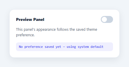
This snippet demonstrates the standard pattern for persisting a user's light/dark theme choice across page loads using localStorage, with a visible status line so the persistence behavior is observable rather than implied.
Saving the preference
The toggle switch's change handler determines the new theme string ('dark' or 'light'), applies it to the preview panel via data-theme, and immediately calls localStorage.setItem('theme', theme) — the choice is durable the instant it's made, not just held in memory.
Restoring on load, with a fallback chain
On initialization, localStorage.getItem('theme') is read first. If it returns a valid saved value, that value is applied straight away and the status line reports it came from storage. If nothing has been saved yet (a fresh visitor), the code checks window.matchMedia('(prefers-color-scheme: dark)').matches and falls back to the OS-level preference instead — so the panel never defaults to an arbitrary hardcoded theme when the user hasn't made an explicit choice.
Making persistence visible
A small monospace status line below the panel reads either "Saved to localStorage: dark" (once an explicit choice has been stored) or "No preference saved yet — using system default" (before any choice is made), and updates live on every toggle — turning what would otherwise be an invisible background behavior into something a reader can directly observe working.
Step by step
How to Use
- 1Load the snippetClick "Theme Preference Persistence Demo" in the sidebar to load its HTML, CSS, and JS into the editor panels. The preview updates instantly.
- 2Edit the codeModify any panel — HTML, CSS, or JS. The preview refreshes as you type. Use Reset in each panel header to restore the original.
- 3Preview on devicesClick the Mobile (375px), Tablet (768px), or Desktop buttons in the preview header to check responsiveness.
- 4Export in your formatClick "HTML" to download a standalone file, "JSX" for a React component, "Tailwind" for a React + Tailwind CSS component, "Tailwind HTML" for a standalone HTML file with Tailwind CDN, "Vue" for a Vue 3 SFC with <template>/<script setup>/<style scoped>, or "Angular" for a standalone Angular .component.ts file. "Copy all" copies the full code to clipboard.
- 5Save your versionClick "Save as", type a name, and press Enter. Your snippet saves to IndexedDB and appears in the Saved tab.
Real-world uses
Common Use Cases
Got questions?
Frequently Asked Questions
localStorage.getItem("theme") returns null, so the code checks window.matchMedia("(prefers-color-scheme: dark)") and applies dark or light based on the operating system's setting, without writing anything to storage yet.
Only when the toggle is switched. Until the user makes an explicit choice, the theme is derived live from the system preference each load; the moment they toggle it, that choice is written via localStorage.setItem and takes precedence on every future load.
init() and the change handler both call updateStatus with a boolean flag indicating whether the value came from localStorage.getItem versus the prefers-color-scheme fallback, and the status text branches on that flag.
Yes — apply the same data-theme attribute to document.documentElement or document.body instead of (or in addition to) the panel element, and define your dark-mode CSS rules against that scope.