Source Code
<div class="ds-shell" id="dsShell" data-theme="light">
  <aside class="ds-sidebar">
    <div class="ds-logo">Northstar</div>
    <nav class="ds-nav">
      <a class="ds-nav-item ds-active" href="#">Overview</a>
      <a class="ds-nav-item" href="#">Projects</a>
      <a class="ds-nav-item" href="#">Reports</a>
      <a class="ds-nav-item" href="#">Team</a>
      <a class="ds-nav-item" href="#">Settings</a>
    </nav>
  </aside>

  <div class="ds-main">
    <header class="ds-topbar">
      <h1>Overview</h1>
      <button class="ds-theme-btn" id="dsThemeBtn">
        <svg class="ds-icon-sun" width="16" height="16" viewBox="0 0 24 24" fill="none" stroke="currentColor" stroke-width="2" stroke-linecap="round" stroke-linejoin="round"><circle cx="12" cy="12" r="4"/><path d="M12 2v2M12 20v2M4.9 4.9l1.4 1.4M17.7 17.7l1.4 1.4M2 12h2M20 12h2M4.9 19.1l1.4-1.4M17.7 6.3l1.4-1.4"/></svg>
        <svg class="ds-icon-moon" width="16" height="16" viewBox="0 0 24 24" fill="none" stroke="currentColor" stroke-width="2" stroke-linecap="round" stroke-linejoin="round"><path d="M21 12.8A9 9 0 1111.2 3a7 7 0 009.8 9.8z"/></svg>
        <span id="dsThemeLabel">Dark mode</span>
      </button>
    </header>

    <section class="ds-tiles">
      <div class="ds-tile">
        <span class="ds-tile-label">Active users</span>
        <span class="ds-tile-value">4,218</span>
        <span class="ds-tile-delta ds-up">+12.4%</span>
      </div>
      <div class="ds-tile">
        <span class="ds-tile-label">Revenue</span>
        <span class="ds-tile-value">$38.2k</span>
        <span class="ds-tile-delta ds-up">+8.1%</span>
      </div>
      <div class="ds-tile">
        <span class="ds-tile-label">Churn rate</span>
        <span class="ds-tile-value">2.3%</span>
        <span class="ds-tile-delta ds-down">-0.4%</span>
      </div>
    </section>

    <section class="ds-content">
      <p>Main content area — swap this placeholder for tables, charts, or any other dashboard content.</p>
    </section>
  </div>
</div>
* { box-sizing: border-box; }
body { font-family: system-ui, -apple-system, sans-serif; margin: 0; background: #f1f5f9; }
.ds-shell {
display: grid; grid-template-columns: 220px 1fr; min-height: 100vh;
--ds-bg: #f1f5f9; --ds-surface: #ffffff; --ds-sidebar: #1e293b; --ds-sidebar-text: #cbd5e1;
--ds-text: #1e293b; --ds-muted: #64748b; --ds-border: #e2e8f0; --ds-accent: #4f46e5;
background: var(--ds-bg); color: var(--ds-text);
transition: background 0.2s, color 0.2s;
}
.ds-shell[data-theme="dark"] { --ds-bg: #0f172a; --ds-surface: #1e293b; --ds-sidebar: #020617; --ds-sidebar-text: #94a3b8; --ds-text: #f1f5f9; --ds-muted: #94a3b8; --ds-border: #334155; --ds-accent: #818cf8; }
.ds-sidebar { background: var(--ds-sidebar); padding: 22px 14px; transition: background 0.2s; }
.ds-logo { color: #fff; font-weight: 800; font-size: 15px; padding: 0 10px; margin-bottom: 24px; }
.ds-nav { display: flex; flex-direction: column; gap: 2px; }
.ds-nav-item { color: var(--ds-sidebar-text); text-decoration: none; font-size: 13px; font-weight: 600; padding: 9px 12px; border-radius: 8px; }
.ds-nav-item:hover { background: rgba(255,255,255,0.06); }
.ds-nav-item.ds-active { background: var(--ds-accent); color: #fff; }
.ds-main { padding: 24px 28px; }
.ds-topbar { display: flex; align-items: center; justify-content: space-between; margin-bottom: 22px; }
.ds-topbar h1 { margin: 0; font-size: 19px; }
.ds-theme-btn { display: flex; align-items: center; gap: 8px; background: var(--ds-surface); border: 1px solid var(--ds-border); color: var(--ds-text); padding: 8px 14px; border-radius: 9px; font-size: 12.5px; font-weight: 700; cursor: pointer; font-family: inherit; }
.ds-icon-moon { display: none; }
.ds-shell[data-theme="dark"] .ds-icon-sun { display: none; }
.ds-shell[data-theme="dark"] .ds-icon-moon { display: block; }
.ds-tiles { display: grid; grid-template-columns: repeat(3, 1fr); gap: 14px; margin-bottom: 22px; }
.ds-tile { background: var(--ds-surface); border: 1px solid var(--ds-border); border-radius: 14px; padding: 18px; display: flex; flex-direction: column; gap: 6px; transition: background 0.2s, border-color 0.2s; }
.ds-tile-label { font-size: 11.5px; font-weight: 700; color: var(--ds-muted); text-transform: uppercase; letter-spacing: 0.03em; }
.ds-tile-value { font-size: 22px; font-weight: 800; }
.ds-tile-delta { font-size: 11.5px; font-weight: 700; width: fit-content; }
.ds-up { color: #22c55e; }
.ds-down { color: #ef4444; }
.ds-content { background: var(--ds-surface); border: 1px solid var(--ds-border); border-radius: 14px; padding: 40px 24px; text-align: center; color: var(--ds-muted); font-size: 13px; transition: background 0.2s, border-color 0.2s; }
@media (max-width: 640px) {
.ds-shell { grid-template-columns: 1fr; }
.ds-sidebar { display: none; }
.ds-tiles { grid-template-columns: 1fr; }
}var shell = document.getElementById('dsShell');
var themeBtn = document.getElementById('dsThemeBtn');
var themeLabel = document.getElementById('dsThemeLabel');
function applyTheme(theme) {
shell.setAttribute('data-theme', theme);
themeLabel.textContent = theme === 'dark' ? 'Light mode' : 'Dark mode';
}
themeBtn.addEventListener('click', function () {
var current = shell.getAttribute('data-theme');
applyTheme(current === 'dark' ? 'light' : 'dark');
});
applyTheme('light');Learn Coding Visually
Learn to code with interactive, live-preview playgrounds — HTML, CSS, JavaScript, React & more.
 HTML Playground42 lessons · Click-based · Live preview
 CSS PlaygroundLearn CSS with a live editor
 JavaScript Playground60 lessons · DOM · Async · Canvas
 React PlaygroundLearn React with a live code editor
 GSAP PlaygroundLearn GSAP animation interactively
 SVG Playground44 lessons · shapes · paths · animation
 SCSS Playground45 lessons · Sass modules · tokens
 Tailwind PlaygroundLearn Tailwind CSS with a live editor
 Bootstrap 5 Playground50 lessons · live preview
Dashboard Shell with Dark Mode — Free HTML CSS JS Snippet
Dashboard Shell with Dark Mode · Dashboards · Plain HTML, CSS & JS · Live preview
What's included
Features
About this UI Snippet
Dashboard Shell with Dark Mode — Sidebar, Top Bar, and Stat Tiles with a Unified Theme Toggle
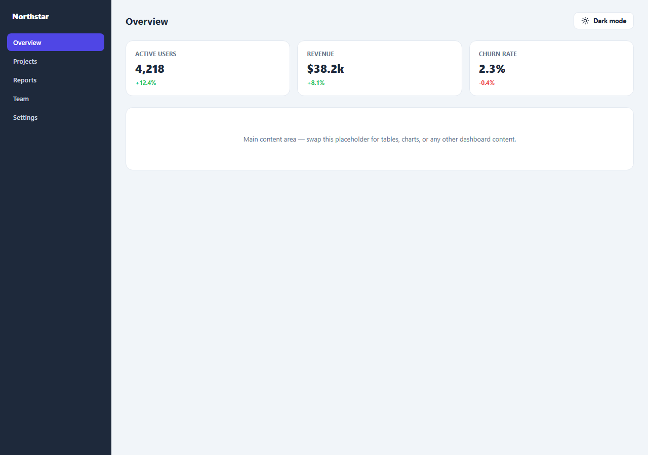
This snippet is a small but complete dashboard shell — a dark sidebar with navigation, a top bar with a page title and theme toggle, three stat tiles, and a placeholder content area — with a single toggle button that switches the entire shell between light and dark themes consistently.
One token set for the whole shell
Every color used across the sidebar, top bar, tiles, and content area is a CSS custom property defined on the outer .ds-shell grid container: background, surface, sidebar background, sidebar text, primary text, muted text, border, and accent. No individual section defines its own color values, which is what guarantees the sidebar, tiles, and borders all restyle together rather than some pieces lagging behind on a theme switch.
Toggling the whole shell at once
Clicking the theme button in the top bar reads the shell's current data-theme attribute and flips it between "light" and "dark". A single [data-theme="dark"] CSS rule scoped to .ds-shell redefines all eight custom properties at once — because every descendant element already reads its colors through var(), one attribute change on one element is sufficient to restyle the entire shell.
Icon and label swap without extra JS
The toggle button contains both a sun and a moon icon; CSS attribute selectors (.ds-shell[data-theme="dark"] .ds-icon-sun and its moon counterpart) show only the icon appropriate to the current theme, while the button's text label is the one piece of the UI updated directly by JavaScript, since it must describe the action the click will perform next (e.g. showing "Dark mode" while currently light).
Step by step
How to Use
- 1Load the snippetClick "Dashboard Shell with Dark Mode" in the sidebar to load its HTML, CSS, and JS into the editor panels. The preview updates instantly.
- 2Edit the codeModify any panel — HTML, CSS, or JS. The preview refreshes as you type. Use Reset in each panel header to restore the original.
- 3Preview on devicesClick the Mobile (375px), Tablet (768px), or Desktop buttons in the preview header to check responsiveness.
- 4Export in your formatClick "HTML" to download a standalone file, "JSX" for a React component, "Tailwind" for a React + Tailwind CSS component, "Tailwind HTML" for a standalone HTML file with Tailwind CDN, "Vue" for a Vue 3 SFC with <template>/<script setup>/<style scoped>, or "Angular" for a standalone Angular .component.ts file. "Copy all" copies the full code to clipboard.
- 5Save your versionClick "Save as", type a name, and press Enter. Your snippet saves to IndexedDB and appears in the Saved tab.
Real-world uses
Common Use Cases
Got questions?
Frequently Asked Questions
Every color in the sidebar, top bar, tiles, and content area is a CSS custom property defined once on the outer .ds-shell element. A single [data-theme="dark"] rule redefines all of them at once, and because every descendant reads colors via var(), the whole shell restyles together.
Both icons are always in the DOM. CSS attribute selectors scoped to the current data-theme value show only the relevant one (display: none on the other), so no JavaScript touches the icons directly.
It reads the shell's current data-theme attribute, flips it to the opposite value, and updates the toggle button's text label to describe the next available action. All visual restyling is handled by CSS reacting to that attribute change.
Below 640px, the CSS grid collapses to a single column, the sidebar is hidden, and the stat tiles stack vertically — independent of whichever theme is currently active.