Source Code
<div class="ll-wrap">
  <h2 class="ll-heading">Scroll to lazy-load images</h2>
  <div class="ll-grid" id="llGrid"></div>
</div>
* { box-sizing: border-box; margin: 0; padding: 0; }
body { font-family: system-ui, -apple-system, sans-serif; background: #f8fafc; min-height: 100vh; padding: 24px; }
.ll-wrap { max-width: 620px; margin: 0 auto; }
.ll-heading { font-size: 15px; font-weight: 800; color: #1e293b; margin-bottom: 12px; }
.ll-grid {
max-height: 500px; overflow-y: auto; display: grid; grid-template-columns: repeat(3, 1fr);
gap: 10px; padding: 10px; background: #eef1f6; border-radius: 14px;
}
@media (max-width: 480px) {
.ll-grid { grid-template-columns: repeat(2, 1fr); }
}
.ll-tile {
aspect-ratio: 4 / 3; border-radius: 10px; overflow: hidden;
background: linear-gradient(100deg, #e2e8f0 20%, #edf1f6 40%, #e2e8f0 60%);
background-size: 200% 100%; animation: ll-shimmer 1.4s infinite;
}
.ll-tile img { width: 100%; height: 100%; object-fit: cover; display: block; opacity: 0; transition: opacity 0.4s; }
.ll-tile img.ll-loaded { opacity: 1; }
.ll-tile.ll-done { animation: none; background: none; }
@keyframes ll-shimmer {
0% { background-position: 200% 0; }
100% { background-position: -200% 0; }
}const grid = document.getElementById('llGrid');
const SEEDS = ['alpha', 'bravo', 'charlie', 'delta', 'echo', 'foxtrot', 'golf', 'hotel', 'india', 'juliet', 'kilo', 'lima'];
SEEDS.forEach((seed, i) => {
const tile = document.createElement('div');
tile.className = 'll-tile';
const img = document.createElement('img');
img.dataset.src = 'https://picsum.photos/seed/' + seed + '/400/300';
img.alt = 'Lazy loaded image ' + (i + 1);
tile.appendChild(img);
grid.appendChild(tile);
});
const observer = new IntersectionObserver((entries) => {
entries.forEach((entry) => {
if (entry.isIntersecting) {
const img = entry.target;
const tile = img.closest('.ll-tile');
img.src = img.dataset.src;
img.addEventListener('load', () => {
img.classList.add('ll-loaded');
if (tile) tile.classList.add('ll-done');
}, { once: true });
observer.unobserve(img);
}
});
}, {
root: grid,
rootMargin: '200px',
threshold: 0.01,
});
grid.querySelectorAll('img[data-src]').forEach((img) => {
observer.observe(img);
});Learn Coding Visually
Learn to code with interactive, live-preview playgrounds — HTML, CSS, JavaScript, React & more.
 HTML Playground42 lessons · Click-based · Live preview
 CSS PlaygroundLearn CSS with a live editor
 JavaScript Playground60 lessons · DOM · Async · Canvas
 React PlaygroundLearn React with a live code editor
 GSAP PlaygroundLearn GSAP animation interactively
 SVG Playground44 lessons · shapes · paths · animation
 SCSS Playground45 lessons · Sass modules · tokens
 Tailwind PlaygroundLearn Tailwind CSS with a live editor
 Bootstrap 5 Playground50 lessons · live preview
Lazy Load Image Grid — Free HTML CSS JS Snippet
Lazy Load Image Grid · Layouts · Plain HTML, CSS & JS · Live preview
What's included
Features
About this UI Snippet
Lazy Load Image Grid — IntersectionObserver-Driven Image Loading
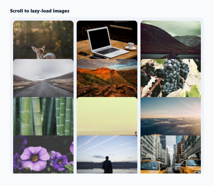
This snippet is a grid of image tiles that defer loading their actual images until each tile scrolls near the visible area, using the browser's IntersectionObserver API instead of loading everything upfront.
Placeholders instead of real sources
Each <img> starts with no src attribute at all — only a data-src holding the real picsum.photos URL. Without a real src, the browser never requests the image, and each tile shows an animated shimmer skeleton background (a CSS gradient animation) in the meantime, making the "not yet loaded" state visually obvious.
One observer watching every tile
A single IntersectionObserver instance is created once and told to observe() every placeholder image. Its rootMargin: '200px' option expands the effective viewport by 200px on all sides, so images start loading slightly before they actually scroll into view rather than popping in right at the edge. The root option is set to the grid container itself (not the page), since the grid scrolls internally via max-height and overflow-y: auto.
Load-once semantics
When an entry's isIntersecting becomes true, the callback copies data-src into the real src attribute, which triggers the actual network request. Once the image's native load event fires, a .ll-loaded class fades it in via a CSS opacity transition and the shimmer skeleton is removed. Critically, observer.unobserve(entry.target) is called immediately after triggering the load — so each image is only ever loaded once, and the observer stops doing any work for tiles that have already loaded.
Step by step
How to Use
- 1Load the snippetClick "Lazy Load Image Grid" in the sidebar to load its HTML, CSS, and JS into the editor panels. The preview updates instantly.
- 2Edit the codeModify any panel — HTML, CSS, or JS. The preview refreshes as you type. Use Reset in each panel header to restore the original.
- 3Preview on devicesClick the Mobile (375px), Tablet (768px), or Desktop buttons in the preview header to check responsiveness.
- 4Export in your formatClick "HTML" to download a standalone file, "JSX" for a React component, "Tailwind" for a React + Tailwind CSS component, "Tailwind HTML" for a standalone HTML file with Tailwind CDN, "Vue" for a Vue 3 SFC with <template>/<script setup>/<style scoped>, or "Angular" for a standalone Angular .component.ts file. "Copy all" copies the full code to clipboard.
- 5Save your versionClick "Save as", type a name, and press Enter. Your snippet saves to IndexedDB and appears in the Saved tab.
Real-world uses
Common Use Cases
Got questions?
Frequently Asked Questions
The native attribute works well for simple cases, but IntersectionObserver gives full control over the threshold, root element (useful here since the grid scrolls internally, not the page), rootMargin pre-loading distance, and lets you trigger custom effects like the fade-in and skeleton removal precisely when loading starts and completes.
It expands the observer's effective intersection boundary outward by 200px in every direction, so an image is considered "intersecting" — and starts loading — while it is still 200px away from actually entering the visible grid area, giving the network request a head start before the user scrolls to it.
Once an image has loaded, there is no reason to keep paying the (small) cost of the observer tracking its intersection state. Calling unobserve stops the observer from firing further callbacks for that element, which is the standard "load once" pattern for lazy-loaded content.
The grid itself is internally scrollable via max-height and overflow-y: auto, so the relevant scrolling container is the grid, not the page. Setting root to the grid element makes the observer calculate intersection relative to that internal scroll area.