Source Code
<div class="tt-wrap">
  <div class="tt-segmented" id="ttSegmented">
    <div class="tt-highlight" id="ttHighlight"></div>
    <button class="tt-option tt-active" data-mode="light">
      <svg width="15" height="15" viewBox="0 0 24 24" fill="none" stroke="currentColor" stroke-width="2" stroke-linecap="round" stroke-linejoin="round"><circle cx="12" cy="12" r="4"/><path d="M12 2v2M12 20v2M4.9 4.9l1.4 1.4M17.7 17.7l1.4 1.4M2 12h2M20 12h2M4.9 19.1l1.4-1.4M17.7 6.3l1.4-1.4"/></svg>
      Light
    </button>
    <button class="tt-option" data-mode="dark">
      <svg width="15" height="15" viewBox="0 0 24 24" fill="none" stroke="currentColor" stroke-width="2" stroke-linecap="round" stroke-linejoin="round"><path d="M21 12.8A9 9 0 1111.2 3a7 7 0 009.8 9.8z"/></svg>
      Dark
    </button>
    <button class="tt-option" data-mode="system">
      <svg width="15" height="15" viewBox="0 0 24 24" fill="none" stroke="currentColor" stroke-width="2" stroke-linecap="round" stroke-linejoin="round"><rect x="3" y="4" width="18" height="12" rx="2"/><path d="M8 20h8M12 16v4"/></svg>
      System
    </button>
  </div>

  <div class="tt-preview" id="ttPreview" data-theme="light">
    <div class="tt-preview-header">
      <span class="tt-dot" style="background:#f87171"></span>
      <span class="tt-dot" style="background:#fbbf24"></span>
      <span class="tt-dot" style="background:#34d399"></span>
    </div>
    <h3>Preview panel</h3>
    <p>This card restyles instantly based on the selected theme mode, including when "System" resolves from your OS setting.</p>
    <button class="tt-preview-btn">Sample button</button>
  </div>
</div>
* { box-sizing: border-box; }
body { font-family: system-ui, -apple-system, sans-serif; background: #f1f5f9; margin: 0; min-height: 100vh; display: flex; align-items: center; justify-content: center; padding: 24px; }
.tt-wrap { width: 100%; max-width: 340px; }
.tt-segmented { position: relative; display: flex; background: #e2e8f0; border-radius: 12px; padding: 4px; margin-bottom: 20px; }
.tt-highlight { position: absolute; top: 4px; bottom: 4px; left: 4px; width: calc(33.333% - 4px); background: #fff; border-radius: 9px; box-shadow: 0 2px 6px rgba(15,23,42,0.12); transition: transform 0.25s cubic-bezier(0.32,0.72,0,1); z-index: 0; }
.tt-option { position: relative; z-index: 1; flex: 1; display: flex; align-items: center; justify-content: center; gap: 6px; border: none; background: none; padding: 9px 6px; font-size: 12.5px; font-weight: 700; color: #64748b; cursor: pointer; font-family: inherit; border-radius: 9px; }
.tt-option.tt-active { color: #1e293b; }
.tt-preview {
border-radius: 16px; padding: 22px; border: 1px solid var(--tt-border);
background: var(--tt-surface); color: var(--tt-text);
transition: background 0.2s, color 0.2s, border-color 0.2s;
--tt-surface: #ffffff; --tt-text: #1e293b; --tt-border: #e2e8f0; --tt-muted: #64748b;
}
.tt-preview[data-theme="dark"] { --tt-surface: #1e293b; --tt-text: #f1f5f9; --tt-border: #334155; --tt-muted: #94a3b8; }
.tt-preview-header { display: flex; gap: 6px; margin-bottom: 16px; }
.tt-dot { width: 10px; height: 10px; border-radius: 50%; }
.tt-preview h3 { margin: 0 0 8px; font-size: 15px; }
.tt-preview p { margin: 0 0 16px; font-size: 12.5px; line-height: 1.6; color: var(--tt-muted); }
.tt-preview-btn { background: #4f46e5; color: #fff; border: none; padding: 9px 16px; border-radius: 8px; font-weight: 700; font-size: 12.5px; cursor: pointer; font-family: inherit; }var segmented = document.getElementById('ttSegmented');
var highlight = document.getElementById('ttHighlight');
var preview = document.getElementById('ttPreview');
var options = Array.prototype.slice.call(segmented.querySelectorAll('.tt-option'));
function resolveSystemTheme() {
return window.matchMedia && window.matchMedia('(prefers-color-scheme: dark)').matches ? 'dark' : 'light';
}
function applyTheme(mode) {
var effective = mode === 'system' ? resolveSystemTheme() : mode;
preview.setAttribute('data-theme', effective);
}
function moveHighlight(index) {
highlight.style.transform = 'translateX(' + (index * 100) + '%)';
}
function selectMode(mode, index) {
options.forEach(function (opt) { opt.classList.remove('tt-active'); });
options[index].classList.add('tt-active');
moveHighlight(index);
applyTheme(mode);
}
options.forEach(function (opt, index) {
opt.addEventListener('click', function () {
selectMode(opt.dataset.mode, index);
});
});
if (window.matchMedia) {
window.matchMedia('(prefers-color-scheme: dark)').addEventListener('change', function () {
var activeOpt = segmented.querySelector('.tt-active');
if (activeOpt && activeOpt.dataset.mode === 'system') applyTheme('system');
});
}
selectMode('light', 0);Learn Coding Visually
Learn to code with interactive, live-preview playgrounds — HTML, CSS, JavaScript, React & more.
 HTML Playground42 lessons · Click-based · Live preview
 CSS PlaygroundLearn CSS with a live editor
 JavaScript Playground60 lessons · DOM · Async · Canvas
 React PlaygroundLearn React with a live code editor
 GSAP PlaygroundLearn GSAP animation interactively
 SVG Playground44 lessons · shapes · paths · animation
 SCSS Playground45 lessons · Sass modules · tokens
 Tailwind PlaygroundLearn Tailwind CSS with a live editor
 Bootstrap 5 Playground50 lessons · live preview
Three-Way Theme Toggle Switch — Free HTML CSS JS Snippet
Three-Way Theme Toggle Switch · Buttons · Plain HTML, CSS & JS · Live preview
What's included
Features
About this UI Snippet
Three-Way Theme Toggle Switch — Light / Dark / System Segmented Control
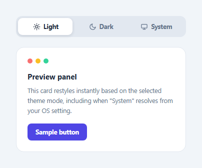
Most theme toggles are a simple two-state switch, but a "System" option — deferring to the operating system's preference — is what most production apps actually ship. This snippet implements a three-way segmented control (Light / Dark / System) with a sliding highlight behind the active option, wired to a live preview panel that restyles through CSS custom properties.
The sliding highlight
.tt-highlight is a single absolutely-positioned element sized to one-third of the segmented control's width. Selecting an option translates it via transform: translateX(index * 100%), animated with a CSS transition — a cheap, GPU-accelerated slide rather than re-rendering separate active backgrounds for each button.
Resolving "System" at selection time
Choosing "System" doesn't set a fixed theme; resolveSystemTheme() checks window.matchMedia('(prefers-color-scheme: dark)').matches at the moment of selection to decide whether the preview should currently look light or dark. A change listener on that same media query re-resolves the theme live if the OS preference changes while "System" is still selected — the preview updates without requiring the user to click anything again.
CSS custom properties drive the actual restyle
The preview panel defines its light-mode colors as CSS custom properties (--tt-surface, --tt-text, --tt-border, --tt-muted) directly on .tt-preview, then overrides all four inside a [data-theme="dark"] attribute selector scoped to the same element. Every color used inside the panel — background, text, borders, muted copy — reads from these variables, so setting one attribute (data-theme) is enough to restyle the entire panel consistently.
Step by step
How to Use
- 1Load the snippetClick "Three-Way Theme Toggle Switch" in the sidebar to load its HTML, CSS, and JS into the editor panels. The preview updates instantly.
- 2Edit the codeModify any panel — HTML, CSS, or JS. The preview refreshes as you type. Use Reset in each panel header to restore the original.
- 3Preview on devicesClick the Mobile (375px), Tablet (768px), or Desktop buttons in the preview header to check responsiveness.
- 4Export in your formatClick "HTML" to download a standalone file, "JSX" for a React component, "Tailwind" for a React + Tailwind CSS component, "Tailwind HTML" for a standalone HTML file with Tailwind CDN, "Vue" for a Vue 3 SFC with <template>/<script setup>/<style scoped>, or "Angular" for a standalone Angular .component.ts file. "Copy all" copies the full code to clipboard.
- 5Save your versionClick "Save as", type a name, and press Enter. Your snippet saves to IndexedDB and appears in the Saved tab.
Real-world uses
Common Use Cases
Got questions?
Frequently Asked Questions
It reads window.matchMedia("(prefers-color-scheme: dark)").matches at the moment System is selected. If the OS preference changes afterward while System is still active, a change listener on that same media query re-resolves and reapplies the theme automatically.
A single absolutely-positioned element sized to one-third the control's width is translated horizontally by a multiple of 100% of its own width based on the selected option's index, animated with a CSS transition on transform.
All of its colors are CSS custom properties defined on .tt-preview. A [data-theme="dark"] attribute selector scoped to the same element redefines those properties; toggling the attribute is the only change needed to restyle everything inside it.
Yes — add another .tt-option button and adjust the highlight width percentage and translateX multiplier to match the new number of options, plus a corresponding CSS custom property override block.