Source Code
<div class="sc-card" id="scCard">
  <button class="sc-header" id="scHeader" aria-expanded="true">
    <div class="sc-header-left">
      <svg class="sc-ring" width="44" height="44" viewBox="0 0 44 44">
        <circle class="sc-ring-track" cx="22" cy="22" r="18"></circle>
        <circle class="sc-ring-fill" id="scRingFill" cx="22" cy="22" r="18"></circle>
      </svg>
      <div>
        <h3>Get started</h3>
        <p id="scProgressText">0 of 5 complete</p>
      </div>
    </div>
    <svg class="sc-chevron" id="scChevron" width="18" height="18" viewBox="0 0 24 24" fill="none" stroke="currentColor" stroke-width="2.5" stroke-linecap="round" stroke-linejoin="round"><path d="M6 9l6 6 6-6"/></svg>
  </button>

  <div class="sc-body" id="scBody">
    <div class="sc-progress-bar"><div class="sc-progress-fill" id="scProgressFill"></div></div>
    <ul class="sc-list" id="scList"></ul>
  </div>
</div>
* { box-sizing: border-box; }
body { font-family: system-ui, -apple-system, sans-serif; background: #f1f5f9; margin: 0; min-height: 100vh; display: flex; align-items: center; justify-content: center; padding: 24px; }
.sc-card { width: 100%; max-width: 380px; background: #fff; border: 1px solid #e2e8f0; border-radius: 16px; overflow: hidden; box-shadow: 0 10px 30px rgba(15,23,42,0.06); }
.sc-header { width: 100%; display: flex; align-items: center; justify-content: space-between; gap: 12px; padding: 18px 20px; background: none; border: none; cursor: pointer; font-family: inherit; text-align: left; }
.sc-header-left { display: flex; align-items: center; gap: 12px; }
.sc-header h3 { margin: 0; font-size: 15px; color: #1e293b; }
.sc-header p { margin: 2px 0 0; font-size: 12px; color: #64748b; }
.sc-chevron { color: #94a3b8; transition: transform 0.2s; flex-shrink: 0; }
.sc-card.sc-collapsed .sc-chevron { transform: rotate(-90deg); }
.sc-ring { transform: rotate(-90deg); flex-shrink: 0; }
.sc-ring-track { fill: none; stroke: #eef2ff; stroke-width: 4; }
.sc-ring-fill { fill: none; stroke: #4f46e5; stroke-width: 4; stroke-linecap: round; stroke-dasharray: 113.1; stroke-dashoffset: 113.1; transition: stroke-dashoffset 0.35s ease; }
.sc-body { max-height: 600px; overflow: hidden; transition: max-height 0.25s ease, opacity 0.2s ease; }
.sc-card.sc-collapsed .sc-body { max-height: 0; opacity: 0; }
.sc-progress-bar { height: 5px; background: #eef2ff; margin: 0 20px 14px; border-radius: 999px; overflow: hidden; }
.sc-progress-fill { height: 100%; background: #4f46e5; width: 0%; transition: width 0.35s ease; border-radius: 999px; }
.sc-list { list-style: none; margin: 0; padding: 0 12px 14px; }
.sc-item { display: flex; align-items: center; gap: 12px; padding: 10px 8px; border-radius: 10px; cursor: pointer; }
.sc-item:hover { background: #f8fafc; }
.sc-check { width: 22px; height: 22px; border-radius: 50%; border: 2px solid #cbd5e1; flex-shrink: 0; display: flex; align-items: center; justify-content: center; color: #fff; transition: background 0.15s, border-color 0.15s; }
.sc-item.sc-done .sc-check { background: #4f46e5; border-color: #4f46e5; }
.sc-check svg { opacity: 0; transition: opacity 0.15s; width: 13px; height: 13px; }
.sc-item.sc-done .sc-check svg { opacity: 1; }
.sc-item-label { font-size: 13.5px; font-weight: 600; color: #334155; }
.sc-item.sc-done .sc-item-label { color: #94a3b8; text-decoration: line-through; }var TASKS = [
{ id: 't1', label: 'Verify your email', done: true },
{ id: 't2', label: 'Set a password', done: true },
{ id: 't3', label: 'Invite a teammate', done: false },
{ id: 't4', label: 'Connect an integration', done: false },
{ id: 't5', label: 'Create your first project', done: false },
];
var card = document.getElementById('scCard');
var header = document.getElementById('scHeader');
var list = document.getElementById('scList');
var progressText = document.getElementById('scProgressText');
var progressFill = document.getElementById('scProgressFill');
var ringFill = document.getElementById('scRingFill');
var ringCircumference = 2 * Math.PI * 18;
function renderList() {
list.innerHTML = '';
TASKS.forEach(function (task) {
var li = document.createElement('li');
li.className = 'sc-item' + (task.done ? ' sc-done' : '');
li.innerHTML =
'<span class="sc-check"><svg viewBox="0 0 24 24" fill="none" stroke="currentColor" stroke-width="3" stroke-linecap="round" stroke-linejoin="round"><path d="M5 13l4 4L19 7"/></svg></span>' +
'<span class="sc-item-label">' + task.label + '</span>';
li.addEventListener('click', function () {
task.done = !task.done;
renderList();
renderProgress();
});
list.appendChild(li);
});
}
function renderProgress() {
var doneCount = TASKS.filter(function (t) { return t.done; }).length;
var pct = doneCount / TASKS.length;
progressText.textContent = doneCount + ' of ' + TASKS.length + ' complete';
progressFill.style.width = (pct * 100) + '%';
ringFill.style.strokeDashoffset = String(ringCircumference * (1 - pct));
}
header.addEventListener('click', function () {
card.classList.toggle('sc-collapsed');
header.setAttribute('aria-expanded', String(!card.classList.contains('sc-collapsed')));
});
renderList();
renderProgress();Learn Coding Visually
Learn to code with interactive, live-preview playgrounds — HTML, CSS, JavaScript, React & more.
 HTML Playground42 lessons · Click-based · Live preview
 CSS PlaygroundLearn CSS with a live editor
 JavaScript Playground60 lessons · DOM · Async · Canvas
 React PlaygroundLearn React with a live code editor
 GSAP PlaygroundLearn GSAP animation interactively
 SVG Playground44 lessons · shapes · paths · animation
 SCSS Playground45 lessons · Sass modules · tokens
 Tailwind PlaygroundLearn Tailwind CSS with a live editor
 Bootstrap 5 Playground50 lessons · live preview
Setup Checklist Onboarding Widget — Free HTML CSS JS Snippet
Setup Checklist Onboarding Widget · Dashboards · Plain HTML, CSS & JS · Live preview
What's included
Features
About this UI Snippet
Setup Checklist Onboarding Widget — Collapsible Progress Ring Checklist
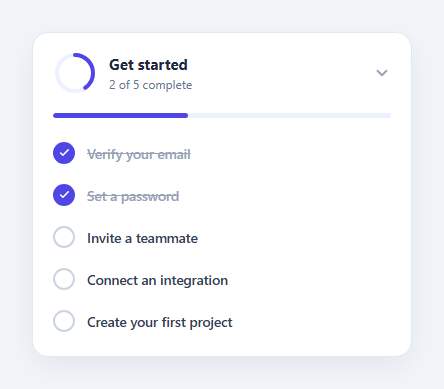
New users rarely finish setup on their own, so many products surface a persistent "Get started" widget that tracks completion of a handful of onboarding tasks and nudges the user toward finishing them. This snippet implements that pattern as a single card: a circular progress ring plus a linear progress bar, and a five-item checklist that can be toggled complete by clicking any row.
One state array drives every visual
A plain TASKS array of { id, label, done } objects is the entire source of truth. renderList() builds the checklist rows from it, and renderProgress() recomputes the completed count, the linear progress bar's width, and the ring's stroke offset — all three visuals are derived, never set independently, so they can never disagree with each other.
The progress ring without a library
The ring is a pair of concentric SVG <circle> elements. The foreground circle's stroke-dasharray is fixed to its full circumference; its stroke-dashoffset is set to circumference * (1 - completedFraction), which visually "fills in" the ring proportionally to progress, animated with a CSS transition on stroke-dashoffset.
Toggling and collapsing
Clicking any checklist row flips that task's done flag and re-renders both the list and the progress visuals — there is no separate "mark complete" button, keeping the interaction to a single click per task. The header itself is a button that toggles a .sc-collapsed class on the card, collapsing the body via a max-height/opacity transition and rotating the chevron, so the widget can be tucked away without losing its progress state.
Step by step
How to Use
- 1Load the snippetClick "Setup Checklist Onboarding Widget" in the sidebar to load its HTML, CSS, and JS into the editor panels. The preview updates instantly.
- 2Edit the codeModify any panel — HTML, CSS, or JS. The preview refreshes as you type. Use Reset in each panel header to restore the original.
- 3Preview on devicesClick the Mobile (375px), Tablet (768px), or Desktop buttons in the preview header to check responsiveness.
- 4Export in your formatClick "HTML" to download a standalone file, "JSX" for a React component, "Tailwind" for a React + Tailwind CSS component, "Tailwind HTML" for a standalone HTML file with Tailwind CDN, "Vue" for a Vue 3 SFC with <template>/<script setup>/<style scoped>, or "Angular" for a standalone Angular .component.ts file. "Copy all" copies the full code to clipboard.
- 5Save your versionClick "Save as", type a name, and press Enter. Your snippet saves to IndexedDB and appears in the Saved tab.
Real-world uses
Common Use Cases
Got questions?
Frequently Asked Questions
It is two SVG circles. The foreground circle's stroke-dasharray equals its full circumference, and its stroke-dashoffset is set to circumference times (1 minus the completed fraction), which visually reveals more of the stroke as progress increases.
All three are recalculated from the same TASKS array inside renderProgress(), which runs after every toggle. There is no independent state for any of the three visuals.
The row's done flag flips, both renderList() and renderProgress() re-run, and the row gets a filled checkmark and strikethrough label while the ring and bar animate to the new percentage.
Yes — clicking a completed row toggles it back to incomplete, and all three progress visuals update accordingly.