Source Code
<div class="cm-demo">
  <div class="cm-toolbar">
    <button class="cm-tool-btn" title="New file">
      <svg width="18" height="18" viewBox="0 0 24 24" fill="none" stroke="currentColor" stroke-width="2" stroke-linecap="round" stroke-linejoin="round"><path d="M12 5v14M5 12h14"/></svg>
    </button>
    <button class="cm-tool-btn" title="Search">
      <svg width="18" height="18" viewBox="0 0 24 24" fill="none" stroke="currentColor" stroke-width="2" stroke-linecap="round" stroke-linejoin="round"><circle cx="11" cy="11" r="7"/><path d="M21 21l-4.3-4.3"/></svg>
    </button>
    <button class="cm-tool-btn cm-coach-target" id="cmExportBtn" title="Export">
      <span class="cm-pulse-ring"></span>
      <svg width="18" height="18" viewBox="0 0 24 24" fill="none" stroke="currentColor" stroke-width="2" stroke-linecap="round" stroke-linejoin="round"><path d="M12 3v12M7 8l5-5 5 5"/><path d="M5 21h14"/></svg>
    </button>
    <button class="cm-tool-btn" title="Settings">
      <svg width="18" height="18" viewBox="0 0 24 24" fill="none" stroke="currentColor" stroke-width="2" stroke-linecap="round" stroke-linejoin="round"><circle cx="12" cy="12" r="3"/><path d="M19.4 15a1.7 1.7 0 00.3 1.9l.1.1a2 2 0 11-2.9 2.9l-.1-.1a1.7 1.7 0 00-1.9-.3 1.7 1.7 0 00-1 1.6V21a2 2 0 11-4 0v-.1a1.7 1.7 0 00-1-1.6 1.7 1.7 0 00-1.9.3l-.1.1a2 2 0 11-2.9-2.9l.1-.1a1.7 1.7 0 00.3-1.9 1.7 1.7 0 00-1.6-1H3a2 2 0 110-4h.1a1.7 1.7 0 001.6-1 1.7 1.7 0 00-.3-1.9l-.1-.1a2 2 0 112.9-2.9l.1.1a1.7 1.7 0 001.9.3H9a1.7 1.7 0 001-1.6V3a2 2 0 114 0v.1a1.7 1.7 0 001 1.6 1.7 1.7 0 001.9-.3l.1-.1a2 2 0 112.9 2.9l-.1.1a1.7 1.7 0 00-.3 1.9V9a1.7 1.7 0 001.6 1H21a2 2 0 110 4h-.1a1.7 1.7 0 00-1.6 1z"/></svg>
    </button>
  </div>

  <div class="cm-canvas">
    <p>This mock toolbar demonstrates a "coach mark" — a spotlighted call-out that draws attention to a specific feature the first time a user encounters it.</p>
  </div>

  <div class="cm-coach-tooltip" id="cmCoachTooltip">
    <div class="cm-coach-arrow"></div>
    <div class="cm-coach-tag">New</div>
    <p class="cm-coach-text">Export your data here — download as CSV, JSON, or PDF whenever you need it.</p>
    <button class="cm-coach-dismiss" id="cmDismissBtn">Got it</button>
  </div>
</div>
* { box-sizing: border-box; }
body { font-family: system-ui, -apple-system, sans-serif; background: #f1f5f9; margin: 0; min-height: 100vh; }
.cm-demo { position: relative; min-height: 100vh; padding: 40px 24px; }
.cm-toolbar { display: flex; gap: 8px; background: #fff; border: 1px solid #e2e8f0; border-radius: 12px; padding: 10px; width: fit-content; margin: 0 auto 40px; box-shadow: 0 6px 20px rgba(15,23,42,0.06); }
.cm-tool-btn { position: relative; width: 40px; height: 40px; border-radius: 9px; border: none; background: none; color: #475569; display: flex; align-items: center; justify-content: center; cursor: pointer; }
.cm-tool-btn:hover { background: #f1f5f9; }
.cm-tool-btn.cm-coach-target { color: #4f46e5; }
.cm-pulse-ring {
position: absolute; inset: -4px; border-radius: 11px; border: 2px solid #4f46e5;
animation: cmPulse 1.8s ease-out infinite;
}
@keyframes cmPulse {
0% { transform: scale(1); opacity: 0.9; }
100% { transform: scale(1.35); opacity: 0; }
}
.cm-canvas { max-width: 480px; margin: 0 auto; text-align: center; }
.cm-canvas p { color: #64748b; font-size: 13.5px; line-height: 1.7; }
.cm-coach-tooltip {
position: fixed; z-index: 30; width: 240px;
background: #1e293b; color: #fff; border-radius: 12px; padding: 16px;
box-shadow: 0 20px 40px rgba(15,23,42,0.3);
opacity: 0; pointer-events: none; transform: translateY(-6px);
transition: opacity 0.2s ease, transform 0.2s ease;
}
.cm-coach-tooltip.cm-visible { opacity: 1; pointer-events: auto; transform: translateY(0); }
.cm-coach-arrow { position: absolute; top: -6px; left: 50%; transform: translateX(-50%) rotate(45deg); width: 12px; height: 12px; background: #1e293b; }
.cm-coach-tag { display: inline-block; background: #4f46e5; color: #fff; font-size: 10px; font-weight: 800; text-transform: uppercase; letter-spacing: 0.04em; padding: 2px 8px; border-radius: 999px; margin-bottom: 8px; }
.cm-coach-text { margin: 0 0 12px; font-size: 12.5px; line-height: 1.6; color: #e2e8f0; }
.cm-coach-dismiss { background: #fff; color: #1e293b; border: none; border-radius: 8px; padding: 7px 14px; font-size: 12.5px; font-weight: 700; cursor: pointer; font-family: inherit; }var exportBtn = document.getElementById('cmExportBtn');
var tooltip = document.getElementById('cmCoachTooltip');
var dismissBtn = document.getElementById('cmDismissBtn');
function positionCoachMark() {
var rect = exportBtn.getBoundingClientRect();
var tooltipRect = tooltip.getBoundingClientRect();
var top = rect.bottom + 14;
var left = rect.left + rect.width / 2 - tooltipRect.width / 2;
var maxLeft = window.innerWidth - tooltipRect.width - 12;
if (left > maxLeft) left = maxLeft;
if (left < 12) left = 12;
tooltip.style.top = top + 'px';
tooltip.style.left = left + 'px';
}
function showCoachMark() {
tooltip.classList.add('cm-visible');
positionCoachMark();
}
function hideCoachMark() {
tooltip.classList.remove('cm-visible');
var pulse = exportBtn.querySelector('.cm-pulse-ring');
if (pulse) pulse.remove();
}
dismissBtn.addEventListener('click', hideCoachMark);
window.addEventListener('resize', function () {
if (tooltip.classList.contains('cm-visible')) positionCoachMark();
});
showCoachMark();Learn Coding Visually
Learn to code with interactive, live-preview playgrounds — HTML, CSS, JavaScript, React & more.
 HTML Playground42 lessons · Click-based · Live preview
 CSS PlaygroundLearn CSS with a live editor
 JavaScript Playground60 lessons · DOM · Async · Canvas
 React PlaygroundLearn React with a live code editor
 GSAP PlaygroundLearn GSAP animation interactively
 SVG Playground44 lessons · shapes · paths · animation
 SCSS Playground45 lessons · Sass modules · tokens
 Tailwind PlaygroundLearn Tailwind CSS with a live editor
 Bootstrap 5 Playground50 lessons · live preview
Welcome Coach Mark Tooltip — Free HTML CSS JS Snippet
Welcome Coach Mark Tooltip · Misc · Plain HTML, CSS & JS · Live preview
What's included
Features
About this UI Snippet
Welcome Coach Mark Tooltip — Positioned Feature Callout with Pulsing Ring
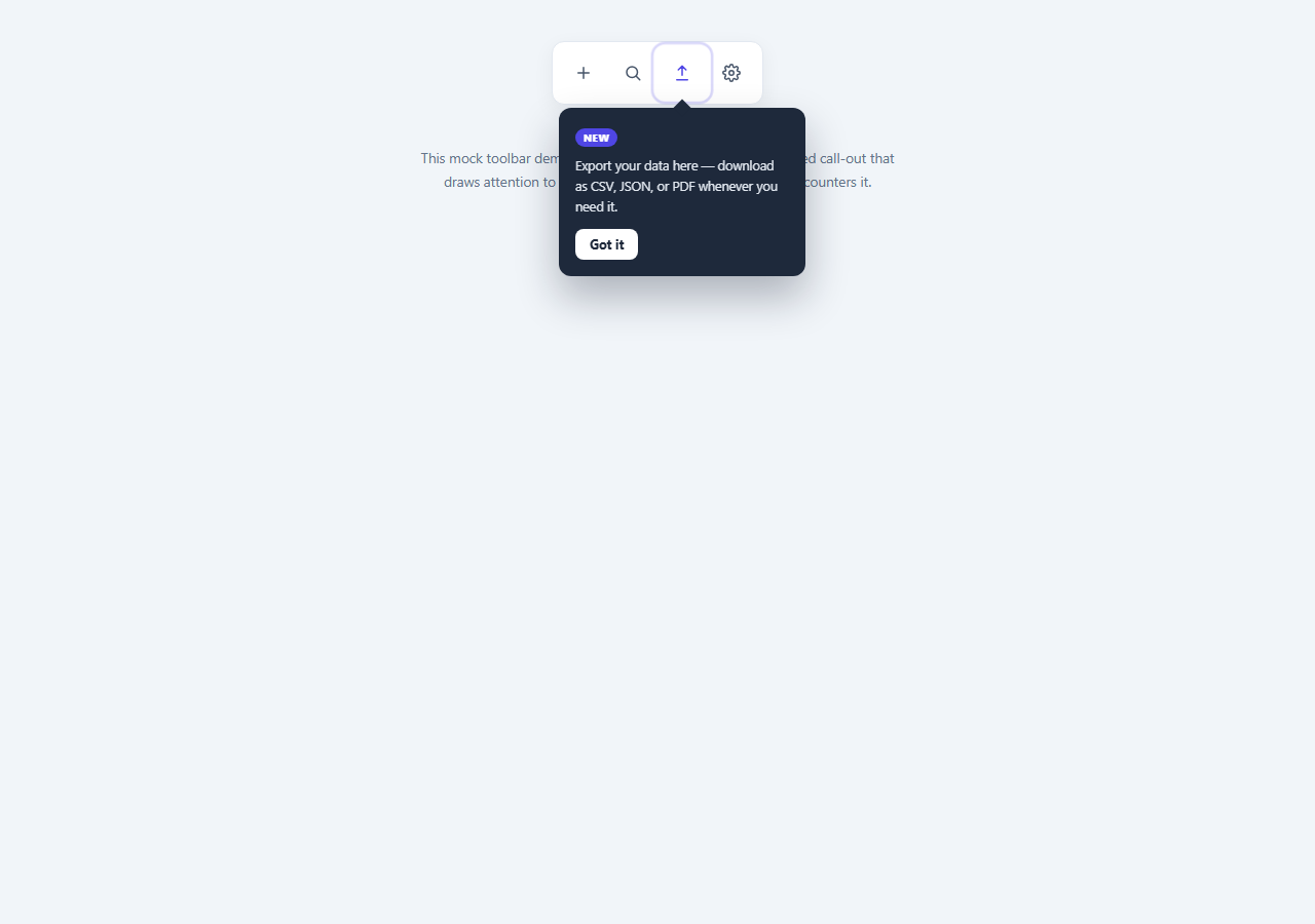
Coach marks are small, self-dismissing callouts that highlight one specific UI element the first time a user is likely to notice it — commonly used to introduce a new feature without interrupting the whole page like a modal would. This snippet demonstrates the pattern against a mock toolbar, calling out an "Export" button with a pulsing ring and a positioned tooltip card.
The pulsing ring
A .cm-pulse-ring element sits absolutely positioned around the target button, growing and fading via a CSS @keyframes animation (transform: scale() combined with fading opacity) that loops indefinitely until dismissed — a lightweight, GPU-friendly way to draw the eye without JavaScript-driven animation.
Real-position tooltip placement
Rather than hardcoding the tooltip's coordinates, positionCoachMark() reads the target button's getBoundingClientRect() and centers the tooltip horizontally beneath it, then clamps the resulting left offset against the viewport width so the card never overflows the screen edge — the same technique used by production tooltip and popover libraries, implemented here in a few lines of vanilla JS.
Dismissal removes both the ring and the tooltip
Clicking "Got it" hides the tooltip via a CSS class toggle (letting the opacity/transform transition play) and removes the pulsing ring element outright, so the coach mark disappears for good rather than resuming its animation loop — mirroring how a real onboarding flow marks a coach mark as seen and never shows it again.
Step by step
How to Use
- 1Load the snippetClick "Welcome Coach Mark Tooltip" in the sidebar to load its HTML, CSS, and JS into the editor panels. The preview updates instantly.
- 2Edit the codeModify any panel — HTML, CSS, or JS. The preview refreshes as you type. Use Reset in each panel header to restore the original.
- 3Preview on devicesClick the Mobile (375px), Tablet (768px), or Desktop buttons in the preview header to check responsiveness.
- 4Export in your formatClick "HTML" to download a standalone file, "JSX" for a React component, "Tailwind" for a React + Tailwind CSS component, "Tailwind HTML" for a standalone HTML file with Tailwind CDN, "Vue" for a Vue 3 SFC with <template>/<script setup>/<style scoped>, or "Angular" for a standalone Angular .component.ts file. "Copy all" copies the full code to clipboard.
- 5Save your versionClick "Save as", type a name, and press Enter. Your snippet saves to IndexedDB and appears in the Saved tab.
Real-world uses
Common Use Cases
Got questions?
Frequently Asked Questions
positionCoachMark() reads the target button's bounding rectangle and centers the tooltip's horizontal midpoint under it, placing it a fixed distance below the button's bottom edge, then clamps the left offset so it never runs off either side of the viewport.
A CSS @keyframes rule scales the ring element up while fading its opacity to zero, looping indefinitely via animation: ... infinite — no JS timers are involved in the animation itself.
The tooltip's visible class is removed (triggering its CSS fade/slide transition) and the pulsing ring element is removed from the DOM entirely, so dismissing it is permanent for that session.
Yes — move the .cm-coach-target class and .cm-pulse-ring span to any other button and update the exportBtn reference in the JS; the positioning logic works with any target element.