
Learn Coding Visually
Learn to code with interactive, live-preview playgrounds — HTML, CSS, JavaScript, React & more.
 HTML Playground42 lessons · Click-based · Live preview
 CSS PlaygroundLearn CSS with a live editor
 JavaScript Playground60 lessons · DOM · Async · Canvas
 React PlaygroundLearn React with a live code editor
 GSAP PlaygroundLearn GSAP animation interactively
 SVG Playground44 lessons · shapes · paths · animation
 SCSS Playground45 lessons · Sass modules · tokens
 Tailwind PlaygroundLearn Tailwind CSS with a live editor
 Bootstrap 5 Playground50 lessons · live preview
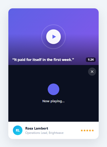
Testimonial Slider — Free HTML CSS JS Carousel Snippet
Testimonial Slider · Cards · Plain HTML, CSS & JS · Live preview
What's included
Features
About this UI Snippet
Testimonial Slider — Auto-Play Carousel, Touch Swipe, Keyboard Nav & Dot Indicators

A testimonial slider cycles through customer quotes (each a testimonial card) automatically, showing social proof without requiring a long scroll on the page — for a static grid instead, see the testimonial masonry. It is one of the most common components on landing pages, pricing pages, and homepages — and one of the most frequently requested UI patterns. This snippet provides a complete testimonial carousel: auto-advancing every 5 seconds, CSS translateX slide animation, dot indicator controls, prev/next arrow buttons, keyboard arrow key navigation, and touch swipe support — all without any carousel library (see the general-purpose carousel for non-quote content).
The CSS translateX slide mechanism
All slides sit side by side in a single .slider-track flex row, each with flex: 0 0 100% to occupy exactly the full width. The track is translateX(-current × 100%) to show only the current slide. CSS transition: transform 0.45s cubic-bezier(0.4,0,0.2,1) animates between slides. overflow: hidden on the wrapper clips all slides except the currently visible one. No cloning, no absolute positioning — pure flex layout.
Auto-advance with reset on interaction
A setInterval calls slideTo(current + 1) every 5 seconds. Whenever the user interacts (clicks a dot, arrow, or swipes), resetAuto() clears the current interval and starts a new one. This ensures the 5-second timer always counts from the last user interaction, not the last auto-advance — preventing the timer from firing immediately after a user swipe.
Touch swipe detection
touchstart records the initial X position. touchend computes the delta between start and end. If the absolute delta exceeds 50px (a minimum swipe distance threshold), the slider advances in the swipe direction. The passive: true option on touchstart allows the browser to scroll while tracking the gesture.
Infinite looping
The modulo calculation ((idx % total) + total) % total handles negative indices and wrap-around. Sliding left from index 0 gives (((-1) % 4) + 4) % 4 = 3, wrapping to the last slide. Sliding right from index 3 gives ((4 % 4) + 4) % 4 = 0, wrapping to the first.
Dot indicators
Dots are created dynamically from the slide count. The active dot scales up (transform: scale(1.3)) and turns indigo. Clicking a dot calls slideTo(i) directly, navigating to that specific slide and resetting the auto-advance timer.
Adding pause on hover
Improve usability by pausing auto-advance when the user hovers the slider: track.addEventListener("mouseenter", () => clearInterval(autoTimer)); track.addEventListener("mouseleave", resetAuto). This gives users time to read a testimonial they are currently viewing without the slider advancing while their cursor is on it.
Build with AI
Build, Understand, Optimize, and Extend It With AI
You don't have to work out the swipe-threshold or wrap-around math by hand. Paste this snippet's HTML, CSS, and JS into an AI coding assistant like Claude and ask it to explain exactly why the touch handler only advances the slide once the horizontal delta between touchstart and touchend exceeds 50 pixels, and how the double-modulo expression in slideTo correctly wraps negative indices without an if-statement. The same assistant can help optimize it — for instance whether resetAuto tearing down and rebuilding the interval on every single navigation (including the very first auto-advance) is the cleanest way to keep the timer in sync, or whether a vertical scroll gesture could accidentally be misread as a horizontal swipe on some devices. It's also useful for extending the slider: ask it to add a hover-to-pause behavior alongside the existing keyboard and touch support, show a countdown progress bar under each slide, or make it responsive to show two testimonials per view on wider screens. Treat the code less like a finished artifact and more like a starting point for a conversation.
Prompt to recreate it
Copy this into your AI assistant of choice to build the effect from scratch, or as a jumping-off point for your own variant:
Build an auto-advancing "testimonial slider" in plain HTML, CSS, and JavaScript with keyboard navigation and touch swipe support — no carousel library, no framework.

Requirements:
- A flex track of slides inside an overflow-hidden wrapper, where every slide takes exactly 100% of the track's width, and the visible slide is controlled entirely by a CSS transition on the track's transform property.
- A single slideTo(index) function that normalizes the given index into valid bounds using a double-modulo expression so both forward overflow and negative (backward) indices wrap correctly, updates the track's transform, and marks the corresponding dot indicator active — every navigation path (arrow buttons, dot clicks, autoplay, keyboard, and touch swipe) must call this one function.
- Dot indicators built dynamically from the actual number of slide elements found in the DOM (not a hardcoded count), so adding or removing a slide from the markup automatically changes the dot count with no JavaScript edits.
- An auto-advance timer on a fixed interval that is fully cleared and recreated (not just left running) inside slideTo, so every manual navigation resets the countdown and the next auto-advance is always a full interval away from the last change, whether it was triggered by a user or by the timer itself.
- A document-level keydown listener mapping the left and right arrow keys to going to the previous and next slide respectively.
- Touch handling that records the horizontal touch position on touchstart, computes the horizontal distance moved by touchend, and only triggers a slide change if that distance exceeds a minimum pixel threshold (to avoid accidental navigation from small movements or vertical scrolling), advancing in the direction of the swipe.
- Prev/next buttons that must never be permanently disabled since the slider loops infinitely in both directions.
Want to tighten it up first? Run this prompt through the AI Prompt Studio to score it across 8 quality dimensions, catch anti-patterns, and tune the wording for Claude, ChatGPT, or Gemini before you paste it in.
Source Code
<section class="section">
  <div class="section-head">
    <div class="eyebrow">Customer stories</div>
    <h2 class="section-title">Loved by thousands of teams</h2>
  </div>

  <div class="slider-wrap" id="slider-wrap">
    <div class="slider-track" id="slider-track">

      <div class="slide">
        <div class="quote-icon">"</div>
        <p class="quote-text">This tool completely transformed how our team ships features. We went from 2-week cycles to shipping every day. The productivity gain is real — I can't imagine going back.</p>
        <div class="author-row">
          <div class="author-av" style="background:linear-gradient(135deg,#6366f1,#a78bfa)">SK</div>
          <div class="author-info">
            <div class="author-name">Sarah Kim</div>
            <div class="author-role">CTO · Orbital Labs</div>
          </div>
          <div class="stars">★★★★★</div>
        </div>
      </div>

      <div class="slide">
        <div class="quote-icon">"</div>
        <p class="quote-text">We evaluated five platforms. This was the only one where the team actually got excited about using it. Onboarding took one afternoon, and we haven't looked back since.</p>
        <div class="author-row">
          <div class="author-av" style="background:linear-gradient(135deg,#ec4899,#f97316)">MJ</div>
          <div class="author-info">
            <div class="author-name">Marcus Johnson</div>
            <div class="author-role">VP Engineering · Nexus</div>
          </div>
          <div class="stars">★★★★★</div>
        </div>
      </div>

      <div class="slide">
        <div class="quote-icon">"</div>
        <p class="quote-text">The support team is extraordinary. When we had a question at 11pm, we had a detailed response within the hour. That kind of responsiveness is rare and it matters enormously to us.</p>
        <div class="author-row">
          <div class="author-av" style="background:linear-gradient(135deg,#10b981,#0ea5e9)">AL</div>
          <div class="author-info">
            <div class="author-name">Aisha Laurent</div>
            <div class="author-role">Head of Product · Pulse</div>
          </div>
          <div class="stars">★★★★★</div>
        </div>
      </div>

      <div class="slide">
        <div class="quote-icon">"</div>
        <p class="quote-text">ROI was positive within the first month. We eliminated three separate tools and reduced our monthly SaaS bill by 40%. It pays for itself several times over.</p>
        <div class="author-row">
          <div class="author-av" style="background:linear-gradient(135deg,#f59e0b,#ef4444)">RP</div>
          <div class="author-info">
            <div class="author-name">Raj Patel</div>
            <div class="author-role">CEO · Vertex Inc</div>
          </div>
          <div class="stars">★★★★★</div>
        </div>
      </div>

    </div>
  </div>

  <div class="slider-controls">
    <button class="ctrl-btn prev" id="prev-btn" onclick="slideTo(current-1)" aria-label="Previous testimonial">
      <svg width="16" height="16" viewBox="0 0 24 24" fill="none" stroke="currentColor" stroke-width="2.5" stroke-linecap="round"><polyline points="15 18 9 12 15 6"/></svg>
    </button>
    <div class="dots" id="dots"></div>
    <button class="ctrl-btn next" id="next-btn" onclick="slideTo(current+1)" aria-label="Next testimonial">
      <svg width="16" height="16" viewBox="0 0 24 24" fill="none" stroke="currentColor" stroke-width="2.5" stroke-linecap="round"><polyline points="9 18 15 12 9 6"/></svg>
    </button>
  </div>
</section>
* { box-sizing: border-box; margin: 0; padding: 0; }
body { font-family: system-ui, sans-serif; background: #f8fafc; min-height: 100vh; display: flex; align-items: center; justify-content: center; padding: 40px 24px; }
.section { width: 100%; max-width: 680px; display: flex; flex-direction: column; gap: 28px; }
.section-head { text-align: center; }
.eyebrow { font-size: 12px; font-weight: 700; letter-spacing: 1.5px; text-transform: uppercase; color: #6366f1; margin-bottom: 8px; }
.section-title { font-size: clamp(22px,4vw,32px); font-weight: 800; color: #0f172a; letter-spacing: -0.4px; }
/* Slider */
.slider-wrap { overflow: hidden; border-radius: 20px; }
.slider-track { display: flex; transition: transform 0.45s cubic-bezier(0.4,0,0.2,1); will-change: transform; }
.slide { flex: 0 0 100%; background: #fff; border-radius: 20px; padding: 36px 32px 28px; border: 1px solid #e2e8f0; display: flex; flex-direction: column; gap: 20px; box-shadow: 0 2px 12px rgba(0,0,0,0.05); }
.quote-icon { font-size: 64px; line-height: 0.8; color: #e2e8f0; font-family: Georgia, serif; margin-bottom: -8px; }
.quote-text { font-size: 16px; color: #374151; line-height: 1.75; font-style: italic; flex: 1; }
.author-row { display: flex; align-items: center; gap: 12px; }
.author-av { width: 44px; height: 44px; border-radius: 50%; color: #fff; font-size: 13px; font-weight: 800; display: flex; align-items: center; justify-content: center; flex-shrink: 0; }
.author-info { flex: 1; }
.author-name { font-size: 14px; font-weight: 700; color: #0f172a; }
.author-role { font-size: 12px; color: #64748b; margin-top: 1px; }
.stars { color: #f59e0b; font-size: 14px; letter-spacing: 2px; flex-shrink: 0; }
/* Controls */
.slider-controls { display: flex; align-items: center; justify-content: center; gap: 16px; }
.ctrl-btn { width: 40px; height: 40px; border-radius: 50%; border: 1.5px solid #e2e8f0; background: #fff; color: #475569; cursor: pointer; display: flex; align-items: center; justify-content: center; transition: all 0.15s; }
.ctrl-btn:hover:not(:disabled) { border-color: #6366f1; color: #6366f1; }
.ctrl-btn:disabled { opacity: 0.35; cursor: default; }
.dots { display: flex; gap: 8px; }
.dot { width: 8px; height: 8px; border-radius: 50%; background: #e2e8f0; border: none; cursor: pointer; transition: background 0.2s, transform 0.2s; padding: 0; }
.dot.active { background: #6366f1; transform: scale(1.3); }const track = document.getElementById('slider-track');
const slides = track.querySelectorAll('.slide');
const total = slides.length;
let current = 0;
let autoTimer = null;
// Build dots
const dotsWrap = document.getElementById('dots');
slides.forEach((_, i) => {
const dot = document.createElement('button');
dot.className = 'dot' + (i === 0 ? ' active' : '');
dot.setAttribute('aria-label', 'Slide ' + (i + 1));
dot.onclick = () => slideTo(i);
dotsWrap.appendChild(dot);
});
function slideTo(idx) {
current = ((idx % total) + total) % total;
track.style.transform = 'translateX(-' + current * 100 + '%)';
document.querySelectorAll('.dot').forEach((d,i) => d.classList.toggle('active', i === current));
document.getElementById('prev-btn').disabled = false;
document.getElementById('next-btn').disabled = false;
resetAuto();
}
function resetAuto() {
clearInterval(autoTimer);
autoTimer = setInterval(() => slideTo(current + 1), 5000);
}
// Keyboard navigation
document.addEventListener('keydown', e => {
if (e.key === 'ArrowLeft') slideTo(current - 1);
if (e.key === 'ArrowRight') slideTo(current + 1);
});
// Touch/swipe support
let touchX = 0;
track.addEventListener('touchstart', e => { touchX = e.touches[0].clientX; }, { passive: true });
track.addEventListener('touchend', e => {
const diff = touchX - e.changedTouches[0].clientX;
if (Math.abs(diff) > 50) slideTo(current + (diff > 0 ? 1 : -1));
});
resetAuto();Step by step
How to Use
- 1Watch the auto-advance and interact with controlsThe slider advances every 5 seconds. Click the ‹ › arrows or dots to navigate manually — the auto-advance timer resets after any interaction. Use keyboard arrow keys for navigation.
- 2Swipe on touch devicesOn mobile, swipe left to advance and right to go back. The 50px minimum swipe distance prevents accidental navigation during vertical scroll.
- 3Replace the testimonial contentEdit each .slide div: update .quote-text, .author-av initials and gradient, .author-name, .author-role, and optionally the .stars count. Each slide is self-contained.
- 4Add or remove slidesDuplicate a .slide div or delete one. The JavaScript reads slides.length dynamically, so the dot count and loop bounds update automatically. No code changes needed.
- 5Change the auto-advance speedUpdate 5000 in the setInterval call to any millisecond value. Set to 0 or remove the setInterval call entirely to disable auto-advance for a user-only controlled slider.
- 6Export in your formatClick "HTML" for a standalone file, "JSX" for a React component using useState for current index and useEffect for the auto-advance interval, or "Tailwind" for a Tailwind CSS version.
Real-world uses
Common Use Cases
Got questions?
Frequently Asked Questions
The resetAuto() function calls clearInterval(autoTimer) to stop the current interval, then immediately calls setInterval(() => slideTo(current+1), 5000) to start a fresh 5-second timer. This is called inside slideTo() on every navigation — user-triggered or auto-triggered. The result: the timer always counts 5 full seconds from the last slide change, regardless of when it happened. Without the clearInterval, a user swipe near the end of a 5-second cycle could cause an immediate second advance.
Change the .slider-track from display:flex to position:relative. Make each .slide position:absolute; inset:0; opacity:0; transition:opacity 0.5s. Add an .active class with opacity:1 to the current slide. In slideTo(), add/remove .active: slides.forEach((s,i)=>s.classList.toggle("active",i===current)). Remove the translateX logic entirely. The .slider-wrap needs position:relative and height matching the slide height.
Add a .progress div at the bottom of each slide: <div class="progress-bar"><div class="progress-fill" id="progress"></div></div>. CSS: .progress-fill { height:2px; background:#6366f1; animation: progress 5s linear; } @keyframes progress { from{width:0} to{width:100%} }. In slideTo(), reset the animation: const pbar = document.getElementById("progress"); pbar.style.animation="none"; pbar.offsetHeight; pbar.style.animation="".
Click "JSX" to download. Manage current with useState(0). The auto-advance uses useEffect: const id = setInterval(() => setCurrent(c => (c+1)%total), 5000); return () => clearInterval(id) — cleanup on unmount. Reset the interval on user interaction by tracking a dependency. Compute the track style: {transform: translateX(-${current*100}%)}. Build dots from Array.from({length:total},(_,i)=>i) and apply onClick and active class per index.