Source Code
<div class="demo">
  <div class="compare" id="compare">
    <div class="side side-a">
      <span class="side-label">Basic</span>
      <ul class="feat-list">
        <li>5 projects</li>
        <li>2 team seats</li>
        <li>Community support</li>
        <li>1 GB storage</li>
        <li>Basic analytics</li>
        <li class="muted">✕ Priority support</li>
        <li class="muted">✕ Custom domains</li>
        <li class="muted">✕ Audit logs</li>
      </ul>
    </div>
    <div class="side side-b">
      <span class="side-label">Pro</span>
      <ul class="feat-list">
        <li>Unlimited projects</li>
        <li>Unlimited seats</li>
        <li>Priority support</li>
        <li>100 GB storage</li>
        <li>Advanced analytics</li>
        <li>✓ Priority support</li>
        <li>✓ Custom domains</li>
        <li>✓ Audit logs</li>
      </ul>
    </div>
    <div class="handle" id="handle" role="slider" tabindex="0" aria-label="Compare Basic and Pro plans" aria-valuemin="0" aria-valuemax="100" aria-valuenow="50">
      <div class="handle-line"></div>
      <div class="handle-grip">
        <svg width="14" height="14" viewBox="0 0 24 24" fill="none" stroke="currentColor" stroke-width="2.4" stroke-linecap="round"><path d="M8 6 3 12l5 6M16 6l5 6-5 6"/></svg>
      </div>
    </div>
    <div class="tag tag-a">BASIC</div>
    <div class="tag tag-b">PRO</div>
  </div>
  <p class="hint">Drag the handle, or use ← → keys when focused</p>
</div>
* { box-sizing: border-box; margin: 0; padding: 0; }
body { font-family: system-ui, sans-serif; background: #f8fafc; display: flex; align-items: center; justify-content: center; min-height: 100vh; padding: 24px; }
.demo { display: flex; flex-direction: column; align-items: center; gap: 14px; }
.compare { position: relative; width: 460px; max-width: 100%; height: 340px; border-radius: 16px; overflow: hidden; border: 1px solid #e2e8f0; box-shadow: 0 8px 24px rgba(15,23,42,0.06); user-select: none; }
.side { position: absolute; inset: 0; padding: 46px 24px 24px; }
.side-a { background: #f1f5f9; }
.side-b { background: #0f172a; clip-path: inset(0 0 0 50%); transition: clip-path 0.05s linear; }
.side-b .feat-list li { color: #cbd5e1; }
.side-b .feat-list li::before { color: #34d399; }
.side-b .side-label { color: #f1f5f9; }
.side-label { display: block; font-size: 13px; font-weight: 800; letter-spacing: 0.06em; text-transform: uppercase; color: #334155; margin-bottom: 16px; }
.feat-list { list-style: none; display: flex; flex-direction: column; gap: 11px; }
.feat-list li { font-size: 13.5px; font-weight: 600; color: #334155; padding-left: 22px; position: relative; }
.feat-list li::before { content: '✓'; position: absolute; left: 0; color: #059669; font-weight: 800; }
.feat-list li.muted { color: #94a3b8; }
.feat-list li.muted::before { content: '✕'; color: #cbd5e1; }
.handle { position: absolute; top: 0; bottom: 0; left: 50%; width: 40px; margin-left: -20px; display: flex; align-items: center; justify-content: center; cursor: ew-resize; touch-action: none; }
.handle-line { position: absolute; top: 0; bottom: 0; left: 50%; width: 2px; background: rgba(255,255,255,0.9); box-shadow: 0 0 0 1px rgba(15,23,42,0.15); transform: translateX(-1px); }
.handle-grip { position: relative; width: 34px; height: 34px; border-radius: 50%; background: #fff; color: #0f172a; display: flex; align-items: center; justify-content: center; box-shadow: 0 4px 14px rgba(15,23,42,0.25); transition: transform 0.15s ease; }
.handle:hover .handle-grip, .handle:focus-visible .handle-grip { transform: scale(1.08); }
.handle:focus-visible { outline: none; }
.handle:focus-visible .handle-grip { box-shadow: 0 0 0 3px #6366f1, 0 4px 14px rgba(15,23,42,0.25); }
.tag { position: absolute; top: 16px; font-size: 10.5px; font-weight: 800; letter-spacing: 0.08em; padding: 4px 9px; border-radius: 6px; pointer-events: none; }
.tag-a { left: 24px; background: #e2e8f0; color: #475569; }
.tag-b { right: 24px; background: rgba(255,255,255,0.12); color: #f1f5f9; }
.hint { font-size: 12px; color: #94a3b8; }const compare = document.getElementById('compare');
const handle = document.getElementById('handle');
const sideB = compare.querySelector('.side-b');
function setPos(pct) {
pct = Math.max(4, Math.min(96, pct));
sideB.style.clipPath = `inset(0 0 0 ${pct}%)`;
handle.style.left = pct + '%';
handle.setAttribute('aria-valuenow', Math.round(pct));
}
function pctFromClientX(clientX) {
const rect = compare.getBoundingClientRect();
return ((clientX - rect.left) / rect.width) * 100;
}
let dragging = false;
handle.addEventListener('pointerdown', (e) => {
dragging = true;
handle.setPointerCapture(e.pointerId);
});
handle.addEventListener('pointermove', (e) => {
if (!dragging) return;
setPos(pctFromClientX(e.clientX));
});
handle.addEventListener('pointerup', () => { dragging = false; });
handle.addEventListener('pointercancel', () => { dragging = false; });
handle.addEventListener('keydown', (e) => {
const current = parseFloat(handle.style.left) || 50;
if (e.key === 'ArrowLeft') { setPos(current - 5); e.preventDefault(); }
if (e.key === 'ArrowRight') { setPos(current + 5); e.preventDefault(); }
});
setPos(50);Learn Coding Visually
Learn to code with interactive, live-preview playgrounds — HTML, CSS, JavaScript, React & more.
 HTML Playground42 lessons · Click-based · Live preview
 CSS PlaygroundLearn CSS with a live editor
 JavaScript Playground60 lessons · DOM · Async · Canvas
 React PlaygroundLearn React with a live code editor
 GSAP PlaygroundLearn GSAP animation interactively
 SVG Playground44 lessons · shapes · paths · animation
 SCSS Playground45 lessons · Sass modules · tokens
 Tailwind PlaygroundLearn Tailwind CSS with a live editor
 Bootstrap 5 Playground50 lessons · live preview
Plan Comparison Slider — Drag to Reveal Basic vs Pro Plan Features
Plan Comparison Slider — Drag to Reveal Basic vs Pro Features · Pricing · Plain HTML, CSS & JS · Live preview
What's included
Features
About this UI Snippet
Drag-to-Compare Plan Slider — A Split-Panel Feature Comparison
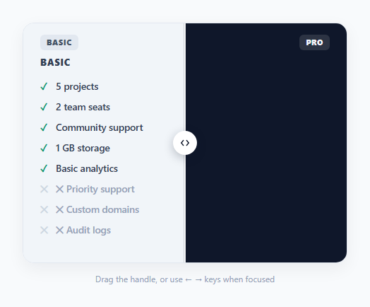
This component borrows the mechanics of a before/after image slider and applies them to a much more common pricing-page need: showing a visitor exactly what changes when they move from a cheaper plan to a more expensive one. Instead of comparing two photos, dragging the handle compares two feature lists stacked in the same physical space.
How the two-layer clip-path works
The trick is two absolutely positioned .side panels occupying the exact same box — .side-a (Basic) sits underneath in normal light styling, and .side-b (Pro, dark styling) sits on top with clip-path: inset(0 0 0 50%). That clip-path hides everything in .side-b to the left of the 50% mark, letting the Basic panel underneath show through. Dragging the handle simply updates that left-inset percentage in JavaScript — inset(0 0 0 ${pct}%) — which is why the Pro panel appears to "wipe in" from the right as you drag left, without ever animating the feature list items themselves.
Why pointer events instead of separate mouse/touch handlers
The drag logic uses pointerdown/pointermove/pointerup with setPointerCapture, which unifies mouse, touch, and pen input into one event model and keeps receiving move events even if the cursor leaves the handle's bounding box mid-drag — a common failure mode with plain mousemove listeners bound only to the handle itself.
Keyboard accessibility built in from the start
The handle is a real <div role="slider" tabindex="0"> with aria-valuemin, aria-valuemax, and a live aria-valuenow that updates on every drag or arrow-key press — so a screen reader announces the current comparison position as a percentage, and keyboard users can operate the entire comparison with the ArrowLeft/ArrowRight keys alone, with no mouse required at all.
Where this earns its place over a static comparison table
Traditional side-by-side pricing tables ask a visitor to scan two columns and mentally diff them row by row. This slider instead makes the *act of comparing* physical and continuous — sliding toward "Pro" viscerally shows more of the upgraded feature set filling the frame, which tends to read as more persuasive on a pricing page than a static checkmark grid, while still degrading gracefully to a readable feature list at either extreme.
Build with AI
Build, Understand, Optimize, and Extend It With AI
Ask an AI assistant to walk through exactly why clip-path: inset() is a better fit here than translateX or width-based reveals, and to explain how setPointerCapture prevents the drag from breaking if the cursor moves faster than the handle can visually follow. It's also worth asking for a version that supports three or more plans via a horizontal multi-stop slider, or one that snaps to discrete tier positions instead of tracking the pointer continuously.
Prompt to recreate it
Copy this into your AI assistant of choice to build the effect from scratch, or as a jumping-off point for your own variant:
Build a draggable two-panel comparison slider in HTML, CSS and vanilla JavaScript that reveals a "Pro" plan's feature list over a "Basic" plan's feature list as the user drags a central handle left and right — no external libraries.

Requirements:
- Two absolutely-positioned panels occupying the same box, each listing plan features; the top panel must be revealed using CSS clip-path: inset(), not width or transform tricks.
- A draggable circular handle positioned at the clip boundary, operable via the Pointer Events API (pointerdown/pointermove/pointerup with setPointerCapture) so it works for mouse, touch and pen input uniformly.
- The handle must be a real role="slider" element with aria-valuemin, aria-valuemax, and a live aria-valuenow attribute that updates on every drag.
- Full keyboard support: when the handle has focus, ArrowLeft and ArrowRight keys must move the comparison position in fixed increments.
- Clamp the draggable range so neither panel can be fully hidden — leave at least a few percent of each side always visible.
- Visually distinguish the two panels (e.g. light vs dark background) and label each with a small corner tag.
Want to tighten it up first? Run this prompt through the AI Prompt Studio to score it across 8 quality dimensions, catch anti-patterns, and tune the wording for Claude, ChatGPT, or Gemini before you paste it in.
Step by step
How to Use
- 1Edit the two feature listsUpdate the <li> items inside .side-a and .side-b in the HTML panel to match your own plan tiers.
- 2Keep list item counts alignedFor a clean comparison, keep the same number of <li> rows in both lists so items line up vertically as the handle moves.
- 3Adjust the starting positionChange the 50 passed to setPos(50) at the bottom of the JS panel to start the slider closer to one plan.
- 4Restyle the dark Pro panelUpdate the background, text and accent colors on .side-b in the CSS panel to match your brand instead of the default dark theme.
- 5Test keyboard operationClick the handle to focus it, then press the left and right arrow keys to confirm the slider is fully operable without a mouse.
Real-world uses
Common Use Cases
Got questions?
Frequently Asked Questions
Yes — it uses the Pointer Events API (pointerdown/pointermove/pointerup) which normalizes mouse, touch and pen input into a single set of handlers, so dragging works identically on a phone screen.
The clip-path technique is inherently two-panel. For three or more tiers, use a traditional side-by-side comparison table or a tabbed switcher instead — this component is best suited to a direct two-plan comparison.
clip-path: inset() clips the top panel precisely without affecting layout flow or triggering reflow on the panel underneath, which keeps the drag interaction smooth even at high frame rates.
Yes — the handle is a role="slider" element with aria-valuemin, aria-valuemax and a live aria-valuenow, and it supports ArrowLeft/ArrowRight keyboard operation in addition to drag.
The setPos function already clamps the percentage between 4 and 96 so a sliver of both panels always remains visible — adjust those two numbers to change the clamp range.
Yes — add a CSS transition on clip-path to .side-b for eased movement, though for a live drag interaction most implementations keep it instant (transition: 0.05s) so it feels directly connected to the pointer.