More Layouts Snippets
Auto-Play Carousel — Free HTML CSS JS Snippet
Auto-Play Carousel · Layouts · Plain HTML, CSS & JS · Live preview
What's included
Features
translateX(-n*100%) on the track — no DOM manipulation, just a single CSS property change per transition.linear CSS transition timed to match the 4-second interval, giving users a clear visual countdown.width and border-radius transitions communicate slide position more clearly than a simple colour change alone.mouseenter clears the advance interval and progress animation. mouseleave restarts both from zero — the user always gets a full read time after re-entering.pointerdown/pointerup handler on the track captures both mouse drags and touch swipes. Deltas over 40px trigger navigation.aria-live="polite" on the container and per-slide aria-hidden updates ensure screen readers announce new content without interrupting user actions.cubic-bezier(0.77,0,0.18,1) — an aggressive ease-in with smooth landing that gives the slide a confident, high-quality feel.About this UI Snippet
Auto-Play Carousel — CSS Transform Track, Progress Bar Timer & Pointer Swipe
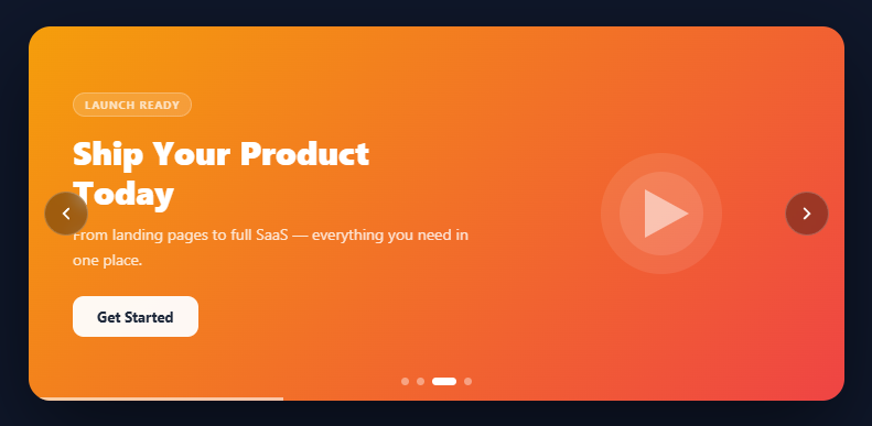
A carousel is one of the most requested UI patterns in frontend development — showcasing featured content, hero slides, testimonials, or product images in a compact rotating format. This snippet delivers a production-ready auto-playing carousel in pure HTML, CSS, and vanilla JavaScript with zero dependencies: a sliding track with smooth cubic-bezier transitions, animated dot indicators, arrow navigation, a visual progress bar, pause-on-hover, and pointer-based swipe support for touch screens.
The carousel is used across virtually every category of web project — SaaS landing pages, e-commerce hero sections, portfolio showcases, marketing sites, and dashboards. Getting the implementation right matters: jank-free transitions, accessible ARIA attributes, correct swipe detection, and pause-on-hover are all expected by users and required for production quality.
The sliding track mechanism
The core of the carousel is a display: flex track containing all slides as min-width: 100% children. Navigating to slide n sets transform: translateX(-n * 100%) on the track, which shifts the entire row by one viewport-width unit. The CSS transition: transform 0.55s cubic-bezier(0.77,0,0.18,1) applies a custom easing — fast start, smooth deceleration — that feels cinematic rather than mechanical.
The progress bar timer
Each auto-play cycle is visualised with a bottom progress bar that grows from 0% to 100% width over the same duration as the interval (4 seconds). The animation uses a width CSS transition set to linear with the exact interval duration, so the bar and the slide advance in sync. When the user navigates manually, the transition is reset to none (forcing a synchronous paint), then re-applied on the next requestAnimationFrame — this reliably restarts the animation from 0% without a flash.
Dot indicators with pill active state
Each dot starts as a 7px circle. The active dot expands to a 22px-wide pill via width and border-radius transitions — a pattern that communicates both current position and progress direction more clearly than a simple colour change. Dots are <button> elements with role="tab" for keyboard and screen reader accessibility.
Pause on hover
mouseenter clears both the slide interval and progress timers. mouseleave restarts them. This prevents the carousel from advancing while the user is reading content — a standard UX expectation that many basic carousel implementations miss.
Swipe support via Pointer Events API
Rather than separate touch and mouse event handlers, the snippet uses a single pointerdown/pointerup pair on the track. The delta (clientX end minus start) determines direction: left-swipe advances, right-swipe retreats. Any delta larger than 40px counts as an intentional swipe. The Pointer Events API handles both mouse drags and touch swipes with one code path.
Accessibility
Each slide has aria-hidden="false" (current) or aria-hidden="true" (hidden), updated on every navigation. The container has role="region" and aria-live="polite", and arrow buttons have aria-label. Dot buttons have role="tab" and individual aria-label values. Pair with an animated tabs component for tabbed content that doesn't auto-advance.
Step by step
How to Use
- 1Paste HTML, CSS, and JSDrop the three blocks into your page. A full-width carousel appears with four coloured slides, arrow buttons, dot indicators, and a bottom progress bar.
- 2Watch the auto-playThe carousel advances every 4 seconds. The progress bar at the bottom fills left-to-right, giving users a visual count of when the next slide arrives.
- 3Click the arrows or dotsArrow buttons navigate prev/next. Dot buttons jump to any slide directly. Both reset the timer so the current slide gets its full 4-second display time.
- 4Swipe on touch devicesDrag the track left or right — swipes larger than 40px trigger navigation. Works with both touch and mouse pointer events.
- 5Hover to pauseMove the mouse over the carousel and it pauses. The progress bar freezes. Move away and it resumes — the full 4 seconds starts again from 0.
- 6Customise slide contentEach
.slidediv is independent — change the gradient background, tag text, heading, description, button label, and SVG illustration. Add or remove slides and the dot system updates automatically.
Real-world uses
Common Use Cases
Got questions?
Frequently Asked Questions
Change the INTERVAL constant at the top of the JS (default 4000ms). The progress bar animation automatically adjusts to match — it reads the same constant.
Duplicate any .slide div in the HTML and update its content. The JS counts slides with track.querySelectorAll(".slide") and the dot builder loops over that count — no JS changes needed.
Remove the startProgress() call at the bottom of the JS and remove the mouseenter/mouseleave listeners. The arrows and dots will still work. You can also set INTERVAL to a very large number like 99999.
Click the "↓ React" export button above the preview. The state becomes const [current, setCurrent] = useState(0). The setInterval goes in a useEffect with a cleanup return. The progress bar animation uses a key={current} on the bar element to force remount on each slide change, which restarts the CSS animation automatically.
Yes — change each slide's min-width from 100% to 33.333% and update the translateX calculation to current * (100/3)%. You will also need to guard the advance logic against going past the last group.
Auto-Play Carousel — Export as HTML, React, Vue, Angular & Tailwind
<!DOCTYPE html>
<html lang="en">
<head>
<meta charset="UTF-8" />
<meta name="viewport" content="width=device-width, initial-scale=1.0" />
<title>Auto-Play Carousel</title>
<style>
*{box-sizing:border-box;margin:0;padding:0}
body{font-family:system-ui,sans-serif;background:#0f172a;display:flex;align-items:center;justify-content:center;min-height:100vh}
.scene{width:100%;max-width:780px;padding:20px}
.carousel-wrap{position:relative;border-radius:20px;overflow:hidden;box-shadow:0 30px 80px rgba(0,0,0,0.5);user-select:none}
.track{display:flex;transition:transform 0.55s cubic-bezier(0.77,0,0.18,1);will-change:transform}
.slide{min-width:100%;height:340px;position:relative;display:flex;align-items:center;overflow:hidden;padding:40px}
.slide-bg{position:absolute;inset:0;transition:opacity 0.3s}
.slide-content{position:relative;z-index:2;max-width:55%}
.slide-tag{display:inline-block;font-size:10px;font-weight:700;letter-spacing:.08em;text-transform:uppercase;color:rgba(255,255,255,0.7);background:rgba(255,255,255,0.15);border:1px solid rgba(255,255,255,0.25);border-radius:20px;padding:3px 10px;margin-bottom:14px}
.slide-title{font-size:clamp(20px,3.5vw,30px);font-weight:800;color:#fff;line-height:1.2;margin-bottom:10px}
.slide-desc{font-size:14px;color:rgba(255,255,255,0.8);line-height:1.6;margin-bottom:22px}
.slide-btn{display:inline-flex;align-items:center;gap:6px;padding:10px 22px;background:rgba(255,255,255,0.95);color:#1e293b;font-size:13px;font-weight:700;border:none;border-radius:10px;cursor:pointer;transition:transform .15s,box-shadow .15s;font-family:inherit}
.slide-btn:hover{transform:translateY(-2px);box-shadow:0 8px 20px rgba(0,0,0,0.25)}
.slide-art{position:absolute;right:0;top:0;bottom:0;width:45%;z-index:1;display:flex;align-items:center;justify-content:center;opacity:.9}
.slide-art svg{width:100%;height:100%;max-width:200px}
.arrow{position:absolute;top:50%;transform:translateY(-50%);z-index:10;width:40px;height:40px;border-radius:50%;background:rgba(0,0,0,0.35);border:1px solid rgba(255,255,255,0.2);color:#fff;display:flex;align-items:center;justify-content:center;cursor:pointer;transition:background .2s,transform .2s;backdrop-filter:blur(8px)}
.arrow:hover{background:rgba(0,0,0,0.6);transform:translateY(-50%) scale(1.08)}
.arrow-prev{left:14px}
.arrow-next{right:14px}
.dots{position:absolute;bottom:14px;left:50%;transform:translateX(-50%);display:flex;gap:7px;z-index:10}
.dot{width:7px;height:7px;border-radius:50%;background:rgba(255,255,255,0.4);border:none;cursor:pointer;transition:background .25s,transform .25s,width .25s;padding:0}
.dot.active{background:#fff;width:22px;border-radius:4px}
.progress-bar{position:absolute;bottom:0;left:0;height:3px;background:rgba(255,255,255,0.6);width:0%;transition:width linear}
</style>
</head>
<body>
<div class="scene">
<div class="carousel-wrap" id="carouselWrap" role="region" aria-label="Featured content carousel" aria-live="polite">
<div class="track" id="track">
<div class="slide" aria-hidden="false">
<div class="slide-bg" style="background:linear-gradient(135deg,#6366f1 0%,#8b5cf6 100%)"></div>
<div class="slide-content">
<span class="slide-tag">Design System</span>
<h2 class="slide-title">Build Faster With Components</h2>
<p class="slide-desc">A library of 175+ copy-paste UI snippets ready for any project.</p>
<button class="slide-btn">Explore Library</button>
</div>
<div class="slide-art">
<svg viewBox="0 0 200 180" fill="none" xmlns="http://www.w3.org/2000/svg">
<rect x="20" y="30" width="70" height="50" rx="8" fill="rgba(255,255,255,0.15)"/>
<rect x="100" y="30" width="80" height="22" rx="6" fill="rgba(255,255,255,0.2)"/>
<rect x="100" y="60" width="55" height="22" rx="6" fill="rgba(255,255,255,0.12)"/>
<rect x="20" y="96" width="160" height="12" rx="4" fill="rgba(255,255,255,0.1)"/>
<rect x="20" y="116" width="120" height="12" rx="4" fill="rgba(255,255,255,0.08)"/>
<rect x="20" y="136" width="90" height="12" rx="4" fill="rgba(255,255,255,0.06)"/>
</svg>
</div>
</div>
<div class="slide" aria-hidden="true">
<div class="slide-bg" style="background:linear-gradient(135deg,#0ea5e9 0%,#06b6d4 100%)"></div>
<div class="slide-content">
<span class="slide-tag">Analytics</span>
<h2 class="slide-title">Insights That Drive Growth</h2>
<p class="slide-desc">Real-time dashboards and charts to understand your audience.</p>
<button class="slide-btn">View Demo</button>
</div>
<div class="slide-art">
<svg viewBox="0 0 200 180" fill="none" xmlns="http://www.w3.org/2000/svg">
<rect x="20" y="130" width="24" height="40" rx="4" fill="rgba(255,255,255,0.2)"/>
<rect x="52" y="100" width="24" height="70" rx="4" fill="rgba(255,255,255,0.3)"/>
<rect x="84" y="80" width="24" height="90" rx="4" fill="rgba(255,255,255,0.4)"/>
<rect x="116" y="60" width="24" height="110" rx="4" fill="rgba(255,255,255,0.3)"/>
<rect x="148" y="40" width="24" height="130" rx="4" fill="rgba(255,255,255,0.5)"/>
<path d="M20 100 Q60 60 100 80 Q140 100 180 30" stroke="rgba(255,255,255,0.6)" stroke-width="2.5" fill="none"/>
</svg>
</div>
</div>
<div class="slide" aria-hidden="true">
<div class="slide-bg" style="background:linear-gradient(135deg,#f59e0b 0%,#ef4444 100%)"></div>
<div class="slide-content">
<span class="slide-tag">Launch Ready</span>
<h2 class="slide-title">Ship Your Product Today</h2>
<p class="slide-desc">From landing pages to full SaaS — everything you need in one place.</p>
<button class="slide-btn">Get Started</button>
</div>
<div class="slide-art">
<svg viewBox="0 0 200 180" fill="none" xmlns="http://www.w3.org/2000/svg">
<circle cx="100" cy="90" r="55" fill="rgba(255,255,255,0.1)"/>
<circle cx="100" cy="90" r="38" fill="rgba(255,255,255,0.12)"/>
<path d="M85 68 L85 112 L125 90 Z" fill="rgba(255,255,255,0.6)"/>
</svg>
</div>
</div>
<div class="slide" aria-hidden="true">
<div class="slide-bg" style="background:linear-gradient(135deg,#10b981 0%,#059669 100%)"></div>
<div class="slide-content">
<span class="slide-tag">Open Source</span>
<h2 class="slide-title">Free. Forever. No Sign-Up.</h2>
<p class="slide-desc">Every snippet is free to copy, modify, and use in commercial projects.</p>
<button class="slide-btn">Start Coding</button>
</div>
<div class="slide-art">
<svg viewBox="0 0 200 180" fill="none" xmlns="http://www.w3.org/2000/svg">
<path d="M100 30 L115 75 L163 75 L124 100 L138 145 L100 120 L62 145 L76 100 L37 75 L85 75 Z" fill="rgba(255,255,255,0.3)" stroke="rgba(255,255,255,0.5)" stroke-width="1.5"/>
</svg>
</div>
</div>
</div>
<button class="arrow arrow-prev" id="prevBtn" aria-label="Previous slide">
<svg width="18" height="18" viewBox="0 0 24 24" fill="none" stroke="currentColor" stroke-width="2.5" stroke-linecap="round"><polyline points="15 18 9 12 15 6"/></svg>
</button>
<button class="arrow arrow-next" id="nextBtn" aria-label="Next slide">
<svg width="18" height="18" viewBox="0 0 24 24" fill="none" stroke="currentColor" stroke-width="2.5" stroke-linecap="round"><polyline points="9 18 15 12 9 6"/></svg>
</button>
<div class="dots" id="dots" role="tablist" aria-label="Slide navigation"></div>
<div class="progress-bar" id="progressBar"></div>
</div>
</div>
<script>
const track = document.getElementById('track');
const slides = track.querySelectorAll('.slide');
const dotsWrap = document.getElementById('dots');
const progressBar = document.getElementById('progressBar');
const N = slides.length;
const INTERVAL = 4000;
let current = 0, timer, progTimer, isAnimating = false;
track.addEventListener('transitionend', () => { isAnimating = false; });
// Build dots
slides.forEach((_,i) => {
const d = document.createElement('button');
d.className = 'dot' + (i===0?' active':'');
d.setAttribute('role','tab');
d.setAttribute('aria-label','Slide '+(i+1));
d.addEventListener('click',()=>goTo(i,true));
dotsWrap.appendChild(d);
});
const dots = dotsWrap.querySelectorAll('.dot');
function updateAria(){
slides.forEach((s,i)=>s.setAttribute('aria-hidden', i!==current ? 'true':'false'));
}
function goTo(n, resetTimer=false){
if(isAnimating) return;
isAnimating = true;
current=(n+N)%N;
track.style.transform=`translateX(-${current*100}%)`;
dots.forEach((d,i)=>d.classList.toggle('active',i===current));
updateAria();
if(resetTimer){clearInterval(timer);clearInterval(progTimer);startProgress();}
}
function startProgress(){
clearInterval(progTimer);
progressBar.style.transition='none';
progressBar.style.width='0%';
requestAnimationFrame(()=>{
progressBar.style.transition=`width ${INTERVAL}ms linear`;
progressBar.style.width='100%';
});
timer=setInterval(()=>{
goTo(current+1);
progressBar.style.transition='none';
progressBar.style.width='0%';
requestAnimationFrame(()=>{
progressBar.style.transition=`width ${INTERVAL}ms linear`;
progressBar.style.width='100%';
});
},INTERVAL);
}
document.getElementById('prevBtn').addEventListener('click',()=>goTo(current-1,true));
document.getElementById('nextBtn').addEventListener('click',()=>goTo(current+1,true));
// Swipe support
let startX=0;
track.addEventListener('pointerdown',e=>{startX=e.clientX;});
track.addEventListener('pointerup',e=>{
const dx=e.clientX-startX;
if(Math.abs(dx)>40){goTo(dx<0?current+1:current-1,true);}
});
// Pause on hover
const wrap=document.getElementById('carouselWrap');
wrap.addEventListener('mouseenter',()=>{clearInterval(timer);clearInterval(progTimer);});
wrap.addEventListener('mouseleave',()=>startProgress());
updateAria();
startProgress();
</script>
</body>
</html><!DOCTYPE html>
<html lang="en">
<head>
<meta charset="UTF-8" />
<meta name="viewport" content="width=device-width, initial-scale=1.0" />
<title>Auto-Play Carousel</title>
<!-- Tailwind CSS v3+ — arbitrary value classes (e.g. bg-[#0f172a]) are valid -->
<script src="https://cdn.tailwindcss.com"></script>
<style>
* {
box-sizing:border-box;margin:0;padding:0
}
body {
font-family:system-ui,sans-serif;background:#0f172a;display:flex;align-items:center;justify-content:center;min-height:100vh
}
.track {
display:flex;transition:transform 0.55s cubic-bezier(0.77,0,0.18,1);will-change:transform
}
.slide-art svg {
width:100%;height:100%;max-width:200px
}
.dots {
position:absolute;bottom:14px;left:50%;transform:translateX(-50%);display:flex;gap:7px;z-index:10
}
.dot {
width:7px;height:7px;border-radius:50%;background:rgba(255,255,255,0.4);border:none;cursor:pointer;transition:background .25s,transform .25s,width .25s;padding:0
}
.dot.active {
background:#fff;width:22px;border-radius:4px
}
</style>
</head>
<body>
<div class="w-full max-w-[780px] p-5">
<div class="relative rounded-[20px] overflow-hidden shadow-[0_30px_80px_rgba(0,0,0,0.5)] select-none" id="carouselWrap" role="region" aria-label="Featured content carousel" aria-live="polite">
<div class="track" id="track">
<div class="slide min-w-full h-[340px] relative flex items-center overflow-hidden p-10" aria-hidden="false">
<div class="absolute inset-0 [transition:opacity_0.3s]" style="background:linear-gradient(135deg,#6366f1 0%,#8b5cf6 100%)"></div>
<div class="relative z-[2] max-w-[55%]">
<span class="inline-block text-xs font-bold tracking-[.08em] uppercase text-[rgba(255,255,255,0.7)] bg-[rgba(255,255,255,0.15)] border border-[rgba(255,255,255,0.25)] rounded-[20px] py-[3px] px-2.5 mb-3.5">Design System</span>
<h2 class="text-[clamp(20px,3.5vw,30px)] font-extrabold text-[#fff] leading-[1.2] mb-2.5">Build Faster With Components</h2>
<p class="text-sm text-[rgba(255,255,255,0.8)] leading-[1.6] mb-[22px]">A library of 175+ copy-paste UI snippets ready for any project.</p>
<button class="inline-flex items-center gap-1.5 py-2.5 px-[22px] bg-[rgba(255,255,255,0.95)] text-[#1e293b] text-[13px] font-bold border-0 rounded-[10px] cursor-pointer [transition:transform_.15s,box-shadow_.15s] font-[inherit] hover:[transform:translateY(-2px)] hover:shadow-[0_8px_20px_rgba(0,0,0,0.25)]">Explore Library</button>
</div>
<div class="slide-art absolute right-0 top-0 bottom-0 w-[45%] z-[1] flex items-center justify-center opacity-90">
<svg viewBox="0 0 200 180" fill="none" xmlns="http://www.w3.org/2000/svg">
<rect x="20" y="30" width="70" height="50" rx="8" fill="rgba(255,255,255,0.15)"/>
<rect x="100" y="30" width="80" height="22" rx="6" fill="rgba(255,255,255,0.2)"/>
<rect x="100" y="60" width="55" height="22" rx="6" fill="rgba(255,255,255,0.12)"/>
<rect x="20" y="96" width="160" height="12" rx="4" fill="rgba(255,255,255,0.1)"/>
<rect x="20" y="116" width="120" height="12" rx="4" fill="rgba(255,255,255,0.08)"/>
<rect x="20" y="136" width="90" height="12" rx="4" fill="rgba(255,255,255,0.06)"/>
</svg>
</div>
</div>
<div class="slide min-w-full h-[340px] relative flex items-center overflow-hidden p-10" aria-hidden="true">
<div class="absolute inset-0 [transition:opacity_0.3s]" style="background:linear-gradient(135deg,#0ea5e9 0%,#06b6d4 100%)"></div>
<div class="relative z-[2] max-w-[55%]">
<span class="inline-block text-xs font-bold tracking-[.08em] uppercase text-[rgba(255,255,255,0.7)] bg-[rgba(255,255,255,0.15)] border border-[rgba(255,255,255,0.25)] rounded-[20px] py-[3px] px-2.5 mb-3.5">Analytics</span>
<h2 class="text-[clamp(20px,3.5vw,30px)] font-extrabold text-[#fff] leading-[1.2] mb-2.5">Insights That Drive Growth</h2>
<p class="text-sm text-[rgba(255,255,255,0.8)] leading-[1.6] mb-[22px]">Real-time dashboards and charts to understand your audience.</p>
<button class="inline-flex items-center gap-1.5 py-2.5 px-[22px] bg-[rgba(255,255,255,0.95)] text-[#1e293b] text-[13px] font-bold border-0 rounded-[10px] cursor-pointer [transition:transform_.15s,box-shadow_.15s] font-[inherit] hover:[transform:translateY(-2px)] hover:shadow-[0_8px_20px_rgba(0,0,0,0.25)]">View Demo</button>
</div>
<div class="slide-art absolute right-0 top-0 bottom-0 w-[45%] z-[1] flex items-center justify-center opacity-90">
<svg viewBox="0 0 200 180" fill="none" xmlns="http://www.w3.org/2000/svg">
<rect x="20" y="130" width="24" height="40" rx="4" fill="rgba(255,255,255,0.2)"/>
<rect x="52" y="100" width="24" height="70" rx="4" fill="rgba(255,255,255,0.3)"/>
<rect x="84" y="80" width="24" height="90" rx="4" fill="rgba(255,255,255,0.4)"/>
<rect x="116" y="60" width="24" height="110" rx="4" fill="rgba(255,255,255,0.3)"/>
<rect x="148" y="40" width="24" height="130" rx="4" fill="rgba(255,255,255,0.5)"/>
<path d="M20 100 Q60 60 100 80 Q140 100 180 30" stroke="rgba(255,255,255,0.6)" stroke-width="2.5" fill="none"/>
</svg>
</div>
</div>
<div class="slide min-w-full h-[340px] relative flex items-center overflow-hidden p-10" aria-hidden="true">
<div class="absolute inset-0 [transition:opacity_0.3s]" style="background:linear-gradient(135deg,#f59e0b 0%,#ef4444 100%)"></div>
<div class="relative z-[2] max-w-[55%]">
<span class="inline-block text-xs font-bold tracking-[.08em] uppercase text-[rgba(255,255,255,0.7)] bg-[rgba(255,255,255,0.15)] border border-[rgba(255,255,255,0.25)] rounded-[20px] py-[3px] px-2.5 mb-3.5">Launch Ready</span>
<h2 class="text-[clamp(20px,3.5vw,30px)] font-extrabold text-[#fff] leading-[1.2] mb-2.5">Ship Your Product Today</h2>
<p class="text-sm text-[rgba(255,255,255,0.8)] leading-[1.6] mb-[22px]">From landing pages to full SaaS — everything you need in one place.</p>
<button class="inline-flex items-center gap-1.5 py-2.5 px-[22px] bg-[rgba(255,255,255,0.95)] text-[#1e293b] text-[13px] font-bold border-0 rounded-[10px] cursor-pointer [transition:transform_.15s,box-shadow_.15s] font-[inherit] hover:[transform:translateY(-2px)] hover:shadow-[0_8px_20px_rgba(0,0,0,0.25)]">Get Started</button>
</div>
<div class="slide-art absolute right-0 top-0 bottom-0 w-[45%] z-[1] flex items-center justify-center opacity-90">
<svg viewBox="0 0 200 180" fill="none" xmlns="http://www.w3.org/2000/svg">
<circle cx="100" cy="90" r="55" fill="rgba(255,255,255,0.1)"/>
<circle cx="100" cy="90" r="38" fill="rgba(255,255,255,0.12)"/>
<path d="M85 68 L85 112 L125 90 Z" fill="rgba(255,255,255,0.6)"/>
</svg>
</div>
</div>
<div class="slide min-w-full h-[340px] relative flex items-center overflow-hidden p-10" aria-hidden="true">
<div class="absolute inset-0 [transition:opacity_0.3s]" style="background:linear-gradient(135deg,#10b981 0%,#059669 100%)"></div>
<div class="relative z-[2] max-w-[55%]">
<span class="inline-block text-xs font-bold tracking-[.08em] uppercase text-[rgba(255,255,255,0.7)] bg-[rgba(255,255,255,0.15)] border border-[rgba(255,255,255,0.25)] rounded-[20px] py-[3px] px-2.5 mb-3.5">Open Source</span>
<h2 class="text-[clamp(20px,3.5vw,30px)] font-extrabold text-[#fff] leading-[1.2] mb-2.5">Free. Forever. No Sign-Up.</h2>
<p class="text-sm text-[rgba(255,255,255,0.8)] leading-[1.6] mb-[22px]">Every snippet is free to copy, modify, and use in commercial projects.</p>
<button class="inline-flex items-center gap-1.5 py-2.5 px-[22px] bg-[rgba(255,255,255,0.95)] text-[#1e293b] text-[13px] font-bold border-0 rounded-[10px] cursor-pointer [transition:transform_.15s,box-shadow_.15s] font-[inherit] hover:[transform:translateY(-2px)] hover:shadow-[0_8px_20px_rgba(0,0,0,0.25)]">Start Coding</button>
</div>
<div class="slide-art absolute right-0 top-0 bottom-0 w-[45%] z-[1] flex items-center justify-center opacity-90">
<svg viewBox="0 0 200 180" fill="none" xmlns="http://www.w3.org/2000/svg">
<path d="M100 30 L115 75 L163 75 L124 100 L138 145 L100 120 L62 145 L76 100 L37 75 L85 75 Z" fill="rgba(255,255,255,0.3)" stroke="rgba(255,255,255,0.5)" stroke-width="1.5"/>
</svg>
</div>
</div>
</div>
<button class="absolute top-1/2 [transform:translateY(-50%)] z-10 w-10 h-10 rounded-full bg-[rgba(0,0,0,0.35)] border border-[rgba(255,255,255,0.2)] text-[#fff] flex items-center justify-center cursor-pointer [transition:background_.2s,transform_.2s] [backdrop-filter:blur(8px)] hover:bg-[rgba(0,0,0,0.6)] hover:[transform:translateY(-50%)_scale(1.08)] left-3.5" id="prevBtn" aria-label="Previous slide">
<svg width="18" height="18" viewBox="0 0 24 24" fill="none" stroke="currentColor" stroke-width="2.5" stroke-linecap="round"><polyline points="15 18 9 12 15 6"/></svg>
</button>
<button class="absolute top-1/2 [transform:translateY(-50%)] z-10 w-10 h-10 rounded-full bg-[rgba(0,0,0,0.35)] border border-[rgba(255,255,255,0.2)] text-[#fff] flex items-center justify-center cursor-pointer [transition:background_.2s,transform_.2s] [backdrop-filter:blur(8px)] hover:bg-[rgba(0,0,0,0.6)] hover:[transform:translateY(-50%)_scale(1.08)] right-3.5" id="nextBtn" aria-label="Next slide">
<svg width="18" height="18" viewBox="0 0 24 24" fill="none" stroke="currentColor" stroke-width="2.5" stroke-linecap="round"><polyline points="9 18 15 12 9 6"/></svg>
</button>
<div class="dots" id="dots" role="tablist" aria-label="Slide navigation"></div>
<div class="absolute bottom-0 left-0 h-[3px] bg-[rgba(255,255,255,0.6)] w-0 transition" id="progressBar"></div>
</div>
</div>
<script>
const track = document.getElementById('track');
const slides = track.querySelectorAll('.slide');
const dotsWrap = document.getElementById('dots');
const progressBar = document.getElementById('progressBar');
const N = slides.length;
const INTERVAL = 4000;
let current = 0, timer, progTimer, isAnimating = false;
track.addEventListener('transitionend', () => { isAnimating = false; });
// Build dots
slides.forEach((_,i) => {
const d = document.createElement('button');
d.className = 'dot' + (i===0?' active':'');
d.setAttribute('role','tab');
d.setAttribute('aria-label','Slide '+(i+1));
d.addEventListener('click',()=>goTo(i,true));
dotsWrap.appendChild(d);
});
const dots = dotsWrap.querySelectorAll('.dot');
function updateAria(){
slides.forEach((s,i)=>s.setAttribute('aria-hidden', i!==current ? 'true':'false'));
}
function goTo(n, resetTimer=false){
if(isAnimating) return;
isAnimating = true;
current=(n+N)%N;
track.style.transform=`translateX(-${current*100}%)`;
dots.forEach((d,i)=>d.classList.toggle('active',i===current));
updateAria();
if(resetTimer){clearInterval(timer);clearInterval(progTimer);startProgress();}
}
function startProgress(){
clearInterval(progTimer);
progressBar.style.transition='none';
progressBar.style.width='0%';
requestAnimationFrame(()=>{
progressBar.style.transition=`width ${INTERVAL}ms linear`;
progressBar.style.width='100%';
});
timer=setInterval(()=>{
goTo(current+1);
progressBar.style.transition='none';
progressBar.style.width='0%';
requestAnimationFrame(()=>{
progressBar.style.transition=`width ${INTERVAL}ms linear`;
progressBar.style.width='100%';
});
},INTERVAL);
}
document.getElementById('prevBtn').addEventListener('click',()=>goTo(current-1,true));
document.getElementById('nextBtn').addEventListener('click',()=>goTo(current+1,true));
// Swipe support
let startX=0;
track.addEventListener('pointerdown',e=>{startX=e.clientX;});
track.addEventListener('pointerup',e=>{
const dx=e.clientX-startX;
if(Math.abs(dx)>40){goTo(dx<0?current+1:current-1,true);}
});
// Pause on hover
const wrap=document.getElementById('carouselWrap');
wrap.addEventListener('mouseenter',()=>{clearInterval(timer);clearInterval(progTimer);});
wrap.addEventListener('mouseleave',()=>startProgress());
updateAria();
startProgress();
</script>
</body>
</html>import React, { useEffect } from 'react';
// CSS — optionally move to AutoPlayCarousel.module.css
const css = `
*{box-sizing:border-box;margin:0;padding:0}
body{font-family:system-ui,sans-serif;background:#0f172a;display:flex;align-items:center;justify-content:center;min-height:100vh}
.scene{width:100%;max-width:780px;padding:20px}
.carousel-wrap{position:relative;border-radius:20px;overflow:hidden;box-shadow:0 30px 80px rgba(0,0,0,0.5);user-select:none}
.track{display:flex;transition:transform 0.55s cubic-bezier(0.77,0,0.18,1);will-change:transform}
.slide{min-width:100%;height:340px;position:relative;display:flex;align-items:center;overflow:hidden;padding:40px}
.slide-bg{position:absolute;inset:0;transition:opacity 0.3s}
.slide-content{position:relative;z-index:2;max-width:55%}
.slide-tag{display:inline-block;font-size:10px;font-weight:700;letter-spacing:.08em;text-transform:uppercase;color:rgba(255,255,255,0.7);background:rgba(255,255,255,0.15);border:1px solid rgba(255,255,255,0.25);border-radius:20px;padding:3px 10px;margin-bottom:14px}
.slide-title{font-size:clamp(20px,3.5vw,30px);font-weight:800;color:#fff;line-height:1.2;margin-bottom:10px}
.slide-desc{font-size:14px;color:rgba(255,255,255,0.8);line-height:1.6;margin-bottom:22px}
.slide-btn{display:inline-flex;align-items:center;gap:6px;padding:10px 22px;background:rgba(255,255,255,0.95);color:#1e293b;font-size:13px;font-weight:700;border:none;border-radius:10px;cursor:pointer;transition:transform .15s,box-shadow .15s;font-family:inherit}
.slide-btn:hover{transform:translateY(-2px);box-shadow:0 8px 20px rgba(0,0,0,0.25)}
.slide-art{position:absolute;right:0;top:0;bottom:0;width:45%;z-index:1;display:flex;align-items:center;justify-content:center;opacity:.9}
.slide-art svg{width:100%;height:100%;max-width:200px}
.arrow{position:absolute;top:50%;transform:translateY(-50%);z-index:10;width:40px;height:40px;border-radius:50%;background:rgba(0,0,0,0.35);border:1px solid rgba(255,255,255,0.2);color:#fff;display:flex;align-items:center;justify-content:center;cursor:pointer;transition:background .2s,transform .2s;backdrop-filter:blur(8px)}
.arrow:hover{background:rgba(0,0,0,0.6);transform:translateY(-50%) scale(1.08)}
.arrow-prev{left:14px}
.arrow-next{right:14px}
.dots{position:absolute;bottom:14px;left:50%;transform:translateX(-50%);display:flex;gap:7px;z-index:10}
.dot{width:7px;height:7px;border-radius:50%;background:rgba(255,255,255,0.4);border:none;cursor:pointer;transition:background .25s,transform .25s,width .25s;padding:0}
.dot.active{background:#fff;width:22px;border-radius:4px}
.progress-bar{position:absolute;bottom:0;left:0;height:3px;background:rgba(255,255,255,0.6);width:0%;transition:width linear}
`;
export default function AutoPlayCarousel() {
// Auto-generated escape hatch: the original snippet's vanilla JS runs once
// after mount and queries the rendered DOM. For idiomatic React, lift this
// into state + handlers.
useEffect(() => {
const _listeners = [];
const _originalAddEventListener = EventTarget.prototype.addEventListener;
EventTarget.prototype.addEventListener = function(type, listener, options) {
_listeners.push({ target: this, type, listener, options });
return _originalAddEventListener.call(this, type, listener, options);
};
const track = document.getElementById('track');
const slides = track.querySelectorAll('.slide');
const dotsWrap = document.getElementById('dots');
const progressBar = document.getElementById('progressBar');
const N = slides.length;
const INTERVAL = 4000;
let current = 0, timer, progTimer, isAnimating = false;
track.addEventListener('transitionend', () => { isAnimating = false; });
// Build dots
slides.forEach((_,i) => {
const d = document.createElement('button');
d.className = 'dot' + (i===0?' active':'');
d.setAttribute('role','tab');
d.setAttribute('aria-label','Slide '+(i+1));
d.addEventListener('click',()=>goTo(i,true));
dotsWrap.appendChild(d);
});
const dots = dotsWrap.querySelectorAll('.dot');
function updateAria(){
slides.forEach((s,i)=>s.setAttribute('aria-hidden', i!==current ? 'true':'false'));
}
function goTo(n, resetTimer=false){
if(isAnimating) return;
isAnimating = true;
current=(n+N)%N;
track.style.transform=`translateX(-${current*100}%)`;
dots.forEach((d,i)=>d.classList.toggle('active',i===current));
updateAria();
if(resetTimer){clearInterval(timer);clearInterval(progTimer);startProgress();}
}
function startProgress(){
clearInterval(progTimer);
progressBar.style.transition='none';
progressBar.style.width='0%';
requestAnimationFrame(()=>{
progressBar.style.transition=`width ${INTERVAL}ms linear`;
progressBar.style.width='100%';
});
timer=setInterval(()=>{
goTo(current+1);
progressBar.style.transition='none';
progressBar.style.width='0%';
requestAnimationFrame(()=>{
progressBar.style.transition=`width ${INTERVAL}ms linear`;
progressBar.style.width='100%';
});
},INTERVAL);
}
document.getElementById('prevBtn').addEventListener('click',()=>goTo(current-1,true));
document.getElementById('nextBtn').addEventListener('click',()=>goTo(current+1,true));
// Swipe support
let startX=0;
track.addEventListener('pointerdown',e=>{startX=e.clientX;});
track.addEventListener('pointerup',e=>{
const dx=e.clientX-startX;
if(Math.abs(dx)>40){goTo(dx<0?current+1:current-1,true);}
});
// Pause on hover
const wrap=document.getElementById('carouselWrap');
wrap.addEventListener('mouseenter',()=>{clearInterval(timer);clearInterval(progTimer);});
wrap.addEventListener('mouseleave',()=>startProgress());
updateAria();
startProgress();
// Cleanup: restore addEventListener and remove all listeners
return () => {
EventTarget.prototype.addEventListener = _originalAddEventListener;
for (const { target, type, listener, options } of _listeners) {
target.removeEventListener(type, listener, options);
}
};
}, []);
return (
<>
<style>{css}</style>
<div className="scene">
<div className="carousel-wrap" id="carouselWrap" role="region" aria-label="Featured content carousel" aria-live="polite">
<div className="track" id="track">
<div className="slide" aria-hidden="false">
<div className="slide-bg" style={{ background: 'linear-gradient(135deg,#6366f1 0%,#8b5cf6 100%)' }}></div>
<div className="slide-content">
<span className="slide-tag">Design System</span>
<h2 className="slide-title">Build Faster With Components</h2>
<p className="slide-desc">A library of 175+ copy-paste UI snippets ready for any project.</p>
<button className="slide-btn">Explore Library</button>
</div>
<div className="slide-art">
<svg viewBox="0 0 200 180" fill="none" xmlns="http://www.w3.org/2000/svg">
<rect x="20" y="30" width="70" height="50" rx="8" fill="rgba(255,255,255,0.15)"/>
<rect x="100" y="30" width="80" height="22" rx="6" fill="rgba(255,255,255,0.2)"/>
<rect x="100" y="60" width="55" height="22" rx="6" fill="rgba(255,255,255,0.12)"/>
<rect x="20" y="96" width="160" height="12" rx="4" fill="rgba(255,255,255,0.1)"/>
<rect x="20" y="116" width="120" height="12" rx="4" fill="rgba(255,255,255,0.08)"/>
<rect x="20" y="136" width="90" height="12" rx="4" fill="rgba(255,255,255,0.06)"/>
</svg>
</div>
</div>
<div className="slide" aria-hidden="true">
<div className="slide-bg" style={{ background: 'linear-gradient(135deg,#0ea5e9 0%,#06b6d4 100%)' }}></div>
<div className="slide-content">
<span className="slide-tag">Analytics</span>
<h2 className="slide-title">Insights That Drive Growth</h2>
<p className="slide-desc">Real-time dashboards and charts to understand your audience.</p>
<button className="slide-btn">View Demo</button>
</div>
<div className="slide-art">
<svg viewBox="0 0 200 180" fill="none" xmlns="http://www.w3.org/2000/svg">
<rect x="20" y="130" width="24" height="40" rx="4" fill="rgba(255,255,255,0.2)"/>
<rect x="52" y="100" width="24" height="70" rx="4" fill="rgba(255,255,255,0.3)"/>
<rect x="84" y="80" width="24" height="90" rx="4" fill="rgba(255,255,255,0.4)"/>
<rect x="116" y="60" width="24" height="110" rx="4" fill="rgba(255,255,255,0.3)"/>
<rect x="148" y="40" width="24" height="130" rx="4" fill="rgba(255,255,255,0.5)"/>
<path d="M20 100 Q60 60 100 80 Q140 100 180 30" stroke="rgba(255,255,255,0.6)" strokeWidth="2.5" fill="none"/>
</svg>
</div>
</div>
<div className="slide" aria-hidden="true">
<div className="slide-bg" style={{ background: 'linear-gradient(135deg,#f59e0b 0%,#ef4444 100%)' }}></div>
<div className="slide-content">
<span className="slide-tag">Launch Ready</span>
<h2 className="slide-title">Ship Your Product Today</h2>
<p className="slide-desc">From landing pages to full SaaS — everything you need in one place.</p>
<button className="slide-btn">Get Started</button>
</div>
<div className="slide-art">
<svg viewBox="0 0 200 180" fill="none" xmlns="http://www.w3.org/2000/svg">
<circle cx="100" cy="90" r="55" fill="rgba(255,255,255,0.1)"/>
<circle cx="100" cy="90" r="38" fill="rgba(255,255,255,0.12)"/>
<path d="M85 68 L85 112 L125 90 Z" fill="rgba(255,255,255,0.6)"/>
</svg>
</div>
</div>
<div className="slide" aria-hidden="true">
<div className="slide-bg" style={{ background: 'linear-gradient(135deg,#10b981 0%,#059669 100%)' }}></div>
<div className="slide-content">
<span className="slide-tag">Open Source</span>
<h2 className="slide-title">Free. Forever. No Sign-Up.</h2>
<p className="slide-desc">Every snippet is free to copy, modify, and use in commercial projects.</p>
<button className="slide-btn">Start Coding</button>
</div>
<div className="slide-art">
<svg viewBox="0 0 200 180" fill="none" xmlns="http://www.w3.org/2000/svg">
<path d="M100 30 L115 75 L163 75 L124 100 L138 145 L100 120 L62 145 L76 100 L37 75 L85 75 Z" fill="rgba(255,255,255,0.3)" stroke="rgba(255,255,255,0.5)" strokeWidth="1.5"/>
</svg>
</div>
</div>
</div>
<button className="arrow arrow-prev" id="prevBtn" aria-label="Previous slide">
<svg width="18" height="18" viewBox="0 0 24 24" fill="none" stroke="currentColor" strokeWidth="2.5" strokeLinecap="round"><polyline points="15 18 9 12 15 6"/></svg>
</button>
<button className="arrow arrow-next" id="nextBtn" aria-label="Next slide">
<svg width="18" height="18" viewBox="0 0 24 24" fill="none" stroke="currentColor" strokeWidth="2.5" strokeLinecap="round"><polyline points="9 18 15 12 9 6"/></svg>
</button>
<div className="dots" id="dots" role="tablist" aria-label="Slide navigation"></div>
<div className="progress-bar" id="progressBar"></div>
</div>
</div>
</>
);
}import React, { useEffect } from 'react';
// Requires Tailwind CSS v3+ — https://tailwindcss.com/docs/installation
// Arbitrary value classes (e.g. bg-[#0f172a]) are valid Tailwind v3+
export default function AutoPlayCarousel() {
// Auto-generated escape hatch: the original snippet's vanilla JS runs once
// after mount and queries the rendered DOM. For idiomatic React, lift this
// into state + handlers.
useEffect(() => {
const _listeners = [];
const _originalAddEventListener = EventTarget.prototype.addEventListener;
EventTarget.prototype.addEventListener = function(type, listener, options) {
_listeners.push({ target: this, type, listener, options });
return _originalAddEventListener.call(this, type, listener, options);
};
const track = document.getElementById('track');
const slides = track.querySelectorAll('.slide');
const dotsWrap = document.getElementById('dots');
const progressBar = document.getElementById('progressBar');
const N = slides.length;
const INTERVAL = 4000;
let current = 0, timer, progTimer, isAnimating = false;
track.addEventListener('transitionend', () => { isAnimating = false; });
// Build dots
slides.forEach((_,i) => {
const d = document.createElement('button');
d.className = 'dot' + (i===0?' active':'');
d.setAttribute('role','tab');
d.setAttribute('aria-label','Slide '+(i+1));
d.addEventListener('click',()=>goTo(i,true));
dotsWrap.appendChild(d);
});
const dots = dotsWrap.querySelectorAll('.dot');
function updateAria(){
slides.forEach((s,i)=>s.setAttribute('aria-hidden', i!==current ? 'true':'false'));
}
function goTo(n, resetTimer=false){
if(isAnimating) return;
isAnimating = true;
current=(n+N)%N;
track.style.transform=`translateX(-${current*100}%)`;
dots.forEach((d,i)=>d.classList.toggle('active',i===current));
updateAria();
if(resetTimer){clearInterval(timer);clearInterval(progTimer);startProgress();}
}
function startProgress(){
clearInterval(progTimer);
progressBar.style.transition='none';
progressBar.style.width='0%';
requestAnimationFrame(()=>{
progressBar.style.transition=`width ${INTERVAL}ms linear`;
progressBar.style.width='100%';
});
timer=setInterval(()=>{
goTo(current+1);
progressBar.style.transition='none';
progressBar.style.width='0%';
requestAnimationFrame(()=>{
progressBar.style.transition=`width ${INTERVAL}ms linear`;
progressBar.style.width='100%';
});
},INTERVAL);
}
document.getElementById('prevBtn').addEventListener('click',()=>goTo(current-1,true));
document.getElementById('nextBtn').addEventListener('click',()=>goTo(current+1,true));
// Swipe support
let startX=0;
track.addEventListener('pointerdown',e=>{startX=e.clientX;});
track.addEventListener('pointerup',e=>{
const dx=e.clientX-startX;
if(Math.abs(dx)>40){goTo(dx<0?current+1:current-1,true);}
});
// Pause on hover
const wrap=document.getElementById('carouselWrap');
wrap.addEventListener('mouseenter',()=>{clearInterval(timer);clearInterval(progTimer);});
wrap.addEventListener('mouseleave',()=>startProgress());
updateAria();
startProgress();
// Cleanup: restore addEventListener and remove all listeners
return () => {
EventTarget.prototype.addEventListener = _originalAddEventListener;
for (const { target, type, listener, options } of _listeners) {
target.removeEventListener(type, listener, options);
}
};
}, []);
return (
<>
<style>{`
* {
box-sizing:border-box;margin:0;padding:0
}
body {
font-family:system-ui,sans-serif;background:#0f172a;display:flex;align-items:center;justify-content:center;min-height:100vh
}
.track {
display:flex;transition:transform 0.55s cubic-bezier(0.77,0,0.18,1);will-change:transform
}
.slide-art svg {
width:100%;height:100%;max-width:200px
}
.dots {
position:absolute;bottom:14px;left:50%;transform:translateX(-50%);display:flex;gap:7px;z-index:10
}
.dot {
width:7px;height:7px;border-radius:50%;background:rgba(255,255,255,0.4);border:none;cursor:pointer;transition:background .25s,transform .25s,width .25s;padding:0
}
.dot.active {
background:#fff;width:22px;border-radius:4px
}
`}</style>
<div className="w-full max-w-[780px] p-5">
<div className="relative rounded-[20px] overflow-hidden shadow-[0_30px_80px_rgba(0,0,0,0.5)] select-none" id="carouselWrap" role="region" aria-label="Featured content carousel" aria-live="polite">
<div className="track" id="track">
<div className="slide min-w-full h-[340px] relative flex items-center overflow-hidden p-10" aria-hidden="false">
<div className="absolute inset-0 [transition:opacity_0.3s]" style={{ background: 'linear-gradient(135deg,#6366f1 0%,#8b5cf6 100%)' }}></div>
<div className="relative z-[2] max-w-[55%]">
<span className="inline-block text-xs font-bold tracking-[.08em] uppercase text-[rgba(255,255,255,0.7)] bg-[rgba(255,255,255,0.15)] border border-[rgba(255,255,255,0.25)] rounded-[20px] py-[3px] px-2.5 mb-3.5">Design System</span>
<h2 className="text-[clamp(20px,3.5vw,30px)] font-extrabold text-[#fff] leading-[1.2] mb-2.5">Build Faster With Components</h2>
<p className="text-sm text-[rgba(255,255,255,0.8)] leading-[1.6] mb-[22px]">A library of 175+ copy-paste UI snippets ready for any project.</p>
<button className="inline-flex items-center gap-1.5 py-2.5 px-[22px] bg-[rgba(255,255,255,0.95)] text-[#1e293b] text-[13px] font-bold border-0 rounded-[10px] cursor-pointer [transition:transform_.15s,box-shadow_.15s] font-[inherit] hover:[transform:translateY(-2px)] hover:shadow-[0_8px_20px_rgba(0,0,0,0.25)]">Explore Library</button>
</div>
<div className="slide-art absolute right-0 top-0 bottom-0 w-[45%] z-[1] flex items-center justify-center opacity-90">
<svg viewBox="0 0 200 180" fill="none" xmlns="http://www.w3.org/2000/svg">
<rect x="20" y="30" width="70" height="50" rx="8" fill="rgba(255,255,255,0.15)"/>
<rect x="100" y="30" width="80" height="22" rx="6" fill="rgba(255,255,255,0.2)"/>
<rect x="100" y="60" width="55" height="22" rx="6" fill="rgba(255,255,255,0.12)"/>
<rect x="20" y="96" width="160" height="12" rx="4" fill="rgba(255,255,255,0.1)"/>
<rect x="20" y="116" width="120" height="12" rx="4" fill="rgba(255,255,255,0.08)"/>
<rect x="20" y="136" width="90" height="12" rx="4" fill="rgba(255,255,255,0.06)"/>
</svg>
</div>
</div>
<div className="slide min-w-full h-[340px] relative flex items-center overflow-hidden p-10" aria-hidden="true">
<div className="absolute inset-0 [transition:opacity_0.3s]" style={{ background: 'linear-gradient(135deg,#0ea5e9 0%,#06b6d4 100%)' }}></div>
<div className="relative z-[2] max-w-[55%]">
<span className="inline-block text-xs font-bold tracking-[.08em] uppercase text-[rgba(255,255,255,0.7)] bg-[rgba(255,255,255,0.15)] border border-[rgba(255,255,255,0.25)] rounded-[20px] py-[3px] px-2.5 mb-3.5">Analytics</span>
<h2 className="text-[clamp(20px,3.5vw,30px)] font-extrabold text-[#fff] leading-[1.2] mb-2.5">Insights That Drive Growth</h2>
<p className="text-sm text-[rgba(255,255,255,0.8)] leading-[1.6] mb-[22px]">Real-time dashboards and charts to understand your audience.</p>
<button className="inline-flex items-center gap-1.5 py-2.5 px-[22px] bg-[rgba(255,255,255,0.95)] text-[#1e293b] text-[13px] font-bold border-0 rounded-[10px] cursor-pointer [transition:transform_.15s,box-shadow_.15s] font-[inherit] hover:[transform:translateY(-2px)] hover:shadow-[0_8px_20px_rgba(0,0,0,0.25)]">View Demo</button>
</div>
<div className="slide-art absolute right-0 top-0 bottom-0 w-[45%] z-[1] flex items-center justify-center opacity-90">
<svg viewBox="0 0 200 180" fill="none" xmlns="http://www.w3.org/2000/svg">
<rect x="20" y="130" width="24" height="40" rx="4" fill="rgba(255,255,255,0.2)"/>
<rect x="52" y="100" width="24" height="70" rx="4" fill="rgba(255,255,255,0.3)"/>
<rect x="84" y="80" width="24" height="90" rx="4" fill="rgba(255,255,255,0.4)"/>
<rect x="116" y="60" width="24" height="110" rx="4" fill="rgba(255,255,255,0.3)"/>
<rect x="148" y="40" width="24" height="130" rx="4" fill="rgba(255,255,255,0.5)"/>
<path d="M20 100 Q60 60 100 80 Q140 100 180 30" stroke="rgba(255,255,255,0.6)" strokeWidth="2.5" fill="none"/>
</svg>
</div>
</div>
<div className="slide min-w-full h-[340px] relative flex items-center overflow-hidden p-10" aria-hidden="true">
<div className="absolute inset-0 [transition:opacity_0.3s]" style={{ background: 'linear-gradient(135deg,#f59e0b 0%,#ef4444 100%)' }}></div>
<div className="relative z-[2] max-w-[55%]">
<span className="inline-block text-xs font-bold tracking-[.08em] uppercase text-[rgba(255,255,255,0.7)] bg-[rgba(255,255,255,0.15)] border border-[rgba(255,255,255,0.25)] rounded-[20px] py-[3px] px-2.5 mb-3.5">Launch Ready</span>
<h2 className="text-[clamp(20px,3.5vw,30px)] font-extrabold text-[#fff] leading-[1.2] mb-2.5">Ship Your Product Today</h2>
<p className="text-sm text-[rgba(255,255,255,0.8)] leading-[1.6] mb-[22px]">From landing pages to full SaaS — everything you need in one place.</p>
<button className="inline-flex items-center gap-1.5 py-2.5 px-[22px] bg-[rgba(255,255,255,0.95)] text-[#1e293b] text-[13px] font-bold border-0 rounded-[10px] cursor-pointer [transition:transform_.15s,box-shadow_.15s] font-[inherit] hover:[transform:translateY(-2px)] hover:shadow-[0_8px_20px_rgba(0,0,0,0.25)]">Get Started</button>
</div>
<div className="slide-art absolute right-0 top-0 bottom-0 w-[45%] z-[1] flex items-center justify-center opacity-90">
<svg viewBox="0 0 200 180" fill="none" xmlns="http://www.w3.org/2000/svg">
<circle cx="100" cy="90" r="55" fill="rgba(255,255,255,0.1)"/>
<circle cx="100" cy="90" r="38" fill="rgba(255,255,255,0.12)"/>
<path d="M85 68 L85 112 L125 90 Z" fill="rgba(255,255,255,0.6)"/>
</svg>
</div>
</div>
<div className="slide min-w-full h-[340px] relative flex items-center overflow-hidden p-10" aria-hidden="true">
<div className="absolute inset-0 [transition:opacity_0.3s]" style={{ background: 'linear-gradient(135deg,#10b981 0%,#059669 100%)' }}></div>
<div className="relative z-[2] max-w-[55%]">
<span className="inline-block text-xs font-bold tracking-[.08em] uppercase text-[rgba(255,255,255,0.7)] bg-[rgba(255,255,255,0.15)] border border-[rgba(255,255,255,0.25)] rounded-[20px] py-[3px] px-2.5 mb-3.5">Open Source</span>
<h2 className="text-[clamp(20px,3.5vw,30px)] font-extrabold text-[#fff] leading-[1.2] mb-2.5">Free. Forever. No Sign-Up.</h2>
<p className="text-sm text-[rgba(255,255,255,0.8)] leading-[1.6] mb-[22px]">Every snippet is free to copy, modify, and use in commercial projects.</p>
<button className="inline-flex items-center gap-1.5 py-2.5 px-[22px] bg-[rgba(255,255,255,0.95)] text-[#1e293b] text-[13px] font-bold border-0 rounded-[10px] cursor-pointer [transition:transform_.15s,box-shadow_.15s] font-[inherit] hover:[transform:translateY(-2px)] hover:shadow-[0_8px_20px_rgba(0,0,0,0.25)]">Start Coding</button>
</div>
<div className="slide-art absolute right-0 top-0 bottom-0 w-[45%] z-[1] flex items-center justify-center opacity-90">
<svg viewBox="0 0 200 180" fill="none" xmlns="http://www.w3.org/2000/svg">
<path d="M100 30 L115 75 L163 75 L124 100 L138 145 L100 120 L62 145 L76 100 L37 75 L85 75 Z" fill="rgba(255,255,255,0.3)" stroke="rgba(255,255,255,0.5)" strokeWidth="1.5"/>
</svg>
</div>
</div>
</div>
<button className="absolute top-1/2 [transform:translateY(-50%)] z-10 w-10 h-10 rounded-full bg-[rgba(0,0,0,0.35)] border border-[rgba(255,255,255,0.2)] text-[#fff] flex items-center justify-center cursor-pointer [transition:background_.2s,transform_.2s] [backdrop-filter:blur(8px)] hover:bg-[rgba(0,0,0,0.6)] hover:[transform:translateY(-50%)_scale(1.08)] left-3.5" id="prevBtn" aria-label="Previous slide">
<svg width="18" height="18" viewBox="0 0 24 24" fill="none" stroke="currentColor" strokeWidth="2.5" strokeLinecap="round"><polyline points="15 18 9 12 15 6"/></svg>
</button>
<button className="absolute top-1/2 [transform:translateY(-50%)] z-10 w-10 h-10 rounded-full bg-[rgba(0,0,0,0.35)] border border-[rgba(255,255,255,0.2)] text-[#fff] flex items-center justify-center cursor-pointer [transition:background_.2s,transform_.2s] [backdrop-filter:blur(8px)] hover:bg-[rgba(0,0,0,0.6)] hover:[transform:translateY(-50%)_scale(1.08)] right-3.5" id="nextBtn" aria-label="Next slide">
<svg width="18" height="18" viewBox="0 0 24 24" fill="none" stroke="currentColor" strokeWidth="2.5" strokeLinecap="round"><polyline points="9 18 15 12 9 6"/></svg>
</button>
<div className="dots" id="dots" role="tablist" aria-label="Slide navigation"></div>
<div className="absolute bottom-0 left-0 h-[3px] bg-[rgba(255,255,255,0.6)] w-0 transition" id="progressBar"></div>
</div>
</div>
</>
);
}<template>
<div class="scene">
<div class="carousel-wrap" id="carouselWrap" role="region" aria-label="Featured content carousel" aria-live="polite">
<div class="track" id="track">
<div class="slide" aria-hidden="false">
<div class="slide-bg" style="background:linear-gradient(135deg,#6366f1 0%,#8b5cf6 100%)"></div>
<div class="slide-content">
<span class="slide-tag">Design System</span>
<h2 class="slide-title">Build Faster With Components</h2>
<p class="slide-desc">A library of 175+ copy-paste UI snippets ready for any project.</p>
<button class="slide-btn">Explore Library</button>
</div>
<div class="slide-art">
<svg viewBox="0 0 200 180" fill="none" xmlns="http://www.w3.org/2000/svg">
<rect x="20" y="30" width="70" height="50" rx="8" fill="rgba(255,255,255,0.15)"/>
<rect x="100" y="30" width="80" height="22" rx="6" fill="rgba(255,255,255,0.2)"/>
<rect x="100" y="60" width="55" height="22" rx="6" fill="rgba(255,255,255,0.12)"/>
<rect x="20" y="96" width="160" height="12" rx="4" fill="rgba(255,255,255,0.1)"/>
<rect x="20" y="116" width="120" height="12" rx="4" fill="rgba(255,255,255,0.08)"/>
<rect x="20" y="136" width="90" height="12" rx="4" fill="rgba(255,255,255,0.06)"/>
</svg>
</div>
</div>
<div class="slide" aria-hidden="true">
<div class="slide-bg" style="background:linear-gradient(135deg,#0ea5e9 0%,#06b6d4 100%)"></div>
<div class="slide-content">
<span class="slide-tag">Analytics</span>
<h2 class="slide-title">Insights That Drive Growth</h2>
<p class="slide-desc">Real-time dashboards and charts to understand your audience.</p>
<button class="slide-btn">View Demo</button>
</div>
<div class="slide-art">
<svg viewBox="0 0 200 180" fill="none" xmlns="http://www.w3.org/2000/svg">
<rect x="20" y="130" width="24" height="40" rx="4" fill="rgba(255,255,255,0.2)"/>
<rect x="52" y="100" width="24" height="70" rx="4" fill="rgba(255,255,255,0.3)"/>
<rect x="84" y="80" width="24" height="90" rx="4" fill="rgba(255,255,255,0.4)"/>
<rect x="116" y="60" width="24" height="110" rx="4" fill="rgba(255,255,255,0.3)"/>
<rect x="148" y="40" width="24" height="130" rx="4" fill="rgba(255,255,255,0.5)"/>
<path d="M20 100 Q60 60 100 80 Q140 100 180 30" stroke="rgba(255,255,255,0.6)" stroke-width="2.5" fill="none"/>
</svg>
</div>
</div>
<div class="slide" aria-hidden="true">
<div class="slide-bg" style="background:linear-gradient(135deg,#f59e0b 0%,#ef4444 100%)"></div>
<div class="slide-content">
<span class="slide-tag">Launch Ready</span>
<h2 class="slide-title">Ship Your Product Today</h2>
<p class="slide-desc">From landing pages to full SaaS — everything you need in one place.</p>
<button class="slide-btn">Get Started</button>
</div>
<div class="slide-art">
<svg viewBox="0 0 200 180" fill="none" xmlns="http://www.w3.org/2000/svg">
<circle cx="100" cy="90" r="55" fill="rgba(255,255,255,0.1)"/>
<circle cx="100" cy="90" r="38" fill="rgba(255,255,255,0.12)"/>
<path d="M85 68 L85 112 L125 90 Z" fill="rgba(255,255,255,0.6)"/>
</svg>
</div>
</div>
<div class="slide" aria-hidden="true">
<div class="slide-bg" style="background:linear-gradient(135deg,#10b981 0%,#059669 100%)"></div>
<div class="slide-content">
<span class="slide-tag">Open Source</span>
<h2 class="slide-title">Free. Forever. No Sign-Up.</h2>
<p class="slide-desc">Every snippet is free to copy, modify, and use in commercial projects.</p>
<button class="slide-btn">Start Coding</button>
</div>
<div class="slide-art">
<svg viewBox="0 0 200 180" fill="none" xmlns="http://www.w3.org/2000/svg">
<path d="M100 30 L115 75 L163 75 L124 100 L138 145 L100 120 L62 145 L76 100 L37 75 L85 75 Z" fill="rgba(255,255,255,0.3)" stroke="rgba(255,255,255,0.5)" stroke-width="1.5"/>
</svg>
</div>
</div>
</div>
<button class="arrow arrow-prev" id="prevBtn" aria-label="Previous slide">
<svg width="18" height="18" viewBox="0 0 24 24" fill="none" stroke="currentColor" stroke-width="2.5" stroke-linecap="round"><polyline points="15 18 9 12 15 6"/></svg>
</button>
<button class="arrow arrow-next" id="nextBtn" aria-label="Next slide">
<svg width="18" height="18" viewBox="0 0 24 24" fill="none" stroke="currentColor" stroke-width="2.5" stroke-linecap="round"><polyline points="9 18 15 12 9 6"/></svg>
</button>
<div class="dots" id="dots" role="tablist" aria-label="Slide navigation"></div>
<div class="progress-bar" id="progressBar"></div>
</div>
</div>
</template>
<script setup>
import { onMounted } from 'vue';
let track;
let slides;
let dotsWrap;
let progressBar;
let N;
const INTERVAL = 4000;
let current = 0, timer, progTimer, isAnimating = false;
let dots;
function updateAria(){
slides.forEach((s,i)=>s.setAttribute('aria-hidden', i!==current ? 'true':'false'));
}
function goTo(n, resetTimer=false){
if(isAnimating) return;
isAnimating = true;
current=(n+N)%N;
track.style.transform=`translateX(-${current*100}%)`;
dots.forEach((d,i)=>d.classList.toggle('active',i===current));
updateAria();
if(resetTimer){clearInterval(timer);clearInterval(progTimer);startProgress();}
}
function startProgress(){
clearInterval(progTimer);
progressBar.style.transition='none';
progressBar.style.width='0%';
requestAnimationFrame(()=>{
progressBar.style.transition=`width ${INTERVAL}ms linear`;
progressBar.style.width='100%';
});
timer=setInterval(()=>{
goTo(current+1);
progressBar.style.transition='none';
progressBar.style.width='0%';
requestAnimationFrame(()=>{
progressBar.style.transition=`width ${INTERVAL}ms linear`;
progressBar.style.width='100%';
});
},INTERVAL);
}
// Swipe support
let startX=0;
let wrap;
onMounted(() => {
track = document.getElementById('track');
slides = track.querySelectorAll('.slide');
dotsWrap = document.getElementById('dots');
progressBar = document.getElementById('progressBar');
N = slides.length;
track.addEventListener('transitionend', () => { isAnimating = false; });
// Build dots
slides.forEach((_,i) => {
const d = document.createElement('button');
d.className = 'dot' + (i===0?' active':'');
d.setAttribute('role','tab');
d.setAttribute('aria-label','Slide '+(i+1));
d.addEventListener('click',()=>goTo(i,true));
dotsWrap.appendChild(d);
});
dots = dotsWrap.querySelectorAll('.dot');
document.getElementById('prevBtn').addEventListener('click',()=>goTo(current-1,true));
document.getElementById('nextBtn').addEventListener('click',()=>goTo(current+1,true));
track.addEventListener('pointerdown',e=>{startX=e.clientX;});
track.addEventListener('pointerup',e=>{
const dx=e.clientX-startX;
if(Math.abs(dx)>40){goTo(dx<0?current+1:current-1,true);}
});
wrap = document.getElementById('carouselWrap');
wrap.addEventListener('mouseenter',()=>{clearInterval(timer);clearInterval(progTimer);});
wrap.addEventListener('mouseleave',()=>startProgress());
updateAria();
startProgress();
});
</script>
<style scoped>
*{box-sizing:border-box;margin:0;padding:0}
body{font-family:system-ui,sans-serif;background:#0f172a;display:flex;align-items:center;justify-content:center;min-height:100vh}
.scene{width:100%;max-width:780px;padding:20px}
.carousel-wrap{position:relative;border-radius:20px;overflow:hidden;box-shadow:0 30px 80px rgba(0,0,0,0.5);user-select:none}
.track{display:flex;transition:transform 0.55s cubic-bezier(0.77,0,0.18,1);will-change:transform}
.slide{min-width:100%;height:340px;position:relative;display:flex;align-items:center;overflow:hidden;padding:40px}
.slide-bg{position:absolute;inset:0;transition:opacity 0.3s}
.slide-content{position:relative;z-index:2;max-width:55%}
.slide-tag{display:inline-block;font-size:10px;font-weight:700;letter-spacing:.08em;text-transform:uppercase;color:rgba(255,255,255,0.7);background:rgba(255,255,255,0.15);border:1px solid rgba(255,255,255,0.25);border-radius:20px;padding:3px 10px;margin-bottom:14px}
.slide-title{font-size:clamp(20px,3.5vw,30px);font-weight:800;color:#fff;line-height:1.2;margin-bottom:10px}
.slide-desc{font-size:14px;color:rgba(255,255,255,0.8);line-height:1.6;margin-bottom:22px}
.slide-btn{display:inline-flex;align-items:center;gap:6px;padding:10px 22px;background:rgba(255,255,255,0.95);color:#1e293b;font-size:13px;font-weight:700;border:none;border-radius:10px;cursor:pointer;transition:transform .15s,box-shadow .15s;font-family:inherit}
.slide-btn:hover{transform:translateY(-2px);box-shadow:0 8px 20px rgba(0,0,0,0.25)}
.slide-art{position:absolute;right:0;top:0;bottom:0;width:45%;z-index:1;display:flex;align-items:center;justify-content:center;opacity:.9}
.slide-art svg{width:100%;height:100%;max-width:200px}
.arrow{position:absolute;top:50%;transform:translateY(-50%);z-index:10;width:40px;height:40px;border-radius:50%;background:rgba(0,0,0,0.35);border:1px solid rgba(255,255,255,0.2);color:#fff;display:flex;align-items:center;justify-content:center;cursor:pointer;transition:background .2s,transform .2s;backdrop-filter:blur(8px)}
.arrow:hover{background:rgba(0,0,0,0.6);transform:translateY(-50%) scale(1.08)}
.arrow-prev{left:14px}
.arrow-next{right:14px}
.dots{position:absolute;bottom:14px;left:50%;transform:translateX(-50%);display:flex;gap:7px;z-index:10}
.dot{width:7px;height:7px;border-radius:50%;background:rgba(255,255,255,0.4);border:none;cursor:pointer;transition:background .25s,transform .25s,width .25s;padding:0}
.dot.active{background:#fff;width:22px;border-radius:4px}
.progress-bar{position:absolute;bottom:0;left:0;height:3px;background:rgba(255,255,255,0.6);width:0%;transition:width linear}
</style>// @ts-nocheck
// Note: vanilla JS DOM manipulation is preserved as-is inside ngAfterViewInit().
// For idiomatic Angular, replace document.getElementById() with @ViewChild() refs
// and move state into component properties with two-way binding.
import { Component, AfterViewInit, ViewEncapsulation } from '@angular/core';
import { CommonModule } from '@angular/common';
@Component({
selector: 'app-auto-play-carousel',
standalone: true,
imports: [CommonModule],
encapsulation: ViewEncapsulation.None,
template: `
<div class="scene">
<div class="carousel-wrap" id="carouselWrap" role="region" aria-label="Featured content carousel" aria-live="polite">
<div class="track" id="track">
<div class="slide" aria-hidden="false">
<div class="slide-bg" style="background:linear-gradient(135deg,#6366f1 0%,#8b5cf6 100%)"></div>
<div class="slide-content">
<span class="slide-tag">Design System</span>
<h2 class="slide-title">Build Faster With Components</h2>
<p class="slide-desc">A library of 175+ copy-paste UI snippets ready for any project.</p>
<button class="slide-btn">Explore Library</button>
</div>
<div class="slide-art">
<svg viewBox="0 0 200 180" fill="none" xmlns="http://www.w3.org/2000/svg">
<rect x="20" y="30" width="70" height="50" rx="8" fill="rgba(255,255,255,0.15)"/>
<rect x="100" y="30" width="80" height="22" rx="6" fill="rgba(255,255,255,0.2)"/>
<rect x="100" y="60" width="55" height="22" rx="6" fill="rgba(255,255,255,0.12)"/>
<rect x="20" y="96" width="160" height="12" rx="4" fill="rgba(255,255,255,0.1)"/>
<rect x="20" y="116" width="120" height="12" rx="4" fill="rgba(255,255,255,0.08)"/>
<rect x="20" y="136" width="90" height="12" rx="4" fill="rgba(255,255,255,0.06)"/>
</svg>
</div>
</div>
<div class="slide" aria-hidden="true">
<div class="slide-bg" style="background:linear-gradient(135deg,#0ea5e9 0%,#06b6d4 100%)"></div>
<div class="slide-content">
<span class="slide-tag">Analytics</span>
<h2 class="slide-title">Insights That Drive Growth</h2>
<p class="slide-desc">Real-time dashboards and charts to understand your audience.</p>
<button class="slide-btn">View Demo</button>
</div>
<div class="slide-art">
<svg viewBox="0 0 200 180" fill="none" xmlns="http://www.w3.org/2000/svg">
<rect x="20" y="130" width="24" height="40" rx="4" fill="rgba(255,255,255,0.2)"/>
<rect x="52" y="100" width="24" height="70" rx="4" fill="rgba(255,255,255,0.3)"/>
<rect x="84" y="80" width="24" height="90" rx="4" fill="rgba(255,255,255,0.4)"/>
<rect x="116" y="60" width="24" height="110" rx="4" fill="rgba(255,255,255,0.3)"/>
<rect x="148" y="40" width="24" height="130" rx="4" fill="rgba(255,255,255,0.5)"/>
<path d="M20 100 Q60 60 100 80 Q140 100 180 30" stroke="rgba(255,255,255,0.6)" stroke-width="2.5" fill="none"/>
</svg>
</div>
</div>
<div class="slide" aria-hidden="true">
<div class="slide-bg" style="background:linear-gradient(135deg,#f59e0b 0%,#ef4444 100%)"></div>
<div class="slide-content">
<span class="slide-tag">Launch Ready</span>
<h2 class="slide-title">Ship Your Product Today</h2>
<p class="slide-desc">From landing pages to full SaaS — everything you need in one place.</p>
<button class="slide-btn">Get Started</button>
</div>
<div class="slide-art">
<svg viewBox="0 0 200 180" fill="none" xmlns="http://www.w3.org/2000/svg">
<circle cx="100" cy="90" r="55" fill="rgba(255,255,255,0.1)"/>
<circle cx="100" cy="90" r="38" fill="rgba(255,255,255,0.12)"/>
<path d="M85 68 L85 112 L125 90 Z" fill="rgba(255,255,255,0.6)"/>
</svg>
</div>
</div>
<div class="slide" aria-hidden="true">
<div class="slide-bg" style="background:linear-gradient(135deg,#10b981 0%,#059669 100%)"></div>
<div class="slide-content">
<span class="slide-tag">Open Source</span>
<h2 class="slide-title">Free. Forever. No Sign-Up.</h2>
<p class="slide-desc">Every snippet is free to copy, modify, and use in commercial projects.</p>
<button class="slide-btn">Start Coding</button>
</div>
<div class="slide-art">
<svg viewBox="0 0 200 180" fill="none" xmlns="http://www.w3.org/2000/svg">
<path d="M100 30 L115 75 L163 75 L124 100 L138 145 L100 120 L62 145 L76 100 L37 75 L85 75 Z" fill="rgba(255,255,255,0.3)" stroke="rgba(255,255,255,0.5)" stroke-width="1.5"/>
</svg>
</div>
</div>
</div>
<button class="arrow arrow-prev" id="prevBtn" aria-label="Previous slide">
<svg width="18" height="18" viewBox="0 0 24 24" fill="none" stroke="currentColor" stroke-width="2.5" stroke-linecap="round"><polyline points="15 18 9 12 15 6"/></svg>
</button>
<button class="arrow arrow-next" id="nextBtn" aria-label="Next slide">
<svg width="18" height="18" viewBox="0 0 24 24" fill="none" stroke="currentColor" stroke-width="2.5" stroke-linecap="round"><polyline points="9 18 15 12 9 6"/></svg>
</button>
<div class="dots" id="dots" role="tablist" aria-label="Slide navigation"></div>
<div class="progress-bar" id="progressBar"></div>
</div>
</div>
`,
styles: [`
*{box-sizing:border-box;margin:0;padding:0}
body{font-family:system-ui,sans-serif;background:#0f172a;display:flex;align-items:center;justify-content:center;min-height:100vh}
.scene{width:100%;max-width:780px;padding:20px}
.carousel-wrap{position:relative;border-radius:20px;overflow:hidden;box-shadow:0 30px 80px rgba(0,0,0,0.5);user-select:none}
.track{display:flex;transition:transform 0.55s cubic-bezier(0.77,0,0.18,1);will-change:transform}
.slide{min-width:100%;height:340px;position:relative;display:flex;align-items:center;overflow:hidden;padding:40px}
.slide-bg{position:absolute;inset:0;transition:opacity 0.3s}
.slide-content{position:relative;z-index:2;max-width:55%}
.slide-tag{display:inline-block;font-size:10px;font-weight:700;letter-spacing:.08em;text-transform:uppercase;color:rgba(255,255,255,0.7);background:rgba(255,255,255,0.15);border:1px solid rgba(255,255,255,0.25);border-radius:20px;padding:3px 10px;margin-bottom:14px}
.slide-title{font-size:clamp(20px,3.5vw,30px);font-weight:800;color:#fff;line-height:1.2;margin-bottom:10px}
.slide-desc{font-size:14px;color:rgba(255,255,255,0.8);line-height:1.6;margin-bottom:22px}
.slide-btn{display:inline-flex;align-items:center;gap:6px;padding:10px 22px;background:rgba(255,255,255,0.95);color:#1e293b;font-size:13px;font-weight:700;border:none;border-radius:10px;cursor:pointer;transition:transform .15s,box-shadow .15s;font-family:inherit}
.slide-btn:hover{transform:translateY(-2px);box-shadow:0 8px 20px rgba(0,0,0,0.25)}
.slide-art{position:absolute;right:0;top:0;bottom:0;width:45%;z-index:1;display:flex;align-items:center;justify-content:center;opacity:.9}
.slide-art svg{width:100%;height:100%;max-width:200px}
.arrow{position:absolute;top:50%;transform:translateY(-50%);z-index:10;width:40px;height:40px;border-radius:50%;background:rgba(0,0,0,0.35);border:1px solid rgba(255,255,255,0.2);color:#fff;display:flex;align-items:center;justify-content:center;cursor:pointer;transition:background .2s,transform .2s;backdrop-filter:blur(8px)}
.arrow:hover{background:rgba(0,0,0,0.6);transform:translateY(-50%) scale(1.08)}
.arrow-prev{left:14px}
.arrow-next{right:14px}
.dots{position:absolute;bottom:14px;left:50%;transform:translateX(-50%);display:flex;gap:7px;z-index:10}
.dot{width:7px;height:7px;border-radius:50%;background:rgba(255,255,255,0.4);border:none;cursor:pointer;transition:background .25s,transform .25s,width .25s;padding:0}
.dot.active{background:#fff;width:22px;border-radius:4px}
.progress-bar{position:absolute;bottom:0;left:0;height:3px;background:rgba(255,255,255,0.6);width:0%;transition:width linear}
`]
})
export class AutoPlayCarouselComponent implements AfterViewInit {
ngAfterViewInit(): void {
const track = document.getElementById('track');
const slides = track.querySelectorAll('.slide');
const dotsWrap = document.getElementById('dots');
const progressBar = document.getElementById('progressBar');
const N = slides.length;
const INTERVAL = 4000;
let current = 0, timer, progTimer, isAnimating = false;
track.addEventListener('transitionend', () => { isAnimating = false; });
// Build dots
slides.forEach((_,i) => {
const d = document.createElement('button');
d.className = 'dot' + (i===0?' active':'');
d.setAttribute('role','tab');
d.setAttribute('aria-label','Slide '+(i+1));
d.addEventListener('click',()=>goTo(i,true));
dotsWrap.appendChild(d);
});
const dots = dotsWrap.querySelectorAll('.dot');
function updateAria(){
slides.forEach((s,i)=>s.setAttribute('aria-hidden', i!==current ? 'true':'false'));
}
function goTo(n, resetTimer=false){
if(isAnimating) return;
isAnimating = true;
current=(n+N)%N;
track.style.transform=`translateX(-${current*100}%)`;
dots.forEach((d,i)=>d.classList.toggle('active',i===current));
updateAria();
if(resetTimer){clearInterval(timer);clearInterval(progTimer);startProgress();}
}
function startProgress(){
clearInterval(progTimer);
progressBar.style.transition='none';
progressBar.style.width='0%';
requestAnimationFrame(()=>{
progressBar.style.transition=`width ${INTERVAL}ms linear`;
progressBar.style.width='100%';
});
timer=setInterval(()=>{
goTo(current+1);
progressBar.style.transition='none';
progressBar.style.width='0%';
requestAnimationFrame(()=>{
progressBar.style.transition=`width ${INTERVAL}ms linear`;
progressBar.style.width='100%';
});
},INTERVAL);
}
document.getElementById('prevBtn').addEventListener('click',()=>goTo(current-1,true));
document.getElementById('nextBtn').addEventListener('click',()=>goTo(current+1,true));
// Swipe support
let startX=0;
track.addEventListener('pointerdown',e=>{startX=e.clientX;});
track.addEventListener('pointerup',e=>{
const dx=e.clientX-startX;
if(Math.abs(dx)>40){goTo(dx<0?current+1:current-1,true);}
});
// Pause on hover
const wrap=document.getElementById('carouselWrap');
wrap.addEventListener('mouseenter',()=>{clearInterval(timer);clearInterval(progTimer);});
wrap.addEventListener('mouseleave',()=>startProgress());
updateAria();
startProgress();
// Bind inline-handler functions to the component so the template can call them
Object.assign(this, { updateAria, goTo, startProgress });
}
}