More Navigation Snippets
Front-End Coding Playgrounds
Learn to code with interactive, live-preview playgrounds — HTML, CSS, JavaScript, React & more.
 HTML Playground42 lessons · Click-based · Live preview
 CSS PlaygroundLearn CSS with a live editor
 JavaScript Playground60 lessons · DOM · Async · Canvas
 React PlaygroundLearn React with a live code editor
 GSAP PlaygroundLearn GSAP animation interactively
 SVG Playground44 lessons · shapes · paths · animation
 SCSS Playground45 lessons · Sass modules · tokens
 Tailwind PlaygroundLearn Tailwind CSS with a live editor
 Bootstrap 5 Playground50 lessons · live preview
Animated Tabs — Free HTML CSS JS Sliding Pill Snippet
Animated Tabs with Indicator · Navigation · Plain HTML, CSS & JS · Live preview
What's included
Features
About this UI Snippet
Animated Tabs — Sliding Pill via offsetLeft/offsetWidth & Panel Active Class
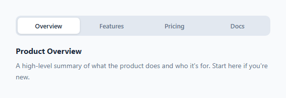
Animated tabs replace the basic underline indicator of the standard tab bar with a sliding pill background that smoothly glides between tabs when clicked. The pill communicates transition direction and gives the interface a premium, physically responsive quality — for stacked tabs, see the vertical tabs; for a two-option switch, the segmented control.
The sliding indicator
A .indicator div sits inside the .tabs container with position: absolute; transition: left 0.2s, width 0.2s. moveIndicator(btn) reads the clicked tab's offsetLeft and offsetWidth — the tab's pixel position and size relative to the container — and assigns them to indicator.style.left and indicator.style.width. The CSS transition animates the pill to the new position. This correctly handles tabs of different widths.
Why offsetLeft/offsetWidth instead of a class
The indicator's position is dynamic — it depends on the exact pixel dimensions of each tab. A CSS class can't encode runtime pixel values. Using offsetLeft and offsetWidth reads the actual rendered size, so tabs with longer labels get a wider pill automatically.
Panel switching
switchTab(btn, idx) removes .active from all tabs and panels, then adds .active to the clicked tab and the panel at index idx. The panel uses a opacity + transform transition on .panel.active for a fade-in effect. The idx parameter maps each tab button to its corresponding panel by DOM order.
Adding tabs
Add a new .tab button and a matching .panel div. The JS uses querySelectorAll and numeric index — the order in the HTML determines the mapping.
The offsetLeft/offsetWidth technique
The pill indicator reads the active tab button's actual pixel position using offsetLeft and offsetWidth — values that the browser computes after layout. Setting pill.style.left = btn.offsetLeft + 'px' and pill.style.width = btn.offsetWidth + 'px' positions and sizes the pill to exactly match the active tab. CSS transition: left 0.2s, width 0.2s animates between positions. This approach handles any tab label length, any font size, and any number of tabs automatically — no hardcoded positions needed.
Panel switching
Each tab button has a data-panel attribute matching a panel ID. Clicking a tab: (1) removes .active from all tab buttons, (2) adds .active to the clicked button, (3) hides all panels, (4) shows the matching panel. The panel switch is instant (no animation) while the pill indicator slides smoothly — this matches the expected tab behaviour where content switches immediately but the indicator communicates which tab was clicked.
Accessible implementation
Add role="tablist" to the tab container, role="tab" to each button, and role="tabpanel" to each panel. Add aria-selected="true/false" to tab buttons and aria-hidden="true/false" to panels. Add aria-controls on each tab pointing to its panel ID, and aria-labelledby on each panel pointing to its tab ID.
Build with AI
Build, Understand, Optimize, and Extend It With AI
You don't have to trace the geometry calls by hand — paste this snippet's HTML, CSS, and JS into an AI coding assistant like Claude and ask it to explain exactly why moveIndicator reads offsetLeft and offsetWidth from the clicked button rather than using hardcoded percentage widths, and what would visually break for tabs with unequal label lengths if those measurements were skipped. The same assistant is useful for optimizing it — asking whether the resize listener recalculating the indicator position on every resize event needs throttling for smoother behavior on window drag. It's just as good for extending the tabs: ask it to add full ARIA tablist semantics with keyboard arrow-key navigation between tabs, animate the panel transition with a directional slide instead of a plain fade, or make the tab list horizontally scrollable with the indicator staying correctly positioned when tabs overflow. Treat the code less like a finished artifact and more like a starting point for a conversation.
Prompt to recreate it
Copy this into your AI assistant of choice to build the effect from scratch, or as a jumping-off point for your own variant:
Build "animated tabs" with a sliding pill indicator in plain HTML, CSS, and JavaScript — no libraries, using measured DOM geometry rather than fixed-width assumptions.

Requirements:
- A row of tab buttons inside a relatively-positioned container, plus one absolutely-positioned indicator element that sits behind the tab labels (lower z-index) and shares the same rounded shape as an individual tab.
- Clicking a tab must: remove an active class from all tabs and panels, add it to the clicked tab and its corresponding panel (mapped by array index, not by guessing from text), and reposition the indicator to sit exactly behind the newly active tab.
- The indicator's position and size must be computed by reading the clicked tab button's real offsetLeft (relative to the tab container) and offsetWidth at click time and writing those directly as the indicator's left and width styles — do not hardcode indicator positions or assume equal-width tabs, since tab labels vary in length.
- Both the left and width changes must be CSS-transitioned together with a shared duration and easing so the pill smoothly slides and resizes in one motion between tabs of different widths.
- On page load, position the indicator under whichever tab starts marked active (without requiring a click), and add a window resize listener that recalculates and repositions the indicator under the currently active tab whenever the viewport changes, since tab widths may change responsively.
- Panels must switch their visibility instantly via a CSS display or active-class toggle (not animated in sync with the pill), but should play a brief fade-and-rise-in transition each time a panel becomes active, independent from the indicator's slide animation.
Step by step
How to Use
- 1Click each tabClick Design, Development, and Marketing tabs to see the pill indicator slide smoothly between them and the panel content switch.
- 2Update tab labels and panel contentIn the HTML panel, change the tab button text and each .panel div content.
- 3Add a fourth tabAdd a .tab button and a matching .panel div. The JS uses index order automatically.
- 4Change animation speedUpdate 0.2s on transition: left, width in the CSS .indicator rule.
- 5Change indicator colourUpdate background: #fff on .indicator to any colour.
- 6Export in your formatClick "HTML" for a standalone file, "JSX" for a React component, or "Tailwind" for a React + Tailwind version.
Real-world uses
Common Use Cases
Got questions?
Frequently Asked Questions
moveIndicator(btn) reads btn.offsetLeft (the tab's left pixel position relative to .tabs) and btn.offsetWidth (the tab's width). It sets indicator.style.left and indicator.style.width to these values. CSS transition: left 0.2s, width 0.2s animates between positions.
The indicator position needs to match the exact pixel location and size of each tab — values that depend on the rendered tab label length. CSS classes cannot encode runtime pixel values. offsetLeft and offsetWidth read the actual DOM geometry.
Add a <button class="tab" onclick="switchTab(this, N)">Label</button> where N is the zero-based panel index. Add a matching <div class="panel">content</div>. The querySelectorAll picks up new tabs automatically.
Call switchTab(document.querySelectorAll(".tab")[N], N) after the JS code to open the Nth tab on page load.
Yes. Click "JSX" for a React component. In React, manage activeTab in useState. Use useRef on the indicator element and read the active tab button's offsetLeft/offsetWidth in a useEffect after state changes to update the indicator position.
The Tab Bar uses a CSS border-bottom underline indicator. Animated Tabs uses a sliding pill background. The pill is more visually prominent and communicates transition direction. The panel switching logic is similar in both.