More Navigation Snippets
Front-End Coding Playgrounds
Learn to code with interactive, live-preview playgrounds — HTML, CSS, JavaScript, React & more.
 HTML Playground42 lessons · Click-based · Live preview
 CSS PlaygroundLearn CSS with a live editor
 JavaScript Playground60 lessons · DOM · Async · Canvas
 React PlaygroundLearn React with a live code editor
 GSAP PlaygroundLearn GSAP animation interactively
 SVG Playground44 lessons · shapes · paths · animation
 SCSS Playground45 lessons · Sass modules · tokens
 Tailwind PlaygroundLearn Tailwind CSS with a live editor
 Bootstrap 5 Playground50 lessons · live preview
Vertical Tabs — Side Tab Navigation Snippet
Vertical Tabs · Navigation · Plain HTML, CSS & JS · Live preview
What's included
Features
About this UI Snippet
Vertical Tabs — Icon Side Rail, Animated Panels & ARIA Keyboard Navigation
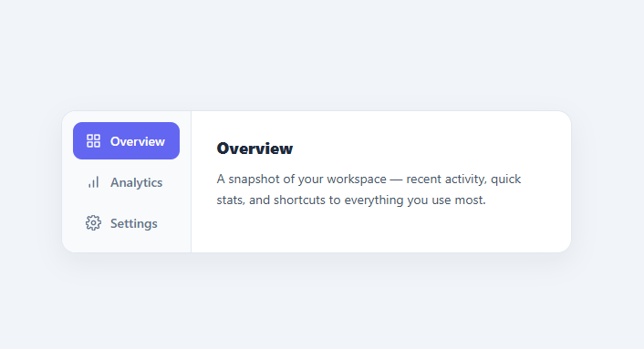
Vertical tabs are one of the most-searched navigation snippets because a side-by-side "rail of tabs on the left, content on the right" layout is the standard for settings pages, dashboards, account screens, and documentation — anywhere there are several sections and the horizontal tab bar would run out of room. This snippet is a complete, accessible vertical tab component: an icon side rail, animated content panels, full WAI-ARIA roles with arrow-key navigation, and a responsive layout that collapses to a horizontal scroll on mobile.
The two-column layout
The component is a flex row: a fixed-width .vtab-list rail on the left and a flexible .vtab-panels area on the right, wrapped in a bordered, rounded container. The rail holds the tab buttons stacked vertically; the panel area shows one panel at a time. Because the rail is flex-shrink: 0 and the panels are flex: 1, the rail keeps its width while the content fills the rest — the canonical settings-screen layout. Each tab has an icon plus a label, which is why vertical tabs scale better than horizontal ones: you can fit many labeled sections down the side without horizontal overflow.
Switching tabs and panels
A select(i) function is the single source of truth. It loops the tabs, marking the chosen one .active and setting aria-selected, and loops the panels, showing the matching one and hiding the rest with the hidden attribute. Using hidden (not just CSS) means inactive panels are removed from the accessibility tree and the tab order entirely, which is correct — a hidden tab panel should not be reachable. Each panel fades and slides in with a short @keyframes fade animation when it becomes active, so switching sections feels smooth rather than an instant swap.
Full WAI-ARIA tabs semantics
This is built to the ARIA Authoring Practices tabs pattern, which most "vertical tabs" tutorials skip. The rail is role="tablist" with aria-orientation="vertical" (telling assistive tech the tabs are arranged vertically, so it expects up/down keys). Each button is role="tab" with aria-selected and an aria-controls pointing at its panel; each panel is role="tabpanel" with aria-labelledby pointing back at its tab. This bidirectional wiring lets screen readers announce "tab, 1 of 3, selected" and associate each panel with its tab. It is the difference between a div soup that looks like tabs and a component that actually behaves like tabs for assistive tech.
Roving tabindex and arrow-key navigation
Proper tabs use a "roving tabindex": only the active tab is in the page tab order (tabIndex = 0), while the others are tabIndex = -1. So pressing Tab moves *into and out of* the tablist as a single stop, and you move *between* tabs with the arrow keys — exactly how native tab widgets work and what keyboard users expect. The keydown handler intercepts ArrowDown/ArrowUp (the correct keys for vertical orientation), wraps around at the ends, selects the new tab, and moves focus to it. This roving-tabindex-plus-arrow-keys behavior is the hallmark of a correctly implemented tab component and is implemented here in a few lines.
Responsive: vertical on desktop, horizontal on mobile
Vertical tabs do not fit a narrow phone screen, so a @media (max-width: 480px) query flips the layout: the container becomes a column, and the rail becomes a horizontal, scrollable strip along the top (flex-direction: row; overflow-x: auto) with a bottom border instead of a right one. The panels then sit below. This gives you the best of both — a spacious side rail on desktop and a familiar horizontal tab bar on mobile — without duplicating any markup.
Customizing the tabs
Re-theme by changing the active tab color, the hover background, and the rail background. Add or remove tabs by adding a <button role="tab"> and a matching <div role="tabpanel"> with paired id/aria-controls/aria-labelledby values; the script picks up any number of tabs automatically. Swap the icons for your own. Widen the rail for longer labels, or hide the labels and show only icons on smaller screens. To remember the selected tab across reloads, save the active index to localStorage in select() and restore it on load. Because the component is index-driven, all of these are small changes.
Accessibility checklist
Keep the role="tablist"/role="tab"/role="tabpanel" triad and the aria-controls/aria-labelledby links intact — they are what make it a real tab widget. Preserve the roving tabindex so keyboard users Tab into the group once and arrow between tabs. Maintain strong contrast for the active tab so its selected state is clear, and ensure the icons are decorative (the text label provides the name). Because inactive panels use the hidden attribute, they are correctly excluded from screen readers and keyboard focus. With these in place, the component is usable by mouse, keyboard, and assistive tech alike.
Build with AI
Build, Understand, Optimize, and Extend It With AI
Instead of tracing the ARIA wiring by hand, paste this snippet's HTML, CSS, and JS into an AI coding assistant like Claude and ask it to explain exactly why each tab needs a roving tabindex (tabIndex 0 on the active tab, -1 on the rest) instead of leaving every tab in the default tab order, and why the panels are hidden with the hidden attribute rather than plain CSS display or opacity. It's also worth asking about the initVerticalTabs guard clause — have it explain why the script checks document.readyState before running, and what would happen in a framework export if that check were skipped. For extending it, have it add localStorage persistence of the active tab index across reloads, support for badge counts next to each tab label, or a variant where tabs can be reordered by drag-and-drop. Treat the code less like a finished artifact and more like a starting point for a conversation.
Prompt to recreate it
Copy this into your AI assistant of choice to build the effect from scratch, or as a jumping-off point for your own variant:
Build fully accessible vertical tabs in plain HTML, CSS, and vanilla JavaScript with no libraries, implementing the complete WAI-ARIA tabs pattern rather than just a visual side-rail layout.

Requirements:
- A tablist container with aria-orientation="vertical" containing several tab buttons, each with role="tab", an aria-selected attribute, and an aria-controls attribute pointing at its matching panel's id; a separate area holding one panel per tab, each with role="tabpanel" and aria-labelledby pointing back at its tab's id.
- Only one tab panel visible at a time. Inactive panels must use the hidden attribute (not just a CSS class) so they are removed from the accessibility tree and the keyboard tab order entirely.
- Implement roving tabindex: the currently active tab must have tabIndex 0 and every other tab must have tabIndex -1, so pressing Tab moves into and out of the whole tablist as a single stop rather than stopping on every individual tab.
- Handle ArrowDown and ArrowUp keydown events on the tabs to move selection to the next or previous tab respectively, wrapping around at the first and last tab, and move keyboard focus to the newly selected tab when this happens.
- The panel that becomes active must play a brief fade-and-slide-in CSS animation so switching feels smooth rather than an instant swap.
- On viewports narrower than roughly 480px, the layout must flip from a vertical side rail to a horizontal, horizontally-scrollable strip of tabs with the panel content below it.
- The initialization script must safely handle running before the DOM has fully parsed (guard on document.readyState) since it may be invoked in a framework export context where the markup mounts asynchronously.
Step by step
How to Use
- 1Copy the structureCopy the .vtabs container with its .vtab-list of role="tab" buttons and the .vtab-panels of role="tabpanel" divs. Keep the id / aria-controls / aria-labelledby links paired.
- 2Edit tabs and contentChange the tab labels and icons, and the heading and text inside each panel. The script handles any number of tab/panel pairs.
- 3Keep the ARIA wiringEach tab's aria-controls must match its panel id, and each panel's aria-labelledby must match its tab id. This makes it a real accessible tab widget.
- 4Re-theme itUpdate the active tab color, hover background, and rail background to match your design.
- 5Remember the active tab (optional)Save the selected index to localStorage in select() and restore it on load so the last tab reopens.
- 6Export in your formatClick "HTML" for a standalone file, "JSX" for a React component, or "Tailwind" for a React + Tailwind version.
Real-world uses
Common Use Cases
Got questions?
Frequently Asked Questions
Functionally they are the same WAI-ARIA tabs pattern; only the layout and key bindings change. Vertical tabs stack down a side rail (using aria-orientation="vertical" and Up/Down arrow keys) and suit settings pages with many labeled sections that would overflow a horizontal bar.
Tabs use a roving tabindex: only the active tab has tabIndex 0, the rest -1, so Tab moves into and out of the whole tablist as one stop. You move between tabs with the arrow keys (Up/Down for vertical), which select the tab and move focus to it, wrapping at the ends.
The hidden attribute removes inactive panels from the accessibility tree and the tab order, which is correct — a hidden tab panel should not be reachable by keyboard or announced by screen readers. CSS display:none also hides them, but using the attribute keeps the intent explicit and the ARIA state consistent.
Add a <button role="tab"> to the rail and a matching <div role="tabpanel"> to the panels, with paired id, aria-controls, and aria-labelledby values. The index-driven script automatically includes any number of tab/panel pairs.
A media query at 480px flips the container to a column and turns the side rail into a horizontal, scrollable strip along the top with a bottom border. The panels sit below, giving a familiar horizontal tab bar on small screens with no extra markup.
Yes. Click "JSX" for a React component or "Tailwind" for a React + Tailwind version. In React, hold the active index in useState, render tabs and panels from an array with the ARIA attributes, and replicate the arrow-key handler; the structure maps directly.