Settings Panel — Free HTML CSS JS Snippet

Settings Panel · Layouts · Plain HTML, CSS & JS · Live preview

Share & Support

What's included

Features

Two-panel flex layout: fixed sidebar + flex-1 scrollable content area
showTab() tab switching: display:none/block toggle via .active class
CSS toggle switch: input:checked + .track pseudo-element sliding animation
Profile form: 2-column CSS Grid with full-width Bio and avatar row
Theme picker: 3-button group with .active border highlight
Accent color picker: circle buttons with active border + white outline ring
Font size slider: native range input with accent-color CSS tint
Danger zone: red border section with delete account CTA

About this UI Snippet

Settings Panel — Sidebar Nav, Profile Form, Notification Toggles & Appearance Controls
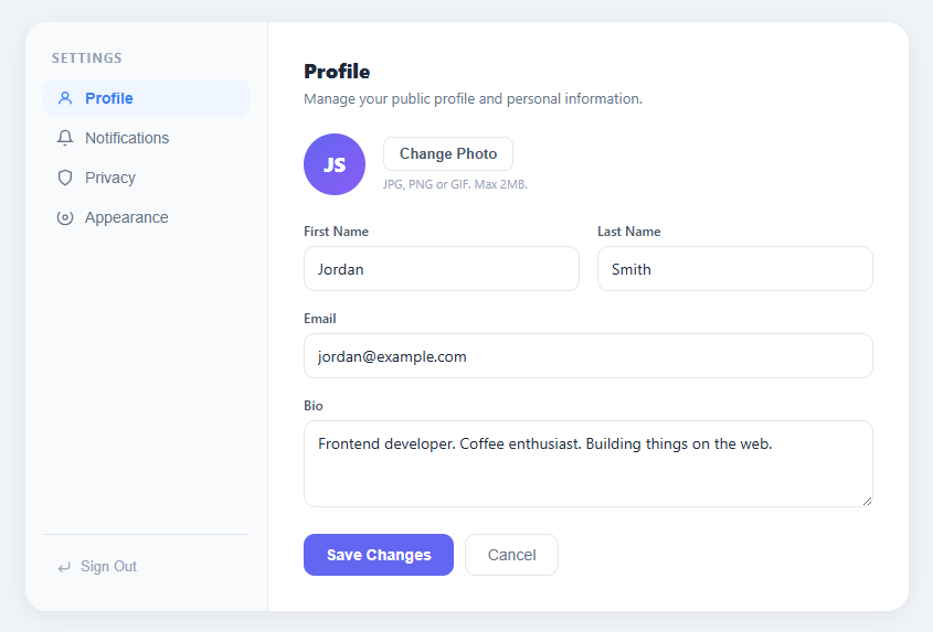
Screenshot of the Settings Panel snippet rendered live

A settings panel is a fundamental page in any web application — it centralises user preferences, account management, privacy controls, and appearance customisation. This snippet delivers a complete settings page layout with a left sidebar navigation, four content tabs (Profile, Notifications, Privacy, Appearance), a profile form with avatar, notification toggles, a privacy section with a danger zone, and an appearance tab with theme, accent color, and font size controls.

The two-panel layout

The .panel container uses display: flex with a fixed-width .sidebar (220px) and a flex: 1 .content area. The sidebar has position: relative with border-right separator. The content area uses overflow-y: auto so tall tab content scrolls without the sidebar scrolling. On mobile, this can be adapted to a stacked layout by setting flex-direction: column and giving the sidebar a horizontal scrollable nav row.

Tab switching without a framework

showTab(btn, id) removes .active from all .nav-item and .tab elements, then adds .active to the clicked button and the corresponding tab panel (by ID: tab-profile, tab-notifications, etc.). All tabs are in the DOM simultaneously — only the .active one has display: block via CSS. This keeps tab content persistent between switches, preserving any unsaved form input.

The CSS toggle switch

The notification and privacy toggles use the same CSS-only toggle switch pattern: a hidden checkbox input overlaid by a .track span. When the checkbox is checked, input:checked + .track changes background to indigo, and the ::after pseudo-element (the white circle) translates 20px to the right. The transition on both the background and transform creates the sliding animation.

The appearance controls

The theme selector uses three buttons with .active toggling (setTheme). The accent color picker uses circular buttons; the active one gets a border and an outline ring (outline: 2px solid white, outline-offset: 1px). The font size slider uses a native range input with accent-color: #6366f1 for cross-browser tinted track/thumb styling.

Applying appearance changes to the whole page

To make the accent color and font size controls apply globally, define CSS custom properties on :root: --accent: #6366f1 and --font-size: 14px. In the color picker's onclick handler, call document.documentElement.style.setProperty("--accent", chosenColor). In the font size slider oninput, call document.documentElement.style.setProperty("--font-size", value + "px"). All component CSS that references var(--accent) updates immediately across the page without a reload. Persist the chosen values to localStorage so they survive navigation: localStorage.setItem("accent", color) and localStorage.setItem("fontSize", value). On DOMContentLoaded, read these stored values and apply them before the page renders to avoid a flash of default styles.

Step by step

How to Use

  1. 1
    Click the sidebar nav items to switch tabsClick Profile, Notifications, Privacy, or Appearance in the sidebar to switch the content panel. The active item is highlighted in blue.
  2. 2
    Edit the profile formUpdate name, email, and bio fields. Click Save Changes to trigger a save action. The form uses a 2-column CSS Grid with a full-width row for the bio textarea.
  3. 3
    Toggle notifications and privacy settingsClick any toggle switch in the Notifications or Privacy tabs to toggle the setting on or off. Add API calls in the toggleSwitch() function to persist changes to the server.
  4. 4
    Change theme, accent color, and font sizeIn the Appearance tab, click System/Light/Dark theme buttons, choose an accent color circle, or drag the font size slider. Wire these to a CSS custom property (--accent-color) to apply changes site-wide.
  5. 5
    Wire Save Changes to an APIIn the tab-actions Save button click handler, collect form values with FormData or individual input reads, then POST to /api/user/profile. Show a success toast on resolve.
  6. 6
    Export for your frameworkClick "JSX" for a React component with useState for the active tab and toggle states. Click "Vue" for a Vue 3 SFC with ref-based tab switching.

Real-world uses

Common Use Cases

SaaS application user account settings page
The most common use case. Wire each tab to a separate API endpoint: PATCH /api/profile for profile, PUT /api/notifications for notification prefs, DELETE /api/account for the danger zone. Show a toast notification after each successful save.
Dashboard admin panel user management settings
Repurpose the sidebar for admin sections: General, Team Members, Billing, Integrations, API Keys. Each tab becomes an admin control panel. The same two-panel layout scales to 10+ sidebar items with a scrollable nav.
Mobile app settings page on a responsive web view
On small screens, collapse the sidebar into a horizontal tab bar at the top (flex-direction: column on .panel, then row direction on sidebar). The content panel scrolls vertically below the tabs.
Persist settings to localStorage or a REST API
Read all toggle states and form values in a saveSettings() function. Store in localStorage for client-only persistence: localStorage.setItem("settings", JSON.stringify(settings)). For multi-device sync, POST to an API endpoint on every change.
Study the CSS toggle switch implementation
The notification toggle uses no JavaScript for its visual state — just input:checked + .track CSS selector and a ::after pseudo-element transform. This is the standard accessible toggle pattern: the hidden checkbox carries the semantic state, the visible track is purely presentational.
Developer tool or IDE settings/preferences panel
Adapt for a code editor settings page: Appearance tab for theme/font/indentation, Keybindings tab, Extensions tab. The sidebar nav cleanly organises 8–12 settings sections without visual clutter.

Got questions?

Frequently Asked Questions

showTab(btn, id) removes .active from all .nav-item and .tab elements (querySelectorAll + forEach), then adds .active to the clicked nav button and the tab div with id="tab-" + id. In CSS, .tab { display: none } and .tab.active { display: block }. All tab content stays in the DOM, so unsaved form values are preserved when switching between tabs.

The toggle is a label containing a hidden checkbox and a .track span. The checkbox handles the checked state natively. The CSS rule input:checked + .track changes background to indigo. The .track::after pseudo-element is the white circle, positioned left: 3px by default. input:checked + .track::after uses transform: translateX(20px) to slide it right. The transition on both properties creates the animation.

Define CSS custom properties on :root: --accent: #6366f1; --font-size: 14px. In setColor(), read the button's background color and set document.documentElement.style.setProperty("--accent", color). In the font size slider oninput, set document.documentElement.style.setProperty("--font-size", value + "px"). Reference these in all component CSS.

In React, manage the active tab with const [tab, setTab] = useState("profile"). Render each tab section conditionally: {tab === "profile" && <ProfileTab />}. For toggle switches, use const [prefs, setPrefs] = useState({ analytics: true, marketing: false }) and pass values/setters as props. In Vue 3, use ref("profile") for the active tab and a reactive() object for toggle states. The sidebar nav items call setTab / tab.value on click. For URL-based tab persistence (so the back button works and links to specific tabs are shareable), sync the active tab with the URL hash: on mount, read window.location.hash to set the initial tab; in setTab(), update window.location.hash = tab so the URL reflects the current section. Listen to the hashchange event to handle browser back/forward navigation between tabs without a full route change.

Settings Panel — Export as HTML, React, Vue, Angular & Tailwind

HTML
<!DOCTYPE html>
<html lang="en">
<head>
  <meta charset="UTF-8" />
  <meta name="viewport" content="width=device-width, initial-scale=1.0" />
  <title>Settings Panel</title>
  <style>
    * { box-sizing: border-box; margin: 0; padding: 0; }
    body { font-family: system-ui, sans-serif; background: #f1f5f9; min-height: 100vh; display: flex; align-items: flex-start; justify-content: center; padding: 32px 20px; }
    .wrap { width: 100%; max-width: 800px; }
    .panel { display: flex; background: #fff; border-radius: 20px; box-shadow: 0 4px 24px rgba(0,0,0,0.08); overflow: hidden; min-height: 520px; }
    .sidebar { width: 220px; flex-shrink: 0; background: #f8fafc; border-right: 1px solid #e2e8f0; padding: 24px 16px; display: flex; flex-direction: column; }
    .sidebar-title { font-size: 12px; font-weight: 700; color: #94a3b8; text-transform: uppercase; letter-spacing: 1px; margin-bottom: 12px; padding: 0 8px; }
    .sidebar-nav { display: flex; flex-direction: column; gap: 2px; flex: 1; }
    .nav-item { display: flex; align-items: center; gap: 10px; padding: 9px 12px; border: none; background: none; color: #64748b; font-size: 14px; font-weight: 500; border-radius: 10px; cursor: pointer; text-align: left; transition: all 0.15s; width: 100%; }
    .nav-item:hover { background: #f1f5f9; color: #334155; }
    .nav-item.active { background: #eff6ff; color: #3b82f6; font-weight: 600; }
    .sidebar-footer { padding-top: 12px; border-top: 1px solid #e2e8f0; }
    .danger-btn { display: flex; align-items: center; gap: 8px; width: 100%; padding: 9px 12px; border: none; background: none; color: #94a3b8; font-size: 13px; cursor: pointer; border-radius: 8px; transition: all 0.15s; }
    .danger-btn:hover { background: #fee2e2; color: #ef4444; }
    .content { flex: 1; padding: 32px; overflow-y: auto; }
    .tab { display: none; }
    .tab.active { display: block; }
    .tab-header { margin-bottom: 24px; }
    .tab-header h2 { font-size: 18px; font-weight: 800; color: #1e293b; margin-bottom: 4px; }
    .tab-header p { font-size: 13px; color: #64748b; }
    .avatar-row { display: flex; align-items: center; gap: 16px; margin-bottom: 24px; }
    .avatar { width: 56px; height: 56px; border-radius: 50%; background: linear-gradient(135deg,#6366f1,#8b5cf6); color: #fff; font-size: 18px; font-weight: 800; display: flex; align-items: center; justify-content: center; flex-shrink: 0; }
    .btn-sec { background: #fff; border: 1px solid #e2e8f0; color: #475569; padding: 7px 14px; border-radius: 8px; font-size: 13px; font-weight: 600; cursor: pointer; transition: all 0.15s; }
    .btn-sec:hover { border-color: #cbd5e1; background: #f8fafc; }
    .hint { font-size: 11px; color: #94a3b8; margin-top: 4px; }
    .form-grid { display: grid; grid-template-columns: 1fr 1fr; gap: 16px; margin-bottom: 24px; }
    .field { display: flex; flex-direction: column; gap: 6px; }
    .field.full { grid-column: 1 / -1; }
    .field-label { font-size: 12px; font-weight: 600; color: #475569; }
    .field-input { padding: 10px 12px; border: 1px solid #e2e8f0; border-radius: 10px; font-size: 14px; color: #1e293b; outline: none; transition: border-color 0.15s; resize: vertical; font-family: inherit; }
    .field-input:focus { border-color: #6366f1; }
    .tab-actions { display: flex; gap: 10px; }
    .btn-save { background: #6366f1; color: #fff; border: none; padding: 10px 20px; border-radius: 10px; font-size: 14px; font-weight: 700; cursor: pointer; transition: background 0.15s; }
    .btn-save:hover { background: #4f46e5; }
    .btn-cancel { background: none; border: 1px solid #e2e8f0; color: #64748b; padding: 10px 20px; border-radius: 10px; font-size: 14px; cursor: pointer; transition: all 0.15s; }
    .btn-cancel:hover { background: #f8fafc; }
    .toggle-list { display: flex; flex-direction: column; gap: 0; }
    .toggle-row { display: flex; justify-content: space-between; align-items: center; padding: 16px 0; border-bottom: 1px solid #f8fafc; }
    .toggle-title { font-size: 14px; font-weight: 600; color: #1e293b; margin-bottom: 2px; }
    .toggle-desc { font-size: 12px; color: #94a3b8; }
    .toggle { position: relative; width: 44px; height: 24px; flex-shrink: 0; }
    .toggle input { opacity: 0; width: 0; height: 0; }
    .track { position: absolute; inset: 0; background: #e2e8f0; border-radius: 12px; cursor: pointer; transition: background 0.2s; }
    .track::after { content: ''; position: absolute; width: 18px; height: 18px; border-radius: 50%; background: #fff; top: 3px; left: 3px; transition: transform 0.2s; box-shadow: 0 1px 3px rgba(0,0,0,0.2); }
    .toggle input:checked + .track { background: #6366f1; }
    .toggle input:checked + .track::after { transform: translateX(20px); }
    .danger-zone { margin-top: 32px; border: 1px solid #fee2e2; border-radius: 12px; padding: 20px; }
    .dz-title { font-size: 12px; font-weight: 700; color: #ef4444; text-transform: uppercase; letter-spacing: 0.5px; margin-bottom: 12px; }
    .dz-row { display: flex; justify-content: space-between; align-items: center; gap: 16px; }
    .dz-label { font-size: 14px; font-weight: 600; color: #1e293b; margin-bottom: 2px; }
    .dz-desc { font-size: 12px; color: #94a3b8; }
    .btn-danger { background: #ef4444; color: #fff; border: none; padding: 8px 16px; border-radius: 8px; font-size: 13px; font-weight: 700; cursor: pointer; flex-shrink: 0; transition: background 0.15s; }
    .btn-danger:hover { background: #dc2626; }
    .theme-btns { display: flex; gap: 8px; }
    .theme-btn { display: flex; align-items: center; gap: 8px; padding: 10px 16px; border: 2px solid #e2e8f0; background: #fff; color: #475569; border-radius: 10px; font-size: 13px; font-weight: 600; cursor: pointer; transition: all 0.15s; }
    .theme-btn:hover { border-color: #cbd5e1; }
    .theme-btn.active { border-color: #6366f1; color: #6366f1; background: rgba(99,102,241,0.05); }
    .color-btns { display: flex; gap: 8px; }
    .color-btn { width: 32px; height: 32px; border-radius: 50%; border: 3px solid transparent; cursor: pointer; transition: transform 0.15s; }
    .color-btn:hover { transform: scale(1.1); }
    .color-btn.active { border-color: #1e293b; outline: 2px solid #fff; outline-offset: 1px; }
    .size-row { display: flex; align-items: center; gap: 10px; margin-top: 4px; }
    .size-label { font-size: 13px; color: #94a3b8; }
    .size-label.lg { font-size: 20px; }
    .size-slider { flex: 1; accent-color: #6366f1; }
    .size-val { font-size: 12px; color: #6366f1; font-weight: 700; min-width: 32px; }
  </style>
</head>
<body>
  <div class="wrap">
    <div class="panel">
      <div class="sidebar">
        <div class="sidebar-title">Settings</div>
        <nav class="sidebar-nav">
          <button class="nav-item active" onclick="showTab(this,'profile')">
            <svg width="16" height="16" viewBox="0 0 24 24" fill="none" stroke="currentColor" stroke-width="2"><circle cx="12" cy="8" r="4"/><path d="M4 20c0-4 3.6-7 8-7s8 3 8 7"/></svg>
            Profile
          </button>
          <button class="nav-item" onclick="showTab(this,'notifications')">
            <svg width="16" height="16" viewBox="0 0 24 24" fill="none" stroke="currentColor" stroke-width="2"><path d="M18 8A6 6 0 0 0 6 8c0 7-3 9-3 9h18s-3-2-3-9"/><path d="M13.73 21a2 2 0 0 1-3.46 0"/></svg>
            Notifications
          </button>
          <button class="nav-item" onclick="showTab(this,'privacy')">
            <svg width="16" height="16" viewBox="0 0 24 24" fill="none" stroke="currentColor" stroke-width="2"><path d="M12 22s8-4 8-10V5l-8-3-8 3v7c0 6 8 10 8 10z"/></svg>
            Privacy
          </button>
          <button class="nav-item" onclick="showTab(this,'appearance')">
            <svg width="16" height="16" viewBox="0 0 24 24" fill="none" stroke="currentColor" stroke-width="2"><circle cx="12" cy="12" r="3"/><path d="M19.07 4.93a10 10 0 1 1-14.14 0"/></svg>
            Appearance
          </button>
        </nav>
        <div class="sidebar-footer">
          <button class="danger-btn">
            <svg width="14" height="14" viewBox="0 0 24 24" fill="none" stroke="currentColor" stroke-width="2"><polyline points="9 10 4 15 9 20"/><path d="M20 4v7a4 4 0 0 1-4 4H4"/></svg>
            Sign Out
          </button>
        </div>
      </div>
      <div class="content">
        <div class="tab active" id="tab-profile">
          <div class="tab-header"><h2>Profile</h2><p>Manage your public profile and personal information.</p></div>
          <div class="avatar-row">
            <div class="avatar">JS</div>
            <div>
              <button class="btn-sec">Change Photo</button>
              <div class="hint">JPG, PNG or GIF. Max 2MB.</div>
            </div>
          </div>
          <div class="form-grid">
            <div class="field">
              <label class="field-label">First Name</label>
              <input class="field-input" type="text" value="Jordan">
            </div>
            <div class="field">
              <label class="field-label">Last Name</label>
              <input class="field-input" type="text" value="Smith">
            </div>
            <div class="field full">
              <label class="field-label">Email</label>
              <input class="field-input" type="email" value="[email protected]">
            </div>
            <div class="field full">
              <label class="field-label">Bio</label>
              <textarea class="field-input" rows="3" placeholder="Tell us about yourself...">Frontend developer. Coffee enthusiast. Building things on the web.</textarea>
            </div>
          </div>
          <div class="tab-actions">
            <button class="btn-save">Save Changes</button>
            <button class="btn-cancel">Cancel</button>
          </div>
        </div>
        <div class="tab" id="tab-notifications">
          <div class="tab-header"><h2>Notifications</h2><p>Choose what you want to be notified about.</p></div>
          <div class="toggle-list">
            <div class="toggle-row">
              <div class="toggle-info"><div class="toggle-title">Email Notifications</div><div class="toggle-desc">Receive important updates by email</div></div>
              <label class="toggle"><input type="checkbox" checked onchange="toggleSwitch(this)"><span class="track"></span></label>
            </div>
            <div class="toggle-row">
              <div class="toggle-info"><div class="toggle-title">Push Notifications</div><div class="toggle-desc">Browser push alerts for real-time activity</div></div>
              <label class="toggle"><input type="checkbox" checked onchange="toggleSwitch(this)"><span class="track"></span></label>
            </div>
            <div class="toggle-row">
              <div class="toggle-info"><div class="toggle-title">Weekly Digest</div><div class="toggle-desc">A summary of your activity every Monday</div></div>
              <label class="toggle"><input type="checkbox" onchange="toggleSwitch(this)"><span class="track"></span></label>
            </div>
            <div class="toggle-row">
              <div class="toggle-info"><div class="toggle-title">Marketing Emails</div><div class="toggle-desc">Product updates, tips, and announcements</div></div>
              <label class="toggle"><input type="checkbox" onchange="toggleSwitch(this)"><span class="track"></span></label>
            </div>
            <div class="toggle-row">
              <div class="toggle-info"><div class="toggle-title">Security Alerts</div><div class="toggle-desc">Logins from new devices or locations</div></div>
              <label class="toggle"><input type="checkbox" checked onchange="toggleSwitch(this)"><span class="track"></span></label>
            </div>
          </div>
        </div>
        <div class="tab" id="tab-privacy">
          <div class="tab-header"><h2>Privacy</h2><p>Control your data and visibility settings.</p></div>
          <div class="toggle-list">
            <div class="toggle-row">
              <div class="toggle-info"><div class="toggle-title">Public Profile</div><div class="toggle-desc">Let others find and view your profile</div></div>
              <label class="toggle"><input type="checkbox" checked onchange="toggleSwitch(this)"><span class="track"></span></label>
            </div>
            <div class="toggle-row">
              <div class="toggle-info"><div class="toggle-title">Show Activity Status</div><div class="toggle-desc">Let others see when you were last active</div></div>
              <label class="toggle"><input type="checkbox" onchange="toggleSwitch(this)"><span class="track"></span></label>
            </div>
            <div class="toggle-row">
              <div class="toggle-info"><div class="toggle-title">Analytics Tracking</div><div class="toggle-desc">Help improve the product with usage data</div></div>
              <label class="toggle"><input type="checkbox" checked onchange="toggleSwitch(this)"><span class="track"></span></label>
            </div>
          </div>
          <div class="danger-zone">
            <div class="dz-title">Danger Zone</div>
            <div class="dz-row"><div><div class="dz-label">Delete Account</div><div class="dz-desc">Permanently remove your account and all data.</div></div><button class="btn-danger">Delete</button></div>
          </div>
        </div>
        <div class="tab" id="tab-appearance">
          <div class="tab-header"><h2>Appearance</h2><p>Customise how the app looks and feels.</p></div>
          <div class="field">
            <label class="field-label">Theme</label>
            <div class="theme-btns">
              <button class="theme-btn active" onclick="setTheme(this,'system')">
                <svg width="18" height="18" viewBox="0 0 24 24" fill="none" stroke="currentColor" stroke-width="2"><rect x="2" y="3" width="20" height="14" rx="2"/><line x1="8" y1="21" x2="16" y2="21"/><line x1="12" y1="17" x2="12" y2="21"/></svg>
                System
              </button>
              <button class="theme-btn" onclick="setTheme(this,'light')">
                <svg width="18" height="18" viewBox="0 0 24 24" fill="none" stroke="currentColor" stroke-width="2"><circle cx="12" cy="12" r="5"/><line x1="12" y1="1" x2="12" y2="3"/><line x1="12" y1="21" x2="12" y2="23"/><line x1="4.22" y1="4.22" x2="5.64" y2="5.64"/><line x1="18.36" y1="18.36" x2="19.78" y2="19.78"/><line x1="1" y1="12" x2="3" y2="12"/><line x1="21" y1="12" x2="23" y2="12"/><line x1="4.22" y1="19.78" x2="5.64" y2="18.36"/><line x1="18.36" y1="5.64" x2="19.78" y2="4.22"/></svg>
                Light
              </button>
              <button class="theme-btn" onclick="setTheme(this,'dark')">
                <svg width="18" height="18" viewBox="0 0 24 24" fill="none" stroke="currentColor" stroke-width="2"><path d="M21 12.79A9 9 0 1 1 11.21 3 7 7 0 0 0 21 12.79z"/></svg>
                Dark
              </button>
            </div>
          </div>
          <div class="field">
            <label class="field-label">Accent Color</label>
            <div class="color-btns">
              <button class="color-btn active" style="background:#6366f1" onclick="setColor(this)" title="Indigo"></button>
              <button class="color-btn" style="background:#0ea5e9" onclick="setColor(this)" title="Sky"></button>
              <button class="color-btn" style="background:#10b981" onclick="setColor(this)" title="Emerald"></button>
              <button class="color-btn" style="background:#f59e0b" onclick="setColor(this)" title="Amber"></button>
              <button class="color-btn" style="background:#ef4444" onclick="setColor(this)" title="Red"></button>
              <button class="color-btn" style="background:#ec4899" onclick="setColor(this)" title="Pink"></button>
            </div>
          </div>
          <div class="field">
            <label class="field-label">Font Size</label>
            <div class="size-row">
              <span class="size-label">A</span>
              <input type="range" min="12" max="20" value="14" class="size-slider" id="fontSize" oninput="document.getElementById('fontVal').textContent=this.value+'px'">
              <span class="size-label lg">A</span>
              <span class="size-val" id="fontVal">14px</span>
            </div>
          </div>
        </div>
      </div>
    </div>
  </div>
  <script>
    function showTab(btn, id) {
      document.querySelectorAll('.nav-item').forEach(function(b) { b.classList.remove('active'); });
      document.querySelectorAll('.tab').forEach(function(t) { t.classList.remove('active'); });
      btn.classList.add('active');
      document.getElementById('tab-' + id).classList.add('active');
    }
    
    function toggleSwitch(input) {
      // Add any additional logic when toggle changes
    }
    
    function setTheme(btn, theme) {
      document.querySelectorAll('.theme-btn').forEach(function(b) { b.classList.remove('active'); });
      btn.classList.add('active');
    }
    
    function setColor(btn) {
      document.querySelectorAll('.color-btn').forEach(function(b) { b.classList.remove('active'); });
      btn.classList.add('active');
    }
  </script>
</body>
</html>
Tailwind
<!DOCTYPE html>
<html lang="en">
<head>
  <meta charset="UTF-8" />
  <meta name="viewport" content="width=device-width, initial-scale=1.0" />
  <title>Settings Panel</title>
  <!-- Tailwind CSS v3+ — arbitrary value classes (e.g. bg-[#0f172a]) are valid -->
  <script src="https://cdn.tailwindcss.com"></script>
  <style>
    * {
      box-sizing: border-box; margin: 0; padding: 0;
    }

    body {
      font-family: system-ui, sans-serif; background: #f1f5f9; min-height: 100vh; display: flex; align-items: flex-start; justify-content: center; padding: 32px 20px;
    }

    .nav-item.active {
      background: #eff6ff; color: #3b82f6; font-weight: 600;
    }

    .tab.active {
      display: block;
    }

    .tab-header h2 {
      font-size: 18px; font-weight: 800; color: #1e293b; margin-bottom: 4px;
    }

    .tab-header p {
      font-size: 13px; color: #64748b;
    }

    .field.full {
      grid-column: 1 / -1;
    }

    .toggle input {
      opacity: 0; width: 0; height: 0;
    }

    .track::after {
      content: ''; position: absolute; width: 18px; height: 18px; border-radius: 50%; background: #fff; top: 3px; left: 3px; transition: transform 0.2s; box-shadow: 0 1px 3px rgba(0,0,0,0.2);
    }

    .toggle input:checked + .track {
      background: #6366f1;
    }

    .toggle input:checked + .track::after {
      transform: translateX(20px);
    }

    .theme-btn.active {
      border-color: #6366f1; color: #6366f1; background: rgba(99,102,241,0.05);
    }

    .color-btn.active {
      border-color: #1e293b; outline: 2px solid #fff; outline-offset: 1px;
    }

    .size-label.lg {
      font-size: 20px;
    }
  </style>
</head>
<body>
  <div class="w-full max-w-[800px]">
    <div class="flex bg-[#fff] rounded-[20px] shadow-[0_4px_24px_rgba(0,0,0,0.08)] overflow-hidden min-h-[520px]">
      <div class="w-[220px] shrink-0 bg-[#f8fafc] border-r border-r-[#e2e8f0] py-6 px-4 flex flex-col">
        <div class="text-xs font-bold text-[#94a3b8] uppercase tracking-[1px] mb-3 py-0 px-2">Settings</div>
        <nav class="flex flex-col gap-0.5 flex-1">
          <button class="nav-item flex items-center gap-2.5 py-[9px] px-3 border-0 bg-transparent text-[#64748b] text-sm font-medium rounded-[10px] cursor-pointer text-left [transition:all_0.15s] w-full hover:bg-[#f1f5f9] hover:text-[#334155] active" onclick="showTab(this,'profile')">
            <svg width="16" height="16" viewBox="0 0 24 24" fill="none" stroke="currentColor" stroke-width="2"><circle cx="12" cy="8" r="4"/><path d="M4 20c0-4 3.6-7 8-7s8 3 8 7"/></svg>
            Profile
          </button>
          <button class="nav-item flex items-center gap-2.5 py-[9px] px-3 border-0 bg-transparent text-[#64748b] text-sm font-medium rounded-[10px] cursor-pointer text-left [transition:all_0.15s] w-full hover:bg-[#f1f5f9] hover:text-[#334155]" onclick="showTab(this,'notifications')">
            <svg width="16" height="16" viewBox="0 0 24 24" fill="none" stroke="currentColor" stroke-width="2"><path d="M18 8A6 6 0 0 0 6 8c0 7-3 9-3 9h18s-3-2-3-9"/><path d="M13.73 21a2 2 0 0 1-3.46 0"/></svg>
            Notifications
          </button>
          <button class="nav-item flex items-center gap-2.5 py-[9px] px-3 border-0 bg-transparent text-[#64748b] text-sm font-medium rounded-[10px] cursor-pointer text-left [transition:all_0.15s] w-full hover:bg-[#f1f5f9] hover:text-[#334155]" onclick="showTab(this,'privacy')">
            <svg width="16" height="16" viewBox="0 0 24 24" fill="none" stroke="currentColor" stroke-width="2"><path d="M12 22s8-4 8-10V5l-8-3-8 3v7c0 6 8 10 8 10z"/></svg>
            Privacy
          </button>
          <button class="nav-item flex items-center gap-2.5 py-[9px] px-3 border-0 bg-transparent text-[#64748b] text-sm font-medium rounded-[10px] cursor-pointer text-left [transition:all_0.15s] w-full hover:bg-[#f1f5f9] hover:text-[#334155]" onclick="showTab(this,'appearance')">
            <svg width="16" height="16" viewBox="0 0 24 24" fill="none" stroke="currentColor" stroke-width="2"><circle cx="12" cy="12" r="3"/><path d="M19.07 4.93a10 10 0 1 1-14.14 0"/></svg>
            Appearance
          </button>
        </nav>
        <div class="pt-3 border-t border-t-[#e2e8f0]">
          <button class="flex items-center gap-2 w-full py-[9px] px-3 border-0 bg-transparent text-[#94a3b8] text-[13px] cursor-pointer rounded-lg [transition:all_0.15s] hover:bg-[#fee2e2] hover:text-[#ef4444]">
            <svg width="14" height="14" viewBox="0 0 24 24" fill="none" stroke="currentColor" stroke-width="2"><polyline points="9 10 4 15 9 20"/><path d="M20 4v7a4 4 0 0 1-4 4H4"/></svg>
            Sign Out
          </button>
        </div>
      </div>
      <div class="flex-1 p-8 overflow-y-auto">
        <div class="tab hidden active" id="tab-profile">
          <div class="tab-header mb-6"><h2>Profile</h2><p>Manage your public profile and personal information.</p></div>
          <div class="flex items-center gap-4 mb-6">
            <div class="w-14 h-14 rounded-full [background:linear-gradient(135deg,#6366f1,#8b5cf6)] text-[#fff] text-lg font-extrabold flex items-center justify-center shrink-0">JS</div>
            <div>
              <button class="bg-[#fff] border border-[#e2e8f0] text-[#475569] py-[7px] px-3.5 rounded-lg text-[13px] font-semibold cursor-pointer [transition:all_0.15s] hover:border-[#cbd5e1] hover:bg-[#f8fafc]">Change Photo</button>
              <div class="text-[11px] text-[#94a3b8] mt-1">JPG, PNG or GIF. Max 2MB.</div>
            </div>
          </div>
          <div class="grid grid-cols-2 gap-4 mb-6">
            <div class="field flex flex-col gap-1.5">
              <label class="text-xs font-semibold text-[#475569]">First Name</label>
              <input class="py-2.5 px-3 border border-[#e2e8f0] rounded-[10px] text-sm text-[#1e293b] outline-none [transition:border-color_0.15s] resize-y font-[inherit] focus:border-[#6366f1]" type="text" value="Jordan">
            </div>
            <div class="field flex flex-col gap-1.5">
              <label class="text-xs font-semibold text-[#475569]">Last Name</label>
              <input class="py-2.5 px-3 border border-[#e2e8f0] rounded-[10px] text-sm text-[#1e293b] outline-none [transition:border-color_0.15s] resize-y font-[inherit] focus:border-[#6366f1]" type="text" value="Smith">
            </div>
            <div class="field flex flex-col gap-1.5 full">
              <label class="text-xs font-semibold text-[#475569]">Email</label>
              <input class="py-2.5 px-3 border border-[#e2e8f0] rounded-[10px] text-sm text-[#1e293b] outline-none [transition:border-color_0.15s] resize-y font-[inherit] focus:border-[#6366f1]" type="email" value="[email protected]">
            </div>
            <div class="field flex flex-col gap-1.5 full">
              <label class="text-xs font-semibold text-[#475569]">Bio</label>
              <textarea class="py-2.5 px-3 border border-[#e2e8f0] rounded-[10px] text-sm text-[#1e293b] outline-none [transition:border-color_0.15s] resize-y font-[inherit] focus:border-[#6366f1]" rows="3" placeholder="Tell us about yourself...">Frontend developer. Coffee enthusiast. Building things on the web.</textarea>
            </div>
          </div>
          <div class="flex gap-2.5">
            <button class="bg-[#6366f1] text-[#fff] border-0 py-2.5 px-5 rounded-[10px] text-sm font-bold cursor-pointer [transition:background_0.15s] hover:bg-[#4f46e5]">Save Changes</button>
            <button class="bg-transparent border border-[#e2e8f0] text-[#64748b] py-2.5 px-5 rounded-[10px] text-sm cursor-pointer [transition:all_0.15s] hover:bg-[#f8fafc]">Cancel</button>
          </div>
        </div>
        <div class="tab hidden" id="tab-notifications">
          <div class="tab-header mb-6"><h2>Notifications</h2><p>Choose what you want to be notified about.</p></div>
          <div class="flex flex-col gap-0">
            <div class="flex justify-between items-center py-4 px-0 border-b border-b-[#f8fafc]">
              <div class="toggle-info"><div class="text-sm font-semibold text-[#1e293b] mb-0.5">Email Notifications</div><div class="text-xs text-[#94a3b8]">Receive important updates by email</div></div>
              <label class="toggle relative w-11 h-6 shrink-0"><input type="checkbox" checked onchange="toggleSwitch(this)"><span class="track absolute inset-0 bg-[#e2e8f0] rounded-xl cursor-pointer [transition:background_0.2s]"></span></label>
            </div>
            <div class="flex justify-between items-center py-4 px-0 border-b border-b-[#f8fafc]">
              <div class="toggle-info"><div class="text-sm font-semibold text-[#1e293b] mb-0.5">Push Notifications</div><div class="text-xs text-[#94a3b8]">Browser push alerts for real-time activity</div></div>
              <label class="toggle relative w-11 h-6 shrink-0"><input type="checkbox" checked onchange="toggleSwitch(this)"><span class="track absolute inset-0 bg-[#e2e8f0] rounded-xl cursor-pointer [transition:background_0.2s]"></span></label>
            </div>
            <div class="flex justify-between items-center py-4 px-0 border-b border-b-[#f8fafc]">
              <div class="toggle-info"><div class="text-sm font-semibold text-[#1e293b] mb-0.5">Weekly Digest</div><div class="text-xs text-[#94a3b8]">A summary of your activity every Monday</div></div>
              <label class="toggle relative w-11 h-6 shrink-0"><input type="checkbox" onchange="toggleSwitch(this)"><span class="track absolute inset-0 bg-[#e2e8f0] rounded-xl cursor-pointer [transition:background_0.2s]"></span></label>
            </div>
            <div class="flex justify-between items-center py-4 px-0 border-b border-b-[#f8fafc]">
              <div class="toggle-info"><div class="text-sm font-semibold text-[#1e293b] mb-0.5">Marketing Emails</div><div class="text-xs text-[#94a3b8]">Product updates, tips, and announcements</div></div>
              <label class="toggle relative w-11 h-6 shrink-0"><input type="checkbox" onchange="toggleSwitch(this)"><span class="track absolute inset-0 bg-[#e2e8f0] rounded-xl cursor-pointer [transition:background_0.2s]"></span></label>
            </div>
            <div class="flex justify-between items-center py-4 px-0 border-b border-b-[#f8fafc]">
              <div class="toggle-info"><div class="text-sm font-semibold text-[#1e293b] mb-0.5">Security Alerts</div><div class="text-xs text-[#94a3b8]">Logins from new devices or locations</div></div>
              <label class="toggle relative w-11 h-6 shrink-0"><input type="checkbox" checked onchange="toggleSwitch(this)"><span class="track absolute inset-0 bg-[#e2e8f0] rounded-xl cursor-pointer [transition:background_0.2s]"></span></label>
            </div>
          </div>
        </div>
        <div class="tab hidden" id="tab-privacy">
          <div class="tab-header mb-6"><h2>Privacy</h2><p>Control your data and visibility settings.</p></div>
          <div class="flex flex-col gap-0">
            <div class="flex justify-between items-center py-4 px-0 border-b border-b-[#f8fafc]">
              <div class="toggle-info"><div class="text-sm font-semibold text-[#1e293b] mb-0.5">Public Profile</div><div class="text-xs text-[#94a3b8]">Let others find and view your profile</div></div>
              <label class="toggle relative w-11 h-6 shrink-0"><input type="checkbox" checked onchange="toggleSwitch(this)"><span class="track absolute inset-0 bg-[#e2e8f0] rounded-xl cursor-pointer [transition:background_0.2s]"></span></label>
            </div>
            <div class="flex justify-between items-center py-4 px-0 border-b border-b-[#f8fafc]">
              <div class="toggle-info"><div class="text-sm font-semibold text-[#1e293b] mb-0.5">Show Activity Status</div><div class="text-xs text-[#94a3b8]">Let others see when you were last active</div></div>
              <label class="toggle relative w-11 h-6 shrink-0"><input type="checkbox" onchange="toggleSwitch(this)"><span class="track absolute inset-0 bg-[#e2e8f0] rounded-xl cursor-pointer [transition:background_0.2s]"></span></label>
            </div>
            <div class="flex justify-between items-center py-4 px-0 border-b border-b-[#f8fafc]">
              <div class="toggle-info"><div class="text-sm font-semibold text-[#1e293b] mb-0.5">Analytics Tracking</div><div class="text-xs text-[#94a3b8]">Help improve the product with usage data</div></div>
              <label class="toggle relative w-11 h-6 shrink-0"><input type="checkbox" checked onchange="toggleSwitch(this)"><span class="track absolute inset-0 bg-[#e2e8f0] rounded-xl cursor-pointer [transition:background_0.2s]"></span></label>
            </div>
          </div>
          <div class="mt-8 border border-[#fee2e2] rounded-xl p-5">
            <div class="text-xs font-bold text-[#ef4444] uppercase tracking-[0.5px] mb-3">Danger Zone</div>
            <div class="flex justify-between items-center gap-4"><div><div class="text-sm font-semibold text-[#1e293b] mb-0.5">Delete Account</div><div class="text-xs text-[#94a3b8]">Permanently remove your account and all data.</div></div><button class="bg-[#ef4444] text-[#fff] border-0 py-2 px-4 rounded-lg text-[13px] font-bold cursor-pointer shrink-0 [transition:background_0.15s] hover:bg-[#dc2626]">Delete</button></div>
          </div>
        </div>
        <div class="tab hidden" id="tab-appearance">
          <div class="tab-header mb-6"><h2>Appearance</h2><p>Customise how the app looks and feels.</p></div>
          <div class="field flex flex-col gap-1.5">
            <label class="text-xs font-semibold text-[#475569]">Theme</label>
            <div class="flex gap-2">
              <button class="theme-btn flex items-center gap-2 py-2.5 px-4 border-2 border-[#e2e8f0] bg-[#fff] text-[#475569] rounded-[10px] text-[13px] font-semibold cursor-pointer [transition:all_0.15s] hover:border-[#cbd5e1] active" onclick="setTheme(this,'system')">
                <svg width="18" height="18" viewBox="0 0 24 24" fill="none" stroke="currentColor" stroke-width="2"><rect x="2" y="3" width="20" height="14" rx="2"/><line x1="8" y1="21" x2="16" y2="21"/><line x1="12" y1="17" x2="12" y2="21"/></svg>
                System
              </button>
              <button class="theme-btn flex items-center gap-2 py-2.5 px-4 border-2 border-[#e2e8f0] bg-[#fff] text-[#475569] rounded-[10px] text-[13px] font-semibold cursor-pointer [transition:all_0.15s] hover:border-[#cbd5e1]" onclick="setTheme(this,'light')">
                <svg width="18" height="18" viewBox="0 0 24 24" fill="none" stroke="currentColor" stroke-width="2"><circle cx="12" cy="12" r="5"/><line x1="12" y1="1" x2="12" y2="3"/><line x1="12" y1="21" x2="12" y2="23"/><line x1="4.22" y1="4.22" x2="5.64" y2="5.64"/><line x1="18.36" y1="18.36" x2="19.78" y2="19.78"/><line x1="1" y1="12" x2="3" y2="12"/><line x1="21" y1="12" x2="23" y2="12"/><line x1="4.22" y1="19.78" x2="5.64" y2="18.36"/><line x1="18.36" y1="5.64" x2="19.78" y2="4.22"/></svg>
                Light
              </button>
              <button class="theme-btn flex items-center gap-2 py-2.5 px-4 border-2 border-[#e2e8f0] bg-[#fff] text-[#475569] rounded-[10px] text-[13px] font-semibold cursor-pointer [transition:all_0.15s] hover:border-[#cbd5e1]" onclick="setTheme(this,'dark')">
                <svg width="18" height="18" viewBox="0 0 24 24" fill="none" stroke="currentColor" stroke-width="2"><path d="M21 12.79A9 9 0 1 1 11.21 3 7 7 0 0 0 21 12.79z"/></svg>
                Dark
              </button>
            </div>
          </div>
          <div class="field flex flex-col gap-1.5">
            <label class="text-xs font-semibold text-[#475569]">Accent Color</label>
            <div class="flex gap-2">
              <button class="color-btn w-8 h-8 rounded-full border-[3px] border-transparent cursor-pointer [transition:transform_0.15s] hover:[transform:scale(1.1)] active" style="background:#6366f1" onclick="setColor(this)" title="Indigo"></button>
              <button class="color-btn w-8 h-8 rounded-full border-[3px] border-transparent cursor-pointer [transition:transform_0.15s] hover:[transform:scale(1.1)]" style="background:#0ea5e9" onclick="setColor(this)" title="Sky"></button>
              <button class="color-btn w-8 h-8 rounded-full border-[3px] border-transparent cursor-pointer [transition:transform_0.15s] hover:[transform:scale(1.1)]" style="background:#10b981" onclick="setColor(this)" title="Emerald"></button>
              <button class="color-btn w-8 h-8 rounded-full border-[3px] border-transparent cursor-pointer [transition:transform_0.15s] hover:[transform:scale(1.1)]" style="background:#f59e0b" onclick="setColor(this)" title="Amber"></button>
              <button class="color-btn w-8 h-8 rounded-full border-[3px] border-transparent cursor-pointer [transition:transform_0.15s] hover:[transform:scale(1.1)]" style="background:#ef4444" onclick="setColor(this)" title="Red"></button>
              <button class="color-btn w-8 h-8 rounded-full border-[3px] border-transparent cursor-pointer [transition:transform_0.15s] hover:[transform:scale(1.1)]" style="background:#ec4899" onclick="setColor(this)" title="Pink"></button>
            </div>
          </div>
          <div class="field flex flex-col gap-1.5">
            <label class="text-xs font-semibold text-[#475569]">Font Size</label>
            <div class="flex items-center gap-2.5 mt-1">
              <span class="size-label text-[13px] text-[#94a3b8]">A</span>
              <input type="range" min="12" max="20" value="14" class="flex-1 accent-[#6366f1]" id="fontSize" oninput="document.getElementById('fontVal').textContent=this.value+'px'">
              <span class="size-label text-[13px] text-[#94a3b8] lg">A</span>
              <span class="text-xs text-[#6366f1] font-bold min-w-[32px]" id="fontVal">14px</span>
            </div>
          </div>
        </div>
      </div>
    </div>
  </div>
  <script>
    function showTab(btn, id) {
      document.querySelectorAll('.nav-item').forEach(function(b) { b.classList.remove('active'); });
      document.querySelectorAll('.tab').forEach(function(t) { t.classList.remove('active'); });
      btn.classList.add('active');
      document.getElementById('tab-' + id).classList.add('active');
    }
    
    function toggleSwitch(input) {
      // Add any additional logic when toggle changes
    }
    
    function setTheme(btn, theme) {
      document.querySelectorAll('.theme-btn').forEach(function(b) { b.classList.remove('active'); });
      btn.classList.add('active');
    }
    
    function setColor(btn) {
      document.querySelectorAll('.color-btn').forEach(function(b) { b.classList.remove('active'); });
      btn.classList.add('active');
    }
  </script>
</body>
</html>
React
import React, { useEffect } from 'react';

// CSS — optionally move to SettingsPanel.module.css
const css = `
* { box-sizing: border-box; margin: 0; padding: 0; }
body { font-family: system-ui, sans-serif; background: #f1f5f9; min-height: 100vh; display: flex; align-items: flex-start; justify-content: center; padding: 32px 20px; }
.wrap { width: 100%; max-width: 800px; }
.panel { display: flex; background: #fff; border-radius: 20px; box-shadow: 0 4px 24px rgba(0,0,0,0.08); overflow: hidden; min-height: 520px; }
.sidebar { width: 220px; flex-shrink: 0; background: #f8fafc; border-right: 1px solid #e2e8f0; padding: 24px 16px; display: flex; flex-direction: column; }
.sidebar-title { font-size: 12px; font-weight: 700; color: #94a3b8; text-transform: uppercase; letter-spacing: 1px; margin-bottom: 12px; padding: 0 8px; }
.sidebar-nav { display: flex; flex-direction: column; gap: 2px; flex: 1; }
.nav-item { display: flex; align-items: center; gap: 10px; padding: 9px 12px; border: none; background: none; color: #64748b; font-size: 14px; font-weight: 500; border-radius: 10px; cursor: pointer; text-align: left; transition: all 0.15s; width: 100%; }
.nav-item:hover { background: #f1f5f9; color: #334155; }
.nav-item.active { background: #eff6ff; color: #3b82f6; font-weight: 600; }
.sidebar-footer { padding-top: 12px; border-top: 1px solid #e2e8f0; }
.danger-btn { display: flex; align-items: center; gap: 8px; width: 100%; padding: 9px 12px; border: none; background: none; color: #94a3b8; font-size: 13px; cursor: pointer; border-radius: 8px; transition: all 0.15s; }
.danger-btn:hover { background: #fee2e2; color: #ef4444; }
.content { flex: 1; padding: 32px; overflow-y: auto; }
.tab { display: none; }
.tab.active { display: block; }
.tab-header { margin-bottom: 24px; }
.tab-header h2 { font-size: 18px; font-weight: 800; color: #1e293b; margin-bottom: 4px; }
.tab-header p { font-size: 13px; color: #64748b; }
.avatar-row { display: flex; align-items: center; gap: 16px; margin-bottom: 24px; }
.avatar { width: 56px; height: 56px; border-radius: 50%; background: linear-gradient(135deg,#6366f1,#8b5cf6); color: #fff; font-size: 18px; font-weight: 800; display: flex; align-items: center; justify-content: center; flex-shrink: 0; }
.btn-sec { background: #fff; border: 1px solid #e2e8f0; color: #475569; padding: 7px 14px; border-radius: 8px; font-size: 13px; font-weight: 600; cursor: pointer; transition: all 0.15s; }
.btn-sec:hover { border-color: #cbd5e1; background: #f8fafc; }
.hint { font-size: 11px; color: #94a3b8; margin-top: 4px; }
.form-grid { display: grid; grid-template-columns: 1fr 1fr; gap: 16px; margin-bottom: 24px; }
.field { display: flex; flex-direction: column; gap: 6px; }
.field.full { grid-column: 1 / -1; }
.field-label { font-size: 12px; font-weight: 600; color: #475569; }
.field-input { padding: 10px 12px; border: 1px solid #e2e8f0; border-radius: 10px; font-size: 14px; color: #1e293b; outline: none; transition: border-color 0.15s; resize: vertical; font-family: inherit; }
.field-input:focus { border-color: #6366f1; }
.tab-actions { display: flex; gap: 10px; }
.btn-save { background: #6366f1; color: #fff; border: none; padding: 10px 20px; border-radius: 10px; font-size: 14px; font-weight: 700; cursor: pointer; transition: background 0.15s; }
.btn-save:hover { background: #4f46e5; }
.btn-cancel { background: none; border: 1px solid #e2e8f0; color: #64748b; padding: 10px 20px; border-radius: 10px; font-size: 14px; cursor: pointer; transition: all 0.15s; }
.btn-cancel:hover { background: #f8fafc; }
.toggle-list { display: flex; flex-direction: column; gap: 0; }
.toggle-row { display: flex; justify-content: space-between; align-items: center; padding: 16px 0; border-bottom: 1px solid #f8fafc; }
.toggle-title { font-size: 14px; font-weight: 600; color: #1e293b; margin-bottom: 2px; }
.toggle-desc { font-size: 12px; color: #94a3b8; }
.toggle { position: relative; width: 44px; height: 24px; flex-shrink: 0; }
.toggle input { opacity: 0; width: 0; height: 0; }
.track { position: absolute; inset: 0; background: #e2e8f0; border-radius: 12px; cursor: pointer; transition: background 0.2s; }
.track::after { content: ''; position: absolute; width: 18px; height: 18px; border-radius: 50%; background: #fff; top: 3px; left: 3px; transition: transform 0.2s; box-shadow: 0 1px 3px rgba(0,0,0,0.2); }
.toggle input:checked + .track { background: #6366f1; }
.toggle input:checked + .track::after { transform: translateX(20px); }
.danger-zone { margin-top: 32px; border: 1px solid #fee2e2; border-radius: 12px; padding: 20px; }
.dz-title { font-size: 12px; font-weight: 700; color: #ef4444; text-transform: uppercase; letter-spacing: 0.5px; margin-bottom: 12px; }
.dz-row { display: flex; justify-content: space-between; align-items: center; gap: 16px; }
.dz-label { font-size: 14px; font-weight: 600; color: #1e293b; margin-bottom: 2px; }
.dz-desc { font-size: 12px; color: #94a3b8; }
.btn-danger { background: #ef4444; color: #fff; border: none; padding: 8px 16px; border-radius: 8px; font-size: 13px; font-weight: 700; cursor: pointer; flex-shrink: 0; transition: background 0.15s; }
.btn-danger:hover { background: #dc2626; }
.theme-btns { display: flex; gap: 8px; }
.theme-btn { display: flex; align-items: center; gap: 8px; padding: 10px 16px; border: 2px solid #e2e8f0; background: #fff; color: #475569; border-radius: 10px; font-size: 13px; font-weight: 600; cursor: pointer; transition: all 0.15s; }
.theme-btn:hover { border-color: #cbd5e1; }
.theme-btn.active { border-color: #6366f1; color: #6366f1; background: rgba(99,102,241,0.05); }
.color-btns { display: flex; gap: 8px; }
.color-btn { width: 32px; height: 32px; border-radius: 50%; border: 3px solid transparent; cursor: pointer; transition: transform 0.15s; }
.color-btn:hover { transform: scale(1.1); }
.color-btn.active { border-color: #1e293b; outline: 2px solid #fff; outline-offset: 1px; }
.size-row { display: flex; align-items: center; gap: 10px; margin-top: 4px; }
.size-label { font-size: 13px; color: #94a3b8; }
.size-label.lg { font-size: 20px; }
.size-slider { flex: 1; accent-color: #6366f1; }
.size-val { font-size: 12px; color: #6366f1; font-weight: 700; min-width: 32px; }
`;

export default function SettingsPanel() {
  // Auto-generated escape hatch: the original snippet's vanilla JS runs once
  // after mount and queries the rendered DOM. For idiomatic React, lift this
  // into state + handlers.
  useEffect(() => {
    const _listeners = [];
    const _originalAddEventListener = EventTarget.prototype.addEventListener;
    EventTarget.prototype.addEventListener = function(type, listener, options) {
      _listeners.push({ target: this, type, listener, options });
      return _originalAddEventListener.call(this, type, listener, options);
    };
    function showTab(btn, id) {
      document.querySelectorAll('.nav-item').forEach(function(b) { b.classList.remove('active'); });
      document.querySelectorAll('.tab').forEach(function(t) { t.classList.remove('active'); });
      btn.classList.add('active');
      document.getElementById('tab-' + id).classList.add('active');
    }
    
    function toggleSwitch(input) {
      // Add any additional logic when toggle changes
    }
    
    function setTheme(btn, theme) {
      document.querySelectorAll('.theme-btn').forEach(function(b) { b.classList.remove('active'); });
      btn.classList.add('active');
    }
    
    function setColor(btn) {
      document.querySelectorAll('.color-btn').forEach(function(b) { b.classList.remove('active'); });
      btn.classList.add('active');
    }
    // Cleanup: restore addEventListener and remove all listeners
    return () => {
      EventTarget.prototype.addEventListener = _originalAddEventListener;
      for (const { target, type, listener, options } of _listeners) {
        target.removeEventListener(type, listener, options);
      }
    };

    // Expose handlers used by inline JSX events to the global scope
    if (typeof showTab === 'function') window.showTab = showTab;
    if (typeof toggleSwitch === 'function') window.toggleSwitch = toggleSwitch;
    if (typeof setTheme === 'function') window.setTheme = setTheme;
    if (typeof setColor === 'function') window.setColor = setColor;
    if (typeof getElementById === 'function') window.getElementById = getElementById;
  }, []);

  return (
    <>
      <style>{css}</style>
      <div className="wrap">
        <div className="panel">
          <div className="sidebar">
            <div className="sidebar-title">Settings</div>
            <nav className="sidebar-nav">
              <button className="nav-item active" onClick={(event) => { showTab(event.currentTarget,'profile') }}>
                <svg width="16" height="16" viewBox="0 0 24 24" fill="none" stroke="currentColor" strokeWidth="2"><circle cx="12" cy="8" r="4"/><path d="M4 20c0-4 3.6-7 8-7s8 3 8 7"/></svg>
                Profile
              </button>
              <button className="nav-item" onClick={(event) => { showTab(event.currentTarget,'notifications') }}>
                <svg width="16" height="16" viewBox="0 0 24 24" fill="none" stroke="currentColor" strokeWidth="2"><path d="M18 8A6 6 0 0 0 6 8c0 7-3 9-3 9h18s-3-2-3-9"/><path d="M13.73 21a2 2 0 0 1-3.46 0"/></svg>
                Notifications
              </button>
              <button className="nav-item" onClick={(event) => { showTab(event.currentTarget,'privacy') }}>
                <svg width="16" height="16" viewBox="0 0 24 24" fill="none" stroke="currentColor" strokeWidth="2"><path d="M12 22s8-4 8-10V5l-8-3-8 3v7c0 6 8 10 8 10z"/></svg>
                Privacy
              </button>
              <button className="nav-item" onClick={(event) => { showTab(event.currentTarget,'appearance') }}>
                <svg width="16" height="16" viewBox="0 0 24 24" fill="none" stroke="currentColor" strokeWidth="2"><circle cx="12" cy="12" r="3"/><path d="M19.07 4.93a10 10 0 1 1-14.14 0"/></svg>
                Appearance
              </button>
            </nav>
            <div className="sidebar-footer">
              <button className="danger-btn">
                <svg width="14" height="14" viewBox="0 0 24 24" fill="none" stroke="currentColor" strokeWidth="2"><polyline points="9 10 4 15 9 20"/><path d="M20 4v7a4 4 0 0 1-4 4H4"/></svg>
                Sign Out
              </button>
            </div>
          </div>
          <div className="content">
            <div className="tab active" id="tab-profile">
              <div className="tab-header"><h2>Profile</h2><p>Manage your public profile and personal information.</p></div>
              <div className="avatar-row">
                <div className="avatar">JS</div>
                <div>
                  <button className="btn-sec">Change Photo</button>
                  <div className="hint">JPG, PNG or GIF. Max 2MB.</div>
                </div>
              </div>
              <div className="form-grid">
                <div className="field">
                  <label className="field-label">First Name</label>
                  <input className="field-input" type="text" value="Jordan" />
                </div>
                <div className="field">
                  <label className="field-label">Last Name</label>
                  <input className="field-input" type="text" value="Smith" />
                </div>
                <div className="field full">
                  <label className="field-label">Email</label>
                  <input className="field-input" type="email" value="[email protected]" />
                </div>
                <div className="field full">
                  <label className="field-label">Bio</label>
                  <textarea className="field-input" rows="3" placeholder="Tell us about yourself...">Frontend developer. Coffee enthusiast. Building things on the web.</textarea>
                </div>
              </div>
              <div className="tab-actions">
                <button className="btn-save">Save Changes</button>
                <button className="btn-cancel">Cancel</button>
              </div>
            </div>
            <div className="tab" id="tab-notifications">
              <div className="tab-header"><h2>Notifications</h2><p>Choose what you want to be notified about.</p></div>
              <div className="toggle-list">
                <div className="toggle-row">
                  <div className="toggle-info"><div className="toggle-title">Email Notifications</div><div className="toggle-desc">Receive important updates by email</div></div>
                  <label className="toggle"><input type="checkbox" defaultChecked onChange={(event) => { toggleSwitch(event.currentTarget) }} /><span className="track"></span></label>
                </div>
                <div className="toggle-row">
                  <div className="toggle-info"><div className="toggle-title">Push Notifications</div><div className="toggle-desc">Browser push alerts for real-time activity</div></div>
                  <label className="toggle"><input type="checkbox" defaultChecked onChange={(event) => { toggleSwitch(event.currentTarget) }} /><span className="track"></span></label>
                </div>
                <div className="toggle-row">
                  <div className="toggle-info"><div className="toggle-title">Weekly Digest</div><div className="toggle-desc">A summary of your activity every Monday</div></div>
                  <label className="toggle"><input type="checkbox" onChange={(event) => { toggleSwitch(event.currentTarget) }} /><span className="track"></span></label>
                </div>
                <div className="toggle-row">
                  <div className="toggle-info"><div className="toggle-title">Marketing Emails</div><div className="toggle-desc">Product updates, tips, and announcements</div></div>
                  <label className="toggle"><input type="checkbox" onChange={(event) => { toggleSwitch(event.currentTarget) }} /><span className="track"></span></label>
                </div>
                <div className="toggle-row">
                  <div className="toggle-info"><div className="toggle-title">Security Alerts</div><div className="toggle-desc">Logins from new devices or locations</div></div>
                  <label className="toggle"><input type="checkbox" defaultChecked onChange={(event) => { toggleSwitch(event.currentTarget) }} /><span className="track"></span></label>
                </div>
              </div>
            </div>
            <div className="tab" id="tab-privacy">
              <div className="tab-header"><h2>Privacy</h2><p>Control your data and visibility settings.</p></div>
              <div className="toggle-list">
                <div className="toggle-row">
                  <div className="toggle-info"><div className="toggle-title">Public Profile</div><div className="toggle-desc">Let others find and view your profile</div></div>
                  <label className="toggle"><input type="checkbox" defaultChecked onChange={(event) => { toggleSwitch(event.currentTarget) }} /><span className="track"></span></label>
                </div>
                <div className="toggle-row">
                  <div className="toggle-info"><div className="toggle-title">Show Activity Status</div><div className="toggle-desc">Let others see when you were last active</div></div>
                  <label className="toggle"><input type="checkbox" onChange={(event) => { toggleSwitch(event.currentTarget) }} /><span className="track"></span></label>
                </div>
                <div className="toggle-row">
                  <div className="toggle-info"><div className="toggle-title">Analytics Tracking</div><div className="toggle-desc">Help improve the product with usage data</div></div>
                  <label className="toggle"><input type="checkbox" defaultChecked onChange={(event) => { toggleSwitch(event.currentTarget) }} /><span className="track"></span></label>
                </div>
              </div>
              <div className="danger-zone">
                <div className="dz-title">Danger Zone</div>
                <div className="dz-row"><div><div className="dz-label">Delete Account</div><div className="dz-desc">Permanently remove your account and all data.</div></div><button className="btn-danger">Delete</button></div>
              </div>
            </div>
            <div className="tab" id="tab-appearance">
              <div className="tab-header"><h2>Appearance</h2><p>Customise how the app looks and feels.</p></div>
              <div className="field">
                <label className="field-label">Theme</label>
                <div className="theme-btns">
                  <button className="theme-btn active" onClick={(event) => { setTheme(event.currentTarget,'system') }}>
                    <svg width="18" height="18" viewBox="0 0 24 24" fill="none" stroke="currentColor" strokeWidth="2"><rect x="2" y="3" width="20" height="14" rx="2"/><line x1="8" y1="21" x2="16" y2="21"/><line x1="12" y1="17" x2="12" y2="21"/></svg>
                    System
                  </button>
                  <button className="theme-btn" onClick={(event) => { setTheme(event.currentTarget,'light') }}>
                    <svg width="18" height="18" viewBox="0 0 24 24" fill="none" stroke="currentColor" strokeWidth="2"><circle cx="12" cy="12" r="5"/><line x1="12" y1="1" x2="12" y2="3"/><line x1="12" y1="21" x2="12" y2="23"/><line x1="4.22" y1="4.22" x2="5.64" y2="5.64"/><line x1="18.36" y1="18.36" x2="19.78" y2="19.78"/><line x1="1" y1="12" x2="3" y2="12"/><line x1="21" y1="12" x2="23" y2="12"/><line x1="4.22" y1="19.78" x2="5.64" y2="18.36"/><line x1="18.36" y1="5.64" x2="19.78" y2="4.22"/></svg>
                    Light
                  </button>
                  <button className="theme-btn" onClick={(event) => { setTheme(event.currentTarget,'dark') }}>
                    <svg width="18" height="18" viewBox="0 0 24 24" fill="none" stroke="currentColor" strokeWidth="2"><path d="M21 12.79A9 9 0 1 1 11.21 3 7 7 0 0 0 21 12.79z"/></svg>
                    Dark
                  </button>
                </div>
              </div>
              <div className="field">
                <label className="field-label">Accent Color</label>
                <div className="color-btns">
                  <button className="color-btn active" style={{ background: '#6366f1' }} onClick={(event) => { setColor(event.currentTarget) }} title="Indigo"></button>
                  <button className="color-btn" style={{ background: '#0ea5e9' }} onClick={(event) => { setColor(event.currentTarget) }} title="Sky"></button>
                  <button className="color-btn" style={{ background: '#10b981' }} onClick={(event) => { setColor(event.currentTarget) }} title="Emerald"></button>
                  <button className="color-btn" style={{ background: '#f59e0b' }} onClick={(event) => { setColor(event.currentTarget) }} title="Amber"></button>
                  <button className="color-btn" style={{ background: '#ef4444' }} onClick={(event) => { setColor(event.currentTarget) }} title="Red"></button>
                  <button className="color-btn" style={{ background: '#ec4899' }} onClick={(event) => { setColor(event.currentTarget) }} title="Pink"></button>
                </div>
              </div>
              <div className="field">
                <label className="field-label">Font Size</label>
                <div className="size-row">
                  <span className="size-label">A</span>
                  <input type="range" min="12" max="20" value="14" className="size-slider" id="fontSize" onInput={(event) => { document.getElementById('fontVal').textContent=event.currentTarget.value+'px' }} />
                  <span className="size-label lg">A</span>
                  <span className="size-val" id="fontVal">14px</span>
                </div>
              </div>
            </div>
          </div>
        </div>
      </div>
    </>
  );
}
React + Tailwind
import React, { useEffect } from 'react';
// Requires Tailwind CSS v3+ — https://tailwindcss.com/docs/installation
// Arbitrary value classes (e.g. bg-[#0f172a]) are valid Tailwind v3+

export default function SettingsPanel() {
  // Auto-generated escape hatch: the original snippet's vanilla JS runs once
  // after mount and queries the rendered DOM. For idiomatic React, lift this
  // into state + handlers.
  useEffect(() => {
    const _listeners = [];
    const _originalAddEventListener = EventTarget.prototype.addEventListener;
    EventTarget.prototype.addEventListener = function(type, listener, options) {
      _listeners.push({ target: this, type, listener, options });
      return _originalAddEventListener.call(this, type, listener, options);
    };
    function showTab(btn, id) {
      document.querySelectorAll('.nav-item').forEach(function(b) { b.classList.remove('active'); });
      document.querySelectorAll('.tab').forEach(function(t) { t.classList.remove('active'); });
      btn.classList.add('active');
      document.getElementById('tab-' + id).classList.add('active');
    }
    
    function toggleSwitch(input) {
      // Add any additional logic when toggle changes
    }
    
    function setTheme(btn, theme) {
      document.querySelectorAll('.theme-btn').forEach(function(b) { b.classList.remove('active'); });
      btn.classList.add('active');
    }
    
    function setColor(btn) {
      document.querySelectorAll('.color-btn').forEach(function(b) { b.classList.remove('active'); });
      btn.classList.add('active');
    }
    // Cleanup: restore addEventListener and remove all listeners
    return () => {
      EventTarget.prototype.addEventListener = _originalAddEventListener;
      for (const { target, type, listener, options } of _listeners) {
        target.removeEventListener(type, listener, options);
      }
    };

    // Expose handlers used by inline JSX events to the global scope
    if (typeof showTab === 'function') window.showTab = showTab;
    if (typeof toggleSwitch === 'function') window.toggleSwitch = toggleSwitch;
    if (typeof setTheme === 'function') window.setTheme = setTheme;
    if (typeof setColor === 'function') window.setColor = setColor;
    if (typeof getElementById === 'function') window.getElementById = getElementById;
  }, []);

  return (
    <>
      <style>{`
* {
  box-sizing: border-box; margin: 0; padding: 0;
}

body {
  font-family: system-ui, sans-serif; background: #f1f5f9; min-height: 100vh; display: flex; align-items: flex-start; justify-content: center; padding: 32px 20px;
}

.nav-item.active {
  background: #eff6ff; color: #3b82f6; font-weight: 600;
}

.tab.active {
  display: block;
}

.tab-header h2 {
  font-size: 18px; font-weight: 800; color: #1e293b; margin-bottom: 4px;
}

.tab-header p {
  font-size: 13px; color: #64748b;
}

.field.full {
  grid-column: 1 / -1;
}

.toggle input {
  opacity: 0; width: 0; height: 0;
}

.track::after {
  content: ''; position: absolute; width: 18px; height: 18px; border-radius: 50%; background: #fff; top: 3px; left: 3px; transition: transform 0.2s; box-shadow: 0 1px 3px rgba(0,0,0,0.2);
}

.toggle input:checked + .track {
  background: #6366f1;
}

.toggle input:checked + .track::after {
  transform: translateX(20px);
}

.theme-btn.active {
  border-color: #6366f1; color: #6366f1; background: rgba(99,102,241,0.05);
}

.color-btn.active {
  border-color: #1e293b; outline: 2px solid #fff; outline-offset: 1px;
}

.size-label.lg {
  font-size: 20px;
}
      `}</style>
      <div className="w-full max-w-[800px]">
        <div className="flex bg-[#fff] rounded-[20px] shadow-[0_4px_24px_rgba(0,0,0,0.08)] overflow-hidden min-h-[520px]">
          <div className="w-[220px] shrink-0 bg-[#f8fafc] border-r border-r-[#e2e8f0] py-6 px-4 flex flex-col">
            <div className="text-xs font-bold text-[#94a3b8] uppercase tracking-[1px] mb-3 py-0 px-2">Settings</div>
            <nav className="flex flex-col gap-0.5 flex-1">
              <button className="nav-item flex items-center gap-2.5 py-[9px] px-3 border-0 bg-transparent text-[#64748b] text-sm font-medium rounded-[10px] cursor-pointer text-left [transition:all_0.15s] w-full hover:bg-[#f1f5f9] hover:text-[#334155] active" onClick={(event) => { showTab(event.currentTarget,'profile') }}>
                <svg width="16" height="16" viewBox="0 0 24 24" fill="none" stroke="currentColor" strokeWidth="2"><circle cx="12" cy="8" r="4"/><path d="M4 20c0-4 3.6-7 8-7s8 3 8 7"/></svg>
                Profile
              </button>
              <button className="nav-item flex items-center gap-2.5 py-[9px] px-3 border-0 bg-transparent text-[#64748b] text-sm font-medium rounded-[10px] cursor-pointer text-left [transition:all_0.15s] w-full hover:bg-[#f1f5f9] hover:text-[#334155]" onClick={(event) => { showTab(event.currentTarget,'notifications') }}>
                <svg width="16" height="16" viewBox="0 0 24 24" fill="none" stroke="currentColor" strokeWidth="2"><path d="M18 8A6 6 0 0 0 6 8c0 7-3 9-3 9h18s-3-2-3-9"/><path d="M13.73 21a2 2 0 0 1-3.46 0"/></svg>
                Notifications
              </button>
              <button className="nav-item flex items-center gap-2.5 py-[9px] px-3 border-0 bg-transparent text-[#64748b] text-sm font-medium rounded-[10px] cursor-pointer text-left [transition:all_0.15s] w-full hover:bg-[#f1f5f9] hover:text-[#334155]" onClick={(event) => { showTab(event.currentTarget,'privacy') }}>
                <svg width="16" height="16" viewBox="0 0 24 24" fill="none" stroke="currentColor" strokeWidth="2"><path d="M12 22s8-4 8-10V5l-8-3-8 3v7c0 6 8 10 8 10z"/></svg>
                Privacy
              </button>
              <button className="nav-item flex items-center gap-2.5 py-[9px] px-3 border-0 bg-transparent text-[#64748b] text-sm font-medium rounded-[10px] cursor-pointer text-left [transition:all_0.15s] w-full hover:bg-[#f1f5f9] hover:text-[#334155]" onClick={(event) => { showTab(event.currentTarget,'appearance') }}>
                <svg width="16" height="16" viewBox="0 0 24 24" fill="none" stroke="currentColor" strokeWidth="2"><circle cx="12" cy="12" r="3"/><path d="M19.07 4.93a10 10 0 1 1-14.14 0"/></svg>
                Appearance
              </button>
            </nav>
            <div className="pt-3 border-t border-t-[#e2e8f0]">
              <button className="flex items-center gap-2 w-full py-[9px] px-3 border-0 bg-transparent text-[#94a3b8] text-[13px] cursor-pointer rounded-lg [transition:all_0.15s] hover:bg-[#fee2e2] hover:text-[#ef4444]">
                <svg width="14" height="14" viewBox="0 0 24 24" fill="none" stroke="currentColor" strokeWidth="2"><polyline points="9 10 4 15 9 20"/><path d="M20 4v7a4 4 0 0 1-4 4H4"/></svg>
                Sign Out
              </button>
            </div>
          </div>
          <div className="flex-1 p-8 overflow-y-auto">
            <div className="tab hidden active" id="tab-profile">
              <div className="tab-header mb-6"><h2>Profile</h2><p>Manage your public profile and personal information.</p></div>
              <div className="flex items-center gap-4 mb-6">
                <div className="w-14 h-14 rounded-full [background:linear-gradient(135deg,#6366f1,#8b5cf6)] text-[#fff] text-lg font-extrabold flex items-center justify-center shrink-0">JS</div>
                <div>
                  <button className="bg-[#fff] border border-[#e2e8f0] text-[#475569] py-[7px] px-3.5 rounded-lg text-[13px] font-semibold cursor-pointer [transition:all_0.15s] hover:border-[#cbd5e1] hover:bg-[#f8fafc]">Change Photo</button>
                  <div className="text-[11px] text-[#94a3b8] mt-1">JPG, PNG or GIF. Max 2MB.</div>
                </div>
              </div>
              <div className="grid grid-cols-2 gap-4 mb-6">
                <div className="field flex flex-col gap-1.5">
                  <label className="text-xs font-semibold text-[#475569]">First Name</label>
                  <input className="py-2.5 px-3 border border-[#e2e8f0] rounded-[10px] text-sm text-[#1e293b] outline-none [transition:border-color_0.15s] resize-y font-[inherit] focus:border-[#6366f1]" type="text" value="Jordan" />
                </div>
                <div className="field flex flex-col gap-1.5">
                  <label className="text-xs font-semibold text-[#475569]">Last Name</label>
                  <input className="py-2.5 px-3 border border-[#e2e8f0] rounded-[10px] text-sm text-[#1e293b] outline-none [transition:border-color_0.15s] resize-y font-[inherit] focus:border-[#6366f1]" type="text" value="Smith" />
                </div>
                <div className="field flex flex-col gap-1.5 full">
                  <label className="text-xs font-semibold text-[#475569]">Email</label>
                  <input className="py-2.5 px-3 border border-[#e2e8f0] rounded-[10px] text-sm text-[#1e293b] outline-none [transition:border-color_0.15s] resize-y font-[inherit] focus:border-[#6366f1]" type="email" value="[email protected]" />
                </div>
                <div className="field flex flex-col gap-1.5 full">
                  <label className="text-xs font-semibold text-[#475569]">Bio</label>
                  <textarea className="py-2.5 px-3 border border-[#e2e8f0] rounded-[10px] text-sm text-[#1e293b] outline-none [transition:border-color_0.15s] resize-y font-[inherit] focus:border-[#6366f1]" rows="3" placeholder="Tell us about yourself...">Frontend developer. Coffee enthusiast. Building things on the web.</textarea>
                </div>
              </div>
              <div className="flex gap-2.5">
                <button className="bg-[#6366f1] text-[#fff] border-0 py-2.5 px-5 rounded-[10px] text-sm font-bold cursor-pointer [transition:background_0.15s] hover:bg-[#4f46e5]">Save Changes</button>
                <button className="bg-transparent border border-[#e2e8f0] text-[#64748b] py-2.5 px-5 rounded-[10px] text-sm cursor-pointer [transition:all_0.15s] hover:bg-[#f8fafc]">Cancel</button>
              </div>
            </div>
            <div className="tab hidden" id="tab-notifications">
              <div className="tab-header mb-6"><h2>Notifications</h2><p>Choose what you want to be notified about.</p></div>
              <div className="flex flex-col gap-0">
                <div className="flex justify-between items-center py-4 px-0 border-b border-b-[#f8fafc]">
                  <div className="toggle-info"><div className="text-sm font-semibold text-[#1e293b] mb-0.5">Email Notifications</div><div className="text-xs text-[#94a3b8]">Receive important updates by email</div></div>
                  <label className="toggle relative w-11 h-6 shrink-0"><input type="checkbox" defaultChecked onChange={(event) => { toggleSwitch(event.currentTarget) }} /><span className="track absolute inset-0 bg-[#e2e8f0] rounded-xl cursor-pointer [transition:background_0.2s]"></span></label>
                </div>
                <div className="flex justify-between items-center py-4 px-0 border-b border-b-[#f8fafc]">
                  <div className="toggle-info"><div className="text-sm font-semibold text-[#1e293b] mb-0.5">Push Notifications</div><div className="text-xs text-[#94a3b8]">Browser push alerts for real-time activity</div></div>
                  <label className="toggle relative w-11 h-6 shrink-0"><input type="checkbox" defaultChecked onChange={(event) => { toggleSwitch(event.currentTarget) }} /><span className="track absolute inset-0 bg-[#e2e8f0] rounded-xl cursor-pointer [transition:background_0.2s]"></span></label>
                </div>
                <div className="flex justify-between items-center py-4 px-0 border-b border-b-[#f8fafc]">
                  <div className="toggle-info"><div className="text-sm font-semibold text-[#1e293b] mb-0.5">Weekly Digest</div><div className="text-xs text-[#94a3b8]">A summary of your activity every Monday</div></div>
                  <label className="toggle relative w-11 h-6 shrink-0"><input type="checkbox" onChange={(event) => { toggleSwitch(event.currentTarget) }} /><span className="track absolute inset-0 bg-[#e2e8f0] rounded-xl cursor-pointer [transition:background_0.2s]"></span></label>
                </div>
                <div className="flex justify-between items-center py-4 px-0 border-b border-b-[#f8fafc]">
                  <div className="toggle-info"><div className="text-sm font-semibold text-[#1e293b] mb-0.5">Marketing Emails</div><div className="text-xs text-[#94a3b8]">Product updates, tips, and announcements</div></div>
                  <label className="toggle relative w-11 h-6 shrink-0"><input type="checkbox" onChange={(event) => { toggleSwitch(event.currentTarget) }} /><span className="track absolute inset-0 bg-[#e2e8f0] rounded-xl cursor-pointer [transition:background_0.2s]"></span></label>
                </div>
                <div className="flex justify-between items-center py-4 px-0 border-b border-b-[#f8fafc]">
                  <div className="toggle-info"><div className="text-sm font-semibold text-[#1e293b] mb-0.5">Security Alerts</div><div className="text-xs text-[#94a3b8]">Logins from new devices or locations</div></div>
                  <label className="toggle relative w-11 h-6 shrink-0"><input type="checkbox" defaultChecked onChange={(event) => { toggleSwitch(event.currentTarget) }} /><span className="track absolute inset-0 bg-[#e2e8f0] rounded-xl cursor-pointer [transition:background_0.2s]"></span></label>
                </div>
              </div>
            </div>
            <div className="tab hidden" id="tab-privacy">
              <div className="tab-header mb-6"><h2>Privacy</h2><p>Control your data and visibility settings.</p></div>
              <div className="flex flex-col gap-0">
                <div className="flex justify-between items-center py-4 px-0 border-b border-b-[#f8fafc]">
                  <div className="toggle-info"><div className="text-sm font-semibold text-[#1e293b] mb-0.5">Public Profile</div><div className="text-xs text-[#94a3b8]">Let others find and view your profile</div></div>
                  <label className="toggle relative w-11 h-6 shrink-0"><input type="checkbox" defaultChecked onChange={(event) => { toggleSwitch(event.currentTarget) }} /><span className="track absolute inset-0 bg-[#e2e8f0] rounded-xl cursor-pointer [transition:background_0.2s]"></span></label>
                </div>
                <div className="flex justify-between items-center py-4 px-0 border-b border-b-[#f8fafc]">
                  <div className="toggle-info"><div className="text-sm font-semibold text-[#1e293b] mb-0.5">Show Activity Status</div><div className="text-xs text-[#94a3b8]">Let others see when you were last active</div></div>
                  <label className="toggle relative w-11 h-6 shrink-0"><input type="checkbox" onChange={(event) => { toggleSwitch(event.currentTarget) }} /><span className="track absolute inset-0 bg-[#e2e8f0] rounded-xl cursor-pointer [transition:background_0.2s]"></span></label>
                </div>
                <div className="flex justify-between items-center py-4 px-0 border-b border-b-[#f8fafc]">
                  <div className="toggle-info"><div className="text-sm font-semibold text-[#1e293b] mb-0.5">Analytics Tracking</div><div className="text-xs text-[#94a3b8]">Help improve the product with usage data</div></div>
                  <label className="toggle relative w-11 h-6 shrink-0"><input type="checkbox" defaultChecked onChange={(event) => { toggleSwitch(event.currentTarget) }} /><span className="track absolute inset-0 bg-[#e2e8f0] rounded-xl cursor-pointer [transition:background_0.2s]"></span></label>
                </div>
              </div>
              <div className="mt-8 border border-[#fee2e2] rounded-xl p-5">
                <div className="text-xs font-bold text-[#ef4444] uppercase tracking-[0.5px] mb-3">Danger Zone</div>
                <div className="flex justify-between items-center gap-4"><div><div className="text-sm font-semibold text-[#1e293b] mb-0.5">Delete Account</div><div className="text-xs text-[#94a3b8]">Permanently remove your account and all data.</div></div><button className="bg-[#ef4444] text-[#fff] border-0 py-2 px-4 rounded-lg text-[13px] font-bold cursor-pointer shrink-0 [transition:background_0.15s] hover:bg-[#dc2626]">Delete</button></div>
              </div>
            </div>
            <div className="tab hidden" id="tab-appearance">
              <div className="tab-header mb-6"><h2>Appearance</h2><p>Customise how the app looks and feels.</p></div>
              <div className="field flex flex-col gap-1.5">
                <label className="text-xs font-semibold text-[#475569]">Theme</label>
                <div className="flex gap-2">
                  <button className="theme-btn flex items-center gap-2 py-2.5 px-4 border-2 border-[#e2e8f0] bg-[#fff] text-[#475569] rounded-[10px] text-[13px] font-semibold cursor-pointer [transition:all_0.15s] hover:border-[#cbd5e1] active" onClick={(event) => { setTheme(event.currentTarget,'system') }}>
                    <svg width="18" height="18" viewBox="0 0 24 24" fill="none" stroke="currentColor" strokeWidth="2"><rect x="2" y="3" width="20" height="14" rx="2"/><line x1="8" y1="21" x2="16" y2="21"/><line x1="12" y1="17" x2="12" y2="21"/></svg>
                    System
                  </button>
                  <button className="theme-btn flex items-center gap-2 py-2.5 px-4 border-2 border-[#e2e8f0] bg-[#fff] text-[#475569] rounded-[10px] text-[13px] font-semibold cursor-pointer [transition:all_0.15s] hover:border-[#cbd5e1]" onClick={(event) => { setTheme(event.currentTarget,'light') }}>
                    <svg width="18" height="18" viewBox="0 0 24 24" fill="none" stroke="currentColor" strokeWidth="2"><circle cx="12" cy="12" r="5"/><line x1="12" y1="1" x2="12" y2="3"/><line x1="12" y1="21" x2="12" y2="23"/><line x1="4.22" y1="4.22" x2="5.64" y2="5.64"/><line x1="18.36" y1="18.36" x2="19.78" y2="19.78"/><line x1="1" y1="12" x2="3" y2="12"/><line x1="21" y1="12" x2="23" y2="12"/><line x1="4.22" y1="19.78" x2="5.64" y2="18.36"/><line x1="18.36" y1="5.64" x2="19.78" y2="4.22"/></svg>
                    Light
                  </button>
                  <button className="theme-btn flex items-center gap-2 py-2.5 px-4 border-2 border-[#e2e8f0] bg-[#fff] text-[#475569] rounded-[10px] text-[13px] font-semibold cursor-pointer [transition:all_0.15s] hover:border-[#cbd5e1]" onClick={(event) => { setTheme(event.currentTarget,'dark') }}>
                    <svg width="18" height="18" viewBox="0 0 24 24" fill="none" stroke="currentColor" strokeWidth="2"><path d="M21 12.79A9 9 0 1 1 11.21 3 7 7 0 0 0 21 12.79z"/></svg>
                    Dark
                  </button>
                </div>
              </div>
              <div className="field flex flex-col gap-1.5">
                <label className="text-xs font-semibold text-[#475569]">Accent Color</label>
                <div className="flex gap-2">
                  <button className="color-btn w-8 h-8 rounded-full border-[3px] border-transparent cursor-pointer [transition:transform_0.15s] hover:[transform:scale(1.1)] active" style={{ background: '#6366f1' }} onClick={(event) => { setColor(event.currentTarget) }} title="Indigo"></button>
                  <button className="color-btn w-8 h-8 rounded-full border-[3px] border-transparent cursor-pointer [transition:transform_0.15s] hover:[transform:scale(1.1)]" style={{ background: '#0ea5e9' }} onClick={(event) => { setColor(event.currentTarget) }} title="Sky"></button>
                  <button className="color-btn w-8 h-8 rounded-full border-[3px] border-transparent cursor-pointer [transition:transform_0.15s] hover:[transform:scale(1.1)]" style={{ background: '#10b981' }} onClick={(event) => { setColor(event.currentTarget) }} title="Emerald"></button>
                  <button className="color-btn w-8 h-8 rounded-full border-[3px] border-transparent cursor-pointer [transition:transform_0.15s] hover:[transform:scale(1.1)]" style={{ background: '#f59e0b' }} onClick={(event) => { setColor(event.currentTarget) }} title="Amber"></button>
                  <button className="color-btn w-8 h-8 rounded-full border-[3px] border-transparent cursor-pointer [transition:transform_0.15s] hover:[transform:scale(1.1)]" style={{ background: '#ef4444' }} onClick={(event) => { setColor(event.currentTarget) }} title="Red"></button>
                  <button className="color-btn w-8 h-8 rounded-full border-[3px] border-transparent cursor-pointer [transition:transform_0.15s] hover:[transform:scale(1.1)]" style={{ background: '#ec4899' }} onClick={(event) => { setColor(event.currentTarget) }} title="Pink"></button>
                </div>
              </div>
              <div className="field flex flex-col gap-1.5">
                <label className="text-xs font-semibold text-[#475569]">Font Size</label>
                <div className="flex items-center gap-2.5 mt-1">
                  <span className="size-label text-[13px] text-[#94a3b8]">A</span>
                  <input type="range" min="12" max="20" value="14" className="flex-1 accent-[#6366f1]" id="fontSize" onInput={(event) => { document.getElementById('fontVal').textContent=event.currentTarget.value+'px' }} />
                  <span className="size-label text-[13px] text-[#94a3b8] lg">A</span>
                  <span className="text-xs text-[#6366f1] font-bold min-w-[32px]" id="fontVal">14px</span>
                </div>
              </div>
            </div>
          </div>
        </div>
      </div>
    </>
  );
}
Vue
<template>
  <div class="wrap">
    <div class="panel">
      <div class="sidebar">
        <div class="sidebar-title">Settings</div>
        <nav class="sidebar-nav">
          <button class="nav-item active" @click="showTab($event.currentTarget,'profile')">
            <svg width="16" height="16" viewBox="0 0 24 24" fill="none" stroke="currentColor" stroke-width="2"><circle cx="12" cy="8" r="4"/><path d="M4 20c0-4 3.6-7 8-7s8 3 8 7"/></svg>
            Profile
          </button>
          <button class="nav-item" @click="showTab($event.currentTarget,'notifications')">
            <svg width="16" height="16" viewBox="0 0 24 24" fill="none" stroke="currentColor" stroke-width="2"><path d="M18 8A6 6 0 0 0 6 8c0 7-3 9-3 9h18s-3-2-3-9"/><path d="M13.73 21a2 2 0 0 1-3.46 0"/></svg>
            Notifications
          </button>
          <button class="nav-item" @click="showTab($event.currentTarget,'privacy')">
            <svg width="16" height="16" viewBox="0 0 24 24" fill="none" stroke="currentColor" stroke-width="2"><path d="M12 22s8-4 8-10V5l-8-3-8 3v7c0 6 8 10 8 10z"/></svg>
            Privacy
          </button>
          <button class="nav-item" @click="showTab($event.currentTarget,'appearance')">
            <svg width="16" height="16" viewBox="0 0 24 24" fill="none" stroke="currentColor" stroke-width="2"><circle cx="12" cy="12" r="3"/><path d="M19.07 4.93a10 10 0 1 1-14.14 0"/></svg>
            Appearance
          </button>
        </nav>
        <div class="sidebar-footer">
          <button class="danger-btn">
            <svg width="14" height="14" viewBox="0 0 24 24" fill="none" stroke="currentColor" stroke-width="2"><polyline points="9 10 4 15 9 20"/><path d="M20 4v7a4 4 0 0 1-4 4H4"/></svg>
            Sign Out
          </button>
        </div>
      </div>
      <div class="content">
        <div class="tab active" id="tab-profile">
          <div class="tab-header"><h2>Profile</h2><p>Manage your public profile and personal information.</p></div>
          <div class="avatar-row">
            <div class="avatar">JS</div>
            <div>
              <button class="btn-sec">Change Photo</button>
              <div class="hint">JPG, PNG or GIF. Max 2MB.</div>
            </div>
          </div>
          <div class="form-grid">
            <div class="field">
              <label class="field-label">First Name</label>
              <input class="field-input" type="text" value="Jordan">
            </div>
            <div class="field">
              <label class="field-label">Last Name</label>
              <input class="field-input" type="text" value="Smith">
            </div>
            <div class="field full">
              <label class="field-label">Email</label>
              <input class="field-input" type="email" value="[email protected]">
            </div>
            <div class="field full">
              <label class="field-label">Bio</label>
              <textarea class="field-input" rows="3" placeholder="Tell us about yourself...">Frontend developer. Coffee enthusiast. Building things on the web.</textarea>
            </div>
          </div>
          <div class="tab-actions">
            <button class="btn-save">Save Changes</button>
            <button class="btn-cancel">Cancel</button>
          </div>
        </div>
        <div class="tab" id="tab-notifications">
          <div class="tab-header"><h2>Notifications</h2><p>Choose what you want to be notified about.</p></div>
          <div class="toggle-list">
            <div class="toggle-row">
              <div class="toggle-info"><div class="toggle-title">Email Notifications</div><div class="toggle-desc">Receive important updates by email</div></div>
              <label class="toggle"><input type="checkbox" checked @change="toggleSwitch($event.currentTarget)"><span class="track"></span></label>
            </div>
            <div class="toggle-row">
              <div class="toggle-info"><div class="toggle-title">Push Notifications</div><div class="toggle-desc">Browser push alerts for real-time activity</div></div>
              <label class="toggle"><input type="checkbox" checked @change="toggleSwitch($event.currentTarget)"><span class="track"></span></label>
            </div>
            <div class="toggle-row">
              <div class="toggle-info"><div class="toggle-title">Weekly Digest</div><div class="toggle-desc">A summary of your activity every Monday</div></div>
              <label class="toggle"><input type="checkbox" @change="toggleSwitch($event.currentTarget)"><span class="track"></span></label>
            </div>
            <div class="toggle-row">
              <div class="toggle-info"><div class="toggle-title">Marketing Emails</div><div class="toggle-desc">Product updates, tips, and announcements</div></div>
              <label class="toggle"><input type="checkbox" @change="toggleSwitch($event.currentTarget)"><span class="track"></span></label>
            </div>
            <div class="toggle-row">
              <div class="toggle-info"><div class="toggle-title">Security Alerts</div><div class="toggle-desc">Logins from new devices or locations</div></div>
              <label class="toggle"><input type="checkbox" checked @change="toggleSwitch($event.currentTarget)"><span class="track"></span></label>
            </div>
          </div>
        </div>
        <div class="tab" id="tab-privacy">
          <div class="tab-header"><h2>Privacy</h2><p>Control your data and visibility settings.</p></div>
          <div class="toggle-list">
            <div class="toggle-row">
              <div class="toggle-info"><div class="toggle-title">Public Profile</div><div class="toggle-desc">Let others find and view your profile</div></div>
              <label class="toggle"><input type="checkbox" checked @change="toggleSwitch($event.currentTarget)"><span class="track"></span></label>
            </div>
            <div class="toggle-row">
              <div class="toggle-info"><div class="toggle-title">Show Activity Status</div><div class="toggle-desc">Let others see when you were last active</div></div>
              <label class="toggle"><input type="checkbox" @change="toggleSwitch($event.currentTarget)"><span class="track"></span></label>
            </div>
            <div class="toggle-row">
              <div class="toggle-info"><div class="toggle-title">Analytics Tracking</div><div class="toggle-desc">Help improve the product with usage data</div></div>
              <label class="toggle"><input type="checkbox" checked @change="toggleSwitch($event.currentTarget)"><span class="track"></span></label>
            </div>
          </div>
          <div class="danger-zone">
            <div class="dz-title">Danger Zone</div>
            <div class="dz-row"><div><div class="dz-label">Delete Account</div><div class="dz-desc">Permanently remove your account and all data.</div></div><button class="btn-danger">Delete</button></div>
          </div>
        </div>
        <div class="tab" id="tab-appearance">
          <div class="tab-header"><h2>Appearance</h2><p>Customise how the app looks and feels.</p></div>
          <div class="field">
            <label class="field-label">Theme</label>
            <div class="theme-btns">
              <button class="theme-btn active" @click="setTheme($event.currentTarget,'system')">
                <svg width="18" height="18" viewBox="0 0 24 24" fill="none" stroke="currentColor" stroke-width="2"><rect x="2" y="3" width="20" height="14" rx="2"/><line x1="8" y1="21" x2="16" y2="21"/><line x1="12" y1="17" x2="12" y2="21"/></svg>
                System
              </button>
              <button class="theme-btn" @click="setTheme($event.currentTarget,'light')">
                <svg width="18" height="18" viewBox="0 0 24 24" fill="none" stroke="currentColor" stroke-width="2"><circle cx="12" cy="12" r="5"/><line x1="12" y1="1" x2="12" y2="3"/><line x1="12" y1="21" x2="12" y2="23"/><line x1="4.22" y1="4.22" x2="5.64" y2="5.64"/><line x1="18.36" y1="18.36" x2="19.78" y2="19.78"/><line x1="1" y1="12" x2="3" y2="12"/><line x1="21" y1="12" x2="23" y2="12"/><line x1="4.22" y1="19.78" x2="5.64" y2="18.36"/><line x1="18.36" y1="5.64" x2="19.78" y2="4.22"/></svg>
                Light
              </button>
              <button class="theme-btn" @click="setTheme($event.currentTarget,'dark')">
                <svg width="18" height="18" viewBox="0 0 24 24" fill="none" stroke="currentColor" stroke-width="2"><path d="M21 12.79A9 9 0 1 1 11.21 3 7 7 0 0 0 21 12.79z"/></svg>
                Dark
              </button>
            </div>
          </div>
          <div class="field">
            <label class="field-label">Accent Color</label>
            <div class="color-btns">
              <button class="color-btn active" style="background:#6366f1" @click="setColor($event.currentTarget)" title="Indigo"></button>
              <button class="color-btn" style="background:#0ea5e9" @click="setColor($event.currentTarget)" title="Sky"></button>
              <button class="color-btn" style="background:#10b981" @click="setColor($event.currentTarget)" title="Emerald"></button>
              <button class="color-btn" style="background:#f59e0b" @click="setColor($event.currentTarget)" title="Amber"></button>
              <button class="color-btn" style="background:#ef4444" @click="setColor($event.currentTarget)" title="Red"></button>
              <button class="color-btn" style="background:#ec4899" @click="setColor($event.currentTarget)" title="Pink"></button>
            </div>
          </div>
          <div class="field">
            <label class="field-label">Font Size</label>
            <div class="size-row">
              <span class="size-label">A</span>
              <input type="range" min="12" max="20" value="14" class="size-slider" id="fontSize" @input="document.getElementById('fontVal').textContent=$event.currentTarget.value+'px'">
              <span class="size-label lg">A</span>
              <span class="size-val" id="fontVal">14px</span>
            </div>
          </div>
        </div>
      </div>
    </div>
  </div>
</template>

<script setup>
import { onMounted } from 'vue';

function showTab(btn, id) {
  document.querySelectorAll('.nav-item').forEach(function(b) { b.classList.remove('active'); });
  document.querySelectorAll('.tab').forEach(function(t) { t.classList.remove('active'); });
  btn.classList.add('active');
  document.getElementById('tab-' + id).classList.add('active');
}
function toggleSwitch(input) {
  // Add any additional logic when toggle changes
}
function setTheme(btn, theme) {
  document.querySelectorAll('.theme-btn').forEach(function(b) { b.classList.remove('active'); });
  btn.classList.add('active');
}
function setColor(btn) {
  document.querySelectorAll('.color-btn').forEach(function(b) { b.classList.remove('active'); });
  btn.classList.add('active');
}

</script>

<style scoped>
* { box-sizing: border-box; margin: 0; padding: 0; }
body { font-family: system-ui, sans-serif; background: #f1f5f9; min-height: 100vh; display: flex; align-items: flex-start; justify-content: center; padding: 32px 20px; }
.wrap { width: 100%; max-width: 800px; }
.panel { display: flex; background: #fff; border-radius: 20px; box-shadow: 0 4px 24px rgba(0,0,0,0.08); overflow: hidden; min-height: 520px; }
.sidebar { width: 220px; flex-shrink: 0; background: #f8fafc; border-right: 1px solid #e2e8f0; padding: 24px 16px; display: flex; flex-direction: column; }
.sidebar-title { font-size: 12px; font-weight: 700; color: #94a3b8; text-transform: uppercase; letter-spacing: 1px; margin-bottom: 12px; padding: 0 8px; }
.sidebar-nav { display: flex; flex-direction: column; gap: 2px; flex: 1; }
.nav-item { display: flex; align-items: center; gap: 10px; padding: 9px 12px; border: none; background: none; color: #64748b; font-size: 14px; font-weight: 500; border-radius: 10px; cursor: pointer; text-align: left; transition: all 0.15s; width: 100%; }
.nav-item:hover { background: #f1f5f9; color: #334155; }
.nav-item.active { background: #eff6ff; color: #3b82f6; font-weight: 600; }
.sidebar-footer { padding-top: 12px; border-top: 1px solid #e2e8f0; }
.danger-btn { display: flex; align-items: center; gap: 8px; width: 100%; padding: 9px 12px; border: none; background: none; color: #94a3b8; font-size: 13px; cursor: pointer; border-radius: 8px; transition: all 0.15s; }
.danger-btn:hover { background: #fee2e2; color: #ef4444; }
.content { flex: 1; padding: 32px; overflow-y: auto; }
.tab { display: none; }
.tab.active { display: block; }
.tab-header { margin-bottom: 24px; }
.tab-header h2 { font-size: 18px; font-weight: 800; color: #1e293b; margin-bottom: 4px; }
.tab-header p { font-size: 13px; color: #64748b; }
.avatar-row { display: flex; align-items: center; gap: 16px; margin-bottom: 24px; }
.avatar { width: 56px; height: 56px; border-radius: 50%; background: linear-gradient(135deg,#6366f1,#8b5cf6); color: #fff; font-size: 18px; font-weight: 800; display: flex; align-items: center; justify-content: center; flex-shrink: 0; }
.btn-sec { background: #fff; border: 1px solid #e2e8f0; color: #475569; padding: 7px 14px; border-radius: 8px; font-size: 13px; font-weight: 600; cursor: pointer; transition: all 0.15s; }
.btn-sec:hover { border-color: #cbd5e1; background: #f8fafc; }
.hint { font-size: 11px; color: #94a3b8; margin-top: 4px; }
.form-grid { display: grid; grid-template-columns: 1fr 1fr; gap: 16px; margin-bottom: 24px; }
.field { display: flex; flex-direction: column; gap: 6px; }
.field.full { grid-column: 1 / -1; }
.field-label { font-size: 12px; font-weight: 600; color: #475569; }
.field-input { padding: 10px 12px; border: 1px solid #e2e8f0; border-radius: 10px; font-size: 14px; color: #1e293b; outline: none; transition: border-color 0.15s; resize: vertical; font-family: inherit; }
.field-input:focus { border-color: #6366f1; }
.tab-actions { display: flex; gap: 10px; }
.btn-save { background: #6366f1; color: #fff; border: none; padding: 10px 20px; border-radius: 10px; font-size: 14px; font-weight: 700; cursor: pointer; transition: background 0.15s; }
.btn-save:hover { background: #4f46e5; }
.btn-cancel { background: none; border: 1px solid #e2e8f0; color: #64748b; padding: 10px 20px; border-radius: 10px; font-size: 14px; cursor: pointer; transition: all 0.15s; }
.btn-cancel:hover { background: #f8fafc; }
.toggle-list { display: flex; flex-direction: column; gap: 0; }
.toggle-row { display: flex; justify-content: space-between; align-items: center; padding: 16px 0; border-bottom: 1px solid #f8fafc; }
.toggle-title { font-size: 14px; font-weight: 600; color: #1e293b; margin-bottom: 2px; }
.toggle-desc { font-size: 12px; color: #94a3b8; }
.toggle { position: relative; width: 44px; height: 24px; flex-shrink: 0; }
.toggle input { opacity: 0; width: 0; height: 0; }
.track { position: absolute; inset: 0; background: #e2e8f0; border-radius: 12px; cursor: pointer; transition: background 0.2s; }
.track::after { content: ''; position: absolute; width: 18px; height: 18px; border-radius: 50%; background: #fff; top: 3px; left: 3px; transition: transform 0.2s; box-shadow: 0 1px 3px rgba(0,0,0,0.2); }
.toggle input:checked + .track { background: #6366f1; }
.toggle input:checked + .track::after { transform: translateX(20px); }
.danger-zone { margin-top: 32px; border: 1px solid #fee2e2; border-radius: 12px; padding: 20px; }
.dz-title { font-size: 12px; font-weight: 700; color: #ef4444; text-transform: uppercase; letter-spacing: 0.5px; margin-bottom: 12px; }
.dz-row { display: flex; justify-content: space-between; align-items: center; gap: 16px; }
.dz-label { font-size: 14px; font-weight: 600; color: #1e293b; margin-bottom: 2px; }
.dz-desc { font-size: 12px; color: #94a3b8; }
.btn-danger { background: #ef4444; color: #fff; border: none; padding: 8px 16px; border-radius: 8px; font-size: 13px; font-weight: 700; cursor: pointer; flex-shrink: 0; transition: background 0.15s; }
.btn-danger:hover { background: #dc2626; }
.theme-btns { display: flex; gap: 8px; }
.theme-btn { display: flex; align-items: center; gap: 8px; padding: 10px 16px; border: 2px solid #e2e8f0; background: #fff; color: #475569; border-radius: 10px; font-size: 13px; font-weight: 600; cursor: pointer; transition: all 0.15s; }
.theme-btn:hover { border-color: #cbd5e1; }
.theme-btn.active { border-color: #6366f1; color: #6366f1; background: rgba(99,102,241,0.05); }
.color-btns { display: flex; gap: 8px; }
.color-btn { width: 32px; height: 32px; border-radius: 50%; border: 3px solid transparent; cursor: pointer; transition: transform 0.15s; }
.color-btn:hover { transform: scale(1.1); }
.color-btn.active { border-color: #1e293b; outline: 2px solid #fff; outline-offset: 1px; }
.size-row { display: flex; align-items: center; gap: 10px; margin-top: 4px; }
.size-label { font-size: 13px; color: #94a3b8; }
.size-label.lg { font-size: 20px; }
.size-slider { flex: 1; accent-color: #6366f1; }
.size-val { font-size: 12px; color: #6366f1; font-weight: 700; min-width: 32px; }
</style>
Angular
// @ts-nocheck
// Note: vanilla JS DOM manipulation is preserved as-is inside ngAfterViewInit().
// For idiomatic Angular, replace document.getElementById() with @ViewChild() refs
// and move state into component properties with two-way binding.
import { Component, AfterViewInit, ViewEncapsulation } from '@angular/core';
import { CommonModule } from '@angular/common';

@Component({
  selector: 'app-settings-panel',
  standalone: true,
  imports: [CommonModule],
  encapsulation: ViewEncapsulation.None,
  template: `
    <div class="wrap">
      <div class="panel">
        <div class="sidebar">
          <div class="sidebar-title">Settings</div>
          <nav class="sidebar-nav">
            <button class="nav-item active" (click)="showTab($event.currentTarget,'profile')">
              <svg width="16" height="16" viewBox="0 0 24 24" fill="none" stroke="currentColor" stroke-width="2"><circle cx="12" cy="8" r="4"/><path d="M4 20c0-4 3.6-7 8-7s8 3 8 7"/></svg>
              Profile
            </button>
            <button class="nav-item" (click)="showTab($event.currentTarget,'notifications')">
              <svg width="16" height="16" viewBox="0 0 24 24" fill="none" stroke="currentColor" stroke-width="2"><path d="M18 8A6 6 0 0 0 6 8c0 7-3 9-3 9h18s-3-2-3-9"/><path d="M13.73 21a2 2 0 0 1-3.46 0"/></svg>
              Notifications
            </button>
            <button class="nav-item" (click)="showTab($event.currentTarget,'privacy')">
              <svg width="16" height="16" viewBox="0 0 24 24" fill="none" stroke="currentColor" stroke-width="2"><path d="M12 22s8-4 8-10V5l-8-3-8 3v7c0 6 8 10 8 10z"/></svg>
              Privacy
            </button>
            <button class="nav-item" (click)="showTab($event.currentTarget,'appearance')">
              <svg width="16" height="16" viewBox="0 0 24 24" fill="none" stroke="currentColor" stroke-width="2"><circle cx="12" cy="12" r="3"/><path d="M19.07 4.93a10 10 0 1 1-14.14 0"/></svg>
              Appearance
            </button>
          </nav>
          <div class="sidebar-footer">
            <button class="danger-btn">
              <svg width="14" height="14" viewBox="0 0 24 24" fill="none" stroke="currentColor" stroke-width="2"><polyline points="9 10 4 15 9 20"/><path d="M20 4v7a4 4 0 0 1-4 4H4"/></svg>
              Sign Out
            </button>
          </div>
        </div>
        <div class="content">
          <div class="tab active" id="tab-profile">
            <div class="tab-header"><h2>Profile</h2><p>Manage your public profile and personal information.</p></div>
            <div class="avatar-row">
              <div class="avatar">JS</div>
              <div>
                <button class="btn-sec">Change Photo</button>
                <div class="hint">JPG, PNG or GIF. Max 2MB.</div>
              </div>
            </div>
            <div class="form-grid">
              <div class="field">
                <label class="field-label">First Name</label>
                <input class="field-input" type="text" value="Jordan">
              </div>
              <div class="field">
                <label class="field-label">Last Name</label>
                <input class="field-input" type="text" value="Smith">
              </div>
              <div class="field full">
                <label class="field-label">Email</label>
                <input class="field-input" type="email" value="[email protected]">
              </div>
              <div class="field full">
                <label class="field-label">Bio</label>
                <textarea class="field-input" rows="3" placeholder="Tell us about yourself...">Frontend developer. Coffee enthusiast. Building things on the web.</textarea>
              </div>
            </div>
            <div class="tab-actions">
              <button class="btn-save">Save Changes</button>
              <button class="btn-cancel">Cancel</button>
            </div>
          </div>
          <div class="tab" id="tab-notifications">
            <div class="tab-header"><h2>Notifications</h2><p>Choose what you want to be notified about.</p></div>
            <div class="toggle-list">
              <div class="toggle-row">
                <div class="toggle-info"><div class="toggle-title">Email Notifications</div><div class="toggle-desc">Receive important updates by email</div></div>
                <label class="toggle"><input type="checkbox" checked (change)="toggleSwitch($event.currentTarget)"><span class="track"></span></label>
              </div>
              <div class="toggle-row">
                <div class="toggle-info"><div class="toggle-title">Push Notifications</div><div class="toggle-desc">Browser push alerts for real-time activity</div></div>
                <label class="toggle"><input type="checkbox" checked (change)="toggleSwitch($event.currentTarget)"><span class="track"></span></label>
              </div>
              <div class="toggle-row">
                <div class="toggle-info"><div class="toggle-title">Weekly Digest</div><div class="toggle-desc">A summary of your activity every Monday</div></div>
                <label class="toggle"><input type="checkbox" (change)="toggleSwitch($event.currentTarget)"><span class="track"></span></label>
              </div>
              <div class="toggle-row">
                <div class="toggle-info"><div class="toggle-title">Marketing Emails</div><div class="toggle-desc">Product updates, tips, and announcements</div></div>
                <label class="toggle"><input type="checkbox" (change)="toggleSwitch($event.currentTarget)"><span class="track"></span></label>
              </div>
              <div class="toggle-row">
                <div class="toggle-info"><div class="toggle-title">Security Alerts</div><div class="toggle-desc">Logins from new devices or locations</div></div>
                <label class="toggle"><input type="checkbox" checked (change)="toggleSwitch($event.currentTarget)"><span class="track"></span></label>
              </div>
            </div>
          </div>
          <div class="tab" id="tab-privacy">
            <div class="tab-header"><h2>Privacy</h2><p>Control your data and visibility settings.</p></div>
            <div class="toggle-list">
              <div class="toggle-row">
                <div class="toggle-info"><div class="toggle-title">Public Profile</div><div class="toggle-desc">Let others find and view your profile</div></div>
                <label class="toggle"><input type="checkbox" checked (change)="toggleSwitch($event.currentTarget)"><span class="track"></span></label>
              </div>
              <div class="toggle-row">
                <div class="toggle-info"><div class="toggle-title">Show Activity Status</div><div class="toggle-desc">Let others see when you were last active</div></div>
                <label class="toggle"><input type="checkbox" (change)="toggleSwitch($event.currentTarget)"><span class="track"></span></label>
              </div>
              <div class="toggle-row">
                <div class="toggle-info"><div class="toggle-title">Analytics Tracking</div><div class="toggle-desc">Help improve the product with usage data</div></div>
                <label class="toggle"><input type="checkbox" checked (change)="toggleSwitch($event.currentTarget)"><span class="track"></span></label>
              </div>
            </div>
            <div class="danger-zone">
              <div class="dz-title">Danger Zone</div>
              <div class="dz-row"><div><div class="dz-label">Delete Account</div><div class="dz-desc">Permanently remove your account and all data.</div></div><button class="btn-danger">Delete</button></div>
            </div>
          </div>
          <div class="tab" id="tab-appearance">
            <div class="tab-header"><h2>Appearance</h2><p>Customise how the app looks and feels.</p></div>
            <div class="field">
              <label class="field-label">Theme</label>
              <div class="theme-btns">
                <button class="theme-btn active" (click)="setTheme($event.currentTarget,'system')">
                  <svg width="18" height="18" viewBox="0 0 24 24" fill="none" stroke="currentColor" stroke-width="2"><rect x="2" y="3" width="20" height="14" rx="2"/><line x1="8" y1="21" x2="16" y2="21"/><line x1="12" y1="17" x2="12" y2="21"/></svg>
                  System
                </button>
                <button class="theme-btn" (click)="setTheme($event.currentTarget,'light')">
                  <svg width="18" height="18" viewBox="0 0 24 24" fill="none" stroke="currentColor" stroke-width="2"><circle cx="12" cy="12" r="5"/><line x1="12" y1="1" x2="12" y2="3"/><line x1="12" y1="21" x2="12" y2="23"/><line x1="4.22" y1="4.22" x2="5.64" y2="5.64"/><line x1="18.36" y1="18.36" x2="19.78" y2="19.78"/><line x1="1" y1="12" x2="3" y2="12"/><line x1="21" y1="12" x2="23" y2="12"/><line x1="4.22" y1="19.78" x2="5.64" y2="18.36"/><line x1="18.36" y1="5.64" x2="19.78" y2="4.22"/></svg>
                  Light
                </button>
                <button class="theme-btn" (click)="setTheme($event.currentTarget,'dark')">
                  <svg width="18" height="18" viewBox="0 0 24 24" fill="none" stroke="currentColor" stroke-width="2"><path d="M21 12.79A9 9 0 1 1 11.21 3 7 7 0 0 0 21 12.79z"/></svg>
                  Dark
                </button>
              </div>
            </div>
            <div class="field">
              <label class="field-label">Accent Color</label>
              <div class="color-btns">
                <button class="color-btn active" style="background:#6366f1" (click)="setColor($event.currentTarget)" title="Indigo"></button>
                <button class="color-btn" style="background:#0ea5e9" (click)="setColor($event.currentTarget)" title="Sky"></button>
                <button class="color-btn" style="background:#10b981" (click)="setColor($event.currentTarget)" title="Emerald"></button>
                <button class="color-btn" style="background:#f59e0b" (click)="setColor($event.currentTarget)" title="Amber"></button>
                <button class="color-btn" style="background:#ef4444" (click)="setColor($event.currentTarget)" title="Red"></button>
                <button class="color-btn" style="background:#ec4899" (click)="setColor($event.currentTarget)" title="Pink"></button>
              </div>
            </div>
            <div class="field">
              <label class="field-label">Font Size</label>
              <div class="size-row">
                <span class="size-label">A</span>
                <input type="range" min="12" max="20" value="14" class="size-slider" id="fontSize" (input)="document.getElementById('fontVal').textContent=$event.currentTarget.value+'px'">
                <span class="size-label lg">A</span>
                <span class="size-val" id="fontVal">14px</span>
              </div>
            </div>
          </div>
        </div>
      </div>
    </div>
  `,
  styles: [`
    * { box-sizing: border-box; margin: 0; padding: 0; }
    body { font-family: system-ui, sans-serif; background: #f1f5f9; min-height: 100vh; display: flex; align-items: flex-start; justify-content: center; padding: 32px 20px; }
    .wrap { width: 100%; max-width: 800px; }
    .panel { display: flex; background: #fff; border-radius: 20px; box-shadow: 0 4px 24px rgba(0,0,0,0.08); overflow: hidden; min-height: 520px; }
    .sidebar { width: 220px; flex-shrink: 0; background: #f8fafc; border-right: 1px solid #e2e8f0; padding: 24px 16px; display: flex; flex-direction: column; }
    .sidebar-title { font-size: 12px; font-weight: 700; color: #94a3b8; text-transform: uppercase; letter-spacing: 1px; margin-bottom: 12px; padding: 0 8px; }
    .sidebar-nav { display: flex; flex-direction: column; gap: 2px; flex: 1; }
    .nav-item { display: flex; align-items: center; gap: 10px; padding: 9px 12px; border: none; background: none; color: #64748b; font-size: 14px; font-weight: 500; border-radius: 10px; cursor: pointer; text-align: left; transition: all 0.15s; width: 100%; }
    .nav-item:hover { background: #f1f5f9; color: #334155; }
    .nav-item.active { background: #eff6ff; color: #3b82f6; font-weight: 600; }
    .sidebar-footer { padding-top: 12px; border-top: 1px solid #e2e8f0; }
    .danger-btn { display: flex; align-items: center; gap: 8px; width: 100%; padding: 9px 12px; border: none; background: none; color: #94a3b8; font-size: 13px; cursor: pointer; border-radius: 8px; transition: all 0.15s; }
    .danger-btn:hover { background: #fee2e2; color: #ef4444; }
    .content { flex: 1; padding: 32px; overflow-y: auto; }
    .tab { display: none; }
    .tab.active { display: block; }
    .tab-header { margin-bottom: 24px; }
    .tab-header h2 { font-size: 18px; font-weight: 800; color: #1e293b; margin-bottom: 4px; }
    .tab-header p { font-size: 13px; color: #64748b; }
    .avatar-row { display: flex; align-items: center; gap: 16px; margin-bottom: 24px; }
    .avatar { width: 56px; height: 56px; border-radius: 50%; background: linear-gradient(135deg,#6366f1,#8b5cf6); color: #fff; font-size: 18px; font-weight: 800; display: flex; align-items: center; justify-content: center; flex-shrink: 0; }
    .btn-sec { background: #fff; border: 1px solid #e2e8f0; color: #475569; padding: 7px 14px; border-radius: 8px; font-size: 13px; font-weight: 600; cursor: pointer; transition: all 0.15s; }
    .btn-sec:hover { border-color: #cbd5e1; background: #f8fafc; }
    .hint { font-size: 11px; color: #94a3b8; margin-top: 4px; }
    .form-grid { display: grid; grid-template-columns: 1fr 1fr; gap: 16px; margin-bottom: 24px; }
    .field { display: flex; flex-direction: column; gap: 6px; }
    .field.full { grid-column: 1 / -1; }
    .field-label { font-size: 12px; font-weight: 600; color: #475569; }
    .field-input { padding: 10px 12px; border: 1px solid #e2e8f0; border-radius: 10px; font-size: 14px; color: #1e293b; outline: none; transition: border-color 0.15s; resize: vertical; font-family: inherit; }
    .field-input:focus { border-color: #6366f1; }
    .tab-actions { display: flex; gap: 10px; }
    .btn-save { background: #6366f1; color: #fff; border: none; padding: 10px 20px; border-radius: 10px; font-size: 14px; font-weight: 700; cursor: pointer; transition: background 0.15s; }
    .btn-save:hover { background: #4f46e5; }
    .btn-cancel { background: none; border: 1px solid #e2e8f0; color: #64748b; padding: 10px 20px; border-radius: 10px; font-size: 14px; cursor: pointer; transition: all 0.15s; }
    .btn-cancel:hover { background: #f8fafc; }
    .toggle-list { display: flex; flex-direction: column; gap: 0; }
    .toggle-row { display: flex; justify-content: space-between; align-items: center; padding: 16px 0; border-bottom: 1px solid #f8fafc; }
    .toggle-title { font-size: 14px; font-weight: 600; color: #1e293b; margin-bottom: 2px; }
    .toggle-desc { font-size: 12px; color: #94a3b8; }
    .toggle { position: relative; width: 44px; height: 24px; flex-shrink: 0; }
    .toggle input { opacity: 0; width: 0; height: 0; }
    .track { position: absolute; inset: 0; background: #e2e8f0; border-radius: 12px; cursor: pointer; transition: background 0.2s; }
    .track::after { content: ''; position: absolute; width: 18px; height: 18px; border-radius: 50%; background: #fff; top: 3px; left: 3px; transition: transform 0.2s; box-shadow: 0 1px 3px rgba(0,0,0,0.2); }
    .toggle input:checked + .track { background: #6366f1; }
    .toggle input:checked + .track::after { transform: translateX(20px); }
    .danger-zone { margin-top: 32px; border: 1px solid #fee2e2; border-radius: 12px; padding: 20px; }
    .dz-title { font-size: 12px; font-weight: 700; color: #ef4444; text-transform: uppercase; letter-spacing: 0.5px; margin-bottom: 12px; }
    .dz-row { display: flex; justify-content: space-between; align-items: center; gap: 16px; }
    .dz-label { font-size: 14px; font-weight: 600; color: #1e293b; margin-bottom: 2px; }
    .dz-desc { font-size: 12px; color: #94a3b8; }
    .btn-danger { background: #ef4444; color: #fff; border: none; padding: 8px 16px; border-radius: 8px; font-size: 13px; font-weight: 700; cursor: pointer; flex-shrink: 0; transition: background 0.15s; }
    .btn-danger:hover { background: #dc2626; }
    .theme-btns { display: flex; gap: 8px; }
    .theme-btn { display: flex; align-items: center; gap: 8px; padding: 10px 16px; border: 2px solid #e2e8f0; background: #fff; color: #475569; border-radius: 10px; font-size: 13px; font-weight: 600; cursor: pointer; transition: all 0.15s; }
    .theme-btn:hover { border-color: #cbd5e1; }
    .theme-btn.active { border-color: #6366f1; color: #6366f1; background: rgba(99,102,241,0.05); }
    .color-btns { display: flex; gap: 8px; }
    .color-btn { width: 32px; height: 32px; border-radius: 50%; border: 3px solid transparent; cursor: pointer; transition: transform 0.15s; }
    .color-btn:hover { transform: scale(1.1); }
    .color-btn.active { border-color: #1e293b; outline: 2px solid #fff; outline-offset: 1px; }
    .size-row { display: flex; align-items: center; gap: 10px; margin-top: 4px; }
    .size-label { font-size: 13px; color: #94a3b8; }
    .size-label.lg { font-size: 20px; }
    .size-slider { flex: 1; accent-color: #6366f1; }
    .size-val { font-size: 12px; color: #6366f1; font-weight: 700; min-width: 32px; }
  `]
})
export class SettingsPanelComponent implements AfterViewInit {
  ngAfterViewInit(): void {
    function showTab(btn, id) {
      document.querySelectorAll('.nav-item').forEach(function(b) { b.classList.remove('active'); });
      document.querySelectorAll('.tab').forEach(function(t) { t.classList.remove('active'); });
      btn.classList.add('active');
      document.getElementById('tab-' + id).classList.add('active');
    }
    
    function toggleSwitch(input) {
      // Add any additional logic when toggle changes
    }
    
    function setTheme(btn, theme) {
      document.querySelectorAll('.theme-btn').forEach(function(b) { b.classList.remove('active'); });
      btn.classList.add('active');
    }
    
    function setColor(btn) {
      document.querySelectorAll('.color-btn').forEach(function(b) { b.classList.remove('active'); });
      btn.classList.add('active');
    }

    // Bind inline-handler functions to the component so the template can call them
    Object.assign(this, { showTab, toggleSwitch, setTheme, setColor });
  }
}