Learn Coding Visually
Learn to code with interactive, live-preview playgrounds — HTML, CSS, JavaScript, React & more.
 HTML Playground42 lessons · Click-based · Live preview
 CSS PlaygroundLearn CSS with a live editor
 JavaScript Playground60 lessons · DOM · Async · Canvas
 React PlaygroundLearn React with a live code editor
 GSAP PlaygroundLearn GSAP animation interactively
 SVG Playground44 lessons · shapes · paths · animation
 SCSS Playground45 lessons · Sass modules · tokens
 Tailwind PlaygroundLearn Tailwind CSS with a live editor
 Bootstrap 5 Playground50 lessons · live preview
Collapsible Sidebar Nav — Free HTML CSS Dashboard Snippet
Collapsible Sidebar Nav · Navigation · Plain HTML, CSS & JS · Live preview
What's included
Features
width + min-width transition at cubic-bezier(.4,0,.2,1) collapses the sidebar from 220px to 60px without layout reflow or icon jumping.::after pseudo-elements with content: attr(data-tip) render label tooltips without any JavaScript — one attribute per nav item is all that is needed.transform: rotate(180deg) on .collapsed .collapse-btn svg — a pure CSS direction indicator..nav-label divides items into labelled sections ("Main", "Management"). Labels fade out in collapsed state to avoid cluttering the icon-only view..active class applies an indigo accent colour matching the logo and avatar gradient — visual coherence across the navigation chrome.classList.toggle call — three lines of JS total. All animation, tooltip, and label logic lives in CSS.About this UI Snippet
Collapsible Sidebar Nav — CSS Width Transition, Icon Tooltip System & Active State Design
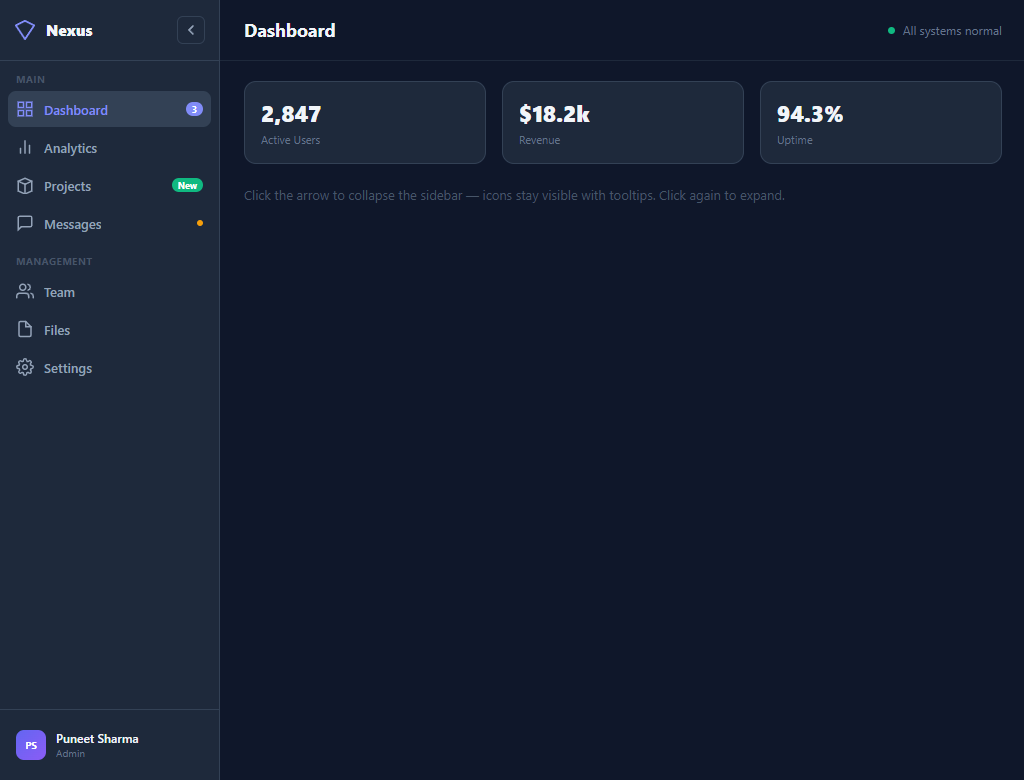
The collapsible sidebar is the defining pattern of dashboard UI design — a persistent navigation panel that maximises screen space when collapsed to icon-only view while remaining fully navigable. This snippet builds a production-quality sidebar in pure HTML and CSS, with a single JavaScript toggle: smooth width animation, labelled nav items with icon fallback, badge counters, notification dots, a user profile footer, and CSS-only tooltips in the collapsed state.
Dashboards are where developers most often need a sidebar, and getting it right requires solving several simultaneous problems: the panel must animate smoothly without layout reflow, labels must hide without leaving gaps, icons must remain accessible in collapsed state (with tooltips), and badges must not clutter the icon view.
The width collapse animation
The sidebar collapses by toggling a .collapsed class that changes width and min-width from 220px to 60px. Both properties are animated with transition: width .28s cubic-bezier(.4,0,.2,1) — the Material Design standard easing for panel motions. Using min-width alongside width prevents the flex container from shrinking below the target during animation. The content inside (logo-text, nav-text, badges, labels) fades out with opacity: 0 and width: 0, which collapses their space without affecting the icon alignment.
CSS-only tooltips in collapsed state
Each .nav-item carries a data-tip attribute with its label text. The collapsed state uses an ::after pseudo-element with content: attr(data-tip) to render this as a floating tooltip. The tooltip is positioned left: calc(100% + 10px) — to the right of the icon — with a dark background and border to match the sidebar theme. pointer-events: none prevents it interfering with clicks. Visibility is controlled with opacity: 0 + opacity: 1 on hover — no JavaScript needed for the tooltip system.
Badge and notification dot system
Three badge styles are demonstrated: a purple numeric badge (3), a green "New" label badge, and a yellow notification dot. In collapsed state, all badges have opacity: 0 — they would crowd the icon-only view. The icons alone communicate location; users expand the sidebar to check counts. This pattern matches VS Code, Linear, and Notion's sidebar behaviour.
Active state with accent colour
The active nav item uses background: #334155 and color: #818cf8 (indigo accent). This accent colour matches the logo icon and the user avatar gradient, creating visual coherence across the sidebar. The active state is set in HTML via the .active class — in a real app, your router would apply this dynamically.
User profile footer
The sidebar footer contains an avatar (initials-based <div> with gradient background), username, and role label. In collapsed state, the details fade out and the avatar tooltip shows the full name. This footer is a standard dashboard pattern — it anchors the user's identity in the navigation chrome and provides a consistent entry point for profile/account settings. Pair with a command palette for keyboard navigation between sections.
Build with AI
Build, Understand, Optimize, and Extend It With AI
You don't have to trace every collapse transition and tooltip rule by hand. Paste this snippet's HTML, CSS, and JS into an AI coding assistant like Claude and ask it to explain exactly why width and min-width are both animated together on the sidebar, or how the data-tip attribute becomes a visible tooltip with no JavaScript involved. The same assistant can help optimize it, for example checking whether the collapsed-state selectors could be consolidated so the browser recalculates fewer rules per toggle, or whether the transition timing feels right at different sidebar depths. It is just as useful for extending the sidebar: ask it to persist the collapsed state in localStorage, add nested sub-menus with their own expand animation, or turn the sidebar into a mobile slide-out drawer below a breakpoint. Treat the code less like a finished artifact and more like a starting point for a conversation.
Prompt to recreate it
Copy this into your AI assistant of choice to build the effect from scratch, or as a jumping-off point for your own variant:
Build a collapsible dashboard sidebar in plain HTML, CSS, and a single JavaScript toggle — no framework, no animation library.

Requirements:
- A fixed-width sidebar (around 220px) containing a logo, several grouped nav sections with icon plus label plus optional badge or notification dot per item, and a footer with a user avatar, name, and role.
- A collapse button that toggles a single class on the sidebar. That class change alone must animate the sidebar from its full width down to an icon-only width (around 60px) using a CSS transition on both width and min-width with an easing curve, not a JS-driven animation loop.
- When collapsed, nav labels, badges, notification dots, and the user's name/role must fade out and collapse their own width via opacity and width transitions, without breaking icon alignment or causing the icons to jump position.
- Every nav item and the user info block must carry a data-tip attribute with its label text. In the collapsed state only, reveal that label as a floating tooltip to the right of the icon using a ::after pseudo-element with content: attr(data-tip), shown on hover via opacity — this tooltip system must work with zero JavaScript.
- The collapse button's icon must rotate 180 degrees via a CSS transform tied to the same collapsed class, so its direction always matches the current state.
- The entire interactive behavior in JavaScript must be a single class toggle call — all visual logic (fading, resizing, tooltips, icon rotation) must live in CSS, not be computed or animated via JS.
Want to tighten it up first? Run this prompt through the AI Prompt Studio to score it across 8 quality dimensions, catch anti-patterns, and tune the wording for Claude, ChatGPT, or Gemini before you paste it in.
Step by step
How to Use
- 1Paste the three code blocksDrop the HTML, CSS, and JS into your page. A full-height layout appears with a 220px sidebar on the left and a main content area on the right.
- 2Click the collapse arrowThe sidebar smoothly animates to 60px — labels, badges, and the logo text fade out. Only icons remain, bottom-aligned.
- 3Hover over icons in collapsed stateA CSS tooltip appears to the right of each icon showing its label. The user avatar tooltip shows the full name. No JavaScript required.
- 4Click again to expandThe collapse arrow rotates 180° and the sidebar expands back to 220px. Labels, badges, and the user details fade back in.
- 5Set an active itemAdd the
.activeclass to any.nav-itemto highlight it with the accent colour. In a real app, apply this based on the current route. - 6Add your nav itemsCopy any
.nav-itemblock, swap the SVG icon, update thedata-tipattribute, label text, and optionally add a badge or dot. Sections are grouped by.nav-section.
Real-world uses
Common Use Cases
Got questions?
Frequently Asked Questions
Save the state to localStorage on toggle: localStorage.setItem('sidebar_collapsed', isCollapsed). On page load, read it: if (localStorage.getItem('sidebar_collapsed') === 'true') sidebar.classList.add('collapsed').
On mobile breakpoints (max-width: 768px), position the sidebar with position: fixed; left: -220px by default, and left: 0 when open. Add an overlay backdrop behind it. The toggle button would move to the topbar. See the drawer snippet for the full pattern.
Add a <div class="sub-menu"> inside a nav item. Toggle a .open class on click. Use max-height: 0 → max-height: 200px with a CSS transition for a smooth expand. The parent item needs a chevron icon that rotates on .open.
Replace the toggle JS with const [collapsed, setCollapsed] = useState(false). Apply className={sidebar${collapsed ? ' collapsed' : ''}} to the aside. The collapse button's onClick calls setCollapsed(c => !c). Active state comes from comparing the current route to each item's href using Next.js usePathname() or React Router useLocation().