More Navigation Snippets
Front-End Coding Playgrounds
Learn to code with interactive, live-preview playgrounds — HTML, CSS, JavaScript, React & more.
 HTML Playground42 lessons · Click-based · Live preview
 CSS PlaygroundLearn CSS with a live editor
 JavaScript Playground60 lessons · DOM · Async · Canvas
 React PlaygroundLearn React with a live code editor
 GSAP PlaygroundLearn GSAP animation interactively
 SVG Playground44 lessons · shapes · paths · animation
 SCSS Playground45 lessons · Sass modules · tokens
 Tailwind PlaygroundLearn Tailwind CSS with a live editor
 Bootstrap 5 Playground50 lessons · live preview
Table of Contents — Free HTML CSS JS Snippet
Table of Contents · Navigation · Plain HTML, CSS & JS · Live preview
What's included
Features
About this UI Snippet
Table of Contents — Auto-Generated from Headings, IntersectionObserver Active Highlight & Sticky Sidebar
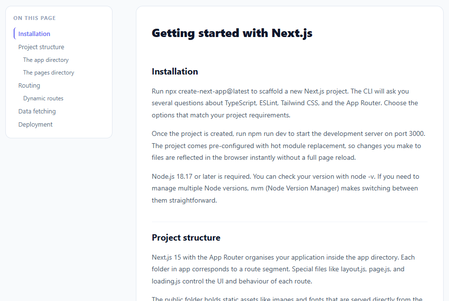
Land on a 3,000-word guide with no table of contents and the only way to know what's ahead — or to get back to the part about installation — is to scroll and hope. A sidebar that lists every section, jumps to it on click, and quietly tracks which one you're currently reading turns that wall of text into something closer to a map. This snippet builds that sidebar entirely from the article's own markup: it walks the DOM for h2/h3 elements, builds the link list automatically, highlights whichever section currently fills the reader's view using IntersectionObserver, smooth-scrolls on click, and stays pinned in view via position: sticky as the page scrolls beneath it.
Building the list from the headings that already exist
Rather than asking authors to maintain a parallel list of links — the kind that quietly drifts out of sync the moment someone adds a section and forgets the sidebar — the script queries article.querySelectorAll('h2, h3') and builds one <li> per heading it finds. Any heading missing an id gets one generated on the spot: h.textContent.trim().toLowerCase().replace(/\s+/g,'-').replace(/[^a-z0-9-]/g,''), lowercasing, hyphenating spaces, and stripping anything that wouldn't survive in a URL fragment. The practical result is that *any* article with headings gets a working, always-current TOC the moment this script runs against it — no manual bookkeeping required.
Why the active zone sits near the top of the viewport, not the middle
A naive "50% visible = active" rule sounds reasonable until you notice that long sections dominate the screen for most of the scroll, while short ones flicker active and inactive within a single swipe. This snippet instead uses rootMargin: '-10% 0% -70% 0%', which shrinks the observer's effective viewport down to a thin horizontal band occupying roughly the top fifth of the screen. A heading is "active" the instant it crosses into *that* band — which corresponds almost exactly to where a reader's eyes are actually resting as they scroll downward. It's the same top-band philosophy the Scroll-Spy Navigation snippet uses for its sliding indicator, just applied here to a flat list of links instead of a pill that glides between them.
Two heading levels, one indentation rule
The visual hierarchy between h2 and h3 entries comes from a single conditional class: links built from an H3 element get .h3 appended, which adds padding-left: 18px and drops the font size slightly. No nested <ul> elements, no recursive tree-building — just one class name deciding how far an item sits from the left edge, which keeps the markup flat and the click-to-scroll wiring identical for every link regardless of its level.
Sticking around without JavaScript scroll handlers
The sidebar uses position: sticky; top: 20px, a single CSS declaration that keeps it pinned near the top of the viewport as the surrounding page scrolls — without a single scroll event listener computing offsets on every frame. Pair that with scrollIntoView({ behavior: 'smooth', block: 'start' }) on each link's click handler (after e.preventDefault() cancels the browser's instant jump), and the whole navigation experience — sticky position, smooth travel, live highlight — runs almost entirely on browser-native primitives rather than hand-rolled scroll math. For pages where readers expand and collapse long sections rather than scrolling through everything, the Read More Expand snippet pairs naturally with this pattern.
Build with AI
Build, Understand, Optimize, and Extend It With AI
You don't have to work out the rootMargin math by hand. Paste this snippet's HTML, CSS, and JS into an AI coding assistant like Claude and ask it to explain exactly why the observer's rootMargin of -10% top and -70% bottom shrinks the detection zone to a thin band near the top of the viewport, and how the visible Set combined with headings.find picks exactly one active heading even when several technically intersect at once. The same assistant can help optimize it — for instance whether rebuilding the auto-generated ids with a regex on every load is safe against duplicate heading text, or whether observing every heading individually scales fine on an article with hundreds of sections. It's also useful for extending the component: ask it to add a collapsible mobile version, support h4 nesting with deeper indentation, or highlight reading progress within the active section instead of just marking one link active. Treat the code less like a finished artifact and more like a starting point for a conversation.
Prompt to recreate it
Copy this into your AI assistant of choice to build the effect from scratch, or as a jumping-off point for your own variant:
Build an auto-generating "table of contents" sidebar in plain HTML, CSS, and JavaScript using only IntersectionObserver — no scroll-position math, no framework.

Requirements:
- On load, query the article container for all h2 and h3 elements (in document order) and build one table-of-contents link per heading found — do not hand-author a parallel list of links anywhere in the markup.
- Any heading missing an id attribute must have one generated automatically from its text content: lowercased, whitespace collapsed to hyphens, and any character that isn't a lowercase letter, digit, or hyphen stripped out.
- Give h3-derived links an extra CSS class that adds left indentation and a smaller font size compared to h2-derived links, using a flat list (no nested unordered lists).
- Clicking a table-of-contents link must prevent the default instant jump and instead smooth-scroll the matching heading into view using scrollIntoView with smooth behavior.
- Create exactly one IntersectionObserver (not one per heading) that observes every heading, with a rootMargin that shrinks the effective viewport to roughly the top 20% of the screen (e.g. a large negative bottom margin and a smaller negative top margin) — a heading is "active" only once it crosses into that band.
- Maintain the current set of intersecting headings and always pick the one that comes first in document order among those currently visible as the single active link, removing the active class from every other link.
- The sidebar itself must use position: sticky to stay pinned near the top of the viewport as the user scrolls, and must collapse or hide entirely below a chosen mobile breakpoint via a media query.
Step by step
How to Use
- 1Scroll the article to see active section highlightingAs you scroll, the TOC link for the currently visible heading turns indigo and gets a left border. Scroll through the article to see it track your reading position.
- 2Click any TOC link to jump to that sectionClicking a TOC link smoothly scrolls the article to that heading using scrollIntoView. The active highlight updates to the section you jumped to.
- 3Replace the article content with your ownUpdate the .article HTML with your real content. Keep the h2 and h3 elements with meaningful ids (or let the script auto-generate them from heading text). The TOC regenerates automatically from the heading structure.
- 4Adjust the active detection zoneUpdate the IntersectionObserver rootMargin: "-10% 0% -70% 0%" to change when sections become "active". Increase the top margin to activate later in the scroll; decrease the bottom margin to keep the active section visible longer.
- 5Customise h2 and h3 visual hierarchyEdit .toc-link.h3 padding-left and font-size for the indentation level. Add .h4 class support by updating the querySelectorAll to include h4 and adding the .h4 CSS class.
- 6Export in your formatClick "HTML" for a standalone file, "JSX" for a React component using useEffect and useRef, or "Tailwind" for a React + Tailwind CSS version.
Real-world uses
Common Use Cases
Got questions?
Frequently Asked Questions
The observer uses rootMargin: "-10% 0% -70% 0%". This shrinks the root viewport: 10% from the top and 70% from the bottom, creating a detection zone that is only the top 20% of the viewport. When a heading enters this zone (moves to the top of the screen as the user scrolls), its TOC link becomes active. When the next heading enters the zone, the first one exits and becomes inactive. This creates a clean single-active-section highlight that tracks scroll position precisely.
The auto-generation works on any page with h2/h3 elements. Add the TOC container HTML (<nav class="toc" id="toc">) to your page template. Include the JavaScript after your article content. The script automatically finds all headings in #article and builds the TOC. For a CMS, add the TOC HTML to your layout template and include the script in your base JavaScript bundle.
Add a toggle button: <button class="toc-toggle" onclick="toggleTOC()">Contents</button>. Style it to appear only on mobile: @media (max-width: 700px) { .toc-toggle { display: block; } }. In toggleTOC(): document.getElementById("toc-list").classList.toggle("hidden"). Add .hidden { display: none } to CSS. The sticky sidebar remains visible on desktop; on mobile it becomes a collapsible panel.
Click "JSX" to download. Use useRef(null) for the article element. Run the heading collection and TOC building in useEffect([]) after mount. For the IntersectionObserver, also create it in useEffect and return a cleanup function: return () => observer.disconnect(). For Next.js App Router, use "use client" on the component since it uses DOM APIs and useEffect.