


Learn Coding Visually
Learn to code with interactive, live-preview playgrounds — HTML, CSS, JavaScript, React & more.
 HTML Playground42 lessons · Click-based · Live preview
 CSS PlaygroundLearn CSS with a live editor
 JavaScript Playground60 lessons · DOM · Async · Canvas
 React PlaygroundLearn React with a live code editor
 GSAP PlaygroundLearn GSAP animation interactively
 SVG Playground44 lessons · shapes · paths · animation
 SCSS Playground45 lessons · Sass modules · tokens
 Tailwind PlaygroundLearn Tailwind CSS with a live editor
 Bootstrap 5 Playground50 lessons · live preview
Drawer — Free HTML CSS JS Navigation Panel Snippet
Side Drawer · Modals · Plain HTML, CSS & JS · Live preview
What's included
Features
About this UI Snippet
Side Drawer — Left Navigation Drawer and Right Settings Panel with Slide Animation & Backdrop
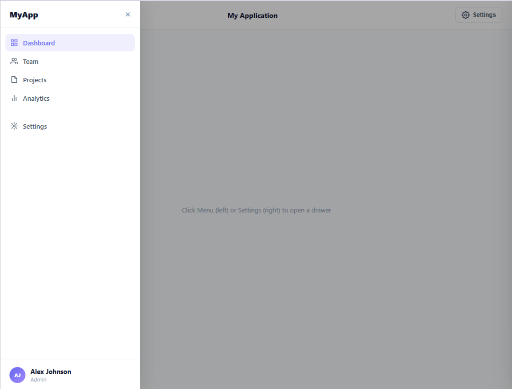
A side drawer is a panel that slides in from the left or right edge of the screen when triggered, overlaying the main content with a semi-transparent backdrop. It is more prominent than a dropdown menu and less disruptive than a full modal — the standard pattern for navigation drawers on mobile web apps, settings panels in desktop apps, and secondary content panels in dashboards. This snippet provides both a left navigation drawer and a right settings panel with shared open/close logic, backdrop, ESC key support, and cubic-bezier slide animation.
The slide animation
Both drawers start at transform: translateX(-100%) (left) and translateX(100%) (right) — fully off-screen. Adding the .open class changes the transform to translateX(0). The CSS transition uses cubic-bezier(0.32, 0.72, 0, 1) — a spring-like curve with fast start and slow decelerate, matching iOS sheet physics. The backdrop simultaneously fades from transparent to rgba(0,0,0,0.35).
Left navigation drawer
The left drawer contains an application brand, a nav list with SVG icons and an active item indicator (indigo background on .active), a divider, and a user footer with gradient avatar initials. This is the standard mobile navigation pattern — the nav items are links to main app sections.
Right settings panel
The right drawer contains four setting rows, each with a label and a CSS toggle switch. The toggle uses the standard hidden checkbox + slider pattern: the checkbox state controls the slider background colour and knob position via :checked selectors. No JavaScript needed for the toggle switches — they work natively as checkboxes.
Shared open/close logic
The open(side) function accepts 'left' or 'right' as a parameter and adds .open to the matching drawer and backdrop. The close() function removes .open from all drawers and the backdrop simultaneously — so opening the left drawer and then clicking the backdrop closes it correctly. ESC key calls close() via a document keydown listener that is added on open and removed on close.
Accessibility
Both drawers use role="dialog" and aria-modal="true". For full focus trapping (required for WCAG 2.1 AA), add a focus trap — see the accessibility note in the FAQ. The drawer also supports a push-content layout: add margin-left: 280px to the main area and transition it in sync with the drawer — the standard desktop sidebar pattern.
Build with AI
Build, Understand, Optimize, and Extend It With AI
Rather than tracing every class toggle yourself, paste this snippet's HTML, CSS, and JS into an AI coding assistant like Claude and ask it to explain exactly how the shared closeDrawer() function safely closes whichever drawer is open without needing to know which side triggered it, and why the cubic-bezier(0.32, 0.72, 0, 1) curve on the transform transition reads as a spring rather than a linear slide. The same assistant can help you optimize it, for example checking whether the keydown listener being added and removed on every open/close cycle could ever leak if openDrawer is called twice in a row without a close between them. It's also useful for extending the drawer: ask it to add real focus trapping so Tab cycles only within the open panel, wire the settings toggles to localStorage so preferences persist across reloads, or convert the left drawer into a push layout that shifts the main content instead of overlaying it. Treat the code less like a finished artifact and more like a starting point for a conversation.
Prompt to recreate it
Copy this into your AI assistant of choice to build the effect from scratch, or as a jumping-off point for your own variant:
Build a slide-in side drawer system with both a left navigation panel and a right settings panel in plain HTML, CSS, and JavaScript with no library.

Requirements:
- Two drawer elements, one anchored to the left edge and one to the right, each starting fully off-screen via a CSS transform (translateX of -100% for the left, 100% for the right), transitioning to translateX(0) on a shared "open" class using a spring-like cubic-bezier easing curve, plus a full-screen backdrop element that fades in opacity in sync with whichever drawer opens.
- A single open function parameterized by which side to open (not two separate near-duplicate functions) that adds the open class to the matching drawer and the backdrop, and a single close function that removes the open class from every drawer and the backdrop regardless of which one is currently open, so closing never needs to know which side was active.
- Wire the backdrop's click event and every drawer's close button to call that same shared close function, and add a document-level Escape keydown listener that also calls it, but only while a drawer is actually open, adding the listener when a drawer opens and removing it when it closes so it never fires or leaks while both drawers are closed.
- Build the right drawer's settings toggles as real checkbox inputs paired with a CSS sibling-selector-driven slider (no JavaScript needed to visually reflect the checked state), so the toggle appearance is driven entirely by the native :checked pseudo-class.
- Mark both drawers with role="dialog" and aria-modal="true" for assistive technology, and structure the left drawer with a distinct header, scrollable navigation list, and a footer user section so it mirrors real dashboard navigation drawers.
Want to tighten it up first? Run this prompt through the AI Prompt Studio to score it across 8 quality dimensions, catch anti-patterns, and tune the wording for Claude, ChatGPT, or Gemini before you paste it in.
Source Code
<div class="app">
  <div class="topbar">
    <button class="menu-btn" id="btn-open-left" aria-label="Open menu">
      <svg width="16" height="16" viewBox="0 0 24 24" fill="none" stroke="currentColor" stroke-width="2.2" stroke-linecap="round"><line x1="3" y1="6" x2="21" y2="6"/><line x1="3" y1="12" x2="21" y2="12"/><line x1="3" y1="18" x2="21" y2="18"/></svg>
      Menu
    </button>
    <span class="topbar-title">My Application</span>
    <button class="menu-btn" id="btn-open-right" aria-label="Open settings">
      <svg width="16" height="16" viewBox="0 0 24 24" fill="none" stroke="currentColor" stroke-width="2.2" stroke-linecap="round"><circle cx="12" cy="12" r="3"/><path d="M19.4 15a1.65 1.65 0 0 0 .33 1.82l.06.06a2 2 0 0 1-2.83 2.83l-.06-.06a1.65 1.65 0 0 0-1.82-.33 1.65 1.65 0 0 0-1 1.51V21a2 2 0 0 1-4 0v-.09A1.65 1.65 0 0 0 9 19.4a1.65 1.65 0 0 0-1.82.33l-.06.06a2 2 0 0 1-2.83-2.83l.06-.06A1.65 1.65 0 0 0 4.68 15a1.65 1.65 0 0 0-1.51-1H3a2 2 0 0 1 0-4h.09A1.65 1.65 0 0 0 4.6 9a1.65 1.65 0 0 0-.33-1.82l-.06-.06a2 2 0 0 1 2.83-2.83l.06.06A1.65 1.65 0 0 0 9 4.68a1.65 1.65 0 0 0 1-1.51V3a2 2 0 0 1 4 0v.09a1.65 1.65 0 0 0 1 1.51 1.65 1.65 0 0 0 1.82-.33l.06-.06a2 2 0 0 1 2.83 2.83l-.06.06A1.65 1.65 0 0 0 19.4 9a1.65 1.65 0 0 0 1.51 1H21a2 2 0 0 1 0 4h-.09a1.65 1.65 0 0 0-1.51 1z"/></svg>
      Settings
    </button>
  </div>

  <div class="page-body">
    <p class="body-hint">Click Menu (left) or Settings (right) to open a drawer</p>
  </div>

  <!-- Backdrop -->
  <div class="backdrop" id="backdrop"></div>

  <!-- Left drawer -->
  <aside class="drawer left" id="drawer-left" role="dialog" aria-modal="true" aria-label="Navigation menu">
    <div class="drawer-head">
      <span class="drawer-brand">MyApp</span>
      <button class="drawer-close" aria-label="Close">×</button>
    </div>
    <nav class="drawer-nav">
      <a href="#" class="nav-item active"><svg width="15" height="15" viewBox="0 0 24 24" fill="none" stroke="currentColor" stroke-width="2" stroke-linecap="round"><rect x="3" y="3" width="7" height="7"/><rect x="14" y="3" width="7" height="7"/><rect x="3" y="14" width="7" height="7"/><rect x="14" y="14" width="7" height="7"/></svg>Dashboard</a>
      <a href="#" class="nav-item"><svg width="15" height="15" viewBox="0 0 24 24" fill="none" stroke="currentColor" stroke-width="2" stroke-linecap="round"><path d="M17 21v-2a4 4 0 0 0-4-4H5a4 4 0 0 0-4 4v2"/><circle cx="9" cy="7" r="4"/><path d="M23 21v-2a4 4 0 0 0-3-3.87"/><path d="M16 3.13a4 4 0 0 1 0 7.75"/></svg>Team</a>
      <a href="#" class="nav-item"><svg width="15" height="15" viewBox="0 0 24 24" fill="none" stroke="currentColor" stroke-width="2" stroke-linecap="round"><path d="M14 2H6a2 2 0 0 0-2 2v16a2 2 0 0 0 2 2h12a2 2 0 0 0 2-2V8z"/><polyline points="14 2 14 8 20 8"/></svg>Projects</a>
      <a href="#" class="nav-item"><svg width="15" height="15" viewBox="0 0 24 24" fill="none" stroke="currentColor" stroke-width="2" stroke-linecap="round"><line x1="18" y1="20" x2="18" y2="10"/><line x1="12" y1="20" x2="12" y2="4"/><line x1="6" y1="20" x2="6" y2="14"/></svg>Analytics</a>
      <div class="nav-divider"></div>
      <a href="#" class="nav-item"><svg width="15" height="15" viewBox="0 0 24 24" fill="none" stroke="currentColor" stroke-width="2" stroke-linecap="round"><circle cx="12" cy="12" r="3"/><path d="M12 1v4M12 19v4M4.22 4.22l2.83 2.83M16.95 16.95l2.83 2.83M1 12h4M19 12h4M4.22 19.78l2.83-2.83M16.95 7.05l2.83-2.83"/></svg>Settings</a>
    </nav>
    <div class="drawer-user">
      <div class="user-av">AJ</div>
      <div><div class="user-name">Alex Johnson</div><div class="user-role">Admin</div></div>
    </div>
  </aside>

  <!-- Right drawer -->
  <aside class="drawer right" id="drawer-right" role="dialog" aria-modal="true" aria-label="Settings panel">
    <div class="drawer-head">
      <span class="drawer-title-text">Settings</span>
      <button class="drawer-close" aria-label="Close">×</button>
    </div>
    <div class="settings-body">
      <div class="setting-row"><span>Dark mode</span><label class="tog"><input type="checkbox"><span class="tog-slider"></span></label></div>
      <div class="setting-row"><span>Email notifications</span><label class="tog"><input type="checkbox" checked><span class="tog-slider"></span></label></div>
      <div class="setting-row"><span>Two-factor auth</span><label class="tog"><input type="checkbox"><span class="tog-slider"></span></label></div>
      <div class="setting-row"><span>Weekly digest</span><label class="tog"><input type="checkbox" checked><span class="tog-slider"></span></label></div>
    </div>
  </aside>
</div>
* { box-sizing: border-box; margin: 0; padding: 0; }
body { font-family: system-ui, sans-serif; background: #f8fafc; margin: 0; overflow: hidden; }
.app { height: 100vh; position: relative; display: flex; flex-direction: column; }
.topbar { display: flex; align-items: center; justify-content: space-between; padding: 12px 20px; background: #fff; border-bottom: 1px solid #e2e8f0; }
.topbar-title { font-size: 14px; font-weight: 700; color: #0f172a; }
.menu-btn { display: flex; align-items: center; gap: 6px; background: transparent; border: 1px solid #e2e8f0; border-radius: 8px; padding: 7px 12px; font-size: 12px; font-weight: 600; color: #475569; cursor: pointer; transition: all 0.12s; }
.menu-btn:hover { border-color: #6366f1; color: #6366f1; }
.page-body { flex: 1; display: flex; align-items: center; justify-content: center; }
.body-hint { font-size: 13px; color: #94a3b8; }
/* Backdrop */
.backdrop { position: fixed; inset: 0; background: rgba(0,0,0,0); pointer-events: none; transition: background 0.3s; z-index: 10; }
.backdrop.open { background: rgba(0,0,0,0.35); pointer-events: all; }
/* Drawer */
.drawer { position: fixed; top: 0; bottom: 0; width: 280px; background: #fff; box-shadow: 0 0 40px rgba(0,0,0,0.15); z-index: 20; display: flex; flex-direction: column; transition: transform 0.3s cubic-bezier(0.32,0.72,0,1); }
.drawer.left { left: 0; border-right: 1px solid #f1f5f9; transform: translateX(-100%); }
.drawer.right { right: 0; border-left: 1px solid #f1f5f9; transform: translateX(100%); }
.drawer.left.open { transform: translateX(0); }
.drawer.right.open { transform: translateX(0); }
.drawer-head { display: flex; align-items: center; justify-content: space-between; padding: 16px 18px; border-bottom: 1px solid #f1f5f9; }
.drawer-brand { font-size: 16px; font-weight: 800; color: #0f172a; }
.drawer-title-text { font-size: 15px; font-weight: 700; color: #0f172a; }
.drawer-close { background: transparent; border: none; font-size: 20px; color: #94a3b8; cursor: pointer; line-height: 1; transition: color 0.12s; }
.drawer-close:hover { color: #0f172a; }
.drawer-nav { flex: 1; padding: 12px 10px; display: flex; flex-direction: column; gap: 2px; overflow-y: auto; }
.nav-item { display: flex; align-items: center; gap: 10px; padding: 9px 10px; border-radius: 8px; font-size: 13px; font-weight: 600; color: #475569; text-decoration: none; transition: all 0.12s; }
.nav-item:hover { background: #f1f5f9; color: #0f172a; }
.nav-item.active { background: rgba(99,102,241,0.1); color: #6366f1; }
.nav-divider { height: 1px; background: #f1f5f9; margin: 8px 0; }
.drawer-user { display: flex; align-items: center; gap: 10px; padding: 14px 18px; border-top: 1px solid #f1f5f9; }
.user-av { width: 32px; height: 32px; border-radius: 50%; background: linear-gradient(135deg,#6366f1,#a78bfa); color: #fff; font-size: 10px; font-weight: 800; display: flex; align-items: center; justify-content: center; flex-shrink: 0; }
.user-name { font-size: 13px; font-weight: 700; color: #0f172a; }
.user-role { font-size: 11px; color: #94a3b8; }
.settings-body { padding: 16px; display: flex; flex-direction: column; gap: 0; }
.setting-row { display: flex; justify-content: space-between; align-items: center; padding: 14px 0; border-bottom: 1px solid #f1f5f9; font-size: 13px; font-weight: 600; color: #374151; }
.setting-row:last-child { border-bottom: none; }
.tog { position: relative; display: inline-block; width: 38px; height: 22px; }
.tog input { opacity: 0; width: 0; height: 0; }
.tog-slider { position: absolute; inset: 0; background: #e2e8f0; border-radius: 22px; cursor: pointer; transition: background 0.15s; }
.tog-slider::before { content: ''; position: absolute; width: 16px; height: 16px; border-radius: 50%; background: #fff; top: 3px; left: 3px; transition: transform 0.15s; box-shadow: 0 1px 3px rgba(0,0,0,0.15); }
.tog input:checked + .tog-slider { background: #6366f1; }
.tog input:checked + .tog-slider::before { transform: translateX(16px); }function openDrawer(side) {
document.getElementById('drawer-' + side).classList.add('open');
document.getElementById('backdrop').classList.add('open');
document.addEventListener('keydown', onKey);
}
function closeDrawer() {
document.querySelectorAll('.drawer').forEach(d => d.classList.remove('open'));
document.getElementById('backdrop').classList.remove('open');
document.removeEventListener('keydown', onKey);
}
function onKey(e) { if (e.key === 'Escape') closeDrawer(); }
document.getElementById('btn-open-left').addEventListener('click', () => openDrawer('left'));
document.getElementById('btn-open-right').addEventListener('click', () => openDrawer('right'));
document.getElementById('backdrop').addEventListener('click', closeDrawer);
document.querySelectorAll('.drawer-close').forEach(btn => btn.addEventListener('click', closeDrawer));Step by step
How to Use
- 1Click Menu or Settings to open each drawerMenu opens the left navigation drawer. Settings opens the right settings panel. Click the backdrop, the × button, or press ESC to close either drawer.
- 2Update the left nav linksEdit the .nav-item anchor texts and href values in the left drawer. Move the .active class to the item matching the current page. Each nav item has an inline SVG icon — swap the icon paths to match your navigation icons.
- 3Update the settings togglesEdit the .setting-row span labels for each setting. The input type="checkbox" handles state natively — add checked to pre-enable a setting. Wire onchange to your settings API or localStorage for persistence.
- 4Add the user info in the footerUpdate the .user-av initials, .user-name, and .user-role text in the left drawer footer. Replace .user-av with an img element for a real avatar photo: add object-fit:cover and keep the border-radius:50%.
- 5Adjust the drawer widthChange width: 280px on .drawer to any value. For a full-width mobile drawer, add @media (max-width:480px) { .drawer { width: 100%; } }. For a narrower icon-only drawer, reduce to 60px and hide the text labels.
- 6Export in your formatClick "HTML" for a standalone file, "JSX" for a React component managing open state with useState and side with a string, or "Tailwind" for a Tailwind CSS version.
Real-world uses
Common Use Cases
Got questions?
Frequently Asked Questions
The drawer starts off-screen at transform: translateX(-100%) for left or translateX(100%) for right. Adding the .open class changes transform to translateX(0). The CSS transition: transform 0.3s cubic-bezier(0.32, 0.72, 0, 1) animates between these values. The cubic-bezier coordinates create a spring-like curve: the first control point (0.32, 0.72) causes fast initial acceleration, and the second (0, 1) causes slow final deceleration — matching the feel of native iOS sheet animations.
After opening the drawer, find all focusable elements inside: const focusable = drawer.querySelectorAll("a,button,input,[tabindex]"). Save the previously focused element: const prevFocus = document.activeElement. Focus the first element: focusable[0].focus(). On keydown Tab: if the last element is focused and Tab (not Shift+Tab), redirect focus to focusable[0]. On Shift+Tab from the first element, redirect to the last. On close, restore focus: prevFocus.focus().
Add onchange handlers to each checkbox: checkbox.addEventListener("change", () => { localStorage.setItem("setting_"+key, checkbox.checked); }). On page load, read each setting: const saved = localStorage.getItem("setting_"+key); if (saved !== null) checkbox.checked = saved === "true". For a server-side app, submit the settings form with a POST request and save to the user's account — the initial checked state is then rendered server-side.
Click "JSX" to download. Manage openSide state with useState<"left"|"right"|null>(null). Render the backdrop and drawers conditionally based on openSide. Apply the open CSS class: className={"drawer left" + (openSide === "left" ? " open" : "")}. Add a useEffect to attach and clean up the ESC keydown listener when openSide is not null. For the toggle switches, replace the native checkbox with controlled React inputs using useState for each setting.