Source Code
<div class="scene">
  <div class="dropdown">
    <button class="trigger" onclick="this.parentElement.classList.toggle('open')">
      My Account
      <svg width="14" height="14" viewBox="0 0 24 24" fill="none" stroke="currentColor" stroke-width="2.5"><polyline points="6 9 12 15 18 9"/></svg>
    </button>
    <ul class="menu">
      <li class="menu-item">
        <svg width="14" height="14" viewBox="0 0 24 24" fill="none" stroke="currentColor" stroke-width="2"><circle cx="12" cy="8" r="4"/><path d="M4 20c0-4 3.6-7 8-7s8 3 8 7"/></svg>
        Profile
      </li>
      <li class="menu-item">
        <svg width="14" height="14" viewBox="0 0 24 24" fill="none" stroke="currentColor" stroke-width="2"><path d="M12 20h9"/><path d="M16.5 3.5a2.121 2.121 0 0 1 3 3L7 19l-4 1 1-4L16.5 3.5z"/></svg>
        Settings
      </li>
      <li class="menu-item">
        <svg width="14" height="14" viewBox="0 0 24 24" fill="none" stroke="currentColor" stroke-width="2"><rect x="2" y="3" width="20" height="14" rx="2"/><path d="M8 21h8M12 17v4"/></svg>
        Billing
      </li>
      <li class="divider"></li>
      <li class="menu-item danger">
        <svg width="14" height="14" viewBox="0 0 24 24" fill="none" stroke="currentColor" stroke-width="2"><path d="M9 21H5a2 2 0 0 1-2-2V5a2 2 0 0 1 2-2h4"/><polyline points="16 17 21 12 16 7"/><line x1="21" y1="12" x2="9" y2="12"/></svg>
        Sign out
      </li>
    </ul>
  </div>
</div>
* { box-sizing: border-box; margin: 0; padding: 0; }
body { font-family: system-ui, sans-serif; background: #f1f5f9; }
.scene { min-height: 100vh; display: flex; align-items: flex-start; justify-content: center; padding: 40px; }
.dropdown { position: relative; }
.trigger {
display: flex; align-items: center; gap: 6px;
padding: 8px 14px; font-size: 13px; font-weight: 600;
color: #1e293b; background: #fff;
border: 1.5px solid #e2e8f0; border-radius: 8px;
cursor: pointer; transition: border-color 0.15s; font-family: inherit;
}
.trigger:hover { border-color: #6366f1; }
.dropdown.open .trigger { border-color: #6366f1; box-shadow: 0 0 0 3px rgba(99,102,241,0.1); }
.menu {
position: absolute; top: calc(100% + 6px); left: 0;
min-width: 180px; background: #fff;
border: 1px solid #e2e8f0; border-radius: 10px;
padding: 4px; list-style: none;
box-shadow: 0 8px 24px rgba(0,0,0,0.1);
opacity: 0; transform: translateY(-6px) scale(0.97);
pointer-events: none;
transition: opacity 0.15s, transform 0.15s; z-index: 99;
}
.dropdown.open .menu { opacity: 1; transform: translateY(0) scale(1); pointer-events: all; }
.menu-item {
display: flex; align-items: center; gap: 8px;
padding: 8px 10px; font-size: 13px; color: #475569;
border-radius: 6px; cursor: pointer;
transition: background 0.1s, color 0.1s;
}
.menu-item:hover { background: #f1f5f9; color: #1e293b; }
.menu-item.danger { color: #dc2626; }
.menu-item.danger:hover { background: #fef2f2; }
.divider { height: 1px; background: #f1f5f9; margin: 4px 0; }document.addEventListener('click', e => {
if (!e.target.closest('.dropdown')) {
document.querySelectorAll('.dropdown').forEach(d => d.classList.remove('open'));
}
});Learn Coding Visually
Learn to code with interactive, live-preview playgrounds — HTML, CSS, JavaScript, React & more.
 HTML Playground42 lessons · Click-based · Live preview
 CSS PlaygroundLearn CSS with a live editor
 JavaScript Playground60 lessons · DOM · Async · Canvas
 React PlaygroundLearn React with a live code editor
 GSAP PlaygroundLearn GSAP animation interactively
 SVG Playground44 lessons · shapes · paths · animation
 SCSS Playground45 lessons · Sass modules · tokens
 Tailwind PlaygroundLearn Tailwind CSS with a live editor
 Bootstrap 5 Playground50 lessons · live preview
Dropdown Menu — Free HTML CSS JS Snippet
Dropdown Menu · Navigation · Plain HTML, CSS & JS · Live preview
What's included
Features
About this UI Snippet
Dropdown Menu — Scale-Opacity Animation, e.target.closest() & Keyboard Close
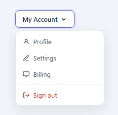
A dropdown menu reveals a list of options from a trigger button — account menus, action menus (see the popover and right-click context menu variants), settings navigation, filter controls. It is one of the most common interactive patterns in web applications. The difference between a good and bad dropdown implementation comes down to three things: how it opens, how it closes, and whether it responds to keyboard input.
How the open animation works
The .menu starts in its closed state: opacity: 0, transform: translateY(-6px) scale(0.97), and pointer-events: none. The transform-origin: top left anchors the scale animation at the corner closest to the trigger button, so the menu appears to emerge from that point. When the parent .dropdown gains the .open class via JavaScript, a 0.15s CSS transition fires: opacity: 1, transform: translateY(0) scale(1). The 3% scale difference and 6px vertical shift are subtle but give the menu a polished "expanding" quality rather than just appearing.
The click-outside close pattern
A single document.addEventListener('click', e => { if (!e.target.closest('.dropdown')) { ... remove .open } }) handles closing on outside clicks. e.target.closest('.selector') traverses the DOM upward from the click target and returns the nearest ancestor matching the selector — or null if none exists. If the click was on the trigger or anywhere inside the dropdown container, closest returns the element and the menu stays open. If the click was outside, it returns null and the menu closes. This pattern works with any number of dropdowns on the page.
ESC key keyboard support
A keydown listener closes all open dropdowns when e.key === 'Escape'. This is required for basic keyboard accessibility — users who opened the menu with Enter should be able to close it with Escape.
Menu item variants
Menu items use .menu-item for standard items. .divider creates a 1px horizontal separator between sections. .danger changes the text to red and applies a red-tinted hover background — the standard convention for destructive actions like "Delete account" or "Revoke access" (confirm them with a confirm dialog).
Pointer-events: none when closed
The closed state uses pointer-events: none. Without this, the invisible menu would intercept clicks on elements behind it. The .open state removes this restriction.
The scale + opacity animation
The dropdown starts at transform: scale(0.97); opacity: 0; pointer-events: none. Adding .open switches to scale(1); opacity: 1; pointer-events: all with CSS transition. The scale(0.97) start point creates a subtle zoom-in that makes the dropdown feel like it "pops" from the trigger. The 0.97 value is small enough to be subtle but enough to create the appearance of depth — the dropdown is slightly smaller than its final size when it first appears.
The transform-origin
transform-origin: top right (for a right-aligned dropdown) or top left (for left-aligned) ensures the scale animation originates from the corner closest to the trigger button. Without a correct transform-origin, the dropdown scales from its centre, which looks disconnected from the trigger.
Click-outside detection
e.target.closest('.dropdown') returns the nearest .dropdown ancestor of the clicked element. If null, the click was outside all dropdowns and the close() function fires. This single document click listener handles all dropdowns on the page without per-dropdown listeners. Add document.addEventListener inside the open() function and remove inside close() to avoid accumulating listeners.
Build with AI
Build, Understand, Optimize, and Extend It With AI
Rather than tracing the click-outside logic by hand, paste this snippet's HTML, CSS, and JS into an AI coding assistant like Claude and ask it to explain exactly how the single document-level click listener uses e.target.closest('.dropdown') to distinguish an inside click from an outside one, and why pointer-events: none on the closed .menu matters even though its opacity is already zero. The same assistant can help optimize it, for instance checking whether one shared document listener really scales cleanly to a page with dozens of independent dropdowns, or whether each needs its own scoped handling. It's also useful for extending the menu: ask it to add arrow-key navigation between menu items, support nested submenus that open on hover, or add the Escape-key close handler this version is missing. Treat the code less like a finished artifact and more like a starting point for a conversation.
Prompt to recreate it
Copy this into your AI assistant of choice to build the effect from scratch, or as a jumping-off point for your own variant:
Build a dropdown menu in plain HTML, CSS, and JavaScript with no library.

Requirements:
- A trigger button that toggles an "open" class on its parent container when clicked, and a menu list that is absolutely positioned below the trigger.
- The closed menu state must use opacity 0, a combined translateY and scale transform (so it looks like it is shrinking toward the trigger corner, anchored with the correct transform-origin), and pointer-events none, transitioning to opacity 1 and the untransformed state when the open class is present.
- Implement closing on outside clicks with exactly one document-level click listener (not one per dropdown instance) that uses closest to check whether the click target is inside any dropdown container, and removes the open class from every open dropdown if not, so the same single listener correctly supports multiple independent dropdown instances on the same page.
- Add a document-level keydown listener that closes all open dropdowns when the Escape key is pressed, for basic keyboard accessibility.
- Support a visually distinct destructive menu item (e.g. "Sign out" or "Delete") with its own red-tinted hover state, and a thin horizontal divider element that can be placed between groups of menu items.
- Ensure the closed menu never intercepts clicks on whatever is positioned behind it, and that reopening the menu after scrolling the page still positions it correctly relative to the trigger.
Want to tighten it up first? Run this prompt through the AI Prompt Studio to score it across 8 quality dimensions, catch anti-patterns, and tune the wording for Claude, ChatGPT, or Gemini before you paste it in.
Step by step
How to Use
- 1Click the trigger buttonClick "My Account" in the preview to open the dropdown. Click anywhere outside or press ESC to close. The menu uses a scale + opacity + translateY animation.
- 2Update the trigger label and menu itemsIn the HTML panel, change the trigger button text and each .menu-item label to your own actions.
- 3Add dividers between groupsAdd <li class="divider"></li> between groups of related actions in the menu list.
- 4Mark destructive actionsAdd the .danger class to any menu item that is destructive — Delete, Remove, Revoke. It renders in red with a red hover background.
- 5Adjust the menu positionThe menu has right: 0 by default (right-aligned). Change to left: 0 for left-aligned. Adjust top: calc(100% + 6px) to change the gap between trigger and menu.
- 6Export in your formatClick "HTML" for a standalone file, "JSX" for a React component, or "Tailwind" for a React + Tailwind version.
Real-world uses
Common Use Cases
Got questions?
Frequently Asked Questions
A document.addEventListener("click") listener runs on every click. e.target.closest(".dropdown") walks up the DOM from the clicked element looking for a .dropdown ancestor. If found, the click was inside the dropdown and it stays open. If null, the click was outside and all dropdowns close via querySelectorAll(".dropdown").forEach(d => d.classList.remove("open")).
The .menu starts at transform: translateY(-6px) scale(0.97) with opacity: 0. When .open is added to the parent .dropdown, CSS transitions fire: transform returns to translateY(0) scale(1) and opacity to 1 over 0.15s. The transform-origin: top left anchors the scale at the trigger corner so the menu appears to expand from that point.
The hidden menu is still in the DOM with opacity: 0. Without pointer-events: none, it would intercept clicks on elements positioned behind it. pointer-events: none makes it completely transparent to mouse and touch events while invisible.
Add CSS: .dropdown:hover .menu { opacity: 1; transform: translateY(0) scale(1); pointer-events: auto; } and remove the onclick attribute from the trigger button. The CSS hover transition handles open/close without JavaScript.
Add an SVG element before the text inside the .menu-item anchor or button. The flex layout and gap on .menu-item will align the icon and text automatically.
Yes. Click "JSX" to download a React component. In React, manage the open state with useState. Replace the onclick handler with setState, and add a useEffect with a document click listener that checks e.target.closest() — clean up the listener on unmount. The CSS animations work unchanged.