Learn Coding Visually
Learn to code with interactive, live-preview playgrounds — HTML, CSS, JavaScript, React & more.
 HTML Playground42 lessons · Click-based · Live preview
 CSS PlaygroundLearn CSS with a live editor
 JavaScript Playground60 lessons · DOM · Async · Canvas
 React PlaygroundLearn React with a live code editor
 GSAP PlaygroundLearn GSAP animation interactively
 SVG Playground44 lessons · shapes · paths · animation
 SCSS Playground45 lessons · Sass modules · tokens
 Tailwind PlaygroundLearn Tailwind CSS with a live editor
 Bootstrap 5 Playground50 lessons · live preview
Confirm Dialog — Type to Confirm HTML CSS JS Snippet
Confirm Dialog · Modals · Plain HTML, CSS & JS · Live preview
What's included
Features
checkPhrase enables Delete only when the input exactly matches the required phrase, forcing deliberate intent.<code>, so changing the displayed name updates the check automatically.backdrop-filter: blur dims and frosts the page; the dialog scales/slides in with transform+opacity for a smooth, export-safe entrance.e.target === overlay), and Escape all route through closeDialog.confirmDelete transitions the button through "Deleting…" and "✓ Deleted", a clear async lifecycle stand-in.busy flag blocks dismissal and repeat clicks during the delete sequence so the action cannot double-fire.About this UI Snippet
Confirm Dialog — Type-to-Confirm Guard, Backdrop Blur & Deleting→Done State
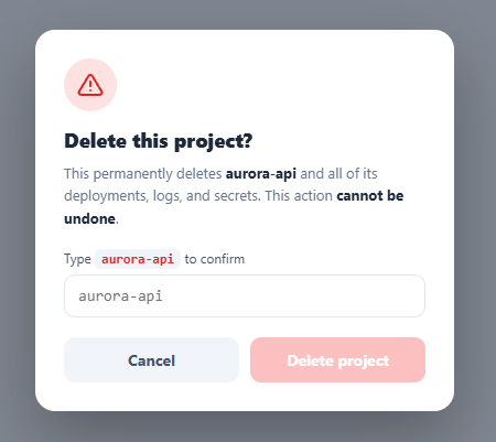
For genuinely destructive actions — deleting a project, dropping a database, closing an account — a plain "Are you sure? [OK]" is too easy to click through on autopilot. The stronger pattern, used by GitHub, Stripe, and Vercel, is type-to-confirm: the user must type the exact name of the thing being destroyed before the confirm button unlocks. That deliberate friction is the point. This snippet implements it in plain HTML, CSS, and vanilla JavaScript: a type-to-confirm guard, a blurred modal overlay, the standard dismissal behaviours, and a deleting→done state.
The type-to-confirm guard
The Delete button starts disabled. checkPhrase runs on every keystroke and compares the trimmed input against the required PHRASE (read from the on-screen <code> so the markup is the source of truth). Only an exact match enables the button and turns the input border green. This forces the user to consciously read and reproduce the resource's name, which all but eliminates accidental deletions and "muscle-memory" confirmations — the entire reason the pattern exists.
A real modal, dismissed the expected ways
The dialog uses role="alertdialog" and aria-modal, with a blurred, dimmed overlay (backdrop-filter: blur). It animates in by scaling and sliding from scale(.94) to scale(1) with opacity — transform/opacity only, so it is smooth and exports cleanly. It can be dismissed three ways: the Cancel button, clicking the backdrop (overlayClick checks e.target === overlay so clicks inside the dialog do not close it), and pressing Escape. Every dismissal path runs closeDialog, which also resets the input and re-disables the button so the guard is fresh next time.
Deleting → done state with a re-entrancy lock
On confirm, confirmDelete switches the button to "Deleting…", then to a green "✓ Deleted", then closes — standing in for an async request. A busy flag locks the dialog during this sequence so Escape, the backdrop, and repeat clicks cannot interrupt or double-fire the action mid-delete. Once finished, closeDialog fully resets the dialog for reuse.
Focus and reset
Opening the dialog focuses the input after the animation so the user can start typing immediately, and closing clears the field, the match style, and the button label — so reopening always presents a clean, locked confirm.
Wire your real delete call into confirmDelete (before the success state) and you have a production-grade safeguard. Pair this with a slide to confirm for an alternative deliberate gesture, a snackbar with undo for reversible deletes, or a modal for non-destructive dialogs.
Build with AI
Build, Understand, Optimize, and Extend It With AI
You don't have to trace the busy flag and the three dismissal paths by hand to trust they can't race each other. Paste this snippet's HTML, CSS, and JS into an AI coding assistant like Claude and ask it to explain exactly why closeDialog checks the busy flag before doing anything, and why the required phrase is read from the on-screen code element's text rather than hardcoded in JavaScript. The same assistant can help optimize it — for instance asking whether the 850ms and 1000ms setTimeout delays in confirmDelete should instead be driven by a real fetch promise, and what error-state handling is missing if that request fails. It's also useful for extending the dialog: ask it to support per-item dynamic phrases when deleting from a list of many resources, add a countdown-style confirm button that only unlocks after a few seconds of reading time, or trap focus fully within the dialog for screen reader users. Treat the code less like a finished artifact and more like a starting point for a conversation.
Prompt to recreate it
Copy this into your AI assistant of choice to build the effect from scratch, or as a jumping-off point for your own variant:
Build a type-to-confirm destructive-action dialog in plain HTML, CSS, and JavaScript — no modal library, no frameworks.

Requirements:
- A trigger button that opens a modal overlay styled as role="alertdialog" with aria-modal and aria-labelledby pointing at the dialog's heading.
- The exact confirmation phrase (e.g. a resource name) must be read from a visible on-screen element's text content at runtime, not hardcoded as a separate JavaScript string, so the displayed warning text and the validation check can never drift apart.
- A text input whose value is compared against that phrase on every keystroke; only an exact trimmed match may enable the destructive confirm button, and a match should also give the input a distinct visual affirmation (such as a colored border) as immediate feedback.
- The destructive confirm button must start disabled and remain unclickable until the phrase matches exactly.
- Three independent ways to dismiss the dialog without confirming: an explicit cancel button, clicking the overlay background outside the dialog box (verified by checking that the click target is the overlay itself, not a descendant), and pressing the Escape key — all three must route through one shared close function that also resets the input value, the match styling, and the confirm button's disabled state.
- On confirm, transition the button's label through an in-progress state (e.g. "Deleting...") standing in for an async request, then to a success state (e.g. a checkmark and "Deleted"), then close the dialog automatically shortly after.
- Introduce a single busy flag that gets set for the entire duration of that confirm sequence, and make every dismissal path (cancel, overlay click, Escape) check and respect that flag so the dialog cannot be dismissed or re-triggered mid-deletion.
- Animate the dialog's entrance and exit using only transform and opacity (scale plus a slight vertical offset) so it exports cleanly to any framework without relying on layout-affecting properties.
Want to tighten it up first? Run this prompt through the AI Prompt Studio to score it across 8 quality dimensions, catch anti-patterns, and tune the wording for Claude, ChatGPT, or Gemini before you paste it in.
Step by step
How to Use
- 1Paste HTML, CSS, and JSA red "Delete project" button appears; clicking it opens a blurred modal asking you to type the project name.
- 2See the locked confirmThe Delete button inside the dialog is disabled — you cannot click it until you prove intent.
- 3Type the phraseType
aurora-apiexactly — the input border turns green and the Delete button unlocks the moment it matches. - 4ConfirmClick Delete — it shows "Deleting…", then a green "✓ Deleted", then the dialog closes.
- 5Dismiss itCancel, click the dimmed backdrop, or press Escape to close without deleting; the guard resets for next time.
- 6Wire your actionPut your real delete API call in
confirmDeletebefore the success state — it only runs once the typed name matches.
Real-world uses
Common Use Cases
Got questions?
Frequently Asked Questions
Put your API call inside confirmDelete before showing the success state: keep the busy lock set, await the request, then switch to "✓ Deleted" and close on success. On failure, clear busy, restore the button label, and show an error message instead of closing — so the user can retry without losing the dialog.
The phrase is read from the #cdPhrase element's text, so render the actual resource name into both that <code> and the warning text when you open the dialog. checkPhrase compares against whatever is shown, so per-item dialogs (deleting "billing-prod" vs "aurora-api") work with no code change.
By default this matches exactly (case-sensitive), which is the safest and matches GitHub's behaviour — it forces careful reproduction. If your resource names are case-insensitive, compare with .toLowerCase() on both sides. Keep the trim (already applied) so trailing spaces from autocomplete do not block a correct match.
It uses role="alertdialog" and aria-modal with an aria-labelledby pointing at the title. For full compliance, trap focus inside the dialog while open (cycle Tab between the input and buttons), return focus to the trigger on close, and ensure Escape closes it (it does). The green match state should be paired with the unlocked button, not colour alone, so the cue is not purely visual.
In React, hold open, the typed value, and a busy flag in useState; derive the button's disabled state from value === phrase, and add an Escape useEffect. In Vue, use refs with v-model and a computed match. In Angular, track state on the component and bind [disabled]. The overlay/scale-in CSS and guard logic port unchanged.