More Modals Snippets
Front-End Coding Playgrounds
Learn to code with interactive, live-preview playgrounds — HTML, CSS, JavaScript, React & more.
 HTML Playground42 lessons · Click-based · Live preview
 CSS PlaygroundLearn CSS with a live editor
 JavaScript Playground60 lessons · DOM · Async · Canvas
 React PlaygroundLearn React with a live code editor
 GSAP PlaygroundLearn GSAP animation interactively
 SVG Playground44 lessons · shapes · paths · animation
 SCSS Playground45 lessons · Sass modules · tokens
 Tailwind PlaygroundLearn Tailwind CSS with a live editor
 Bootstrap 5 Playground50 lessons · live preview
Modal Dialog — Free HTML CSS JS Popup Snippet
Modal / Dialog · Modals · Plain HTML, CSS & JS · Live preview
What's included
Features
About this UI Snippet
Modal Dialog — Backdrop Blur Overlay, Scale Entry & Three Close Mechanisms
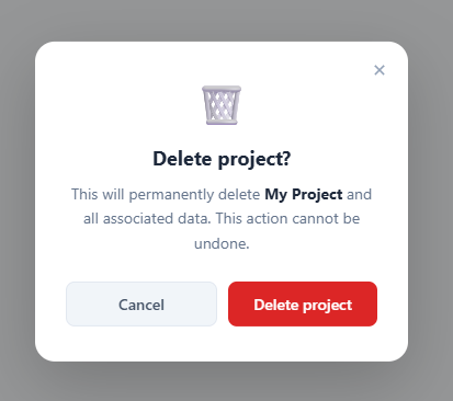
A modal dialog temporarily blocks the rest of the page while the user handles a critical action — a delete confirmation, a form submission, an authentication prompt, or an upgrade gate. The design communicates urgency through the overlay and forces focus through the blurred background. This snippet implements a production-quality modal with three ways to close it and a polished entry animation.
The backdrop blur overlay
.overlay uses background: rgba(0,0,0,0.4) with backdrop-filter: blur(2px). The rgba provides a semi-transparent dark dim. The backdrop-filter blurs everything rendered behind the overlay. The overlay starts at opacity: 0; pointer-events: none. Adding .show transitions to opacity: 1 and restores pointer events. The modal sits on top of the overlay via z-index layering.
The scale entry animation
The modal starts at transform: translate(-50%, -48%) scale(0.95) — centred using the left: 50%; top: 50% absolute positioning trick, but scaled down 5% and shifted 2% upward. Adding .show transitions to translate(-50%, -50%) scale(1). The 5% scale-up and 2px upward movement make the modal appear to emerge from just above centre — a subtle but polished entrance.
Three close mechanisms
openModal() adds .show to both the modal and overlay. closeModal() removes it. Three triggers call closeModal(): the Cancel button, the × close button in the top-right corner, and a document.addEventListener('keydown', e => { if (e.key === 'Escape') closeModal(); }) listener. The overlay div has onclick="closeModal()" so clicking the dim background also closes.
Preventing scroll under the modal
Add document.body.style.overflow = 'hidden' in openModal() and document.body.style.overflow = '' in closeModal(). This prevents the page from scrolling while the modal is open.
Adding accessibility attributes
Add role="dialog", aria-modal="true", and aria-labelledby="modal-title" to the modal div. Give the h3 id="modal-title". Move focus to the first interactive element (the cancel button) when the modal opens.
The three close mechanisms
Production modals need three independent close paths: (1) An explicit × close button in the modal header — covers users who do not know keyboard shortcuts. (2) Click-outside detection on the backdrop — the most natural close gesture on desktop. (3) ESC keydown on document — the universal keyboard escape for any overlay. Implementing all three reduces friction and matches expected behaviour across user profiles. Removing any one of them frustrates a segment of users.
The backdrop blur
backdrop-filter: blur(8px) on the overlay creates the frosted glass effect behind the modal. This requires the overlay to have a partially transparent background (rgba) — a fully opaque overlay has no content behind it to blur. The blur property is GPU-composited and does not trigger layout recalculation.
The entry animation
The modal dialog uses transform: scale(0.95) + opacity: 0 as the initial state, transitioning to scale(1) + opacity: 1 on open. This scale-up-from-slightly-small animation is the standard modal entry across macOS apps, iOS, and most web design systems. It communicates "appearing" more naturally than a slide-in from an edge.
Build with AI
Build, Understand, Optimize, and Extend It With AI
Instead of working out the layering by hand, paste this snippet's HTML, CSS, and JS into an AI coding assistant like Claude and ask it to explain exactly why the overlay needs a partially transparent rgba background for its backdrop-filter: blur to have anything to blur, or why the modal's initial transform is translate(-50%, -48%) scale(0.95) rather than a plain scale(0.95). The same assistant can help optimize it, for instance checking whether toggling opacity and pointer-events with a class is enough to keep the hidden modal from being focusable by assistive tech, or whether the escape-key listener should be removed when the modal closes so it doesn't leak onto other overlays on the page. It's just as useful for extending the pattern: ask it to add a focus trap that cycles Tab between the modal's interactive elements, animate multiple stacked modals, or convert openModal/closeModal into a small reusable dialog controller. Treat the code less like a finished artifact and more like a starting point for a conversation.
Prompt to recreate it
Copy this into your AI assistant of choice to build the effect from scratch, or as a jumping-off point for your own variant:
Build a confirmation "modal dialog" in plain HTML, CSS, and JavaScript using only class toggling and CSS transitions — no animation library, no dialog element.

Requirements:
- A backdrop overlay fixed over the whole viewport with a semi-transparent dark background and a backdrop-filter blur, starting at opacity 0 with pointer-events disabled, and transitioning to opacity 1 with pointer-events enabled when a "show" class is added.
- A centered modal panel positioned with left/top 50% and a translate offset, whose closed state is offset slightly further up than its open state (for example -48% versus -50% on the Y axis) combined with a smaller scale (around 0.95 versus 1), so that opening it plays as a gentle scale-and-rise-into-place rather than a flat fade.
- Exactly three independent ways to close the modal, all calling the same close function: an explicit close (x) button inside the modal, clicking anywhere on the backdrop outside the modal panel, and pressing the Escape key while the modal is open (via a document-level keydown listener).
- A Cancel button and a destructive Confirm button styled distinctly (e.g. neutral gray versus red) inside the modal footer.
- The modal and backdrop must both use pointer-events: none while hidden so that an invisible, off-screen-opacity modal never intercepts clicks meant for the page behind it.
- Confirm and explain in code comments that when the modal opens, page scroll should be locked (body overflow hidden) and restored when it closes.
Step by step
How to Use
- 1Open and close the modalClick "Open modal" to see the blur overlay and scale entry animation. Close via Cancel, the × button, the overlay, or ESC key.
- 2Update the modal contentIn the HTML panel, change the icon, h3 title, and p description to your specific action. Keep the action-confirm pattern for destructive actions.
- 3Change the confirm button colourUpdate background: #dc2626 on .btn-confirm to match your action type — red for delete, blue for save, green for confirm.
- 4Add a form insideReplace the paragraph and button row with a form element containing inputs. The 340px max-width accommodates compact forms with 2-3 fields.
- 5Prevent scrollIn the JS panel, add document.body.style.overflow = "hidden" in openModal() and document.body.style.overflow = "" in closeModal().
- 6Export in your formatClick "HTML" for a standalone file, "JSX" for a React component, or "Tailwind" for a React + Tailwind version.
Real-world uses
Common Use Cases
Got questions?
Frequently Asked Questions
backdrop-filter: blur(2px) blurs everything rendered behind the overlay element. The overlay must have a semi-transparent background (rgba) — a fully opaque background would cover the content before the blur can show. The blur effect requires a transparent path to the content below.
The modal uses position: fixed; left: 50%; top: 50%. The initial transform is translate(-50%, -48%) scale(0.95) — centred but scaled down and shifted 2% up. Adding .show transitions to translate(-50%, -50%) scale(1). The scale change creates the grow effect; the Y shift makes it appear to rise into position.
In openModal(), add document.body.style.overflow = "hidden". In closeModal(), restore it: document.body.style.overflow = "". This blocks scroll events on the body while the modal is visible.
Add role="dialog" aria-modal="true" aria-labelledby="modal-title" to the modal div. Give the h3 id="modal-title". In openModal(), move focus to the first interactive element: document.querySelector(".btn-cancel").focus(). This ensures screen readers announce the modal and keyboard users can navigate it.
Yes. Give each modal div a unique id. Create separate open/close functions for each, or modify openModal() to accept an id parameter: function openModal(id) { document.getElementById(id).classList.add("show"); }.
Yes. Click "JSX" to download a React component. In React, replace the JS open/close functions with useState: const [isOpen, setIsOpen] = useState(false). Render the modal and overlay conditionally based on isOpen. The CSS animations work unchanged.